I told myself I wasn’t going to do this. There are bound to be hundreds of reviews of iOS 6, so why should I contribute to that mess? What could I bring to the table that’s new, that’s different, and which places my own spin on the average new operating system review?
To simplify things, and to ultimately allow for a story arc of sorts, this review is split into three separate parts, each of which is almost its own article but are better presented as a combined piece.
Quick warning: this is kind of long. It’s, according to Byword, nearly 5400 words. If I were you, I’d add it to Instapaper or Pocket if you don’t have time right now.
A Contrast of Approaches
Less than a month after Apple unveiled the features of iOS 6, Google announced Android 4.1 “Jelly Bean”. By and large (and befitting its x.1 version number), it’s a bug fix and tweaking release. But even a major release, like Android 4.0(.1) “Ice Cream Sandwich”, focused more on fixing long-standing issues. Compare, for instance, the feature lists for iOS 6 and Android 4.0, the two most recent version number increases of each platform. The length of both is misleading, but reading through one after the other shows completely different approaches to development by Google and Apple.
Apple chooses to work on a bunch of highly polished, super smooth features at one time. Google releases an initial feature list a mile long and tweaks it over time with trickle releases, while simultaneously implementing more new features. It’s not that Google’s is bad, per se, or that Apple’s is inherently better. It’s just a different approach. Google aims for many incremental updates, whereas Apple targets annual x.0 releases.
Google is very comfortable with releasing products before the paint has dried, using early adopters as beta testers. This strategy has worked very well for a number of their products, such as Gmail and Google Docs. And, judging by the posters around their office, Facebook has adopted a similar strategy.
By contrast, Apple is very particular about only showing, let alone shipping, nearly-completed products. Yes, there are exceptions—the “iTV” at the 2006 “It’s Showtime” event, and Siri. But these are exceptions, not the rule1.
It’s interesting to note that Microsoft has adopted a similar strategy to Apple’s with respect to Windows Phone 7 and 8. The former launched in 2010 (!) without multitasking or copy and paste. They are slowly adding features in (and, in some cases, back in) as they get each upgrade to a point where they feel it’s finished.
I’m not sure which strategy is proving to be more effective, or quote-unquote better for the average user. Sometimes, I don’t mind using incomplete products, but I have been burned by a Google beta before. I used to take notes collaboratively in art history with Google Wave, and it worked beautifully, until it was turned off. To be fair, I used the product knowing full-well that Google could pull the plug on it at any time. Likewise, Facebook.com consistently fails to load various components because of constant changes being commited to the code base.
The difference in strategy is, I think, notable for the differences it produces in products. Android 4.1 ostensibly fixes the pervasive lag that has existed since the beginning of the OS. That’s great, and I’m glad it’s fixed. But it’s another in a long list of longstanding issues. One of the release notes from the Android 4.0 changelog concerns an improvement to copy and paste functionality. But one will note that Apple’s clipboard hasn’t changed since it was released three years ago.
Once again, there are exceptions, as with any generalization. But as I said above, the strategy that Apple aims for is the x.0 release, whereas Google chooses to focus on the .x update. While I think the latter has its benefits, I prefer the former. Moreover, even though I see the benefits of Google’s approach, I wouldn’t recommend it, much in the same way that I wouldn’t recommend an old Alfa Romeo to a friend for obvious reasons. Apple’s strategy means I have to wait longer for features, but it also means that they’re typically better-considered and better-designed when they finally arrive. It’s a better overall package.
The Pixel Envy iOS 6 Review
When I was reading the live blogs of the 2012 WWDC keynote, it became very clear that Apple doesn’t have much low-hanging fruit to conquer any more with iOS, at least not in the way that they did previously. iPhone OS 2 brought third-party apps, version 3 gained cut, copy, and paste, iOS 4 brought multitasking, and iOS 5 dealt with modal notification hell. All of these features filled in obvious weak spots in the operating system.
iOS 6 is subtler than any of these, and improves upon each in almost every way. The first thing I noticed after booting was that most of the user interface is smoother, with matte toolbars and buttons replacing the previous gloss. And, as first things to notice go, these are subtle details. It’s akin to the transition that has occurred for Aqua on the Mac side for the past few years, with ever-decreasing amounts of glossy elements. Icons still gain a glassy overlay by default, though, and some popups are still shiny.
In many places on the iPhone, the grey status bar no longer appears. In fact, as far as I can tell, the grey status bar no longer exists, having been replaced with one which uses the average colour of the bottom row of pixels of the app’s navigation bar. App developers can set a status bar colour if they wish.
In many default applications, such as in Maps or Safari, the old grey status bar has been replaced with a white-on-black variant which slightly rounds the application’s top corners. This is borrowed from the iPad’s UI, creating a less-distracting environment, even on my white iPhone. On my black iPad, this status bar effectively melts into the bezel. It looks very, very cool.
Aside from the smoother default interface components, two default apps have acquired interesting, non-standard UIs. Maps gains a distinctly iPad-like grey metal interface. It’s the only application with this look, and it’s a curious choice. It isn’t bad, just out of place, and I don’t understand why it was ported to the iPhone instead of using one of that device’s native application appearances.
If you open the Music app, you’ll notice that it’s gained a weird white-and-grey UI for its menus, and a matte black interface for the Now Playing screen. It’s similar to its iPad cousin, but it looks much brighter here. And, like the Maps UI, I don’t understand the context of this particular app appearance. Apple has also clearly forgotten about the Cover Flow view when the Music app is turned into landscape (don’t laugh—I bet you did, too) because it retains the old glossy blue look on the album reverse track list.
Leaving aside the Cover Flow oversight, Apple seems to have focused on the default Music app a fair bit in the details. As was reported after the first beta shipped, the reflections on the metallic slider controls in the Music app now respond to the gyro. These are the stupid tweaks that put a smile on my face. Additionally, the “Store” button on the left-hand side of the toolbar has a slight delay to prevent accidentally triggering it after traversing back from a deep level of the app (say, from the Now Playing screen). I whined about this when iOS 5 was released, and filed a radar. They fixed it in iOS 6.
Maps
Maps is clearly the biggest story concerning iOS 6. Much will be said about how this is Apple’s way of sticking it to Google where it hurts, but it’s less dramatic than that, yet so much more interesting.
As you are well aware, Apple wants to control as much of the software-and-hardware stack as is possible. It’s as much for reasons of pride as reasons of practicality. When they want to add new features to their products, it’s straightforward, but only if they control the stack. When Apple wanted to add turn-by-turn navigation to the iPhone’s Maps app, they hit a wall. Their contract with Google didn’t cover the feature, and with Android as their bargaining chip, Google wanted to gain more leverage over the presentation of maps. These discussions were quiet, but the word I’ve heard is that they wanted more money, and better brand placement. My guess is that they wanted to rename the app “Google Maps”. You can imagine how Apple’s executives reacted to that, because a non-Google Maps was born.
Amonst the usual suspects—Digital Globe, Canada Post, the US Postal Service—the Acknowledgements page notes that Apple partnered with navigation company TomTom to acquire much of the mapping and GPS direction skills that the latter is known for. The map tiles are apparently Apple-designed, though with base data from OpenStreetMap, and overlayed with typographic features set in the gorgeous Avenir (or is it Avenir Next?).
The results of this are a mixed bag. As you’d expect, this transition isn’t going to occur perfectly. Google launched their maps service in 2005, and they’re the best in the business. There are some immediately-noticeable improvements, like turn-by-turn directions, Yelp and OpenTable integration, and rendering quality. Due to the new vector-based map tiles, inertial scrolling now works in Maps, as well as all UIMapViews, and the map can be rotated any way the user wishes. Also, there are no more sponsored results from Google’s service injecting themselves into my non-ad-supported device. Fantastic.
Contrary to some reports, the new Maps app does include walking directions. It does not, however, show transit directions; instead, it displays a list of available local transit apps (almost all of which will, ironically, be using Google’s public transit feeds). This is perhaps the biggest drawback for many users after upgrading. Even though there are transit apps available for most big cities worldwide, the previous implementation in Maps was killer.
There’s a special URL scheme available to developers for handing off the directions from Maps to their transit app, and these developers can register with Apple to get their apps listed. It should work very well as more developers get on board, but for the next month or so, it’s going to be rough.
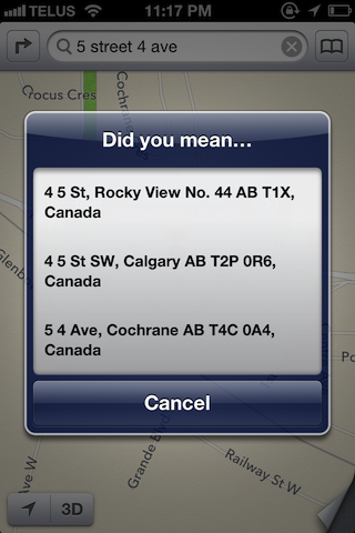
The biggest issue I’ve seen with the new Maps is search. Arbitrary location searches from Maps are startlingly inaccurate. A search for “market” will choose a place in Canmore, Alberta—around a hundred kilometres away—as its best guess. Kensington Wine Market, just down the street, is displayed as a pin, but is not the first choice. Addresses sometimes need to be entered in their entirety, including city and province or state. In general, its search abilities are (surprise) nowhere near as reliable as the Google-powered Maps.
3D Maps
The big, demo-friendly feature of Maps (and, indeed, iOS 6 as a whole) is the 3D flyover view. It only works for a few cities right now, and some of these render better than others. I was delighted to find that London, New York2, and downtown Calgary are now present. Spinning around the Bow is a lot of fun. Unfortunately, some major cities are not present, like Paris, Hong Kong, or Shanghai.
It’s technologically fascinating and very engaging, but critically, it isn’t as useful as Google’s Street View. If you don’t know what Chicago’s Willis Tower looks like, Apple’s 3D maps will provide a better view of it. But if you want to know what your friend’s new neighbourhood looks like before you drive to their housewarming party, Google has flyover beat, hands-down.
Apple’s servers also can’t seem to cope with the amount of traffic that 3D maps require. The rendering and download speed were fairly quick during the early days of the beta, but as more people download the gold master build, it’s taken a noticeable hit. This is going to be an issue for at the next week when everyone is trying out all of this stuff. It remains to be seen how Apple will handle all the additional traffic.
Speaking of the new Maps app, there was a fair amount of speculation and concern as to how linking to an Apple map would work. A new Maps link is a standard HTTP link—http://maps.apple.com/maps?daddr=San+Francisco,+CA&saddr=cupertino—which will open in the native Maps app on iOS 6 by default, or redirect to Google Maps if the system is not running iOS 6, such as a desktop or another phone. Older iOS devices will redirect to the native Google Maps app. As of right now, there isn’t a way to embed Apple-created maps in a website.
Aside: The simple act of reading a word many times begins to make that word sound like gibberish. “Maps” isn’t as succeptable to this as, say, “spoon”, or “painting”. Happily, there are other features of iOS 6 to talk about.
Safari & Reminders
Apple seems to have improved just about every default application in some way or another. For a start, Safari has fixed so many of my longstanding complaints that I uttered an audible “yes, finally!” upon using it for just five minutes.
It’s the simple tweaks, such as opening a new blank page in Safari for iPhone. It will now open after the current tab, not at the end of the stack. That is, if you are using tab two of five, the new page will open in tab three of six, not six of six. This doesn’t apply to the iPad, however.
Happily, opening a new tab in Safari on iPad no longer selects the damn search field by default, and therefore doesn’t display a list of arguably irrelevant previous searches which I must dismiss before I am able to select a bookmark from the bookmarks bar, or manually type a URL. Can you tell how much this irritated me in previous versions of iOS?
Reminders gains two big improvements. In iOS 5, location-based reminders were limited to addresses in your contacts, or your current location. In iOS 6, reminders can now be triggered at an arbitrary location. I’ve noticed that the arbitrary location doesn’t always make the best guess if you try a non-address query. For example, I live near Kensington, in Calgary. Setting a reminder to trigger at “Kensington Starbucks” will drop the pin anywhere between that Starbucks location, and one in North Carolina (see complaints about Maps’ search above). Also, reminders are now able to repeat, like any calendar event.
Passbook
Speaking of default apps, Apple has added another one, just to spite the people who bury Newsstand, Compass, and Voice Memos on the very last page of their home screen. Passbook is an app “for the stuff in your pocket”, as the original marketing material read. It’s one app for gift cards, coupons, tickets, and passes, and it’s pretty rad. Passes get added to a stack, and can be scanned with any optical barcode reader. These scanners are at least as commonplace as near field communication transcievers, but they have a marked improvement over NFC: they rely on common barcode standards. By contrast, there are several competing standards for NFC, and it’s therefore an unfinished piece of hardware right now.
Passes are incredibly simple to create, requiring only an icon, a logo, and a pass.json file. There are also a few things that a developer needs to install on a server, but the process is very easy, and very inexpensive. As a result, mom-and-pop stores are able to hire a developer and designer and get a pass set up quickly, all for a significantly lower budget than a complete app.
Apple presents Passbook by noting that there are a bunch of store-specific apps, and it would be helpful to place them in the same app, since they all perform similar functions. They also offer a few advanced features to developers willing to explore beyond the necessities described above. If you enable location services on a pass, it can push a notification to your lock screen when you are in one of the store’s locations, which makes finding the pass much easier than fumbling through several home screens of apps.
Also, since the pass is powered by a simple json file, pushing updates to a pass is extremely simple, for changes in flight times, or updates to a gift card’s balance.
Adding passes is as easy as opening a link in Safari and tapping button in a confirmation dialog. But if you download and install the OS X 10.8.2 update, it’s even better. You can open the same link, launch the pass on your computer, and sync it over iCloud to your phone with one button. Clever. And, while I haven’t tested this, it seems that iCloud syncing would enable multiple users on the same Apple ID to share a pass.
You’ll note that the bulk of this section is speculative. That’s because, apart from the sample passes given to developers, there are no apps enabled for Passbook yet. This is something that may change come release day but, as a Canadian, these things usually take much longer. I’d therefore like to review Passbook on its own when I’ve had the opportunity to use it for a month or more, to see what the retailer rollout will be like.
Siri
Siri gains a bunch of very nice improvements in iOS 6. First up is full support in Canada, and a bunch of other countries, including location-specific information. Apple has integrated Yelp and OpenTable into Siri, so you can make dinner reservations while driving home after forgetting (shit, shit, shit) that it’s your anniversary. You’re welcome.
If you want, you can check out what movies are playing, too. Probably. Siri stumbles hard on the biggest local theatre, Chinook Centre, and all sample queries I make as I write this are met with the response “I didn’t quite find what you were looking for, but here’s ‘The Inbetweeners’.”
There’s some basic sports integration for football, football (get it?), the NBA, MLB, and the NHL. It looks pretty good for fans of those sports, with player cards, team rosters, and the latest scores. But, as neither billiards nor Formula 1 are enabled yet, it’s not a feature I’ll use often.
On the plus side, you can now update your Twitter and Facebook as you’re walking along the street. Twitter integration is particularly smart: if you have Twitter handles linked to your contacts, it will automatically convert full spoken names into mentions.
Siri is also now on the iPad (third-generation only) and iPod touch (yet-to-ship fifth generation only). See above for what it includes. Any questions?
Redesigned Stores
iOS 6 includes redesigned iTunes, App, and iBooks Stores. These stores look a hell of a lot better than their iOS 5 cousins, with slick, matte black interfaces, and bright, horizontally scrolling selections of content. The iTunes Store is especailly nice, since previews can now play in the background while browsing the rest of the store. It also keeps a history of songs previewed.
Unfortunately, the revised interface for search results in the iPhone App Store is a large step back. While the large previews are nice, the swipable “card” UI makes for a lot of horizontal scrolling to find the app you’re looking for, especially if your search terms are vague (“Twitter client”, or similar). As David Barnard demonstrates, the entire search UI is buggy and convoluted.
The redesigned stores also feel slower, though I’m not sure they actually are. Loading the home page of a given store takes takes nearly 30 seconds over WiFi on my iPad, but I didn’t time it pre-upgrade, so I’m not sure if that’s actually slower. Some of the transforms, like the album flips, are noticeably jittery, momentarily betraying its humble UIWebView foundation.
On the plus side, the redesigned stores are much (much) easier to browse, preview music, and make purchases. The App Store no longer prompts for a password when downloading updates, which is nice (though it would be extra awesome if there were a way to allow apps to automatically update).
Et Cetera
Other subtle tweaks round out iOS 6 nicely. Phone calls can now be responded to by text message while on the lock screen without answering the call, and a reminder can be added to return the call later.
There’s a slightly-refreshed interface in Camera, with a black toolbar and metallic controls. Also, for iPhone 4S users, the panorama camera is enabled, and it’s totally awesome. I’ve only used a few panorama apps, but this seems more elegant and more reliable than any of them. Panoramas can only be shot when the iPhone is held in portrait, but that gives you a much higher quality photo. There’s a helpful level on screen, and a bubble will appear to remind you to slow down when you spin a little too quickly. It’s very, very fun.
I shot a few sample panoramas to see how good the stitching is, and it’s very impressive. You can see them in my iOS 6 set on Flickr.
As mentioned above, Facebook is integrated in a similar manner to Twitter was in iOS 5, except tagging is not supported. If you choose to share a photo to Facebook, you can select the album in which to place the photo, right on the sharing sheet (the default album is one called “iOS Photos”).
Apple has decided to allow the merging of your Apple ID, your iPhone number, and any other email addresses you’ve set up with FaceTime or iMessage. That means that you can now receive iMessages sent to your phone within Messages on Mountain Lion. This is very handy. Apparently, the protocol for accessing text messages over Bluetooth is also supported in iOS 6, but I haven’t discovered a way of activating this.
FaceTime is now supported over 3G (unless you’re on AT&T). I ran a short test, and worked out that FaceTime over 3G uses roughly 3.2 MB/minute, about the same as the Skype app. By contrast, a one-minute film made using the front-facing camera is about 26 MB. Your mileage may vary.
The original iPad wallpaper (“Pyramid Lake (at Night)“) is no longer included as a wallpaper choice, nor is the original rippled water wallpaper for the Retina iPad. If anyone has a copy of the Pyramid Lake photo for a Retina iPad, please get in touch.
The Sharing menu has been redesigned. Not only does it use tiles of the same size as app icons, the menu paginates. Speculate at your leisure.
Spotlight now shows which folder apps are in, in an identical manner to that proposed by Neven Mrgan. He should have patented that3.
Lastly, the shutdown spinner is optimized for Retina displays. Finally.
There’s probably a lot that I’m forgetting here, as it truly is a subtle update. iOS 6 further reinforces Apple’s steady momentum—per Gruber, their roll. If you compare any two sequential major releases of iOS, you’re not going to see complete overhauls of the operating system. Implementing multitasking in the way that Apple chose to was no doubt an engineering achievement, but it’s virtually invisible to the user by design.
But compare versions two or three years apart and it’s obvious that there is dramatic improvement, driven by a laser focus on the same strategy. iOS 6 isn’t noticeably different than iOS 5, but it includes a few very polished new features, along with the requisite bug fixes, tweaks, and improvements. It’s part of the steady drumbeat of Apple’s progress.
The Future of iOS
Regardless of your personal preference, Apple has carved a comfortable slice of the market share for people attracted to a predictable, largely-consistent, and polished mobile operating system. It’s a great OS, and it became better in a lot of little ways with iOS 6. Where can Apple go from here?
Features
As I mentioned, there aren’t many obvious shortcomings left with the OS, especially not in ways consistent with Apple’s goals for it. The availability of third-party apps outside of the App Store is perhaps the biggest complaint amongst the power user crowd. I think an iOS implementation of Gatekeeper would allow for this, but I don’t think that it fits with what iOS means to Apple. OS X only gained an App Store after it was released for iOS (then iPhone OS), and it’s a computer with a true file system. iOS is more abstract, losing (more or less) the legacy of a PC operating system. It’s simpler.
One of the most common comparisons I hear between iOS and Android is that the latter has a plethora of widgets to add to the home screen—everything from email inboxes to small games, and, yes, the venerable weather widget. Esteemed designer Max Rudberg produced a short concept video illustrating a Dashboard-esque overlay of widgets. I think this is a better concept for widgets on iOS than on the home screen, but I don’t think it hits the mark quite right.
Both of the above examples are things which exist on other platforms (read: Android) and are often cited as reasons to recommend that platform over iOS. But Apple doesn’t do things just because others are doing the same. Indeed, both of these examples smell of “me too” pleading.
Something that is straight up Apple’s street, however, is Craig Hockenberry’s “HomeBase” concept. In a nut, it’s a simple way to assign a certain geographic area as your home, and change the phone’s behaviour at that location (turn off passcode, turn off Bluetooth, and similar). Motorola has already added Smart Actions to some of their phones, with a similar concept. It makes sense for Apple, too. They’re the company that brought you Automator.
One of the other ideas I’ve seen floating around is a way to set third-party app alternatives as defaults. Some people want Google Chrome and Sparrow instead of Safari and Mail, and I think that’s a fair idea. I don’t see why Apple wouldn’t do this—they don’t strike me as quite that protective of iOS.
Another common request is for Apple to open Siri up to third-party developers. As I noted in my iOS 6 review above, the new Maps app has created a gap in the market for even more public transit applications. One that struck my eye is the simply-named Transit, which uses your location to find your nearest bus stop or train station, and lists the next arrivals for that stop. It’s a genius concept, though as of the time of writing, it isn’t yet available in Calgary, so I haven’t tested it. An extension I can imagine is that a user will be able to ask Siri “When does my next bus arrive?”, and it will query Transit for the answer. This would, of course, require the ability to set defaults (as above), but it would be incredibly useful for a wide variety of apps.
The Ecosystem
One of the areas Apple has invested heavily in over the past decade is in building their ecosystem. What began with an online music store now offers access to all forms of entertainment, books, newspapers, magazines, video chat, text messages, and a way to keep all of this in sync.
The advantages of this universal support are obvious. With one login controlling the whole bucket, it’s ridiculously easy to buy content. For some people, iMessage has completely replaced text messaging. A friend of mine bought an iPod touch instead of an iPhone, using iMessage, FaceTime, and Skype as replacements for their respective phone functionalities. It makes a lot of sense, and it saves him at least $60 per month.
Since the 10.8.2 and iOS 6 updates also allow a user to tie their phone number to their Apple ID, it’s now possible to answer FaceTime calls, and send and receive iMessages from a Mac, or an iPad. It’s a very impressive, elegant feature.
But this approach relies entirely on Apple’s ability to maintain or increase their market share. In the United States today, chances are pretty good that a text message sent to a random phone number will not be received on an iPhone. This is obviously dependent on who you send text messages to—I sent more text messages than iMessages, for example, because most of my friends do not use an iOS device. Similarly, I tend to have more Skype video calls than FaceTime ones.
You will recall that Apple promised at the iPhone 4 keynote to make FaceTime an open standard. Over two years later, no apparent progress has been made on this promise. Trevor Gilbert at PandoDaily argued for a similar promise for iMessages, though, ideally, one which Apple would keep. I would agree.
I must make pains to note that I am not suggesting that there’s some form of “lock-in”. Take RIM’s BlackBerry Messaging service as another example of a proprietary communication system, which didn’t present itself as a barrier to users wishing to jump ship after RIM let their phones stagnate. Nor is Apple doomed to fail if they don’t make these protocols open.
However, I do belive that it would be in the best interests of their users if they did create a more open standard. RIM isn’t—and wasn’t—in a position to provide a free messaging service to non-BlackBerry users, but Apple is. I think it would offer an enormous advantage on Android, oddly enough, in the same way that iTunes offers Apple a foot in the door on Windows.
Whatever Apple chooses to do in terms of their ecosystem, their mobile future is extremely bright. They might not have the majority market share, but they do make the most money in the mobile space by far. They have the best-designed hardware, the most extensive ecosystem (available in far more countries than Google’s or Amazon’s), and the smoothest OS. It may not tick all the boxes in a specification chart, but it is the most refined and polished without having to fall back on “palm touch mute pause“.
Here’s to the future.
iOS 6 will be released this Wednesday, September 19. OS X 10.8.2 will likely be released the same day, as it includes several related compatibility updates.