Search Results for: "color"

Have you thought about your user stylesheet lately? I cannot blame you if you have not, especially if you have no idea what I mean when I write “user stylesheet”. Here is Jennifer Kyrnin’s great explanation of what that is:

In the past, the internet was filled with bad web design, unreadable fonts, colors that clashed, and nothing adapted to fit the screen size. At that time, web browsers allowed users to write CSS style sheets that the browser used to override the styling choices made by page designers. This user style sheet set the font at a consistent size and set pages to display a specified color background. It was all about consistency and usability.

As Kyrnin writes, web designers usually do a better job these days, and most browsers no longer support user stylesheets by default. Google removed them from Chrome nine years ago and they were made optional in Firefox in 2019. But Safari, my browser of choice, still makes user stylesheets easily visible and, if you have the inclination, I recommend its use for a low-effort way of blocking irritations and overriding bad design choices.

For example, while I frequently use and appreciate the services of the Internet Archive, and the reporting of the Intercept and ProPublica, I find their modal nags to be more intrusive than necessary. So I have this section in my user stylesheet to override those elements:

#donato,
html>body #donato,
#donate_banner,
html>body #donate_banner,
/* same for the intercept */
#third-party--viewport-takeover,
html>body #third-party--viewport-takeover{
    display: none !important;
    height: 0 !important;
    position: absolute !important;
    left: -99999em !important;
}

.InterceptWrapper .Post-body--truncated{
    max-height: none !important;
    overflow: visible !important;
}

.InterceptWrapper .Post-body--truncated:before{
    content: unset !important;
}

/* propublica nag */

body.app iframe.syndicated-modal{
    display: none !important;
}

I pulled these specific selectors by finding the bothersome elements on these websites using Safari’s Web Inspector.

For those of you with some CSS knowledge, the above rules might look like overkill. The logic of including both display: none and left: -99999em seems to make no sense. The only explanation I have is that some of these rules are more applicable to the Internet Archive donation nag while others apply to the Intercept’s email box.

Also, this stylesheet has the cruft of fifteen years of new rules and changing websites, so that may also be a factor.

Here is another example of the power of user stylesheets: you know those awful “sign in with Google” prompts that became more aggressive this year? You can turn them off if you remain signed into your Google account, but you can also style them out of view:

#credential_picker_container,
iframe[title="Sign in with Google Dialog"]{
    display: none;
    position: relative;
}

This is the kind of lightweight solution that I love. It is unnerving to know Google has so much power over the web that it offers users the trade-off of staying logged into their account or be nagged on major websites that offer Google’s login option. It is rewarding to defeat it with five lines of CSS.

But user stylesheets have drawbacks and are evidently from an earlier era of the web. The ways you might employ user styles today are often similar to browser extensions like StopTheMadness or any number of ad blockers. Modern extensions are far more powerful, too, as rules can be tailored to individual websites or run globally. The biggest advantage to the user stylesheet is also its Achilles’ heel: it only works globally, meaning the same rules are applied to all websites. That means your CSS selectors need to be highly specific. If another website has the app class on the <body> element which contains an <iframe> with the syndicated-modal class, it will also get hidden in the same way as it does for me on ProPublica. Finally, many modern websites are built with ugly generated markup which can change any time the code base is updated.

Still, I rely on this user stylesheet to keep my sanity when browsing the web today. Unlike browser extensions, there are no security or privacy questions to worry about, and it is entirely controlled by the user. I saved my stylesheet in my iCloud Drive so it syncs between my Macs; Safari for iOS does not support user styles. It is a feature that will probably be deprecated across all browsers sooner than I would like, but I will be using it until that day arrives. If you have even a passing knowledge of CSS, I encourage you to experiment with its possibilities.
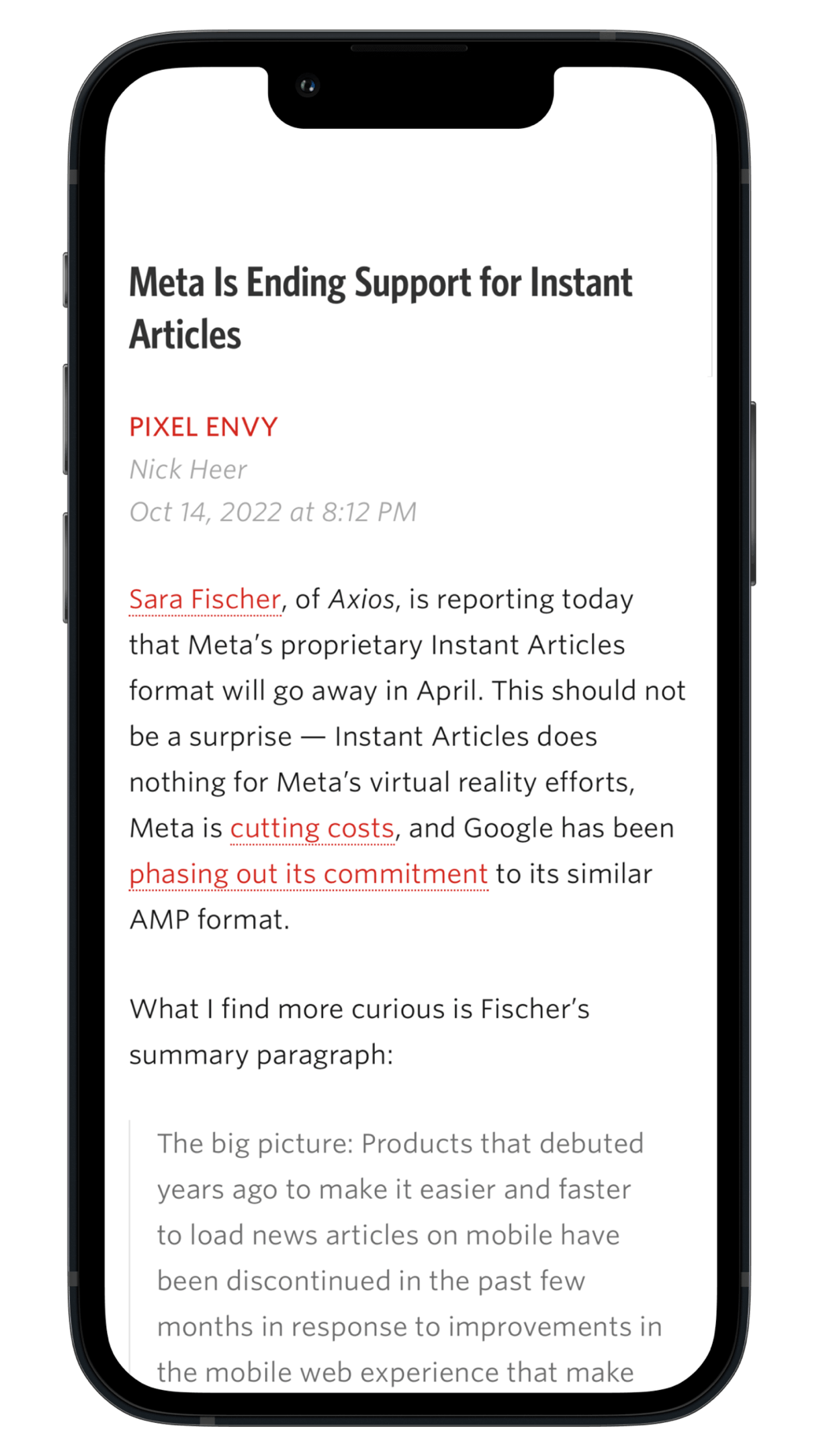
Jason Snell:

[…] But if Mastodon gets enough community gravity to make me want to pay more attention, I’ll need an app. There are a lot of Mastodon client apps out there, and I’ve tried several of them, but none of them are really good enough or polished enough for me to use regularly. The truth is that modern Twitter clients have set the bar pretty high.

I am already finding this the biggest limitation to my adoption of Mastodon on the Mac. There are a few great iOS clients — I have been using Mammoth and I like it a lot — but I have not found a delightful native client for MacOS. I have found enough people to follow that my timeline is buzzing. What I am missing is Mac window chrome around it and an icon in my Dock.

Jake Offenhartz, Gothamist:

At least 500 drones will depart the shores of New Jersey on Thursday evening, flickering over the horizon in a choreographed dance meant to evoke the experience of swiping colorful treats on a phone screen.

Promising a “surreal takeover of New York City’s skyline,” the fleet will pulse with LED lights as it serves miles of Lower Manhattan with an aerial advertisement for the mobile video game, Candy Crush.

This is not the first time something like this has been done with drones and, as Offenhartz documents, it is not even the first time over New York. Surely little is in the greater public interest than looking up at the night sky and being reminded of Candy Crush.

Tim Cook, via Jason Snell’s transcript of comments made during today’s quarterly earnings call:

[…] Importantly, our investment in the category has attracted both upgraders and customers new to Mac, and helped our install base reach an all time high. In fact, we set a quarterly record for upgraders, where nearly half of customers buying Mac during the quarter were new to the device.

[…]

The other thing that I should mention is that about two-thirds of the Apple Watches that we sold were to customers that had not previously owned an Apple Watch. And so we’re still very much selling to new customers here, which is very, very good for future.

No matter how big Apple gets, it is still a little surprising to me every time the company announces that half its Mac buyers are new. It has said that for years, and it is still true today after racking up its best ever Mac sales quarter. Undoubtably, that is why it just had a record quarter, but it demonstrates how far the Mac user base has grown and can continue to do so.

When iPadOS gets released, I read Federico Viticci’s review. When a new version of MacOS is shipped, I rely on Andrew Cunningham of Ars Technica and Jason Snell of Six Colors to tell me the good, the bad, and the buggy.

Choice excerpts from Cunningham’s review:

Suffice it to say that my expectations for the Mac version of Stage Manager — available as an off-by-default optional feature in Control Center or the Desktop & Dock settings — were not high when I finally decided to bite the bullet in a near-final Ventura beta. So imagine my surprise when Stage Manager on a Mac worked — and worked pretty well. And I actually kind of liked it.

[…]

Comparing the night-and-day smoothness and stability of these two features with the same name, it becomes clear that Apple simply bit off more than it could chew with Stage Manager on iPadOS. On the Mac, it’s a new interface on top of a bunch of technologies that already existed. On iPadOS, Apple needed to implement not just the basic Stage Manager interface but a new way for users to interact with “windows” on a “desktop”; a new way for open iPad apps to communicate with each other; and a way for apps to spawn multiple instances, virtual memory swapping, and actual multi-monitor support on a device that has no idea how to handle the idea of “multiple screens” because it has never had them before.

[…]

That [System Preferences] changes in Ventura, which kicks System Preferences to the curb in favor of System Settings, an app with almost all the same functionality that has been rejiggered to more closely resemble the Settings app on an iPhone or iPad. And it’s not just the app — throughout Ventura, the “Preferences” menu item in most first-party Mac apps has been changed to “Settings.”

[…]

When sharing items from the iCloud Drive folder in the Finder, the Share sheet will let you choose whether to send a copy of a selected file or folder to someone or to share it via iCloud so that multiple people can access and edit the file. Weirdly, selecting a folder anywhere else in the Finder also gives you a “Collaborate” option, but when you try to select it, the system tells you to move the folder to iCloud Drive first. I don’t know whether this is a bug or an ad for iCloud Drive that is working as intended.

I will miss “Preferences”; the word “Settings” feels comparatively mechanical. (Update: Apparently, you can revert this change if you are so inclined.)

This year’s Mac hardware compatibility chart is giving me mild anxiety. My Intel iMac is now one of the oldest models officially supported by MacOS Ventura, and I have known it will become unsupported sooner rather than later ever since Apple launched announced the transition to ARM. I bought it less than four years ago and it is still a fast computer. It is hard to believe it will soon be placed on Apple’s vintage Macs list.

And from Snell’s:

Just these choices make System Settings a usability disaster. It’s good that there’s a search box at the top of the settings list, because the best way to use the app is forget that it has any organizational structure and search for what you want. It would actually be less confusing if Apple removed all pretense of a structure and just had the app feature a single pane with a search box and nothing else.

Some of this confusion could have been resolved with a clear re-think about which settings go where. Someone at Apple could have sat down and outlined a sensible hierarchy for settings, but that clearly didn’t happen. Settings are scattered all over the place, in locations that make very little sense, frequently because they got attached there 10 or 15 years ago in System Preferences.

It sounds like many of the individual bugs spotted in beta seeds have been addressed, but the core concept remains fundamentally flawed. I am obviously willing to learn new things and see what I like about the Ventura way, but both these reviews worry me when it comes to an app I use infrequently but urgently.

Great new default Desktop Picture, though. Wait, excuse me — Wallpaper. You know, for the wall that is on your Desktop.

Unread screenshot

Thank you to Golden Hill Software and Unread for this week’s sponsorship.

Unread is an RSS reader for iPhone and iPad with beautiful typography, comfortable gesture-based navigation, and a variety of color themes.

While great websites like Pixel Envy provide RSS feeds with full article content, some websites have feeds that contain only article summaries. When displaying articles from summary-only feeds, Unread retrieves full article content from the website. You get the full article in Unread’s native article view without needing to open the website.

Pixel Envy readers will appreciate Unread’s handling of link articles. A link article is an article that links to and comments on an article from another website. Unread displays both the link article and the full text of the other article in its native article view. No need to open a web browser.

Unread provides a share sheet extension making it easy to subscribe to feeds offered by the website you are visiting from Safari, Chrome, Firefox, or just about any other web browser.

Unread has great syncing. Create a free Unread Cloud account to keep multiple devices in sync. Unread also syncs with services such as Feedbin, Feedly, Inoreader, and NewsBlur.

Additional capabilities include great hardware keyboard navigation on iPad, search functionality, widgets, and VoiceOver support. Most functionality is free. Premium features are available with a subscription. Learn more at Unread’s website or download Unread from the App Store.

In addition to the aforementioned Apple TV, Apple today announced new versions of the iPad and iPad Pro. Alex Guyot of MacStories rightly describes the resulting product selection as “strange”:

As you’ve probably noticed from the many caveats throughout this article, this iPad lineup has some issues. I’m not sure how this happened, but somehow these product lines just seem all mixed up. The lowest-end iPad (not counting the previous 9th generation iPad, which is currently still for sale) has features that the iPad Pro does not. It also has the same design as all of the other iPads, yet lacks the Apple Pencil 2 support which can be found in the rest of them. The brand-new iPad Pro models do not work with the most feature-rich iPad keyboard that Apple sells. That keyboard costs a full half of the base price of the only iPad that supports it.

Apple probably has the best parts bin of any computer company. Its range of A-series SoCs are powerful and efficient, it has years of great camera modules to pull from, and its bucket of display and materials technologies is second to none. Just about any combination will produce a product its competitors could envy.

So it is bizarre when it appears the teams digging through this bin are not on speaking terms. The flat-sided iPad hardware design feels like it was made to go hand-in-glove with the second-generation Apple Pencil. But the tenth-generation iPad does not support that four year old accessory. The iPad Air is within millimetres of the same size as the tenth-generation iPad, but does not support the new Magic Keyboard Folio accessory because the keyboard relies on a smart connector along the edge instead of on the back.

The iPad product lineup even looks and feels confusing. If you look at pictures of them side-by-side, only the 9th generation sticks out as it retains a home button on the front. The others are all flat-sided slabs of metal and glass and lack consistency in colour choices. And here is a list of current iPads, as of today, as Apple describes them:

  • iPad (9th generation)

  • iPad (10th generation)

  • iPad Mini (6th generation)

  • iPad Air (5th generation)

  • iPad Pro 11-in. (4th generation)

  • iPad Pro 12.9-in. (6th generation)

Are we sure these are the latest generation? The descriptions make the two iPad Pro sizes look like they are not comparable. The iPad Air looks like it could be newer than the 11-inch model, but older than the Mini or either suffix-less model. Or perhaps not. Who can say?

The best differentiator is cost. The list above is arranged from least to most expensive. The two lower-cost models support only the first-generation Apple Pencil, have lower-quality displays that only support an sRGB colour gamut, and have older and slower A-series chips. You have to run all the way up to the biggest iPad Pro if you want the best display. If budget is your sole guidance, you will likely understand this product line better than any names, pictures, descriptions, or blizzard of technical specifications can communicate.

I do not understand this lineup. However, I do understand the appeal of both new iPad models announced today. The new iPad Pros permit users to hover a second-generation Apple Pencil about a centimetre away from the display for pre-touch functionality. It is not the first device to support something like this, but I am looking forward to hearing how it works in practice. The tenth-generation iPad, meanwhile, comes in some of the best colours of any iPad ever, and it does look like great value for many iPad users. It helps bridge the chasm between the lowest-end model and the iPad Air, but I wonder if it also adds confusion by being so similar to both.

I am looking forward to reading the reviews of these that will presumably be published early next week.

Unread screenshot

Unread is an RSS reader for iPhone and iPad with beautiful typography, comfortable gesture-based navigation, and a variety of color themes.

While great websites like Pixel Envy provide RSS feeds with full article content, some websites have feeds that contain only article summaries. When displaying articles from summary-only feeds, Unread retrieves full article content from the website. You get the full article in Unread’s native article view without needing to open the website.

Pixel Envy readers will appreciate Unread’s handling of link articles. A link article is an article that links to and comments on an article from another website. Unread displays both the link article and the full text of the other article in its native article view. No need to open a web browser.

Unread provides a share sheet extension making it easy to subscribe to feeds offered by the website you are visiting from Safari, Chrome, Firefox, or just about any other web browser.

Unread has great syncing. Create a free Unread Cloud account to keep multiple devices in sync. Unread also syncs with services such as Feedbin, Feedly, Inoreader, and NewsBlur.

Additional capabilities include great hardware keyboard navigation on iPad, search functionality, widgets, and VoiceOver support. Most functionality is free. Premium features are available with a subscription. Learn more at Unread’s website or download Unread from the App Store.

Adobe last month:

Standardized pre-loaded Color libraries, also known as Pantone Color books, will be phased out of Illustrator, InDesign, and Photoshop in software updates released after August 16, 2022.

After November 2022, the only Pantone Color books that will remain are:

  • Pantone + CYMK Coated

  • Pantone + CYMK Uncoated

  • Pantone + Metallic Coated

This change was supposed to happen in March, but I only saw the notice when I opened Illustrator today. Existing files will apparently be unaffected unless spot channels are used. Designers who rely on Pantone will be required to purchase a separate license at $60 per year. No word on whether Adobe will drop its subscriptions by an equivalent amount to compensate.

A classy move, completely in character for both companies, to reach into users’ machines and remove stuff they had paid for and may rely on because of some licensing spat.

You may remember when Google announced in June that it was adding Google Meet features to Google Duo, then renaming the app Google Meet, while preserving its original Google Meet app for some time. It turns out that strategy was not as easy to understand as you might think.

Abner Li, 9to5Google:

At the start of August, an update (172) started rolling out that replaced the blue Duo icon and introduced the four-colored Meet version. After updating and opening the app, Duo disappears from the launcher.

Version 173 today brings back the Google Duo icon for some reason. As such, you have both the Duo and Meet logos in your app drawer, with both working to launch the new unified Meet-Duo experience.

This is as clear as Google’s messaging strategy has ever been. The thing I have learned from this is that Google thinks launching Meet when users type “Duo” in the search field is some kind of insurmountable technical obstacles.

The 2021 14-inch MacBook Pro into which I am typing these words is arguably the best computer Apple has ever made. It is not as powerful as the Mac Studio or Mac Pro, not as elegant as the MacBook Air, and not the best value in Apple’s line — which, again, is probably the MacBook Air. But it manages to get nearly everything great about those other Macs in a package that is smaller in profile than the computer it replaces in my world.

That is no small feat, by the way. The 2012 MacBook Air I have been using daily for the past ten years is certainly nowhere near as capable as this MacBook Pro by any stretch. But it was my main Mac for seven of those years, accompanying me from my last years in college on journeys across a few continents. It deserves its high ranking on Six Colors’ 20 Macs for 2020 list.

And it is a good thing, too, I bought such a capable laptop in 2012, because I mostly got to avoid the Mac’s flop years. The Touch Bar? I see why people like it, but Apple’s enthusiasm for it quickly waned and it was not for me. The butterfly keyboard? I would love to learn the inside story of what happened there, which will slowly trickle out as the lawsuit unfolds and knowledgeable people are able to speak out.1

But the Mac is back — or, it has been for quite some time, but I had not experienced it until now. And there have been some notable positive changes in the time since I last bought one of Apple’s laptops. The construction of this Mac is flawless. I thought my MacBook Air had a confidence-inspiring quality to its construction, but this MacBook Pro is in a league of its own. It strikes a balance between feeling durable and delicate. Everything that is supposed to feel solid does not move, not even a little; every part that is interactive, like the keyboard and display hinge, feels like it accomplishes its task without any ill effects.

This display is magnificent. I thought I knew Retina displays — I have a 5K iMac on my desk — but this feels like a fuller expression of that idea. One little thing Apple keeps getting better about is matching the display’s brightness and colour temperature to the environment. My iMac is pretty good about the former — it cannot do True Tone trickery — but this display feels increasingly closer to something that reads more like coated paper than it does a computer screen.

Alas, there is a notch. This is my first Mac with one and I can see why some deride it. I do not like it, but nor do I hate it. It is an obvious compromise for getting a webcam into a portable Mac with the smallest possible footprint. If I could spec this MacBook Pro without a webcam — or if it had Face ID — I would find it more acceptable. My dislike of it is almost entirely cosmetic, but that is also true for the solution to removing it: equalize the displays around the bezel. That would necessitate either a larger device footprint or a smaller display, both of which I regard as less desirable compromises for a portable Mac. It is not the best look, but it is the best compromise for me.

Like Michael Tsai, I have not been completely bowled over by the performance of this Mac, nor have I been amazed by its battery life — but I mean that in the best possible sense. This Mac is like the Swiss train network, of which I am once again envious after watching Jason Slaughter’s latest video: it is so efficient and delightful that it is best expressed because of what it does not do. There are no delays, no hangups, no surprise battery consumption warnings, no stutters, and no ill behaviours. Everything just goes. Even the performance issues I see with Safari’s UI on my top-of-the-line iMac are gone.2 I have by no means been trying to find its limits, but it feels limitless in every application I have thrown at it. That is amazing in its own way.

And I have not once heard it. There are apparently two fans spinning away below this keyboard, but I cannot hear them when I put my ear to the case. When I was transferring files last week, my MacBook Air was doing its best to make a deafening racket, like it was screaming for me that it still had plenty of life left in it. This MacBook Pro? Just quietly sipping electricity and flipping bits on its drive in perfect silence. Any noises made by this MacBook Pro are drowned out by the sound of background radiation. It is that quiet. It is an exquisite experience.

The hardware is amazing — but you already knew that because the first reviews for this computer were published about eight months ago. The software? Well, that is almost exactly the same. Rosetta works fine, though I have waited long enough to upgrade to an ARM Mac that only a handful of apps I use are unavailable in ARM native guise. There also seems to be a single system process — CarbonComponentScannerXPC — that remains an always-running Intel app. Strange.

There are a handful of features in MacOS specific to either this laptop or ARM Macs generally. The menu bar is taller to accommodate the notch. I prefer this style primarily because the rounded rectangle selection highlight has some space between the top and bottom of the menu bar. On a notchless Mac, the rectangle’s edges touch the top and bottom of the menu bar and, thanks to the rounded corners, it looks uncomfortable and cramped. I like how the corners of the selection highlight round more aggressively for the Apple menu and the clock, matching the radius of the display.

Other things specific to ARM Macs include AirPlay receiver support (Update: Nope, just not on my iMac.), a globe in Maps, and support for iPhone and iPad apps on MacOS. The latter reminds me of running iOS apps in the Simulator. These are not blockbuster features yet — at least, not for the way I use my Mac.

Otherwise, it feels familiar. All the stuff I use is here; all the bugs that interrupt my workflow are basically the same.

But all of this is running on hardware that feels familiar but different. A MagSafe connection is back — why Apple got rid of that in the first place I will never know, but those flop years hit them hard. I do not need the HDMI port, but I am thrilled this Mac has an SD card slot, making it a perfect companion for anyone who travels with a digital camera besides their smartphone. TouchID is excellent, the keyboard and trackpad are pretty much perfect, and the speakers sound better than they have any right to in a package this small and thin.

This is a professional product worthy of the “MacBook Pro” moniker. I look forward to spending the next decade with it by my side.


  1. Not necessarily a hint, but not not a hint either. ↥︎

  2. Safari is slow to visually become active or inactive (FB9735993) and dialogs for save, open, and print all drop frames when they draw. Mind you, I should not need to be using one of the fastest Macs ever made to see a print dialog appear smoothly. ↥︎

Federico Viticci of MacStories has written up some first impressions of iOS 16 details. Here is his description of the Home Screen wallpaper settings:

That’s not all though. From the same Settings page, you can click your Home Screen preview and tweak the look of your Home Screen as well. New options for the Home Screen wallpaper include a selection of built-in colors, plus a color picker to choose a different gradient as well as invoke the system-wide color picker. Additionally, for wallpapers that include a texture that may conflict with icon labels on the Home Screen, you can tap a ‘Legibility: Blur’ button to blur the wallpaper and make it easier to read text labels.

I think this is really well done. If you prefer your Home Screen background to be a solid colour or gradients, Apple’s implementation is a nice way of saving you the trouble of keeping that sort of thing in your photo library.

Also:

[…] As I mentioned yesterday, Apple has already implemented Live Activities for Now Playing controls on the Lock Screen, but there’s another one too. Timers on the Lock Screen for iOS 16 are now a Live Activity as well, and they’re displayed as an interactive notification at the bottom of the Lock Screen with buttons to pause and cancel an ongoing timer.

This new timer update looks nice, aside from a hard bounding box around the blur.1 But truly nothing is funnier to me about WWDC every year than not seeing support for multiple timers on iOS. You can set more than one timer on WatchOS and a HomePod — I can set multiple timers on the completely basic oven in my apartment — but the wildly more powerful iPhone? Nope.


  1. FB10042776. ↥︎

Benjamin Mayo:

They are built to a passing grade, but nothing more. Basic features found in services from rival companies are either lacking altogether in Apple’s apps, or implemented half-heartedly and performance is sluggish. Browsing in Music and TV is painful, with an over-reliance on the infinite scroll. New content is just tacked on the bottom of already long lists. Meanwhile, the navigation bars are blank when they could include simple shortcut buttons and filters to help users navigate and explore. Moreover, these apps feature too many loading states and too much waiting around. They are akin to janky web apps, rather than richly-compelling responsive experiences.

There is more commentary over at Michael Tsai’s site.

This is something I think about a lot, especially as Apple grows Services revenue and competes in more of these markets. Apple’s native apps on these devices simply are not good enough, and that is bananas. The company’s whole thing is that it makes the entire widget, so hardware, software, and services can work seamlessly together. But they do not. They feel brittle, like I am using prototypes where any deviation from a golden path is a risky endeavour.

There are plenty of engineers working hard on all of these products, and there are evidently people who care. The Music app on MacOS is better than it used to be. Alas, it remains a far cry from how it ought to be, and only managers and executives have the power to set quality as a priority.

Every year for the past few, my main hope for WWDC is a renewed emphasis on stability and higher standards. The growth of this segment of Apple’s revenue is impressive, and its web capabilities are way better than they used to be — remember MobileMe? But there is still so far before Apple’s software and, particularly, services reflect the qualities of its thoughtful and elegant hardware.

Josh Kramer, writing at New Public:

What separates a forum like MetaFilter from Quora, Reddit, or even 8chan? The answer is culture — rules and expectations, developed over a long time. To be clear: MetaFilter isn’t good because it has a lot of old rules, it’s good because it has the right old rules. Below, I lay out some unique, interesting qualities that have developed at MetaFilter over the years and how they’ve contributed to a culture that is still thriving after two decades.

Not only does MetaFilter have many rules, its moderators earnestly enforce them; but they do not always get it right and are subject to their own biases. While I generally favour the idea of larger social networks moving their moderation policies closer to those offered by MeFi, the sorts of stories linked to by a commenter on Kramer’s article paint a picture of moderators who sometimes struggle to identify bigoted conversations when it is not immediately obvious.

Going through some of those older threads, another thing becomes clear: complaints about the sensitivity of moderators are as commonplace then as they are now. There are plenty of complaints from users who feel moderators are oversensitive; there are also plenty from people who feel they are not taking an active-enough role. Even the places on the web where conversations are pretty good have a hard time keeping them that way, as a wander through the etiquette and policy feedback area makes clear.

MetaFilter occupies an increasingly niche part of the web — last year, it was forced to cut back on moderation — and I wonder if its approach can be replicated or improved upon elsewhere. It sounds like Twitter’s Birdwatch is an attempt to do something similar.

Jason Snell, Six Colors:

Apple has released both developer and public beta versions of macOS 12.4 that include within them a beta version of the firmware for the Apple Studio Display. This is the first update to the Studio Display firmware since it shipped, and Apple says that it “has refinements to the Studio Display camera tuning, including improved noise reduction, contrast, and framing.”

[…]

In terms of image quality, beyond having access to extra pixels due to framing, it looks like the camera is being a bit less aggressive when it comes to softening the image and in trying to decrease contrast. In some of the lighting conditions I tested, the dynamic range of the image seemed to be a little wider—highlights weren’t as crushed down, though blacks were still a little more of a gray. Compare it to another Apple webcam like the iMac Pro and you can really see how much less contrast this camera provides.

James Thomson’s comparison between different versions of Studio Display firmware and a four year old iMac Pro is something to behold. One of those pictures is clearly better than the other two. Normally, this would not be such a blemish; except Apple is usually great at making cameras perform well and its marketing emphasizes the new camera system in this display. Something is going very wrong here.

A nice thing about writing this website by myself and as a hobby is how I do not feel like I need to cover today’s insanity.

Here is a nice post from Stephen Hackett covering Apple’s history of standalone displays. Maybe the most interesting one to me was 1998’s Studio Display:

This Studio Display would end up spanning the change from beige plastic to more colorful designs, and would ship in three distinct Revisions:

  • Rev. A: Used a DB-15 connector and came in a graphite finish. Included ADB ports, as well a RCA jack for extra connectivity.

  • Rev. B (January 1999): Used VGA and came in new styling to Match the Blue and White G3, as seen below. Came with a price cut to $1,099.

  • Rev. C (August 1999): Used DVI and included 2 USB ports and was styled to match the early Power Mac G4

It launched at $1,999, so the $900 price cut less than a year after its launch seems notable. Also notable is how I have never seen one of these displays in the wild. I was probably too young at the time of its release, but I do remember seeing its transparent tripod-like successor.

The 2004 era of Cinema Displays remains my favourite, if only because the 30-inch model made such an impression on me at a young age. A good working model still fetches hundreds of dollars on eBay — a testament to its quality and longevity. I still love those aluminum enclosures with the glossy white plastic side panels and soft edges on the top and bottom. They were professional products, but approachable, too.

Killian Bell, Cult of Mac:

The larger iMac probably isn’t gone for good. Apple is rumored to be working on a new model with a revamped design that will be powered by its latest and most powerful M1 chipsets, likely including the incredibly new M1 Ultra.

John Gruber:

I can’t speak to the rumors, but product-fit-wise, I think the 27-inch iMac doesn’t have a spot in the lineup anymore. I think the Mac Studio and Studio Display fill that spot. It even makes sense in hindsight that the consumer-level iMac went from 21 to 24 inches, if it’s going to be the one and only iMac.

Dan Moren, Six Colors:

But what if you’re someone who falls in the middle, what once was called the “prosumer” market? There’s actually a surprising dearth of options on the desktop side. The Mac mini and iMac offer only the 8-core CPU/8-core GPU M1 processor — even in the top of the line iMac, starting at $1699. To get anything more than that, you’d have to jump to a $1999 Mac Studio, and then add a display like Apple’s new $1599 Studio Display. That’s $2000 more than that top of the line iMac.

Moreover, because of the limitations of the M1 chip, the iMac and the Mac mini offer only a maximum of 16GB of RAM and two Thunderbolt ports—the same as an M1 MacBook Air.

I think Moren is more right than Gruber on this one. The Mac Studio occupies a position more akin to the old iMac Pro. In fact, if you build a cart today with the base M1 Ultra Mac Studio model, a Studio Display — standard configuration — a Magic Keyboard, and a Magic Mouse, it is within $200 of the inflation-adjusted price of a base iMac Pro from its launch in 2017. That seems right to me.

The Mac Studio may start with an M1 Max configuration at half the price of the M1 Ultra model, but it is $200 more than the base price of the Intel 27-inch iMac. The Mac Studio’s lowest possible configuration is way better than the Intel model used to offer — 32 GB of RAM compared to just 8 GB, twice the storage, and a better port selection — but you need to buy a 5K display, too. Good luck with that.

I think a mid-range iMac is still a welcome addition to the line. Apple has been extolling the virtues of an all-in-one for decades, and its computers have a greater lifespan — how many people do you know who still used an early 2000s Mac in the late 2000s? There still seems to be space to offer something to a midrange user who has outgrown the M1 iMac, but does not need the raw performance of the Mac Studio. It seems possible to me this could take the form of a different-sized iMac as much as it could a higher-specced version of the 24-inch model.

Dan Moren, Six Colors:

However, as the dust of the event cleared, the existing 27-inch iMac was nowhere to be found: it’s no longer displayed on the Mac section, nor is it obviously available for purchase on Apple’s website. Putting it in the Compare tool shows no price, nor Buy button.

The M1 iMac continues to be branded the “iMac 24″” which seems to leave the door open for a different-sized model. That suggests to me that a hypothetical 27-inch would be viewed more like a size variant and have more in common with the 24-inch model, treating today’s announcement of the Mac Studio as the heir to the iMac Pro role in the line — display, keyboard, and mouse sold separately.

Jason Snell, Six Colors:

It’s time for our annual look back on Apple’s performance during the past year, as seen through the eyes of writers, editors, developers, podcasters, and other people who spend an awful lot of time thinking about Apple.

This is the seventh year that I’ve presented this survey to a hand-selected group. They were prompted with 12 different Apple-related subjects, and asked to rate them on a scale from 1 to 5 and optionally provide text commentary per category. I received 53 replies, with the average results as shown below: […]

I love that Snell puts this survey together every year. It is such a good indicator of the way the winds are blowing for the world’s most valuable company. I am pleasantly surprised the Mac is recording its second year in a row as the highest scoring category, showing quite the turnaround from just a few years ago.

Federico Viticci posted a full copy of his survey comments and scores, and I am sure others will shortly as well. Mine was pretty close to the overall averages for the categories in which I graded — I did not score for HomeKit, Apple Watch, or wearables — so I do not want to post everything I wrote. But there were a couple of areas where my scores differed from the panel’s average that I wanted to highlight.

When I started putting this together, I remembered the new iPhones and Macs and iPads, and assumed I would assess a more pleasant year for Apple than I ultimately graded. I always write the paragraphs first and, in digging around for that information, my optimism started to unravel. I am not sure if I am being particularly harsh this year, but it feels from my more distant perspective like a bunch of things did not come together smoothly on Apple’s end. Product-wise, a brilliant year; but in software, developer relations, and social responsibility, a disappointing one.

Software Quality — 2

My experience with Apple’s software over the past year has been unpleasant. To be entirely fair, it has been that way for a while, and I think I was too generous with my grading last year. For years, there seems to have been a tick-tock cycle to Apple’s software cycle: some years are more feature-heavy, and some years are about quality and stability. This year felt like neither; more like engineers being pressured to deliver under extraordinary circumstances for the second year running.

There were big problems: MacOS Monterey bricked some Macs, a software update overheated some HomePod models to the point where they stopped working, Siri is still Siri, and Shortcuts shipped in an unusable state across all platforms. But there are little things that also do not work correctly that are as aggressively grating. On my Mac, every Quick Look preview flashes bright red. When I use CarPlay, audio sometimes does not initiate and I have to reconnect my phone. Nine of the bugs I filed in 2021 were about scroll position not being maintained in several high-profile applications. Searching Maps still returns locations thousands of kilometres away, even when there is a matching result around the corner. Apple’s Podcasts service became a mess. Mail does not return accurate search results for my inbox, let alone any other folder. Album artwork does not sync properly to my iPhone. If I resume playing music I have paused on my Mac, it will sometimes play with no audio, and I have to change tracks to force it to re-download. iOS’ autocorrect changes “can” to “can’t”, which is an open problem with “more than 10” reports. Media keys do unexpected things in MacOS. Dragging tracks to the bottom of the play queue in Music reverses their play order. There are a hundred more problems like these which I have reported in the last year. 
Apple is far from the only software vendor where it feels like products are rushed and bugs accumulate. But this is the Apple report card, not the one for Microsoft or Adobe. From nearly every vendor, including Apple, it feels like users’ continued patronage is taken for granted. To some degree that is probably true. Even so, I wish it still felt like there was a fight for my business.

I am sometimes running beta releases, but my main Mac is almost always on the latest public release. Right now, Music often crashes when switching between Apple Music, local library, and search views — on the very latest released version. A common response is that Apple needs time to fix bugs after release but, even if these operating systems mostly stabilize by about February, it is not fair that even typical users on the public release track have four or five months of frustrating bugs every year.

I am begging software vendors to please, please prioritize quality and stability.

Environmental and Social Issues – 2

2021 was rough for Apple’s social commitments. Even its calling card, privacy, was hampered. Yes, iCloud Private Relay was sort-of launched, and App Tracking Transparency debuted to the chagrin of ad tech companies. But a third-party experiment in the autumn found that many name-brand apps simply ignore users’ tracking preferences.

Apple’s biggest controversy in 2021 was its announcement of a new Child Sexual Abuse Materials detection system that was supposed to be baked into iOS but, Apple said, would only affect photos and video uploaded to iCloud. But the idea of locally checking files against an opaque database was torn apart. Apple said it has postponed that part of its CSAM mitigation plans as it reworks it, but the damage to its reputation has been done.

There are lingering geopolitical issues, too, like Apple’s dependency on manufacturing in China and antitrust-related cases around the world. Like, we learned in 2021 that a disputed archipelago in the East China Sea appears at a different scale for Apple Maps users in China. That’s still very weird!


I do not mean to accentuate the negative and ignore the positives — of which there were many — but these are two areas where I see Apple’s biggest liabilities. The third is developer relations, to which I also gave a score of 2. I am so impressed by the quality of hardware Apple has been shipping, and the company’s fast adoption of its own processors. But I remain frustrated by software that never seems to feel solid enough, developers taken for granted, and a mixed bag of social repercussions that come with being a corporate giant.

Craig Hockenberry:

My answer is something I call “consistency sin”. Understanding the cause lets us avoid similar situations in the future.

Your first reaction to this nomenclature may be, “Isn’t consistency a good thing in user interfaces?”

Absolutely! Colors, fonts, and other assets should be similar within an app. Combined they help give the user a sense of place and act as a guide through an interface. And in many, cases these similarities should be maintained across platforms. There’s no sin there.

But you can get into trouble when this consistency starts to affect the user experience.

There is an article about consistency I have been putting together for months and have not figured out a great angle. I think Hockenberry’s piece is what I was trying to write.

Consistency exists on so many levels: within a particular window or area of an application, within the application, between applications from the same company, between applications on the same platform, within the platform, and between platforms — and then, consistency between how elements look and how they work. MacOS would be worse if every button looked completely different, and it would also be worse if everything looked and worked the same as it does in iPadOS. I feel like the era of MacOS we are in now has strayed over that line. Dialog boxes are harder to read; notifications are worse; translucency makes things harder to read. I have not heard a satisfactory justification for any of these changes, but all of the excuses I have seen boil down to consistency. All of these elements have been updated to be more like the way things look and work on iOS and iPadOS, but I do not think that is a laudable goal unto itself.