Today in New York we announced our broadest Surface lineup ever – with five new products coming this holiday and two new dual-screen devices, Surface Neo and Surface Duo, coming in Holiday 2020.
As far as I can tell, the updates Microsoft announced today have been well-received by those who know their products well. The Surface line has, generally, seemed very successful — I see them all the time when I’m in coffee shops or at the library.
But there were still traces of the old Microsoft during today’s announcements which became most obvious when they introduced the Surface Neo and Surface Duo — two products that, while intriguing, won’t be available until the end of next year. Why show them now?
Lauren Goode of Wired got to interview Panay and Satya Nadella at Microsoft’s headquarters last week. There isn’t a rationale in her report of why these products are being shown over a year before anyone can buy them; the closest she gets is explaining that Panay can’t talk about where the camera is going to be because it might give competitors ideas. The piece starts with this strange request:
No matter what you do, do not call the new Surface phone a phone. You can call it a Surface, a mobile product, a dual-screen device, a new kind of 2-in-1, a pathway to the all-important cloud. But Panos Panay, Microsoft’s chief product officer, doesn’t want you to call it a phone.
Never mind that the thing slips in and out of the pocket of Panay’s salt-and-pepper tweed blazer exactly the way a smartphone would. Or that one of the earliest scenes in the marketing video for the thing, with its slow, fetishized swirls of the gadget, shows a woman picking it up to her ear and saying “Hello?” the way you would with, well, you know. Or that Panay himself admits he makes what are universally known as a “phone calls” from it.
A few companies have weird stylistic conventions, but people are gonna call this phone-sized, phone-shaped product that has general phone functionality a “phone”.
That phone, by the way, runs Android, and it speaks to the company’s radical transformation since the Steve Ballmer era that this is how Satya Nadella responded when Goode asked if the company would ever make another Windows-based phone:
Later on I ask Nadella the same question, and he zooms out even further. “The operating system is no longer the most important layer for us,” he says. “What is most important for us is the app model and the experience. How people are going to write apps for Duo and Neo will have a lot more to do with each other than just writing a Windows app or an Android app, because it’s going to be about the Microsoft graph.”
Could you imagine a previous Microsoft CEO saying that they do not consider the operating system nearly as important as the app ecosystem?
Regardless of how bizarre it is that these devices were introduced a year out, I’m fascinated by the Surface Neo. I’ve always liked the Microsoft Courier, especially some of its weirder UI ideas that leaned heavily on maximizing its book-like form. I’m not sure how any of this stuff will translate into real life — the marketing video doesn’t give a good impression and neither do the hands-on videos I’ve seen — but it’s interesting, and I dig that.
Four years ago today, the Apple Watch went on sale. Like many of Apple’s biggest hits, it wasn’t immediately well-understood. I think that was partly because of the distraction of the solid gold Edition model, and also partly because of the way the company pitched it. Like the iPhone’s infamous iPod, phone, and internet communicator setup, the Apple Watch was three things: a precise and customizable timepiece, an intimate communications device, and a health and fitness companion. It debuted in two sizes, classified by case material into three collections, all with a bunch of different band options, and with feature-rich software and third-party app availability. In hindsight, I think the rollout of the Apple Watch was unnecessarily complicated for a first-generation product.
But several generations of Apple Watch models and WatchOS versions later, that almost doesn’t matter. The watch has been, it is safe to say, a resounding success for the company. Apple has never broken out sales figures for it, but it’s likely one of the best-selling device families they’ve ever done. From a convoluted and much-mocked start, it has grown to become an invaluable accessory for millions. One more reason it was so often misunderstood: it’s truly the kind of product that you need to use to understand it.
I bought my first shortly after Apple started shipping them in 2015; I liked my Apple Watch so much that I replaced it with a Series 1 model the same day I shattered my Sport’s display in December 2016. But despite the allure of recent models’ GPS capabilities and far nicer industrial design, I have not had the itch to upgrade.
The Apple Watch is, for me, a highly polarizing product within my own head. That is: the things I like about it I really like about it; the things that I do not are deeply frustrating. I think its small size and more limited nature concentrate and amplify its high points as much as its flaws.
I adore the activity and fitness tracking, for example. In an office job, it’s far too easy to remain seated for hours at a time, standing up only to refill a coffee cup or water bottle, or to use the restroom. Similarly, it’s not uncommon for many people to spend a majority of their day barely moving their limbs: you get in the car, you stand in an elevator, you sit at your desk, and then you get back in the elevator and get in your car to go home — and this is likely even more sedentary for those who work from home. I don’t necessarily have the most extreme version of this as I have a walking commute, but reminders to get some physical activity are welcomed, particularly on the weekend and in the winter. Because of the Apple Watch, I walk through Calgary’s excellent indoor walkway system during the winter instead of taking the train to and from work.
I also like some of the smart watch face features. It feels completely natural for me to glance at my watch to check the weather or to see what appointments or reminders I have that day. Having Siri on my wrist is also a revelation. These features combine to help create the kind of passive technology future many of us have dreamed of. If only I could tilt my wrist and see when the next bus or train is due to arrive — that would nearly complete a feeling of immersion.
And then there are some of the finer things that are made possible because the watch is persistently authenticated throughout the day. Paying with my wrist doesn’t always feel natural, but virtually every transit pass I’ve bought since Apple Pay became available in Canada was purchased from my Apple Watch. I also think the ability to automatically unlock my iMac is sublime.
But then there are the things that I feel more negative about, and which have not meaningfully changed over the past four years — the worst of which is the third-party app ecosystem on the device. Even though I have a Series 1 Apple Watch, this has little to do with speed and everything to do with functionality. It feels like third-party developers either cannot figure out what they want to do with their WatchOS apps, or they’re not able to do what they want because of API limitations.
While the fit and finish of the hardware is nice and getting nicer — and the rectangular shape is apt for the many list-based functions of the device — it’s still a little strange to see so many people wearing the exact same watch every day. Band customization only gets you so far, no matter how good the bands are — and they are very good, indeed — and how fantastic the band changing system is; it’s still the same easily-identifiable watch everyone else is wearing. And it’s a little frustrating that it has to be a watch; in the morning, it’s a choice between wearing a traditional watch or wearing my Apple Watch. Rather than augmenting what I already wear, it replaces something.
I’m also not wholly convinced that pushing notifications to my wrist is somehow beneficial for either my phone use or my attentiveness. The notifications that go to my watch are limited to messages, custom Slack notifications,1 phone calls, and activity stuff, but I still have to use my iPhone to act upon virtually all of these. Also, looking at my phone during a meeting or while talking with a friend is considered rude, and I’m not sure looking at my watch is much better. I like that I can look at my watch and make a judgement right away whether it’s something that needs my attention now, or if it’s something I can deal with later; but, because notifications are generally irritating, I’ve already limited them to things that I generally act upon immediately. In general, I still think that devices need to do a better job of managing notifications.
Finally, there’s something about wearing an Apple Watch with my AirPods in my ears while looking at an iPhone that makes me feel, well, a little bit dorky. I don’t want to make a big deal out of this; I’m sure it’s just elevated levels of self-consciousness that are more indicative of who I am than of the device. This is almost certainly a me problem. But, still.
The Apple Watch has been on my mind lately for a couple of reasons, but one main one: my Series 1 is rapidly giving up the ghost. The first release of WatchOS 5.2 made its battery drain by early afternoon every day. And, even though recent beta seeds have restored its all-day battery life, I haven’t stopped thinking about what I would replace it with. Apple still offers the Series 3 which would give me plenty of new features at an affordable price, yet it’s in the same chunky case as the watch I have now. Spending over $500 in Canada would get me the Series 4 with its far nicer industrial design, and I’m just not sure it’s worth the cost for how I use it.
So, I dug out my old Boccia that I haven’t worn much since I got my first Apple Watch. It doesn’t have the same fit and finish as my Apple Watch; its band is not as easily swapped. It does not display the weather. It does not tell me when I should get some exercise. But it feels nice. It’s coincidental that the battery I needed for it arrived yesterday, but I’ve been wearing it all day, and I really like it. And this is not an expensive watch; if I were to spend $500 on a new watch, that would buy a pretty nice timepiece. It’s not Tudor or Omega money, but it would get me a decent Seiko or Citizen. Or I can leave it in the bank and add to it for a watch that’s far more like a piece of jewellery than it is a wrist computer. Even the nicest stainless steel Apple Watch is still identifiable primarily as a device.
Like I said, it’s a complete coincidence that all of this discovery happened around the fourth anniversary of the Apple Watch’s launch; but, this fortuitous timing gives me the opportunity to assess how it has built upon the first-generation product’s three pillars:
A precise and customizable timepiece: All computer clocks are precise; nobody expected the Apple Watch to struggle to keep time. This seemed like a silly and hyperbolic factor against which the Apple Watch should be judged. As far as customizability is concerned, case colours and different bands only get you so far; its hardware still screams “Apple Watch”.2 However, WatchOS updates have made it far more personalized with features like the Siri watch face and better third-party app integration.
An intimate communications device: I now know a lot of people with an Apple Watch, but I don’t know anyone who uses Digital Touch, shares their heartbeat, or even responds to texts with their watch. These features have not changed much over time, and the device’s size dictates its often awkward interaction mechanisms. Perhaps you frequently take calls on your watch or respond to texts with your voice, and that’s fine; it’s just not something I’ve seen a lot of people doing, even while they’re working out.
A health and fitness companion: This is, by far, the area where I think the Apple Watch has succeeded the most, and Apple has demonstrated this year after year by adding health features. The Workout app has come a long way since its launch, with new categories of workouts, workout detection, and a far simpler design. Newer generations of Apple Watch have added fall notification and an ECG, which I still think is wildly impressive. This is where I see myself continuing to use my Apple Watch in a more limited capacity, as it’s what I’ve been using it primarily for every day since I got it: taking my Apple Watch off broke my 379 day streak of closing all my rings. I’m a little bummed about that.
The Apple Watch seems to be excelling in one of its three pillars, doing fine in another, and totally missing the mark on the third. Apple is clearly learning what people use their Apple Watch for and adjusting accordingly, investing most heavily in its fitness and health features.
I have also learned something over the last four years that I’ve used an Apple Watch: I learned that my hesitance to upgrade is not from a lack of new features — there are plenty of those — but almost the opposite. I don’t know that I want more of anything happening on my wrist; I guess I just want less.
I have a Slack workspace all for myself with some custom news alerts and push notifications set up. It’s kind of like a roll-your-own notification service for stuff that I care about. It’s quite silly, granted, but it works for me. ↥︎
The Apple Watch’s hardware is notable for introducing three interaction mechanisms: Force Touch, the Taptic Engine, and the Digital Crown.
Force Touch has been applied across Apple’s product line: it’s used for trackpads on the Mac, and its general principles were brought to the iPhone with 3D Touch. But its role on the Apple Watch has been scaled back since the first release of WatchOS, and 3D Touch is a mixed bag. Maybe the best current implementation of Force Touch is with the nearly solid-state trackpads in Apple’s current notebook lineup and in the second-generation Magic Trackpad, but I don’t use any of the Force Touch stuff in MacOS.
The Digital Crown continues to baffle me. It’s a smart way to use the language of a knob that’s present on pretty much all watches. But so much of the interaction in WatchOS remains screen-dependent, which means that I often see people touching their Apple Watch screens instead of using the Digital Crown.
The Taptic Engine has been a resounding success, as far as I’m concerned. It is among the finest physical interaction methods I’ve used on any device, particularly in its iPhone implementation. The vibration motors in most phones suck; some phones still ship with shitty buzzy vibrator mechanisms in 2019. The Taptic Engine in the Apple Watch is equally great; its strong pulses on the wrist feel sophisticated, not obtrusive. ↥︎
Over the last several months, Twitter has begun inserting what it believes to be relevant and popular tweets into the feeds of people who do not subscribe to the accounts that posted them. In other words, Twitter has started showing users tweets from accounts that are followed by those they follow. This practice is different from the promoted content paid for by advertisers, as Twitter is putting these posts into the feeds of users without being paid and without consent from users.
[…]
In effect, the practice means Twitter may at times end up amplifying inflammatory political rhetoric, misinformation, conspiracy theories, and flat out lies to its users. This comes at a time when other platforms, like YouTube, are facing intense criticism for using algorithms to suggest content to users. It’s been documented, for instance, that YouTube’s algorithm has exposed users to fringe content and helped radicalize them online. YouTube has pledged to address the problem.
[…]
There is some irony to the amplification of these right-wing voices. Trump and other prominent Republicans have long accused Twitter of “shadow banning” users with conservative viewpoints, an accusation Twitter has strongly denied. In reality, not only is Twitter not “shadow banning” these right-wing personalities for their political viewpoints, the platform’s algorithm is actually amplifying some of their tweets to audiences who do not even follow their accounts.
Algorithmic recommendations from all major platforms — Instagram and YouTube, especially — are failing users by encouraging them to take their interests to the farthest maximum: a you like coffee; have you tried cocaine? kind of effect. Are these features necessary? I imagine recommendations increase the amount of time spent on these platforms which, in turn, increases their ad revenue and improves the figures they report every quarter. Evidence is growing, though, that recommendations are also detrimental to the health of the platform and its users.
I hate to sound like a Luddite, but was there something wrong with a purely reverse-chronological feed?
Ask someone about Foursquare and they’ll probably think of the once-hyped social media company, known for gamifying mobile check-ins and giving recommendations. But the Foursquare of today is a location-data giant. During an interview with NBC in November, the company’s CEO, Jeff Glueck, said that only Facebook and Google rival Foursquare in terms of location-data precision.
You might think you don’t use Foursquare, but chances are you do. Foursquare’s technology powers the geofilters in Snapchat, tagged tweets on Twitter; it’s in Uber, Apple Maps, Airbnb, WeChat, and Samsung phones, to name a few. (Condé Nast Traveler, owned by the same parent company as WIRED, relies on Foursquare data.)
In 2014, Foursquare launched Pilgrim, a piece of code that passively tracks where your phone goes using Bluetooth, Wi-Fi, GPS, and GSM to identify the coffee shop or park or Thai restaurant you’re visiting, then feeds that data to its partner apps to send you, say, an offer for a 10 percent off coupon if you leave a review for the restaurant. Today, Pilgrim and the company’s Places API are an integral part of tens of thousands of apps, sites, and interfaces. As Foursquare’s website says, “If it tells you where, it’s probably built on Foursquare.”
I’m sure many apps and services from the earliest days of the App Store are dead now, but I wonder what happened to the ones that aren’t. In either case, I wonder what happened to stored user data — particularly private and personally-identifiable details. Was all of it securely wiped from servers, in the case of a company shuttering? What kind of highly-private data is still lingering on servers and development machines worldwide that has simply been forgotten about by users who have moved on to other apps and services?
In my office, I have a coffee mug from Stanich’s in Portland, Oregon. Under the restaurant name, it says “Great hamburgers since 1949.” The mug was given to me by Steve Stanich on the day I told him that, after eating 330 burgers during a 30-city search, I was naming Stanich’s cheeseburger the best burger in America. That same day, we filmed a short video to announce my pick. On camera, Stanich cried as he talked about how proud his parents would be. After the shoot, he handed me the mug, visibly moved. “My parents are thanking you from the grave,” he said, shaking my hand vigorously. When I left, I felt light and happy. I’d done a good thing.
Five months later, in a story in The Oregonian, restaurant critic Michael Russell detailed how Stanich’s had been forced to shut down. In the article, Steve Stanich called my burger award a curse, “the worst thing that’s ever happened to us.” He told a story about the country music singer Tim McGraw showing up one day, and not being able to serve him because there was a five hour wait for a burger. On January 2, 2018, Stanich shut down the restaurant for what he called a “two week deep cleaning.” Ten months later, Stanich’s is still closed. Now when I look at the Stanich’s mug in my office, I no longer feel light and happy. I feel like I’ve done a bad thing.
There seems to be no satisfactory or clean answer to the question of what do reviewers leave behind?; the reach of a reviewer with a global audience means that, much like geotagging Instagram photos, it has the ability to share something fantastic to such an extent that it ruins everything that made it good.
I’ve been watching this tremendous Twitter thread started by Marcin Wichary since yesterday:
Fascinated by UIs that accidentally amass memories. One of them is the wi-fi “preferred networks” pane – unexpected reminders of business trips, vacations, accidental detours, once frequented and now closed cafés.
Another? The alarm page and its history of painful negotiations with early mornings. (One of these, I’m sure, was for a lunar eclipse; another for sending a friend in Europe a “good luck” text.)
I like that both of these places require you to coax your memory a bit to remember.
What else like this is out there?
People replying have suggested logs of completed reminders, weather app, and composing a new iMessage to an infrequent contact as more memory-laden UIs. Another two suggestions, from me: open tabs, and web browser history. I have a hard time with remembering to close tabs on Safari for iOS, and there’s an animation bug where, sometimes, opening a new tab will scroll through the entire list, giving me glimpses of articles and websites I opened weeks prior. Also, Safari on the Mac defaults to keeping history items for a year, and trudging through those can be a trip down memory lane — again, articles that I was reading, recipes, job hunting, trying to find a new apartment, and the like are all in there.
I love all of those suggestions, but the one I keep coming back to is WiFi history, especially because it’s collected almost passively. I hadn’t checked my own history in a while and found it absolutely full of memories: the network I set up for my parents in my childhood home, which they’ve since sold; there’s a hotspot for a Gloria Jean’s Coffee location, which I could have connected to in Kuta when I got lost there, or it could have been from another time in Los Angeles. Wonderful.
The world has lots of very stupid ideas in it. One of them, one of the most harmful, is the prevailing idea of what it means for one thing to be technologically superior to another. Only a culture sunken to a really frightening and apocalyptic level of libertarian stupidity would regard the Keurig machine — a sophisticated, automated robot designed specifically and only to brew a single serving of coffee, rather than a big efficient pot of it; which presents only illusory ease and convenience only to whoever is using it at the moment of his or her use and to no one else, and only via fragile technologized mediations it wears atop its primary function like an anvil, or a bomb collar; which can be rendered literally unusable by the breakdown of needless components completely ancillary to that primary function — as a technological improvement upon the drip coffeemaker, or the French press, or putting some coffee grounds in a fucking saucepan with some water and holding it over a campfire for a little while until the water smells good. It is not technologically superior to any of those! It is vastly technologically inferior to all of them. It is a wasteful piece of trash. It is not a machine engineered to improve anything or to resolve a problem, but only and entirely the pretext for a sales pitch, a means to separate someone from their money.
Two things that Burneko does not cover in his otherwise comprehensive explanation of a Keurig machine’s failings: dosage and price per pound. Let’s start with dosage.
A K-Cup pod contains somewhere between 9 and 13 grams of coffee grounds. The coffee I make is a bit stronger than most people make, but it’s nowhere near knock-your-head-off territory; even so, I use about 20–22 grams of beans per cup in my AeroPress and follow a method similar to Kaye Joy Ong’s. But even if you like your coffee a little closer to average, you have to fall a long way to get to nine measly grams of beans. That and a Keurig’s low brewing temperature go a long way towards explaining why every cup of Keurig coffee I’ve ever had tastes like laundry water.
And then there’s the price of all of this — up to $50 per pound. There is almost nowhere on Earth you can’t get better coffee shipped to your door for less than $50 per pound. The Keurig is an utterly absurd way to brew expensive instant coffee not very well.
Update: It turns out that some fans of Sean Hannity are destroying their Keurig machines in a bizarre protest that they think offends liberals. This post has absolutely nothing to do with that. For extra credit, reflect on how absurd this update truly is.
I’ve got my balcony door wide open this evening and the breeze it’s creating simply isn’t making a difference — I feel like I’m melting into my couch. I should be used to this after a record-shattering summer, but I am not. I live in Canada, in a city where snowfall has been recorded in every month. I am exhausted. I’m holding in one hand a glass of The Hatch’s 2016 “Rhymes with Door Hinge” and, with the other, I am balancing my iPad perhaps a little too precariously on my leg.
I’m flipping through one of the Atlantic’s excellent weekly photo galleries and I see an amazing picture that I know a friend of mine will love. I put down my glass of wine to be able to perform a somewhat tricky routine of dragging the photo with one finger, dragging the URL with another, swiping from the right-hand part of the screen to float Messages over Safari with a third finger, then navigating to that friend’s chat thread and dropping both the image and URL into a message to send it off. I’m impressed, but also not quite used to these complex interactions. I still feel clumsy sometimes when I do them — a thought that was underscored moments later when I went to pick up my glass of wine only to spill it all over my coffee table.
iOS 11, then: it gives you all kinds of fun new powers, especially on an iPad, but it won’t save you if you’re already a klutz.
I’ve been using iOS 11 daily since it was announced at WWDC and, rather than go through each feature point-by-point like an extended changelog with commentary, I thought I’d explore a bit of how this update feels different with daily use. There’s a lot to unpack and, while I think the vast majority of this upgrade is excellent and demonstrates clear progress in areas previously ignored, I feel there are some things that are really and truly confused. Let me show you what I mean.
The Weird Stuff
Let’s start with the lock screen, because that’s where pretty much every iOS interaction will start. When you unlock the device, the lock screen now slides up as though it’s a cover overtop the rest of the system. In some places, like notification preferences, Apple even calls it the “Cover Screen”. But, while this animation suggests that the lock screen is now sitting in an invisible place above the top of the screen, you can’t swipe upwards to unlock a non-iPhone X device — that action will scroll notifications instead — nor can you pull down from the top to lock it.
Lock Screen.Notification Centre.
Making matters even more confusing, if you do pull down from the top of an unlocked device, the screen looks like the lock screen, but doesn’t actually lock the device.
Control Centre now supports 3D Touch-like gestures on the iPad, but no iPad today has 3D Touch.
Here’s another example: the iPad and other devices that don’t have 3D Touch displays now support some 3D Touch functionality. If you touch and hold on a notification on the lock screen, for example, it looks like you’re doing the “peek” gesture. The new grid-based Control Centre requires 3D Touch interactions on the iPhone but, again, those gestures have been substituted for touch-and-hold on the iPad. I guess these are fine adaptations, but it indicates to me that aspects of the system were designed in anticipation for a mix of devices that don’t yet exist and some — but not all — of the devices that do. It is inconsistent, though: while it’s possible to use 3D Touch interactions in Control Centre and on notifications in Notification Centre, similar “Peek” interactions don’t work on home screen icons or within apps.
The differences in iOS 11, then, continue to balance new functionality with further complications. But this should be no surprise to those who have used Apple’s ecosystem of devices for several years; it is merely accelerating a trend of growing the features of iOS without forgetting its roots. iOS was, in many ways, a fresh start for the future of computing and each iteration of the OS has built upon that. Sometimes, as above, it feels as though these additions are moving a little too fast. I notice this most when additions or updates feel perhaps incomplete, or, at least, not wholly considered.
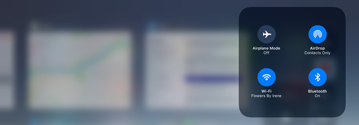
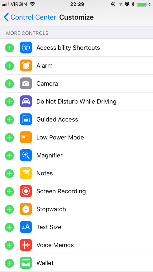
These can all be added to Control Centre, if you’d like.As an example, this iteration of Control Centre is the third major interpretation since iOS 7, released just four years ago. It no longer splits its controls across two pages which, I’m sure, ought to make some people very happy — I was never bothered by that. Its grid-like layout has been touted as being “customizable”, but that’s only true of the app launching and single-function icons across the bottom: you know, the buttons for Calculator, Camera, or the flashlight. You can now choose from over a dozen different apps and functions, including screen recording and a quick-access remote for the Apple TV, and you’re no longer limited to just four of these controls — if there are too many, Control Centre will scroll vertically.
You’d think, though, that by turning Control Centre into a grid that it would be possible to rearrange sections of it by what you use most, or hide controls you never use. That isn’t possible in this version. You might also think that adding a level of customizability would make it possible to assign third-party apps to certain Control Centre launching points — for example, launching PCalc instead of Calculator, or Manual instead of Camera. But that hasn’t happened either. It is also not possible to change which WiFi network you are connected to from Control Centre, despite the additional depth enabled by 3D Touch controls.
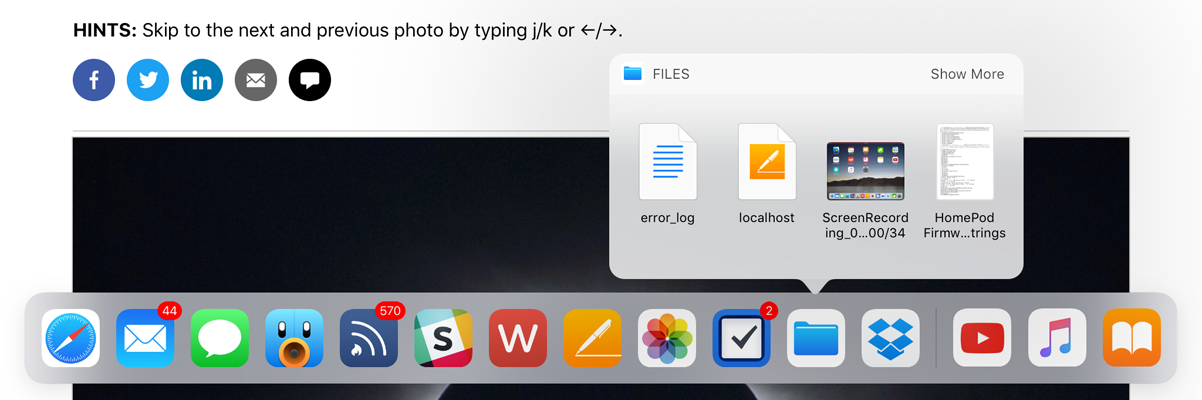
Here’s another example of where things feel a bit incomplete: Slide Over and Split View on the iPad. Previously, dragging an app into either multitasking mode required you to swipe from the right edge to expose a grey panel full of oddly-shaped rounded rectangles, each of which contained an app icon. Apart from looking ugly, which it was, this UI made absolutely no sense to me. What were the rounded rectangles representing? Why did they need to be so large? Why did such an obviously unscalable UI ship?
iPad multitasking on iOS 9 and 10.
Thankfully, this interface is no more for iOS. iPad multitasking is now made somewhat easier by the new systemwide floating Dock. It works and looks a little bit like the Dock on MacOS, insomuch as it contains your favourite apps and can be accessed from within any app simply by swiping upwards from the bottom of the screen. If you want to get an app into Split View or Slide Over, all you need to do is drag its icon up from the Dock and let it expand into a multitasking view on either side of the open app.
But hang on just a minute: if you’re on the home screen, dragging an app icon up from the Dock will remove that app from the Dock. So, in one context, the action is destructive; in others, it’s constructive. That inconsistency feels bizarre in practice, to say the least.
And then there’s the process of getting an app into a multitasking view when it isn’t a Dock app. You can start from the home screen or Spotlight in Notification Centre by finding your app, then touch and hold on the icon until it starts to float. Then, either launch an app with another of your fingers (if you’re starting on the home screen) or press the home button to close Spotlight. Wait until the app icon expands in place, then drop it on either side of the screen to get it into multitasking. It took me a little while to figure out this gymnastics routine and, if I’m honest with myself, it doesn’t feel fully considered. The Dock is brilliant, but the trickiness of getting non-Dock apps into a multitasking view doesn’t yet feel obvious enough.
There is, however, a minor coda of relief: the Dock has space on the righthand side, past the very Mac-like divider, for “suggested” apps. This area tends to include non-Dock apps that you’ve recently used, apps from Handoff, or apps triggered when you connect headphones. But, as this Dock area relies upon technology that is “learning” user patterns rather than being directly user-controlled, the apps you’re expecting may not always be in that area of the Dock. When it works, it’s amazing; when it doesn’t, you still have to do the somewhat-complicated dance of launching apps from the home screen.
Finally, the Dock has more of that pseudo-3D Touch functionality. You can touch and hold on a supported app’s icon to display a kind of popover menu, which looks a lot like the 3D Touch widgets that display on iPhone apps. But they’re not the same thing; apps that have a widget on the iPhone will have to add a different kind of functionality to show a very similar feature in the iPad’s Dock.
So these things — the Dock and Control Centre — feel like they are hinting at newer and more exciting things, but don’t quite conclude those thoughts. They feel, simply, rushed.
In other ways, though, it can sometimes feel like an addition to iOS has taken longer than it should.
Drag and Drop, Keyboard Flicks, and Other iPad Improvements
That statement, naturally, leads me neatly onto systemwide cross-application drag and drop, making its debut this year. There are apparently lots of reasons for why drag and drop was not in iOS previously — for example, it seems as though APFS and its cloning and snapshot features help enable a faster and more efficient drag and drop experience. The new Dock, which allows for more efficient app switching, also seems to have played a role. But regardless of why it took so many years for such a natural interaction to debut on Apple’s touch devices, we should focus on the what of it. Is it good?
Oh, yes. Very.
I love many of the iPad enhancements in this release, but none has been as strong for me as the implementation of drag and drop. Not only can you drag stuff across apps, the drag interactions are separate from the apps themselves. They kind of live in a layer overtop the rest of the system, so you can move around and find just the app you’re looking for — whether you launch it from the Dock, app switcher, home screen, or Spotlight.
You can pick up multiple items from multiple different apps and drop them into any of several different apps. This takes full advantage of the multitouch display on the iPad.
But my favourite thing about drag and drop on iOS and the reason I’ve been so impressed by it is that you can use all of your fingers to “hold” dragged items until you’re ready to drop them. You can also drag items from multiple sources and even multiple apps. It’s crazy good, to the point where dragging and dropping on a traditional computer using a mouse cursor feels like a kludge. In fact, drag and drop is one of the biggest reasons why I’ve chosen to use an iPad more in the past few months than I did for the preceding year.
Developers do have to add support for drag and drop in their apps, but some UI components — like text areas — will support drag and drop in any app without the developer needing to make adjustments.
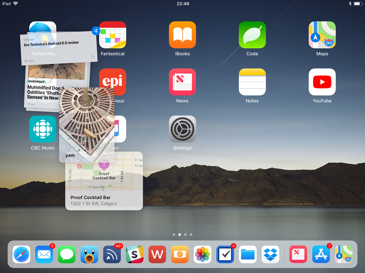
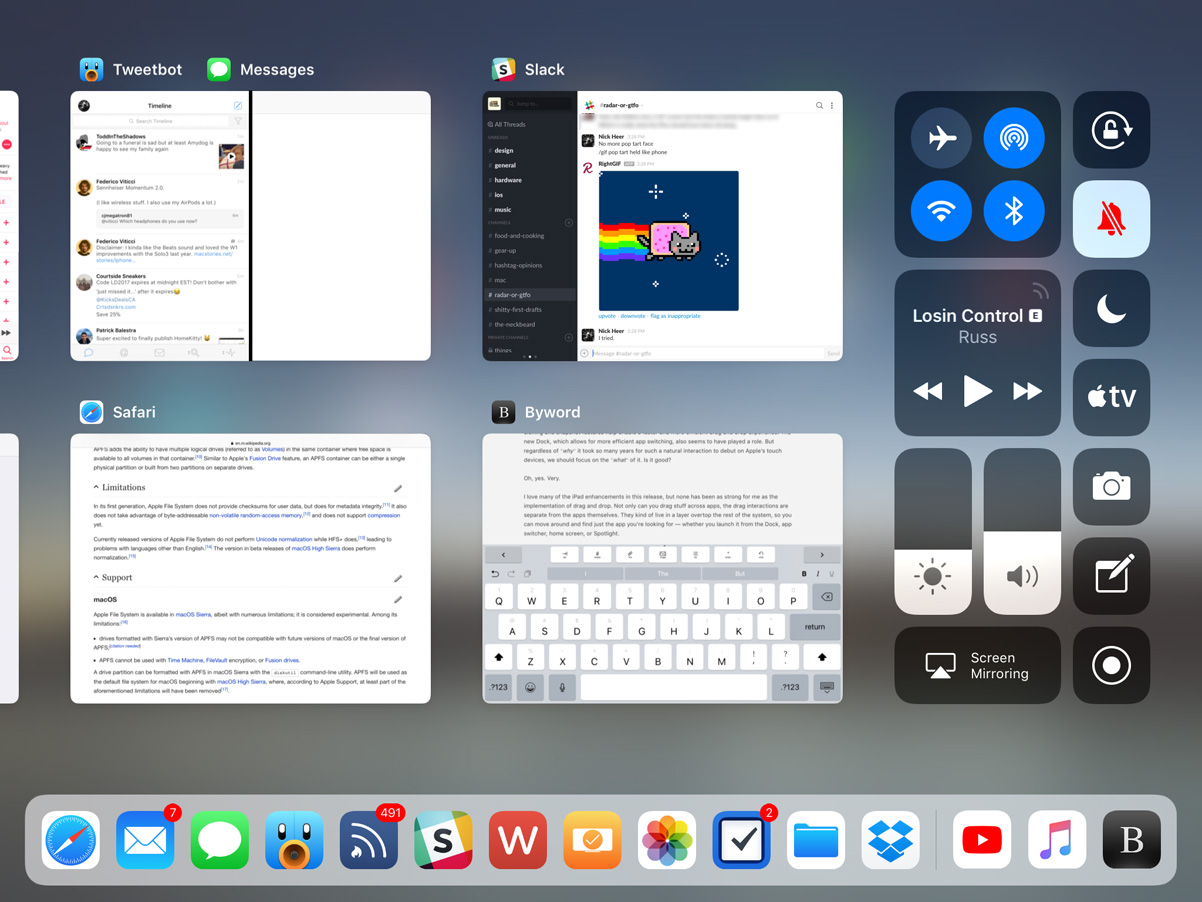
The other really big enhancement that has completely transformed my iPad experience is the new app switcher. Swiping from the bottom of the screen reveals the new floating Dock, but a continued (or second) swipe will show the new app switcher. Instead of showing a single app at a time, six thumbnails now fit onto the screen of my 9.7-inch model at once, making for a much better use of the display’s space. I’m not sure how many app thumbnails fit into a 12.9-inch model’s screen; I hope for more.
Other than being vastly more efficient, which makes the Swiss half of me extremely happy, the app switcher also preserves app “spaces”. When I’m writing, I like to have Slack and Tweetbot open in split-screen, put Safari and Notes together, and keep Byword in its own space. Now, whenever I switch between these, those pairings are retained: if I tap on Tweetbot in the Dock, I’ll see Tweetbot and Slack, exactly as I left them. This makes it really easy to construct little task-specific parts of the system.
Another great enhancement to the system is the new keyboard. Instead of having to navigate between letters, numbers, and symbols with a modal key, you can now swipe down on individual keys to insert common characters. It takes some getting used to — especially for the ways I type, I often insert a “0” where I mean to type a “p”, for instance. Unfortunately, this relatively common typing mistake isn’t caught by autocorrect. Maybe I’m just sloppy; I’m not sure. Even with my misplaced numerals, I appreciate this keyboard refinement. It makes typing so much faster, especially since I frequently have to type combinations of letters and numbers while writing Pixel Envy. I still think frequent patterns — say, postal codes, for example, which in Canada alternate between letters and numbers — should be automatically formatted as you type, but this keyboard is definitely a great step up once you get used to it.
There are some lingering problems I have with the iPad’s keyboard, in particular, however. I find that it occasionally registers keys tapped in fast succession as a two finger tap, which invokes a text selection mode. I have begun to replace entire sentences without realizing it because of this. I wish the iPad’s keyboard could do a better job of understanding the difference between fast typing and invoking selection mode. The goal should be to make the virtual keyboard as close to a physical keyboard in terms of user confidence and key registration accuracy. Also, I continue to have absolutely awful luck with autocorrect: it capitalizes words seemingly at random, changes word tense several typed words later — when I began typing the word “seemingly” just now, it changed “capitalizes” to “capitalized” — and is frequently a focus-disrupting nuisance. It can be turned off in Settings, but I find that the amount of times autocorrect is actually useful just barely outweighs the times that it is frustrating. Enhancing autocorrect is something I believe should be a focus of every iOS release, major or minor.
But, even with all the attention lavished upon the iPad this year, there are still some ultra-frustrating limitations. With the exception of Safari, you can only open one instance of an app at a time. I cannot tell you how frequently I have two different windows from the same app open at the same time on my Mac, and it’s really irritating to not be able to do that on my iPad, especially with the far better support for multiple apps in iOS 11.
There are other things that have left me wanting on the iPad, too, like the stubbornly identical home screen. I’m not entirely sure it needs a complete rethink. Perhaps, somewhere down the line, we could get a first page home screen that acts a little more like MacOS, with recent files, suggested apps, widgets, and a lot more functionality. But even in the short term, it would make sense to be able to add more icons on each page, especially on the larger-sized models.
And, strangely, in terms of space utilization, the iPad fares slightly worse on iOS 11 than it did running iOS 10 because Notification Centre has reverted to a single-column layout. There may be a reason for this — maybe even a really good one — but any attempt to rationalize it is immediately rendered invalid because the iPhone actually gains a two-column Notification Centre layout in landscape on iOS 11. I do not understand either decision.
iOS 11 replaces the two-column Notification Centre with a single column on the iPad, but adds a second column on the iPhone, even on my non-Plus model.
I also think that it’s unfortunate that Siri continues to take over the entire display whenever it is invoked. I hope a future iOS update will treat Siri on the iPad more like a floating window or perhaps something that only covers a third of the display — something closer to the MacOS implementation than a scaled-up iPhone display. I know it’s something that’s typically invoked only briefly and then disappears, but it seems enormously wasteful to use an entire display to show no greater information than what is shown on the iPhone.
Siri
Here’s a funny thing about that previous paragraph: using the word “Siri” to describe Apple’s voice-controlled virtual assistant is actually a bit antiquated. You may recall that, in iOS 10, the app suggestions widget was renamed “Siri App Suggestions”; in iOS 11, it has become clear that “Siri” is what Apple calls their layer of AI automation. That’s not necessarily super important to know in theory, but I think it’s an interesting decision; it’s one thing for a website to note that their search engine is “powered by Google”, but I’m not sure Siri has the reputation to build Apple’s AI efforts on. Then again, perhaps it’s an indication that these efforts are being taken more seriously.
In any case, the new stuff: the personal assistant front-end for Siri has a new voice. In many contexts, I’ve felt it sounds more natural, and that alone helps improve my trust in Siri. However, I’m not sure it’s truly more accurate, though I perceive a slight improvement.
This idea of Siri as a magical black box is something I’ve written about several times here. I will spare you my rehashing of it. Of course, this is the path that many new technologies are taking, from Google and Amazon’s smart speakers to the mysterious friend recommendations in Facebook and LinkedIn. It’s all unfathomable, at least to us laypeople. When it works, it’s magical; when it doesn’t, it’s frustrating, and we have no idea what to do about it, which only encourages our frustration. These technologies are like having a very drunk butler following you everywhere: kind of helpful, but completely unpredictable. You want to trust them, but you’re still wary.
Even with a new voice and perhaps slightly more attentive hearing, Siri is still oblivious to common requests. I am writing these words from a sandwich place near where I live called the Street Eatery. It was recommended to me by Siri after I asked it for lunch recommendations, which is great. However, when I followed up Siri’s recommendation by asking it to “open the Street Eatery’s website”, it opened a Trip Advisor page for a place called the Fifth Street Eatery in Colorado, instead of the restaurant located blocks away that it recommended me only moments before.
In iOS 11, Siri also powers a recommendation engine in News, and suggests search topics in Safari when you begin using the keyboard. For example, when tapped on the location bar after reading this article about Ming-Chi Kuo’s predictions for the new iPhone, it correctly predicted in the QuickType bar that I may want to search more for “OLED”, “Apple Inc.”, or “iPhone”. But sometimes, Siri is still, well, Siri: when I tapped on the location bar after reading a review of an Indian restaurant that opened relatively recently, its suggestions were for Malaysian, Thai, and Indonesian cuisine — none of which were topics on that page. The restaurant is called “Calcutta Cricket Club”, and the post is tagged in WordPress with “Indian cuisine”, so I have no idea how it fathomed those suggestions. And there’s no easy way for me to tell Apple that they’re wrong; I would have to file a radar. See the above section on magical black boxes.
To improve its accuracy over time, Siri now syncs between different devices. Exactly what is synced over iCloud is a mystery — Apple hasn’t said. My hunch is that it’s information about your accent and speech patterns, along with data about the success and failure of different results. Unfortunately, even with synced data, Siri is still a decidedly per-device assistant; you cannot initiate a chain of commands on one device, and then pick it up on another. For example, I wouldn’t be able to ask my iPad to find me recommendations for dinner, then ask my iPhone to begin driving directions to the first result without explicitly stating the restaurant’s name. And, even then, it might pick a restaurant thousands of miles away — you just never know.
User Interface and Visual Design
At the outset of this review, I wrote that I wanted primarily to relay my experiences with the iOS 11 features I use most and had the greatest impact on how I use these devices. I want to avoid the temptation of describing every change in this version, but I don’t think I can describe the ways I have used with my iPhone and iPad without also writing about the ways in which Apple has changed its visual design.
Every new major release of iOS gives Apple the chance to update and refine their design language, and iOS 11 is no exception. Last year, Apple debuted a new style of large, bold titles in News, Music, and the then-new Home app; this year, that design language has bled throughout the system. Any app defined by lists — including Mail, Phone, Contacts, Wallet, Messages, and even Settings — now has a gigantic billboard-esque title. It kind of reminds me of Windows Phone 7, only nicer. I like it a lot and, based on the screenshots I’ve seen so far, it appears to work well to define the upper area of the iPhone X.
This big title style looks nice, but I’m not sure writing “Settings” in gigantic bold letters really affects how I use this app or the system overall.In practice, though, this treatment means that the top quarter of the screen is used rather inefficiently in an app’s initial view. You launch Settings, for example, and the screen is dominated by a gigantic bold “Settings” label. You know you’re in Settings — you just launched it. A more cynical person might point to this as an indication that all post-iOS 7 apps look the same and, therefore, some gigantic text is needed to differentiate them. I do not believe that is the case — there is enough identifying information in each app, between its icon, layout, and contextually-relevant components.
And yet, despite the wastefulness of this large text, I still think it looks great. The very high resolution displays in every device compatible with iOS 11 and Apple’s now-iconic San Francisco typeface combine to give the system a feeling of precision, intention, and clarity. Of course, it’s worth asking why, if it’s so great, a similar large header is not shown as one triangles further into an app. I get the feeling that it would quickly become overbearing; that, once you’re deep within an app, it’s better to maximize efficiency — in magazine terms, the first page can be a cover, but subsequent levels down within the same app should be the body.
Fans of clarity and affordances in user interfaces will be delighted to know that buttons are back. Kind of. Back when iOS 7 debuted, I was among many who found the new text-only “buttons” strewn throughout the system and advocated for in the HIG as contentious and confusing. Though I’ve gotten more used to them over the past several years, my opinion has not changed.
iOS 11 is part of what I’m convinced is a slow march towards once again having buttons that actually look like buttons. The shuffle and looping controls in Music, for instance, are set against a soft grey background. The App Store launcher in Messages is a button-looking button. But, lest you think that some wave of realization has come across the visual designers working on iOS, you should know that the HIG remains unchanged, as does the UIButton control.
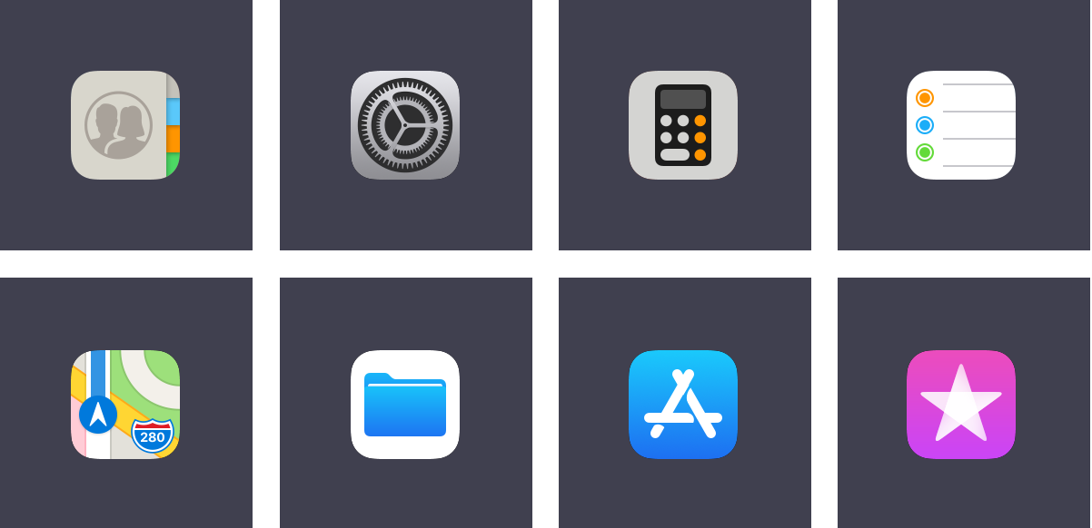
There are some noteworthy icon changes in this update as well. I quite like the new Contacts icon and the higher-contrast icon for Settings, but I have no idea what Apple’s designers were thinking with the new Calculator icon. It’s grey; it has a glyph of a calculator on it in black and orange. And I reiterate: it is grey. The Reminders icon has been tweaked, while the new Maps icon features a stylized interpretation of Apple Park which, per tradition, is cartographically dubious. I don’t like the plain-looking Files icon; I remain less-than-enthusiastic about almost any icon that features a glyph over a white background, with the exceptions of Photos and the NY Times app.
The new App Store icon proved controversial when it launched, but I actually like it. The previous glyph was a carryover from MacOS and, while I don’t think that it was confusing anyone, I do think that this simplified interpretation feels more at home on iOS. The new iTunes Store icon is the less successful of the two redesigns, I feel. As Apple Music has taken over more of the tunes part of iTunes, it appears that the icon is an attempt to associate iTunes with movies and TV shows through the blending of the purple background colour and the star glyph — both attributes, though not identical, are used for the iMovie icon as well. But this only seems to highlight the disconnect between the “iTunes Store” name and its intended function.
Icons on tab bars throughout the system have also been updated. In some places, solid fills replace outlines; in others, heavier line weights replace thin strokes. I really like this new direction. It’s more legible, it feels more consistent, and it simply looks better. These are the kinds of refinements I have expected to see as the course correction that was iOS 7 matures. While it has taken a little longer than I had hoped, it’s welcome nevertheless.
And, for what it’s worth, the signal bars have returned to the status bar, replacing the circular signal dots. This reversion seems primarily driven by the iPhone X’s notched display, but every iPhone and iPad model gets the same status bar. I cannot figure out why the brand new Series 3 Apple Watch uses dots to display LTE signal strength.
To complement the static visual design enhancements, many of the system animations have been tweaked as well. When you lift an iPhone 6S or later, the screen now fades and un-blurs simultaneously; it’s very slick. The app launching animation has been updated, too, so that it now appears as though the app is expanding from its icon. It’s a small thing; I like it.
Assorted Notes and Observations
The App Store has been radically redesigned. I’m dumping it down in this section because, while I applaud the efforts behind separating games from other kinds of apps and I think the News tab is a great way to help users find apps that might be buried by the hundreds of thousands of others, it has not changed the way I use the App Store. I’m pretty settled into a certain routine of apps, so I don’t regularly need to look for more. I didn’t ever really think, during my experience testing it, to check the App Store for what is being featured or what collections have been created lately.
ARKit and Core ML are both very promising technologies that, I think, will need several more months in developers’ hands to bear fruit. Carrot Weather has a fun AR mode today, if you want to try it out.
There aren’t any new Live or Dynamic wallpapers in iOS 11. Live wallpapers were introduced two years ago; Dynamic wallpapers were introduced four years ago.
The new still wallpapers are a clear retro play. There are familiar six-colour rainbow stripes, a Retina-quality version of the Earth photograph from the original iPhone, and — for the first time — Apple has included a plain black wallpaper.
Apple Music has gained some social networking features that, I think, might actually work well. After iTunes Ping and Connect, this is the third time Apple has really tried to push any kind of social functionality (Connect still exists in Apple Music, but I don’t know anybody who actually uses it). Apple Music’s new user profiles can automatically show your friends what you’re listening to, and you can display your playlists too. I expect the automatic sharing aspect — as opposed to requiring users manually update their profiles — to be a primary factor if it continues to be as successful in general use as it has been for me in beta.
There’s also a new take on a shared party playlist. I sincerely doubt that many people go to house parties to control the playlist in a group setting. Maybe this will change with the launch of the HomePod but, like Apple’s previous attempts — Party Shuffle and iTunes DJ — I expect this feature to be largely forgotten.
As I mentioned last year, I think the Memories feature in Photos is one of the best things Apple has built in a long time. iOS 11 promises additional event types, like weddings and anniversaries, which provides more variety in the kinds of Memories that are generated. I love this kind of stuff.
The vast majority of system photo filters have been replaced with much more sensitive and realistic filters. I’ve used them several times. While they’re no replacement for my usual iPhone editing process, they work much better in a pinch than the ones that date back to iOS 7, simply because they’re less garish.
You can now set Live Photos to loop, “bounce” back and forth, or even convert them into long exposure photos. These are fine effects, but I wish the long exposure effect would do better at detecting faces or foreground objects and creating a blur in the background. This may be more sophisticated on iPhones equipped with dual cameras; I’m not sure.
There’s a new file format for video and images — the latter of which is probably the one that will cause the most unnecessary concern. Instead of JPG, photos are saved in the relatively new High-Efficiency Image Format, or HEIF. I have not noticed any compatibility issues, and you get smaller file sizes and fewer compression artifacts in return.
The new Files app ostensibly provides access to all of your files in iCloud Drive and supporting third-party apps. However, because the most major enhancement of this is third-party app support, my time with it while testing is limited to what I have in iCloud, which makes the app function similarly to the iCloud Drive app it replaces. I look forward to using it as more third-party apps support it.
Maps now supports interior maps for an effective handful of malls and airports. If you live in a very large city in the United States or China, this will likely be useful to you; for the rest of us, I guess they have to start somewhere.
Flyover has also been enhanced in Maps, turning it into a sort of Godzilla mode where you can walk around a city overhead from your living room. It is ridiculously cool. I couldn’t confirm whether this is built with ARKit.
There are two new full-screen effects in Messages: “Echo” and “Spotlight”. The former is easily the more interesting and fun of the two. Also, the app drawer has been redesigned so it’s way easier to use.
Messages will support peer-to-peer Apple Pay in the United States later this year — my understanding is that there is a regulatory delay holding it up. As of June, the iPhone 7 was available in about ninety other countries worldwide. There are probably legal requirements that need to be satisfied for it to roll out anywhere else but, as an end user, the reasoning matters little. All that matters to me about this feature is that it will not be available where I live, and that’s a huge bummer.
The 3D Touch shortcut to get into the app switcher has been removed in this version of iOS for reasons I can’t quite figure out. It took me a while to get used to its removal; I used it a lot in iOS 9 and 10.
Safari now takes steps to restrict ad tracking and retargeting cookies to twenty-four hours of data validity. The advertising industry’s biggest trade groups are furious about this. Their creepy selves can fuck straight off.
Final Thoughts
As I’ve been writing for a few years now in occasional posts here, it feels like Apple has been going through a simultaneous series of transitions. Their services business is growing dramatically, they’ve switched over to an SSD-and-high-resolution-display product lineup — for the most part — and have been demonstrating how nontraditional devices like the iPad and Apple Watch can supplant the Mac and iPhone in some use cases.
While this story obviously isn’t going to wrap up so long as technology and Apple keep pushing things forward, iOS 11 feels like it is starting to resolve some of the questions of past releases. Despite my complaints about the rushed-feeling Control Centre and multitasking implementations, I also think that Apple is doing a lot of things very right with this update. Drag and drop is awesome, Siri is getting better, there are visual design improvements throughout, and Apple Music’s social networking features are very fun.
There is a lot that I haven’t covered in this review. That’s deliberate — some features aren’t available where I live or on the devices I use, while other changes have been small enough that you may not notice them day-to-day. However, the cumulative effect of all of these changes is a more complete, well-rounded version of iOS. I do think that the action of putting apps into Slide Over or Split View needs a more considered approach, but I can’t let that spoil how much better the Dock is than the old scrolling list overlay.
The short version of this review is very simple: if you reach for one of your iOS devices instead of running to your Mac for an increasing number of tasks, as Apple is coaxing you to do with each update, you’ll love iOS 11. Even if you don’t, and your iOS devices remain a peripheral extension to your Mac, you’ll find much to love in this version. Make no mistake: this isn’t trying to bring the Mac to your iPhone or iPad; iOS 11 is all about building upon their capabilities in a very iOS-like way. I would expect nothing less and, despite my wishes throughout this review for more, I feel like iOS 11 feels more complete than any previous update. It’s one of those ones where there’s very little you can put your finger on, but there are a lot of small things that make the system better.
iOS 11 is available as a free update for 64-bit iOS devices only: the iPhone 5S or later, iPad Mini 2/iPad Air or later, and the sixth-generation iPod Touch.
If you love your coffee and you’ve never heard of Phil & Sebastian, I think you’re really missing out. They roast some of the finest coffees on the planet, and they do an exceptional job every single time I visit one of their cafés or brew a cup with their beans at home. Co-founder Sebastian Sztabzyb appeared last week on the WorkNotWork podcast to explain how they evolved the company from a small stand at a farmer’s market into the vertically-integrated multi-location business of today. They have a very Apple-y, obsessive approach to coffee — both co-founders are ex-engineers, too — and you can clearly hear that in this interview.
Lauren Goode tried Amazon’s outfit-picking robot for the Verge, and it didn’t exactly thrill her:
I’m finding as I get older, however, that what I’m wearing is less about what’s cool right now right this minute and more about practicality. Is this item appropriate for a funeral? Is this too casual for an interview, or too precious for a casual coffee? Am I going to be freezing at a friend’s wedding if I wear this? If the answer is yes: why are you not recommending I buy a jacket or shawl for that? Is this something that someone half my age would wear? (Yes, if it’s in the Juniors department.) I’m looking for more context, basically. Amazon, perhaps more than any e-commerce company, has the ability to do this. Amazon says this is “just the beginning” with the Echo Look and that it will get smarter over time, but the Echo Look app is just not there yet.
I sometimes forget to check the weather before getting dressed for the day and end up wearing something grotesquely inappropriate for the conditions. About a week ago, I wore a light sweater because I stepped out on my balcony before work and it was a bit chilly. It ended up being nearly 30°C, which is only sweater weather if you spend a lot of time on the Sun’s anvil.
That’s the kind of thing I feel the Echo Look should be best at doing, but it doesn’t sound like those kinds of recommendations are necessarily reliable.
It seems to be a fairly confused kind of a device. On the one hand, it can keep track of the outfits you wear daily so that you don’t find yourself wearing the same one to meet with the same clients a week apart, which should be appealing to those more fashion-conscious. On the other hand, if you’re fashion-conscious, you probably wouldn’t place much trust in a robot telling you what to wear, or what to buy:
I wasn’t really expecting spot-on clothing recommendations from Amazon just yet, try as it might to establish itself in the fashion world. But it never recommended shoes or accessories (which I am most likely to buy from Amazon), and it had a tendency to suggest I shop for other items in a similar color pattern (if I already have a blue blouse I don’t need another blue blouse). It also once suggested I might be interested in a similar top from the Junior’s department even though I haven’t shopped in that section of a store in a very long time.
“I see you bought a vacuum cleaner. Do youuu… want another one?” — Amazon
I rag on Siri a lot, but Amazon almost certainly has the world’s largest database of shopping trends. Surely they could do better than suggesting stuff that’s identical to what you already own or just bought. If their AI can’t get that right, why would you trust it to dress you every day?
I’ve been trying Night Shift on-and-off on my Mac for the past few months and I’m struggling to see the appeal. There was one evening where my eyes were truly strained and I needed to complete some stuff on my computer, so I switched it on. After adjusting to the yellowing, I’m still not sure whether the hue shift or lowered brightness was more effective at minimizing my eye strain.
I’ve noticed no difference in my sleeping habits after evenings where I’ve used Night Shift.
Earlier today, after writing about the discomfort and guilt I feel when using push-button service apps, I remembered this article from the end of January. Lisa Baertlein, Reuters:
Starbucks’ coffee shops are suffering from a feared consequence of the mobile revolution: the digital world can dump an avalanche of orders in a short period of time, creating delays and lines that scare away customers.
Starbucks Corp is an early adopter of mobile order and payment technology that the U.S. restaurant industry hopes will boost sales while reducing the burden of rising labor costs.
But baristas at the company’s busiest cafes had difficulty keeping up with mobile orders in the latest quarter, creating bottlenecks at drink delivery stations and leading some walk-in customers to walk out.
Reuters being a business-oriented publication, this article mostly focuses on Starbucks’ lost potential customers. But can you imagine what it’s like to be a barista facing an onslaught of mobile orders?
If you’ve ever worked in a coffee shop, you’ll be familiar with the rhythm you can develop between the person at the till and the person making drinks. As a person making drinks, you’re counting on the banter at the cash register as a time buffer. Without that, employees are reduced to the frantic and robotic movements that are required to churn drinks out.
I don’t think anyone who places a mobile order from the Starbucks app is necessarily cognizant of this. They’re probably thrilled with the convenience, and rightly so. But the ease of a mobile order comes with a hidden human cost, and we ought to be more understanding of that.
Boris Veldhuijzen van Zanten, co-founder of the Next Web, in an article headlined “Apple Doesn’t Understand Photography” that’s getting quite a lot of traction:
The most innovative thing Apple did with their Photo app recently was the addition of a ‘Selfie’ filter. You can find the folder in your Photos app, and yeah, it is filled with Selfies.
Apart from that Apple still thinks we use photography as we did it 30 years ago: we go on a trip, take a bunch of photo’s then struggle with how to show our friends these photos when we get back from our trip.
I think van Zanten missed WWDC because I cannot figure out why he wrote this article otherwise. Case in point:
What is the problem that needs fixing? It is that photography is changing. I showed my girlfriend some tiny text on the back of a credit card. Without hesitating she pulled out her camera, took a photo, and then zoomed in on the photo to read the text.
The camera in your iPhone is a zoom in device for small text or objects.
iOS 10 will ship with a magnification feature enabled via a triple-press of the home button.
Now you could argue there are different apps for different purposes and I should simply use Evernote for notes, Snapchat for disposable stuff and remember to delete the photos I no longer want. But that’s not how life works. I’m paying for lunch and take a quick pic of the receipt. That’s two actions: Swipe up, take photo.
I could also launch my receipts app. Then means unlocking my phone, finding the app, launching it, clicking the ‘Add receipt photo’, taking the photo, etc. That’s easily 10 steps. Nobody has time for that.
Adding a note in Evernote is also more complicated than just swiping up and launching the camera. But Apple could easily make this easier. If Apple can detect a face in a photo it should be able to detect a receipt as well. If it can detect a selfie surely it can differentiate between ‘holiday photos’ and regular snapshots. In fact, if the photo was taken on a weekday, during work hours, and close to work or home there’s a 95% chance this isn’t some kind of holiday event that needs a photo album.
iOS 10 will also ship with object detection built into the Photos app and, yes, it detects receipts. It doesn’t create albums for any of this stuff; it just tags the photo. This was all announced at WWDC; van Zanten’s article was written nearly a week after the opening keynote.
None of those images are meant to be saved ‘for later’. A year from now nobody will care about what I did at 9:06 AM while waiting in line at the coffee bar. It might be interesting for 1 other person (the person I’m getting coffee for) but it can safely disappear into the void an hour later.
Automatically deleting photos from the Camera strikes me as a terrible idea; for photos taken from within Messages, I can see the value. However, that’s still automatic deletion of user data caused by the system, and that’s rarely okay. There are features within Photos today that help solve this problem, like iCloud Photo Library and device-optimized storage, so deleting photos is rarely necessary. The aforementioned automatic scene detection features coming in iOS 10 mean that far less user intervention is necessary to organize and maintain a large photo library.
Are there loads of features I hope to see from Photos and the Camera app in future versions of iOS? Sure. But to argue that Apple “doesn’t understand photography” using issues that were solved at WWDC is callous and lazy.
On May 25, Microsoft announced that they would no longer be making smartphones.
On the very same day, I purchased a brand new Microsoft Lumia 650 smartphone. I have often said on this website that I would choose a Windows Phone were iOS to one day cease to exist; I figured it was time to put my money where my mouth has long been. So, I used one nearly exclusively for a week.1
The Lumia 650
There are two things to consider here: the Lumia 650, and the Windows 10 Mobile operating system that powers it. And I’ll keep the phone review short: it’s not awful, but it is boring.
The Lumia 650 is handsome, but almost cartoonishly generic. It feels like a prop phone, of the kind you’d see in a stock photo or an IKEA display. The hardware is a slab of glass wrapped in plastic and plasticky-feeling aluminum, adorned with a Windows logo on the back and a Microsoft wordmark on the face. It’s not pretty, but if it weren’t there, you’d forget what kind of phone you were using.
Microsoft has elected to use Qualcomm’s Snapdragon 212 processor. It’s a quad-core processor clocked at 1.3 GHz. With the 1 GB of onboard RAM, you might reasonably expect it to be fast. Or, least, fast enough.
It isn’t.
Get used to seeing this screen. A lot.
Despite the smooth animations and capable SoC, the Lumia 650 is slow. Apps take a long time to launch and are purged from memory far too quickly. Even relatively basic tasks — such as opening an email or loading a webpage — are apparently laborious affairs for this phone.
There are a total of two noteworthy things about the Lumia 650. The first is that it’s cheap — really cheap. I bought mine unlocked at the Microsoft Store for $200 Canadian, and it’s the model featuring two SIM card slots and a 30-day return policy. In a world of $600 Samsungs and $800 iPhones, the Lumia 650 is an absolute bargain.
The second interesting thing about this phone is that it is, as far as Microsoft’s plans are concerned, the final Lumia. It was introduced on February 15 and went on sale on April 1. Less than two months later, Microsoft canned the whole operation.
But, while the Lumia brand is dead, Windows 10 Mobile lives on.
Windows 10 Mobile
As with many of Microsoft’s products, I think Windows Mobile is chock full of really great ideas. I noticed this the first time I put my Lumia to sleep, then pulled it out of my pocket. The time, date, and an indicator of an awaiting email were all displayed in white on the jet-black background — a feature called the “Glance screen” that Nokia first introduced on their Symbian devices, and brought to Windows with the Lumia 925 in 2013. Because of the AMOLED displays in virtually all Windows Mobile devices, only the handful of pixels that make up the time and other information need to be turned on. It’s genius.
Then there are the famous Live Tiles on the home — excuse me — Start screen of all Windows Phone-cum-Mobile releases. Instead of being a static icon, the tiles are large enough that they can flip and scroll to show more information.
The weather icon, for instance, alternates between showing current conditions and a forecast for the next few hours. Twitter’s tile shows the most recent notification, and Outlook shows the subject lines and senders of new messages.
Again, I think Live Tiles are an extremely intelligent innovation. They have the at-a-glance information capacity of a widget married to the uniformity and predictability of icons. They’re not interactive, and they don’t need to be. They’re just a glimpse into what the app is doing in the background.
Microsoft’s virtual assistant, Cortana, also brings some new ideas to the table. Instead of being a black box of unknown capability like Siri, or a presence of unknown reach like Google Now, Cortana includes what Microsoft calls a Notebook. It’s a preferences-like menu of things that Cortana knows about you, including connected accounts, frequent locations, and more. These are all editable, so if Cortana starts thinking that your morning coffee pit-stop is where you work, you can correct it.
Yet, for every innovation in Windows Mobile, I encountered a stumbling block of some kind. Some things aren’t fully developed, while other features are marred by poor execution.
For example, you know how I mentioned you could connect accounts to Cortana? The only account types that can be connected, so far as I can tell, are Microsoft Dynamics CRM, LinkedIn, and Office 365.
Cortana itself is deeply flawed. I regularly use Siri for creating reminders and setting timers, especially while cooking. Sometimes, but not always, invoking Cortana and saying “remind me to pick up my parcel tomorrow at 8:30 AM” would present a results page that looked like a reminder was created, but wouldn’t actually follow through. (I unfortunately neglected to get a screenshot of this.) A request to set a timer for fifteen minutes simply shows a search results page:
Photos are a real mixed bag for Windows Mobile. The Lumia 650 has an acceptable camera, though its processing is aggressive with its sharpening. It even has a Live Photos-esque feature where it will record the first few seconds before the photo was taken. Nice.
The front-facing camera isn’t bad, but it has a special viewfinder that makes you look sick:
A screenshot when the front-facing camera is active.The actual image after saving.
After you take a frankly brilliant photo like that, it will automatically back itself up to the mysterious cloud. A Microsoft account includes access to OneDrive and 15 GB of free storage. By default, all of your photos will be uploaded there automatically, and sorted into separate folders for photos, screenshots, and saved images.
OneDrive even attempts to automatically tag objects and scenery in the shot. From the library of about 100 photos I shot on the Lumia, around 60 have accurate — if general — tags, while a handful have inaccurate tags (for instance, identifying an indoor scene as outdoor). The remainder have no tags at all.
Sounds great, right?
Only after taking a bunch of photos in a row did I find out that Windows Mobile will upload those photos to OneDrive over a cellular connection. I have a metered plan, so this is not ideal.
Luckily, Windows includes a really nice dashboard where you can view your mobile data usage. You can even set your monthly cap and your monthly turnover date, so it’s not dumbly accumulating data usage for the entire phone’s life, like iOS does. There’s also a setting in Photos to prevent automatic uploads on a metered mobile connection.
To the best of my knowledge, however, this setting simply doesn’t work. I have my data limit set, yet any photo I take on the Lumia will automatically upload regardless of what connection I’m on. This resulted in a bill from my provider approximately 50% higher than usual, and I used the Lumia for just one week.
And then there are the little things.
One of the hardest habits to kick while writing this is my tendency to write “Windows Phone”. It turns out that Windows Phone, as a brand, doesn’t exist any more. Due to Microsoft’s platform unification, everything they do is now considered “Windows 10”, and that’s it. My Lumia runs Windows 10, a Surface runs Windows 10, and your friend’s computer begrudgingly runs Windows 10.
Luckily, in lots of their documentation and other literature, Microsoft muddies the water by referring to the phone version of the operating system as “Windows 10 Mobile”, so I’ve been calling it “Windows Mobile” throughout this review.
I mention this because Windows 10 Mobile is surprisingly similar to Windows 10. I don’t mean that in the same sense as Steve Jobs stating that “iPhone runs OS X”. There’s nothing technically wrong about what he said, as anyone who has mucked around in the iOS system folders knows, but the intent of that statement largely served to acknowledge a shared core.
Windows 10 Mobile, on the other hand, is a clear descendent of its desktop predecessors:
In a similar vein, Windows — the desktop kind — is the only supported operating system for syncing software. I tried plugging my Lumia into my Thunderbolt Display via USB to manually drop some songs onto the built-in storage, and it ended up drawing too much power, which shut off all my other connected USB devices.
Even semi-basic stuff like the clipboard doesn’t work as expected. There are two different copy widgets and two different paste widgets, and there’s no consistency between their availability or use.
The inline copy menu.The keyboard-aligned copy menu.
These two controls look completely different, but behave identically. Contrast that with this composite screenshot of the two paste controls available in Windows Mobile:
Composite screenshot of trying to paste a URL into a textarea.
You’ll note that the paste control on the keyboard is greyed out and deactivated, but the menu shows a paste option. I have no idea why this could possibly be.
And that’s all in the first-party apps. What about apps from others?
Third-Party Apps
You knew this was coming, didn’t you?
One of the things I was worried about going into the week with Windows was that I’d find it difficult to use it normally as it might lack the apps I use every day.
One of the nice surprises of the week was just how easy it was. It turns out that I already do a lot of stuff using the default set of apps: email, messaging, web browsing — the usual suspects. But I use a lot of third-party stuff too: Twitter, Slack, Snapchat, the New York Times app, Instagram, a Pinboard client, and an RSS reader, to name a handful.
And you know what? Nearly all of those apps are available for Windows Mobile — Snapchat is the sole exception on that list.
The problem with a lot of these apps is that they’re just not very good. Because Windows Mobile has an insignificant market share, developers are — understandably — hesitant to sink more time into building apps for it than they absolutely must, so there’s a lot of shared interface ideas and assets.
The Twitter app is very similar to its Android cousin, except with a dark background instead of white. Slack, well, looks like Slack. And then there’s Instagram:
Now that’s funny.
Windows Mobile has been the distant third choice for native app development for a very long time. Though Microsoft boasts nearly 670,000 apps in the Windows Store, very few of them are actually good. Aside from cross-platform pollination issues, many of the apps I tried throughout the week felt really bottom-shelf. I’d rather not pick on specific apps, as many are from smaller developers, but there’s a sort of third-rate knockoff quality to most that I tried. They feel rushed, incomplete, and generally of a sub-par quality.
That could be because I bought a Windows device at a particularly rough time for their app store. Due to its dwindling market share, lots of big-name developers and companies have discontinued support for Windows Mobile; what’s left in their wake are lower-rung apps.
The lack of developer support is, of course, not new information. What is news is that Microsoft isn’t making phones any more and is concentrating solely on the operating system. If developers weren’t committed to the platform before, what are the chances of that changing with Microsoft’s reduced investment in it? And how can hardware companies be confident in the phones they’re making when even Microsoft isn’t?
Microsoft may think they’re pushing forward with Windows 10 Mobile development, but it feels more like a slow crawl towards an inevitable sunset.
Buyer’s Advice
For a long time, I’ve said that I’d choose Windows Mobile if iOS didn’t exist. And, to a certain extent, I stand by my reasons why: the operating system feels fluid, it has a lot of uniquely brilliant innovations, and it’s fairly user-friendly.
But after spending a full week with it, I see cracks where I wouldn’t have before. I’ve previously tinkered with a friend’s Windows 8.1 smartphone, and I don’t remember it being as unpolished as Windows 10. There are huge executional flaws that mar the day-to-day experience, in ways that are baffling and obvious. And, of course, the dearth of decent third-party apps is a death knell for the platform.
They say “never meet your heroes”. I think that holds true in a lot of cases; it certainly did here. Despite its deep flaws, I like Windows Mobile. I want to root for it, not because it’s the underdog, but because there’s genuinely good stuff here. But, midway through the week, I started itching to get back onto my iPhone. I missed Fantastical, Pinner, and Tweetbot. I really missed iMessage, and the deep integrations with my Mac. Despite the myriad frustrations I have with iOS, it’s still the one I’d choose every single time.
And if iOS didn’t exist? Well, I can’t see Windows Mobile lasting much longer. I guess I’d have to use an Android phone. I wonder what that’s like.
I wanted to keep using my Apple Watch for fitness tracking, so I had my iPhone in my other pocket. I also listened to music on it, for reasons noted in the review. Excluding that, I was all Windows, all the time. ↥︎
Last month, after a major security vulnerability was announced in QuickTime Player for Windows, Apple quietly confirmed that they were dropping support for it. No update will be issued to fix this gaping issue, or any others. QuickTime is dead on Windows.
So what’s the big deal? Who uses QuickTime anyway? Well, it turns out that a bunch of pro apps — especially those that need to support ProRes — use QuickTime as both an encoder and decoder.
The developers of these apps are now scrambling to implement their own solutions, thereby eliminating their dependency on QuickTime. David McGavran of Adobe:
Today we’re pleased to announce that Adobe has been able to accelerate work that was already in progress to support native reading of ProRes. This new capability is fully licensed and certified by Apple, and barring any unforeseen issues during pre-release, these fixes will be included into an update to the relevant products in Creative Cloud shortly.
Over the weekend, I visited Edmonton to see Beyoncé kick some major ass in the freezing cold and rain. While I was there, I got to meet up with Colby Ludwig and Gus Bendinelli; Gus is a cinematographer based in Los Angeles.
Over coffee, he mentioned that the industry made a big push several years ago to establishing ProRes as the across-the-board standard. Everyone — from those using DSLRs to shoot an indie film, right up to major movies shot on the ARRI Alexa and RED cameras — uses ProRes. Back when everyone made the switch, it seemed like a perfectly sensible choice: it’s a very high quality compression format, so it isn’t always necessary to transfer unfathomably large raw video files. It’s also well-supported on both Macs and PCs, with a wide variety of industry-standard software, and is the format Apple requests for iTunes Store submissions.
While ProRes is closed-source, Apple has licensed the encoder and decoder to lots of software and hardware companies. Some companies, like Adobe, chose instead to use Apple’s QuickTime SDK and (legitimately) piggybacking on its included ProRes codecs. Without a safe QuickTime for Windows, applications that the industry relies upon — like, say, Adobe’s suite — cannot read from or export to ProRes-encoded files. Apple has now expedited their licensing to Adobe of a software implementation of ProRes that doesn’t rely upon QuickTime, and Adobe is rushing to get it into updates to Premiere and After Effects.
This is a pretty crappy situation for movie editors who have a Windows-centric workflow. Apple really ought to have better handled the decommissioning of QuickTime, and Adobe ought to have licensed the ProRes encoder instead of assuming future reliance upon QuickTime.
Update:Ryan Holmes, a director, editor, and film colourist:
For Apple bungling EOLed ProApps reference: Shake, FCP7, XServe, Final Cut Server, and Aperture. Bad track record with PR for ProApps
The loss of Aperture still stings.
This reminded me of one additional thing Gus told me about: QuickTime Animation files were previously popular in the film industry until support for the file type was effectively discontinued. I can’t find an official end-of-life notice, but it was deprecated over the past few years, apparently because of licensing conflicts.
Venture capitalists can probably see themselves purchasing a Juicero and keeping it on their countertops, just another gadget in their toy chest. A single, working-class mom in the Midwest wouldn’t see the point. The median American household income is about $53,657; if you’re buying a Juicero for yourself and using it to make one $8 green juice seven times a week, you’re spending about 7 percent of your annual income on a juicer. The $700 Juicero does exactly one thing with its proprietary bagged fresh produce: juice those specific blends of fruits and vegetables. A $50 food processor does a number of tasks at a fraction of the cost. Starry-eyed venture capitalists may think they’re revolutionizing the agricultural business, but in reality, they’re providing luxury services to a sliver of the top 10 percent of people in a handful of cities.
According to Gallup’s polling in the past ten years, between 15–20% of American adults struggled to afford food. The groups disproportionately most affected were black, Hispanic, and women.
See Also:Keurig’s struggle to make an environmentally-friendly version of their gross single-serving coffee pods.
What a loss. I’m linking here to his episode of Comedians In Cars Getting Coffee, but one of my favourite Shandling appearances was from several years ago on the Green Room with Paul Provenza. Someone uploaded the episode — also featuring Marc Maron, Ray Romano, Judd Apatow, and Bo Burnham — to YouTube, but know that the language is very unfit for work. He was deeply passionate about authenticity, and I think that’s something we could all benefit from.
Apple filed a motion to vacate, which is a legal term for “take that decision back”. It’s 65 pages in total, but remarkably readable for a legal document. You might still need a coffee to chug through it, though:
The All Writs Act (or the “Act”) does not provide the judiciary with the boundless and unbridled power the government asks this Court to exercise. The Act is intended to enable the federal courts to fill in gaps in the law so they can exercise the authority they already possess by virtue of the express powers granted to them by the Constitution and Congress; it does not grant the courts free-wheeling authority to change the substantive law, resolve policy disputes, or exercise new powers that Congress has not afforded them. Accordingly, the Ninth Circuit has squarely rejected the notion that “the district court has such wide-ranging inherent powers that it can impose a duty on a private party when Congress has failed to impose one. To so rule would be to usurp the legislative function and to improperly extend the limited federal court jurisdiction.”
Congress has never authorized judges to compel innocent third parties to provide decryption services to the FBI. Indeed, Congress has expressly withheld that authority in other contexts, and this issue is currently the subject of a raging national policy debate among members of Congress, the President, the FBI Director, and state and local prosecutors. Moreover, federal courts themselves have never recognized an inherent authority to order non-parties to become de facto government agents in ongoing criminal investigations. Because the Order is not grounded in any duly enacted rule or statute, and goes well beyond the very limited powers afforded by Article III of the Constitution and the All Writs Act, it must be vacated.
This is a totally cogent position, especially when coupled with Apple’s explanation on the eighth and ninth pages that CALEA covers the areas of the law in question and, therefore, the All Writs Act cannot apply. There’s a lot at stake here; this decision needs to be right for now, and for the future. The myopic arguments so far made by the FBI and other law enforcement agencies are dangerous in their precedent.
At around 9:00 at night, the temperature in Magelang finally drops to a more hospitable 28°C from the 37° or so that it’s been hovering at. My girlfriend and I are here, just outside Yogyakarta, for this leg of the trip and we’ve stopped at a warung for dinner — think of a small trailer that can be pulled behind a bicycle serving ridiculously tasty food. This warung is known for several noodle dishes, but we’ve asked for mie godog — literally, “boiled noodles”. The broth from this cart is made with candlenut and it’s cooking overtop some hot coals in a wok with spring onions, garlic, some mustard greens, and the aforementioned egg noodles. Every few seconds, someone on a scooter or motorbike putters past, inches from the trio of younger men sitting and smoking on the stoop of the karaoke bar next door.
I’ve taken a couple of Live Photos of the scene and play them back, and I realize that it’s captured the sights and sounds well enough that I’ll be able to show my friends and parents back in Canada, but something’s missing: the smell of this place. It’s a distinct blend of engine fumes, clove cigarette smoke, burning wood, and this incredible food. This, to me, says worlds about the immediacy of place of Live Photos, as well as the limitations that they have. They are a welcome step closer to better capturing a moment in time, but the technology isn’t quite good enough yet for this moment.
A warung in Magelang.
I’ve been using an iPhone 6S since launch day — “Space Grey”, 128 GB, non-Plus — and I’ve read all the reviews that matter. But when I boarded a plane on October 24 from Calgary to Surabaya, I was unprepared for the way that this product would impact my travels, and how my travelling would impact my understanding of mobile technology.
We begin this story during a stopover at Vancouver International Airport. As this is an upgrade from an iPhone 5S, I’m still getting used to the size of the 4.7-inch 6S. After just the short hop from Calgary, I’ve noticed that my 6S feels less comfortable in my front-right jeans pocket, to the point where it becomes an obligation to remove it upon sitting down in a tight airplane seat.
This issue is exacerbated by the addition of a case. I never use one, but I felt that it would make my shiny new phone last a little longer in the rougher conditions I’d be experiencing at some points of my trip. My Peel case didn’t show up in time — something about a fulfillment issue — so I settled for Apple’s mid-brown leather model. It’s nice, but even after just a couple of days, I’m already seeing staining on the edge of the case, where it wraps around the display.
At least it gets rid of that damn camera bump.
My girlfriend and I kill some time by hopping on the moving walkways and checking out some of the kitschy tourist shops that dot the halls. I pull out my phone and take a few short videos across the different available video quality settings. I’m sure 4K looks better, but I don’t have a display that can take advantage of that resolution; 60fps looks great, but also looks too much like a home movie. I kind of wish Apple would add a 24fps mode, for a more cinematic feel. I settle on 30fps 1080p: it’s not exotic or technologically advanced these days, but it works pretty much everywhere and looks gorgeous. Even without the optical stability of the 6S Plus, I’m still impressed by how well the camera cancels out shakiness.
After a couple of hours, we board the twelve-plus-hour flight to Taipei. I pull my phone out, sit down, and notice that the Airbus seats lack power outlets. I check my phone, and it looks like there’s 50-odd percent left. In airplane mode, it should be fine for listening to music for much of the flight and taking the odd photo and video. Maybe without much battery life to spare, I’d even get some sleep.
Taipei from above, 5:28 AM.
We land in Taipei bright and early, and steer immediately to the complimentary showers to freshen up. My iPhone is on the last drips of power in low battery mode, but the shower room has an outlet to top it up. We have an eight-hour layover here which we’ll be spending entirely in the airport — thankfully, with free and reasonably speedy WiFi.
I review the photos I’ve taken while circling the city earlier and am pleasantly surprised at their quality in the dim twilight and smog.
In a little over two hours, we’ve seen most of the airport, which, as with every other, consists of duty free shops only occasionally separated by small cafés and restaurants. There are plenty of tech-related shops selling iPhones, MacBooks, and iPads, all at prices much greater than the exchange rate would suggest. Even outside of the airport, Apple products, in particular, are expensive on this side of the world, especially for the middle-or-lower-class income bracket.
I try to log into Tumblr, an account on which I’ve enabled two-factor authentication via text message. I realize that I cannot receive the confirmation message as I’ve turned off all data on my phone to avoid exorbitant roaming charges. Damn.
After another few hours spent walking throughout the airport in a fruitless search for a basic and inexpensive shirt, it’s finally time to board the flight to Surabaya via Singapore.
Despite taking the same plane and the same seats for the second half of this flight, it’s necessary — for some reason — to leave the aircraft and turn around, passing through a security check again. This irritates me, as my pockets and bag are full of crap that I’ve accumulated in entirely “secure” zones, yet cannot be brought back onto the flight.
To make matters worse, the WiFi at Singapore’s airport requires text message authentication, which I cannot get, cf. my troubles logging into Tumblr. It’s also usually possible to get a code from an attendant, but none are present because it’s late at night, of course.
Thanks to the extra memory in the A9 SoC, I still have plenty of Safari tabs cached so I don’t necessarily need a live internet connection. Unfortunately, it hasn’t preserved all of them — the camera still takes as much memory as it can. My pet theory is that Apple could put desktop levels of RAM in the iPhone and the camera would still purge Safari tabs from the cache.
It’s 11-something at night by the time we land in Surabaya. My phone retains a decent charge despite none of the planes including seat-back power outlets. We exit the airport into the overwhelming Indonesian humidity and heat, and hop into a small van to take us to our hotel.
As we wind through the city, I try recording with my phone pressed against the window. If you’ve ever filmed anything at night in even a moderately well-lit city, you know how difficult this is; in Surabaya, with its extremely dim lighting, almost nothing is visible. I put my phone on the seat and watch the city scroll by.
In the morning, we head over to the mall to pick up a SIM card for my time here. On Telekomsel, 4 GB of 3G data plus plenty of messages and call time costs me just 250,000 Rupiah, or about $25 Canadian. I later learn that it should have cost about half that, but I’m a tourist. Whatever the case, that’s a remarkable deal; at home, I pay $55 per month for 1 GB of data.
I’ve never previously tried swapping my SIM while iMessage is active, or adding a phone number to an existing iMessage account. I have to power-cycle my phone so that Telekomsel can activate the SIM, and another time to get it to work with iMessage, after re-enabling cellular data.
But it doesn’t quite work correctly. I’m presented with a prompt to “update” my Apple ID password, and I can’t figure out whether I need to set a new password or simply type it in again. I try the latter and find that the WiFi hotspot I’m connected to is too slow to reach the Apple ID servers. I try a few times, try a third power cycle, pop in my Apple ID password again, and iMessage is finally activated.
I try messaging a friend in Calgary. To my surprise, it fails. I realize that I must add the country code; despite having prior correspondence of several years while in Canada, it does not automatically resolve this. My friend reports that he’s receiving messages from both my new Indonesian number and my iCloud email address. I chalk this up as another instance where iMessage doesn’t understand that we typically want to message people, not numbers or addresses.
I get a tap on the wrist: my Apple Watch notifies me that it is using iMessage with the same email addresses that I’ve been using for years. Sigh.
After two days in Surabaya, we board a plane for Bali. Destination: Ubud, near the middle of the island. After checking into our hotel, I grab my “proper” camera and head off on a short walking tour of the area.
I’ve opted to bring my seven year-old Canon XSi — coincidentally sporting the same 12 megapixel count of the iPhone 6S — and Canon’s cheap and cheerful 40mm portrait lens plus a polarizer on this vacation (those are affiliate links). It’s not the latest gear, but it’s versatile enough when accompanied by my phone.
Ubud is a fascinating little town. It isn’t coastal, so we don’t get any beach time, but it’s an artistic and vibrant place. It happens to be extremely hot during the early afternoon, which makes spending any extended time under the sun uncomfortable and delays the time that we decide to explore. Due to Bali’s proximity to the Equator, the sun sets somewhere between 5:30 and 6:00, and “magic hour” seems to last the entirety of late afternoon. That’s great news for my vacation photos.
In spite of the heat, we take a walk one afternoon in search of some sandals; the ones provided by the hotel are fine for the room, but not for walking around the city. We duck into a small restaurant for lunch, and my girlfriend orders sate. It’s served in a miniature clay grill overtop hot coals, and I realize that this is the kind of moment the Live Photo feature was built for.
Other reviews have pointed out that it’s sometimes hard to remember that the video component continues to record after taking the still photo. I find it difficult to remember that it begins to record video before tapping the shutter button, so I must remember to wait a couple of seconds between tapping to focus and snapping the still; I must also remember to keep my phone raised after taking the picture. It takes me a few tries to get the hang of it, but I’m pleased by the result. Yet, I cannot share it with anyone — a month after the 6S’ release, it seems that none of the popular services that I use support Live Photos.
The next night, we explore the city later in the afternoon, when it’s a tiny bit cooler. I haven’t remembered to bring my DSLR, as we only plan on going for dinner and poking around some boutiques.
We spot a sign directing passers-by to a rice field “50 metres” away, and decide to take a look. After a walk of probably double that distance along a very sketchy path, with sheer drops on one side, we arrive at one of the most breathtaking landscapes I’ve ever seen. Rice paddy fields stretch from both sides of the single-track lane, framed by coconut trees. A rooster crows in the distance. The sun is low in the sky behind a bit of smog, so it’s a perfect golden hue.
Rice paddy fields in Ubud.
It’s so beautiful that it takes me a few minutes to remember to pull out my phone and, low-ish battery be damned, begin snapping. I snap plenty of landscapes on either side, take the requisite panorama, and even a few Live Photos. Later at the hotel, I review these photos and realize that I can’t remember which ones are “Live”, and which ones are not. I look in vain for a Live Photos album; despite every other “special” photo and video format available on the iPhone being filtered into their own album, it simply doesn’t exist for Live Photos. I try searching “live”, or looking for an icon in the thumbnail view — neither works.
I finally stumble across them as I swipe through the photos I shot on the rice fields that day and notice a slight amount of motion. This is apparently the only indicator of a Live Photo, and the only way to find one. Not easy.
But, as I take a look at the few I’ve shot so far, I see great value in the feature. Live Photos can’t capture everything, but they greatly enhance an otherwise static scene. The sound and video snippet add context and a better sense of place: the rooster crowing, the crickets, and even the steam and smoke curling up from that sate the previous day. I have some perfectly fine still photos, too, but their context is entirely imagined; every Live Photo I’ve taken so far does a better job bringing the memory back. It’s too bad that the heat and smell of the place can’t yet be captured as well.
In any case, I don’t think Live Photos are the gimmick some see them as. They’re a little bit cute, but they work remarkably well.
We spend a day travelling from Ubud to Seminyak and seeing the sights there. Our driver, Sandi, had in his car — among the television screens, faux fur on the dash, and short shag roof liner — a USB outlet for passengers to charge their phones. But, he tells me as I plug mine in, most people just use their power banks. I tell him that I’ve noticed a lot of portable batteries around and he says that some people carry two or more, just in case. He says that this is completely normal.
I’m starting to question the power consumption of my own phone. I’ve used it for long enough in Calgary that I know that I can get a full day’s use out of it, from 7:00 in the morning until late at night. Here, I’m not getting even half that. I check the battery statistics and see that all of my usual web-connected apps have a “low signal” notice.
Not only is 3G service somewhat slower than you might expect in this region, it also has patchier coverage. That eats battery life at a much more significant rate, particularly if you have background services polling for data regularly. iOS is supposed to compensate for this, but if you have email inboxes set to refresh on a timed schedule, it seems as though it will obey that regardless of signal strength.
The low battery mode in iOS 9 does a good job of substantially increasing battery life when cellular coverage is less than ideal. I find it indispensable: coverage is too poor for my inboxes or Tweetbot to refresh regularly, and I don’t really want to check my email much while on holiday anyway.
After dropping our bags at the hotel, we head to Uluwatu for the world-famous kecak dance, performed at sunset on a cliff above the sea. I am so captivated by the dance that I all but forget to take photos until the climax, where the dancer playing the monkey is encircled by fire.
We hang around following the dance to take photos with some of the performers. There are a couple of floodlights illuminating the stage area, but it’s still pretty dark. We get our turn to take a selfie with the monkey performer, and I turn on the new front-facing flash. The photo comes out well — great white balance, well-exposed, and not too grainy — but we look sweaty and tired; I shall spare you that sight.
The next day, we head to the beach. Our hotel is just two blocks away, but even that feels sweltering; the cool waters of the Indian Ocean are beckoning. I shoot with both my iPhone and DSLR here. Normally, I’d be very cautious about stepping into the waves for some more immersive shots with my iPhone pocketed, but the increased water resistance of the 6S gives me more confidence that a few light splashes won’t be an issue, especially with a case.
When we get back to the chairs by the side of the beach, I notice that some lint from my pocket has accumulated around the edges of the case. I pop my phone out to dust it off and notice just how nice it feels in the hand. It is not, to my eyes, the best-looking iPhone industrial design — that would be the 5S followed by the original model — but it is the best-built, by far, and feels fantastic in the hand, despite the size. I’m looking forward to using it regularly without a case again at home.
We weave through Seminyak, then onto Yogyakarta, Magelang, and Rembang. Dinner in the latter two cities is often spent at warungs — it is some of the best food you can have anywhere, provided you know which ones are clean.
Our last dinner in Rembang is in a particularly interesting warung. The proprietor is known for his interpretation of nasi tahu — literally translated as rice and tofu. He sets up his preparation table surrounded on three sides by small, low benches, each of which can seat no more than three or four people. Tarps are draped overtop to protect against the possibility of rain — ’tis the season, after all.
We’ve squeezed ourselves onto the bench directly opposite the cook, currently mashing together peanuts, garlic, lime, and some broth into a paste while frying fist-sized lumps of tofu. It’s crowded and, with a bubbling wok of oil behind the cook, it’s hot, but the combination of every sensation makes the scene unforgettable. I want to show people at home, so I take a few photos on my iPhone of the cook at work, trying also to capture the close quarters of the space.
A warung in Rembang serving nasi tahu.
It occurs to me that taking photographs in this environment would be unnatural and straining were it not for a camera as compact and unassuming as my iPhone. Even my DSLR equipped with a pancake-style portrait lens — which I’ve specifically chosen to be less imposing — would be too obtrusive in this moment.
The final few days of our vacation is spent at a home in Surabaya that doesn’t have WiFi. That’s fine in terms of my data consumption, but the slower 3G connection tends to choke on any modern media-heavy site. Every unnecessary tracking script and every bloated cover image brings my web browsing to a crawl.
Then, I run into an issue where my connection refuses to complete. My iPhone shows me a dialog box informing me that there has been a “PDP authentication failure”. I do not know what PDP is, why it must authenticate, or why its failure means I can’t load anything online. I reset my network settings and that seems to work for a while, only for PDP to be unauthenticated again, or whatever.
I reset and search the great IT help desk that is Google for an answer. The top result is a Reddit thread, so I tap on it, only for it to fail to load. I page back and try an Apple Support thread link and it works fine; though, of course, it has no answers. Reddit, specifically, will not load on my 3G connection.
I get sidetracked from my PDP issue and do a little bit of digging. It turns out that Indonesian pornography laws prohibit both porn itself, and any conduit for it. Though Indonesia does not have a nationwide firewall a la China, the federal government has pressured the major ISPs and cellular networks to block major sites that allow access to porn.
Later in the day, we get carried away at Historica Coffee and forget to grab dinner. There’s not much open at midnight on a Wednesday, particularly if you’re not that interested in what I had been warned was maybe-it’s-food from sketchier vendors.
I swipe to the right on my home screen expecting to see shortcuts to late night food, but that feature isn’t enabled here.
I open Yelp. “Yelp is not available in your country.”
We opt for a nearby late night Chinese food place, and it’s pretty damn good.
On the long series of flights home, I get a chance to review photos from both my DSLR and iPhone while triaging my Instapaper queue. I have more than a few articles saved that proclaim that the camera in an iPhone today is good enough to be considered a camera, not just a smartphone camera. These articles began to percolate around the time of the iPhone 4S, and they are a perennial curiousity for me, especially as I glance at my screen of crisp photos taken on my DSLR.
There’s no question that an iPhone has never had a better camera than those in the 6S and 6S Plus today, with the latter edging out the former due to its optical stabilization. iPhones — and smartphones in general — have taken very good quality photos for the past few years, and I would not hesitate to print or frame any of them. In fact, every photo in this travelogue is unedited, and I think they all look pretty good.
But I’m looking now at photos from that paddy field back in Ubud, and there is an inescapable muddiness to the trees in the background. I didn’t bring my DSLR on that walk to compare, but I’ve no doubt it would render a vastly clearer and more detailed image.
iPhone on the left; Canon on the right, both at 100% size. Both feature 12 MP sensors, but the iPhone has a much wider-angle lens and a significantly smaller sensor.
Similarly, I have photos taken on both cameras from atop a cliff near Uluwatu of surfers paddling in the waves. The wide-angle lens of my iPhone provides a better idea of the scope of the scene, but the surfers are reduce to dark blobs. The images captured on my “real” camera show the clarity in the water and the surfers are clearly human beings.
This is, of course, a completely unfair comparison: the APS-C sensor in my XSi has about ten times more area than the iPhone’s sensor, and it’s paired with a much bigger lens which allows more light in. But, it does illustrate just how different the quality of image is from each device.
There are all kinds of tricks that are easier with a DSLR, too, like tracking focus from or of a moving object. For example, I will look through the windshield from a moving car for potentially interesting roadside scenes. Upon spotting one, I’ll grab focus of something of a similar focal distance as the objects of the scene, then move my camera in the opposite direction of travel at a similar speed. This is much easier on highways where speeds are constant, so I’m able to develop a rhythm of sorts. With my DSLR, this is tricky, but something I can reliably do; I have never succeeded in using this technique on my iPhone. It might be the rolling shutter or something I’m not doing quite right, but I also have not heard of someone else doing something similar.
I offer this not as a complaint with the iPhone’s camera, but as clarification that there is still great value to having a camera with a big-ass sensor and a great lens. I’m under no illusions; I am an optimistic hobbyist photographer, at best, but I can’t shake the feeling that I made the right decision in bringing my DSLR as well. It’s bulky, cumbersome, old, has “hot” pixels on the sensor, and creates gigantic RAW files that occupy a lot of space on my MacBook Air.1 However, it creates beautiful images to last a lifetime, and that’s what counts most for me.
I’ve spent an hour or so in an “e-library” in Taipei’s international airport wrapping up this travelogue. Nobody seems to use the e-libraries here, so they function as a pseudo-private lounge, and a pretty great place to find a power outlet. It’s quite nice.
There were some things I expected about bringing my iPhone to Indonesia. I anticipated that I’d use it to keep in touch with a few people at home, look up addresses and directions, and be able to take great-quality photos anywhere, any time. But I learned a lot about the phone, too: Live Photos showed their brilliance, and I was able to extend my battery life despite none of the aircraft including seatback power. I found out just how well the camera works for capturing intimate moments that would feel artificial or posed if I were to use my DSLR, and figured out some new iMessage limitations.
What I learned most, though, isn’t about the iPhone 6S directly; it’s about the role of technology and the internet in a developing nation.
In most developing nations, the proliferation of technology is limited by policy and economics; Indonesia is no exception to this. But, while I was there, I saw people regularly carry two, three, or more smartphones: usually an inexpensive Android phone — something like a OnePlus or a Xiaomi — plus either an iPhone or a BlackBerry. Apple’s products are still very much a luxury: an iPhone is about a third more expensive in Indonesia than it is in the United States, while the median income is half that of the U.S.2
The Jakarta Post reports that only about 29% of Indonesians are connected to the internet, and the internet they’re connected to is different than the one you and I are used to. But they’re making the most of what they’ve got, and established their own rules and understanding — it isn’t rude to use your phone at the dinner table, for instance, and Path remains alive (remember Path?). Not all the services and products you and I have come to expect have made their way there, and if you think search in Apple Maps is poor where you live, you’ve seen nothing yet.
I escaped to Indonesia for a relaxing vacation in a part of the world I’ve never visited. I vowed to get off the beaten path and out of my cushy boutique hotel. In doing so, I leave with a hint — but only a hint — of what life is like for hundreds of millions of Indonesians. In doing so, I learned a little bit of how they use technology; their smartphone is often their only computer and only connection to the internet.
There is something further to consider here: we — designers, developers, and product people — spend a lot of time worrying about how our new product looks and works in U.S. English on an LTE connection, for the tastes of an American (or, at least, Euro-centric) audience. We spend little time asking how it will function for people who fall outside those parameters — parameters which, by the way, narrow as fast as greater amounts of people get connected to the web. My quip about Path earlier is indicative of this: we assume Path is dead because we don’t use it; yet, it has, as far as I can work out, a respectable user base in Southeast Asia, and that market grows every day.
I’m not pretending to be fully educated in the country after spending just three weeks there, but I am certain I understand it better than three weeks ago. Indonesia is beautiful, breathtaking, delicious, and full of the nicest and most accommodating people I’ve ever met, and I’m Canadian. You should go. Bring a camera.
Not to mention post-processing in Photos on OS X, which remains an app that is hard to love. My workflow for a trip like this is to shoot hundreds of images, import them all into one album for the trip, and then pick my selects from that album.
In Aperture, I’d give five-star ratings to the images I was certain about, four-star ratings to those that might have potential, and no stars to images I wouldn’t bother using. (The digital packrat in me doesn’t delete them — just in case, I suppose.) Then, I could simply filter to four-star-or-better images and edit within that set, upgrading some to five-stars if I deemed them worthy. Exporting was as simple as selecting the already-filtered set within the album.
Photos doesn’t have this level of granularity: you either “like” a photo, or you do not. That keeps things a lot simpler, and I don’t mind that. What I do mind is that there appears to be no way to find only photos I’ve liked within an album. My workaround has been to create a smart album with that filtering criteria, but that seems like a workaround, not a solution. ↥︎
This has other effects, too: a couple of years ago, I guessed that data problems and inconsistencies in Apple Maps would be less frequent in places with more iPhone users, and I think that’s true. With less penetration in Indonesia, Apple Maps often lacked significant local points-of-interest. ↥︎
Two of three devices in Apple’s new “Magic” accessory lineup are capable of being used while charging; one, the Magic Mouse, is not. Why? Because the charging port is on the bottom. And it looks as ridiculous as you think.
The real reason why this is is almost certainly because hardware engineering couldn’t figure out a way of placing the Lightning port along the top edge of the device, as would be logical. But my crazy theory on this is that this is intentional to make sure people use it as a wireless mouse and don’t leave it plugged in all the time.
If you think I’m wrong, here’s what Anil Dash says:
… the end result would be that, while charging, the mouse would still be fully functional; indeed, this mode would still be so useful that a lot of folks (myself included!) would just use it as a corded mouse most of the time and only unplug when needed.
I bet that this elicits something of a deep, frustrated sigh in parts of Cupertino.
This isn’t a massive deal logically; reviewers have pointed out that an exceptionally short charge time will last the entire day. You could plug it in while making coffee in the morning and have enough charge for a few days by the time you’re finished. But that’s not really Apple’s style, and the end result is a part of a product that is truly ridiculous.