I’ve got my balcony door wide open this evening and the breeze it’s creating simply isn’t making a difference — I feel like I’m melting into my couch. I should be used to this after a record-shattering summer, but I am not. I live in Canada, in a city where snowfall has been recorded in every month. I am exhausted. I’m holding in one hand a glass of The Hatch’s 2016 “Rhymes with Door Hinge” and, with the other, I am balancing my iPad perhaps a little too precariously on my leg.
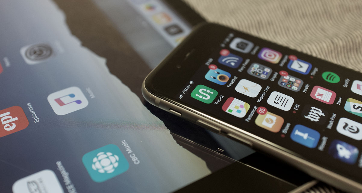
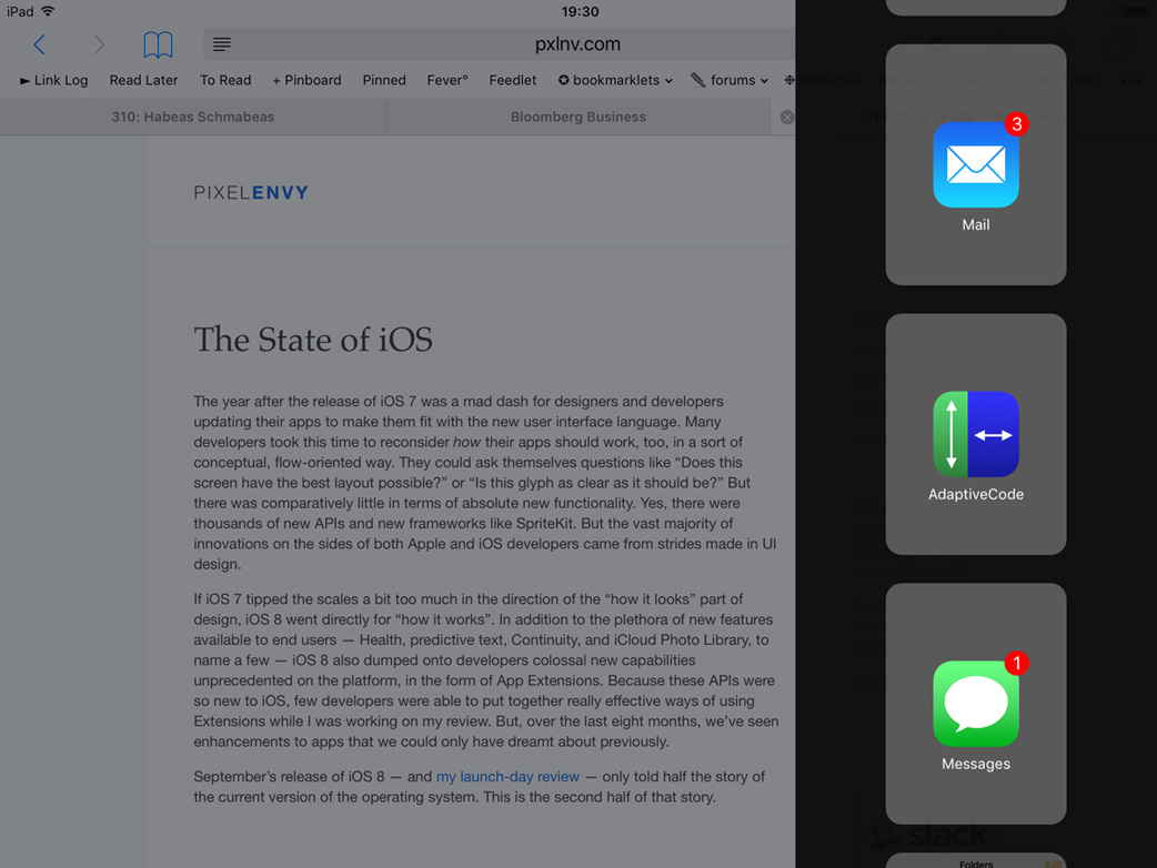
I’m flipping through one of the Atlantic’s excellent weekly photo galleries and I see an amazing picture that I know a friend of mine will love. I put down my glass of wine to be able to perform a somewhat tricky routine of dragging the photo with one finger, dragging the URL with another, swiping from the right-hand part of the screen to float Messages over Safari with a third finger, then navigating to that friend’s chat thread and dropping both the image and URL into a message to send it off. I’m impressed, but also not quite used to these complex interactions. I still feel clumsy sometimes when I do them — a thought that was underscored moments later when I went to pick up my glass of wine only to spill it all over my coffee table.
iOS 11, then: it gives you all kinds of fun new powers, especially on an iPad, but it won’t save you if you’re already a klutz.
I’ve been using iOS 11 daily since it was announced at WWDC and, rather than go through each feature point-by-point like an extended changelog with commentary, I thought I’d explore a bit of how this update feels different with daily use. There’s a lot to unpack and, while I think the vast majority of this upgrade is excellent and demonstrates clear progress in areas previously ignored, I feel there are some things that are really and truly confused. Let me show you what I mean.
The Weird Stuff
Let’s start with the lock screen, because that’s where pretty much every iOS interaction will start. When you unlock the device, the lock screen now slides up as though it’s a cover overtop the rest of the system. In some places, like notification preferences, Apple even calls it the “Cover Screen”. But, while this animation suggests that the lock screen is now sitting in an invisible place above the top of the screen, you can’t swipe upwards to unlock a non-iPhone X device — that action will scroll notifications instead — nor can you pull down from the top to lock it.
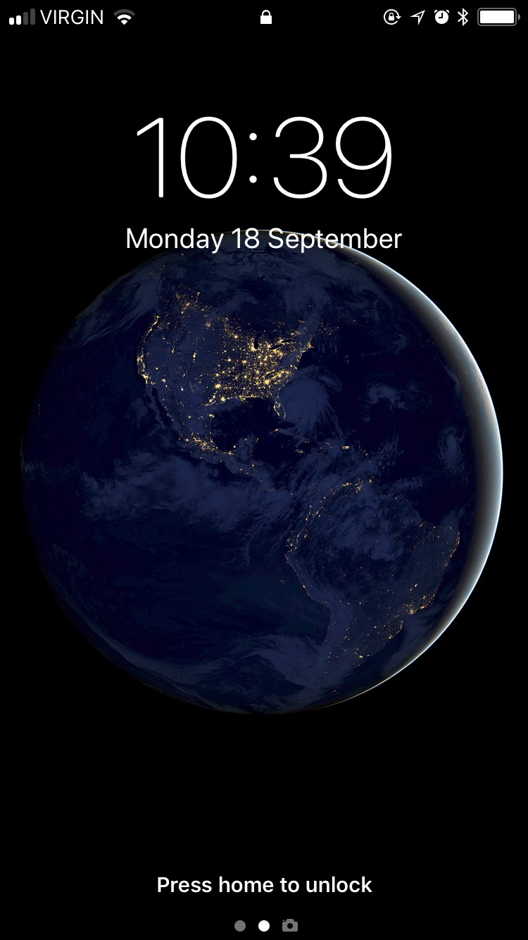
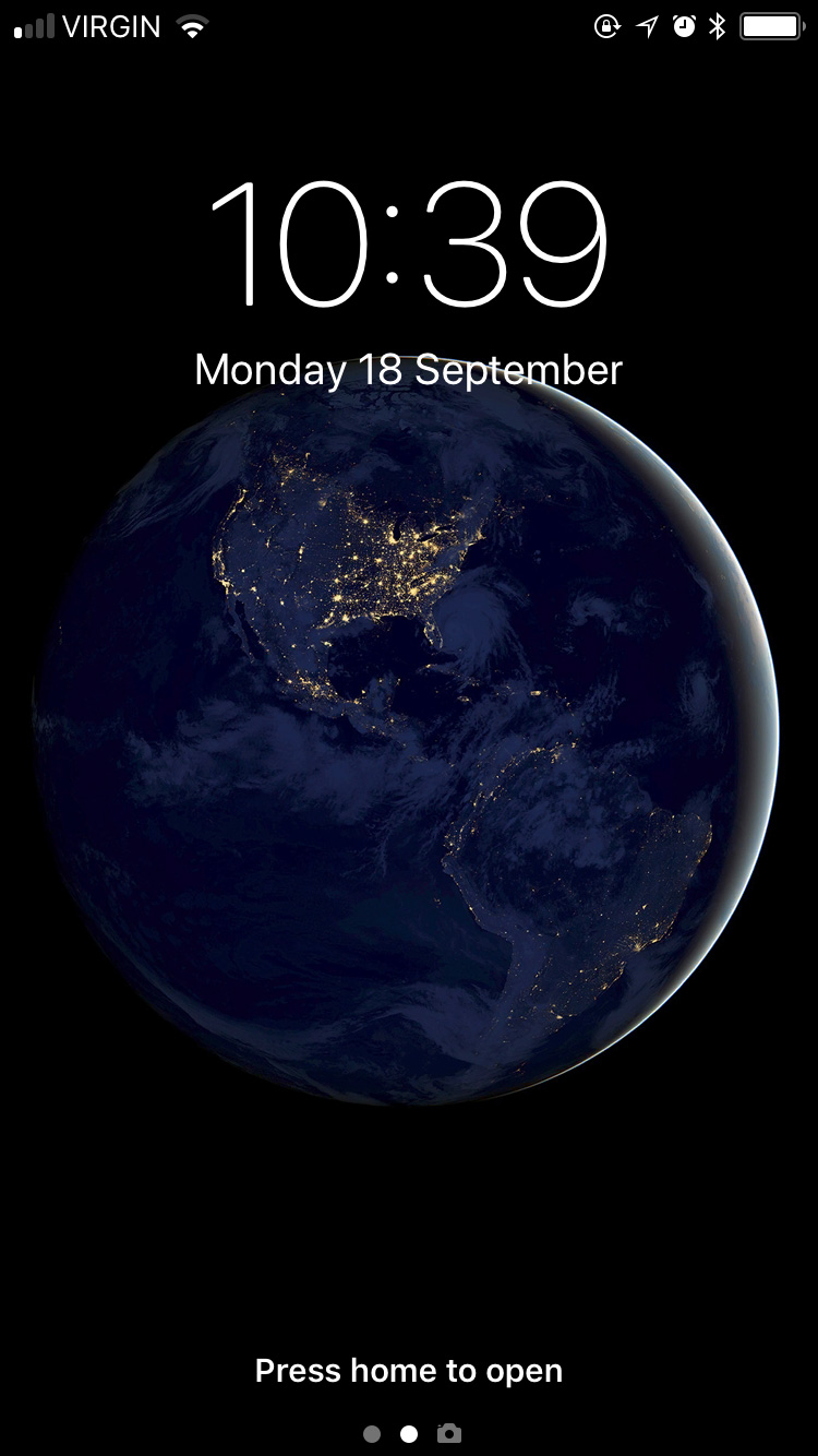
Making matters even more confusing, if you do pull down from the top of an unlocked device, the screen looks like the lock screen, but doesn’t actually lock the device.
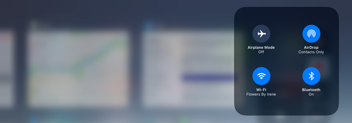
Here’s another example: the iPad and other devices that don’t have 3D Touch displays now support some 3D Touch functionality. If you touch and hold on a notification on the lock screen, for example, it looks like you’re doing the “peek” gesture. The new grid-based Control Centre requires 3D Touch interactions on the iPhone but, again, those gestures have been substituted for touch-and-hold on the iPad. I guess these are fine adaptations, but it indicates to me that aspects of the system were designed in anticipation for a mix of devices that don’t yet exist and some — but not all — of the devices that do. It is inconsistent, though: while it’s possible to use 3D Touch interactions in Control Centre and on notifications in Notification Centre, similar “Peek” interactions don’t work on home screen icons or within apps.
The differences in iOS 11, then, continue to balance new functionality with further complications. But this should be no surprise to those who have used Apple’s ecosystem of devices for several years; it is merely accelerating a trend of growing the features of iOS without forgetting its roots. iOS was, in many ways, a fresh start for the future of computing and each iteration of the OS has built upon that. Sometimes, as above, it feels as though these additions are moving a little too fast. I notice this most when additions or updates feel perhaps incomplete, or, at least, not wholly considered.
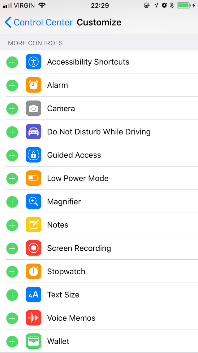
You’d think, though, that by turning Control Centre into a grid that it would be possible to rearrange sections of it by what you use most, or hide controls you never use. That isn’t possible in this version. You might also think that adding a level of customizability would make it possible to assign third-party apps to certain Control Centre launching points — for example, launching PCalc instead of Calculator, or Manual instead of Camera. But that hasn’t happened either. It is also not possible to change which WiFi network you are connected to from Control Centre, despite the additional depth enabled by 3D Touch controls.
Here’s another example of where things feel a bit incomplete: Slide Over and Split View on the iPad. Previously, dragging an app into either multitasking mode required you to swipe from the right edge to expose a grey panel full of oddly-shaped rounded rectangles, each of which contained an app icon. Apart from looking ugly, which it was, this UI made absolutely no sense to me. What were the rounded rectangles representing? Why did they need to be so large? Why did such an obviously unscalable UI ship?
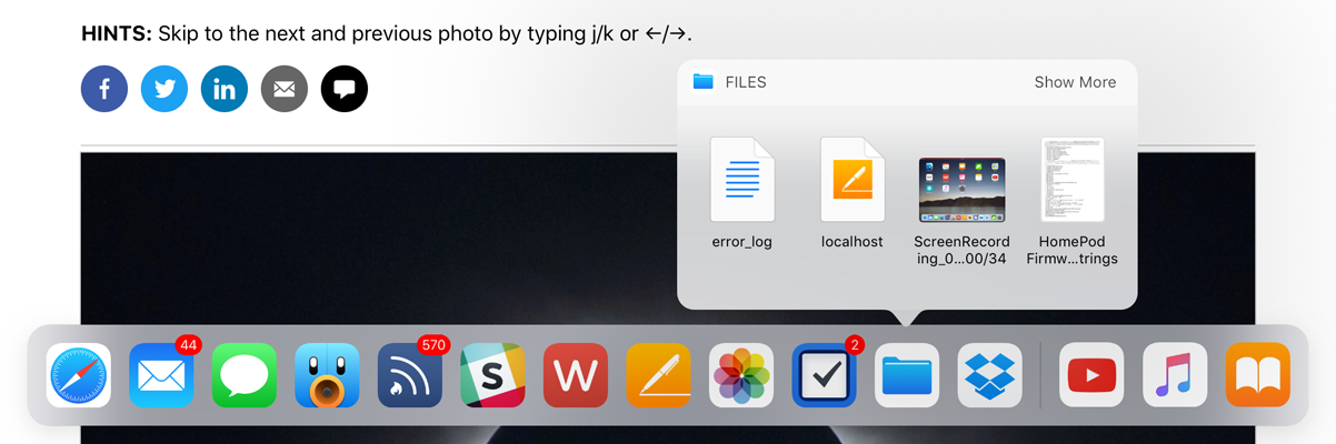
Thankfully, this interface is no more for iOS. iPad multitasking is now made somewhat easier by the new systemwide floating Dock. It works and looks a little bit like the Dock on MacOS, insomuch as it contains your favourite apps and can be accessed from within any app simply by swiping upwards from the bottom of the screen. If you want to get an app into Split View or Slide Over, all you need to do is drag its icon up from the Dock and let it expand into a multitasking view on either side of the open app.
But hang on just a minute: if you’re on the home screen, dragging an app icon up from the Dock will remove that app from the Dock. So, in one context, the action is destructive; in others, it’s constructive. That inconsistency feels bizarre in practice, to say the least.
And then there’s the process of getting an app into a multitasking view when it isn’t a Dock app. You can start from the home screen or Spotlight in Notification Centre by finding your app, then touch and hold on the icon until it starts to float. Then, either launch an app with another of your fingers (if you’re starting on the home screen) or press the home button to close Spotlight. Wait until the app icon expands in place, then drop it on either side of the screen to get it into multitasking. It took me a little while to figure out this gymnastics routine and, if I’m honest with myself, it doesn’t feel fully considered. The Dock is brilliant, but the trickiness of getting non-Dock apps into a multitasking view doesn’t yet feel obvious enough.
There is, however, a minor coda of relief: the Dock has space on the righthand side, past the very Mac-like divider, for “suggested” apps. This area tends to include non-Dock apps that you’ve recently used, apps from Handoff, or apps triggered when you connect headphones. But, as this Dock area relies upon technology that is “learning” user patterns rather than being directly user-controlled, the apps you’re expecting may not always be in that area of the Dock. When it works, it’s amazing; when it doesn’t, you still have to do the somewhat-complicated dance of launching apps from the home screen.
Finally, the Dock has more of that pseudo-3D Touch functionality. You can touch and hold on a supported app’s icon to display a kind of popover menu, which looks a lot like the 3D Touch widgets that display on iPhone apps. But they’re not the same thing; apps that have a widget on the iPhone will have to add a different kind of functionality to show a very similar feature in the iPad’s Dock.
So these things — the Dock and Control Centre — feel like they are hinting at newer and more exciting things, but don’t quite conclude those thoughts. They feel, simply, rushed.
In other ways, though, it can sometimes feel like an addition to iOS has taken longer than it should.
Drag and Drop, Keyboard Flicks, and Other iPad Improvements
That statement, naturally, leads me neatly onto systemwide cross-application drag and drop, making its debut this year. There are apparently lots of reasons for why drag and drop was not in iOS previously — for example, it seems as though APFS and its cloning and snapshot features help enable a faster and more efficient drag and drop experience. The new Dock, which allows for more efficient app switching, also seems to have played a role. But regardless of why it took so many years for such a natural interaction to debut on Apple’s touch devices, we should focus on the what of it. Is it good?
Oh, yes. Very.
I love many of the iPad enhancements in this release, but none has been as strong for me as the implementation of drag and drop. Not only can you drag stuff across apps, the drag interactions are separate from the apps themselves. They kind of live in a layer overtop the rest of the system, so you can move around and find just the app you’re looking for — whether you launch it from the Dock, app switcher, home screen, or Spotlight.
But my favourite thing about drag and drop on iOS and the reason I’ve been so impressed by it is that you can use all of your fingers to “hold” dragged items until you’re ready to drop them. You can also drag items from multiple sources and even multiple apps. It’s crazy good, to the point where dragging and dropping on a traditional computer using a mouse cursor feels like a kludge. In fact, drag and drop is one of the biggest reasons why I’ve chosen to use an iPad more in the past few months than I did for the preceding year.
Developers do have to add support for drag and drop in their apps, but some UI components — like text areas — will support drag and drop in any app without the developer needing to make adjustments.
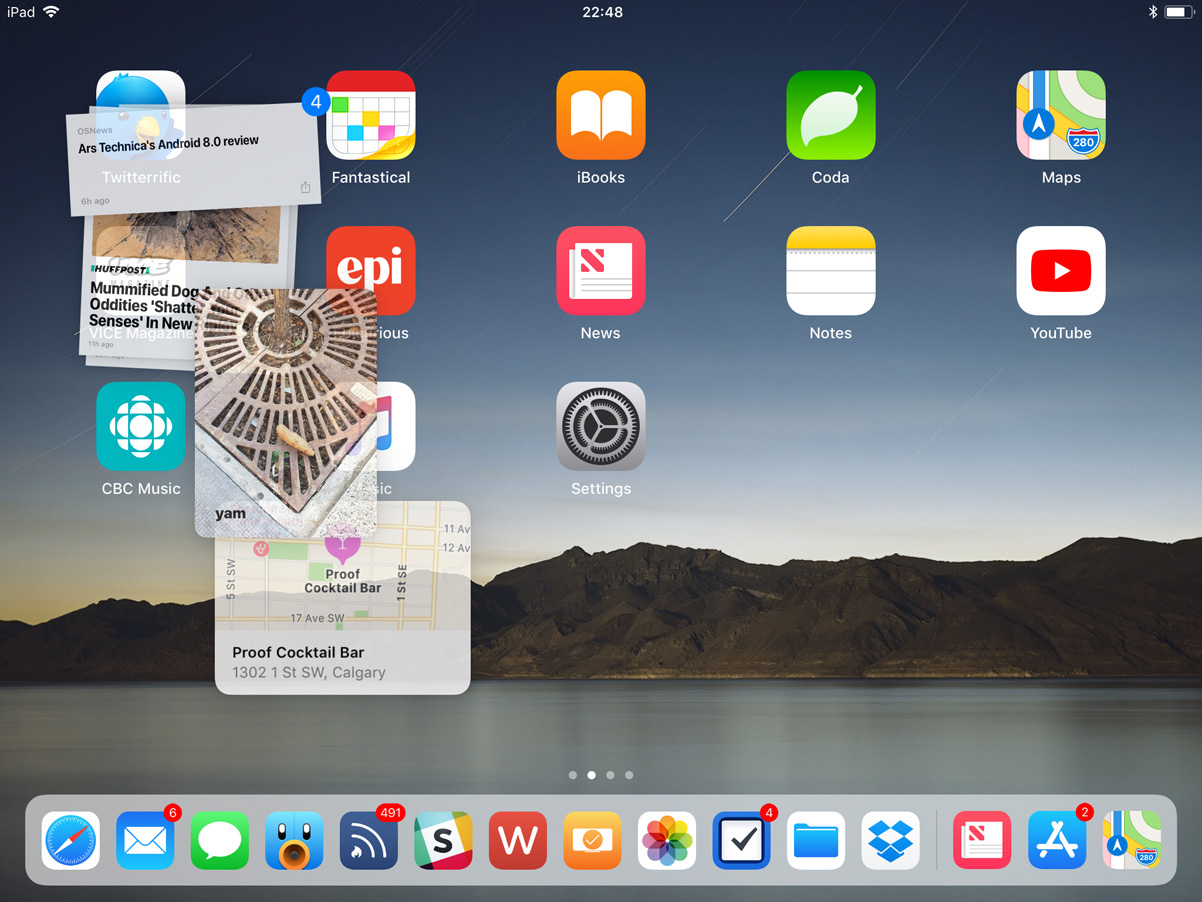
The other really big enhancement that has completely transformed my iPad experience is the new app switcher. Swiping from the bottom of the screen reveals the new floating Dock, but a continued (or second) swipe will show the new app switcher. Instead of showing a single app at a time, six thumbnails now fit onto the screen of my 9.7-inch model at once, making for a much better use of the display’s space. I’m not sure how many app thumbnails fit into a 12.9-inch model’s screen; I hope for more.
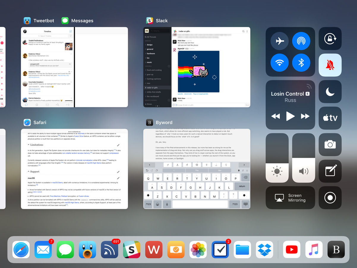
Other than being vastly more efficient, which makes the Swiss half of me extremely happy, the app switcher also preserves app “spaces”. When I’m writing, I like to have Slack and Tweetbot open in split-screen, put Safari and Notes together, and keep Byword in its own space. Now, whenever I switch between these, those pairings are retained: if I tap on Tweetbot in the Dock, I’ll see Tweetbot and Slack, exactly as I left them. This makes it really easy to construct little task-specific parts of the system.
Another great enhancement to the system is the new keyboard. Instead of having to navigate between letters, numbers, and symbols with a modal key, you can now swipe down on individual keys to insert common characters. It takes some getting used to — especially for the ways I type, I often insert a “0” where I mean to type a “p”, for instance. Unfortunately, this relatively common typing mistake isn’t caught by autocorrect. Maybe I’m just sloppy; I’m not sure. Even with my misplaced numerals, I appreciate this keyboard refinement. It makes typing so much faster, especially since I frequently have to type combinations of letters and numbers while writing Pixel Envy. I still think frequent patterns — say, postal codes, for example, which in Canada alternate between letters and numbers — should be automatically formatted as you type, but this keyboard is definitely a great step up once you get used to it.
There are some lingering problems I have with the iPad’s keyboard, in particular, however. I find that it occasionally registers keys tapped in fast succession as a two finger tap, which invokes a text selection mode. I have begun to replace entire sentences without realizing it because of this. I wish the iPad’s keyboard could do a better job of understanding the difference between fast typing and invoking selection mode. The goal should be to make the virtual keyboard as close to a physical keyboard in terms of user confidence and key registration accuracy. Also, I continue to have absolutely awful luck with autocorrect: it capitalizes words seemingly at random, changes word tense several typed words later — when I began typing the word “seemingly” just now, it changed “capitalizes” to “capitalized” — and is frequently a focus-disrupting nuisance. It can be turned off in Settings, but I find that the amount of times autocorrect is actually useful just barely outweighs the times that it is frustrating. Enhancing autocorrect is something I believe should be a focus of every iOS release, major or minor.
But, even with all the attention lavished upon the iPad this year, there are still some ultra-frustrating limitations. With the exception of Safari, you can only open one instance of an app at a time. I cannot tell you how frequently I have two different windows from the same app open at the same time on my Mac, and it’s really irritating to not be able to do that on my iPad, especially with the far better support for multiple apps in iOS 11.
There are other things that have left me wanting on the iPad, too, like the stubbornly identical home screen. I’m not entirely sure it needs a complete rethink. Perhaps, somewhere down the line, we could get a first page home screen that acts a little more like MacOS, with recent files, suggested apps, widgets, and a lot more functionality. But even in the short term, it would make sense to be able to add more icons on each page, especially on the larger-sized models.
And, strangely, in terms of space utilization, the iPad fares slightly worse on iOS 11 than it did running iOS 10 because Notification Centre has reverted to a single-column layout. There may be a reason for this — maybe even a really good one — but any attempt to rationalize it is immediately rendered invalid because the iPhone actually gains a two-column Notification Centre layout in landscape on iOS 11. I do not understand either decision.
I also think that it’s unfortunate that Siri continues to take over the entire display whenever it is invoked. I hope a future iOS update will treat Siri on the iPad more like a floating window or perhaps something that only covers a third of the display — something closer to the MacOS implementation than a scaled-up iPhone display. I know it’s something that’s typically invoked only briefly and then disappears, but it seems enormously wasteful to use an entire display to show no greater information than what is shown on the iPhone.
Siri
Here’s a funny thing about that previous paragraph: using the word “Siri” to describe Apple’s voice-controlled virtual assistant is actually a bit antiquated. You may recall that, in iOS 10, the app suggestions widget was renamed “Siri App Suggestions”; in iOS 11, it has become clear that “Siri” is what Apple calls their layer of AI automation. That’s not necessarily super important to know in theory, but I think it’s an interesting decision; it’s one thing for a website to note that their search engine is “powered by Google”, but I’m not sure Siri has the reputation to build Apple’s AI efforts on. Then again, perhaps it’s an indication that these efforts are being taken more seriously.
In any case, the new stuff: the personal assistant front-end for Siri has a new voice. In many contexts, I’ve felt it sounds more natural, and that alone helps improve my trust in Siri. However, I’m not sure it’s truly more accurate, though I perceive a slight improvement.
This idea of Siri as a magical black box is something I’ve written about several times here. I will spare you my rehashing of it. Of course, this is the path that many new technologies are taking, from Google and Amazon’s smart speakers to the mysterious friend recommendations in Facebook and LinkedIn. It’s all unfathomable, at least to us laypeople. When it works, it’s magical; when it doesn’t, it’s frustrating, and we have no idea what to do about it, which only encourages our frustration. These technologies are like having a very drunk butler following you everywhere: kind of helpful, but completely unpredictable. You want to trust them, but you’re still wary.
Even with a new voice and perhaps slightly more attentive hearing, Siri is still oblivious to common requests. I am writing these words from a sandwich place near where I live called the Street Eatery. It was recommended to me by Siri after I asked it for lunch recommendations, which is great. However, when I followed up Siri’s recommendation by asking it to “open the Street Eatery’s website”, it opened a Trip Advisor page for a place called the Fifth Street Eatery in Colorado, instead of the restaurant located blocks away that it recommended me only moments before.
In iOS 11, Siri also powers a recommendation engine in News, and suggests search topics in Safari when you begin using the keyboard. For example, when tapped on the location bar after reading this article about Ming-Chi Kuo’s predictions for the new iPhone, it correctly predicted in the QuickType bar that I may want to search more for “OLED”, “Apple Inc.”, or “iPhone”. But sometimes, Siri is still, well, Siri: when I tapped on the location bar after reading a review of an Indian restaurant that opened relatively recently, its suggestions were for Malaysian, Thai, and Indonesian cuisine — none of which were topics on that page. The restaurant is called “Calcutta Cricket Club”, and the post is tagged in WordPress with “Indian cuisine”, so I have no idea how it fathomed those suggestions. And there’s no easy way for me to tell Apple that they’re wrong; I would have to file a radar. See the above section on magical black boxes.
To improve its accuracy over time, Siri now syncs between different devices. Exactly what is synced over iCloud is a mystery — Apple hasn’t said. My hunch is that it’s information about your accent and speech patterns, along with data about the success and failure of different results. Unfortunately, even with synced data, Siri is still a decidedly per-device assistant; you cannot initiate a chain of commands on one device, and then pick it up on another. For example, I wouldn’t be able to ask my iPad to find me recommendations for dinner, then ask my iPhone to begin driving directions to the first result without explicitly stating the restaurant’s name. And, even then, it might pick a restaurant thousands of miles away — you just never know.
User Interface and Visual Design
At the outset of this review, I wrote that I wanted primarily to relay my experiences with the iOS 11 features I use most and had the greatest impact on how I use these devices. I want to avoid the temptation of describing every change in this version, but I don’t think I can describe the ways I have used with my iPhone and iPad without also writing about the ways in which Apple has changed its visual design.
Every new major release of iOS gives Apple the chance to update and refine their design language, and iOS 11 is no exception. Last year, Apple debuted a new style of large, bold titles in News, Music, and the then-new Home app; this year, that design language has bled throughout the system. Any app defined by lists — including Mail, Phone, Contacts, Wallet, Messages, and even Settings — now has a gigantic billboard-esque title. It kind of reminds me of Windows Phone 7, only nicer. I like it a lot and, based on the screenshots I’ve seen so far, it appears to work well to define the upper area of the iPhone X.
And yet, despite the wastefulness of this large text, I still think it looks great. The very high resolution displays in every device compatible with iOS 11 and Apple’s now-iconic San Francisco typeface combine to give the system a feeling of precision, intention, and clarity. Of course, it’s worth asking why, if it’s so great, a similar large header is not shown as one triangles further into an app. I get the feeling that it would quickly become overbearing; that, once you’re deep within an app, it’s better to maximize efficiency — in magazine terms, the first page can be a cover, but subsequent levels down within the same app should be the body.
Fans of clarity and affordances in user interfaces will be delighted to know that buttons are back. Kind of. Back when iOS 7 debuted, I was among many who found the new text-only “buttons” strewn throughout the system and advocated for in the HIG as contentious and confusing. Though I’ve gotten more used to them over the past several years, my opinion has not changed.
iOS 11 is part of what I’m convinced is a slow march towards once again having buttons that actually look like buttons. The shuffle and looping controls in Music, for instance, are set against a soft grey background. The App Store launcher in Messages is a button-looking button. But, lest you think that some wave of realization has come across the visual designers working on iOS, you should know that the HIG remains unchanged, as does the UIButton control.
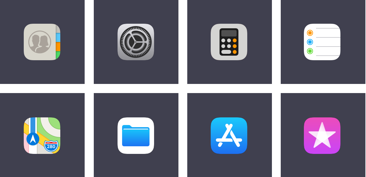
There are some noteworthy icon changes in this update as well. I quite like the new Contacts icon and the higher-contrast icon for Settings, but I have no idea what Apple’s designers were thinking with the new Calculator icon. It’s grey; it has a glyph of a calculator on it in black and orange. And I reiterate: it is grey. The Reminders icon has been tweaked, while the new Maps icon features a stylized interpretation of Apple Park which, per tradition, is cartographically dubious. I don’t like the plain-looking Files icon; I remain less-than-enthusiastic about almost any icon that features a glyph over a white background, with the exceptions of Photos and the NY Times app.
The new App Store icon proved controversial when it launched, but I actually like it. The previous glyph was a carryover from MacOS and, while I don’t think that it was confusing anyone, I do think that this simplified interpretation feels more at home on iOS. The new iTunes Store icon is the less successful of the two redesigns, I feel. As Apple Music has taken over more of the tunes part of iTunes, it appears that the icon is an attempt to associate iTunes with movies and TV shows through the blending of the purple background colour and the star glyph — both attributes, though not identical, are used for the iMovie icon as well. But this only seems to highlight the disconnect between the “iTunes Store” name and its intended function.
Icons on tab bars throughout the system have also been updated. In some places, solid fills replace outlines; in others, heavier line weights replace thin strokes. I really like this new direction. It’s more legible, it feels more consistent, and it simply looks better. These are the kinds of refinements I have expected to see as the course correction that was iOS 7 matures. While it has taken a little longer than I had hoped, it’s welcome nevertheless.
And, for what it’s worth, the signal bars have returned to the status bar, replacing the circular signal dots. This reversion seems primarily driven by the iPhone X’s notched display, but every iPhone and iPad model gets the same status bar. I cannot figure out why the brand new Series 3 Apple Watch uses dots to display LTE signal strength.
To complement the static visual design enhancements, many of the system animations have been tweaked as well. When you lift an iPhone 6S or later, the screen now fades and un-blurs simultaneously; it’s very slick. The app launching animation has been updated, too, so that it now appears as though the app is expanding from its icon. It’s a small thing; I like it.
Assorted Notes and Observations
The App Store has been radically redesigned. I’m dumping it down in this section because, while I applaud the efforts behind separating games from other kinds of apps and I think the News tab is a great way to help users find apps that might be buried by the hundreds of thousands of others, it has not changed the way I use the App Store. I’m pretty settled into a certain routine of apps, so I don’t regularly need to look for more. I didn’t ever really think, during my experience testing it, to check the App Store for what is being featured or what collections have been created lately.
ARKit and Core ML are both very promising technologies that, I think, will need several more months in developers’ hands to bear fruit. Carrot Weather has a fun AR mode today, if you want to try it out.
There aren’t any new Live or Dynamic wallpapers in iOS 11. Live wallpapers were introduced two years ago; Dynamic wallpapers were introduced four years ago.
The new still wallpapers are a clear retro play. There are familiar six-colour rainbow stripes, a Retina-quality version of the Earth photograph from the original iPhone, and — for the first time — Apple has included a plain black wallpaper.
Apple Music has gained some social networking features that, I think, might actually work well. After iTunes Ping and Connect, this is the third time Apple has really tried to push any kind of social functionality (Connect still exists in Apple Music, but I don’t know anybody who actually uses it). Apple Music’s new user profiles can automatically show your friends what you’re listening to, and you can display your playlists too. I expect the automatic sharing aspect — as opposed to requiring users manually update their profiles — to be a primary factor if it continues to be as successful in general use as it has been for me in beta.
There’s also a new take on a shared party playlist. I sincerely doubt that many people go to house parties to control the playlist in a group setting. Maybe this will change with the launch of the HomePod but, like Apple’s previous attempts — Party Shuffle and iTunes DJ — I expect this feature to be largely forgotten.
As I mentioned last year, I think the Memories feature in Photos is one of the best things Apple has built in a long time. iOS 11 promises additional event types, like weddings and anniversaries, which provides more variety in the kinds of Memories that are generated. I love this kind of stuff.
The vast majority of system photo filters have been replaced with much more sensitive and realistic filters. I’ve used them several times. While they’re no replacement for my usual iPhone editing process, they work much better in a pinch than the ones that date back to iOS 7, simply because they’re less garish.
You can now set Live Photos to loop, “bounce” back and forth, or even convert them into long exposure photos. These are fine effects, but I wish the long exposure effect would do better at detecting faces or foreground objects and creating a blur in the background. This may be more sophisticated on iPhones equipped with dual cameras; I’m not sure.
There’s a new file format for video and images — the latter of which is probably the one that will cause the most unnecessary concern. Instead of JPG, photos are saved in the relatively new High-Efficiency Image Format, or HEIF. I have not noticed any compatibility issues, and you get smaller file sizes and fewer compression artifacts in return.
The new Files app ostensibly provides access to all of your files in iCloud Drive and supporting third-party apps. However, because the most major enhancement of this is third-party app support, my time with it while testing is limited to what I have in iCloud, which makes the app function similarly to the iCloud Drive app it replaces. I look forward to using it as more third-party apps support it.
Maps now supports interior maps for an effective handful of malls and airports. If you live in a very large city in the United States or China, this will likely be useful to you; for the rest of us, I guess they have to start somewhere.
Flyover has also been enhanced in Maps, turning it into a sort of Godzilla mode where you can walk around a city overhead from your living room. It is ridiculously cool. I couldn’t confirm whether this is built with ARKit.
There are two new full-screen effects in Messages: “Echo” and “Spotlight”. The former is easily the more interesting and fun of the two. Also, the app drawer has been redesigned so it’s way easier to use.
Messages will support peer-to-peer Apple Pay in the United States later this year — my understanding is that there is a regulatory delay holding it up. As of June, the iPhone 7 was available in about ninety other countries worldwide. There are probably legal requirements that need to be satisfied for it to roll out anywhere else but, as an end user, the reasoning matters little. All that matters to me about this feature is that it will not be available where I live, and that’s a huge bummer.
The 3D Touch shortcut to get into the app switcher has been removed in this version of iOS for reasons I can’t quite figure out. It took me a while to get used to its removal; I used it a lot in iOS 9 and 10.
Safari now takes steps to restrict ad tracking and retargeting cookies to twenty-four hours of data validity. The advertising industry’s biggest trade groups are furious about this. Their creepy selves can fuck straight off.
Final Thoughts
As I’ve been writing for a few years now in occasional posts here, it feels like Apple has been going through a simultaneous series of transitions. Their services business is growing dramatically, they’ve switched over to an SSD-and-high-resolution-display product lineup — for the most part — and have been demonstrating how nontraditional devices like the iPad and Apple Watch can supplant the Mac and iPhone in some use cases.
While this story obviously isn’t going to wrap up so long as technology and Apple keep pushing things forward, iOS 11 feels like it is starting to resolve some of the questions of past releases. Despite my complaints about the rushed-feeling Control Centre and multitasking implementations, I also think that Apple is doing a lot of things very right with this update. Drag and drop is awesome, Siri is getting better, there are visual design improvements throughout, and Apple Music’s social networking features are very fun.
There is a lot that I haven’t covered in this review. That’s deliberate — some features aren’t available where I live or on the devices I use, while other changes have been small enough that you may not notice them day-to-day. However, the cumulative effect of all of these changes is a more complete, well-rounded version of iOS. I do think that the action of putting apps into Slide Over or Split View needs a more considered approach, but I can’t let that spoil how much better the Dock is than the old scrolling list overlay.
The short version of this review is very simple: if you reach for one of your iOS devices instead of running to your Mac for an increasing number of tasks, as Apple is coaxing you to do with each update, you’ll love iOS 11. Even if you don’t, and your iOS devices remain a peripheral extension to your Mac, you’ll find much to love in this version. Make no mistake: this isn’t trying to bring the Mac to your iPhone or iPad; iOS 11 is all about building upon their capabilities in a very iOS-like way. I would expect nothing less and, despite my wishes throughout this review for more, I feel like iOS 11 feels more complete than any previous update. It’s one of those ones where there’s very little you can put your finger on, but there are a lot of small things that make the system better.
iOS 11 is available as a free update for 64-bit iOS devices only: the iPhone 5S or later, iPad Mini 2/iPad Air or later, and the sixth-generation iPod Touch.