Speaking of Siri, Joanna Stern’s column this week for the Wall Street Journal looks at some of the improvements and changes Apple has made to it in iOS 10:
Most of Siri’s third-party integration has been so reliable and accurate that it’s spurred me to start talking to it more and more. In some cases, I’ve been impressed with how much Siri has learned about how we speak. She understands and responds to casual phrases like, “Shoot an email to Geoff” or “What’s up with the weather today?”
Sometimes, though, I have to carefully phrase the question. “When’s the next train coming?” pulls up the definition of “train” on Wikipedia. “Show me transit directions,” however, shows me the latest train schedule. And when it comes to general knowledge, Siri comes in third place behind Google’s and Amazon’s assistants.
Unfortunately, very few of the apps I use regularly either haven’t yet been updated to support SiriKit, or don’t fit into one of the specific domains that SiriKit supports right now.
I’m looking forward to trying Siri with more data sources, though. I think that these kinds of improvements will reduce the psychological impediment that I — and, perhaps, you — face when talking to technology. If it doesn’t feel entirely right, it feels wrong.
Apple says Siri is updated every other week with new information.
That’s not frequent enough. Not even close. Breaking news stories, in particular, should be indexed by Siri as soon as they’re published.
Available now on the Mac App Store — remember the Mac App Store? — MacOS Sierra brings Siri to the Mac, allows you to offload storage of old files to iCloud, and adds Apple Pay to Safari, amongst miscellaneous updates and improvements.
Stephen Hackett’s review is also very good — in particular, his explanation of pinned Siri results:
All conversations with Siri have a small button with a plus symbol. Clicking it opens Notification Center (which now sports a white theme to match iOS) and adds Siri’s results to the top of the stack of widgets.
Here’s the clever bit: the content of these is constantly being updated by the system.
This leads to all sorts of possibilities. Creating a widget during a sports game would keep the real-time score just a swipe away. Creating a Twitter search with a keyword can help you keep updated on what people are saying about your brand. The possibilities are nearly endless.
It’s a little frustrating that this kind of stuff is gated behind a spoken Siri command. Not only does this require talking to your computer — a task which I still find a little bit weird — it also means that the computer must interpret what you’re saying absolutely perfectly for this feature to be of any use. Siri remains not accurate enough for my liking, even on the Sierra betas; so, while I’ll try it out on my Mac, I’m not sure I’ll use it regularly.
Meanwhile, when Jason Snell tried the new iCloud storage optimization feature, he found it working like many of Apple’s other iCloud products:
Here’s what happened: I was editing a podcast in Apple’s Logic Pro X, and my project was stored on the Desktop. All of a sudden, the voice of one of my podcast panelists simply vanished from the mix. I quit and re-launched Logic, only to be told that the file in question was missing. Sure enough, a visit to Finder revealed that Sierra had “optimized” my storage and removed that file from my local drive. I’ll grant you, the file was a couple of weeks old, and very large as most audio files are. But I was also actively using it within a Logic project. Apparently that didn’t count for anything?
That’s not good. The automated storage features in iCloud have been a mixed-bag: iCloud Photo Library has worked perfectly for me so far, but iCloud Music Library has been fairly unreliable — so much so that I refuse to enable it. I doubt I’ll be touching the storage optimization feature in Sierra for a while.1
Especially since I upgraded to a 1 TB SSD in my MacBook Air a few months ago. If you’ve been hesitating on upgrading your SSD, you should know that prices have come way down. ↥︎
I don’t know about all of you, but I think these new iPhone 7, Apple Watch and Apple Music ads are some of the best the company has done in a while.
The iPhone and Watch ads are energetic yet moody, and emphasize the water resistance of both products. The Watch ad, in particular, feels like it has strains of the original iPod campaign’s DNA in it; I will never say no to anything featuring Nina Simone.
The Apple Music ad is entirely different. It’s kind of odd seeing Eddy Cue and Bozoma Saint John in an ad, but it’s pretty fun. I really liked it. James Corden plays himself, and the Apple executives — also including Jimmy Iovine — are on hand to bat down his ridiculous ad pitches. It doesn’t take itself too seriously, and it’s better for it.
Dr. Raymond M. Soneira of DisplayMate summarizes the iPhone 7’s new, wide-gamut LCD panel (capitalization his):
The display on the iPhone 7 is a Truly Impressive Top Performing Display and a major upgrade and enhancement to the display on the iPhone 6. It is by far the best performing mobile LCD display that we have ever tested, and it breaks many display performance records.
Just count the number of superlatives in this review. Soneira is a notoriously tough data-driven reviewer, but his commentary on the iPhone 7’s display is effusive.
The next major iPhone redesign is rumoured to include a change to an OLED display. Soneira addresses this:
LCDs are a great cutting edge high performance display technology for Tablets to TVs, but for handheld Smartphones, OLED displays provide a number of significant advantages over LCDs including: being much thinner, much lighter, with a much smaller bezel providing a near rimless design, they can be made flexible and into curved screens, plus they have a very fast response time, better viewing angles, and an always-on display mode. Many of the OLED performance advantages result from the fact that every single sub-pixel in an OLED display is individually directly powered, which results in better color accuracy, image contrast accuracy, and screen uniformity.
With only the super-saturated displays of Samsung and LG smartphones as reference points, I didn’t think that OLEDs could be calibrated to the accuracy of an LCD. But, after seeing that my Apple Watch is a near-perfect match for the colour profile in my iPhone, I have hope that a hypothetical OLED-equipped iPhone will be as accurate and clear as the LCD reviewed here. I still don’t think greys are quite perfect on my Watch, but they’re close. There are few companies that calibrate displays the way Apple does, and there’s nobody else doing it at their scale and across their entire product line.
The National Security Agency and the FBI are tapping directly into the central servers of nine leading U.S. Internet companies, extracting audio and video chats, photographs, e-mails, documents, and connection logs that enable analysts to track foreign targets, according to a top-secret document obtained by The Washington Post.
That article revealed the existence of the NSA’s PRISM program. It was amongst the earliest articles published from Edward Snowden’s disclosures, and was the first from the Washington Post, reporters from which were given access to the leaked documents. The Post shared a Pulitzer Prize with the Guardian for their work in reporting on the NSA’s domestic and foreign surveillance programs over the course of the rest of the year, including for that article on PRISM.
Two weeks later, the Post published an editorial by Laura K. Donahue:
Another program, PRISM, disclosed by the Guardian and The Washington Post, allows the NSA and the FBI to obtain online data including e-mails, photographs, documents and connection logs. The information that can be assembled about any one person — much less organizations, social networks and entire communities — is staggering: What we do, think and believe.
And, in April 14, Paul Farhi wrote for the Post about the Pulitzer Prize they had just earned:
In both the NSA and Pentagon Papers stories, the reporting was based on leaks of secret documents by government contractors. Both Snowden and Daniel Ellsberg — who leaked the Pentagon Papers to Times reporter Neil Sheehan — were called traitors for their actions. And both the leakers and the news organizations that published the stories were accused by critics, including members of Congress, of enabling espionage and harming national security.
But Post Executive Editor Martin Baron said Monday that the reporting exposed a national policy “with profound implications for American citizens’ constitutional rights” and the rights of individuals around the world.
“Disclosing the massive expansion of the NSA’s surveillance network absolutely was a public service,” Baron said. “In constructing a surveillance system of breathtaking scope and intrusiveness, our government also sharply eroded individual privacy. All of this was done in secret, without public debate, and with clear weaknesses in oversight.”
This history makes yesterday’s Post editorial arguing against a pardon for Snowden all the more startling:
Mr. Snowden’s defenders don’t deny that he broke the law — not to mention oaths and contractual obligations — when he copied and kept 1.5 million classified documents. They argue, rather, that Mr. Snowden’s noble purposes, and the policy changes his “whistle-blowing” prompted, justified his actions. Specifically, he made the documents public through journalists, including reporters working for The Post, enabling the American public to learn for the first time that the NSA was collecting domestic telephone “metadata” — information about the time of a call and the parties to it, but not its content — en masse with no case-by-case court approval. The program was a stretch, if not an outright violation, of federal surveillance law, and posed risks to privacy. Congress and the president eventually responded with corrective legislation. It’s fair to say we owe these necessary reforms to Mr. Snowden.
The complication is that Mr. Snowden did more than that. He also pilfered, and leaked, information about a separate overseas NSA Internet-monitoring program, PRISM, that was both clearly legal and not clearly threatening to privacy. (It was also not permanent; the law authorizing it expires next year.)
It was the Post’s choice to report on that. They seized on a scoop and published dozens of articles and editorials arguing that the NSA’s surveillance efforts — including PRISM — amounted to a significant intrusion into our personal privacy. These articles earned them admiration, praise, and a Pulitzer Prize. And now, they’re arguing that these programs were fine and that their source should be sent to prison?
The Post continues:
No specific harm, actual or attempted, to any individual American was ever shown to have resulted from the NSA telephone metadata program Mr. Snowden brought to light.
On the contrary, all of these programs — and, in particular, the cited Verizon metadata collection court order — has harmed the privacy rights of every American, not to mention billions of others around the world, as pointed out by Post executive editor Martin Baron.
In contrast, his revelations about the agency’s international operations disrupted lawful intelligence-gathering, causing possibly “tremendous damage” to national security, according to a unanimous, bipartisan report by the House Permanent Select Committee on Intelligence. What higher cause did that serve?
“Higher cause”? How about providing Americans some information on the decisions being made in secret that directly contributed to the mass collection of their communications on an unprecedented scale?
The Editorial Page is separate from the news organization and does not speak for the latter; I seriously doubt the journalists or editors at the Post who worked on these news stories would agree with any of that editorial. But still, if the Post Editorial Page Editors now want to denounce these revelations, and even call for the imprisonment of their paper’s own source on this ground, then they should at least have the courage to acknowledge that it was the Washington Post – not Edward Snowden – who made the editorial and institutional choice to expose those programs to the public. They might want to denounce their own paper and even possibly call for its prosecution for revealing top secrets programs that they now are bizarrely claiming should never have been revealed to the public in the first place.
Snowden knew fully that leaking millions of pages of classified and top secret operational data was illegal, and that the American government would throw every law in the book against him. It’s reasonable for him to have left the United States because remaining at home would land him in prison without a fair trial, as the Post’s editorial acknowledges:
Ideally, Mr. Snowden would come home and hash out all of this before a jury of his peers. That would certainly be in the best tradition of civil disobedience, whose practitioners have always been willing to go to jail for their beliefs. He says this is unacceptable because U.S. secrecy-protection statutes specifically prohibit him from claiming his higher purpose and positive impact as a defense — which is true, though it’s not clear how the law could allow that without creating a huge loophole for leakers.
Holding a fair trial with a defence built around a greater public good is not a “loophole” — it’s the bare minimum for a fair trial in a democracy.
But there’s no current means for such a trial to occur, due in no small part to the legal mechanisms revealed through documents leaked by Snowden. As a result, the only method available for him to argue his case is a pardon. It’s not cowardly or an attempt to trivialize his actions; it’s the only avenue. And we only know that because of documents and stories selected for publishing by the Post. As a result, the Post should be supporting Snowden’s bid for a pardon, if for no “higher purpose” than their own journalistic integrity and ego.
And, if their editorial board continues to argue that Snowden not be pardoned, I submit that the Post should return their Pulitzer. They clearly don’t think of their own work as having a “higher cause”.
Reddit user “AWPrahWinfrey” picked up their iPhone 7 yesterday and, because they’re in Singapore, they had a good half-day of usage before anyone in the United States got their hands on one. Better still, they went to the Singapore Grand Prix and took a lot of photos, which are worth checking out. The bigger sensor and wider aperture clearly make a huge difference.
The Coalition for Better Ads was announced today in Cologne, Germany, where the Dmexco conference has been taking place this week. The coalition’s founding members include Google, Facebook, Procter & Gamble, Unilever, the 4As, the Association of National Advertisers, the World Federation of Advertisers, The Washington Post, GroupM and the Interactive Advertising Bureau.
The consortium aims to monitor the quality of online advertising using technology currently being developed at the IAB’s Tech Lab. Digital ad campaigns will be scored on everything from creative to load time, and the coalition will come up with standards based on data gleaned from the system as well as from consumer feedback and input from marketers.
Of course, there’s nothing in these regulations that attempts to address ever-increasing data collection and user profiling from ads. In fact, if I’m reading the last sentence correctly, they’re increasing the amount of data they collect with these “better” ads.
This is all academic, frankly. After the chairman of an adtech company proposed to the IAB that member sites should disable their traffic to anyone using an ad blocker — with no success — and the IAB launched an entirely-voluntary “LEAN” ad initiative, which has seen little success, I doubt these regulations will create meaningful improvements in the quality, design, or speed of web ads. The advertising industry does not have a good track record of self-governance or improvement.
I’ve previously discussed the new emoji in iOS 10, but I didn’t dedicate too much of my review to them because I think Vince Staples does a much better job than I ever could.
Some language in this video is probably not safe for work.
The constant reminders of potential combustibility have further dented Samsung’s reputation and shaved as much as $14 billion off its market value, just when it looked to be gaining ground on Apple, its longtime rival, with its new line of sleek Galaxy smartphones. They also raise questions about whether Samsung’s rush to take back the phones created more problems.
Experts say it led to a ham-handed effort that confused customers, frustrated regulators and continued to generate headlines both in the United States and at home. Data from the mobile analytics firm Apteligent showed that while Samsung’s recall appeared to have stopped new sales of the phone, a majority of people who had the affected phones were continuing to use them.
As I said earlier this week, Samsung’s recall started off strong and prompt. That was encouraging: an acknowledgement of the problem, and a promise to fix it. The story since then, however, has been a disaster: the CPSC recall program was only announced today, a full two weeks after Samsung announced that they’d be recalling all Galaxy Note 7s sold so far.
But this isn’t the first time Samsung has had a problem with dealing with consumer complaints about fire hazards. Back in May 2015, Brian X. Chen’s Samsung oven melted the side of his kitchen cabinets and had a woeful time trying to get the company to acknowledge the problem and issue a refund.
Update: Via Yorrike on Twitter, washing machines made by Samsung and used primarily in Australia and New Zealand have been catching on fire for three years:
Fairfax Media can reveal Samsung made a potentially fatal error in its mammoth recall of 144,500 washing machines with a waterproofing fault that has burnt down homes.
In response to an email from Ms Teitzel in May 2015, a product safety officer assured her that, based on the serial number, her unit was manufactured after February 28, 2013, and therefore had been “modified”.
This assessment was incorrect. The machine was manufactured in January 2013 and the fault had never been repaired.
Speaking of the Mac Pro, it crossed a big milestone on Tuesday: one thousand days since it was last updated. With the exception of the effectively-deprecated non-Retina MacBook Pro, no other product has gone for so long without an update. Even the iPod lineup was refreshed more recently.
Stephen Hackett:
I think it’s far past time Apple knock some off the price of this machine. Selling three year old hardware at its launch price is pretty insulting to pro users.
Apple’s silicon team has outdone themselves with the A10: it benchmarks faster than my MacBook Air and, indeed, any before or after it. It also beats the 12-core Mac Pro in single-core testing. The iPhone 7 might be the third iteration of a similar exterior design, but it’s one of the biggest leaps forward that they’ve ever made.
According to Apple’s most recent diversity report, women make up 32% of its global workforce. About a dozen of those women joined Danielle on a recent email thread, shared with Mic by an Apple employee, in which they commiserated on their experiences working in a company dominated by men. The thread included stories of discrimination and workplace harassment and was sparked after another Apple employee shared Danielle’s experience in an attempt to galvanize the necessary support to mobilize and enact change.
This thread is just one part of over 50 pages of emails obtained by Mic from current and former Apple employees.
There are several users on Hacker News who claim to be Apple employees, and that the specific complaint that “Danielle” (not her real name) raised was to an inappropriate reference, for which the offender apologized. There are plenty of other incidents in this article that appear far more serious:
Claire* said that she faced retaliation from her male colleagues for reporting them. According to Claire, when someone finally came in to investigate the issue of the harassment she reported up, Apple admitted to her that she was in a hostile work environment. But instead of working to ameliorate her situation, she said, the company gave her a choice: stay in the position or take a lower ranking, lower paying job on another team.
Claire took the demotion.
Brianna Wu says that she’s heard similar stories as well.
The craziest part of reading an article like this is that it feels all too familiar. The culture of Silicon Valley is such that these sorts of experiences and reports are depressingly common. That’s deeply troubling.
All of the major tech firms need to do better, but Apple — in particular — says that they stand for more than this. They should back that up with meaningful action. A little bit of empathy for those taking issue with these incidents would go a long way.
[The] way I summarize this issue: it takes certain type of woman to survive in this industry and it shouldn’t.
Well said.
Mic has a website that’s even worse than iMore’s. Hundreds of HTTP requests, nearly 10 MB of transferred data, and a load time of nearly 13 seconds on my broadband connection. Lots of email prompts, autoplaying video ads, and page takeover garbage complete the experience. ↥︎
Despite all of the things I thought Apple did right in iOS 10, I found their lack of support for the iPad as a unique platform to be disappointing. I know they can’t hit every item on their internal wish list with each release, but after the robust enhancements to the iPad experience in iOS 9, seeing many of this year’s improvements be scaled-up versions of the iPhone experience was not encouraging. In particular, the lack of significant improvements for the 12.9-inch iPad Pro seems worrying.
On the big iPad Pro, though, the new version of iWork includes a touch-optimized version of the formatting sidebar that appears in all three desktop apps. It’s pretty clear that there are people within Apple who want the iPad to be far more robust and capable, but it’s too bad that more of that focus didn’t make it into iOS 10.
Another iMessage sticker pack I think many of you will enjoy:
Panic Co-Founders Cabel and Steve are for some reason now available in iMessage sticker form at last! Enjoy peppering your important message communications with, for example, Steven dressed as a sea captain, or Cabel riding on top of the Transmit icon. With an icon for every emotion, Steve and Cabel will be happy to enhance your words.
Why do you want this? More like: why don’t you want this?
I touched a little on it in my iOS 10 review, but Ben McCarthy — the guy behind Obscura — wrote a great article for iMore about the increased range and depth available when shooting RAW:
In all these tests, JPEG is to the left; RAW to the right. Directly out of the camera, the JPEG looks a little more interesting: It has more contrast, and there appears to be more detail. The RAW image looks downright drab in comparison.
But as Apple SVP Phil Schiller noted on stage during the iPhone 7 event, Apple does a lot of work to process images behind the scenes using its ISP (image signal processor). It makes the images more vibrant and ready to display on the iPhone’s beautiful screen. But it does mean that the image is being altered as you take it — and that can be a detriment when you want to make further changes beyond what the ISP had in mind.
The built-in camera app has always been my go-to capture app, but ever since Ben sent me a build of Obscura with RAW capture support, I’ve used it almost exclusively. I spent some time yesterday shooting with the newest version of Manual, which also has RAW capture support — not that there’s any difference in the RAW files they create, mind you.1 There’s so much more depth and vitality to a RAW file if you’re willing to spend more time editing it. And, if you already spend a lot of time in post-production, you should be shooting RAW.
Every year, Austin Mann gets a prerelease iPhone from Apple, jets off to someplace awesome, and shoots a lot of great photos. It’s a shitty job, but someone’s gotta do it.
Anyway, this year, he went to Rwanda and the photos he captured on both phones — but particularly on the Plus variant — are gorgeous. Even the time-lapse function is better on these models, with significantly reduced flicker when the phone compensates for changing lighting conditions.
Totally fun new iMessage app that I’ve been testing. You can begin with a familiar emoji’s base shape, then add lips, eyes, accessories, and all sorts of things to build your own variation. It sounds ridiculous — and, believe me, it is — but there’s nothing like a large, disco dancing “pile of poo” emoji to add some pizazz to your conversations.
Back in June, I had this crazy idea that I was going to review iOS 10 and WatchOS 3 this year, both in my usual long-but-not-too-long style. I drafted an entry for each in MarsEdit, made my notes, and then — nothing. Some real life stuff got in the way, I procrastinated, and I ended up only being able to finish my annual iOS review. I’m okay with that, because I’m pretty happy with the way it turned out this year, but I wish I got the time to write up my thoughts on WatchOS 3 as well.
That being said, I think Matt Birchler has done an outstanding job with his review. He touches on all the main points, in a beautifully-designed review, to boot.
Let’s get something out of the way upfront: iOS 10 is a big release. It’s not big in an iOS 7 way, with a full-system redesign, nor does it introduce quite so many new APIs and features for developers as iOS 8 did. But it’s a terrific combination of those two sides of the spectrum, with a bunch of bug fixes tossed in for some zest.
For some perspective, there has been more time between the release of iOS 10 and the original iPhone than between the release of the first iMac and the first iPhone. It’s come a long way, baby, and it shows.
Installing iOS 10 is a straightforward affair, particularly with the enhancements to the software update process initiated in iOS 9. It requires less free space than its predecessors to upgrade, and you can ask iOS to update overnight. Nice.
iOS 10 is compatible with most of the devices that iOS 9 was, but it does drop support for some older devices. A5-generation devices and the third-generation iPad are all incompatible; the iPhone 5 is the oldest device that supports iOS 10.
There are additional limitations for the few 32-bit devices that remain supported: Memories and “rich” notifications are are only supported on 64-bit devices. Raise to Wake is only supported on iPhones 6S and newer; it is not supported on any iPad or the iPod Touch. I find that a curious choice — surely Raise to Wake would be just as helpful, if not more so, on the iPad, given its much larger size. And it’s not like a lack of an M-class motion co-processor is an excuse, because both iPads Pro contain a derivative of the A9 processor in the iPhone 6S with the same embedded M9 co-processor.
Lock Screen, Widgets, and Notifications
Goodbye, Slide to Unlock
Back when I bought my first iPhone OS device in 2007 — a first-generation iPod Touch, as the iPhone wasn’t yet available in Canada — I was constantly being asked to demo two features for anyone who asked: slide to unlock, and pinch to zoom. Everyone I know wanted to plunk their finger onto the little arrow nubby and slide it across the bar.
Once again proving that they give nary a shit about legacy or tradition, Apple is dropping “slide to unlock”. Like any major shift — the transition from the thirty-pin dock connector to Lightning, or, say, the removal of the headphone jack — there will be detractors. But I’m not one of them.
Let’s start from the beginning. Back in the days when our iPhones were made of wood and powered by diesel, it made sense to place an interactive barrier on the touch screen between switching the phone on and accessing its functions. It prevented accidental unlocks, and it provided a deliberate delineation between waking the phone and using it.
The true tipping point for “slide to unlock” was the introduction of Touch ID. Instead of requiring an onscreen interaction, it became easier to press the Home button and simply leave your thumb on the button for a little longer to unlock the device. iOS 10 formalizes the completion of the transition to Touch ID. The expectation is that you have a passcode set on your device and that you’re using Touch ID; iOS 10 supports just four devices that don’t have Touch ID home buttons.
But I happen to have one of those devices: an iPad Mini 2. Because it’s an iPad — and, therefore, much larger than an iPhone — I’m far more likely to use the home button to wake it from sleep than I am the sleep/wake button. It took me a while to lose the muscle memory developed over many years to slide the home screen to unlock my iPad. I’m used to interacting with the hardware first, and the onscreen controls immediately after; iOS 10 upends all of this by requiring me to press the home button twice, followed by typing my passcode onscreen. It’s only slightly different, but it sent my head for a bit of a trip for a month or so. I still, on occasion, try to slide to unlock, and curse myself for doing so.
The lock screen interaction feels much better on my iPhone 6S for two reasons. First, my iPhone has the benefit of having the best Touch ID sensor Apple has ever shipped, which means that pressing once on the home button and leaving my finger on the sensor for a bit longer unlocks my phone — almost exactly the same interaction as before, with no additional friction. That’s something that you’ll find across most of the devices compatible with iOS 10, as most of those devices have Touch ID.
The second reason for the vastly improved lock screen experience on my iPhone is that it supports the new Raise to Wake feature. The Windows 10 phone I used for a week earlier this year had a similar feature, and I loved it then; I’m thrilled to see it come to the iPhone. Raise to Wake allows you to pick up your iPhone or pull it out of your pocket to switch on the screen. Awaiting notifications appear with a subtle zoom effect, as though they’re bubbling onscreen from the ether. I suspect a lot of lessons learned from developing the wrist activation on the Apple Watch went into building Raise to Wake, and it shows: I’ve found it to be extremely reliable when pulling my phone out of its pocket, and only a little less so when lifting my phone off a desk.
Throughout this section, I’ve been using the word “unlock” to refer to the same action it’s always been used for: going from the lock screen to the home screen. But this isn’t quite correct any more because it’s now possible to wake and unlock an iOS device without moving away from the lock screen. This is useful for, say, viewing private data in widgets, but it leads to a complication of terminology — when I say that I unlocked my phone, did I go to the home screen or did I remain on the lock screen?
To clarify the terminology, Apple is now referring to the once-“unlocking” act of going to the home screen as “opening” an iOS device. That makes a lot of sense if you think of your iPhone as a door; as I don’t have a Plus model, I do not.
Widgets
No matter what iOS device you use, the lock screen is now even more powerful. The familiar notifications screen sits in what is the middle of a sort of lock screen sandwich, with widgets on the left, and the camera to the right.
The widgets screen is actually just a copy of the Today view in Notification Centre; it’s also available to the left of the first home screen. That makes three places where widgets are available; yet, sadly, all three are identical. It seems to me that there are differences in the way one might use widgets in each location: on the lock screen, you may prefer widgets for the weather, your calendar, and the time of the next bus; in your Notification Centre, you may prefer to see your latest Pinboard bookmarks and what the next episode of your favourite TV show will be.
Widgets and notifications now share a similar frosted glass style, but older style widgets don’t suffer from a loss of contrast — if they haven’t been updated for iOS 10, they get a dark grey background instead. Widgets, notifications, the new Control Centre, and many UI components previously rendered as rounded rectangles are now drawn with a superellipse shape, similar to an expanded version of the shape of the icons on the home screen, or the iPhone itself. It’s a shape that’s simultaneously softer-looking and more precise, without the sharp transition between the rounded corner and the straight edge. I really liked this shape when it appeared on the home screen, and to see it used throughout apps and in widgets makes the whole system feel tied-together. It feels sophisticated, and very deliberately so.
In previous versions of iOS, the only place that widgets would appear is in the Today view, and if you have automatic app updates enabled, the only time you’d figure out if your favourite app had a new widget available was to scroll to the bottom of Today and find it. And, if you wanted to use a particular widget occasionally, but not always, you had to add and remove it from the Today view as you needed it.
The Activity widget, displayed when pressing on its home screen icon.In addition to the Today view in Notification Centre and on the home and lock screens, apps updated for iOS 10 also get to show their widgets in the 3D Touch menu that accompanies the app’s home screen icon. I think this is terrifically clever. It balances new functionality with the familiarity of the home screen that has remained effectively unchanged in its purpose and appearance in over nine years.
Notifications
In iOS 10, the similarities in style between notifications and widgets are not coincidental: notifications have been rewritten from the ground up to allow for far more interactivity directly from the notification itself. Notifications can now show dynamic content and images, and they support live updates. Their additional functionality probably explains why they’re so huge, too: it serves as an indication that each notification is interactive. Even so, their size and heavy emphasis on structure makes for a certain lack of elegance. They’re not ugly, but there’s something about the screen to the right that’s not particularly inviting, either.
Pressing on a notification from Messages, for instance, will display the past messages from that thread directly in the notification balloon; or, if the iPhone is unlocked, you can see several past messages. This is particularly nice as a way to reestablish context when someone has replied to an hours- or days-old thread. However, there’s no way to scroll back within a notification balloon — they’re not as fully interactive as they seem to be.
This year also marks the return of my least favourite bug from iOS 8: if you’re typing a quick reply and you tap outside of the keyboard or notification balloon, you lose everything you’ve typed. This bug was fixed in iOS 8.3, but has surfaced again in iOS 10. I’ve lost my fair share of texts due to a misplaced tap; I’m not sure why this remains an issue.
Apple also provides examples of rich data within an expanded notification balloon, like showing the position of a car on a map for a ride hailing app’s notification, or updating a sports score notification as more pucks are dunked in the goalpost. Or whatever. I didn’t have the opportunity to test those features, but I’m looking forward to developers making greater use of Notification Centre as a place to complete tasks without having to open the app.
Notification Centre also borrows a trick from the Apple Watch: you can now press on the clear button in the upper-right to clear all notifications. It really is everything you could have wanted.
Springboard
Default Applications
After a seemingly-endless climb in the number of preinstalled applications on fresh copies of iOS, finally, a plateau — this year’s total is the same as last year’s, at 33. Though the Home app is new, the Game Centre app has been removed, though the framework remains.
But 33 apps is still a lot, particularly when plenty of them will be squirrelled away by most users in a folder marked “Junk”, or the more-cleverly named “Crapple”. I’d make a handsome wager that a majority of iPhone users who have changed their home screen layout have placed the Stocks app in such a folder. Many others will do the same for Calculator, Clock, Contacts, Compass, and Voice Memos. People who don’t own an Apple Watch have no need for the Watch app, so they dump it in there, too.
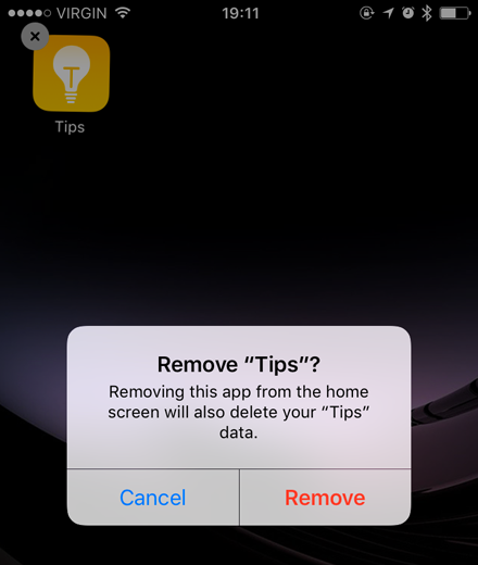
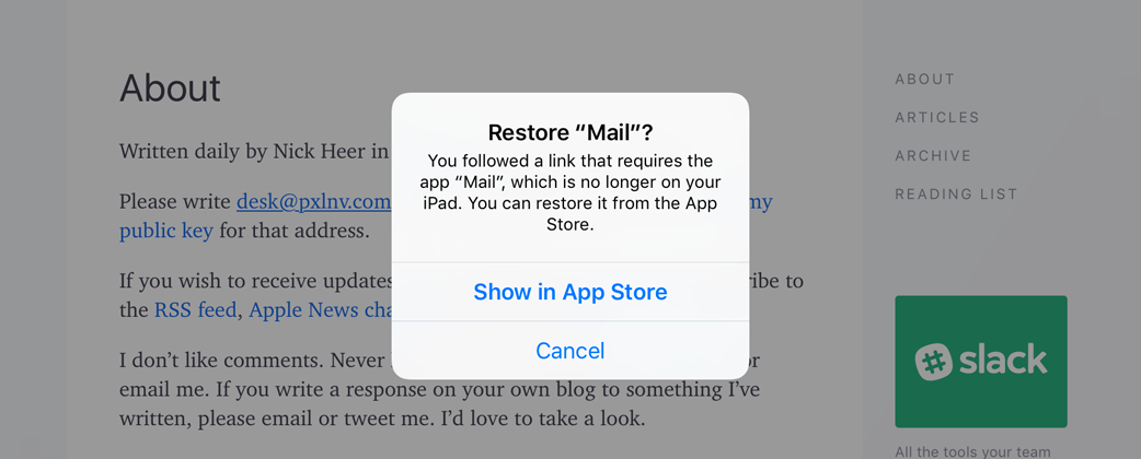
Go away.We don’t really want this folder full of apps we never use on our phones. What we want is to remove them from our phones entirely, never to be seen again. And that’s kind of what you get in iOS 10: just tap and hold on any icon, and you’ll see delete buttons where you’ve never seen them before. Most of the apps you’d expect to be removable are; you can even remove some you might not expect, like Music, Maps, and Mail. As a result of this broad-reaching change, the on/off switch for the iCloud Drive app has been removed as well.
Want to restore an app? That’s pretty easy, too — just open the App Store and search for it.
There are, unfortunately, a couple of caveats that come with this new power. First, it’s important to know that the app isn’t being deleted from your iPhone — it’s simply being removed from the Home screen. This is in large part for security, according to Craig Federighi:
We’re not actually deleting the application binary, and the reason is really pretty two-fold. One, they’re small, but more significantly, the whole iOS security architecture around the system update is this one signed binary, where we can verify the integrity of that with every update.
That also means that even though the default apps appear in the App Store, they won’t get individual updates.
I see this as a limitation due to the way iOS has been built for the past decade, but I don’t necessarily see it always being this way. It would require a large effort to make these core apps independent of the system, but it’s not inconceivable that, one day, updates to these apps might be delivered via the App Store instead of rolling them into monolithic iOS versions.
So if the binary isn’t being removed, what is? Federighi, again:
[When] you remove an app, you’re removing it from the home screen, you’re removing all the user’s data associated from it, you’re moving all of the hooks it has into other system services. Like, Siri will no longer try to use that when you talk and so forth.
In most cases, this works entirely smoothly. If you remove Calculator, for example, it will also be removed from Control Centre. Even if you remove Calendar, it won’t break your ability to add new events or open .ics calendar files.
But if you remove Mail, be prepared to be in for a world of hurt. Mail is the only app permitted to open mailto: links, and no other app can be set to handle those should Mail not be present. When you tap on an email address or an mailto: link, you’ll be prompted to restore Mail; and, because all of its settings are removed when the app is hidden, you’ll have to rebuild your entire email setup. If you have just one email account, you’ll probably be fine, but if you have several, it’s a pain in the ass.
In earlier betas, tapping on a mailto: link would result in a Safari error page. While the shipping solution is slightly better — insomuch as something actually happens when tapping an email link — I wouldn’t consider this resolved by any stretch. Either it should be impossible to remove Mail, or it ought to be possible to select a third-party app to handle mailto: links.
Wallpaper
Bad news, everyone: aside from the blue-green waterfall image we’ve seen in the betas, there are no new wallpapers in iOS 10. In fact, with just fifteen still images included, and the removal of all but one of the “feather” images from iOS 9, and the loss of all but three of the ones added in iOSes 7 and 8, I think the wallpaper selection in iOS 10 might be at its most pitiful since the iPhone’s launch.
Luckily, we can set our own still images as wallpaper, but we have no way to add a custom dynamic wallpaper. And, for the third year in a row, there isn’t a single new dynamic wallpaper in iOS. I’m not sure if it’s something Apple forgot they added back in iOS 7, or if there are simply no new ideas beyond some bouncing circles. There are also no new live wallpapers.
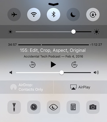
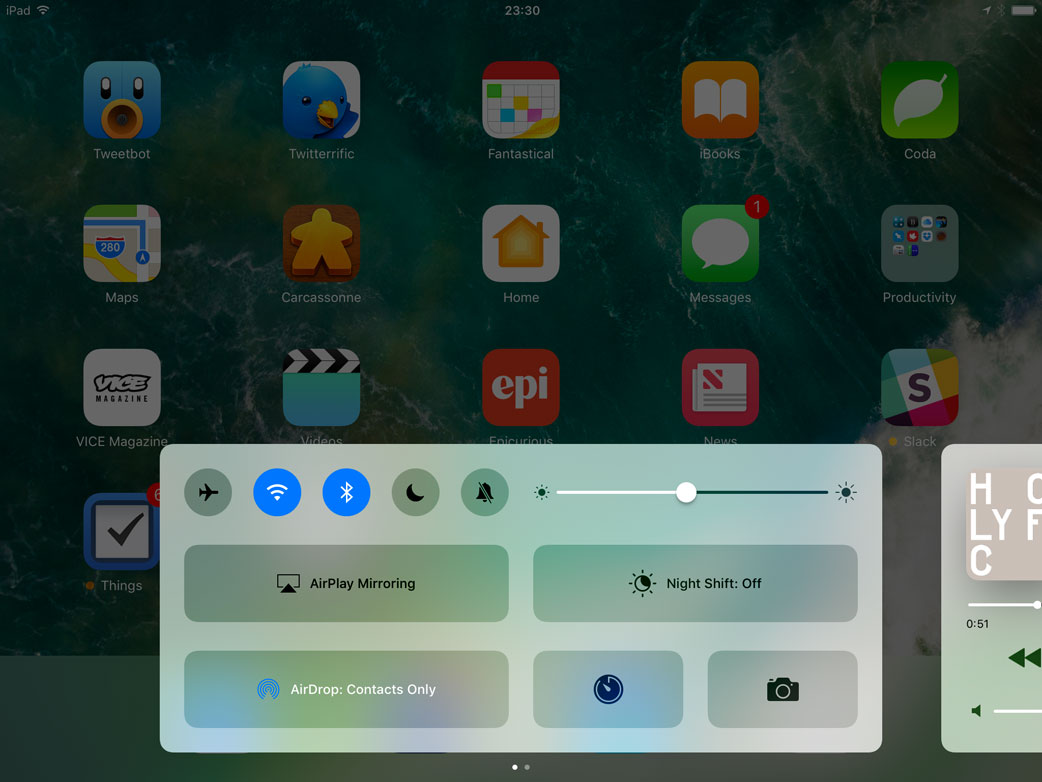
Control Centre
Since its introduction in iOS 7, Control Centre has been a bit of a grab bag of quick-access shortcuts. To sort out all of its functionality, Apple created five groups of related items: toggles for system settings, a screen brightness slider, audio playback controls, AirDrop and AirPlay controls, and lightweight app shortcuts.
But having all of these controls on a single sheet is less than ideal. At a glance, there’s not quite enough space between disparate controls, which means that your thumb can easily tap the wrong thing when looking for a particular button. And that’s without adding new functionality, like a control for Night Shift — the kludgy-looking five-across row at the bottom is a clue that it doesn’t fit into the existing layout — or quick access controls for HomeKit.
Something clearly had to change, and Apple has addressed it in a rather dramatic fashion: a thorough redesign of Control Centre. It’s now split across two “sheets” — three, if you have connected HomeKit devices.
The initial response to the splitting of Control Centre, as I observed on Twitter and in industry press, was, at best, contentious. Adrian Kingsley-Hughes, in a widely-circulated ZDNet article published weeks after the first beta was released:
The iOS 10 Control Center ranks not only as one of the worst user interface designs by Apple, but as one of the worst by any major software developer.
That’s harsh — undeservedly so, I feel. In fact, I’d go so far as to say that the revised Control Centre is one of the smartest and best-considered user interfaces in iOS.
Let’s start with the actual act of splitting it up into multiple pages. As I noted earlier, there’s only so much Apple could do with the existing single-page layout. Since nobody would seriously propose that Control Centre should not gain any new functionality, there are only a few ways for it to be expanded while remaining on a single page: the controls could get smaller, Control Centre could get taller, or the available controls could be customizable.
Making the controls smaller is no good because thumbs aren’t getting any smaller. If anything, some controls — like the track position scrubber — are already far too small for my liking. Making Control Centre taller, meanwhile, isn’t good for usability either, because thumbs aren’t getting any longer.
As for customizing Control Centre, while I’ve heard rumours that it’s being worked on, it clearly hasn’t progressed to a public release yet. It’s a valid solution, but one that also has its own drawbacks and complexities — it could very quickly become a second-level home screen when the doors of customization are opened. That’s not to say it’s not a solvable problem; rather, that the solution hasn’t yet been finalized.
So: extending it over two panels makes sense. And, when you add to the mix the space requirements of several HomeKit devices, having a third page become available makes even more sense.
The beauty of this UI, though, is that it remembers which page you left it on. If you use the music playback controls as frequently as I do, that means you can turn Control Centre into an ever-present remote control for audio, with some additional controls available if, for some reason, you need to toggle WiFi.
Across the bottom of the first page of Control Centre sits a familiar array of quick actions: flashlight, timer, calculator, and camera. The icons in this array now support 3D Touch, so it’s even faster to set a timer, and you can set the flashlight to three different levels of intensity. Unfortunately, it isn’t possible to use 3D Touch on the top row of toggles. It would be helpful, for example, to be able to launch WiFi settings from its toggle, or to have the option to lock the screen in a horizontal orientation on the iPhone.
I think the large buttons for AirPlay and AirDrop are fairly nice. They look like buttons, provide the additional information required by both services in a fairly compact space, but are adequately thumb-sized. However, the gigantic Night Shift button leaves me perplexed. When I first saw it, I assumed that it would be split in half for a True Tone toggle. However, not only does the iPhone 7 not have a True Tone display, the only iOS device with one — the 9.7-inch iPad Pro — doesn’t feature this split toggle. This button is unnecessarily large, and I probably find it particularly grating because Night Shift makes my iPhone look like it has a diseased liver.
Music and News: Back to the Drawing Board
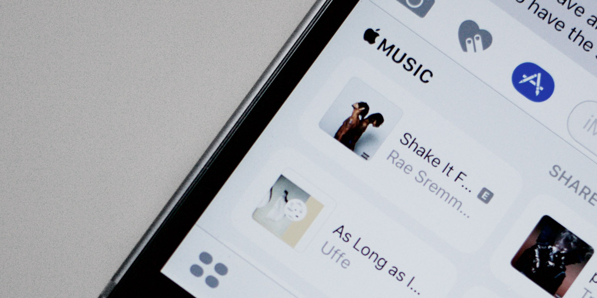
I don’t remember the last time Apple introduced an app in one version of their software, only to radically redesign it just a year later; I certainly can’t think of two instances where that’s happened. But it did, this year, with Music and News.
I’ve always had a funny relationship with the Music app on iOS. In many ways, it has long been one of the finest apps Apple has ever shipped with the platform, featuring prominently in the original iPhone demo and in plenty of ads; but, deep down, there are some baffling design and functionality choices. That imbalance reached something of a high point in iOS 8.4, when Apple Music was added to the mix. Because Apple Music, by design, blurs the delineation between music you own and music you stream, the UI decisions made to add that layer of functionality increased the complexity of Music.
News, meanwhile, was a fine app last year, but it wasn’t particularly imaginative. There was very little distinctive about it; it looked a bit generic, if anything.
Both of these apps have received a complete makeover this year. I’m bundling them together because both of them — and the new HomeKit front-end app called Home — share a common design language unlike anything else on the system. Their UIs are defined by very heavy weights of San Francisco, stark white backgrounds, and big imagery. I read an article just after WWDC — which, regrettably, I cannot find — that described these apps as having “editorial” interfaces, and I think that’s probably the most fitting adjective for this design language.
I’m struggling to understand why it’s being used in these three contexts, though — why in Music, News, and Home, but nowhere else? What do these three apps have in common? Music and News provide personalized recommendations and serve as windows into different media, but Home isn’t akin to either. Home and Music both provide direct control elements, but News doesn’t. If anyone can explain to me why these three apps get the same UI language that’s entirely different from any other app, I’d be happy to hear it.
Incongruity aside, I love the way Music and News look; Home is an app I’ve only seen in screenshots, because every time I try to launch it in my entirely HomeKit-free apartment, it just sits on this screen and spins away:
¯\_(ツ)_/¯
I’ve no idea what’s going on here. I don’t know if there’s simply no timeout, or maybe there is but it’s set to the year 2022, or maybe you’re just not supposed to be an idiot like me and launch Home if you don’t have any HomeKit devices. (This is also why I was unable to comment on the third, Home-centric page of Control Centre.)
That aside, I think this new design language is fantastic. It’s bold and full of character, but not in a way that feels gaudy or overbearing. They feel like glossy interactive magazines, at least on the surface. As you get deeper into each app, the big, bold titles are minimized — secondary and tertiary interfaces look pretty standard compared with the primary screens of each app.
I think it would be interesting if this design language made its way into more apps on iOS. I think Phone, Reminders, and even Mail could take to this style quite well. Of course, there’s the bigger question of how permanent this style is: it appears in one app that’s brand new, and two others that were redesigned within twelve months of their launch. That’s not to say it can’t or won’t last, but its currently limited application makes it perhaps more experimental than other design languages Apple has implemented throughout the system.
Animations
I’ve been an ardent supporter of Apple’s interface design direction over the past few years. Though some critics may bemoan a generally less expressive experience with the iconography and human interface components of many apps, I’ve found that expressiveness to surface in other means — primarily, as it turns out, through motion and animation. From the subtle parallax effects in Weather and Photos to the new super goofy iMessage effects — more on that later — animations have become as much a part of the iOS user interface as are buttons and icons.
Unfortunately, many of the Springboard animations added in iOS 7 felt like they slowed down actually using the system. While they looked great the first few times, waiting for a long and softly-eased animation to complete for every task became, rather quickly, an irritation more than a pleasant experience. This was exacerbated by the inability to cancel any of these animations: if you opened the wrong app or folder on your phone, you had to wait for the “opening” and “closing” animations to play before you could try again. In the grand scheme of things, not the worst UI crime imaginable, but a frustration nonetheless.
In iOS 10, animations have been tweaked throughout the system to feel far faster. In fact, I’d convinced myself that all of the animations actually were faster, until I compared them to an iPhone 5S running iOS 9 and found them to be virtually identical.
But there is one very subtle change that makes a world of difference: it’s now possible to cancel animations before they complete. Tapped on Mail rather than Messages in your dock? Just hit the home button and it instantly responds. It’s the same story for folders, too; but, sadly, not for multitasking or opening Notification Centre.
Other animations still look and feel as slow as they were when iOS 7 debuted, including the icons flying in after unlocking. This animation has always grated on me. It takes about a full second to play; I wish it took about half that time because it makes the system feel much slower than it actually is.
Animations like these are most effective when they imply meaning — a sense of space, or an action. This has long been something that iOS does pretty well. For example, when you tap on a message in the Mail inbox, the whole UI slides to the left to show the message, as though it were laying just to the right of what the screen could contain. This animation is combined with the familiar right carat (›) that’s placed in each cell, completing the spatial relationship between the inbox and each message.
In iOS 7, the rather confusing spatial relationship between Springboard elements was organized into a more straightforward hierarchy. However, some animations and interactions were not fully considered; as a result, this hierarchy did not maintain consistency. The folder animation, in particular, was confusing: tapping on it would hide all of the home screen icons and perform some kind of hyperspace zoom into the folder area.
This has been fixed in iOS 10. Folders now appear to expand and sit overtop the rest of the home screen which, naturally, blurs. This animation feels a lot faster and more logical, while preserving the order of depth established in iOS 7.
The Hidden UI
You may have noticed that many of the most exciting new features I’ve mentioned so far — like additional options in Control Centre, and expanding notifications — make heavy use of 3D Touch. Plenty more of the enhancements that I’ll chat about later do too. In iOS 10, 3D Touch has been upgraded from a curious optional extra to a functional aspect of the system, and there are some complexities that are inherent to such a shift.
Because 3D Touch adds depth to a system that is, by the nature of pixels on a piece of glass, flat, its functionality is not obvious unless you know it’s there first. Paradoxically, the expansion of 3D Touch ought to make it feel much more like an expectation than an option, but there remains a steep learning curve for users to understand that 3D Touch is not necessarily consistent between apps.
3D Touch is also a bit of an anomaly across the iOS lineup. Apple says that they have over a billion iOS devices in use around the world, but only the iPhones 6S and to-be-released 7 support it. They sold a little over 200 million iPhones in the year since the 6S was introduced, which means that a maximum of about 20% of the entire iOS base is able to use those features.
This doesn’t even begin to touch on the questionable UI choices for the iPad. More on that later.
Without 3D Touch, the user experience of a feature like rich notifications really breaks down. Instead of pressing on the notification bubble, it’s necessary to swipe the notification to the left and tap the “View” button that appears, to see its options. Of course, this is a compromise that will scarcely be a memory in a couple of years, about 80% of existing iOS device users will, on launch day, have a less-than-satisfactory experience.
Keyboard
Of all of the images of Steve Jobs onstage at an Apple event, there are few more instantly memorable than this moment at Macworld 2007:
“What’s wrong with their user interfaces? Well, the problem with them is really sort of in the bottom 40 there.”
You might remember Jobs explaining that the keyboards “fixed in plastic” are a core issue with these phones, and that changing to a touch screen would allow for optimized controls for each application.
But one thing he didn’t mention — at least, not explicitly — is that the keyboard itself would see significant changes over the next nine versions of the operating system. From international keyboards and dictation, to the Predictive bar and case switching on the keycaps, the keyboard has come a long way since 2007. But it has always primarily been an explicit, active means of user input.
In iOS 10, the keyboard becomes a little more passive and a lot smarter by way of the QuickType bar. Instead of merely predicting what word you should type next based on what you’ve been typing so far, it now suggests inputs based on contextual prompts.
For example, if a webpage has a field for your email address, QuickType will suggest two of your email addresses. Or, if a friend texts you asking “Where are you?”, the keyboard will prompt you to send your current location.
And the improvements to the QuickType bar just keep getting better: as you’re typing, it can also suggest an appropriate emoji. Type “love” and you’ll see a heart; type “ugh”, and you’ll be prompted to add a straight-faced emoji. Unfortunately, as Apple is a strenuously PG-rated company, typing “shit” will not suggest the “pile of poo” emoji — though “crap” will — and typing “penis” won’t suggest the eggplant.
There are also some improvements to autocorrect. For users who type in multiple languages or mix languages, iOS now automatically handles corrections and suggestions in those other languages on the fly, ostensibly. For the most part, I’m monolingual, but I know a few sentences in other languages. Even after adding those languages as keyboards in Settings, I wasn’t able to get it to autocorrect to those languages if I didn’t manually select those keyboards.
The only time I ever saw a language switch in the QuickType bar without manually selecting another keyboard is when my girlfriend sent me a text reading “Yup yup yup”. QuickType decided that I should reply in what appears to be Turkish. I’ve noticed that these reviews get harder to write when I’m able to explain less about how the system works.
I’m entirely the wrong person to be trying this out; that it didn’t work for me means nothing. Maybe read Ticci’s review — that guy knows what he’s talking about.
3D Touch support has also been enhanced in the keyboard. The trackpad gesture now works far more reliably, and pressing harder on the delete key will erase text at about twice the speed.
Differential Privacy
Apple has long prided itself on standing up for the privacy of its users. They’ve fought the FBI, and have long resisted taking the relatively easy route of uploading all of their users’ data to their own servers to diddle around with in any way they want.
But there comes a time when even they will agree that it’s in the best interests of their users to detect trends, for instance, or enhance certain machine learning qualities.
In iOS 10, Apple is using a fairly esoteric field of study to enhance their machine learning capabilities. It’s called “differential privacy”, and they’re using it beginning only with the keyboard to learn new words.
You’ve probably heard a million explanations of how differential privacy works, so here’s the elevator pitch version, for reference: the keyboard tracks the words that you enter and how Autocorrect responds, and blends all of that with a lot of statistical noise. The data from you and hundreds of millions of other iOS users gets combined and the noise is averaged out, leaving certain trending words behind when they’re used by a significant number of people.
This isn’t a technique invented by Apple, but they’re the first to deploy it at this kind of scale. There are some people who are doubting its success, but there’s no way to tell whether it’s making a meaningful impact on our typing until iOS 10 reaches mass deployment.
Emoji
As part of the iOS 10 update, Apple has redesigned most of the characters in the “Smileys & People” category, along with a bunch of others in several more categories. The redesigned characters look a little more saturated to my eye, and a tiny bit softer. I really like them.
In addition to the redesigned characters, there are also a bunch of new and more diverse emoji that depict women in professions and activities previously represented only by men, as well as more variations for family characters. This is a good step forward — showing police officers, detectives, and swimmers as men while displaying women only as brides and princesses was clearly not representative of reality.
However, unlike on MacOS, there still isn’t a means to search for emoji in iOS 10. The keyboard may provide suggestions while typing, but it’s not the same as search: there’s only one suggestion, which necessitates a more precise guess to find the right emoji. I wish I could swipe down on the emoji keyboard to see a proper search field.
Siri
Before I jump into what’s new in Siri this year, I want to elaborate a little bit on where I see Siri today. To understand the current state of Siri is to understand why there are now APIs available to third parties.
The best place to start, I think, is with Steven Levy’s August profile of Apple’s artificial intelligence and machine learning technologies:
As far as the core [Siri] product is concerned, [Eddy] Cue cites four components of the product: speech recognition (to understand when you talk to it), natural language understanding (to grasp what you’re saying), execution (to fulfill a query or request), and response (to talk back to you). “Machine learning has impacted all of those in hugely significant ways,” he says.
I think it’s critical that we understand all four of these components: how they work on their own, in sequence, and how the unreliability of any component affects Siri as a whole.
So, let’s start with the first: speech recognition. One thing that has become consistently better with Siri’s ongoing development is its ability to clearly and accurately transcribe our speech. Even just a few years ago, it. was. necessary. to. speak. to. Siri. in. a. jolted. manner. William Shatner likely had few problems with Siri, but the rest of us found this frustrating.
In 2014, Apple transitioned Siri from a backend largely reliant upon third parties to one of their own design. The result was a noticeable and, perhaps, dramatic improvement in Siri’s speed and accuracy, to the extent that Apple felt confident enough to add real-time dictation with iOS 8.
But the quality of Siri’s transcription of homonyms and more esoteric words often leaves a lot to be desired, due in part to inconsistencies with the second component cited by Cue: the interpretation of what is being said. Here’s an easily reproducible example that you can try right now: tell Siri “remind me to sew my cardigan tomorrow at noon”. Siri doesn’t understand the context of the word “sew” nor its relationship to the word “cardigan”, so it always — or, at least, every time I’ve tried this — transcribes it as “so”.
Speech recognition and interpretation are, I would argue, two parts of a single “input” step in a given Siri interaction. The next two parts — execution and response — can also be combined into a single “output” step, and I think it has far deeper and more fundamental problems.
Nearly any frustration we have with any computer or any piece of software tends to boil down to a single truth: the output is not what we had expected, based on our input. Whether that’s because we open an app and it crashes, or our email doesn’t refresh on a timely basis, or perhaps because autocorrect inserts the wrong word every ducking time — these are regular irritations because they defy our expectations.
In many ways, Siri is truly amazing, typically answering our requests faster than we could ever type them out. But because Siri can do so much, we experiment, and rightfully expect that similar queries would behave similarly in their response.
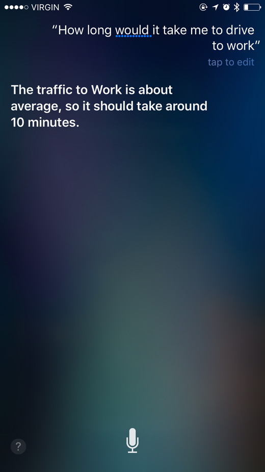
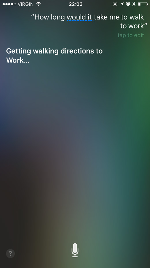
Let’s start with a basic request — for instance, “hey Siri, how long would it take me to drive to work?” As expected, Siri will happily respond with information about the current traffic conditions and the amount of time it will take to get there. Now, change the word “drive” to “walk” in the exact same query, and witness an entirely different result:
These requests are nearly identical, but are treated vastly differently. The driving example works perfectly; the walking example doesn’t answer my question — I’m not looking for directions, I’m asking for a time estimate.
Worse still is when Siri fails to provide an answer to a specific request. Siri is akin to pushing the “I’m Feeling Lucky” button in Google: it ought to be the shortest, straightest line between asking something and getting an answer. If I ask Siri to “find me a recipe for banana bread”, I want a recipe, not a web search that gives me a choice of recipes. If I wanted options, I would have asked for them.
As Siri’s speech recognition and interpretation becomes more reliable, this becomes more of a problem. Based solely on anecdotal observations, I think that users will be more tolerant of an occasional mismatched result than they are of having to interact with Siri, so long as it remains fast and reliable.
With that, I’d like to propose a few guidelines for what a virtual assistant ought to be and do.
Speech recognition and transcription should prioritize context over a direct phonetic interpretation.
Similar commands should perform similarly.
Returning an absolute answer should be the highest priority. A web search should be seen as a last-ditch fallback effort, and every effort should be made to minimize its use. User interaction should, overall, be minimized.
These bullet points are, I’m sure, much more difficult to implement than I’ve made them out to be. Contextualizing a phrase to interpret which words are most likely to be spoken in relation to one another requires a great depth of machine learning, for example; however, I see these guidelines as a baseline for all virtual assistants to behave predictably.
SiriKit and Intents
While Apple is busy working on the fundamental components of Siri, they’ve opened up its capabilities to third-party developers who have been chomping at the bit since Siri was launched in 2011. Much like multitasking in iOS 4, the functionality of SiriKit is limited to unique scopes or domains:
VoIP
Messaging
Payments
Photo search
Workouts
CarPlay
Ride hailing
These individual scopes each have their own “Intents” and vocabulary, and these can be defined by developers. For example, Uber provides different levels of ride hailing service, and they can define those levels for Siri in their app’s metadata; or, a payment service could define different methods of payment. Developers can include shorthand and alternate variants of their app’s terminology within their app’s vocabulary metadata.
All of this stuff sounds like it’s going to be a great way to expand the capabilities of Siri without Apple having to chase down individual partnerships. Unfortunately, these precise app categories tend to be dominated by big players who wouldn’t care to let me test their new apps. I’m looking forward to seeing what I can do with these apps once they’re released into the wild, though, because I have lots of questions.
Maps
The first thing you’ll notice about Maps in iOS 10 is that it’s received a complete makeover. With its bold card-based layout, floating controls, and Proactive suggestions, it now looks like the app Apple has wanted it to be since they dropped Google and went their own way back in iOS 6. It has taken on some of the design cues established in Music and News, though not to the same degree. I find it even easier to use than the old version, though it does retain some of its — uh — charms.
I could do with some waffles and a glass of Prosecco right now.The bigger news in Maps doesn’t come from Apple, though: third-party developers can now integrate their apps directly into Maps’ UI, using Intents and similar code to SiriKit. Only two kinds of Intents are available for Maps integration: ride hailing and restaurant reservations. Third-party restaurant reservation integration is only supported in Maps; Siri has supported OpenTable integration since iOS 6. It’s not a particularly glamorous integration, but it is a useful one. This could be taken one step further by adding an Intent for delivery services as well.
I couldn’t test any of the ride hailing stuff because Uber threw a hissy-fit over Calgary’s requirements that drivers carry proper licensing and that vehicles are inspected, so they don’t offer ride sharing here.
Photos
About a year ago, Benedict Evans posed an intriguing question: about how many photos are being taken today? Given that there are a couple of billion smartphones in the world, it’s probably a lot:
How many more were taken and not shared? Again, there’s no solid data for this (though Apple and Google probably have some). Some image sharing is probably 1:1 for taken:shared (Snapchat, perhaps) but other people on other services will take hundreds and share only a few. So it could be double the number of photos shared or it could be 10x. Meanwhile, estimates of the total number of photos ever taken on film range from 2.5-3.5 trillion. That in turn would suggest that more photos will be taken this year than were taken on film in the entire history of the analogue camera business.
That was last year; this year, there will no doubt be a far greater number of photos taken due to the continued proliferation of smartphones worldwide. We all know this, and we all know how difficult it has become to manage those photos.
A few months before Evans wrote that article on photos, Google tried to combat this problem by introducing Photos, to much critical and public acclaim. Instead of worrying about storing those photos on your device — a worry that will be present so long as companies like Apple continue to include inadequate local storage in their smartphone lineups — Google reasoned that it would make more sense to allow users to stash their photos in a cloud storage system. Not only does this free up local space on the device, it allows photos to benefit from the ridiculous redundancy built into Google’s cloud storage facilities.
To sweeten the deal, Google built software that would analyze the photos as they’re stored in Google Photos. It could identify objects and people within photos, which means that finding that one photo of your dog licking a burger became as quick and easy as a Google search.
By all accounts, Google Photos has been a rousing success; it became quite clear in the intervening year that these kinds of improvements were expected from Apple, too. But this intelligence has long been presumed to require a sacrifice on user privacy — a sacrifice that has seemed unlikely for Apple to make. Om Malik wrote what is perhaps the most cogent explanation of this assumed contradiction for the New Yorker in June 2015:
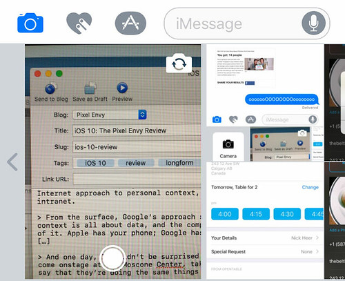
The battle between Google and Apple has shifted from devices, operating systems, and apps to a new, amorphous idea called “contextual computing.” We have become data-spewing factories, and the only way to make sense of it all is through context. Google’s approach to context is using billions of data points in its cloud and matching them to our personal usage of the Google-powered Web; Apple’s approach is to string together personal streams of data on devices, without trying to own any of it. If Google is taking an Internet approach to personal context, then Apple’s way is like an intranet.
From the surface, Google’s approach seems superior. Understanding context is all about data, and the company is collecting a lot more of it. Apple has your phone; Google has access to almost everything. […]
And one day, I wouldn’t be surprised to see an executive from Apple come onstage at the Moscone Center, take a page from its rival, and say that they’re doing the same things with your data that Google is.
That day came, kind of, about a year later, on June 13, 2016. An Apple executive — Craig Federighi, naturally — took the stage at the Bill Graham Auditorium to explain that they‘re not doing the same things with your data that Google is. Apple claimed that they were able to do the same kind of facial and scene recognition on your photos entirely locally.
That sounds pretty compelling: a marriage of privacy and capabilities. All of the power, yet none of the drawbacks. So: has it worked?
Well, there are lots of criteria one could use to judge that. At its core, it’s a simple question of Can you search for objects and see photos you’ve taken of them?, to which the answer is “yes, probably”. But it would be disingenuous and irresponsible of me to view Photos in a vacuum.
While this won’t be a full Apple Photos vs. Google Photos comparison, it seems appropriate to have at least some idea of a benchmark. With that in mind, I uploaded about 1,400 photos that I’d taken through June and July to Google Photos; those same photos also live in my iCloud Photo Library. But, before we get to that, let’s see what Photos has to offer on its own terms.
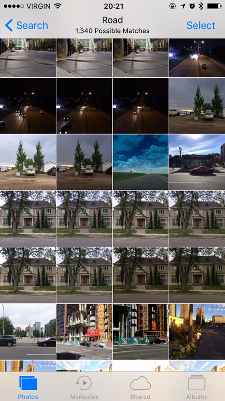
Upon updating to iOS 10, your existing photo library will be analyzed while your iPhone or iPad is plugged in and locked. How long this will take obviously depends on how many photos you have — my library of about 22,000 photos took a few days of overnight analysis to complete. However, new photos taken on an iPhone are analyzed as they make their way into the Camera Roll. Apple says that they make eleven billion calculations on each photo to determine whether there’s a horse in it. For real:
In fact, we do 11 billion computations per photo to be able to detect things like there’s a horse, there’s water, there’s a mountain.
And those calculations have determined that there are, in fact, horses in some of my photos:
Editor’s note: dragonflies are not horses.
There are lots more searches that are possible, too — an article from earlier this year by Kay Yin pegs the total number of scenes and objects that Photos will detect at 4,432. Yin told me in an email that they acquired the list through an analysis of Apple’s private PhotoAnalysis.framework. It includes everything from the obvious — food, museums, and musical instruments, to name a few — to the peculiar and surprising: ungulates, marine museums, and tympans all make an appearance on the list.
Weirdly, though, some searches still return zero results in Photos. You can’t search for photos by type — like screenshot, panorama, or Live Photos — nor can you search by camera brand or model. This information is within pretty much any photo, but is not indexed by Photos for reasons not entirely clear to me. Perhaps very few people will search for photos taken on their Canon DSLR, but it doesn’t make much sense to me to not allow that. It feels like an artificial limitation. The only way to find Live Photos within your library on your iPhone is still to thumb through each photo individually until you see some sense of movement.
For the myriad keywords Photos does support, however, there’s plenty of good news. After it has finished analyzing and indexing the photo library, searches are fast and respectably accurate, but it’s not perfect. In that “horse” screenshot above, you can see a photo of a dragonfly, for instance. A search of my library for “receipts” shows plenty of receipts that were indexed, but also some recipes, a photo of a railway timetable, and a photo of my wristband from when I was in the hospital a couple of years ago. In general, it seems to err in favour of showing too many photos — those that might be, say, a 70-80% match — rather than being too fine-grained and excluding potential matches.
Perhaps my biggest complaint with Photos’ search is that it isn’t available in the media picker. That wasn’t as big a deal in previous versions of iOS, but with the depth and quality of indexing in iOS 10, it would be really nice to be able to search within Messages or in an image picking sheet for a specific photo to send.
Apple’s facial recognition is also quite good, generally speaking. It’s reasonably adept at identifying photos of the same person when the face is somewhat square with the camera, but differences in hair length, glasses, mediocre lighting, and photos with a more sideways profile-like perspective tend to trip it up.
If you’re a completionist about this sort of thing, you’ll likely become frustrated with the most obvious mechanism for dealing with photos misidentified as being from different people. It’s not that it’s hard; it is, however, extremely tedious. To get to it, tap on the Albums tab within Photos, then tap People, then tap Add People. You’ll be presented with a grid of all of the faces identified in your photos.
The thumbnails are sorted in descending order of the number of photos found per face detected. The first few screens of these thumbnails will look fine — 21 instances of a face here, 40-odd there — but as you scroll, the number of photos per face drops precipitously. I got about a quarter of the way through my thumbnails before I started seeing instances of a single photo per detected face. You can add each to your People album, and assign a set of photos to a contact. If you’ve already started collecting photos with a specific contact in them, it will offer to merge any new photos you add to that contact.
Tapping more than one thumbnail in the Add People view will activate the Merge button in the lower-left corner. This allows you to select multiple photos featuring the same face and teach Photos that they are the same person. Unfortunately, it’s still quite laborious to sort through photos one-by-one, in some cases. To make matters worse, thumbnails will sometimes feature the faces of two people, making it difficult to determine which of them is being detected in this instance.
This is a time-consuming way of handling multiple photos from a single person. Despite its utility, I find this view to be frustrating.
Happily, there’s an easier method of teaching Photos which faces belong to which contact. If you tap on one of the faces you’ve already taught Photos about and scroll to the bottom of the screen, past the Details view — more on that later — you’ll see a Confirm Additional Photos option. Tap on it, and you’ll get a well-designed “yes” or “no” way of confirming additional photos of that person. There’s even some really pleasant audio feedback, making it feel a little bit like a game.
Unlike object detection, which seems to err on the side of including too many photos so as to miss as few potential matches as possible, facial detection errs on the side of caution. It may be much pickier about which faces are of the same person, but I haven’t seen a single false-positive. If there is a false-positive, the process for disassociating a photo with it is a bit bizarre: the button for Not This Person is hidden in the Share sheet.
But is all of this stuff as good as Google Photos? I’m not adequately prepared to fully answer that question, but here’s the short version: it seems real close.
I have common praise. Both successfully identified obvious objects within photos most of the time. Both also had the occasional miss — identifying an object incorrectly, and not identifying an object at all. Both struggle with plurals in searches, too: a search for “mushroom” in both apps returns photos I took of a cluster of mushrooms at the base of a tree, but searching “mushrooms” does not.
In this set, Google Photos falsely identified a river as a road, something which Apple’s Photos app didn’t do. We all make mistakes.
Had Apple’s Photos search detected that river as a road, it would have been in this screenshot.I found that both apps were similarly successful at recognizing faces, with a slight edge for Google. However, I’m not sure the pool of photos I uploaded to Google was comprehensive enough for me to figure out how good it was for recognizing a lot of different faces; my iCloud Photo Library has far more images in it with lots more faces. I’d love if someone uploaded an identical batch of tens of thousands of photos to both, and did a more thorough investigation.
My main concern with Apple’s attempt at photo recognition and categorization was that it wouldn’t be anywhere near competitive with Google’s offering. My (admittedly brief) comparison indicates that this simply isn’t the case. Apple’s offering is properly good.
But, perhaps because it’s doing all of the object and facial recognition on the device, locally, it doesn’t sync any of this stuff within iCloud Photo Library. I hope you enjoyed the tedium of assigning names to faces and confirming all which photos contain each of your friends, because you’re going to have to do that for every device that you own. Have fun!
There’s also a rather nice Details view for each photo. You can tap on the Details button in the upper right or, in a completely non-obvious manoeuvre, you can scroll the photo vertically. There, you’ll see a map of where the photo was taken, any people identified within the image, and related Memories.
And I haven’t even mentioned my favourite new feature.
Teddy told me that in Greek, “nostalgia” literally means “the pain from an old wound.” It’s a twinge in your heart far more powerful than memory alone. This device isn’t a spaceship, it’s a time machine. It goes backwards, and forwards… it takes us to a place where we ache to go again.
You’ve probably read that quote in a dozen other reviews and articles about photo-related things, but there’s a good reason for that: photographs are a near-flawless conduit between your eyeballs to your heart. Trite as that excerpt may be, I couldn’t think of a better summary of Memories in iOS 10.
See, the photo analysis that iOS 10 does is not “dumb”; it doesn’t simply leave the data that it collects sitting there for you to comb through. Photos actually tries to do something with the information embedded in all of those images and videos: locations, dates, and — now, in photos — people and objects. It assesses that data looking for anything that might tie certain sets of images together, like those taken within a certain timeframe, or a set of photos from a trip abroad. It automatically groups those photos and videos together into small albums, and creates a short slideshow video from them. That, in a nutshell, is Memories.
I usually take pictures of buildings and empty fields, so my first set of Memories were not particularly inspiring. Don’t get me wrong — the albums were fine, but none were moving or emotional.
And then, one day, Photos surprised me by generating an album of photos of me and my girlfriend over the course of the past year. I guess it figured out that there are a few photos on my phone of us together, and a lot of her, and it put together an album and a video.
Despite all that I know about how automated and mechanized this stuff is, I was and remain deeply touched by the effect.
I’m trying not to sound too sappy here, but, in a way, I want to be extra sappy — I want you to know how powerful this feature can be. Sure, it’s all made by shuffling some bits around and associating whatever data it can find, but when you wake up to find a slideshow of you and your significant other over the past year, it really is pretty powerful.
I can’t confirm this, but Memories seems to prefer edited and liked photos, which makes sense — those are probably the best ones in a given set. It also incorporates Live Photos and video in a really nice way.
If you don’t like the auto-generated video, you can customize it. A theme is assigned by default, but you can pick your own, too, from options like “sentimental” and “dreamy” to “epic” and “extreme, with music and title styles to match. If you don’t like the soundtrack, just tap the adjustment button in the lower-right corner and you can pick from nearly one-hundred provided songs, plus all of the ones in your library. You can also adjust nearly all attributes of the video, including title style and the precise photo selection. But I’ve found that the auto-generated Memories are, generally-speaking, just fine.
The nature of this feature is such that most of the ones that it made for me are quite personal in nature — more on that in a minute. Thankfully, I do take enough photos of buildings and whatnot that it has produced a couple that I feel comfortable sharing. First up is one that was generated entirely automatically:
Here, as they say, is one I made earlier, with a few modifications:
You can imagine that if these were videos of your family or your significant other, they would be much more meaningful. I hope these examples provide you with a sense of what’s possible.
There’s something else unique about Memories, compared to — say — Timehop, or the “On This Day” posts that Facebook dredges up from years past. Because apps like these tend to use primarily public posts, they’re pre-selected based on the kind of image we project of ourselves. But we take far more photos that never get posted for all kinds of reasons.
I have a series of photos from mid-August of a trio of ducks fighting over a fish. I didn’t post them publicly because it’s of little-to-no interest of anyone, I presume, but it reminds me of watching those ducks duke it out on the river. That’s a memory particular to me, and it’s the kind of thing that will one day be served up by Memories.
I will say that I’ve seen it have some problems with facial recognition when cropping portrait-oriented photos to fit within a 16:9 video frame. More than once, the people in the photos have had their heads cut off. Sometimes, it’s only my head visible, instead of the faces of those I’m with; that seems to be the inverse of the most appropriate way to crop an image — who wants to look at themselves?
Regardless, Memories is probably my favourite new feature in iOS 10’s Photos app, and maybe in the entirety of iOS 10. It’s a beautifully-executed and completely effortless high-test nostalgia delivery system.
RAW and Live Photos
iOS 10 unlocks new capabilities for developers as well. Third-party applications can now shoot Live Photos, and encode and decode RAW images. The former capability is fine — I’m happy to have it for those times I want to have a little more control over a Live Photo than the default camera app can provide.
The latter capability, though: oh my. The default camera app doesn’t encode RAW images, but the newest versions of Obscura and Manual can, and they’re totally worth buying just to try RAW shooting on your phone. It’s clear that a lot of detail is obliterated when the photo is processed and compressed as a JPEG; a RAW image is three-to-four times the file size of the same JPEG, and it’s completely lossless. The easiest way to demonstrate the difference is with a simple, unedited comparison of two photos I shot one after another:
Shot as a JPEG, 100% zoom.
Shot as a RAW image, 100% zoom.
In the image shot as a JPEG, the trees become a blocky, gestural mess. The fine lines on the outside of the green building on the left are incomplete and chunky. The whole thing looks a little more like an oil painting than a photograph.
In order to process the RAW for web use, I simply applied Photoshop’s “auto” Camera Raw setting; it may have flattened out the shadows, which is why the roof of the castle-looking building looks darker in the JPEG. But, even with that minimal processing, you can clearly see individual tree branches instead of a blocky mess. The train tracks on the overpass are clearly distinct. You can almost make out the windows on the sandstone school in the distance, in the middle of this crop. Every detail is captured far better.
Of course, the JPEG variant looks far better at the typical size of a photo viewed on Facebook, for example, where these photos typically go. And, naturally, the lack of any processing means that a full spectrum of noise is also captured; it’s not quite fine enough to be considered pleasantly grainy. But for those of us who want some more control over individual attributes, the capability of shooting RAW is extremely exciting. It presents far more flexibility, provided third-party photo editing apps jump on the bandwagon. Snapseed already handles RAW in post; I’ve heard confirmations from the developers of several other apps confirming that they will soon support RAW editing, too.
For an utterly unfair comparison, I shot a similar photo on my DSLR, a Canon XSi with a 12 megapixel sensor — the same rating as the one in my iPhone. Of course, the APS-C sensor in it is far larger and the lens I have on it — the cheap and cheerful 40mm pancake — is much nicer, and has a completely different field of view as my iPhone. Even so:
Shot as a RAW image on my DSLR, 100% zoom.
There’s a long way for the iPhone’s camera to go to become comparable to a professional DSLR — in fact, I’m not sure it ever can compete on that level. But, with RAW shooting capabilities, I see this as one of the single biggest jumps in image quality in the history of the iPhone. It is properly, exceedingly, brilliantly good.
Messages
Like most of you, I can think of few apps I use more on my iPhone than Messages — Safari, Mail, and Tweetbot are the only three that come to mind as contenders. Its popularity is a direct result of its simplicity and versatility, with few apps making text-based conversation as straightforward.
Perhaps because of that simplicity, Messages has seen few updates in its lifetime. iPhone OS 3 brought MMS support, iOS 5 introduced iMessage, and iOS 8 added more messaging types and a better Details view. But the ubiquity and flexibility of applications for Messages means that those improvements effected amongst the most significant changes on the utility of any app on iOS. While Apple hasn’t released their monthly active user count for iMessages, for example, I bet that it’s one of the most popular messaging standards in the world.
But, while you’ve always been able to send text, pictures, and video through iMessage, the experience has always been rather static. Until now.
In iOS 10, you can now send handwritten and Digital Touch messages through iMessage on your iOS device. What was once a niche feature for Apple Watch owners takes very kindly to the larger displays of the iPhone and iPad, allowing you to send Snapchat-like sketches through iMessage. The heartbeat option is even available if an Apple Watch is paired, and you can mark up photos and videos right from the media picker. In some ways, it seems that Apple is still chasing a bit of Snapchat’s unique style of photo-based messaging.
The media picker has, by the way, been completely redesigned. There’s now a tiny camera preview right in the picker, alongside a double row of recent photos. Swiping right on the picker will show buttons to open the camera or show the entire Camera Roll.
This redesign is simultaneously brilliant and confusing. I love the camera preview, and I think the recent photo picker is fine. But the hidden buttons are far too hidden for my liking, and it’s somewhat easy to miss the small arrow that provides a visual clue. Once you find them, they’re easy; but I have, on more than one occasion, forgotten where the button to access the full Camera Roll picker now resides.
But what if you want to communicate in a more textual way? Well, iOS 10 has plenty of new features there. After you type out a message, you can tap on the keyboard switcher icon to replace any words in your message with emoji. Relevant words or phrases will be highlighted in orange, and tapping on the words will either suggest emoji to replace them with, or simply replace the words if only one character seems to fit the phrase. Yet, despite the extent to which I already communicate through emoji, I could never really get the hang of this feature. The QuickType bar provides a good-enough suggestion throughout the OS that I never really got the hang of tapping on the emoji icon after typing the word I intend to replace, but only in Messages. It simply doesn’t match with the way I think when I bash out a text message. Your mileage may vary.
And then there’s the stuff I got a little obsessed with while testing iOS 10 this summer. Apple has added a whole host of weird and wonderful effects for when you send an iMessage. Press on the Send button, and a full-screen sheet will appear with a bunch of available effects. Some message effects display inline, while others will take over the entire screen the first time the message is read. Some are interactive: “Invisible Ink” requires the recipient to touch over the message to reveal it. An effect like “Lasers” turns the whole display into a nightclub, replete with bangin’ choons. What’s more, sending some messages — like “Happy Birthday” or “Congrats!” — will automatically fill the recipient’s screen with balloons.
Imagine the President getting their daily security briefing with these effects.
I make no bones about how much I love these effects. I’ve only been screwing around with them for the past few months with a handful of people, but they bring so much excitement and joy to any conversation that they’re easy to over-use, potentially to the chagrin of anyone else you’re talking to.
If you hate fun, you’ll probably be disappointed that there’s no way to opt out of receiving them, with the exception of switching on the “Reduce Motion” option in Accessibility settings — but that has all sorts of other side effects, too.
I’ve also noticed that these effects don’t regress very well. Users on devices running older versions of iOS or OS X will see the message followed by a second message reading “(sent with Loud Effect)”, or whatever the effect might be.
Messages has also learned some lessons from Slack. Links to webpages now show inline previews if the message was sent from a device running iOS 10 or MacOS Sierra. These previews can be pretty clever, too: a pasted Twitter link will show the whole tweet, the user it’s from, and any attached media; and, for YouTube links, you can actually play the video inline (but, curiously, not for Vimeo links). You can also react to individual messages with one of six different emotions by tapping and holding on a message bubble, a feature Apple calls “Tapback”, or with stickers from apps — more on that in a moment. Messages containing just emoji, up to three, will display much larger. All of these relatively small tweaks combine to produce some of the most welcome improvements to an app we use dozens of times a day.
Curiously enough, Messages in iOS 10 actually loses some functionality as well. In iOS 8, Apple attempted their take on Snapchat. You’ll recall that tapping and sliding on the camera icon would immediately send a disappearing photo or video. There is no longer a way to do that in iOS 10. Not that anyone would notice, of course — as I noted at the time, that feature was often more frustrating than helpful. I don’t know anyone who used that shortcut to send photos. I suspect few will notice its removal.
But I think that everyone will notice that developers can now add to Messages in a really big way.
iMessage Apps and Stickers
For the past few releases of iOS, Apple has rapidly been opening up their first-party apps to third-party developers. From sharing sheets to Safari, extension points now exist throughout iOS to make the system vastly more capable, efficient, and personalized. And now, they’re giving developers perhaps one of the biggest opportunities in years: apps and stickers in Messages.
Stickers are probably easiest to understand because they sound exactly like what they are: packs of images — still or animated — that you can stick to messages in a conversation. If the success of stickers in every other chat app is to be believed, they’re are going to be one of the hottest new features for both users and developers alike.
Actually, even saying “developers” is a misnomer here. Creating a sticker pack does not require writing a single line of code. The only things anyone needs to build a sticker pack are Xcode, correctly-sized artwork for the stickers in common image file formats, and an icon in different sizes, which means that virtually any idiot can make one. And I can tell you that because this idiot, right here, made a sticker pack in about ten minutes, excluding the amount of time I spent fighting with Xcode. It could scarcely be simpler: drag your sticker image assets into one tab of Xcode, drag a bunch of icon sizes into the other, and build. Unfortunately, you do have to subscribe to Apple’s Developer Program in order to test the app on your device; you can’t use a free Apple ID to build a sticker pack just for yourself.
As a result of this simplicity, I think a lot of artists and designers are going to have a field day making all kinds of sticker packs and selling them. Aside from free stickers — plenty of which will be from brands half-assing their marketing efforts — I’m guessing that the one-dollar price point will be the sweet spot for a typical pack.
From a user’s perspective, these stickers will be a fun addition to pretty much any conversation. They can be dropped — with a slick animation — on top of any message, or they can be sent as plain images in the chat. Some users may get frustrated that stickers typically overlap a message, which can make it hard to read. You can tap and hold on any message bubble to temporarily hide stickers and get more information about what stickers were used.
Stickers are a hoot for users and developers alike. But, of course, if you want more functionality, you’re going to have to write some code and put together an app for Messages. Apple says that developers can create all sorts of interactive environments, optimized for short-duration usage: think back-and-forth games, peer-to-peer payments, and the like.
It’s telling that they call these “iMessage Apps”, and not “Apps for Messages” or some variant thereof. While apps that confine themselves to sending just images or links will work fine over SMS, any of the truly cool interactive apps won’t work.
Apple ships two examples with iOS 10: Music and “#images”. The former, of course, lets you share your most recently-played tracks with friends. Instead of having to switch to Music from a conversation and tapping on the Share button, the track is served to you from within the thread. When combined with rich previews for Apple Music links, the app provides a totally seamless experience.
The “#images” app — I will continue to use quotation marks because I cannot stand that name — is a much-needed enhancement for those of us who like to spice up any conversation with various movie and T.V. references. It appears to use the same Bing-powered image search engine as Siri on the Mac, except perhaps more tailored for Messages. That is to say, it seems more GIF-oriented, and it appears to suggest images based on the conversation. There are even two buttons across the top that are pre-populated with likely search terms. Like any Messages app or sticker pack, you can tap on the arrow in the lower-right corner to expand its view, but in “#images” you can also press on any image’s thumbnail to see a full preview.
“#images” has been the bane of my friends’ discussions with me for the past few months. GIFs are way better than emoji, of course, and any opportunity to reply to a message with Homer Simpson starting a bowl of corn flakes on fire really is a tremendous ability. If I’m completely honest, though, I don’t really need every movie reference on the planet; I only need clips from the Simpsons. I do hope a Frinkiac app is on the way.
Unlike other app extensions, apps running in Messages are entirely independent, and don’t require a container app; however, developers can use their existing and new iOS apps, if they so choose.
And, like pretty much every other extension point on the system, there’s no indication of when an app is installed that features a Messages extension. Unlike every other extension point, there’s a switch that allows you to automatically activate any new Messages apps. I think a similar option should be available for other extension types, like keyboards and share sheet items, as the current method of determining whether an app has installed a new extension is, at best, a matter of trial and error.
Apps and sticker packs are installed in Messages similarly, in a pseudo-Springboard sheet that appears in place of the keyboard. It behaves like Springboard, too: you can tap and hold on an icon to change the order of the apps, or tap the x in the corner to remove the extension. There’s even a row of page indicator dots across the bottom; if you install a lot of apps, it doesn’t scale particularly gracefully.
I managed to run up this tally just by downloading all of the iOS 10 updates issued to apps already on my phone. Nearly every app that I updated today included a Messages extension. Imagine what it’s going to be like if you really dive deep into the iMessage App Store.
I’m sure that these apps are going to be insanely popular. Consider, for comparison, the popularity of emoji keyboards like Bitmoji or Kimoji. Perhaps a handful of apps will take over, but I anticipate plenty of users overrunning the page dot capacity. I’m surprised that this is not handled more gracefully.
Music
I wrote at length earlier about the interface design changes in Music and News; here, I want to spend a little more time on how those updates affect the usability of the app.
I want to start with the five tabs across the bottom. To me, their relatively subtle change has radically improved how I use Music. Previously, the tabs in Music were, from left to right: For You, What’s New, Radio, Connect, and Library.
The redesigned version of Music makes a subtle but critical change to its overall usability, simply by adjusting the five tabs that appear across the bottom: Library, For You, Browse, Radio, and Search. The implication of this change is a promotion of Library from the lowest priority item to the highest, where it belongs.
Arguably the most significant improvement to usability directly gained from the adjustments to the tab bar is the promotion of Search. After all, when you’re looking for something — whether in Apple Music or your local library — you probably use search. Its previous placement, in the toolbar across the top, was an awkward place for it, primarily because results ended up in the New tab, for reasons I can’t quite explain. By simply adding a search tab bar item, the usability of Music is far better than it used to be.
Even the rather vaguely-named Browse tab is a boon. The old New tab indicated that you’d only find new releases within; Browse, while more generic, allows Apple to add sub-categories for Curated Playlists, Top Charts, Genres, and the previously-buried Videos feature.
Meanwhile, the Connect features have been moved to the For You tab, and individual artist pages. I don’t know if that will improve its popularity among artists or users; I suspect not.
Within the Library tab, Music loses the weird drop picker that previously allowed you to browse by artists, genres, and so forth. This has been replaced by a simple, straightforward list, and it’s much better for it. There’s very little hunting around in this version of the Music app; most everything is pretty much where you’d expect it.
But, while Apple resolved most of the usability issues of the old app, they created a few new ones as well. “Loving” tracks and playlists — a critical component of the Apple Music experience and the only way to train the For You selection — is now a multi step process. There is no longer a heart button on the lock screen, nor is there one on the playback screen. Instead, you need to unlock your device and tap the ellipsis icon on the playback screen, or beside the item in a list. It’s a little odd to see so much emphasis placed on the ellipsis icon; it’s a metaphor that’s more frequently used on Android.
I love the artwork-as-drop-shadow effect used on this screen.The playback screen is, overall, probably the least-successful element of the redesigned Music app, from a usability perspective. It took me a few days with it before I realized that it was possible to scroll the screen vertically, exposing the shuffle and repeat buttons, adjustable playback queue, and lyrics, when available. There’s simply no visual indicator that it’s possible to scroll this screen. My bug report on this was marked as a duplicate, so I suppose I’m not the only person who feels this way.
There are some holes in other parts of the app as well. There’s still no option to sort albums from an artist by year, otherwise known as “the only acceptable way to sort albums by a single artist”. There’s still no way to filter or search for music by year.
If you want a list of songs from a particular artist, you’ll want to use the Songs menu item to get a giant list of all songs, sorted by artist. There’s no way to do this from within the Artists menu item, which makes no sense to me. If I’m looking for songs by an artist, I’m going to start by looking in Artists; I bet you’d probably do the same.
Aside from the occasional usability bafflement, I’m certain that this version of Music is a much more successful organization of its myriad features. I’ve said many times that my ideal streaming service would feel like a massively extended version of my local library, and Music in iOS 10 comes closest to accomplishing that, even without enabling iCloud Music Library.
So what about some of the new features in the app, like lyrics support and new recommendations in Apple Music? Well, while lyrics are ostensibly supported, I had a hell of a time finding a song where that’s the case. After trying a bunch of different tracks from lots of different genres, I found that lyrics were shown for tracks from Drake’s “Views” album and Kanye West’s “The Life of Pablo“.
Lyrics only display for Apple Music songs, and I do mean only. My purchased-from-iTunes copy of “Views” doesn’t have lyrics, but if I stream the same song from that album on Apple Music, it does.
However, with the notable exception of Kim Mitchell’s truly terrible “Patio Lanterns“, just being able to read the lyrics doesn’t usually communicate the intent or meaning of a song. For that, you need something like Genius — not to be confused with the iTunes feature of the same name. I think it would be more useful if there were some substance behind displaying the lyrics.
While there’s no indication that adjustments have been made to the recommendation algorithms that power For You, there are two playlists that are served up on a weekly basis: the Favourites Mix, refreshed every Wednesday, and the New Releases Mix, refreshed every Friday. Unlike most of the pre-made playlists on Apple Music, these are algorithmically generated, but I’ve found them to be pretty good.
The first New Releases Mix that I got was a decent sampler plate of a bunch of new music that I generally enjoyed. Of the 25 tracks, in the first mix, I’d say that only two or three were misses. From my experience with both Apple Music and Spotify, that success rate compares favourably to the Discover Weekly mix in the latter service. Apple’s mix is, however, focused entirely on new releases a user might like; there doesn’t appear to be an automatically-generated playlist in the vein of Spotify’s.
All told, I think this iteration of Music is markedly more successful than the outgoing one, which grated on me more and more as the year wore on. I haven’t felt that with this version. Though it’s not yet perfect, it’s far better than its predecessor.
Continuity
Universal Clipboard
After launching with a robust set of initial features last year, the overarching concept of Continuity has been updated to support a frequently-requested feature: a universal clipboard.
The idea is simple: copy a piece of text, or an image, or a URL, or whatever on any device you own and have the ability to paste it on a completely different device. Apps like Copied, CloudClip, and Command-C filled in the gap left by the lack of official support for this functionality.
But, now, there is official support for clipboard sync, and it’s pretty good for my very basic uses. Like Handoff, Apple says that the clipboard is encrypted and synced entirely locally over WiFi and Bluetooth; your iCloud account is only used to ensure that it’s you copying or pasting on both devices.
As I said, my use-case for this is extraordinarily simple. Sometimes, I’ll have read something on my iPhone and want to link to it within a post. I can either open a new Safari tab on my iPad or Mac and wade through my iCloud Tabs until I find the right one, or I can just copy it on my iPhone and paste it on my other device. Or, sometimes, I’ll have something copied in a Mac-only app like TextMate that I can paste into an email message on my iPad. It’s pretty cool.
Unfortunately, there’s no visual indication of when an item is available to paste from a different device. I haven’t yet run into an instance where I’ve pasted in the entirely wrong thing from a different device, and the lack of a visual indicator strikes me as very deliberate: Universal Clipboard isn’t something you should have to think about — it “just works”.
Universal Clipboard lacks some of the more power-friendly options of the third-party apps mentioned earlier, like clipboard history and saved snippets, but it does a perfectly cromulent job fulfilling a basic use case for clipboard syncing. It works pretty well for me.
Apple Pay
Apple Pay was only introduced in Canada this June, but I’ve already become accustomed to paying for all kinds of stuff with it. Most payment terminals have supported tap-to-pay for a long time, but Apple Pay is more secure and, from my experience, faster and more reliable.
That it’s come to the web is a good thing; that I no longer have to use PayPal or submit my credit card details to an online store is a very good thing.
None of the places I typically order online from have yet added Apple Pay to their checkout options, so I tried using Stripe’s Apple Pay demo and it seemed to work pretty well.
I’ve dumped this feature into the Continuity section because Apple Pay is also supported in Safari on MacOS Sierra. You just start the purchase on your Mac, and authenticate on your iPhone. Strangely, though, this same cross-device functionality isn’t supported to authenticate an iPad purchase using an iPhone.
iPad
After several years of menial adjustments tailored for the iPad, iOS 9 brought serious systemwide improvements: proper multitasking, keyboard shortcuts, ⌘-Tab application switching, and lots more. iOS 9 was the significant boost the iPad needed, particularly since there are now two iPads named “Pro”. I, perhaps naïvely, thought that this was a renaissance for the iPad — a wakeup call for a platform that should feel like its own experience.
I was wrong. iOS 10 brings very few changes specifically designed for the iPad, and a whole lot of changes that feel like they were scaled-up from the iPhone.
There’s a scaled-up Notification Centre’s Today view that makes for an amazing visual trick in looking both cramped and inefficient with its use of the iPad’s larger display:
Control Centre also looks a bit odd on the iPad’s larger display, featuring gigantic buttons for AirDrop, AirPlay Mirroring, and Night Shift:
Half the space in the second Control Centre tile is occupied by a playback output destination list:
Instead of a list of output devices — something which I doubt most users will be adjusting with enough frequency to merit its equal priority to playback controls — why not show the “What’s Next” queue or additional Apple Music controls?
There are plenty of instances where the iPad simply doesn’t utilize the available screen space effectively. While not every pixel should be filled, shouldn’t playlist descriptions in Apple Music expand to fill the available space?
Shouldn’t I see more than this in my library?
Shouldn’t the timer feel a little more deliberate?
The rotational dial looks so lost on this screen.
Then there are the aspects of the iPad’s interface and features that remain, inexplicably, unchanged. The 12.9-inch iPad Pro retains the 5 × 4 (plus dock) home screen layout of the original iPad. The Slide Over drawer still shows the same large rounded cells around each icon, and its lack of scalability has shown as more apps support Slide Over.
That’s not to say that no new iPad features debuted this year. You can now run two instances of Safari side-by-side on iPads that support multitasking; however, it is the only app where this is possible.
The limitations created by the iPad’s form factor — a finger-based touch screen with a bare minimum of hardware buttons — has required ingenious design solutions for common tasks. Windowing, complex toolbars, and other UI components taken for granted were, and are, either impossible or impractical on the iPad. Similar problems were solved when the iPhone was developed. But, while there’s a good argument for retaining some consistency with the iPhone, the iPad is its own experience, and it should be treated as such.
There’s a glimmer of hope for iPad users: Federico Viticci has heard that more iPad-specific features are “in the pipeline“, presumably for an iOS 10.x release. Their absence from the 10.0 release is, however, noteworthy.
Grab Bag
As ever, in addition to the big headlining updates to iOS, there are a bunch of smaller updates to all sorts of apps. This year, though, there’s a deep-level system update as well.
System
Of all of the enhancements rumoured to be coming to iOS, not one revolved around a new file system. Yet, that’s one of the things that’s coming to iOS 10. It’s not finished yet, and it is projected to arrive as part of a system update next year, but it sounds like a thoroughly modern, fast, and future-friendly file system. I’m nowhere near intelligent enough to fully understand APFS, as it’s called, but Lee Hutchinson of Ars Technica wrote a very good early look at it back in June that you should read.
Phone and Contacts
It’s telling that I’ve buried what is ostensibly the core functionality of a smartphone — that is, being a telephone — all the way down here. We don’t really think of our iPhone as a telephone; it’s more of an always-connected internet box in our pants. But that doesn’t mean that its phone functions can’t be improved.
For those of you who use alternative voice or video calling apps, there’s a new API that allows those apps to present a similar ringing screen as the default phone app. And there’s another API that allows third-party apps to flag incoming phone calls as spam and scams. I don’t get that many unsolicited calls, blessedly, but I hope that apps like these can help get rid of the telemarketing industry once and for all.
The phone app also promises to transcribe voicemails using Siri’s speech-to-text engine. My cellular provider doesn’t support visual voicemail, so I wasn’t able to test this feature.
In addition, Apple says that you can set third-party apps as the primary means of contact for different people.
Mail
Mail has an entirely new look within a message thread, with a conversational view very similar to that of Mail on the Mac. This makes a long conversation much easier to follow, and allows you to take action on individual messages by sliding them to either side.
Additionally, there’s a new button in the bottom-left of message lists to filter which messages are shown. After tapping the filter button, you can tap the “filtered by” text that appears in the middle of the bottom toolbar to select filtering criteria; the default is unread messages across all inboxes.
This filter is similar to the Unread inbox introduced in iOS 9; but, with the ability to define much more stringent criteria, it’s far more powerful. I’ve been using it for the past couple of months to try to tame my unruly inbox with an unread count that keeps spiralling out of control.
Mail also offers to unsubscribe you when it detects a message was sent from a mailing list. That can save a great deal of time hunting through the email to find the unsubscribe link and then, inevitably, being asked to fill out a survey or getting caught in some other UI dark pattern. I used it on a couple of newsletters and it seems to have worked with just a tap.
Safari
Safari now supports “unlimited” tabs, up from 36 in iOS 8, and 24 prior to that. I checked this claim out, and got to 260 open tabs before I got bored. Of course, not all those tabs will be in memory, but they’ll be open for your tab hoarding pleasure. In addition, a long-press on the tab button in the lower-right lets you close all 260 of those tabs at once, should A&E show up with a film crew.
Sharing
Ever since iOS 8 allowed third-party developers to add actions from their apps to the Share sheet, I’ve wanted to see this feature enabled systemwide for pretty much anything I could conceivably share. As you can imagine, I save a lot of links to Pinboard and Instapaper. I also subscribe to a bunch of great newsletters, like NextDraft and CNN’s excellent Reliable Sources. But, while third-party email apps have long allowed you to share the contents of emails using the system Share sheet, the default Mail client hasn’t.
It’s a similar story in Safari: you’ve been limited to sharing just the frontmost tab’s URL using the Share sheet, and no other links on the page.
Previously, touching and holding on a link would pull up a series of options, one of which was to send the link to your Reading List. Now, for those of us who don’t use Safari’s Reading List, there’s a far better option available: touching and holding on any link will display a “Share…” option, which launches the system Share sheet. It’s terrific — truly, one of my favourite details in iOS 10.
App Store
As previewed in the week prior to WWDC, this year’s round of major updates brings with it some changes to the way the App Store works. Most of these changes have trickled out in a limited way this summer, including faster review times, and a beta test of ads in the American App Store. I’m Canadian, so I’m still not seeing ads, and that’s fine with me.
One thing that wasn’t clarified initially was the handling of the new Share feature for every third-party app. At the time, I wrote:
I sincerely hope that’s not just an additional item in every third-party app’s 3D Touch menu, because that will get pretty gross pretty fast.
Well, guess what?
That’s exactly how that feature works.
It isn’t as bad as I was expecting it to be. The Share menu item is always farthest-away from the app icon in the 3D Touch list, and it means that every icon on the home screen is 3D Touch-able, even if the app hasn’t been updated in ages.
For TestFlight apps, the Share item becomes a “Send Beta Feedback” item, which is a truly helpful reminder to do that.
Improvements for Apple Watch
While I won’t be writing a WatchOS 3 review — at least, not for today — there are a couple of noteworthy changes for Apple Watch owners on the iPhone.
There’s a new tab along the bottom of the Watch app for a “Face Gallery”. In this tab, Apple showcases different ways to use each of the built-in faces and how they look with a multitude of options and Complications set. I’m not one to speculate too much, but this appears to set the groundwork for many more faces coming to the Watch. I don’t think just any developer will be able to create faces any time soon, but I wouldn’t be surprised to see more partnerships with fashion and fitness brands on unique faces.
In addition, the Apple Watch has been added to the Find My iPhone app — and, yes, it’s still called “Find My iPhone”, despite finding iPhones being literally one-quarter of its functionality. Your guess is as good as mine.
Settings
With all sorts of systemwide adjustments comes the annual reshuffling of the Settings app. This year, the longstanding combined “Mail, Contacts, Calendars” settings screen has become the separate “Mail”, “Contacts”, and “Calendars” settings screens, as it’s now possible to individually delete any of those apps.
Additionally, Siri has been promoted from being buried “General” to a top-level item, complete with that totally gorgeous new icon. It doesn’t really go with the rest of the icons in Settings, to be fair, but it is awfully pretty.
As Game Centre no longer has a front-end interface, its options have been scaled back to the point of near-pointlessness. There is no longer an option to allow invitations from friends, nor can you enable friend recommendations from Contacts or Facebook. The only option under “Friends Management” is to remove all friends in Game Centre. There is no longer a way to find a list of your Game Centre friends anywhere on iOS or MacOS. Yet, for some reason, the framework lives on. Given these ill-considered omissions, if I were a developer, I wouldn’t necessarily build a new app that’s dependent on it. Just a hunch.
There are a bunch of little tweaks throughout Settings as well. It now warns you if you connect to an insecure WiFi network, and — for some reason — the option to bypass password authentication for free apps has been removed.
Sounds
There may not be any new wallpapers in iOS this year, but a few of the system sounds have been refreshed. Instead of the noise of a padlock clicking shut, the revised lock sound is more reminiscent of a door closing. Perhaps it’s my affinity for the old lock sound, but the new one hasn’t grown on me. It feels comparatively light and thin — more like a screen door than a bank vault.
The new keyboard clicks, however, sound good enough that I kept them on for most of the beta period, and I really hate keyboard noises on smartphones. There’s a subtle difference in the noise between a letter key and a function key — such as shift or the return key — which should help those with reduced vision and those of us who type while walking.
I should say, however, that my dislike of keyboard sounds eventually caught up with me and I switched them back off. It’s a smartphone, not a typewriter.
Conclusion
iOS 10 is a fascinating update to me. Every other version of iOS has had a single defining feature, from the App Store in iPhone OS 2 and multitasking in iOS 4, to the iOS 7 redesign, iOS 8’s inter-app interoperability, and iOS 9’s iPad focus.
iOS 10 seems to buck this trend with its sheer quantity of updates. Developers have been asking for a Siri API for years, and it’s here, albeit in a limited form. The number of developers using the deep integrations in Messages and Maps is already higher than I had anticipated at this stage of iOS 10’s release, and I’m writing this the night before it launches.
Then there are the little things sprinkled throughout the system that I didn’t have time to cover in this review: breaking news notifications and subscriptions in individual News channels, a redesigned back button, CarPlay integrations, and so much more.
I may regularly bemoan individual parts of iOS. There are certain places where I wish Apple had made more progress than they did, but there are also aspects of the system that have been greatly enhanced in ways I’d never have expected. Saying that iOS 10 is the best release of iOS yet is a bit trite — you’d kind of hope the latest version would be, right?
But there’s so much that has gone into this version of iOS that I deeply appreciate. The experience of using it, from when I wake up in the morning to when I go to bed at night — oh, yeah, there’s this great bedtime alarm thing built into the Clock app — that I can’t imagine going back to a previous version of iOS, or to a different platform. It feels like a unified, integrated system across all of my devices. Some people may call this sort of thing “lock-in”, but I like to think of it as a form of customer appreciation.
Whatever the case, I highly recommend updating to iOS 10 as soon as you can. I hope it surprises and delights you the way it did for me the first time someone sent me an iMessage with a goofy effect, or the last time it made a Memories slide show for me. These are little things, and they’re mechanized and automated like crazy, but they feel alive, in a sense. iOS 10 isn’t just the best version of iOS to date; it’s the most human release.
A big thank you to Sam Gross for proof-reading this review, and to Janik Baumgartner for assisting with some iPad verification. Thanks must also go to all the developers who provided beta versions of their apps.