Stu Maschwitz — an actual photographer and filmmaker — tried the new Portrait camera mode on his iPhone 7 Plus and he’s amazed:
So don’t ask if Depth Effect is perfect. A better question is if its failures are distracting. And I have certainly taken some test photos where they are. But the funny thing about test photos is that there’s often nothing worth photographing in them, so you just stare at the problems. In my own testing, whenever I’ve pointed Portrait Mode at something I actually care about, the results have been solid.
That’s a good way of putting it. I still don’t think it’s enough to tempt me into using the bigger model full-time, but the results are very compelling. And, according to Maschwitz, it’s definitely not a simple gaussian blur that gets applied to the background:
To my eye, Apple’s blur is obviously not gaussian, or even gaussian-esque. It’s some kind of sharp-edged circular blur kernel, maybe computed at a lower spatial resolution than the final image, which would account for some of the softness — and the miraculous speed with which the iPhone 7 Plus can do the job.
This seems to have been more-or-less In his TechCrunch article previewing Portrait mode, Matthew Panzarino called it a gaussian blur, but the article was updated with a comment from Apple after publishing:
Once it has these nine slices, it can then pick and choose which layers are sharp and which get a gaussian blur blur effect applied to them. Update: On additional inquiry, Apple clarified for me that it is in fact not gaussian effect but instead a custom disc blur. This is a blur with a more defined, circular shape than gaussian blur. So if you’re one of the few that was hankering to know exactly what kind of blur was applied here, now you know.
I can’t find too much on the web about disc blurring, but this explanation from Matt Pettineo seems pretty good:
Samples of the original color render target are taken along a disc, with the radius of the disc based on the blur factor calculated from the depth texture. This can produce a more realistic bokeh effect, and also opens up the possibility to simulate the bokeh produced by various lens types.
In this context, the disc blur effect is being applied to a 3D render, but Apple’s application of it to photography likely utilizes a similar technique. Very clever, and far more realistic than an ultra-soft gaussian blur.
After publishing our second article about the phenomenon, which is being called “touch disease,” my inbox flooded with stories from people who—many out of blind brand loyalty to Apple—have continued replacing their iPhone 6 Pluses with refurbished units that are just as likely to break as their old ones.
As we’ve detailed in those stories, “touch disease” is an iPhone 6 Plus flaw related to “bendgate” in which the two tiny “Touch IC” connectors, which translate touchscreen presses into a machine input, become unseated from the phone’s logic board. It can be recognized by flickering gray bars along the top of the phone, and is associated with intermittent or total touchscreen failure.
[…]
In the last 24 hours, I’ve gotten emails from 27 separate iPhone 6 Plus owners who have encountered this problem and were unaware that Apple internally considers it a known issue. Many of them have been put through lengthy tech support protocols on obviously broken phones only to be told that they would have to pay $329 for a refurbished phone that is still fundamentally flawed. Others have had to put up with months of forcefully bending or twisting the phone in order to get its Touch IC connectors to intermittently work for a few minutes, hours, or days before the problem inevitably resurfaces.
It seems pretty unfair to expect customers to shell out for a refurbished phone that will exhibit the same issue because of the engineering defect. Moreover, a few of the customers Koebler cites seem to have experienced unhelpful customer service while trying to get the problem resolved. This is something Apple ought to be making right, not making more complicated.
When there was an known engineering defect in my mid-2007 MacBook Pro, I took it in for the out-of-warranty repair program. They didn’t have any of my model’s logic boards in stock, so they replaced it with an upgraded version that had a better video card and faster processor, at no charge. That’s the kind of customer service users who are reporting this problem should be getting: either upgrade them to a 6S Plus which doesn’t exhibit the same issue, or refurbish the 6 Plus in such a way that the ICs are reinforced.
Without diminishing the effort that’s been put into this new standard, I’m not convinced there’s a plausible rationale for it. It would impose significant costs on type designers, provide no obvious advantage to our customers, and mostly benefit a small set of wealthy corporate sponsors.
Butterick has many well-considered objections to packaging different weights of type into a single font file — OpenType Variations, in a nut — but I vehemently disagree with his objections to the OpenType working group’s file size argument. As written by John Hudson, member of the working group:
A variable font is a single binary with greatly-reduced comparable file size and, hence, smaller disc footprint and webfont bandwidth. This means more efficient packaging of embedded fonts, and faster delivery and loading of webfonts.
As far as I’m concerned, this is one of the best arguments in favour of OpenType Variations, though there are significant problems — see Butterick’s article. But Butterick’s refutation of this argument is incredibly flawed, even in its most basic premise:
“But customers benefit from smaller file sizes too, because that makes web pages faster.” Certainly, that was true in 1996. And some web developers persist with politcal objections. But with today’s faster connections — even on mobile — optimizing for file size is less useful than ever.
On the contrary, optimizing for file size continues to be paramount, especially on mobile. This is because most mobile connections – particularly in North America — continue to have a monthly data allotment. It would be impolite to serve, say, an entirely textual thousand-word article as a 4 MB document.1
That is, of course, a problem of today. There is, of course, the possibility that your cellular carrier will suddenly become charitable and allow everyone to use large amounts of data at very low monthly costs, but — if the way ISPs have behaved for the past twenty years is any guide — I foresee an increase in costs to users, not a decrease.
More than that, Butterick refutes his own objections to the working group’s assertion:
For reasons unclear, this claim about network latency has always provoked howls of outrage among the web-dev Twitterati. Folks, let’s work from evidence, not superstition. For example, here’s a quick test I did this week, with home pages ranked in order of load time. As you can see, load time correlates more strongly with number of requests than download size. And Practical Typography beats everyone but the world’s biggest corporation.
I’m seeing the transfer of eleven different font files every time I load a Practical Typography page without caching. Butterick could cut those requests down to just three — one for each typeface used on the page — by using OpenType Variations, and have a faster site as a result.
There are plenty of factors other than raw file size that affect load times, of course: the speed of the host’s connection, what kind of servers they use, the number of requests, the route that the connection takes between host and destination, and more. But optimizing all of these things is absolutely critical if you care about how your site loads if a visitor happens to have one or two bars or a crappy Midtown connection. Even if they have five bars or they’re using a gigabit connection, it’s just polite, especially when a site is little more than text.
I pay $65 per month for 2 GB of data from my cellular provider. Loading this document on my phone would, therefore, cost me about $0.13. Considering that there are all sorts of background processes and other apps requiring my cellular data, it is only responsible for web developers to be cognizant of the amount of data required for each page load, and to try to reduce it wherever possible. ↥︎
Yahoo has blamed state actors for the attack, but it was actually elite hackers-for-hire who did it, according to InfoArmor, which claims to have some of the stolen information.
The independent security firm found the alleged data as part of its investigation into “Group E,” a team of five professional hackers believed to be from Eastern Europe.
It’s currently unclear how reliable InfoArmor’s analysis is:
Vitali Kremez, a cybercrime analyst at Flashpoint, is more skeptical of InfoArmor’s findings. “They might have jumped the gun too early on this,” he said.
He questioned discrepancies between the database that InfoArmor obtained and what Yahoo said was stolen. For example, Yahoo said passwords hashed with the bcrypt algorithm and security questions may have been lifted as part of the breach. The data InfoArmor uncovered only contains passwords hashed with the MD5 algorithm, and no mention of security questions, he said.
Yahoo’s announcement of the leaks only said that “the vast majority” were encrypted with bcrypt. It’s possible that InfoArmor’s subset of data is just the first few million database rows, which would likely be the older accounts — I suspect those would use MD5.
Finally conceding defeat in a battle lost long ago to Apple Inc. and Samsung Electronics Co., BlackBerry is handing over production of the phones to overseas partners and turning its full attention to the more profitable and growing software business. It’s the formalization of a move in the making since Chief Executive Officer John Chen took over nearly three years ago and outsourced some manufacturing to Foxconn Technology Group. Getting the money-losing smartphone business off BlackBerry’s books will also make it easier for the company to consistently hit profitability.
According to their Q1 2017 results — which were released in June because BlackBerry’s fiscal years are bizarre — their revenue in software services increased by $29 million compared to the year-ago quarter, while revenue from hardware sales and service access fees1 declined by $117 million and $146 million, respectively. Reduced manufacturing costs is how another fruit-themed company helped stem its losses, too.
BlackBerry said it struck a licensing agreement with an Indonesian company to make and distribute branded devices. More deals are in the works with Chinese and Indian manufacturers. It will still design smartphone applications and an extra-secure version of Alphabet Inc.’s Android operating system.
BlackBerry phones — and BBM, their proprietary messaging app — are still fairly popular in Indonesia. However, the iPhone is a significant status symbol there, and their middle class is growing (along with a rapid rise in inequality). If those projections remain accurate, the market for BlackBerry will be eaten up by iPhones and Android phones within just a few years. Maybe BlackBerry can make a comeback, but I doubt it.
Update: Three of the best journalists in tech have compiled a short list of reasons why BlackBerry has struggled with its hardware sales these past few years.
Service access fees apply only to older BlackBerry phones, not their BB10 or Android models. ↥︎
Dan Moren, writing for Macworld regarding the new object and face detection features in Photos:
People don’t like to feel that their personal and private photos are being pored over, even if “just” by a machine. But these local silos have, at least at the moment, made the feature less useful, because the analysis happens on each device that the new Photos is on. That means even if all the photos on your iPhone are scanned for faces, when you upgrade your Mac to Sierra, the Photos app there doesn’t benefit from the information on your phone—even if they’re all the same photos.
Not only does that seem remarkably inefficient, but it also runs into possible collisions. For example, I store my pictures in iCloud Photo Library: My MacBook Air running Sierra and my iPhone 7 running iOS 10 both have my entire 23,154 photo library synced. And yet, if I look at the People album in iOS 10, it identifies 12 people; my Mac’s People album has only 11. Moreover, the total numbers of photos for each of those people largely differs between the two. For example, my phone identified 523 pictures of me; my Mac, only 306. Those are some pretty disparate numbers, and a search for photos on one is sure to look substantially different from the other. And if I make changes in one place to add in more photos to a certain person, I’m just going to have to repeat that process on my other devices.
It sounds like to have things work the way you’d want, you would have to re-tag all your photos on each device. And, I guess, forget about doing anything with faces from the Web interface.
Apple has previously stated that identified objects and people won’t sync — at least, not initially — for privacy reasons. I was under the impression that iCloud was extremely private and secure — again, this is what Apple has been saying for a while. Like Tsai, I don’t get how storing photos in iCloud is totally private, but it’s not yet possible to securely keep associated metadata in sync, too.
At WWDC this year, Craig Federighi strongly disagreed with the argument that privacy and cloud features are competing interests. I’m inclined to believe him; I don’t think that privacy must be compromised in order to provide services that are proactive or user-tailored. I hope that my belief isn’t too idealistic, but Apple’s argument gets harder to agree with when rudimentary gaps remain in existing features.
The University of Pennsylvania’s Wharton School reviewed a new book by Cathy O’Neil:
Most of us, unless we’re insurance actuaries or Wall Street quantitative analysts, have only a vague notion of algorithms and how they work. But they actually affect our daily lives by a considerable amount. Algorithms are a set of instructions followed by computers to solve problems. The hidden algorithms of Big Data might connect you with a great music suggestion on Pandora, a job lead on LinkedIn or the love of your life on Match.com.
These mathematical models are supposed to be neutral. But former Wall Street quant Cathy O’Neil, who had an insider’s view of algorithms for years, believes that they are quite the opposite. In her book, Weapons of Math Destruction: How Big Data Increases Inequality and Threatens Democracy, O’Neil says these WMDs are ticking time-bombs that are well-intended but ultimately reinforce harmful stereotypes, especially of the poor and minorities, and become “secret models wielding arbitrary punishments.”
This article is striking for its summary of how dependent we’ve become on opaque algorithms we know very little about. The developers of these applications treat them as proprietary, and resist any sort of public or regulatory scrutiny. The combination of little oversight and wide use is, to put it mildly, quite terrifying. I will absolutely be reading O’Neil’s book.
The spreadsheet can’t be opened “for some reason”?? What sort of error message is that??
[…]
“For some reason.” How this ever got past any sort of quality assurance I cannot imagine. Did the engineer/s assign an out-of-bounds error code to the problem, and the operating system can’t decide what to say and so falls back to “for some reason”?
I got the same error message back in April while opening a Pages file from a shared drive after a reboot. No clue what it meant then, and it was fixed with a restart of Pages so it doesn’t seem to overlap with Arthur’s cause of error. It does seem to be specific to iWork apps, though.
Buzzfeed’s Reggie Ugwu spoke with Zane Lowe, Jimmy Iovine, and Bozoma Saint John about the updates to Apple Music that debuted alongside iOS 10 and MacOS Sierra. The article is pretty light and fluffy, but there’s a noteworthy scoop:
The other big change is the addition of two new personalized playlists: My Favorites Mix and My New Music Mix. The playlists are generated by algorithms, a first for the service, which has largely relied on human curation for its playlists up to this point. Revealing how the mixes operate for the first time to BuzzFeed News, Apple claimed a potential advantage over similar algorithmically personalized playlists, including Spotify’s Discover Weekly and Pandora’s Thumbprint Radio: deep historical knowledge of individual users’ tastes and habits, based on years of data carried over from iTunes.
Anecdotally, the recommendations I’ve received from Spotify have generally been more well-rounded in almost all regards, despite using the service less than I do Apple Music or local playback. I also appreciate Spotify’s large variety of community-created playlists.
But I’d rather pay for just one streaming service, and I’d prefer to use the one that’s integrated into the applications I use most: Music on iOS, and iTunes on my Mac. Unfortunately, as I’ve written before, its recommendations have been lacklustre.
Just now, I opened up Music and tapped the “For You” tab to see what it thinks I should be listening to. For some reason, it’s suggesting Linkin Park and Coheed and Cambria, two artists I’m not fond of. So, I went ahead and tapped the “dislike” button on both. Both albums are still in my recommendations and, presumably, will remain there until For You is refreshed. There appears to be no way to do that manually.
Similarly, I think that the items displayed in “Browse” should be somewhat tailored as well. There’s no reason to suggest the new Luke Bryan record — nothing in my playback history suggests that I would be even remotely interested in that record.
There’s a clear solution to a lot of these issues, and Apple has already implemented it. The two new playlists cited by Buzzfeed are among the most accurate I’ve seen, but there are just two of them, and they’re refreshed weekly. It remains a complete mystery to me why the rest of Apple Music’s recommendation features are not using iTunes playback and rating data, nor the previously-collected Genius data.
Of all the rumoured buyers so far — Google, Microsoft, Salesforce, Facebook, and others — Disney is my preferred option. The others are either institutional (Microsoft and Salesforce) or horrific for privacy (Google and Facebook). Disney is a media company, and that’s rapidly what Twitter is becoming — and, arguably, what Twitter has always been.
Korolova and her student Jun Tang discovered that Apple had lumped in the mention of differential privacy under two different diagnostic sections in iOS 10. With iOS 10, opting in to having diagnostic and usage data sent automatically to app developers means that users are also automatically subjected to data collection using differential privacy. It seems that if a user wants to submit diagnostic data to developers, but not be subject to the collection of this new data, they’re out of luck.
Most of the non-technical people I know will try to get through the long iOS setup process as quickly as they can, and they don’t necessarily read each page in full. Virtually everyone I know has disallowed the submission of diagnostics and usage data and, consequently, opted out of differential privacy features as well.
If differential privacy allows Apple to collect data while keeping it entirely non-specific and unidentifiable, it should be presented as a great way to make every iOS device smarter while keeping information private.
But the entire setup process also ought to be shorter, while allowing users a similar level of control over their privacy and security. Though this may seem paradoxical, I think the critical factor in the unfriendliness of the setup process is the number of pages and options presented. This could be made less intimidating by, for instance, storing as many options and settings as possible in iCloud, and allowing the user to confirm them on a single page during setup. Something like that would go a long way towards making a shorter setup process that asks less of the user, gets them using their device sooner, and maintains their privacy.
Chris began working for Apple in July, but didn’t tell anyone at The Verge that he’d taken a new job until we discovered and verified his dual-employment in early September. Chris continued actively working at The Verge in July, but was not in contact with us through most of August and into September. During that period, in the dark and concerned for Chris, we made every effort to contact him and to offer him help if needed. We ultimately terminated his employment at The Verge and Vox Media the same day we verified that he was employed at Apple.
I have so many questions about this, but I have just one big one: how did nobody notice this? If I didn’t turn up for work for a month, people would notice. People would ask questions. Heck, I would ask questions like How am I maintaining two full-time jobs at the same time? and Why am I trying to maintain two jobs that have a clear conflict of interest for both parties?
I’m sure Patel and the rest of the Verge’s editorial staff are furious about this, but I bet a small part of them is a little bemused by Ziegler’s pluck.
I don’t know what Ziegler is doing at Apple, but he’s not the first journalist they’ve hired over the past couple of years: Anand Lai Shimpi and Chris Breen both left their publications for Apple, and the company has sought more journalists for Apple News, too.
Apple Inc. and Google made tweaks to their popular mobile web browsers recently to enable video content to play automatically in web pages, provided audio is muted.
The changes could result in a boost in mobile video consumption for online publishers if they allow their videos to play automatically, and it could unlock new revenue opportunities as a result.
Looking forward to my cellular carrier finding more revenue opportunities for all of the data this is going to use. Canadians already pay the highest prices for cellular contracts in amongst developed countries. I certainly don’t want to pay for overages when a website like Mic or iMore decides to load an autoplaying video ad somewhere on the page.
I’ve set up a rule in 1Blocker, in the Hide Page Elements package, to block video[~autoplay]. This is broad, but it should prevent autoplaying video elements from loading in Safari.
“We take these things not just seriously, but personally,” said Young Smith in an interview in the atrium of 1 Infinite Loop. “I have been grieved over this … that someone may have had this kind of an experience.”
[…]
“Commensurate actions have been taken,” Young Smith said, noting that disciplinary actions can range from an informal conversation to dismissal. She declined to say what was done in these specific cases, citing privacy concerns.
I certainly hope circumstances like these are not as pervasive at Apple as Mic’s Melanie Ehrenkranz initial report suggested. However, a followup report contains new allegations that are somewhat evocative of that Amazon article from last year. That’s concerning.
The massive 2014 breach disclosed today by Yahoo is just one of three reported hacks from the past four years. As noted previously, there was also a 2012 breach of 200 million accounts, and Emptywheel has pointed to an individual account hacked earlier this year.
There’s something very unsettling about the way tech companies are responding to these big security breaches: none of them informed their users with anything resembling a sense of urgency. Dropbox waited four years to tell users about their 2012 hack, and only did so after lying about why they were resetting users’ passwords. Tumblr waited three years.
And then there’s Yahoo. They didn’t tell users about the breach in 2012, even after Vice’s Joseph Cox asked about it earlier this year. Today, Kara Swisher and Kurt Wagner of Recode have a comment from Verizon — who are currently in the process of acquiring Yahoo — stating that they didn’t know about the 2012 breach until two days ago, and they only discovered the 2014 hack while investigating the one from 2012.
All of these responses are incredibly irresponsible. Nobody should be finding out that their personal details have been floating around underground message boards for years. These breaches ought to have been publicly acknowledged immediately.
Earlier today, Kara Swisher reported that Yahoo would be confirming the breach of 200 million accounts said to have been compromised in 2012. Swisher was, unfortunately, wrong — the breach turns out to have occurred in 2014, and the size of it is unprecedented.
Based on the ongoing investigation, Yahoo believes that information associated with at least 500 million user accounts was stolen and the investigation has found no evidence that the state-sponsored actor is currently in Yahoo’s network. Yahoo is working closely with law enforcement on this matter.
This far eclipses the impact of the previous record-holding breach — a set of nearly 360 million MySpace accounts, ostensibly leaked by the same hacker, “Peace” (PDF), responsible for the 2012 breach.
Also, you read that right: Yahoo is blaming this attack on a “state-sponsored actor”. They haven’t disclosed any more than that, but in a June interview with Wired, Peace claimed to be Russian and working on behalf of a Russian “‘team,’ if you want to call it that”.
Peace is also responsible for the earlier leak of 65 million Tumblr accounts, originating sometime in 2013. It’s unclear whether there’s some overlap between the two data sets, as Yahoo acquired Tumblr that same year.
Update: Clarified the role of Peace in the 2012 attack.
The version of Allo rolling out today will store all non-incognito messages by default — a clear change from Google’s earlier statements that the app would only store messages transiently and in non-identifiable form. The records will now persist until the user actively deletes them, giving Google default access to a full history of conversations in the app. Users can also avoid the logging by using Allo’s Incognito Mode, which is still fully end-to-end encrypted and unchanged from the initial announcement.
[…]
According to Google, the change was made to improve Allo’s smart reply feature, which generates suggested responses to a given conversation. Like most machine learning systems, the smart replies work better with more data. As the Allo team tested those replies, they decided the performance boost from permanently stored messages was worth giving up privacy benefits of transient storage.
Or, to put it another way, Google made their development of Allo easier by making it significantly less friendly to your privacy.
If you’ve skipped here to see how the heck it works, I don’t blame you. The short answer: incredibly, miraculously well in many instances. And pretty rough in others. Apple says this is still in beta and it is. It has trouble with leaves, with chain link fences and patterns and with motion. But it also handles things so well that I never thought possible like fine children’s hair and dog fur, shooting pictures with people facing away and objects that are not people at all.
Panzarino’s test shots look decent, but when Serenity Caldwell posted a side-by-side comparison with a DSLR, it was obvious to me which was which. There is an inherently more natural fallout from the point of focus that can’t be simulated with the nine slices of depth generated by the iPhone’s dual cameras.
But these photos are extremely impressive, especially from a smartphone. It’s a simulation, sure, but a very convincing one when these photos are shared on Instagram or Facebook.
William Wilkinson also posted some tests on Twitter — featuring a cat instead of a baby — that are worth taking a look at. I’d love to give this a try, but I’m not sure it’s enough to convince me to choose the Plus model over the regular iPhone.
Update: According to Jeff Benjamin at 9to5Mac, Portrait mode works with inanimate objects:
I was almost sure that it would be a people-only thing, at least initially, due to the way Apple was wording the feature during its event and in its press materials. As Apple often does, it under-promised and over-delivered; that much is obvious, even in this early beta stage of the game.
That’s impressive.
If you’re part of Apple’s public beta program, you should be getting this update by the end of the week. ↥︎
There is a familiar set of rituals the tech press follows in the weeks after an Apple event. It starts as a keynote happens, with hurriedly-written takes on the lack of surprises, written by someone who kept up with industry rumour blogs leading up to the event. Initial impressions from the hands-on area follow, most of which seem to laud the quality and impressiveness of the products just announced. Then, after one-to-two weeks of mixed takes and boredom, the reviews follow, bringing with them an enthusiastic bout of excitement for the products.
And then, shortly after the first round of product delivery, a mood sets in that I like to call the “Post-Launch Hangover” — a sort of But what have you done for us lately? feeling that takes over the editorial pages of major tech publications.
This isn’t a new phenomenon, of course. Here’s Ben Woods writing for ZDNet a couple of months after WWDC 2012 and about a month before the introduction of the iPhone 5:
While Apple says it has hardware to beat all-comers, I’d argue it doesn’t: it has beautifully designed devices with close to, but not quite, top-of-the-range specs. It’s true, though, that this has been good enough for it to maintain excellent margins on massive volumes of sales and to keep people eager for more.
But to my mind, Apple is in danger of becoming boring.
I’m not sure why Woods hedged his assessment of Apple with an “in danger of” clause. His article is almost entirely about how tired he is of Apple’s hardware in the present, rather than in the future.
Then, in February of 2013, Ashraf Eassa wrote an article for Seeking Alpha about his boredom with Apple:
The point here is that everyone is busy trying new things and really pushing the boundaries while Apple sticks to the tried-and-true formula. While in the short term Apple’s momentum will continue and the profit train won’t suddenly crash, the long-term picture is somewhat grim given that the company derives over 50% of its operating profits from the iPhone.
Dan Nosowitz repeated a similar notion in a 2014 article for Fast Company:
There’s nothing wrong with embracing Apple’s style; It uses fine, sturdy materials which are very functional and very inoffensive. This aesthetic signifies “hip” without alienating anyone; who could possibly object to the style of a MacBook Air? It’s all black and silver and glass. It goes with everything. It is a slim pair of dark jeans. It is fine. But design is a creative field built around evolving ideas, and when it comes to consumer technology, things have become stagnant.
For proof of that, you need look no further than Apple itself. Read any iPhone 6 review, and the design talk paints Apple in the same light as always; Apple design is good. The iPhone is beautiful. But new iPhone designs have typically brought new ideas with it. The iPhone 6 simply adopts the pre-existing design language of the iPads and covers it in ugly antenna lines.
Then, in a January 2015 Engadget article, Aaron Souppouris expressed the same sentiment:
In less than a decade, Apple completely changed the world of personal computing, and the music industry in the process. First came the iPod and the iTunes Store; then the iPhone and App Store; and then the iPad. The Apple of the 2000s was an exciting company to follow. It’s just not that company anymore. Instead, it’s spent the past few years slowly improving its admittedly great cash cows, iterating and iterating and iterating. It’s made cheaper iPhones, bigger iPhones and even gave in and made a phablet. It’s made cheaper iPads, smaller iPads and is apparently planning a bigger iPad. It’s made cheaper MacBooks, smaller MacBooks… you get the point. Its latest project, the Apple Watch, sure looks like a smartwatch, and it might be very successful, but is it doing anything totally unique? Is it really exciting? No.
Should you think that these reactions are limited to the past five years of Tim Cook’s Apple, I humbly submit this turd of a quote from Sébastien Page’s first look at the iPhone 3GS for iDownloadBlog:
I think what I hate the most about the iPhone 3G S is the design which is exactly identical to the iPhone 3G. When I pay $560.16 for a new phone, I expect to have something that looks different from everybody else. Yes, the iPhone is a phone for the elite, I admit it. I kinda miss the days of the first iPhone, when people came to me and candidly asked me “wow, is this the iPhone?”. I was proud of it. Now everyone has an iPhone, and even worse, everyone has an iPhone that looks similar.
So: a long and not particularly proud tradition of tech journalists collectively yawning at the new products that Apple releases.
But most of these writers aren’t really noteworthy. I’m not picking on kids writing in the Verge’s comments section, but none of these contributors are particularly distinguished. For that, one must turn to Farhad Manjoo of the New York Times, shortly after the introduction of the iPhone 7:1
The absence of a jack is far from the worst shortcoming in Apple’s latest product launch. Instead, it’s a symptom of a deeper issue with the new iPhones, part of a problem that afflicts much of the company’s product lineup: Apple’s aesthetics have grown stale.
In an article posted today, John Gruber effectively dismantles this notion piece-by-piece:2
You need to recognize a Porsche 911 as a 911. An iPhone needs to look like an iPhone. The design needs to evolve, not transform. The thing to keep in mind is that the iPhone itself, what it looks like in your hand, is the embodiment of the iPhone brand. There is nothing printed on the front face of an iPhone because there doesn’t need to be. The Apple logo is the company’s logo. The iPhone’s logo is the iPhone itself.
A couple of days ago, Rene Ritchie posted a photo on Instagram of his original iPhone stacked on top of an iPhone 7 Plus. Even if you were to remove the Apple logo from both cases, there is a clear lineage. The iPhone 7 is — again, as Gruber notes — simultaneously new and familiar, and that’s a hell of a feat.
Even Dustin Curtis, a writer and designer whose work I’ve long respected, thinks that Apple’s aesthetics are “stagnating”:
There was a time, not too long ago, when Apple used to test radically new designs all of the time–the iMac used to change almost every year, the iPod changed even more often than that, and though some of those changes were failures (remember the iMac’s swivel screen?), most led to groundbreaking improvements that were eventually adopted by the whole computer industry. The G4 Cube was interesting, if short-lived. The Titanium PowerBook was a statement. But Apple’s recent designs have been much more reserved, much more careful, than designs of the past. I fear they’ve become more boring.
It’s curious that Curtis mentions the TiBook while writing about his exhaustion with Apple’s industrial design team. At the time, it was a radical new design, but Christopher Phin of Macworld compared it to a 15-inch MacBook Pro and they are also, clearly, cousins. Apple’s professional laptops seem to have changed very little in their immediate aesthetics since the TiBook was introduced. But that’s fine.
Apple has long been a company of iterative processes. While the iPod Nano was an ever-changing product, the iPod Classic of 2007 differed little in its overall aesthetic from the model launched in 2001. Similarly, the iPhone has arguably changed its design language just twice from the time it was introduced: to flat edges, with the iPhone 4; and back to curved sides, with the iPhone 6.
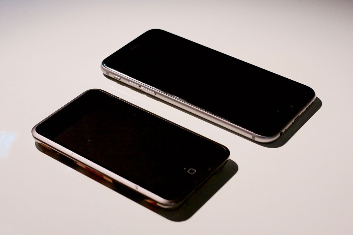
I dug up my first-generation iPod Touch for this photo:
My first-generation iPod Touch meets my iPhone 6S.
Those two products may have been released eight years apart, but they are clearly of the same family. The sameness goes back even further: the original iPhone had solid coloured front and a metal back, like the original iPod, and that aesthetic was brought to the Mac as well.
There are some who will see this as laziness or a lack of creativity, but design is so much more than the way these products look. Apple has become very good at lots of things over the years, but their main innovations in the past few have been in elevating the quality of their high-volume products while trying new ideas on smaller scales.
My iPhone 6S feels like a flattened original iPhone. I’ve previously made known my dislike of the antenna lines and the misaligned camera bump — blessedly fixed in the iPhone 7. But, aside from the size of its display and its thickness, the original iPhone feels noticeably different. It feels like multiple parts, rather than the singular form is seems to be. There are gaps between parts and minor misalignments that would drive today’s Apple absolutely crazy.
My 6S, on the other hand, feels like a continuous shape. The edge of the curved glass meets the rounded edges flawlessly. None of the buttons move in any direction other than inwards. The power button and volume controls all feel the same. The iPhone 7, particularly in the new Jet Black finish, seeks to push this even farther by making the entire phone feel and look like a singular form. And they’re doing this at the scale of tens of millions of iPhones every quarter.
A similar obsession with solidity and uniformity has spread to Apple’s other product lines. The iMac, the MacBook, and the iPad are all designed to feel like the most rigid, solid products you can buy in their respective classes. The little things Apple has been chipping away at — solid-state trackpads, laminated displays, and lower tolerances — add up to make the latest generation of each of their product lines feel less like they were assembled from multiple components, and more as though they were spawned into existence as entirely finished units.
I do understand Curtis’ frustration with the lack of the new, however. One thing you’ll notice is that many of the innovations he cites — from the original iMac to the iPhone 4 — came about as a result of a change in materials. And Apple has, indeed, been working with new and different materials at relatively small scales.
It’s safe to say that no other company understands aluminum as well as Apple due to the scale at which they use it and study it; few others parallel their knowledge of glass, too. But they’ve also used gold, sapphire, Liquidmetal, and — with the new Apple Watch Edition — ceramic. It seems to me that they want to be as rigorous as they can be in their research of new materials, and that often means trying these materials in smaller quantities or with less-impactful applications.
Sapphire, you will recall, was first used for the camera lens cover on the iPhone 5, before making its way onto the home button and Touch ID sensor in the 5S. The 63 was, according to many early rumours, supposed to be fitted with a sapphire display cover, but supplier troubles required a change of plan. This is the risk with using new materials at the scale of the iPhone.
The Apple Watch, on the other hand, is shaping up to be similar to the iPod. The aluminum model is the least expensive, and it’s the material Apple has the most experience working with. Stainless steel is something Apple has worked with less frequently, but they’ve previously used it on the iPhone 4 and 4S and it’s one of the most commonly-used materials in the world.
The Edition, though, is Jony Ive’s playground. The first model was made of high-grade gold alloys, while the Series 2 model is made of ceramic. Both of these materials are new to Apple, and because the Edition sells in such low quantities, there’s plenty of space to try them on a more sedate production line. I don’t know if the next iPhone will be ceramic — in fact, I doubt it will — but their process for making it might yield unique results that are applicable to other product lines.4
But that’s then; this is now, in our Post-Launch Hangover. I have very little idea what the future may hold, but I know what the present holds. And I don’t see anything boring about what I’ve seen this year, nor do I see this as some kind of downfall for Apple’s famed industrial design team. They’re pursuing the same strategy they always have: refine, iterate, repeat. It’s slow, tedious work, but it results in products that are built with unparalleled care and finesse at unprecedented scales. Evolution is slow to see when you’re witnessing it in real-time, but when the iPhone 14 — or whatever — is released, we will almost certainly be able to look back and see that it is a clear descendant from the original iPhone while still looking new. That’s not boring; that’s designing an icon.
I began the article you’re reading right now last night after Tze-Ho Tan sent me a link on Twitter. While I was at work today, Gruber published his excellent piece. It’s merely coincidental that the topics are similar and published on the same day, but I think that offers some light support for my “Post-Launch Hangover” theory. ↥︎
Based on Tim Bajarin’s reporting and the typical iPhone production ramp-up, I believe sapphire displays were more likely targeted for the iPhone 6S, not the 6. I very much doubt that the display material of the iPhone 6 was switched “several weeks” before it was launched. ↥︎
The Mac Pro, explained by Curtis as “the last truly staggering piece of industrial design work that Apple released”, is another lower-volume product with which they can experiment. It utilizes some innovative production techniques, but perhaps none more so than being built in the United States. ↥︎
Transit has always been my favourite public transportation app, and the 4.0 update adds some pretty killer features. Most notably, “GO”:
Using voice and push notifications, GO manages each aspect of your trip so you don’t have to think about…
when to leave
where to get off
or whether you’ll reach your destination in time
It notifies you when you should leave to catch the train or bus, to walk faster if it detects that you’re going to miss your ride, and more. For straightforward daily commutes, this probably won’t be that useful. But for those of us who take public transit everywhere or for unfamiliar cities, this is going to be amazing. If you’re dependent on public transit and you use any app other than Transit, I’m not sure we can be friends.
Update: Jonas Wisser tried the GO feature on an hour-long commute and found that it’s hard on battery life. Keep that in mind when you try it out.