Jony Ive’s redesign of iOS 7 is making the rounds of press, critique, and analysis. Some people are hopped up on the colour palette or icon design in an attempt to understand why this is such a big change despite being instantly familiar as iOS. But I think the reasons run much deeper, through the hierarchy of the operating system. And, as with many things Jony Ive, this can be traced back to Dieter Rams:1
4. Good design makes a product understandable
It clarifies the product’s structure. Better still, it can make the product talk. At best, it is self-explanatory.
6. Good design is unobtrusive
Products fulfilling a purpose are like tools. They are neither decorative objects nor works of art. Their design should therefore be both neutral and restrained, to leave room for the user’s self-expression.
An awful lot of the tech press is fawning over iOS 7’s relationship to Dieter Rams’ sixth principle of good design. The chrome is decidedly less obtrusive and much cleaner. But Rams’ fourth principle is also at play here. The new hierarchy of iOS 7 is clear, especially once it is compared to its predecessor’s. I created the following graphic in an attempt to illustrate how convoluted iOS 6 is:
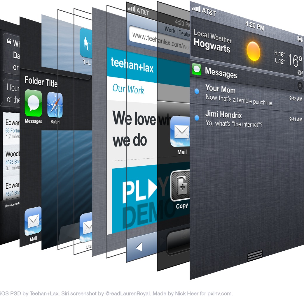
The home screen of iOS is often thought as the base level of the system. But Siri, folders, and the multitasking tray all reside “underneath” the wallpaper. Even the home screen itself is comprised of several layers — the wallpaper on the bottom, followed by pagination dots and the dock surface, with icons resting overtop.
Each application has its own stack, too. Safari’s consists of everyone’s favourite linen texture, followed by the content on top, with window chrome overlaying it. Share sheets and panels float overtop as they are called.
Finally, Notification Center sits atop everything when it is invoked, yet it uses the same linen texture as all of the stuff underneath the wallpaper. It’s a mess.
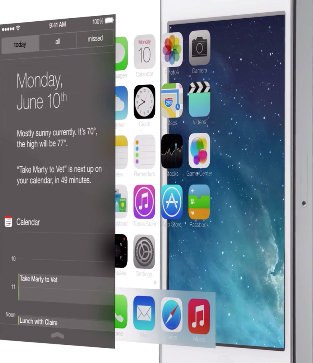
By contrast, the hierarchy of iOS 7 is very simple: everything is on top of the wallpaper. Everything.
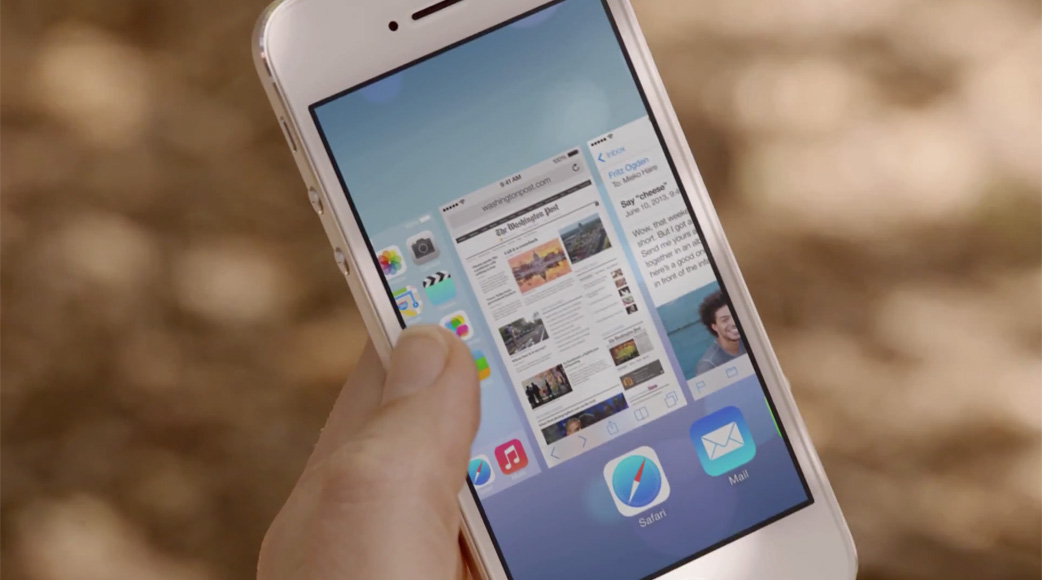
The home screen icons are now treated as their own view. Notice how the home screen is now visible within the multitasking switcher, with a blur as its background; the actual wallpaper remains focused and crisp, as if all applications and the home screen’s icons are hovering overtop. Scrolling too far in Safari no longer shows linen; rather, the wallpaper image is visible again. Open folders now hover above the wallpaper, too.
The stack is brilliantly simple: the wallpaper is on the bottom, with whatever content on top, then the window chrome (what little of it is left), and finally Siri and the Notification and Control Centers slide overtop.
iOS 7’s hierarchy makes the product understandable. True to Rams’ fourth principle, the context and structure are understandable, and help communicate the usability of the system. In many ways, this OS update removes the training wheels, with an expectation that most users are familiar with touch screens. But it is, at the same time, much more obvious for a novice user, and the clear hierarchy makes this possible.
-
This is an excerpt from my copy of Sophie Lovell’s “Dieter Rams: As Little Design as Possible”. The translation from the original German may vary slightly from source to source. ↥︎