There is a familiar set of rituals the tech press follows in the weeks after an Apple event. It starts as a keynote happens, with hurriedly-written takes on the lack of surprises, written by someone who kept up with industry rumour blogs leading up to the event. Initial impressions from the hands-on area follow, most of which seem to laud the quality and impressiveness of the products just announced. Then, after one-to-two weeks of mixed takes and boredom, the reviews follow, bringing with them an enthusiastic bout of excitement for the products.
And then, shortly after the first round of product delivery, a mood sets in that I like to call the “Post-Launch Hangover” — a sort of But what have you done for us lately? feeling that takes over the editorial pages of major tech publications.
This isn’t a new phenomenon, of course. Here’s Ben Woods writing for ZDNet a couple of months after WWDC 2012 and about a month before the introduction of the iPhone 5:
While Apple says it has hardware to beat all-comers, I’d argue it doesn’t: it has beautifully designed devices with close to, but not quite, top-of-the-range specs. It’s true, though, that this has been good enough for it to maintain excellent margins on massive volumes of sales and to keep people eager for more.
But to my mind, Apple is in danger of becoming boring.
I’m not sure why Woods hedged his assessment of Apple with an “in danger of” clause. His article is almost entirely about how tired he is of Apple’s hardware in the present, rather than in the future.
Then, in February of 2013, Ashraf Eassa wrote an article for Seeking Alpha about his boredom with Apple:
The point here is that everyone is busy trying new things and really pushing the boundaries while Apple sticks to the tried-and-true formula. While in the short term Apple’s momentum will continue and the profit train won’t suddenly crash, the long-term picture is somewhat grim given that the company derives over 50% of its operating profits from the iPhone.
Dan Nosowitz repeated a similar notion in a 2014 article for Fast Company:
There’s nothing wrong with embracing Apple’s style; It uses fine, sturdy materials which are very functional and very inoffensive. This aesthetic signifies “hip” without alienating anyone; who could possibly object to the style of a MacBook Air? It’s all black and silver and glass. It goes with everything. It is a slim pair of dark jeans. It is fine. But design is a creative field built around evolving ideas, and when it comes to consumer technology, things have become stagnant.
For proof of that, you need look no further than Apple itself. Read any iPhone 6 review, and the design talk paints Apple in the same light as always; Apple design is good. The iPhone is beautiful. But new iPhone designs have typically brought new ideas with it. The iPhone 6 simply adopts the pre-existing design language of the iPads and covers it in ugly antenna lines.
Then, in a January 2015 Engadget article, Aaron Souppouris expressed the same sentiment:
In less than a decade, Apple completely changed the world of personal computing, and the music industry in the process. First came the iPod and the iTunes Store; then the iPhone and App Store; and then the iPad. The Apple of the 2000s was an exciting company to follow. It’s just not that company anymore. Instead, it’s spent the past few years slowly improving its admittedly great cash cows, iterating and iterating and iterating. It’s made cheaper iPhones, bigger iPhones and even gave in and made a phablet. It’s made cheaper iPads, smaller iPads and is apparently planning a bigger iPad. It’s made cheaper MacBooks, smaller MacBooks… you get the point. Its latest project, the Apple Watch, sure looks like a smartwatch, and it might be very successful, but is it doing anything totally unique? Is it really exciting? No.
Should you think that these reactions are limited to the past five years of Tim Cook’s Apple, I humbly submit this turd of a quote from Sébastien Page’s first look at the iPhone 3GS for iDownloadBlog:
I think what I hate the most about the iPhone 3G S is the design which is exactly identical to the iPhone 3G. When I pay $560.16 for a new phone, I expect to have something that looks different from everybody else. Yes, the iPhone is a phone for the elite, I admit it. I kinda miss the days of the first iPhone, when people came to me and candidly asked me “wow, is this the iPhone?”. I was proud of it. Now everyone has an iPhone, and even worse, everyone has an iPhone that looks similar.
So: a long and not particularly proud tradition of tech journalists collectively yawning at the new products that Apple releases.
But most of these writers aren’t really noteworthy. I’m not picking on kids writing in the Verge’s comments section, but none of these contributors are particularly distinguished. For that, one must turn to Farhad Manjoo of the New York Times, shortly after the introduction of the iPhone 7:1
The absence of a jack is far from the worst shortcoming in Apple’s latest product launch. Instead, it’s a symptom of a deeper issue with the new iPhones, part of a problem that afflicts much of the company’s product lineup: Apple’s aesthetics have grown stale.
In an article posted today, John Gruber effectively dismantles this notion piece-by-piece:2
You need to recognize a Porsche 911 as a 911. An iPhone needs to look like an iPhone. The design needs to evolve, not transform. The thing to keep in mind is that the iPhone itself, what it looks like in your hand, is the embodiment of the iPhone brand. There is nothing printed on the front face of an iPhone because there doesn’t need to be. The Apple logo is the company’s logo. The iPhone’s logo is the iPhone itself.
A couple of days ago, Rene Ritchie posted a photo on Instagram of his original iPhone stacked on top of an iPhone 7 Plus. Even if you were to remove the Apple logo from both cases, there is a clear lineage. The iPhone 7 is — again, as Gruber notes — simultaneously new and familiar, and that’s a hell of a feat.
Even Dustin Curtis, a writer and designer whose work I’ve long respected, thinks that Apple’s aesthetics are “stagnating”:
There was a time, not too long ago, when Apple used to test radically new designs all of the time–the iMac used to change almost every year, the iPod changed even more often than that, and though some of those changes were failures (remember the iMac’s swivel screen?), most led to groundbreaking improvements that were eventually adopted by the whole computer industry. The G4 Cube was interesting, if short-lived. The Titanium PowerBook was a statement. But Apple’s recent designs have been much more reserved, much more careful, than designs of the past. I fear they’ve become more boring.
It’s curious that Curtis mentions the TiBook while writing about his exhaustion with Apple’s industrial design team. At the time, it was a radical new design, but Christopher Phin of Macworld compared it to a 15-inch MacBook Pro and they are also, clearly, cousins. Apple’s professional laptops seem to have changed very little in their immediate aesthetics since the TiBook was introduced. But that’s fine.
Apple has long been a company of iterative processes. While the iPod Nano was an ever-changing product, the iPod Classic of 2007 differed little in its overall aesthetic from the model launched in 2001. Similarly, the iPhone has arguably changed its design language just twice from the time it was introduced: to flat edges, with the iPhone 4; and back to curved sides, with the iPhone 6.
I dug up my first-generation iPod Touch for this photo:
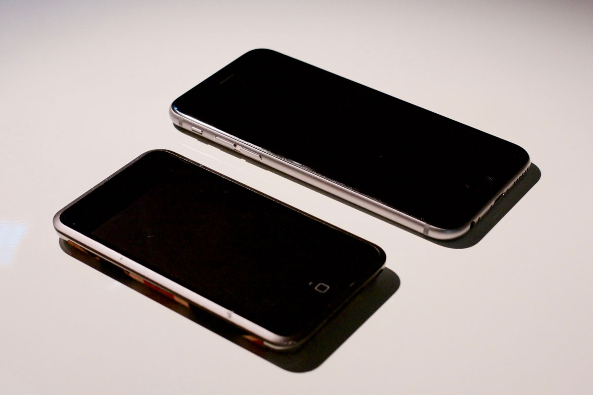
Those two products may have been released eight years apart, but they are clearly of the same family. The sameness goes back even further: the original iPhone had solid coloured front and a metal back, like the original iPod, and that aesthetic was brought to the Mac as well.
There are some who will see this as laziness or a lack of creativity, but design is so much more than the way these products look. Apple has become very good at lots of things over the years, but their main innovations in the past few have been in elevating the quality of their high-volume products while trying new ideas on smaller scales.
My iPhone 6S feels like a flattened original iPhone. I’ve previously made known my dislike of the antenna lines and the misaligned camera bump — blessedly fixed in the iPhone 7. But, aside from the size of its display and its thickness, the original iPhone feels noticeably different. It feels like multiple parts, rather than the singular form is seems to be. There are gaps between parts and minor misalignments that would drive today’s Apple absolutely crazy.
My 6S, on the other hand, feels like a continuous shape. The edge of the curved glass meets the rounded edges flawlessly. None of the buttons move in any direction other than inwards. The power button and volume controls all feel the same. The iPhone 7, particularly in the new Jet Black finish, seeks to push this even farther by making the entire phone feel and look like a singular form. And they’re doing this at the scale of tens of millions of iPhones every quarter.
A similar obsession with solidity and uniformity has spread to Apple’s other product lines. The iMac, the MacBook, and the iPad are all designed to feel like the most rigid, solid products you can buy in their respective classes. The little things Apple has been chipping away at — solid-state trackpads, laminated displays, and lower tolerances — add up to make the latest generation of each of their product lines feel less like they were assembled from multiple components, and more as though they were spawned into existence as entirely finished units.
I do understand Curtis’ frustration with the lack of the new, however. One thing you’ll notice is that many of the innovations he cites — from the original iMac to the iPhone 4 — came about as a result of a change in materials. And Apple has, indeed, been working with new and different materials at relatively small scales.
It’s safe to say that no other company understands aluminum as well as Apple due to the scale at which they use it and study it; few others parallel their knowledge of glass, too. But they’ve also used gold, sapphire, Liquidmetal, and — with the new Apple Watch Edition — ceramic. It seems to me that they want to be as rigorous as they can be in their research of new materials, and that often means trying these materials in smaller quantities or with less-impactful applications.
Sapphire, you will recall, was first used for the camera lens cover on the iPhone 5, before making its way onto the home button and Touch ID sensor in the 5S. The 63 was, according to many early rumours, supposed to be fitted with a sapphire display cover, but supplier troubles required a change of plan. This is the risk with using new materials at the scale of the iPhone.
The Apple Watch, on the other hand, is shaping up to be similar to the iPod. The aluminum model is the least expensive, and it’s the material Apple has the most experience working with. Stainless steel is something Apple has worked with less frequently, but they’ve previously used it on the iPhone 4 and 4S and it’s one of the most commonly-used materials in the world.
The Edition, though, is Jony Ive’s playground. The first model was made of high-grade gold alloys, while the Series 2 model is made of ceramic. Both of these materials are new to Apple, and because the Edition sells in such low quantities, there’s plenty of space to try them on a more sedate production line. I don’t know if the next iPhone will be ceramic — in fact, I doubt it will — but their process for making it might yield unique results that are applicable to other product lines.4
But that’s then; this is now, in our Post-Launch Hangover. I have very little idea what the future may hold, but I know what the present holds. And I don’t see anything boring about what I’ve seen this year, nor do I see this as some kind of downfall for Apple’s famed industrial design team. They’re pursuing the same strategy they always have: refine, iterate, repeat. It’s slow, tedious work, but it results in products that are built with unparalleled care and finesse at unprecedented scales. Evolution is slow to see when you’re witnessing it in real-time, but when the iPhone 14 — or whatever — is released, we will almost certainly be able to look back and see that it is a clear descendant from the original iPhone while still looking new. That’s not boring; that’s designing an icon.
-
I recently read Manjoo’s book, “True Enough: Learning to Live in a Post-Fact Society“. Manjoo may be wrong on the iPhone, but he is no dummy. ↥︎
-
I began the article you’re reading right now last night after Tze-Ho Tan sent me a link on Twitter. While I was at work today, Gruber published his excellent piece. It’s merely coincidental that the topics are similar and published on the same day, but I think that offers some light support for my “Post-Launch Hangover” theory. ↥︎
-
Based on Tim Bajarin’s reporting and the typical iPhone production ramp-up, I believe sapphire displays were more likely targeted for the iPhone 6S, not the 6. I very much doubt that the display material of the iPhone 6 was switched “several weeks” before it was launched. ↥︎
-
The Mac Pro, explained by Curtis as “the last truly staggering piece of industrial design work that Apple released”, is another lower-volume product with which they can experiment. It utilizes some innovative production techniques, but perhaps none more so than being built in the United States. ↥︎