Month: June 2013

Harry Marks responds to Nilay Patel’s silly criticism of Phil Schiller’s “can’t innovate any more, my ass” comment during the WWDC keynote:

The only new web services Apple presented at WWDC were iTunes Radio and a browser-based version of the iWork suite, both of which are beautiful but neither of which particularly disrupts the crowded market they enter.

Only? Knowing Apple’s track record with online products, I’m glad it only demoed two Web-based services. Any more and I would’ve worried it was stretching itself thin, what with that brand new Mac Pro, iOS 7 overhaul, OS X Mavericks, and new MacBook Airs. How much more is expected from one company during a two-hour keynote meant for developers?

Smart takedown of a ridiculous argument. It’s also important to note that while WWDC is a developer-centric conference, the keynote is very public. While the products introduced are largely for developers (at least right now), it was also a public announcement. Apple doesn’t have their head in the sand about the quality of their online services, but it’s really fucking boring to talk about load management at a server farm. WWDC is more than the keynote, too. They’re working on improving this stuff for both developers and end users, but Patel can’t write about that because it’s all under a non-disclosure agreement.

Peter Alguacil:

One could argue that by making the user interface behave as if it is backlit, Apple is treating iOS 7 as a more integral part of the device itself.

This is very clever. If this is indeed part of Apple’s rationale for the new user interface features and aesthetic, I wonder how this will play out in the future. It’s a complete shift in perception, and the possibilities are fascinating.

My own mindless speculation, that is.

Remember this Branch thread from earlier in the year, wherein a bunch of Apple-focused pundits posted some of the tips and whispers they’d heard?

Rene Ritchie:

I’ve heard from several sources that there was/is an event planned for April, new 9.7 inch iPad if it’s ready.

John Gruber:

If we don’t see [a new iPad] in April, I’d guess that it’s late. And if it’s late, I think they’d do a standalone event in May rather than hold it until WWDC in (I presume) June.

I don’t think they would want to unveil the new iPad at WWDC alongside iOS 7, because the new iPad won’t ship with iOS 7.

Redesigning iOS in seven months has been a tall order, and the iPhone-only demonstrations and betas are clear evidence of that. There are only two places where mockups of an iPad running iOS 7 have been shown: in the compatibility chart, and on the iTunes Radio page. Since iPad apps have their own user interface philosophy, components, and styles, it’s reasonable to assume that these are still in progress.

Furthermore, since well-connected pundits heard that an iPad refresh was scheduled for spring, yet it did not occur, it’s reasonable to assume that Apple is still working on it and trying to shoehorn a launch in for later this summer or in the fall. Therefore, it’s reasonable to guess that an iPad event later this summer could also be the first real glimpse into iOS 7 on the iPad.

Update: iPads are also the only non-retina devices supported by iOS 7, and the new user interface — with its use of lighter font weights and thinner graphics — is very much retina-favoured.

Jony Ive’s redesign of iOS 7 is making the rounds of press, critique, and analysis. Some people are hopped up on the colour palette or icon design in an attempt to understand why this is such a big change despite being instantly familiar as iOS. But I think the reasons run much deeper, through the hierarchy of the operating system. And, as with many things Jony Ive, this can be traced back to Dieter Rams:1

4. Good design makes a product understandable

It clarifies the product’s structure. Better still, it can make the product talk. At best, it is self-explanatory.

6. Good design is unobtrusive

Products fulfilling a purpose are like tools. They are neither decorative objects nor works of art. Their design should therefore be both neutral and restrained, to leave room for the user’s self-expression.

An awful lot of the tech press is fawning over iOS 7’s relationship to Dieter Rams’ sixth principle of good design. The chrome is decidedly less obtrusive and much cleaner. But Rams’ fourth principle is also at play here. The new hierarchy of iOS 7 is clear, especially once it is compared to its predecessor’s. I created the following graphic in an attempt to illustrate how convoluted iOS 6 is:

iOS 6 exploded view

The home screen of iOS is often thought as the base level of the system. But Siri, folders, and the multitasking tray all reside “underneath” the wallpaper. Even the home screen itself is comprised of several layers — the wallpaper on the bottom, followed by pagination dots and the dock surface, with icons resting overtop.

Each application has its own stack, too. Safari’s consists of everyone’s favourite linen texture, followed by the content on top, with window chrome overlaying it. Share sheets and panels float overtop as they are called.

Finally, Notification Center sits atop everything when it is invoked, yet it uses the same linen texture as all of the stuff underneath the wallpaper. It’s a mess.

iOS 7 exploded view

By contrast, the hierarchy of iOS 7 is very simple: everything is on top of the wallpaper. Everything.

The home screen icons are now treated as their own view. Notice how the home screen is now visible within the multitasking switcher, with a blur as its background; the actual wallpaper remains focused and crisp, as if all applications and the home screen’s icons are hovering overtop. Scrolling too far in Safari no longer shows linen; rather, the wallpaper image is visible again. Open folders now hover above the wallpaper, too.

The stack is brilliantly simple: the wallpaper is on the bottom, with whatever content on top, then the window chrome (what little of it is left), and finally Siri and the Notification and Control Centers slide overtop.

iOS 7’s hierarchy makes the product understandable. True to Rams’ fourth principle, the context and structure are understandable, and help communicate the usability of the system. In many ways, this OS update removes the training wheels, with an expectation that most users are familiar with touch screens. But it is, at the same time, much more obvious for a novice user, and the clear hierarchy makes this possible.


  1. This is an excerpt from my copy of Sophie Lovell’s “Dieter Rams: As Little Design as Possible”. The translation from the original German may vary slightly from source to source. ↥︎

Possibly the most disappointing part of the keynote for me. My hope was that the lengthy contractual negotiations were because Apple wished to launch in all of the countries in which iTunes already exists; it’s clear that this wasn’t the case. But Apple is miles ahead of their nearest rivals in bringing music services to the world. Rdio is available in 18 countries, while Spotify is in around 20. But Pandora, Amazon, and all Google music services are only available in the US. iTunes, on the other hand, is live for almost all services in around 100 countries.

Hyper-nerdy goodness brought to you by Ars Technica’s Nate Anderson:

The overarching goal of the power efficiency changes is of course longer battery life, but Apple claims that it can acheive this without harming “and in some cases even improving” overall system responsiveness. Three main technologies make this possible.

Clever stuff.

Craig Hockenberry, with a late entry to my round-up of really smart opinions on iOS 7:

But with major user interface changes such as Aqua or iOS 7, Apple has another tendency: they overshoot the mark. Their incremental approach then becomes one where unnecessary items are removed (such as Aqua’s stripes) or improved (excessive shadows and transparency are toned down.)

There’s a good reason for this: it’s much easier to take away elements from a design than it is to add them. Simplicity is achieved by removing that which is not really needed.

iOS 7 is a huge change. With such a change comes the inevitable bevy of articles critiquing, interpreting, and explaining it.

Federico Viticci wants you to think in a broader scope:

The motivation has changed: Apple isn’t asking how they can create a mobile OS that takes the user by the hand; they want to make iOS more delightful and simple without giving up on raw power and advanced technology. And for iOS 7, they have decided to bet on content and functionality instead of ornaments. This is a profound change with consequences that go beyond “how icons look”.

John Gruber thinks that iOS 7 feels like it has become part of the hardware:

There’s a sense of place, depth, and spatiality in iOS 7 that makes it feel like hardware. A real thing, not pixels rendered on glass. It’s as though Ive has brought the same design goals that have always informed Apple’s hardware to software. And here, his team isn’t limited by physics. Planes can have zero thickness. But it’s a system, in the truest sense of the word.

Kelsey Campbell-Dollaghan really likes the parallax effect:

The biggest—and perhaps most elegant—element of the new system is its responsivity. For example, iOS 7 uses the accelerometer to adapt the screen in parallax, achieving those new sorts of depth Ive mentioned. And using the phone’s light meter, it seems that the new icons and background adapt to the lighting to improve readability automatically—a bit like the previous iOS’ ability to adapt screen brightness to environmental conditions.

Frank Chimero wants you to be more patient:

It’s worth remembering that Ive took over Human Interface only 7 months ago, and they redesigned the whole phone in that time. Straight up: seven months is a ridiculous deadline.

Stephen Hackett doesn’t think that this redesign was really all that big, in the wider scope:

However, once we can all zoom out a little bit, I think iOS 7 will be seen as an evolutionary change. A big one, perhaps, but one that shouldn’t be seen as all that surprising.

Joshua Topolsky has written a diatribe which is partly comprised of smart observations, and partly padded with silly complaints:

The Control Center, a new option which can be summoned with a quick swipe up from the bottom of the screen, is actually a great idea but its design and organization of items is bizarre. It is an odd, jarring collection of functions. Toggles for oft-used controls, a brightness bar, a music player? AirDrop accessibility? A flashlight app? The clock? It feels like for lack of a better location Apple lumped all the other stuff into a single, messy space that floats above your onscreen content, making the already busy utility a visual strain.

The top row is toggles, below that is a brightness control, below that are music controls, then Air-branded sharing options, then quick access to common functions. Think of it as a quick way to tweak frequently-accessed things. This isn’t difficult.

As I mentioned, Topolsky does have a few smart critiques in his post. But, as with many editorials on The Verge these days, it is padded with click-inducing SEO-enhancing goodness.

Harry Marks thinks that you’re complaining too much:

A popular podcaster and writer once claimed “nothing is so perfect it cannot be complained about” and in saying that, did readers and listeners a disservice. He instilled in them a belief that all opinions are valuable, but the Internet has proven that is simply untrue. Additionally, the feeling that something must be complained about in order to be understood is a terrible way to live. There is no happiness in nitpicking something to the point where it’s no longer enjoyable. When nothing is “good enough”, nothing is good.

There’s a lot to unpack in iOS 7. With an over-the-air update — iPhone 4, iPad 2, and everything more recent — combined with fast user uptake, it’s set to be the most popular mobile OS this fall. It needs to be great, and Apple is laying the groundwork for just that.

I defer to my own commentary from yesterday:

But all of these features are simply ways of representing the mantra with which they opened the keynote. Everything is about design, and therefore about functionality. Apple ditched the leather in Calendar partly because it’s aesthetically challenged, but because of a broader reason than that: it isn’t helpful to the end user. This philosophy has long beeen a part of Apple’s design process, but it has ascended to new importance with Jony Ive’s rising role at the company.

This is the Tim Cook Apple.

Craig Grannell (via Harry Marks):

I know you probably just sat through the WWDC 2013 keynote crying your eyes out at the lack of a new iPad mini with Retina display or an iPhone 6, despite the fact Apple was never going to announce one today. Because you’re now barely able to see your monitor through the tears, I thought I’d help you out.

I bet BGR would find this helpful.

Apple’s biggest days are bigger than anyone else’s biggest days, or so it would seem. There was a noticeable fanfare, panache, and rapid-fire pace underneath their two-hour marathon of an opening keynote at WWDC 2013. But, contrary to several previous WWDCs, it didn’t begin with a comedic sketch — in 2012, it was Siri doing standup comedy, and in previous years, it opened with a special ad in the Mac & PC lineage.

This year, it was different. The keynote kicked off with a brief kinetic typographic representation of a mantra. It was an explaination of the underlying principles of the famous “designed by Apple in California” wordmark, but it set the stage for an event with every presenter firing on all cylinders. It was a simple way for Apple to try to explain their philosophy to the stock traders and tech journalists who demand constant iteration, change, and variety.

Tim Cook started off, as you’d expect, by reading out the numbers. These figures betray the vast scale at which Apple operates, and every year the numbers are harder to grasp. Nearly a million applications on the App Store, paying a combined $10 billion to developers from 575 million accounts with credit cards. Massive.

Then, something strange. It has become traditional for Apple to give time to individual developers during the very public WWDC keynote. This year, they kicked off with a brand new company which launched effectively during the keynote and with Tim Cook’s endorsement. Bizarre.

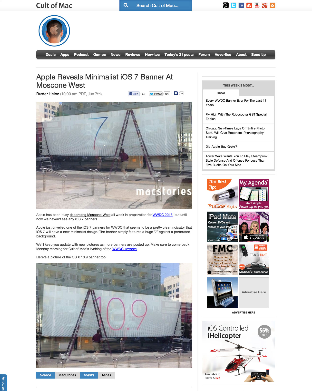
Then to the meat; OS X “Mavericks”. They’ve finally run out of cats, and are instead naming their OS releases after places around California.1 Of note, Apple seems to refer to Mavericks almost nowhere as 10.9, or a derivative thereof. It is entirely versionless, aside from in the fine print. The upgrade is modest, at least on the surface. Some iOS features have, perhaps inevitably, made their way into OS X, including the iBooks and Maps applications. And, yes, Apple has ditched the leather in Calendar. There’s some great stuff under the hood, too. The system apparently better organizes how it uses CPU time and memory to optimize for battery life. Clever.

But all of these features are simply ways of representing the mantra with which they opened the keynote. Everything is about design, and therefore about functionality. Apple ditched the leather in Calendar partly because it’s aesthetically challenged, but because of a broader reason than that: it isn’t helpful to the end user. This philosophy has long beeen a part of Apple’s design process, but it has ascended to new importance with Jony Ive’s rising role at the company.

This philosophy is also obvious in the update everyone was waiting and watching for. Apple claims that iOS 7 is the “most significant iOS update since the original iPhone”, and it’s hard to disagree. Every application has been changed and modified to suit this newly-focused Apple aesthetic of simplicity and lightness. Per Jony Ive in the introduction video:

True simplicity is derived from so much more than just the absence of clutter and ornamentation. It’s about bringing order to complexity.

Ive explains that the interface design team created a structure and mathematical methodology to the interface. A new grid structure was created for everything from the icons to the typography which should, in Ive’s words, make individual elements more “harmonious”.

iOS 7 three up

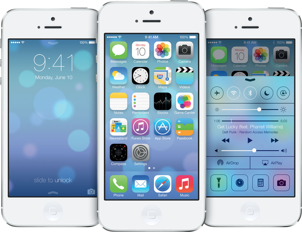
The updated iconography is one of the updates which I feel is less successful in some ways than the outgoing interpretation. The grid system has produced icons which, oddly enough, look imbalanced near each other. The edges are more rounded with larger glyphs, making some of the icons feel more cluttered, like a cluster of balloons. Some interpretations, such as the Photos, Music, and Weather, are very successful and downright beautiful. Others feel less so, such as Safari, Newsstand, and both of the stores. Mail, for example, looks a little like someone at Apple discovered the web 2.0 Photoshop gradient pack. But focusing on just the icons to determine whether Apple is still the king of visual design is a bit like looking only at one dish on a restaurant’s menu to see if they’re reputable.

The rest of the system shows significant improvements. Traditional ways of showing visual depth have been eschewed in favour of background blurring on overlays. Panels and toolbars now look like a smear of Vaseline across the device — a truly clever way of showing context clearly to the user. Throughout the OS, the interface effectively disappears to elevate any given application’s content to the forefront. The combination of blurred backgrounds with simpler icons removes the nonessentials of the interface, but don’t make the mistake of thinking this is easier for Apple to design. It’s minimalist and is, to my eyes, superior on aesthetic and functional levels.

WWDC wasn’t just about software releases, or hardware releases and previews for that matter. It was an opportunity for Apple to remind us of the vision they have as a company, and how they differ from their competitors. To emphasize the latter, Schiller and Federighi took turns zinging their rivals.2 The overarching narrative was clear: Apple’s not slowing down. They’re at the top of their game, and they aim to stay there.


  1. I can’t wait for OS X Compton. ↥︎

  2. “You just tap to share, and you don’t need to wander around, ‘bumping’ your phone”, and the crowd favourite “can’t innovate any more, my ass”. ↥︎

Gruber:

The training wheels can now come off. That’s what I think Apple’s going to do tomorrow.

This has been the quietest six months in post-iPod Apple history. Exciting.

Glenn Greenwald reveals the man behind three of the biggest intelligence leaks in American history:

Three weeks ago, [Edward] Snowden made final preparations that resulted in last week’s series of blockbuster news stories. At the NSA office in Hawaii where he was working, he copied the last set of documents he intended to disclose.

He then advised his NSA supervisor that he needed to be away from work for “a couple of weeks” in order to receive treatment for epilepsy, a condition he learned he suffers from after a series of seizures last year.

As he packed his bags, he told his girlfriend that he had to be away for a few weeks, though he said he was vague about the reason. “That is not an uncommon occurrence for someone who has spent the last decade working in the intelligence world.”

On May 20, he boarded a flight to Hong Kong, where he has remained ever since.

Greenwald has also published a Q&A with Snowden.

Ed Bott for ZD Net in a smart piece about the journalistic failings of the Washington Post about the PRISM story:

The biggest problem was that the Post took a leaked PowerPoint presentation from a single anonymous source and leaped to conclusions without supporting evidence. McCullagh quotes one of his named (not anonymous) sources, former general counsel of the NSA Stewart Baker, as saying the slides look “flaky”:

“The PowerPoint is suffused with a kind of hype that makes it sound more like a marketing pitch than a briefing — we don’t know what its provenance is and we don’t know the full context,” Baker said. He added, referring to the Post’s coverage: “It looks rushed and it looks wrong.”

“Rushed” would indeed be the best way to describe why the Post story changed so dramatically in a 24-hour period. Normally, an investigative piece like this would be reported thoroughly before being published. Instead, it looks like the Post rushed to publish, perhaps fearing that the slide deck had been leaked to another publication that would beat them to the punch.

It has become clear that massive scoops like this are going increasingly unchecked for fear that the publication will miss the ability to break the news.

Sean Gordon, the Globe and Mail:

The contract between Montreal’s current race promoter, François Dumontier, and Ecclestone runs out in 2014, and while talks have been ongoing for more than a year to extend that contract for another decade, progress has been painstaking.

There is still ample time to reach a deal – the 2015 F1 calendar won’t come out until the fall of next year – but the longer the negotiations drag on, the more the uncertainty will build.

The Canadian Grand Prix is perennially one of the greatest races on the calendar. It doesn’t have the prestige of Monaco, nor the financial exuberance of Abu Dhabi, nor the incredible history of Silverstone or Spa. But what it does have is one of the most deceptively wonderful tracks in the world, paired with an excited crowd and unpredictable weather. Its discontinuation would be a significant loss; 2009 was a notably crappier season as a result.

But it’s 2013, and the race is on for this Sunday. The forecast for Montreal calls for a high chance of rain, which is good news for spectators. It’s going to be an exciting race.