It’s incredible just how much of a feature regression Pages experienced in the ’09-to-’13 update, going from an easy-to-use page layout machine to a barely-cutting-it word processor. It still doesn’t support page numbering on alternating sides, full OpenType features, or a useful contextual menu.
Jon Bois, writing for SB Nation,1 shares some of his stories from his employment at the legendary prototypical American electronics retailer:
Most folks who have worked in retail are probably familiar with this. Once every couple months, we’d have to stay after hours and count inventory. The store computer would print out a novel of every single item we were supposed to have in stock, from TVs to transistors to batteries, and then we’d have to root through the entire store and make sure we had all of it.
This could mean staying until midnight on a good inventory, or staying until five in the morning, depending on how obsessive my manager happened to be. RadioShack could very easily have scheduled these regularly and in advance, as a courtesy to its employees, but RadioShack is a craven and unfeeling entity that issued what I can only describe as open contempt of those they employed. The higher-ups preferred to spring them on us with maybe a day’s notice.
That is a major violation of labor laws, but they didn’t care. Sometimes they’d call an hour before the store closed to let us know we were staying there until two in the morning. We could comply or be fired.
Great piece. Altogether unsurprising, too. Every time I went into a RadioShack, I felt overwhelmed by how cheap and nasty everything felt. Not compared to Apple; compared to the dashboard of a mid-’80s Chevrolet. It’s almost as if they genuinely wanted people to feel like they couldn’t buy anything more downmarket.
I once bought a quarter-inch-to-eighth-inch audio cable adapter from RadioShack. It cost me four dollars, I believe, which already felt a bit spendy for something that felt so light and plasticky in my hand. But it’s all they had, and I wanted to plug my headphones into my guitar amp, so I picked it up. I took it home, plugged it in, plugged my headphones in, played for a bit, and felt it was acceptable. Then, I unplugged my headphones, and pulled the entire adapter’s assembly apart with the connector.
I haven’t seen any RadioShack locations near where I live, but we have their replacement, called “the Source”. Same shit, different name.
Which recently, I think, added some sort of bullshit contextual highlight-and-tweet Javascript. It’s baked into the site-wide scripts, though, so I can’t just add it to my JS Blacklist extension, which is a pity. I hope it doesn’t make its way over to the Verge. ↥︎
Privacy has its tradeoffs. While the setup process for a Nexus 9 requires just eight steps, the setup process for an iPad Air 2 takes 23. Most of those are for turning on individually-segmented features: iCloud, Find My iPad, iCloud Drive, and your Apple ID all require separate activation steps, for example. It gives the user more control, but it creates a much more cumbersome first-run experience.
Maybe next they’ll be stopped from calling their 3 Mbps plan their “pro” plan, as if there’s a professional something somewhere who enjoys waiting, according to AT&T, 3.1 hours for their 2 hour movie to load.
It turns out — and thanks to Jon Gotow of St. Clair Software, maker of the excellent Default Folder X, for the answer to this — that there’s a bug in Yosemite that causes a sheet to grow taller by 22 pixels every time you use it.
This is such a weird bug, but so easy — and fun! — to reproduce. Just hit Cmd + S in this window, then hit Esc. Rinse and repeat until your Safari window is moving way off-screen to fit the enormous Save dialog.
The prosecution screwed up. The President’s speech was weak. The looting and violence is wrong. But the decision not to indict the officer responsible? That’s beyond reproach. I can understand bringing this case before a court and finding the officer not guilty, if that’s what the evidence shows. But refusing to admit that the officer could have possibly committed a crime in the shooting death of an unarmed person? I can’t understand that at all. It’s relatively common in cases like this involving an officer, though.
The degree that users are switching core Apple apps — calendar, email, tasks, notes etc. — with alternatives is something that interests me a lot. I discussed this in last years’ shareholder letter. Startups and companies other than Apple made significant inroads here in 2013. Fifty percent of people who have a mail app on their homescreens in the sample have a non-Apple mail app. For task-related apps the number is 57 percent, calendaring 46 percent, weather 44 percent, maps is 54 percent and for podcasting the number is 65 percent. The discovery process in mobile is still nascent, yet Apple has a huge advantage over other app developers by installing their default experiences and not letting carriers change them pre-sale. The large percentage of people going through the hassle of switching suggests that even in an iOS7 post-skeuomorphic world Apple’s apps are often not best in class.
On the contrary, I’m a little surprised that 50% of a sample skewed in favour of a technologically-literate user base continues to use Apple’s Mail app,1 and 54% use the default Calendar app. The users who are not using Apple’s default apps are likely splitting their vote across a wide variety of third-party apps, with the exception of Maps, which is probably almost universally Google Maps.
What that suggests is that Apple’s default apps are good enough for most people, most of the time. Tech-savvy users are using more specialized apps, but not nearly as much I had anticipated.
I see this in my personal circle of friends as well. The vast majority are primarily using Apple’s apps and other “default” apps, like the official Twitter client and the standard Facebook app. My more tech-savvy friends are using a mix of first- and third-party apps, or other alternatives — Facebook Paper over standard Facebook, for instance.
I think Lukas Mathis nails his critique of the new Android calendar app, with one minor quibble:
It’s now a «5 Day» view, because it only shows five days. This is confusing, because it means that the starting day in this view changes. Instead of always being Monday (or Sunday in the US), it’s now a random day. So in order for me to figure out what I’m looking at, I first have to take a second to recalibrate my brain. Okay, the leftmost day is now a Wednesday…
I’m one of the heathens who vastly prefers a dynamic week layout, with today plus the next few days; if it’s a Wednesday, the Monday and Tuesday probably don’t matter much to me. Today-plus-four or today-plus-six is how I’ve always had my calendar set up. It’s one of the things a computer calendar does vastly better than a paper one.
I mean, of course I’m excited about the Watch. The UI is unlike anything else out there right now, and there are going to be some really great apps and some really useful ways to use the device.
And yet it’s quotes like this one from Kevin Systrom that describe exactly what I don’t want in a watch:
Apple Watch allows us to make the Instagram experience even more intimate and in the moment. With actionable notifications you can see and instantly like a photo or react with an emoji. The Instagram news and watch list allows you to see your friends’ latest photos, follow new accounts and get a real-time view of your likes and comments.
This is exactly what a Watch app should not be, and it remains a mystery to me as to why Apple put this in their press release, especially when you consider the HIG:
Apps on Apple Watch are designed for quick, lightweight interactions that make the most of the display size and its position on the wrist. Information is accessible and dismissible quickly and easily, for both privacy and usability. The notification Short Look, for example, is designed to provide a minimal alert, only revealing more information if the wearer remains engaged. And Glances provide information from apps in an easy-to-access, swipe-able interface. Apps designed for Apple Watch should respect the context in which the wearer experiences them: briefly, frequently, and on a small display.
Despite many attempts to decrypt it, the final section of the Kryptos sculpture remains unsolved. Jim Sanborn, the sculptor, told the New York Times in 2010 that the 64th to 69th characters, which read NYPVTT, will read BERLIN when decoded.
This week, Mr. Sanborn gave the Times a second clue: the 70th through 74th positions, which read MZFPK, will read CLOCK when decoded.
Twenty years of the best cryptographers in the world having a crack at a 97-letter puzzle, and it remains unsolved. Truly the contemporary Enigma, as it were.
The biggest change for some of you, however, will be that we have decided to remove the commenting function from the site. We thought about this decision long and hard, since we do value reader opinion. But we concluded that, as social media has continued its robust growth, the bulk of discussion of our stories is increasingly taking place there, making onsite comments less and less used and less and less useful.
It’s been less than two months since the Apple Watch was announced, and it won’t ship for several more months, but Apple is getting developers on the fast track by launching the Watch’s SDK, WatchKit, now. And it’s a real treat because it’s the first extended glimpse into the interface and what it means to develop for the Watch. After reading the documentation, what appears clear is that the Apple Watch will be like no other iOS device and no other smartwatch on the market.
Pixels and Performance
Without releasing any hardware, Apple has revealed the answer to a big mystery on that front: the display resolutions of both models of Watch. The 38mm one has a screen that’s 272 × 340 pixels, while the 42mm one measures 312 × 390 pixels. Based on the 1:1 graphic on the Layout page of the Human Interface Guidelines and my rough calculations, that works out to about 312 and 326 pixels per inch, respectively.
If I were a betting man, I’d have bet on a shared resolution, with the smaller one utilizing a trimmed version of the iPhone 6 Plus’ panel, and the bigger one getting the 326 pixel-per-inch panel used in iPhones since the fourth generation. Clearly — and surprisingly, to me at least — that’s not exactly the case.
But what’s not known is just what kind of panel the Watch will have; I’m interested to see whether it’s an LED or some kind of (AM)OLED, which would be Apple’s first.
Along with display pixels, the Human Interface Guidelines also reveal the different sizes of icons required by the system. As you might expect, with two different — and somewhat finicky — display resolutions, there are two sets of icon sizes required. The small Watch has 29-pixel Notification Centre icons, 80-pixel “long look” icons, and 172-pixel home screen icons; the big one has 36-pixel, 88-pixel, and 196-pixel versions of the same. Apple also provides a set of recommended stroke weights for the contextual Force Touch menu icons, with a single pixel of weight difference between the little Watch and the big one.
From the outside looking in, this seems needlessly resource-intensive and complex; two different resolutions with two different sets of icon sizes means a lot of work for designers and developers alike. But it also comes across as a certain level of care and dilligence. Apple didn’t simply trim down an iPhone; this is someting entirely new for them. It’s a complete reconceptualization of personal technology, and it’s going to take some effort for it to work well. 1
Indeed, the HIG is notable for where it differs from the recommendations in, say, the iOS HIG. From the Color and Typography page:
Avoid using color to show interactivity. Apply color as appropriate for your branding but do not use color solely to indicate interactivity for buttons and other controls.
Consider choosing a key color to indicate interactivity and state. Key colors in the built-in apps include yellow in Notes and red in Calendar. If you define a key color to indicate interactivity and state, make sure that the other colors in your app don’t compete with it.
Avoid using the same color in both interactive and noninteractive elements. Color is one of the ways that a UI element indicates its interactivity. If interactive and noninteractive elements have the same color, it’s harder for users to know where to tap.
There are other, more subtle, differences between the way different UI components are treated on each platform. The message here is clear: don’t just try to scale down your iPhone app.
Speaking of hard work for designers and developers, have you seen the Watch’s approach to animation? I’ll simply quote the HIG:
Create prerendered animations using a sequence of static images. Store canned animations in your Watch app bundle so that they can be presented quickly to the user. Canned animations also let you deliver high frame rates and smoother animations.
Let’s see that again in an instant replay:
Create prerendered animations using a sequence of static images.
I didn’t believe that this meant what I knew it meant, so I downloaded the “Lister” demo app to take a look at its assets. And I found a progress bar rendered as a circle, with each of the 360 frames of the animation in its own PNG image. It means exactly what you think it means: each frame is its own image.
All this adds up to a distinct impression that the Apple Watch is little more than a dumb notifications screen, which is what I — and so many others — have repeatedly stressed that we don’t want. Indeed, that’s basically what the Watch App Architecture document conveys:
When the user interacts with your Watch app, Apple Watch looks for an appropriate storyboard scene to display. It selects the scene based on whether the user is viewing your app’s glance, is viewing a notification, or is interacting with your app’s main interface. After choosing a scene, Watch OS tells the paired iPhone to launch your WatchKit extension and load the appropriate objects for running that interface.
So why am I not worried? WatchKit is kind of like the “sweet solution” of the Apple Watch, only way better than that ever was. For now, Watch apps are limited to interactive notifications and Glances, Apple’s name for quick, focused information from a parent app. Watch apps require an iPhone to be present, paired, and nearby for them to run, because they’re basically just showing an extended UI projected from the iPhone.
Apple is promising “native” Watch apps later in the year, though it remains to be seen the extent of the processing that can be done on an Apple Watch itself. The limitations currently imposed on Watch apps are likely limited by the speed at which UI components and code can be transmitted from an iPhone to a Watch, not the processor inside the Watch itself. But I’m not sure it’ll be possible to leave the house with only the Watch, and not your iPhone, too. You may not need to take your iPhone out of your pocket, but it appears that you’ll be relying upon it for most connectivity and app data.
For now, though, WatchKit is limited to treating the Apple Watch as a way to show immediately-relevant information, and little more. So why would I be more optimistic about its chances? Or, at least, more optimistic compared to, say, the way I viewed the Pebble Steel or the Samsung Galaxy Gear — or, indeed, smartwatches as a category. I’m more optimistic because it feels like the iPhone all over again: Apple wasn’t the first to market, but they’re seeking to be the best. And everyone else will likely follow in their footsteps.
There’s a lot to pick through in this new territory, but Apple seems dedicated to making it as straightforward as possible for both designers and developers. Developers have extraordinary limitations — barely any options for sizing and placement of UI objects, and no subclassing of interface controllers, both which developers have previously relied upon to create customized interfaces. Designers have the luxury of a care package of PSD templates of icons, interfaces, and UI components.2 Oh, and the new system fonts.
San Francisco
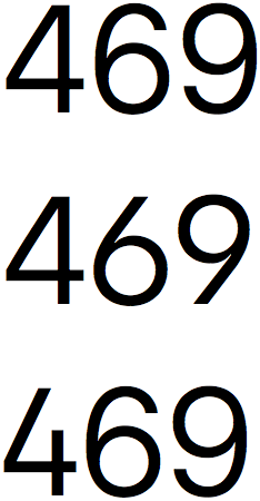
Top to bottom: the standard character set, stylistic set 1 (which is just the alternate 6 and 9), and stylistic set 2 (which is just an open 4).
I remember reading all kinds of reactions to the Apple Watch, but the commentary from designers about the new typeface is what I remember clearest of all. In September, it didn’t even have a name. Plenty of people called it “DINvetica”, while others speculated that this was, indeed, Apple Sans. While it may be the final form of “Apple Sans”, its public name is San Francisco, harking back to the old Macintosh days of typefaces with names like Chicago and Geneva. Indeed, it now occupies the namespace of Susan Kare’s original.
This is clearly something Apple has been working on for a very long time. Initial — and, dare I say, lazy — comments immediately rushed to compare it to Roboto. A closer look reveals more differences than similarities.
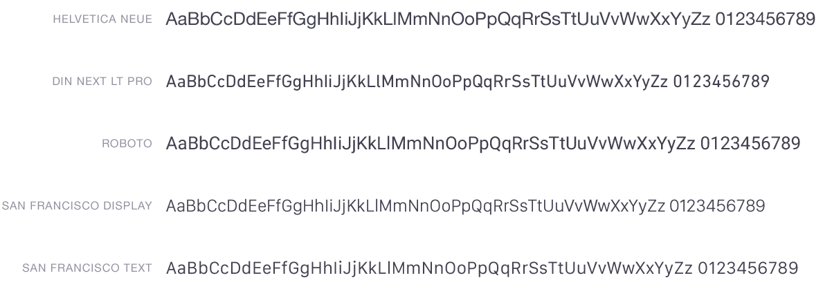
The San Francisco family comes in three styles, each in myriad weights. Display is to be used when text is 20 points or greater, while Text is to be used at smaller sizes. There’s also a Rounded style hiding in the SDK, but don’t tell anyone.3 There are also a few alternate numbers, shown at right, proper small caps, and a plethora of international and special characters. It’s a very comprehensive typeface family.
I compared it against two similar faces: DIN Next is a 2009 update of the venerable DIN 1451, and Roboto is Google’s house face. I threw Helvetica Neue into this comparison because it’s Apple’s current system face. All of these are the regular weights, and all are set at the exact same size, utilizing the fonts’ built-in kerning metrics. A few things are immediately apparent in this comparison:
San Francsico Display is noticeably optimized for larger sizes. Strokes are thinner, and it’s a little tighter.
The “DINvetica” reference couldn’t be more appropriate: the numbers look very similar to Helvetica’s, while the characters take inspiration from DIN.
If Roboto looked a little gross before, it looks really gross in comparison to these. This is the newly-updated version of Roboto, not the old one with the Helvetica-knockoff uppercase-R. It looks way better than the old version, but it’s nowhere near as precise-looking nor as balanced as the others here.
San Francisco Text — that’s the one for smaller text sizes — has similar metrics to Helvetica Neue. Not the same, but if you squint a little, kind of close enough, and closer still to the metrics of Lucida Grande. Perhaps this is eventually the new UI font for all Apple interfaces. It certainly would be more of a distinct signature face than Helvetica, and it would be more legible, too.
San Francisco is extremely exciting. Apple has released a number of in-house typefaces, even very recently — Menlo was released in 2009, and Chalkboard in 2003 — but this is the first comprehensive family to be released since 1984. It’s apparently still being worked on, but it’s in very good shape.4
Just how long have we been asking for a PSD of the iPhone UI? ↥︎
San Francisco Rounded isn’t shown here because it silently fails to install. ↥︎
When you try to print a document with San Francisco, the tracking is absolutely enormous. This might be due to Dynamic Text features, or it might be related to a Yosemite bug for fonts with UPMs greater than 1000. San Francisco has a UPM of 2048. ↥︎
Senate Republicans blocked legislation Tuesday that would limit the government’s sweeping domestic spying powers, dealing a massive blow to the post-Snowden efforts to reform the U.S. surveillance state.
At a final vote of 58 to 42, nearly every Democrat and four Republicans voted for the bill, the USA Freedom Act, but it failed to clear the 60-vote threshold necessary to move forward in the upper chamber. Its defeat almost certainly means that any reforms to the National Security Agency will have to wait until next year, when Republicans take over the Senate.
With nearly every Republican voting against this bill, what are the chances that any real reform will occur next year when they’re in the majority?
A BuzzFeed editor was invited to the dinner by the journalist Michael Wolff, who later said that he had failed to communicate that the gathering would be off the record; neither Kalanick, his communications director, nor any other Uber official suggested to BuzzFeed News that the event was off the record.
Keep the “off the record” defence in mind as you read what Uber SVP Emil Michael said at the event:
Over dinner, [Michael] outlined the notion of spending “a million dollars” to hire four top opposition researchers and four journalists. That team could, he said, help Uber fight back against the press — they’d look into “your personal lives, your families,” and give the media a taste of its own medicine.
[…]
Michael was particularly focused on one journalist, Sarah Lacy, the editor of the Silicon Valley website PandoDaily, a sometimes combative voice inside the industry. Lacy recently accused Uber of “sexism and misogyny.” She wrote that she was deleting her Uber app after BuzzFeed News reported that Uber appeared to be working with a French escort service.
[…]
He said that he thought Lacy should be held “personally responsible” for any woman who followed her lead in deleting Uber and was then sexually assaulted.
Unless forces more powerful than me in the Valley– or even Washington DC– see this latest horror as a wakeup call and decide this is enough. That the First Amendment and rights of journalists do matter. That companies shouldn’t be allowed to go to illegal lengths to defame and silence reporters. That all these nice words about gender equality in tech aren’t just token board appointments every once in a while. That professional women in this industry actually deserve respect. That they shouldn’t be bullied with the same old easy slurs about bitchiness or sexual objectification. That deep scary misogyny in a culture isn’t something that you hire a campaign manager to “message out” of a founder, nor is it something you excuse as genius at work. That there is a line someone can cross, even amid an era where the Valley believes founders can never be fired.
That last line seems a little prophetic now. Uber’s CEO went on Twitter to apologize for Michaels’ behaviour but, as Mashable’s Todd Wasserman reports, didn’t fire him. Atrocious, but expected in Silicon Valley. And that’s what’s so depressing about this story: it’s par for the course.
For users with no browsing history (typically a new installation), they will see Directory Tiles offering an updated, interactive design and suggesting useful sites. A separate feature, Enhanced Tiles, will improve upon the existing new tab page experience for users who already have a history in their browser.
Tiles provides Mozilla (including our local communities) new ways to interact with and communicate with our users. (If you’ve been using a pre-release Firefox build, you might have seen promotions for Citizenfour, a documentary about Edward Snowden and the NSA, appearing in your new tab in the past few weeks.)
Tiles also offers Mozilla new partnership opportunities with advertisers and publishers all while respecting and protecting our users. These sponsorships serve several important goals simultaneously by balancing the benefits to users of improved experience, control and choice, with sustainability for Mozilla.
Translation: “We know these ads are gross, but being forever dependent on Google is worse for us. Also, we’ve just found out that it’s really difficult to make money while giving away for free our software and its source code. Also, check out this ad for a movie about the NSA being creepy as shit while we collect your browser history to tailor ads to you.”
The good news is that you can avoid scams by looking for telltale signs that indicate when a site is fake or an email is phishy. The next time you are not completely confident that you are on a legitimate website or that an email you received is valid, check for these signs:
Uses an incorrect URL – If you are used to going to your bank via a regular address and the address of the site you land at is not the same name, you can be confident that you are not at the real site. Always double check to make sure that the site address is accurate. You can also hover your mouse pointer over a link in the email to verify that the link is directed to the same site that the email came from.
So, in short, be on the lookout for scams that look legitimate, and legitimate sites that look like scams. And it’s still a big mystery to some that people actually fall for this stuff.
Some welcome improvements in this update, including (finally) a fix for the Share sheet extension reordering bug, and some nice performance improvements for older hardware.
Update: Federico Viticci noted a couple of edge cases to setting and maintaining Share sheet extension reordering. The systemwide nature of Share sheet extensions is simple to understand for everyone, but might feel heavy-handed for power users. On the other hand, setting them on a per-app basis would be a huge pain in the ass.
Watchville for iOS pulls in news stories from top watch blogs with cheeky names like Perpetuelle and Haute Time. That includes hands-on reviews, buyer’s guides, and feature posts that will titillate timekeepers, whether they consume through the app’s Reader Mode or view the original articles through Watchville’s internal browser.
Collectors can synchronize their watches to the exact time using the app’s Atomic Clock. Little bell sounds count down the last five seconds of each minute so they can listen for just when to punch in the crown. And if their timepieces show the moon phase, they can set that too.
If it all sounds wildly esoteric, that’s kind of the point. There’s a small, diehard, but very lucrative community that Watchville wants to appeal to.
I don’t anticipate this market is shrinking, either. I wonder how such a market will react to the Apple Watch, particularly the Edition model. The timelessness of luxury watches is a huge part of their appeal; constant iteration, on the other hand, is part of technology’s appeal.