Flat ⇥ 9to5mac.com
The usually well-connected Mark Gurman, 9to5Mac:
According to multiple people who have either seen or have been briefed on the upcoming iOS 7, the operating system sports a redesigned user-interface that will be attractive to new iOS users, but potentially unsettling for those who are long-accustomed to the platform.
The new interface is said to be “very, very flat,” according to one source. Another person said that the interface loses all signs of gloss, shine, and skeuomorphism seen across current and past versions of iOS.
I’m excited to see this. As I’ve said previously, iOS is used by hundreds of millions of people. They can’t radically change the OS in a way that would disorientate longtime users, but it sounds like they’re trying to hit a sweet spot of redesign.
Then there’s this nugget (emphasis mine):
iOS 7 is codenamed “Innsbruck,” according to three people familiar with the OS. The interface changes include an all-new icon set for Apple’s native apps in addition to newly designed tool bars, tab bars, and other fundamental interface features across the system.
I don’t want to get too speculative, but if the WWDC logo was hinting at anything, it seems to me that many of the default app icons are represented within its colours:
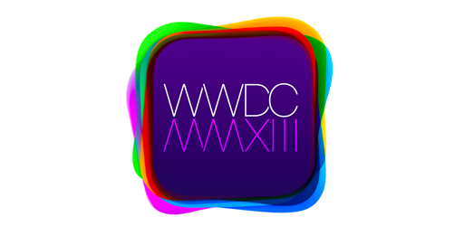
Orange is Music, green is both Phone and Messages, magenta is iTunes, and red is Calendar. Just something to ponder.