U.S. President Donald Trump says he’s ending all trade discussions with Canada to hit back at Ottawa for slapping a tax on web giants — and he wants it removed before negotiations can begin again.
His objection is, ostensibly, about its apparent targeting of companies based in the United States. This is a very silly complaint. The U.S. seized the heart of the tech economy and, instead of cooperating with others, used it as leverage around the world. That is one reason for its unrivalled dominance in the industry. Any tax on tech companies will disproportionately affect U.S. businesses, but they have been exerting disproportionate influence around the world for decades.
This is just the latest thing our hostile neighbour can use to try and make us crack. If there were no tax, there would be something else to complain about, because we are not dealing with a reasonable administration that wants mutually beneficial trade arrangements.
As far as I can see, this tax makes sense. Unlike the Online News Act, which requires large platforms to pay for some traffic they send elsewhere, this act is specifically about revenue extracted from Canadians by businesses that are only beginning to see antitrust regulation.
Thinking about the energy “footprint” of artificial intelligence products makes it a good time to re-link to Mark Kaufman’s excellent 2020 Mashable article in which he explores the idea of a carbon footprint:
The genius of the “carbon footprint” is that it gives us something to ostensibly do about the climate problem. No ordinary person can slash 1 billion tons of carbon dioxide emissions. But we can toss a plastic bottle into a recycling bin, carpool to work, or eat fewer cheeseburgers. “Psychologically we’re not built for big global transformations,” said John Cook, a cognitive scientist at the Center for Climate Change Communication at George Mason University. “It’s hard to wrap our head around it.”
Ogilvy & Mather, the marketers hired by British Petroleum, wove the overwhelming challenges inherent in transforming the dominant global energy system with manipulative tactics that made something intangible (carbon dioxide and methane — both potent greenhouse gases — are invisible), tangible. A footprint. Your footprint.
The framing of most of the A.I. articles I have seen thankfully shies away from ascribing individual blame; instead, they point to systemic flaws. This is preferable, but it still does little at the scale of electricity generation worldwide.
One hint that we might just be stuck in a hype cycle is the proliferation of what you might call “second-order slop” or “slopaganda”: a tidal wave of newsletters and X threads expressing awe at every press release and product announcement to hoover up some of that sweet, sweet advertising cash.
That AI companies are actively patronising and fanning a cottage economy of self-described educators and influencers to bring in new customers suggests the emperor has no clothes (and six fingers).
The (verified) X accounts producing threads of links to bad A.I. products, boosted by dozens of replies from other verified X accounts, are annoying spam, but seem relatively harmless. But the newsletters profiled here are curious.
One is Rowan Cheung’s Rundown AI newsletter, which Cheung bills as the “world’s most read daily AI newsletter”, which is different from the other newsletter in the article, Zain Kahn’sSuperhuman AI, the “world’s biggest AI newsletter”. As alluded to by Venkataramakrishnan but not expanded upon, both attract some heavy-hitting sponsors. The Rundown was recently sponsored by Salesforce, HubSpot, Sana, and Writer, while Superhuman’s recent sponsors include companies like HubSpot, Sana, and Writer — no Salesforce.
While Cheung’s newsletter is mostly A.I. boosterism with sponsorships, there is a block near the end of each issue for a sibling product: the Rundown University. The first thing you need to know about it is that it is not a university, obviously. It is online training through individual “courses” offered at $50 apiece with individual lessons on using A.I. tools, some of which — like Gamma and Zapier — happen to have sponsored of the newsletter. Or, if you want access to all the “courses” plus workshops, tutorials, and some kind of group chat, you can get all that for just a penny shy of $1,000 per year. Just above the footer sits a carousel of inspirational quotes about A.I. from people like Sam Altman, Jeff Bezos, Mark Cuban, and Elon Musk. None are actually specific to Rundown “University”, just vibes about the importance of A.I. and its impact. It all feels a bit much.
I am fascinated by the knock-on effects of a hype cycle, and A.I. has produced some magnificent examples — including those above. It is illuminating to search Google for a phrase likeintitle:"how" intitle:"is using ai to" and witnessing what is ostensibly breathtaking innovation across industries. A 2023 Guardian story says the “oldest surviving newspaper in the world” — untrue and in spirit only — is using ChatGPT to generate articles from council meeting minutes. According to the Harvard Business Review, construction companies are using large language models to, among other things, summarize documents. Stitch Fix is, according to a disguised ad in Vogue Business, using A.I. to detect trends.
There are countless examples of articles like these illustrating how companies are benefitting from the glow of hype while contributing to it. None of this is to say it is necessarily unearned — maybe detecting money laundering really is more reliable when you run it through A.I. processes. But I remember stories like these in the days when the hot new thing was called “machine learning” or, before that, “big data”. I would not be surprised if these technologies are truly beneficial yet it is hard not to feel the weight of hype and the marketing people behind it all.
Remember when new technology felt stagnant? All the stuff we use — laptops, smartphones, watches, headphones — coalesced around a similar design language. Everything became iterative or, in more euphemistic terms, mature. Attempts to find a new thing to excite people mostly failed. Remember how everything would change with 5G? How about NFTs? How is your metaverse house? The world’s most powerful hype machine could not make any of these things stick.
This is not necessarily a problem in the scope of the world. There should be a point at which any technology settles into a recognizable form and function. These products are, ideally, utilitarian — they enable us to do other stuff.
But here we are in 2025 with breakthroughs in artificial intelligence and, apparently, quantum computing and physics itself. The former is something I have written about at length already because it has become adopted so quickly and so comprehensively — whether we like it or not — that it is impossible to ignore. But the news in quantum computers is different because it is much, much harder for me to grasp. I feel like I should be fascinated, and I suppose I am, but mainly because I find it all so confusing.
This is not an explainer-type article. This is me working things out for myself. Join me. I will not get far.
Today I’m delighted to announce Willow, our latest quantum chip. Willow has state-of-the-art performance across a number of metrics, enabling two major achievements.
The first is that Willow can reduce errors exponentially as we scale up using more qubits. This cracks a key challenge in quantum error correction that the field has pursued for almost 30 years.
Second, Willow performed a standard benchmark computation in under five minutes that would take one of today’s fastest supercomputers 10 septillion (that is, 1025) years — a number that vastly exceeds the age of the Universe.
Microsoft today introduced Majorana 1, the world’s first quantum chip powered by a new Topological Core architecture that it expects will realize quantum computers capable of solving meaningful, industrial-scale problems in years, not decades.
It leverages the world’s first topoconductor, a breakthrough type of material which can observe and control Majorana particles to produce more reliable and scalable qubits, which are the building blocks for quantum computers.
Microsoft says it created a new state of matter and observed a particular kind of particle, both for the first time. In a twelve-minute video, the company defines this new era — called the “quantum age” — as a literal successor to the Stone Age and the Bronze Age. Jeez.
There is hype, and then there is hype. This is the latter. Even if it is backed by facts — I have no reason to suspect Microsoft is lying in large part because, to reiterate, I do not know anything about this — and even if Microsoft deserves this much attention, it is a lot. Maybe I have become jaded by one too many ostensibly world-changing product launches.
There is good reason to believe the excitement shown by Google and Microsoft is not pure hyperbole. The problem is neither company is effective at explaining why. As of writing the first sentence of this piece, my knowledge of quantum computers was only that they can be much, much, much faster than any computer today, thanks to the unique properties of quantum mechanics and, specifically, quantum bits. That is basically all. But what does a wildly fast computer enable in the real world? My brain can only grasp the consumer-level stuff I use, so I am reminded of something I wrote when the first Mac Studio was announced a few years ago: what utility does speed have?
I am clearly thinking in terms far too small. Domenico Vicinanza wrote a good piece for the Conversation earlier this year:
Imagine being able to explore every possible solution to a problem all at once, instead of once at a time. It would allow you to navigate your way through a maze by simultaneously trying all possible paths at the same time to find the right one. Quantum computers are therefore incredibly fast at finding optimal solutions, such as identifying the shortest path, the quickest way.
This explanation helped me — not a lot, but a little bit. What I remain confused by are the examples in the announcements from Google and Microsoft. Why quantum computing could help “discover new medicines” or “lead to self-healing materials” seems like it should be obvious to anyone reading, but I do not get it.
I am suspicious in part because technology companies routinely draw links between some new buzzy thing they are selling and globally significant effects: alleviating hunger, reducing waste, fixing our climate crisis, developing alternative energy sources, and — most of all — revolutionizing medical care. Search the web for (hyped technology) cancer and you can find this kind of breathless revolutionary language drawing a clear line between cancer care and 5G, 6G, blockchain, DAOs, the metaverse, NFTs, and Web3 as a whole. This likely speaks as much about insidious industries that take advantage of legitimate qualms with the medical system and fears of cancer, but it is nevertheless a pattern with these new technologies.
I am not even saying these promises are always wrong. Technological advancement has surely led to improving cancer care, among other kinds of medical treatments.
I have no big goal for this post — no grand theme or message. I am curious about the promises of quantum computers for the same reason I am curious about all kinds of inventions. I hope they work in the way Google, Microsoft, and other inventors in this space seem to believe. It would be great if some of the world’s neglected diseases can be cured and we could find ways to fix our climate.
But — and this is a true story — I read through Microsoft’s various announcement pieces and watched that video while I was waiting on OneDrive to work properly. I struggle to understand how the same company that makes a bad file syncing utility is also creating new states of matter. My brain is fully cooked.
In November 2023, two researchers at the University of California, Irvine, and their supervisor published “Dazed and Confused”, a working paper about Google’s reCAPTCHAv2 system. They wrote mostly about how irritating and difficult it is to use, and also explore its privacy and labour costs — and it is that last section about which I had some doubts when I first noticed the paper being passed around in July.
I was content to leave it there, assuming this paper would be chalked up as one more curiosity on a heap of others on arXiv. It has not been subjected to peer review at any journal, as far as I can figure out, nor can I find another academic article referencing it. (I am not counting the dissertation by one of the paper’s authors summarizing its findings.) Yet parts of it are on their way to becoming zombie statistics.
Mike Elgan, writing in his October Computerworld column, repeated the paper’s claim that “Google might have profited as much as $888 billion from cookies created by reCAPTCHA sessions”.
Ted Litchfield of PC Gamer included another calculation alleging solving CAPTCHAs “consum[ed] 7.5 million kWhs of energy[,] which produced 7.5 million pounds of CO2 pollution”; the article is headlined reCAPTCHAs “[…] made us spend 819 million hours clicking on traffic lights to generate nearly $1 trillion for Google”. In a Boing Boing article earlier this month, Mark Frauenfelder wrote:
[…] Through analyzing over 3,600 users, the researchers found that solving image-based challenges takes 557% longer than checkbox challenges and concluded that reCAPTCHA has cost society an estimated 819 million hours of human time valued at $6.1 billion in wages while generating massive profits for Google through its tracking capabilities and data collection, with the value of tracking cookies alone estimated at $888 billion.
I get why these figures are alluring. CAPTCHAs are heavily studied; a search of Google Scholar for “CAPTCHA” returns over 171,000 results. As you might expect, most are adversarial experiments, but there are several examining usability and, others, privacy. However, I could find just one previous paper correlating, say, emissions and CAPTCHA solving, and it was a joke paper (PDF) from the 2009 SIGBOVIK conference, “the Association for Computational Heresy Special Interest Group”. Choice excerpt: “CAPTCHAs were the very starting point for human computation, a recently proposed new field of Computer Science that lets computer scientists appear less dumb to the world”. Excellent.
So you can see why the claims of the U.C. Irvine researchers have resonated in the press. For example, here is what they — Andrew Searles, Renascence Tarafder Prapty, and Gene Tsudik — wrote in their paper (PDF) about emissions:
Assuming un-cached scenarios from our technical analysis (see Appendix B), network bandwidth overhead is 408 KB per session. This translates into 134 trillion KB or 134 Petabytes (194 x 1024 Terrabytes [sic]) of bandwidth. A recent (2017) survey estimated that the cost of energy for network data transmission was 0.06 kWh/GB (Kilowatt hours per Gigabyte). Based on this rate, we estimate that 7.5 million kWh of energy was used on just the network transmission of reCAPTCHA data. This does not include client or server related energy costs. Based on the rates provided by the US Environmental Protection Agency (EPA) and US Energy Information Administration (EIA), 1 kWh roughly equals 1-2.4 pounds of CO2 pollution. This implies that reCAPTCHA bandwidth consumption alone produced in the range of 7.5-18 million pounds of CO2 pollution over 9 years.
Obviously, any emissions are bad — but how much is 7.5–18 million pounds of CO2 over nine years in context? A 2024 working paper from the U.S. Federal Housing Finance Agency estimated residential properties each produce 6.8 metric tons of CO2 emissions from electricity and heating, or about 15,000 pounds. That means CAPTCHAs produced as much CO2 as providing utilities to 55–133 U.S. houses per year. Not good, sure, but not terrible — at least, not when you consider the 408 kilobyte session transfer against, say, Google’s homepage, which weighs nearly 2 MB uncached. CAPTCHAs are not a meaningful burden on the web or our environment.
The numbers in this discussion area are suspect. From these CO2 figures to the value of reCAPTCHA cookies — apparently responsible for nearly half of Google’s revenue from when it acquired the company — I find the evidence for them lacking. Yet they continue to circulate in print and, now, in a Vox-esque mini documentary.
The video, on the CHUPPL “investigative journalism” YouTube channel, was created by Jack Joyce. I found it via Frauenfelder, of Boing Boing, and it was also posted by Daniel Sims at TechSpot and Emma Roth at the Verge. The roughly 17-minute mini-doc has been watched nearly 200,000 times, and the CHUPPL channel has over 350,000 subscribers. Neither number is massive for YouTube, but it is not a small amount of viewers, either. Four of the ten videos from CHUPPL have achieved over a million views apiece. This channel has a footprint. But watching the first half of its reCAPTCHA video is what got me to open BBEdit and start writing this thing. It is a masterclass in how the YouTube video essay format and glossy production can mask bad journalism. I asked CHUPPL several questions about this video and did not receive a response by the time I published this.
Let me begin at the beginning:
How does this checkbox know that I’m not a robot? I didn’t click any motorcycles or traffic lights. I didn’t even type in distorted words — and yet it knew. This infamous tech is called reCAPTCHA and, when it comes to reach, few tools rival its presence across the web. It’s on twelve and a half million websites, quietly sitting on pages that you visit every day, and it’s actually not very good at stopping bots.
While Joyce provides sources for most claims in this video, there is not one for this specific number. According to BuiltWith, which tracks technologies used on websites, the claim is pretty accurate — it sees it used on about twelve million websites, and it is the most popular CAPTCHA script.
But Google has far more popular products than these if it wants to track you across the web. Google Maps, for example, is on over 15 million live websites, Analytics is on around 31 million, and AdSense is on nearly 49 million. I am not saying that we should not be concerned about reCAPTCHA because it is on only twelve million sites, but that number needs context. Google Maps is more popular, according to BuiltWith, than reCAPTCHA. If Google wants to track user activity across the web, AdSense is explicitly designed for that purpose. Yes, it is probably true that “few tools rival its presence across the web”, but you can say that of just about any technology from Google, Meta, Amazon, Cloudflare, and a handful of other giants — but, especially, Google.
Back to the intro:
It turns out reCAPTCHA isn’t what we think it is, and the public narrative around reCAPTCHA is an impossibly small sliver of the truth. And by accepting that sliver as the full truth, we’ve all been misled. For months, we followed the data, we examined glossed over research, and uncovered evidence that most people don’t know exists. This isn’t the story of an inconsequential box. It’s the story of a seemingly innocent tool and how it became a gateway for corporate greed and mass surveillance. We found buried lawsuits, whispers of the NSA, and echoes of Edward Snowden. This is the story of the future of the Internet and who’s trying to control it.
The claims in this introduction vastly oversell what will be shown in this video. The lawsuits are not “buried”, they were linked from the reCAPTCHA Wikipedia article as it appeared before the video was published. The “whispers” and “echoes” of mass surveillance disclosures will prove to be based on almost nothing. There are real concerns with reCAPTCHA, and this video does justice to almost none of them.
The main privacy problems with reCAPTCHA are found in its ubiquity and its ownership. Google swears up and down it collects device and user behaviour data through reCAPTCHA only for better bot detection. It issued a statement saying as much to Techradar in response to the “Dazed and Confused” paper circulating again. In a 2021 blog post announcing reCAPTCHA Enterprise — the latest version combining V2, V3, and the mobile SDKs under a single brand — Google says:
Today, reCAPTCHA Enterprise is a pure security product. Information collected is used to provide and improve reCAPTCHA Enterprise and for general security purposes. We don’t use this data for any other purpose.
[…] Additionally, none of the data collected can be used for personalized advertising by Google.
Google goes on to explain that it collects data as a user navigates through a website to help determine if they are a bot without having to present a challenge. Again, it is adamant none of this data is used to feed its targeted advertising machine.
There are a couple of problems with this. First, because Google does not disclose exactly how reCAPTCHA works, its promise requires that you trust the company. It is not a great idea to believe the word of corporations in general. Specifically, in Google’s case, a leak of its search ranking signals last year directlycontradicted its public statements. But, even though Google was dishonest then, there is currently no evidence reCAPTCHA data is being misused in the way Joyce’s video suggests. Coyly asking questions with sinister-sounding music underneath is not a substitute for evidence.
The second problem is the way Google’s privacy policy can be interpreted, as reported by Thomas Claburn in 2020 in the Register:
Zach Edwards, co-founder of web analytics biz Victory Medium, found that Google’s reCAPTCHA’s JavaScript code makes it possible for the mega-corp to conduct “triangle syncing,” a way for two distinct web domains to associate the cookies they set for a given individual. In such an event, if a person visits a website implementing tracking scripts tied to either those two advertising domains, both companies would receive network requests linked to the visitor and either could display an ad targeting that particular individual.
You will hear from Edwards later in Joyce’s video making a similar argument. Just because Google can do this, it does not mean it is actually doing so. It has the far more popular AdSense for that.
ReCAPTCHA interacts with three Google cookies when it is present: AEC, NID, and OGPC. According to Google, AEC is “used to detect spam, fraud, and abuse” including for advertising click fraud. I could not find official documentation about OGPC, but it and NID appear to be used for advertising for signed-out users. Of these, NID is most interesting to me because it is also used to store Google Search preferences, so someone who uses Google’s most popular service is going to have it set regardless, and its value is fixed for six months. Therefore, it is possible to treat it as a unique identifier for that time.
I could not find a legal demand of Google specifically for reCAPTCHA history. But I did find a high-profile request to re-identify NID cookies. In 2017, the first Trump administration began seizing records from reporters, including those from the New York Times. The Times uses Google Apps for its email system. That administration and then the Biden one tried obtaining email metadata, too, while preventing Times executives from disclosing anything about it. In the warrant (PDF), the Department of Justice demands of Google:
PROVIDER is required to disclose to the United States the following records and other information, if available, for the Account(s) for the time period from January 14, 2017, through April 30, 2017, constituting all records and other information relating to the Account(s) (except the contents of communications), including:
[…]
Identification of any PROVIDER account(s) that are linked to the Account(s) by cookies, including all PROVIDER user IDs that logged into PROVIDER’s services by the same machine as the Account(s).
And by “cookies”, the government says that includes “[…] cookies related to user preferences (such as NID), […] cookies used for advertising (such as NID, SID, IDE, DSID, FLC, AID, TAID, and exchange_uid) […]” plus Google Analytics cookies. This is not the first time Google’s cookies have been used in intelligence or law enforcement matters — the NSA has, of course, been using them that way for years — but it is notable for being an explicit instance of tying the NID cookie, which is among those used with reCAPTCHA, to a user’s identity. (Google says site owners can use a different reCAPTCHA domain to disassociate its cookies.) Also, given the effort of the Times’ lawyers to release this warrant, it is not surprising I was unable to find another public document containing similar language. I could not find any other reporting on this cookie-based identification effort, so I think this is news. In this case, Google successfully fought the government’s request for email metadata.
Assuming Google retains these records, what the Department of Justice was demanding would be enough to connect a reCAPTCHA user to other Google product activity and a Google account holder using the shared NID cookie. Furthermore, it is a problem that so much of the web relies on a relative handful of companies. Google has long treated the open web as its de facto operating system, coercing site owners to use features like AMP or making updates to comply with new search ranking guidelines. It is not just Google that is overly controlling, to be fair — I regularly cannot access websites on my iMac because Cloudflare believes I am a robot and it will not let me prove otherwise — but it is the most significant example. Its fingers in every pie — from site analytics, to fonts, to advertising, to maps, to browsers, to reCAPTCHA — means it has a unique vantage point from which to see how billions of people use the web.
These are actual privacy concerns, but you will learn none of them from Joyce’s video. You will instead be on the receiving end of a scatterbrained series of suggestions of reCAPTCHA’s singularly nefarious quality, driven by just-asking-questions conspiratorial thinking, without reaching a satisfying destination.
From here on, I am going to use timecodes as reference points. 1:56:
Journalists told you such a small sliver of the truth that I would consider it to be deceptive.
Bad news: Joyce is about to be fairly deceptive while relying on the hard work of journalists.
At 3:24:
Okay, you’re probably thinking “why does any of this matter?”, and I agree with you.
I did agree with you. I actually halted this investigation for a few weeks because I thought it was quite boring — until I went to renew my passport. (Passport status dot state dot gov.)
I got a CAPTCHA — not a checkbox, not fire hydrants, but the old one. And I clicked it. And it took me here.
The “here” Joyce mentions is a page at captcha.org, which is redirected from its original destination at captcha.com. The material is similar on both. The ownership of the .org domain is unclear, but the .com is run by Captcha, Inc., and it sells the CAPTCHA package used by the U.S. Department of State among other government departments. I have a sneaking suspicion the .org retains some ties to Captcha, Inc. given the DNS recordsof each. Also, the list of CAPTCHA software on the .org site begins with all the packages offered by Captcha, Inc., and its listing for reCAPTCHA is outdated — it does not display Google as its owner, for example — but the directory’s operators found time to add the recaptcha.sucks website.
About that. 4:07:
An entire page dedicated to documenting the horrors of reCAPTCHA: alleging national security implications for the U.S. and foreign governments, its ability to doxx users, mentioning secret FISA orders — the same type of orders that Edward Snowden risked his life to warn us about. […]
Who put this together? “Anonymous”.
if you are a web-native journalist, wishing to get in touch, we doubt you are going to have a hard-time figuring out who we are anyway.
This felt like a key left in plain sight, whispering there’s a door nearby and it’s meant to be opened. This is what we’re good at. This is what we do.
The U.S. “national security implications”, as you can see on screen as these words are being said, are not present: “stay tuned — it will be continued”, the message from ten years ago reads. The FISA reference, meanwhile, is a quote from Google’s national security requests page acknowledging the types of data it can disclose under these demands. It is a note that FISA exists and, under that law, Google can be compelled to disclose user data — a policy that applies to every company.
This all comes from the ReCAPTCHA Sucks website. On the About page, the site author acknowledges they are a competitor and maintains their anonymity is due to trademark concerns:
a free-speech / gripe-site on trademarked domains must not be used in a ‘bad faith’ — what includes promotion of competing products and services.
and under certain legal interpretations disclosing of our identity here might be construed as a promotion of our own competing captcha product or service.
it frustrates us indeed, but those are the rules of the game.
The page concludes, as Joyce quoted:
if you are a web-native journalist, wishing to get in touch, we doubt you are going to have a hard-time figuring out who we are anyway.
Joyce reads this as a kind of spooky challenge yet, so far as I can figure out, did not attempt to contact the site’s operators. I asked CHUPPL about this and I have not heard back. It is not very difficult to figure out who they are. The site has a shared technical infrastructure, including a historic Google Analytics account, with captcha.com. It feels less like the work of a super careful anonymous tipster, and more like an open secret from an understandably cheesed competitor.
5:05:
Okay, let’s get this out of the way: reCAPTCHA is not and really has never been very good at stopping bots.
Joyce points to the success rate of a couple of reCAPTCHA breakers here as evidence of its ineffectiveness, though does not mention they were both against the audio version. What Joyce does not establish is whether these programs were used much in the real world.
In 2023, Trend Micro published research into the way popular CAPTCHA solving services operate. Despite the seemingly high success rate of automated techniques, “they break CAPTCHAs by farming out CAPTCHA-breaking tasks to actual human solvers” because there are a lot more services out there than reCAPTCHA. That is exactly how many CAPTCHA solvers markettheirservices, though some are now saying they use A.I. instead. Also, it is not as though other types of CAPTCHAs are not subject to similar threats. In 2021, researchers solved hCAPTCHA (PDF) with a nearly 96% success rate. Being only okay at stopping bot traffic is not unique to reCAPTCHA, and these tools are just one of several technologies used to minimize automated traffic. And, true enough, none of these techniques is perfect, or even particularly successful. But that does not mean their purpose is nefarious, as Joyce suggests later in the video, at 11:45:
Google has said that they don’t use the data collected from reCAPTCHA for targeted advertising, which actually scares me a bit more. If not for targeted ads, which is their whole business model, why is Google acting like an intelligence agency?
Joyce does not answer this directly, instead choosing to speculate about a way reCAPTCHA data could be used to identify people who submit anonymous tips to the FBI — yes, really. More on that later.
5:49:
2018 was the launch of V3. According to researchers at U.C. Irvine, there’s practically no difference between V2 and V3.
Onscreen, Joyce shows an excerpt from the “Dazed and Confused” paper, and the sentence fragment “there is no discernable difference between reCAPTCHAv2 and reCAPTCHAv3” is highlighted. But just after that, you can see the sentence continues: “in terms of appearance or perception of image challenges and audio challenges”.
Screenshot from CHUPPL video.
Remember: these researchers were mainly studying the usability of these CAPTCHAs. This section is describing how users perceive the similar challenges presented by both versions. They are not saying V2 and V3 have “practically no difference” in general terms.
At 6:56:
ReCAPTCHA “takes a pixel-by-pixel fingerprint” of your browser. A real-time map of everything you do on the internet.
This part contains a quote from a 2015 Business Insider article by Lara O’Reilly. O’Reilly, in turn, cites research by AdTruth, then — as now — owned by Experian. I can find plenty of references to O’Reilly’s article but, try as I might, I have not been able to find a copy of the original report. But, as a 2017 report from Cracked Labs (PDF) points out, Experian’s AdTruth “provides ‘universal device recognition’”, “creat[ing] a ‘unique user ID’ for each device, by collecting information such as IP addresses, device models and device settings”. To the extent “pixel-by-pixel fingerprint” means anything in this context — it does not, but it misleadingly sounds to me like it is taking screenshots — Experian’s offering also fits that description. It is a problem there are so many things which quietly monitor user activity across their entire digital footprint.
Unfortunately, at 7:41, Joyce whiffs hard while trying to make this point:
If there’s any part of this video you should listen to, it’s this. Stop making dinner, stop scrolling on your phone, and please listen.
When I tell you that reCAPTCHA is watching you, I’m not saying that in some abstract, metaphorical way. Right now, reCAPTCHA is watching you. It knows that you’re watching me. And it doesn’t want you to know.
This stumbles in two discrete ways. First, reCAPTCHA is owned by Google, but so is YouTube. Google, by definition, knows what you are doing on YouTube. It does not need reCAPTCHA to secretly gather that information, too.
Second, the evidence Joyce presents for why “it doesn’t want you to know” is that Google has added some CSS to hide a floating badge, a capability it documents. This is for one presentation of reCAPTCHAv2, which is as invisible background validation and where a checkbox is shown only to suspicious users.
Screenshot from CHUPPL video.
I do not think Google “does not want you to know” about reCAPTCHA on YouTube. I think it thinks it is distracting. Google products using other Google technologies has not been a unique concern since the company merged user data and privacy policies in 2012.
The second half of the video, following the sponsor read, is a jumbled mess of arguments. Joyce spends time on a 2015 class action lawsuit filed against Google in Massachusetts alleging completing the old-style word-based reCAPTCHA was unfairly using unpaid labour to transcribe books. It was tossed in 2016because the plaintiff (PDF) “failed to identify any statute assigning value to the few seconds it takes to transcribe one word”, and “Google’s profit is not Plaintiff’s damage”.
Joyce then takes us on a meandering journey through the way Google’s terms of use document is written — this is where we hear from Edwards reciting the same arguments as appeared in that 2020 Register article — and he touches briefly on the U.S. v. Google antitrust trial, none of which concerned reCAPTCHA. There is a mention of a U.K. audit in 2015 specifically related to its 2012 privacy policy merger. This is dropped with no explanation into the middle of Edwards’ questioning of what Google deems “security related” in the context of its current privacy policy.
Then we get to the FBI stuff. Remember earlier when I told you Joyce has a theory about how Google uses reCAPTCHA to unmask FBI tipsters? Here is when that comes up again:
Check this out: if you want to submit a tip to the FBI, you’re met with this notice acknowledging your right to anonymity. But even though the State Department doesn’t use reCAPTCHA, the FBI and the NSA do. […] If they want to know who submitted the anonymous report, Google has to tell them.
This is quite the theory. There is video of Edward Snowden and clips from news reports about the mysteries of the FISA court. Dramatic music. A chart of U.S. government requests for user data from Google.
But why focus on reCAPTCHA when the FBI and NSA — and a whole bunch of other government sites — also use Google Analytics? Though Google says Analytics cookies are distinct from those used by its advertising services, site owners can link them together, which would not be obvious to users. There is no evidence the FBI or any other government agency is doing so. The actual problem here is that sensitive and ostensibly anonymous government sites are using any Google services whatsoever, though that is probably because they are a massive U.S. corporation with lots of widely-used products and services.
Even so, many federal sites use the product offered by Captcha, Inc. and it seems to respect privacy by being self-hosted. All of them should just use that. The U.S. government has its own analytics service; the stats are public. The reason for inconsistencies is probably the same reason any massive organization’s websites are fragmented: it is a lot of work to keep them unified.
Joyce juxtaposes this with the U.S. Secret Service’s use of Babel Street’s Locate X data. He does not explain any direct connection to reCAPTCHA or Google, and there is a very good reason for this: there is none. Babel Street obtained some of its location data from Venntel, which is owned by Gravy Analytics, which obtained it from personalized ads.
Joyce ultimately settles on a good point near the end of the video, saying Google uses various browsing signals “before, during, and after” clicking the CAPTCHA to determine whether you are likely human. If it does not have enough information about you — “you clear your cookies, you are browsing Incognito, maybe you are using a privacy-focused browser” — it is more likely to challenge you.
None of this is actually news. It has all been disclosed by Google itself on its website and in a 2014 Wired article by Andy Greenberg, linked from O’Reilly’s Business Insider story. This is what Joyce refers to at 7:24 in the video in saying “reCAPTCHA doesn’t need to be good at stopping bots because it knows who you are. The new reCAPTCHA runs in the background, is invisible, and only shows challenges to bots or suspicious users”. But that is exactly how reCAPTCHA stops bots, albeit not perfectly: it either knows who you are and lets you through without a challenge, or it asks you for confirmation.
It is this very frustration I have as I try to protect my privacy while still using the web. I hit reCAPTCHA challenges frequently, especially when working on something like this article, in which I often relied on Google’s superior historical index and advanced search operators to look up stories from ten years ago. As I wrote earlier, I run into Cloudflare’s bot wall constantly on one of my Macs but not the other, and I often cannot bypass it without restarting my Mac or, ironically enough, using a private browsing window. Because I use Safari, website data is deleted more frequently, which means I am constantly logging into services I use all the time. The web becomes more cumbersome to use when you want to be tracked less.
There are three things I want to leave you with. First, there is an interesting video to be made about the privacy concerns of reCAPTCHA, but this is not it. It is missing evidence, does not put findings in adequate context, and drifts conspiratorially from one argument to another while only gesturing at conclusions. Joyce is incorrect in saying “journalists told you such a small sliver of the truth that I would consider it to be deceptive”. In fact, they have done the hard work over many years to document Google’s many privacy failures — including in reCAPTCHA. That work should bolster understandable suspicions about massive corporations ruining our right to privacy. This video is technically well produced, but it is of shoddy substance. It does not do justice to the work of the better journalists whose work it relies upon.
Second, CAPTCHAs offer questionable utility. As iffy as I find the data in the discussion section of the “Dazed and Confused” paper, its other findings seem solid: people find it irritating to label images or select boxes containing an object. A different paper (PDF) with two of the same co-authors and four other researchers found people most like reCAPTCHA’s checkbox-only presentation — the one that necessarily compromises user privacy — but also found some people will abandon tasks rather than solve a CAPTCHA. Researchers in 2020 (PDF) found CAPTCHAs were an impediment to people with visual disabilities. This is bad. Unfortunately, we are in a new era of mass web scraping — one reason I was able to so easily find many CAPTCHA solving services. Site owners wishing to control that kind of traffic have options like identifying user agents or I.P. address strings, but all of these can be defeated. CAPTCHAs can, too. Sometimes, all you can do is pile together a bunch of bad options and hope the result is passable.
Third, this is yet another illustration of how important it is for there to be strong privacy legislation. Nobody should have to question whether checking a box to prove they are not a robot is, even in a small way, feeding a massive data mining operation. We are never going to make progress on tracking as long as it remains legal and lucrative.
I completely understand if you do not. Announced with great fanfare by Elon Musk after his eager-then-reluctant takeover of the company, writers like Lee Fang, Michael Shellenberger, Rupa Subramanya, Matt Taibbi, and Bari Weiss were permitted access to internal records of historic moderation decisions. Each published long Twitter threads dripping in gravitas about their discoveries.
But after stripping away the breathless commentary and just looking at the documents as presented, Twitter’s actions did not look very evil after all. Clumsy at times, certainly, but not censorial — just normal discussions about moderation. Contrary to Taibbi’s assertions, the “institutional meddling” was research, not suppression.
Now, Musk works for the government’s DOGE temporary organization and has spent the past two weeks — just two weeks — creating chaos with vast powers and questionable legality. But that is just one of his many very real jobs. Another one is his ownership of X where he also has an executive role. Today, he decided to accuse another user of committing a crime, and used his power to suspend their account.
What was their “crime”? They quoted a Wired story naming six very young people who apparently have key roles at DOGE despite their lack of experience. The full tweetread:1
Here’s a list of techies on the ground helping Musk gaining and using access to the US Treasury payment system.
Akash Bobba
Edward Coristine
Luke Farritor
Gautier Cole Killian
Gavin Kliger
Ethan Shaotran
I wonder if the fired FBI agents may want dox them and maybe pay them a visit.
In the many screenshots I have seen of this tweet, few seem to include the last line as it is cut off by the way X displays it. Clicking “Show more” would have displayed it. It is possible to interpret this as violative of X’s Abuse and Harassment rules, which “prohibit[s] behavior that encourages others to harass or target specific individuals or groups of people with abuse”, including “behavior that urges offline action”.
X, as Twitter before it, enforces these policies haphazardly. The same policy also “prohibit[s] content that denies that mass murder or other mass casualty events took place”, but searching “Sandy Hook” or “Building 7” turns up loads of tweets which would presumably also run afoul. Turns out moderation of a large platform is hard and the people responsible sometimes make mistakes.
But the ugly suggestion made in that user’s post might not rise to the level of a material threat — a “crime”, as it were — and, so, might still be legal speech. Musk’s X also suspended a user who just posted the names of public servants. And Musk is currently a government employee in some capacity. The “Twitter Files” crew, ostensibly concerned about government overreach at social media platforms, should be furious about this dual role and heavy-handed censorship.
It was at this point in drafting this article that Mike Masnick of Techdirt published his impressions much faster than I could turn it around. I have been bamboozled by my day job. Anyway:
Let’s be crystal clear about what just happened: A powerful government official who happens to own a major social media platform (among many other businesses) just declared that naming government employees is criminal (it’s not) and then used his private platform to suppress that information. These aren’t classified operatives — they’re public servants who, theoretically, work for the American people and the Constitution, not Musk’s personal agenda.
This doesn’t just “seem like” a First Amendment issue — it’s a textbook example of what the First Amendment was designed to prevent.
So far, however, we have seen from the vast majority of them no exhausting threads, no demands for public hearings — in fact, barely anything. To his extremely limited credit, Taibbi did acknowledge it is “messed up”, going on to write:
That new-car free speech smell is just about gone now.
“Now”?
Taibbi is the only one of those authors who has written so much as a tweet about Musk’s actions. Everyone else — Fang, Shellenberger, Subramanya, and Weiss — has moved on to unsubstantive commentary about newer and shinier topics.
This is not mere hypocrisy. What Musk is doing is a far more explicit blurring of the lines between government power and platform speech permissions. This could be an interesting topic that a writer on the free speech beat might want to explore. But for a lot of them, it would align them too similarly to mainstream reporting, and their models do not permit that.
It is one of the problems with being a shallow contrarian. Because these writers must position themselves as alternatives to mainstream news coverage — “focus[ing] on stories that are ignored or misconstrued in the service of an ideological narrative”, “for people who dare to think for themselves”. How original. They suggest they cannot cover the same news — or, at least, not from a similar perspective — as in the mainstream. This is not actually true, of course: each of them frequently publishes hot takes about high-profile stories along their particular ideological bent, which often coincide with standard centre-right to right-wing thought. They are not unbiased. Yet this widely covered story has either escaped their attention, or they have mostly decided it is not worth mentioning.
I am not saying this is a conspiracy among these writers, or that they are lackeys for Musk or Trump. What I am saying is that their supposed principles are apparently only worth expressing when they are able to paint them as speaking truth to power, and their concept of power is warped beyond recognition. It goes like this: some misinformation researchers partially funded by government are “power”, but using the richest man in the world as a source is not. It also goes like this: when that same man works for the government in a quasi-official capacity and also owns a major social media platform, it is not worth considering those implications because Rolling Stone already has an article.
They can prove me wrong by dedicating just as much effort to exposing the blurrier-than-ever lines between a social media platform and the U.S. government. Instead, it is busy reposting glowing profiles of now-DOGE staff. They are not interested in standing for specific principles when knee-jerk contrarianism is so much more thrilling.
There are going to be a lot of x.com links in this post, as it is rather unavoidable. ↥︎
This week, the United States Supreme Court heard arguments about whether it is legal to require that TikTok be forced to divest from its parent company by January 19 or be banned. You may know this as the “TikTok ban” because that is how it has been reported basically everywhere. Seriously — I was going to list some examples, but if you visit your favourite news publication, you will almost certainly see it called the “TikTok ban”.
Pedants would be right to point out this is not technically a ban. All TikTok needs to do is become incorporated with entirely different ownership, with the word “all” doing most of the work in that phrase. Consider a hypothetical demand by a populous country that Meta divest Instagram to continue its operations locally. Not only is that not easy, I strongly suspect the U.S. government would intervene in that circumstance. No country wants another to take away their soft power.
Coverage of Supreme Court hearings is always a little funny to read because the justices are, ostensibly, impartial adjudicators of the law who are just asking questions of both sides, and are not supposed to tip their hand. That means reporters end up speculating about the vibes. Amy Howe, syndicated at SCOTUSblog,1 reports the justices were “skeptical” and “divided over the constitutionality” of the law. CNN’s reporters, meanwhile, wrote that they “appeared likely to uphold a controversial ban on TikTok”. While some justices were not persuaded by the potential for manipulation, they did seem to agree on the question of user data. I also think privacy is important, and perhaps for some intersecting reasons, but targeting a single app is the dumbest way to resolve that particular complaint.
Mathew Ingram wrote a great piece calling this week’s proceedings a slide into “even stupider” territory, which could refer to just about anything. How about NBC News’ reporting that the Biden Administration is looking into “ways to keep TikTok available in the United States if a ban that’s scheduled to go into effect Sunday proceeds”? Yes, apparently the government which signed this into law with bipartisan urgency is now undermining its own position.
Alas, Ingram’s article has nothing do to with that, but it is worth your time. I want to highlight one paragraph, though, which I believe is not as clear as it could be:
We’ve had decades of fear-mongering about both American and foreign companies manipulating people’s minds, including the Cambridge Analytica scandal, but there’s no evidence that any of it has actually changed people’s minds. All of the Russian manipulation of Facebook and other platforms that allegedly influenced the 2016 election amounted to not much of anything, according to social scientists. I would argue that Fox News is a far bigger problem than Russia ever was. And even if the Chinese government forces TikTok to block mentions of Tiananmen Square (as it has forced Google to), it’s a massive leap to assume that this would somehow affect the minds of gullible young TikTok users in any significant way. In my opinion, people should be a lot more concerned about how Apple — despite all of its bragging about protecting the privacy of its users — gave the Chinese government effective control over all of its data.
I get the feeling the discussions about manipulating users’ opinions will be never-ending, as have those about, say, the influence of violence in video games. Two recent articles I found persuasive are one by Henry Farrell, and another by Charlie Warzel and Mike Caulfield, in the Atlantic, calling the internet a “justification machine”.
But to Ingram’s argument about Apple, it should be noted that it gave over control of data about users in China, not “all of its data”. This is probably still a bad outcome for most of those users, yes, but the way Ingram wrote this makes it sound as though the Chinese government has control over my Apple-stored data. As far as I am aware, that is not true.
The publisher of SCOTUSblog is facing charges today of tax evasion through fraudulent employment schemes. ↥︎
Wired has been publishing a series of predictions about the coming state of the world. Unsurprisingly, most concern artificial intelligence — how it might impact health, music, our choices, the climate, and more. It is an issue of the magazine Wired describes as its “annual trends briefing”, but it also kind of like a hundred-page op-ed section. It is a mixed bag.
A.I. critic Gary Marcus contributed a short piece about what he sees as the pointlessness of generative A.I. — and it is weak. That is not necessarily because of any specific argument, but because of how unfocused it is despite its brevity. It opens with a short history of OpenAI’s models, with Marcus writing “Generative A.I. doesn’t actually work that well, and maybe it never will”. Thesis established, he begins building the case:
Fundamentally, the engine of generative AI is fill-in-the-blanks, or what I like to call “autocomplete on steroids.” Such systems are great at predicting what might sound good or plausible in a given context, but not at understanding at a deeper level what they are saying; an AI is constitutionally incapable of fact-checking its own work. This has led to massive problems with “hallucination,” in which the system asserts, without qualification, things that aren’t true, while inserting boneheaded errors on everything from arithmetic to science. As they say in the military: “frequently wrong, never in doubt.”
Systems that are frequently wrong and never in doubt make for fabulous demos, but are often lousy products in themselves. If 2023 was the year of AI hype, 2024 has been the year of AI disillusionment. Something that I argued in August 2023, to initial skepticism, has been felt more frequently: generative AI might turn out to be a dud. The profits aren’t there — estimates suggest that OpenAI’s 2024 operating loss may be $5 billion — and the valuation of more than $80 billion doesn’t line up with the lack of profits. Meanwhile, many customers seem disappointed with what they can actually do with ChatGPT, relative to the extraordinarily high initial expectations that had become commonplace.
Marcus’ financial figures here are bizarre and incorrect. He quotes a Yahoo News-syndicated copy of a PC Gamer article, which references a Windows Central repackaging of a paywalled report by the Information — a wholly unnecessary game of telephone when the New York Timesobtained financial documents with the same conclusion, and which were confirmed by CNBC. The summary of that Information article — that OpenAI “may run out of cash in 12 months, unless they raise more [money]”, as Marcus wrote on X — is somewhat irrelevant now after OpenAI proceeded to raise $6.6 billion at a staggering valuation of $157 billion.
I will leave analysis of these financials to MBA types. Maybe OpenAI is like Amazon, which took eight years to turn its first profit, or Uber, which took fourteen years. Maybe it is unlike either and there is no way to make this enterprise profitable.
None of that actually matters, though, when considering Marcus’ actual argument. He posits that OpenAI is financially unsound as-is, and that Meta’s language models are free. Unless OpenAI “come outs [sic] with some major advance worthy of the name of GPT-5 before the end of 2025″, the company will be in a perilous state and, “since it is the poster child for the whole field, the entire thing may well soon go bust”. But hold on: we have gone from ChatGPT is disappointing “many customers” — no citation provided — to the entire concept of generative A.I. being a dead end. None of this adds up.
The most obvious problem is that generative A.I. is not just ChatGPT or other similar chat bots; it is an entire genre of features. I wrote earlier this month about some of the features I use regularly, like Generative Remove in Adobe Lightroom Classic. As far as I know, this is no different than something like OpenAI’s Dall-E in concept: it has been trained on a large library of images to generate something new. Instead of responding to a text-based prompt, it predicts how it should replicate textures and objects in an arbitrary image. It is far from perfect, but it is dramatically better than the healing brush tool before it, and clone stamping before that.
There are other examples of generative A.I. as features of creative tools. It can extend images and replace backgrounds pretty well. The technology may be mediocre at making video on its own terms, but it is capable of improving the quality of interpolated slow motion. In the technology industry, it is good at helping developers debug their work and generate new code.
Yet, if you take Marcus at his word, these things and everything else generative A.I. “might turn out to be a dud”. Why? Marcus does not say. He does, however, keep underscoring how shaky he finds OpenAI’s business situation. But this Wired article is ostensibly about generative A.I.’s usefulness — or, in Marcus’ framing, its lack thereof — which is completely irrelevant to this one company’s financials. Unless, that is, you believe the reason OpenAI will lose five billion dollars this year is because people are unhappy with it, which is not the case. It simply costs a fortune to train and run.
The one thing Marcus keeps coming back to is the lack of a “moat” around generative A.I., which is not an original position. Even if this is true, I do not see this as evidence of a generative A.I. bubble bursting — at least, not in the sense of how many products it is included in or what capabilities it will be trained on.
What this looks like, to me, is commoditization. If there is a financial bubble, this might mean it bursts, but it does not mean the field is wiped out. Adobe is not disappearing; neither are Google or Meta or Microsoft. While I have doubts about whether chat-like interfaces will continue to be a way we interact with generative A.I., it continues to find relevance in things many of us do every day.
Citing national security concerns, the federal government has ordered TikTok to close its Canadian operations — but users will still be able to access the popular app.
My position is that TikTok should not be banned; instead, governments should focus on comprehensive privacy legislation to protect users from all avenues of data exploitation. So it is kind of a good thing the Canadian government is not prohibiting the app or users’ access — except the government’s position appears to be entirely contradictory. It is very worried about user privacy:
Former CSIS director David Vigneault told CBC News it’s “very clear” from the app’s design that data gleaned from its users “is available to the government of China” and its large-scale data harvesting goals.
But laws drawn up in 2022 which would restrict these practices have been stuck in committee since May. So there is an ostensibly dangerous app posing a risk to Canadians, and the government’s response is to let people keep using it while shutting down the company’s offices? The Standing Committee on Industry and Technology had better get moving.
X on Wednesday announced a new set of terms, something which is normally a boring and staid affair. But these are a doozy:
Here’s a high-level recap of the primary changes that go into effect on November 15, 2024. You may see an in-app notice about these updates as well.
Governing law and forum changes: For users residing outside of the European Union, EFTA States, and the United Kingdom, we’ve updated the governing law and forum for lawsuits to Texas as specified in our terms. […]
Specifically, X says “disputes […] will be brought exclusively in the U.S. District Court for the Northern District of Texas or state courts located in Tarrant County, Texas, United States”. X’s legal address is on a plot of land shared with SpaceX and the Boring Company near Bastrop, which is in the Western District. This particular venue is notable as the federal judge handling current X litigation in the Northern District owns Tesla stock and has not recused himself in X’s suit against Media Matters, despite stepping aside on a similar case because of a much smaller investment in Unilever. The judge, Reed O’Connor, is a real piece of work from the Federalist Society who issues reliably conservative decisions and does not want that power undermined.
An investment in Tesla does not necessarily mean a conflict of interest with X, an ostensibly unrelated company — except it kind of does, right? This is the kind of thing the European Commission is trying to figure out: are all of these different businesses actually related because they share the same uniquely outspoken and influential figurehead? Musk occupies such a particularly central role in all these businesses and it is hard to disentangle him from their place in our society. O’Connor is not the only judge in the district, but it is notable the company is directing legal action to that venue.
But X is only too happy to sue you in any court of its choosing.
Another of the X terms updates:
AI and machine learning clarifications: We’ve added language to our Privacy Policy to clarify how we may use the information you share to train artificial intelligence models, generative or otherwise.
This is rude. It is a “clarifi[cation]” described in vague terms, and what it means is that users will no longer be able to opt out of their data being used to train Grok or any other artificial intelligence product. This appears to also include images and video, posts in private accounts and, if I am reading this right, direct messages.
Notably, Grok is developed by xAI, which is a completely separate company from X. See above for how Musk’s companies all seem to bleed together.
Updates to reflect how our products and services work: We’ve incorporated updates to better reflect how our existing and upcoming products, features, and services work.
I do not know what this means. There are few product-specific changes between the old and new agreements. There are lots — lots — of new ways X wants to say it is not responsible for anything at all. There is a whole chunk which effectively replicates the protections of Section 230 of the CDA, you now need written permission from X to transfer your account to someone else, and X now spells out its estimated damages from automated traffic: $15,000 USD per million posts every 24 hours.
If your posts are set to public, accounts you have blocked will be able to view them, but they will not be able to engage (like, reply, repost, etc.).
The block button is one of the most effective ways to improve one’s social media experience. From removing from your orbit people who you never want to hear from for even mundane reasons, to reducing the ability for someone to stalk or harass, its expected action is vital. This sucks. I bet the main reason this change was made is because Musk is blocked by a lot of people.
All of these changes seem designed to get rid of any remaining user who is not a true believer. Which brings us to today.
Social networking startup Bluesky, which just reported a gain of half a million users over the past day, has now soared into the top five apps on the U.S. App Store and has become the No. 2 app in the Social Networking category, up from No. 181 a week ago, according to data from app intelligence firm Appfigures. The growth is entirely organic, we understand, as Appfigures confirmed the company is not running any App Store Search Ads.
As of writing, Bluesky is the fifth most popular free app in the Canadian iOS App Store, and the second most popular free app in the Social Networking category. Threads is the second most popular free app, and the most popular in the Social Networking category.
X is number 74 on the top free apps list. It remains classified as “News” in the App Store because it, like Twitter, has always compared poorly against other social media apps.
The New York Times recently ran a one–two punch of stories about the ostensibly softening political involvement of Mark Zuckerberg and Meta — where by “punch”, I mean “gentle caress”.
On Facebook, Instagram and Threads, political content is less heavily featured. App settings have been automatically set to de-emphasize the posts that users see about campaigns and candidates. And political misinformation is harder to track on the platforms after Meta removed transparency tools that journalists and researchers used to monitor the sites.
[…]
“It’s quite the pendulum swing because a decade ago, everyone at Facebook was desperate to be the face of elections,” said Katie Harbath, chief executive of Anchor Change, a tech consulting firm, who previously worked at Facebook.
Facebook used to have an entire category of “Government and Politics” advertising case studies through 2016 and 2017; it was removed by early 2018. I wonder if anything of note happened in the intervening months. Anything at all.
All of this discussion has so far centred U.S. politics; due to the nature of reporting, that will continue for the remainder of this piece. I wonder if Meta is ostensibly minimizing politics everywhere. What are the limits of that policy? Its U.S. influence is obviously very loud and notable, but its services have taken hold — with help — around the world. No matter whether it moderates those platforms aggressively or it deprioritizes what it identifies as politically sensitive posts, the power remains U.S.-based.
Theodore Schleifer and Mike Isaac, in the other Times article about Zuckerberg personally, under a headline claiming he “is done with politics”, wrote about the arc of his philanthropic work, which he does with his wife, Dr. Priscilla Chan:
Two years later, taking inspiration from Bill Gates, Mr. Zuckerberg and Dr. Chan established the Chan Zuckerberg Initiative, a philanthropic organization that poured $436 million over five years into issues such as legalizing drugs and reducing incarceration.
[…]
Mr. Zuckerberg and Dr. Chan were caught off guard by activism at their philanthropy, according to people close to them. After the protests over the police killing of George Floyd in 2020, a C.Z.I. employee asked Mr. Zuckerberg during a staff meeting to resign from Facebook or the initiative because of his unwillingness at the time to moderate comments from Mr. Trump.
The incident, and others like it, upset Mr. Zuckerberg, the people said, pushing him away from the foundation’s progressive political work. He came to view one of the three central divisions at the initiative — the Justice and Opportunity team — as a distraction from the organization’s overall work and a poor reflection of his bipartisan point-of-view, the people said.
This foundation, like similar ones backed by other billionaires, appears to be a mix of legitimate interests for Chan and Zuckerberg, and a vehicle for tax avoidance. I get that its leadership tries to limit its goals and focus on specific areas. But to be in any way alarmed by internal campaigning? Of course there are activists there! One cannot run a charitable organization claiming to be “building a better future for everyone” without activism. That Zuckerberg’s policies at Meta is an issue for foundation staff points to the murky reality of billionaire-controlled charitable initiatives.
Other incidents piled up. After the 2020 election, Mr. Zuckerberg and Dr. Chan were criticized for donating $400 million to the nonprofit Center for Tech and Civic Life to help promote safety at voting booths during pandemic lockdowns. Mr. Zuckerberg and Dr. Chan viewed their contributions as a nonpartisan effort, though advisers warned them that they would be criticized for taking sides.
The donations came to be known as “Zuckerbucks” in Republican circles. Conservatives, including Mr. Trump and Representative Jim Jordan of Ohio, a Republican who is chairman of the House Judiciary Committee, blasted Mr. Zuckerberg for what they said was an attempt to increase voter turnout in Democratic areas.
This is obviously a bad faith criticism. In what healthy democracy would lawmakers actively campaign against voter encouragement? Zuckerberg ought to have stood firm. But it is one of many recent clues as to Zuckerberg’s thinking.
My pet theory is Zuckerberg is not realigning on politics — either personally or as CEO of Meta — out of principle; I am not even sure he is changing at all. He has always been sympathetic to more conservative voices. Even so, it is important for him to show he is moving toward overt libertarianism. In the United States, politicians of both major parties have been investigating Meta for antitrust concerns. Whether the effort by Democrats is in earnest is a good question. But the Republican efforts have long been dominated by a persecution complex where they believe U.S. conservative voices are being censored — something which has been repeatedlyshownto beuntrue or, at least, lacking context. If Zuckerberg can convince Republican lawmakers he is listening to their concerns, maybe he can alleviate the bad faith antitrust concerns emanating from the party.
I would not be surprised if Zuckerberg’s statements encourage Republican critics to relent. Unfortunately, as in 2016, that is likely to taint any other justifiable qualms with Meta as politically motivated. Recall how even longstanding complaints about Facebook’s practices, privacy-hostile business, and moderation turned into a partisan argument. The giants of Silicon Valley have every reason to expect ongoing scrutiny. After Meta’s difficult 2022, it is now worth more than ever before — the larger and more influential it becomes, the more skepticism it should expect.
Some suggest Zuckerberg has been emboldened by X’s Musk.
“With Elon Musk coming and literally saying ‘fuck you’ to people who think he shouldn’t run Twitter the way he has, he is dramatically lowering the bar for what is acceptable behaviour for a social media platform,” said David Evan Harris, the Chancellor’s public scholar at California University, Berkeley and a former Meta staffer. “He gives Mark Zuckerberg a lot of permission and leeway to be defiant.”
This is super cynical. It also feels, unfortunately, plausible for both Zuckerberg and Meta as a company. There is a vast chasm of responsible corporate behaviour which opened up in the past two years and it seems like it is giving room to already unethical players to shine.
See Also: Karl Bode was a guest on “Tech Won’t Save Us” to discuss Zuckerberg’s P.R. campaign with Paris Marx.
I loved this essay from Thea Lim, as published in the Walrus, about our quantified digital lives subsuming our reality, but I have a quibble with this otherwise excellent paragraph:
[…] What we hardly talk about is how we’ve reorganized not just industrial activity but any activity to be capturable by computer, a radical expansion of what can be mined. Friendship is ground zero for the metrics of the inner world, the first unquantifiable shorn into data points: Friendster testimonials, the MySpace Top 8, friending. […]
To the contrary, this is something we not only talk about with frequency, but usually with anxiety approaching a moral panic. I share those worries, for what it is worth; I am not sure it is a positive thing to have constant reminders of our social and physical performance. I am sometimes upset I do not scrobble my vinyl records with Last.fm, even though I also know this is very silly. Since I stopped wearing a smartwatch or any kind of fitness tracker, I am no longer recording health metrics and I feel healthier as a result. I track webpage views here and have a vanity search for the site URL because it lets me see when coolpeople have noticed something I wrote. Your experience may vary.
This next paragraph in Lim’s essay, though, is noteworthy:
And those ascetics who disavow all socials? They are still caught in the network. Acts of pure leisure — photographing a sidewalk cat with a camera app or watching a video on how to make a curry — are transmuted into data to grade how well the app or the creators’ deliverables are delivering. If we’re not being tallied, we affect the tally of others. We are all data workers.
We are all helping create webpage views, ad impressions, and video plays, all of which are reported to people who are ostensibly concerned with accuracy. But all of these stats lie. If one’s livelihood depends on what they report, it is hard not to see why they are taken so seriously, even if everyone kind of knows they are not real. We are all participants in this shared delusion.
Mr. Musk’s fixation on Blue extended beyond the design, and he engaged in lengthy deliberations about how much it should cost. Mr. [David] Sacks insisted that they should raise the price to $20 a month, from its current $4.99. Anything less felt cheap to him, and he wanted to present Blue as a luxury good.
[…]
Mr. Musk also turned to the author Walter Isaacson for advice. Mr. Isaacson, who had written books on Steve Jobs and Benjamin Franklin, was shadowing him for an authorized biography. “Walter, what do you think?” Mr. Musk asked.
“This should be accessible to everyone,” Mr. Isaacson said, no longer just the fly on the wall. “You need a really low price point, because this is something that everyone is going to sign up for.”
I learned a new specific German word today as a direct result of this article: fremdschämen. It is more-or-less the opposite of schadenfreude; instead of being pleased by someone else’s embarrassment, you instead feel their pain.
This is humiliating for everyone involved: Musk, Sacks — who compared Twitter’s blue checkmarks to a Chanel handbag — and Jason Calacanis of course. But most of all, this is another blow to Isaacson’s credibility as an ostensibly careful observer of unfolding events.
Max Tani, of Semafor, was tipped off to Isaacson’s involvement earlier this year by a single source:
“I wanted to get in touch because we’re including an item in this week’s Semafor media newsletter reporting that you actually set the price for Twitter Premium,” I wrote to Isaacson in March. “We’ve heard that while you were shadowing Elon Musk for your book, he told Twitter staff that you had advised him on what the price should be, and he thought it was a good idea and implemented it.”
“Hah! That’s the first I’d heard of this. It’s not true. I’m not even sure what the price is. Sorry,” he replied.
This denial is saved from being a lie only by the grounds that Isaacson did not literally “set the price”, as Tani put it, on the subscription service. In all meaningful ways, though, it is deceptive.
After Robb Knight found — and Wired confirmed — Perplexity summarizes websites which have followed its opt out instructions, I noticed a number of people making a similar claim: this is nothing but a big misunderstanding of the function of controls like robots.txt. A Hacker News comment thread contains several versions of these two arguments:
robots.txt is only supposed to affect automated crawling of a website, not explicit retrieval of an individual page.
It is fair to use a user agent string which does not disclose automated access because this request was not automated per se, as the user explicitly requested a particular page.
That is, publishers should expect the controls provided by Perplexity to apply only to its indexing bot, not a user-initiated page request. Wary of being the kind of person who replies to pseudonymous comments on Hacker News, this is an unnecessarily absolutist reading of how site owners expect the Robots Exclusion Protocol to work.
To be fair, that protocol was published in 1994, well before anyone had to worry about websites being used as fodder for large language model training. And, to be fairer still, it has never been formalized. A spec was only recently proposed in September 2022. It has so far been entirely voluntary, but the draft standard proposes a more rigid expectation that rules will be followed. Yet it does not differentiate between different types of crawlers — those for search, others for archival purposes, and ones which power the surveillance economy — and contains no mention of A.I. bots. Any non-human means of access is expected to comply.
The question seems to be whether what Perplexity is doing ought to be considered crawling. It is, after all, responding to a direct retrieval request from a user. This is subtly different from how a user might search Google for a URL, in which case they are asking whether that site is in the search engine’s existing index. Perplexity is ostensibly following real-time commands: go fetch this webpage and tell me about it.
But it clearly is also crawling in a more traditional sense. The New York Times and Wired both disallow PerplexityBot, yet I was able to ask it to summarize a set of recent stories from bothpublications. At the time of writing, the Wired summary is about seventeen hours outdated, and the Times summary is about two days old. Neither publication has changed its robots.txt directives recently; they were both blocking Perplexity last week, and they are blocking it today. Perplexity is not fetching these sites in real-time as a human or web browser would. It appears to be scraping sites which have explicitly said that is something they do not want.
Perplexity should be following those rules and it is shameful it is not. But what if you ask for a real-time summary of a particular page, as Knight did? Is that something which should be identifiable by a publisher as a request from Perplexity, or from the user?
The Robots Exclusion Protocol may be voluntary, but a more robust method is to block bots by detecting their user agent string. Instead of expecting visitors to abide by your “No Homers Club” sign, you are checking IDs. But these strings are unreliable and there are often good reasons for evading user agent sniffing.
Perplexity says its bot is identifiable by both its user agent and the IP addresses from which it operates. Remember: this whole controversy is that it sometimes discloses neither, making it impossible to differentiate Perplexity-originating traffic from a real human being — and there is a difference.
A webpage being rendered through a web browser is subject to the quirks and oddities of that particular environment — ad blockers, Reader mode, screen readers, user style sheets, and the like — but there is a standard. A webpage being rendered through Perplexity is actually being reinterpreted and modified. The original text of the page is transformed through automated means about which neither the reader or the publisher has any understanding.
This is true even if you ask it for a direct quote. I asked for a full paragraph of a recent article and it mashed together two separate sections. They are direct quotes, to be sure, but the article must have been interpreted to generate this excerpt.1
It is simply not the case that requesting a webpage through Perplexity is akin to accessing the page via a web browser. It is more like automated traffic — even if it is being guided by a real person.
The existing mechanisms for restricting the use of bots on our websites are imperfect and limited. Yet they are the only tools we have right now to opt out of participating in A.I. services if that is something one wishes to do, short of putting pages or an entire site behind a user name and password. It is completely reasonable for someone to assume their signal of objection to any robotic traffic ought to be respected by legitimate businesses. The absolute least Perplexity can do is respecting those objections by clearly and consistently identifying itself, and excluding websites which have indicated they do not want to be accessed by these means.
I am not presently blocking Perplexity, and my argument is not related to its ability to access the article. I am only illustrating how it reinterprets text. ↥︎
BNN (the “Breaking News Network”, a news website operated by tech entrepreneur and convicted domestic abuser Gurbaksh Chahal) allegedly offers independent news coverage from an extensive worldwide network of on-the-ground reporters. As is often the case, things are not as they seem. A few minutes of perfunctory Googling reveals that much of BNN’s “coverage” appears to be mildly reworded articles copied from mainstream news sites. For science, here’s a simple technique for algorithmically detecting this form of copying.
Many traditional news organizations are already fighting for traffic and advertising dollars. For years, they competed for clicks against pink slime journalism — so-called because of its similarity to liquefied beef, an unappetizing, low-cost food additive.
Low-paid freelancers and algorithms have churned out much of the faux-news content, prizing speed and volume over accuracy. Now, experts say, A.I. could turbocharge the threat, easily ripping off the work of journalists and enabling error-ridden counterfeits to circulate even more widely — as has already happened with travel guidebooks, celebrity biographies and obituaries.
See, it is not just humans producing abject garbage; robots can do it, too — and way better. There was a time when newsrooms could be financially stable on display ads. Those days are over for a team of human reporters, even if all they do is rewrite rich guy tweets. But if you only need to pay a skeleton operations staff to ensure the robots continue their automated publishing schedule, well that becomes a more plausible business venture.
Another thing of note from the Times story:
Before ending its agreement with BNN Breaking, Microsoft had licensed content from the site for MSN.com, as it does with reputable news organizations such as Bloomberg and The Wall Street Journal, republishing their articles and splitting the advertising revenue.
I have to wonder how much of an impact this co-sign had on the success of BNN Breaking. Syndicated articles on MSN like these are shown in various places on a Windows computer, and are boosted in Bing search results. Microsoft is increasingly dependent on A.I. for editing its MSN portal with predictable consequences.
The YouTube channel is not the only data point that connects Trimfeed to BNN. A quick comparison of the bylines on BNN’s and Trimfeed’s (plagiarized) articles shows that many of the same names appear on both sites, and several X accounts that regularly posted links to BNN articles prior to April 2024 now post links to Trimfeed content. Additionally, BNN seems to have largely stopped publishing in early April, both on its website and social media, with the Trimfeed website and related social media efforts activating shortly thereafter. It is possible that BNN was mothballed due to being downranked in Google search results in March 2024, and that the new Trimfeed site is an attempt to evade Google’s decision to classify Trimfeed’s predecessor as spam.
The Times reporters definitively linked the two and, after doing so, Trimfeed stopped publishing. Its domain, like BNN Breaking, now redirects to BNNGPT, which ostensibly uses proprietary technologies developed by Chahal. Nothing about this makes sense to me and it smells like bullshit.
Finally. The government of the United States finally passed a law that would allow it to force the sale of, or ban, software and websites from specific countries of concern. The target is obviously TikTok — it says so right in its text — but crafty lawmakers have tried to add enough caveats and clauses and qualifiers to, they hope, avoid it being characterized as a bill of attainder, and to permit future uses. This law is very bad. It is an ineffective and illiberal position that abandons democratic values over, effectively, a single app. Unfortunately, TikTok panic is a very popularposition in the U.S. and, also, here in Canada.
The adversaries the U.S. is worried about are the “covered nations” defined in 2018 to restrict the acquisition by the U.S. of key military materials from four countries: China, Iran, North Korea, and Russia. The idea behind this definition was that it was too risky to procure magnets and other important components of, say, missiles and drones from a nation the U.S. considers an enemy, lest those parts be compromised in some way. So the U.S. wrote down its least favourite countries for military purposes, and that list is now being used in a bill intended to limit TikTok’s influence.
According to the law, it is illegal for any U.S. company to make available TikTok and any other ByteDance-owned app — or any app or website deemed a “foreign adversary controlled application” — to a user in the U.S. after about a year unless it is sold to a company outside the covered countries, and with an ownership stake less than twenty percent from any combination of entities in those four named countries. Theoretically, the parent company could be based nearly anywhere in the world; practically, if there is a buyer, it will likely be from the U.S. because of TikTok’s size. Also, the law specifically exempts e-commerce apps for some reason.
This could be interpreted as either creating an isolated version specifically for U.S. users or, as I read it, moving the global TikTok platform to a separate organization not connected to ByteDance or China.1 ByteDance’s ownership is messy, though mostly U.S.-based, but politicians worried about its Chinese origin have had enough, to the point they are acting with uncharacteristic vigour. The logic seems to be that it is necessary for the U.S. government to influence and restrict speech in order to prevent other countries from influencing or restricting speech in ways the U.S. thinks are harmful. That is, the problem is not so much that TikTok is foreign-owned, but that it has ownership ties to a country often antithetical to U.S. interests. TikTok’s popularity might, it would seem, be bad for reasons of espionage or influence — or both.
Power
So far, I have focused on the U.S. because it is the country that has taken the first step to require non-Chinese control over TikTok — at least for U.S. users but, due to the scale of its influence, possibly worldwide. It could force a business to entirely change its ownership structure. So it may look funny for a Canadian to explain their views of what the U.S. ought to do in a case of foreign political interference. This is a matter of relevance in Canada as well. Our federal government raised the alarm on “hostile state-sponsored or influenced actors” influencing Canadian media and said it had ordered a security review of TikTok. There was recently a lengthy public inquiry into interference in Canadian elections, with a special focus on China, Russia, and India. Clearly, the popularity of a Chinese application is, in the eyes of these officials, a threat.
Yet it is very hard not to see the rush to kneecap TikTok’s success as a protectionist reaction to shaking the U.S. dominance of consumer technologies, as convincingly expressed by Paris Marx at Disconnect:
In Western discourses, China’s internet policies are often positioned solely as attempts to limit the freedoms of Chinese people — and that can be part of the motivation — but it’s a politically convenient explanation for Western governments that ignores the more important economic dimension of its protectionist approach. Chinese tech is the main competitor to Silicon Valley’s dominance today because China limited the ability of US tech to take over the Chinese market, similar to how Japan and South Korea protected their automotive and electronics industries in the decades after World War II. That gave domestic firms the time they needed to develop into rivals that could compete not just within China, but internationally as well. And that’s exactly why the United States is so focused not just on China’s rising power, but how its tech companies are cutting into the global market share of US tech giants.
This seems like one reason why the U.S. has so aggressively pursued a divestment or ban since TikTok’s explosive growth in 2019 and 2020. On its face it is similar to some reasons why the E.U. has regulated U.S. businesses that have, it argues, disadvantaged European competitors, and why Canadian officials have tried to boost local publications that have seen their ad revenue captured by U.S. firms. Some lawmakers make it easy to argue it is a purely xenophobic reaction, like Senator Tom Cotton, who spent an exhausting minute questioning TikTok’s Singaporean CEO Shou Zi Chew about where he is really from. But I do not think it is entirely a protectionist racket.
A mistake I have made in the past — and which I have seen some continue to make — is assuming those who are in favour of legislating against TikTok are opposed to the kinds of dirty tricks it is accused of on principle. This is false. Many of these same people would be all too happy to allow U.S. tech companies to do exactly the same. I think the most generous version of this argument is one in which it is framed as a dispute between the U.S. and its democratic allies, and anxieties about the government of China — ByteDance is necessarily connected to the autocratic state — spreading messaging that does not align with democratic government interests. This is why you see few attempts to reconcile common objections over TikTok with the quite similar behaviours of U.S. corporations, government arms, and intelligence agencies. To wit: U.S.-based social networks also suggest posts with opaque math which could, by the same logic, influence elections in other countries. They also collect enormous amounts of personal data that is routinely wiretapped, and are required to secretly cooperate with intelligence agencies. The U.S. is not authoritarian as China is, but the behaviours in question are not unique to authoritarians. Those specific actions are unfortunately not what the U.S. government is objecting to. What it is disputing, in a most generous reading, is a specifically antidemocratic government gaining any kind of influence.
Espionage and Influence
It is easiest to start by dismissing the espionage concerns because they are mostly misguided. The peek into Americans’ lives offered by TikTok is no greater than that offered by countless ad networks and data brokers — something the U.S. is also trying to restrict more effectively through a comprehensive federal privacy law. So long as online advertising is dominated by a privacy-hostile infrastructure, adversaries will be able to take advantage of it. If the goal is to restrict opportunities for spying on people, it is idiotic to pass legislation against TikTok specifically instead of limiting the data industry.
But the charge of influence seems to have more to it, even though nobody has yet shown that TikTok is warping users’ minds in a (presumably) pro-China direction. Some U.S. lawmakers described its danger as “theoretical”; others seem positively terrified. There are a few different levels to this concern: are TikTok users uniquely subjected to Chinese government propaganda? Is TikTok moderated in a way that boosts or buries videos to align with Chinese government views? Finally, even if both of these things are true, should the U.S. be able to revoke access to software if it promotes ideologies or viewpoints — and perhaps explicit propaganda? As we will see, it looks like TikTok sometimes tilts in ways beneficial — or, at least, less damaging — to Chinese government interests, but there is no evidence of overt government manipulation and, even if there were, it is objectionable to require it to be owned by a different company or ban it.
The main culprit, it seems, is TikTok’s “uncannily good” For You feed that feels as though it “reads your mind”. Instead of users telling TikTok what they want to see, it just begins showing videos and, as people use the app, it figures out what they are interested in. How it does this is not actually that mysterious. A 2021 Wall Street Journal investigation found recommendations were made mostly based on how long you spent watching each video. Deliberate actions — like sharing and liking — play a role, sure, but if you scroll past videos of people and spend more time with a video of a dog, it learns you want dog videos.
That is not so controversial compared to the opacity in how TikTok decides what specific videos are displayed and which ones are not. Why is this particular dog video in a user’s feed and not another similar one? Why is it promoting videos reflecting a particular political viewpoint or — so a popular narrative goes — burying those with viewpoints uncomfortable for its Chinese parent company? The mysterious nature of an algorithmic feed is the kind of thing into which you can read a story of your choosing. A whole bunch of X users are permanently convinced they are being “shadow banned” whenever a particular tweet does not get as many likes and retweets as they believe it deserved, for example, and were salivating at the thought of the company releasing its ranking code to solve a nonexistent mystery. There is a whole industry of people who say they can get your website to Google’s first page for a wide range of queries using techniques that are a mix of plausible and utterly ridiculous. Opaque algorithms make people believe in magic. An alarmist reaction to TikTok’s feed should be expected particularly as it was the first popular app designed around entirely recommended material instead of personal or professional connections. This has now been widely copied.
March 2023 brought a renewed effort to divest or ban the platform. Chew, TikTok’s CEO, was called to a U.S. Congressional hearing and questioned for hours, to little effect. During that hearing, a report prepared for the Australian government was cited by some of the lawmakers, and I think it is a telling document. It is about eighty pages long — excluding its table of contents, appendices, and citations — and shows several examples of Chinese government influence on other products made by ByteDance. However, the authors found no such manipulation on TikTok itself, leading them to conclude:
In our view, ByteDance has demonstrated sufficient capability, intent, and precedent in promoting Party propaganda on its Chinese platforms to generate material risk that they could do the same on TikTok.
“They could do the same”, emphasis mine. In other words, if they had found TikTok was boosting topics and videos on behalf of the Chinese government, they would have said so — so they did not. The closest thing I could find to a covert propaganda campaign on TikTok anywhere in this report is this:
The company [ByteDance] tried to do the same on TikTok, too: In June 2022, Bloomberg reported that a Chinese government entity responsible for public relations attempted to open a stealth account on TikTok targeting Western audiences with propaganda”. [sic]
If we follow the Bloomberg citation — shown in the report as a link to the mysterious Archive.today site — the fuller context of the article by Olivia Solondisproves the impression you might get from reading the report:
In an April 2020 message addressed to Elizabeth Kanter, TikTok’s head of government relations for the UK, Ireland, Netherlands and Israel, a colleague flagged a “Chinese government entity that’s interested in joining TikTok but would not want to be openly seen as a government account as the main purpose is for promoting content that showcase the best side of China (some sort of propaganda).”
The messages indicate that some of ByteDance’s most senior government relations team, including Kanter and US-based Erich Andersen, Global Head of Corporate Affairs and General Counsel, discussed the matter internally but pushed back on the request, which they described as “sensitive.” TikTok used the incident to spark an internal discussion about other sensitive requests, the messages state.
This is the opposite conclusion to how this story was set up in the report. Chinese government public relations wanted to set up a TikTok account without any visible state connection and, when TikTok management found out about this, it said no. This Bloomberg article makes TikTok look good in the face of government pressure, not like it capitulates. Yes, it is worth being skeptical of this reporting. Yet if TikTok acquiesced to the government’s demands, surely the report would provide some evidence.
While this report for the Australian Senate does not show direct platform manipulation, it does present plenty of examples where it seems like TikTok may be biased or self-censoring. Its authors cite stories from the Washington Post and Vice finding posts containing hashtags like #HongKong and #FreeXinjiang returned results favourable to the official Chinese government position. Sometimes, related posts did not appear in search results, which is not unique to TikTok — platforms regularly use crude search term filtering to restrict discovery for lots of reasons. I would not be surprised if there were bias or self-censorship to blame for TikTok minimizing the visibility of posts critical of the subjugation of Uyghurs in China. However, it is basically routine for every social media product to be accused of suppression. The Markup found different types of posts on Instagram, for example, had captions altered or would no longer appear in search results, though it is unclear to anyone why that is the case. Meta said it was a bug, an explanation also offered frequently by TikTok.
The authors of the Australian report conducted a limited quasi-study comparing results for certain topics on TikTok to results on other social networks like Instagram and YouTube, again finding a handful of topics which favoured the government line. But there was no consistent pattern, either. Search results for “China military” on Instagram were, according to the authors, “generally flattering”, and X searches for “PLA” scarcely returned unfavourable posts. Yet results on TikTok for “China human rights”, “Tianamen”, and “Uyghur” were overwhelmingly critical of Chinese official positions.
The Network Contagion Research Institute published its own report in December 2023, similarly finding disparities between the total number of posts with specific hashtags — like #DalaiLama and #TiananmenSquare — on TikTok and Instagram. However, the study contained some pretty fundamental errors, as pointed out by — and I cannot believe I am citing these losers — the Cato Institute. The study’s authors compared total lifetime posts on each social network and, while they say they expect 1.5–2.0× the posts on Instagram because of its larger user base, they do not factor in how many of those posts could have existed before TikTok was even launched. Furthermore, they assume similar cultures and a similar use of hashtags on each app. But even benign hashtags have ridiculous differences in how often they are used on each platform. There are, as of writing, 55.3 million posts tagged “#ThrowbackThursday” on Instagram compared to 390,000 on TikTok, a ratio of 141:1. If #ThrowbackThursday were part of this study, the disparity on the two platforms would rank similarly to #Tiananmen, one of the greatest in the Institute’s report.
The problem with most of these complaints, as their authors acknowledge, is that there is a known input and a perceived output, but there are oh-so-many unknown variables in the middle. It is impossible to know how much of what we see is a product of intentional censorship, unintentional biases, bugs, side effects of other decisions, or a desire to cultivate a less stressful and more saccharine environment for users. A report by Exovera (PDF) prepared for the U.S.–China Economic and Security Review Commission indicates exactly the latter: “TikTok’s current content moderation strategy […] adheres to a strategy of ‘depoliticization’ (去政治化) and ‘localization’ (本土化) that seeks to downplay politically controversial speech and demobilize populist sentiment”, apparently avoiding “algorithmic optimization in order to promote content that evangelizes China’s culture as well as its economic and political systems” which “is liable to result in backlash”. Meta, on its own platforms, said it would not generally suggest “political” posts to users but did not define exactly what qualifies. It said its goal in limiting posts on social issues was because of user demand, but these types of posts have been difficult to moderate. A difference in which posts are found on each platform for specific search terms is not necessarily reflective of government pressure, deliberate or not. Besides, it is not as though there is no evidence for straightforward propaganda on TikTok. One just needs to look elsewhere to find it.
Propaganda
The Office of the Director of National Intelligence recently released its annual threat assessment summary (PDF). It is unclassified and has few details, so the only thing it notes about TikTok is “accounts run by a PRC propaganda arm reportedly targeted candidates from both political parties during the U.S. midterm election cycle in 2022”. It seems likely to me this is a reference to this article in Forbes, though this is a guess as there are no citations. The state-affiliated TikTok account in question — since made private — posted a bunch of news clips which portray the U.S. in an unflatteringlight. There is a related account, also marked as state-affiliated, which continues to post the same kinds of videos. It has over 33,000 followers, which sounds like a lot, but each post is typically getting only a few hundred views. Some have been viewed thousands of times, others as little as thirteen times as of writing — on a platform with exaggerated engagement numbers. Nonetheless, the conclusion is obvious: these accounts are government propaganda, and TikTok willingly hosts them.
But that is something it has in common with all social media platforms. The Russian RT News network and China’s People’s Daily newspaper have X and Facebook accounts with follower counts in the millions. Until recently, the North Korean newspaper Uriminzokkirioperated accounts on Instagram and X. It and other North Korean state-controlled media used to have YouTube channels, too, but they were shut down by YouTube in 2017 — a move that was protested by academics studying the regime’s activities. The irony of U.S.-based platforms helping to disseminate propaganda from the country’s adversaries is that it can be useful to understand them better. Merely making propaganda available — even promoting it — is a risk and also a benefit to generous speech permissions.
The DNI’s unclassified report has no details about whether TikTok is an actual threat, and the FBI has “nothing to add” in response to questions about whether TikTok is currently doing anything untoward. More secretive information was apparently provided to U.S. lawmakers ahead of their March vote and, though few details of what, exactly, was said, several were not persuaded by what they heard, including Rep. Sara Jacobs of California:
As a member of both the House Armed Services and House Foreign Affairs Committees, I am keenly aware of the threat that PRC information operations can pose, especially as they relate to our elections. However, after reviewing the intelligence, I do not believe that this bill is the answer to those threats. […] Instead, we need comprehensive data privacy legislation, alongside thoughtful guardrails for social media platforms – whether those platforms are funded by companies in the PRC, Russia, Saudi Arabia, or the United States.
Lawmakers like Rep. Jacobs were an exception among U.S. Congresspersons who, across party lines, were eager to make the case against TikTok. Ultimately, the divest-or-ban bill got wrapped up in a massive and politically popular spending package agreed to by both chambers of Congress. Its passage was enthusiastically received by the White House and it was signed into law within hours. Perhaps that outcome is the democratic one since polls so often find people in the U.S. support a sale or ban of TikTok.
I get it: TikTok scoops up private data, suggests posts based on opaque criteria, its moderation appears to be susceptible to biases, and it is a vehicle for propaganda. But you could replace “TikTok” in that sentence with any other mainstream social network and it would be just as true, albeit less scary to U.S. allies on its face.
A Principled Objection
Forcing TikTok to change its ownership structure whether worldwide or only for a U.S. audience is a betrayal of liberal democratic principles. To borrow from Jon Stewart, “if you don’t stick to your values when they’re being tested, they’re not values, they’re hobbies”. It is not surprising that a Canadian intelligence analysis specifically pointed out how those very same values are being taken advantage of by bad actors. This is not new. It is true of basically all positions hostile to democracy — from domestic nationalist groups in Canada and the U.S., to those which originate elsewhere.
Julian G. Ku, for China File, offered a seemingly reasonable rebuttal to this line of thinking:
This argument, while superficially appealing, is wrong. For well over one hundred years, U.S. law has blocked foreign (not just Chinese) control of certain crucial U.S. electronic media. The Protect Act [sic] fits comfortably within this long tradition.
Yet this counterargument falls apart both in its details and if you think about its further consequences. As Martin Peers writes at the Information, the U.S. does not prohibit all foreign ownership of media. And governing the internet like public airwaves gets way more complicated if you stretch it any further. Canada has broadcasting laws, too, and it is not alone. Should every country begin requiring social media platforms comply with laws designed for ownership of broadcast media? Does TikTok need disconnected local versions of its product in each country in which it operates? It either fundamentally upsets the promise of the internet, or it is mandating the use of protocols instead of platforms.
It also looks hypocritical. Countries with a more authoritarian bent and which openly censor the web have responded to even modest U.S. speech rules with mockery. When RT America — technically a U.S. company with Russian funding — was required to register as a foreign agent, its editor-in-chief sarcastically applauded U.S. free speech standards. The response from Chinese government officials and media outlets to the proposed TikTok ban has been similarly scoffing. Perhaps U.S. lawmakers are unconcerned about the reception of their policies by adversarial states, but it is an indicator of how these policies are being portrayed in these countries — a real-life “we are not so different, you and I” setup — that, while falsely equivalent, makes it easy for authoritarian states to claim that democracies have no values and cannot work. Unless we want to contribute to the fracturing of the internet — please, no — we cannot govern social media platforms by mirroring policies we ostensibly find repellant.
The way the government of China seeks to shape the global narrative is understandably concerning given its poor track record on speech freedoms. An October 2023 U.S. State Department “special report” (PDF) explored several instances where it boosted favourable narratives, buried critical ones, and pressured other countries — sometimes overtly, sometimes quietly. The government of China and associated businesses reportedly use social media to create the impression of dissent toward human rights NGOs, and apparently everything from university funding to new construction is a vector for espionage. On the other hand, China is terribly ineffective in its disinformation campaigns, and many of the cases profiled in that State Department report end in failure for the Chinese government initiative. In Nigeria, a pitch for a technologically oppressive “safe city” was rejected; an interview published in the Jerusalem Post with Taiwan’s foreign minister was not pulled down despite threats from China’s embassy in Israel. The report’s authors speculate about “opportunities for PRC global censorship”. But their only evidence is a “list [maintained by ByteDance] identifying people who were likely blocked or restricted” from using the company’s many platforms, though the authors can only speculate about its purpose.
The problem is that trying to address this requires better media literacy and better recognition of propaganda. That is a notoriously daunting problem. We are exposed to a more destabilizing cocktail of facts and fiction, but there is declining trust in experts and institutions to help us sort it out. Trying to address TikTok as a symptomatic or even causal component of this is frustratingly myopic. This stuff is everywhere.
Also everywhere is corporate propaganda arguing regulations would impede competition in a global business race. I hate to be mean by picking on anyone in particular, but a post from Om Malik has shades of this corporate slant. Malik is generally very good on the issues I care about, but this is not one we appear to agree on. After a seemingly impressed observation of how quickly Chinese officials were able to eject popular messaging apps from the App Store in the country, Malik compares the posture of each country’s tech industries:
As an aside, while China considers all its tech companies (like Bytedance) as part of its national strategic infrastructure, the United States (and its allies) think of Apple and other technology companies as public enemies.
This is laughable. Presumably, Malik is referring to the chillier reception these companies have faced from lawmakers, and antitrust cases against Amazon, Apple, Google, and Meta. But that tougher impression is softened by the U.S. government’s actual behaviour. When the E.U. announced the Digital Markets Act and Digital Services Act, U.S. officialssprang to the defenceof tech companies. Even before these cases, Uber expanded in Europe thanks in part to its close relationship with Obama administration officials, as Marx pointed out. The U.S. unquestionably sees its tech industry dominance as a projection of its poweraround the world, hardly treating those companies as “public enemies”.
Far more explicit were the narratives peddled by lobbyists from Targeted Victory in 2022 about TikTok’s dangers, and American Edge beginning in 2020 about how regulations will cause the U.S. to become uncompetitive with China and allow TikTok to win. Both organizations were paid by Meta to spread those messages; the latter was reportedly founded after a single large contribution from Meta. Restrictions on TikTok would obviously be beneficial to Meta’s business.
If you wanted to boost the industry — and I am not saying Malik is — that is how you would describe the situation: the U.S. is fighting corporations instead of treating them as pals to win this supposed race. It is not the kind of framing one uses if they wanted to dissuade people from the notion this is a protectionist dispute over the popularity of TikTok. But it is the kind of thing you hear from corporations via their public relations staff and lobbyists, which gets trickled into public conversation.
This Is Not a TikTok Problem
TikTok’s divestment would not be unprecedented. The Committee on Foreign Investment in the United States — henceforth, CFIUS, pronounced “siff-ee-us” — demanded, after a 2019 review, that Beijing Kunlun Tech Co Ltd sell Grindr. CFIUS concluded the risk to users’ private data was too great for Chinese ownership given Grindr’s often stigmatized and ostracized user base. After its sale, now safe in U.S. hands, a priest was outed thanks to data Grindr had been selling since before it was acquired by the Chinese firm, and it is being sued for allegedly sharing users’ HIV status with third parties. Also, because it transacts with data brokers, it potentially still leaks users’ private information to Chinese companies (PDF), apparently violating the fundamental concern triggering this divestment.
Perhaps there is comfort in Grindr’s owner residing in a country where same-sex marriage is legal rather than in one where it is not. I think that makes a lot of sense, actually. But there remain plenty of problems unaddressed by its sale to a U.S. entity.
Similarly, this U.S. TikTok law does not actually solve potential espionage or influence for a few reasons. The first is that it has not been established that either are an actual problem with TikTok. Surely, if this were something we ought to be concerned about, there would be a pattern of evidence, instead of what we actually have which is a fear something bad could happen and there would be no way to stop it. But many things could happen. I am not opposed to prophylactic laws so long as they address reasonable objections. Yet it is hard not to see this law as an outgrowth of Cold War fears over leaflets of communist rhetoric. It seems completely reasonable to be less concerned about TikTok specifically while harbouring worries about democratic backsliding worldwide and the growing power of authoritarian states like China in international relations.
Second, the Chinese government does not need local ownership if it wants to exert pressure. The world wants the country’s labour and it wants its spending power, so businesses comply without a fight, and often preemptively. Hollywood films are routinely changed before, during, and after production to fit the expectations of state censors in China, a pattern which has been pointed out using the same “Red Dawn” anecdote in story after story after story. (Abram Dylan contrasted this phenomenon with U.S. military cooperation.) Apple is only too happy to acquiesce to the government’s many demands — see the messaging apps issue mentioned earlier — including, reportedly, in its media programming. Microsoft continues to operate Bing in China, and its censorship requirements have occasionally spilled elsewhere. Economic leverage over TikTok may seem different because it does not need access to the Chinese market — TikTok is banned in the country — but perhaps a new owner would be reliant upon China.
Third, the law permits an ownership stake no greater than twenty percent from a combination of any of the “covered nations”. I would be shocked if everyone who is alarmed by TikTok today would be totally cool if its parent company were only, say, nineteen percent owned by a Chinese firm.
If we are worried about bias in algorithmically sorted feeds, there should be transparency around how things are sorted, and more controls for users including wholly opting out. If we are worried about privacy, there should be laws governing the collection, storage, use, and sharing of personal information. If ownership ties to certain countries is concerning, there are more direct actions available to monitor behaviour. I am mystified why CFIUS and TikTok apparently abandoned (PDF) a draft agreement that would give U.S.-based entities full access to the company’s systems, software, and staff, and would allow the government to end U.S. access to TikTok at a moment’s notice.
Any of these options would be more productive than this legislation. It is a law which empowers the U.S. president — whoever that may be — to declare the owner of an app with a million users a “covered company” if it is from one of those four nations. And it has been passed. TikTok will head to court to dispute it on free speech grounds, and the U.S. may respond by justifying its national security concerns.
Obviously, the U.S. government has concerns about the connections between TikTok, ByteDance, and the government of China, which have been extensively reported. Rest of World says ByteDance put pressure on TikTok to improve its financial performance and has taken greater control by bringing in management from Douyin. The Wall Street Journal says U.S. user data is not fully separated. And, of course, Emily Baker-White has reported — first for Buzzfeed News and now for Forbes — a litany of stories about TikTok’s many troubling behaviours, including spying on her. TikTok is a well scrutinized app and reporters have found conduct that has understandably raised suspicions. But virtually all of these stories focus on data obtained from users, which Chinese agencies could do — and probably are doing — without relying on TikTok. None of them have shown evidence that TikTok’s suggestions are being manipulated at the behest or demand of Chinese officials. The closest they get is an article from Baker-White and Iain Martin which alleges TikTok “served up a flood of ads from Chinese state propaganda outlets”, yet waiting until the third-to-last paragraph before acknowledging “Meta and Google ad libraries show that both platforms continue to promote pro-China narratives through advertising”. All three platforms label state-run media outlets, albeit inconsistently. Meanwhile, U.S.-owned X no longer labels any outlets with state editorial control. It is not clear to me that TikTok would necessarily operate to serve the best interests of the U.S. even if it was owned by some well-financed individual or corporation based there.
For whatever it is worth, I am not particularly tied to the idea that the government of China would not use TikTok as a vehicle for influence. The government of China is clearly involved in propaganda efforts both overt and covert. I do not know how much of my concerns are a product of living somewhere with a government and a media environment that focuses intently on the country as particularly hostile, and not necessarily undeservedly. The best version of this argument is one which questions the platform’s possible anti-democratic influence. Yes, there are many versions of this which cross into moral panic territory — a new Red Scare. I have tried to put this in terms of a more reasonable discussion, and one which is not explicitly xenophobic or envious. But even this more even-handed position is not well served by the law passed in the U.S., one which was passed without evidence of influence much more substantial than some choice hashtag searches. TikTok’s response to these findings was, among other things, to limit its hashtag comparison tool, which is not a good look. (Meta is doing basically the same by shutting down CrowdTangle.)
I hope this is not the beginning of similar isolationist policies among democracies worldwide, and that my own government takes this opportunity to recognize the actual privacy and security threats at the heart of its own TikTok investigation. Unfortunately, the head of CSIS is really leaning on the espionage angle. For years, the Canadian government has been pitching sorely needed updates to privacy legislation, and it would be better to see real progress made to protect our private data. We can do better than being a perpetual recipient of decisions made by other governments. I mean, we cannot do much — we do not have the power of the U.S. or China or the E.U. — but we can do a little bit in our own polite Canadian way. If we are worried about the influence of these platforms, a good first step would be to strengthen the rights of users. We can do that without trying to governing apps individually, or treating the internet like we do broadcasting.
To put it more bluntly, the way we deal with a possible TikTok problem is by recognizing it is not a TikTok problem. If we care about espionage or foreign influence in elections, we should address those concerns directly instead of focusing on a single app or company that — at worst — may be a medium for those anxieties. These are important problems and it is inexcusable to think they would get lost in the distraction of whether TikTok is individually blameworthy.
Because this piece has taken me so long to write, a whole bunch of great analyses have been published about this law. I thought the discussion on “Decoder” was a good overview, especially since two of the three panelists are former lawyers. ↥︎
In the 1970s and 1980s, in-house researchers at Exxon began to understand how crude oil and its derivatives were leading to environmental devestation. They were among the first to comprehensively connect the use of their company’s core products to the warming of the Earth, and they predicted some of the harms which would result. But their research was treated as mere suggestion by Exxon because the effects of obvious legislation would “alter profoundly the strategic direction of the energy industry”. It would be a business nightmare.
Forty years later, the world has concluded its warmest year in recorded history by starting another. Perhaps we would have been more able to act if businesses like Exxon equivocated less all these years. Instead, they publicly created confusion and minimized lawmakers’ knowledge. The continued success of their industry lay in keeping these secrets.
“The success lies in the secrecy” is a shibboleth of the private surveillance industry, as described in Byron Tau’s new book, “Means of Control”. It is easy to find parallels to my opening anecdote throughout though, to be clear, a direct comparison to human-led ecological destruction is a knowingly exaggerated metaphor. The erosion of privacy and civil liberties is horrifying in its own right, and shares key attributes: those in the industry knew what they were doing and allowed it to persist because it was lucrative and, in a post-9/11 landscape, ostensibly justified.
Tau’s byline is likely familiar to anyone interested in online privacy. For several years at the Wall Street Journal, he produced dozens of deeply reported articles about the intertwined businesses of online advertising, smartphone software, data brokers, and intelligence agencies. Tau no longer writes for the Journal, but “Means of Control” is an expansion of that earlier work and carefully arranged into a coherent set of stories.
Tau’s book, like so many others describing the current state of surveillance, begins with the terrorists attacks of September 11 2001. This was the early days, when Acxiom realized it could connect its consumer data set to flight and passport records. The U.S. government ate it up and its appetite proved insatiable. Tau documents the growth of an industry that did not exist — could not exist — before the invention of electronic transactions, targeted advertising, virtually limitless digital storage, and near-universal smartphone use. This rapid transformation occurred not only with little regulatory oversight, but with government encouragement, including through investments in startups like Dataminr, GeoIQ, PlaceIQ, and PlanetRisk.
In near-chronological order, Tau tells the stories which have defined this era. Remember when documentation released by Edward Snowden showed how data created by mobile ad networks was being used by intelligence services? Or how a group of Colorado Catholics bought up location data for outing priests who used gay-targeted dating apps? Or how a defence contractor quietly operates nContext, an adtech firm, which permits the U.S. intelligence apparatus to effectively wiretap the global digital ad market? Regarding the latter, Tau writes of a meeting he had with a source who showed him a “list of all of the advertising exchanges that America’s intelligence agencies had access to”, and who told him American adversaries were doing the exact same thing.
What impresses most about this book is not the volume of specific incidents — though it certainly delivers on that front — but the way they are all woven together into a broader narrative perhaps best summarized by Tau himself: “classified does not mean better”. That can be true for volume and variety, and it is also true for the relative ease with which it is available. Tracking someone halfway around the world no longer requires flying people in or even paying off people on the ground. Someone in a Virginia office park can just make that happen and likely so, too, can other someones in Moscow and Sydney and Pyongyang and Ottawa, all powered by data from companies based in friendly and hostile nations alike.
The tension running through Tau’s book is in the compromise I feel he attempts to strike between acknowledging the national security utility of a surveillance state while describing how the U.S. has abdicated the standards of privacy and freedom it has long claimed are foundational rights. His reporting often reads as an understandable combination of awe and disgust. The U.S. has, it seems, slid in the direction of the kinds of authoritarian states its administration routinely criticizes. But Tau is right to clarify in the book’s epilogue that the U.S. is not, for example, China, separated from the standards of the latter by “a thin membrane of laws, norms, social capital, and — perhaps most of all — a lingering culture of discomfort” with concentrated state power. However, the preceding chapters of the book show questions about power do not fully extend into the private sector, where there has long been pride in the scale and global reach of U.S. businesses but concern about their influence. Tau’s reporting shows how U.S. privacy standards have been exported worldwide. For a more pedestrian example, consider the frequent praise–complaint sandwiches of Amazon, Meta, Starbucks, and Walmart, to throw a few names out there.
Corporate self-governance is an entirely inadequate response. Just about every data broker and intermediary from Tau’s writing which I looked up promised it was “privacy-first” or used similar language. Every business insists in marketing literature it is concerned about privacy and says they ensure they are careful about how they collect and use information, and they have been doing so for decades — yet here we are. Entire industries have been built on the backs of tissue-thin user consent and a flexible definition of “privacy”.
When polled, people say they are concerned about how corporations and the government collect and use data. Still, when lawmakers mandate choices for users about their data collection preferences, the results do not appear to show a society that cares about personal privacy.
In response to the E.U.’s General Data Privacy Regulation, websites decided they wanted to continue collecting and sharing loads of data with advertisers, so they created the now-ubiquitous cookie consent sheet. The GPDR does not explicitly mandate this mechanism and many remain non-compliant with the rules and intention of the law, but they are a particularly common form of user consent. However, if you arrive at a website and it asks you whether you are okay with it sharing your personal data with hundreds of ad tech firms, are you providing meaningful consent with a single button click? Hardly.
Similarly, something like 10–40% of iOS users agree to allow apps to track them. In the E.U., the cost of opting out of Meta’s tracking will be €6–10 per month which, I assume, few people will pay.
All of these examples illustrate how inadequately we assess cost, utility, and risk. It is tempting to think of this as a personal responsibility issue akin to cigarette smoking but, as we are so often reminded, none of this data is particularly valuable in isolation — it must be aggregated in vast amounts. It is therefore much more like an environmental problem.
As with global warming, exposé after exposé after exposé is written about how our failure to act has produced extraordinary consequences. All of the technologies powering targeted advertising have enabled grotesque and pervasive surveillance as Tau documents so thoroughly. Yet these are abstract concerns compared to a fee to use Instagram, or the prospect of reading hundreds of privacy policies with a lawyer and negotiating each of them so that one may have a smidge of control over their private information.
There are technical answers to many of these concerns, and there are also policy answers. There is no reason both should not be used.
I have become increasingly convinced the best legal solution is one which creates a framework limiting the scope of data collection, restricting it to only that which is necessary to perform user-selected tasks, and preventing mass retention of bulk data. Above all, users should not be able to choose a model that puts them in obvious future peril. Many of you probably live in a society where so much is subject to consumer choice. What I wrote sounds pretty drastic, but it is not. If anything, it is substantially less radical than the status quo that permits such expansive surveillance on the basis that we “agreed” to it.
Last month, Wired reported that Near Intelligence — a data broker you can read more about in Tau’s book — was able to trace dozens of individual trips to Jeffrey Epstein’s island. That could be a powerful investigative tool. It is also very strange and pretty creepy all that information was held by some random company you probably have not heard of or thought about outside stories like these. I am obviously not defending the horrendous shit Epstein and his friends did. But it is really, really weird that Near is capable of producing this data set. When interviewed by Wired, Eva Galperin, of the Electronic Frontier Foundation, said “I just don’t know how many more of these stories we need to have in order to get strong privacy regulations.”
Exactly. Yet I have long been convinced an effective privacy bill could not be implemented in either the United States nor European Union, and certainly not with any degree of urgency. And, no, Matt Stoller: de facto rules on the backs of specific FTC decisions do not count. Real laws are needed. But the products and services which would be affected are too popular and too powerful. The E.U. is home to dozens of ad tech firms that promise full identity resolution. The U.S. would not want to destroy such an important economic sector, either.
Imagine my surprise when, while I was in middle of writing this review, U.S. lawmakers announced the American Privacy Rights Act (PDF). If passed, it would give individuals more control over how their information — including biological identifiers — may be collected, used, and retained. Importantly, it requires data minimization by default. It would be the most comprehensive federal privacy legislation in the U.S., and it also promises various security protections and remedies, though I think lawmakers’ promise to “prevent data from being hacked or stolen” might be a smidge unrealistic.
Such rules would more-or-less match the GDPR in setting a global privacy regime that other countries would be expected to meet, since so much of the world’s data is processed in the U.S. or otherwise under U.S. legal jurisdiction. The proposed law borrows heavily from the state-level California Consumer Privacy Act, too. My worry is that it will be treated by corporations similarly to the GDPR and CCPA by continuing to offload decision-making to users while taking advantage of a deliberate imbalance of power. Still, any progress on this front is necessary.
So, too, is it useful for anyone to help us understand how corporations and governments have jointly benefitted from privacy-hostile technologies. Tau’s “Means of Control” is one such example. You should read it. It is a deep exploration of one specific angle of how data flows from consumer software to surprising recipients. You may think you know this story, but I bet you will learn something. Even if you are not a government target — I cannot imagine I am — it is a reminder that the global private surveillance industry only functions because we all participate, however unwillingly. People get tracked based on their own devices, but also those around them. That is perhaps among the most offensive conclusions of Tau’s reporting. We have all been conscripted for any government buying this data. It only works because it is everywhere and used by everybody.
For all they have erred, democracies are not authoritarian societies. Without reporting like Tau’s, we would be unable to see what our own governments are doing and — just as important — how that differs from actual police states. As Tau writes, “in China, the state wants you to know you’re being watched. In America, the success lies in the secrecy“. Well, the secret is out. We now know what is happening despite the best efforts of an industry to keep it quiet, just like we know the Earth is heating up. Both problems massively affect our lived environment. Nobody — least of all me — would seriously compare the two. But we can say the same about each of them: now we know. We have the information. Now comes the hard part: regaining control.
Just over half of Amazon Fresh stores are equipped with Just Walk Out. The technology allows customers to skip checkout altogether by scanning a QR code when they enter the store. Though it seemed completely automated, Just Walk Out relied on more than 1,000 people in India watching and labeling videos to ensure accurate checkouts. The cashiers were simply moved off-site, and they watched you as you shopped.
Zeff says, paraphrasing the Information’s reporting, that 70% of sales needed human review as of 2022, though Amazon says that is inaccurate.
Based on this story and reporting from the Associated Press, it sounds like Amazon is only ending Just Walk Out support in its own stores. According to the AP and Amazon’s customer website and retailer marketing page, several other stores will still use a technology it continues to say works by using “computer vision, sensor fusion, and deep learning”.
How is this not basically a scam? It certainly feels that way: if I was sold this ostensibly automated feat of technology, I would feel cheated by Amazon if it was mostly possible because someone was watching a live camera feed and making manual corrections. If the Information’s reporting is correct, only 30% of transactions are as magically automated as Amazon claims. However, Amazon told Gizmodo that only a “small minority” of transactions need human review today — but, then again, Amazon has marketed this whole thing from jump as though it is just computers figuring it all out.
If the government wins the suit, “the walls of Apple’s walled garden will be partially torn down,” wrote New York Times opinion columnist Peter Coy, meaning its suite of products will be “more like a public utility,” available to its rivals to use. “That seems to me like stretching what antitrust law is for,” Coy wrote. Tech policy expert Adam Kovacevich agreed, writing on Medium that people have long gone back and forth between iPhones and Android devices. “People vote with their pocketbooks,” Kovacevich said. “Why should the government force iPhones to look more like Androids?”
Many argue that this is an issue of consumer choice, and the government shouldn’t intervene to help companies such as Samsung gain a better footing in the market. The Consumer Choice Center’s media director put it this way: “Imagine the classroom slacker making the case to the teacher that the straight-A student in the front of the class is being anti-competitive by not sharing their lecture notes with them.”
The Kovacevich article this links to is the same one I wrote about over the weekend. His name caught my eye, but not nearly as much as the way he is described: as a “tech policy expert”. That is not wrong, but it is incomplete. He is the CEO of the Chamber of Progress, an organization that lobbies for policies favourable to the large technology companies that fund it.
It also seems unfair to attribute the latter quote to the Consumer Choice Center without describing what it represents — though I suppose its name makes it pretty obvious. It positions itself at the centre of “the global grassroots movement for consumer choice”, and you do not need the most finely tuned bullshit detector to be suspicious of the “grassroots” nature of an organization promoting the general concept of having lots of stuff to buy.
Indeed, the Center acknowledges being funded by a wide variety of industries, including “energy” — read: petroleum — nicotine, and “digital”. According to tax documents, it pulled in over $4 million in 2022. It shares its leadership with another organization, Consumer Choice Education. It brought in $1.5 million in 2022, over half of which came from the Atlas Network, a network of libertarian think tanks that counts among its supporters petroleum companies and the billionaire Koch brothers. The ostensibly people-centred Center just promoting the rights of consumers is, very obviously, supported by corporations either directly or via other pro-business organizations that also get their funding either directly from corporations or via other — oh, you understand how this works.
None of that inherently invalidates the claims made by either Kovacevich or Stephen Kent for the Consumer Choice Center, but I fault Semafor for the lack of context for either quote. Both people surely believe what they wrote. But organizations that promote the interests of big business exist to provide apparently independent supporting voices because it is more palatable than those companies making self-interested arguments.
Has the rapid availability of images generated by A.I. programs duped even mainstream news into unwittingly using them in coverage of current events?
That is the impression you might get if you read a report from Cam Wilson, at Crikey, about generated photorealistic graphics available from Adobe’s stock image service that purportedly depict real-life events. Wilson pointed to images which suggested they depict the war in Gaza despite being created by a computer. When I linked to it earlier this week, I found similar imagery ostensibly showing Russia’s war on Ukraine, the terrorist attacks of September 11, 2001, and World War II.
This story has now been widely covered but, aside from how offensive it seems for Adobe to be providing these kinds of images — more on that later — none of these outlets seem to be working hard enough to understand how these images get used. Some publications which referenced the Crikey story, like Insider and the Register, implied these images were being used in news stories without knowing or acknowledging they were generative products. This seemed to be, in part, based on a screenshot in that Crikey report of one generated image. But when I looked at the actual pages where that image was being used, it was a more complicated story: there were a couple of sketchy blog posts, sure, but a few of them were referencing an article which used it to show how generated images could look realistic.1
This is just one image and a small set of examples. There are thousands more A.I.-generated photorealistic images that apparently depict real tragedies, ongoing wars, and current events. So, to see if Adobe’s A.I. stock library is actually tricking newsrooms, I spent a few nights this week looking into this in the interest of constructive technology criticism.
Here is my methodology: on the Adobe Stock website, I searched for terms like “Russia Ukraine war”, “Israel Palestine”, and “September 11”. I filtered the results to only show images marked as A.I.-generated, then sorted the results by the number of downloads. Then, I used Google’s reverse image search with popular Adobe images that looked to me like photographs. This is admittedly not perfect and certainly not comprehensive, but it is a light survey of how these kinds of images are being used.
Then, I would contact people and organizations which had used these images and ask them if they were aware it was marked as A.I.-generated, and if they had any thoughts about using A.I. images.
I found few instances where a generated image was being used by a legitimate news organization in an editorial context — that is, an A.I.-generated image being passed off as a photo of an event described by a news article. I found no instances of this being done by high-profile publishers. This is not entirely surprising to me because none of these generated images are visible on Adobe Stock when images are filtered to Editorial Use only; and, also, because Adobe is not a major player in editorial photography to the same extent as, say, AP Photos or Getty Images.
I also found many instances of fake local news sites — similar to these — using these images, and examples from all over the web used in the same way as commercial stock photography.
This is not to suggest some misleading uses are okay, only to note a difference in gravity between egregious A.I. use and that which is a question of taste. It would be extremely deceptive for a publisher to use a generated image in coverage of a specific current event, as though the image truly represents what is happening. It seems somewhat less severe should that kind of image be used by a non-journalistic organization to illustrate a message of emotional support, to use a real example I found. And it seems further less so for a generated image of a historic event to be used by a non-journalistic organization as a kind of stock photo in commemoration.
But these are distinctions of severity; it is never okay for media to mislead audiences into believing something is a photo related to the story when it is neither. For example, here are relevant guidelines from the Associated Press:
We avoid the use of generic photos or video that could be mistaken for imagery photographed for the specific story at hand, or that could unfairly link people in the images to illicit activity. No element should be digitally altered except as described below.
[…]
[Photo-based graphics] must not misrepresent the facts and must not result in an image that looks like a photograph – it must clearly be a graphic.
Any digital manipulation, including the use of CGI or other production techniques (such as Photoshop) to create or enhance scenes or characters, should not distort the meaning of events, alter the impact of genuine material or otherwise seriously mislead our audiences. Care should be taken to ensure that images of a real event reflect the event accurately.
Images in our pages, in the paper or on the Web, that purport to depict reality must be genuine in every way. No people or objects may be added, rearranged, reversed, distorted or removed from a scene (except for the recognized practice of cropping to omit extraneous outer portions). […]
[…]
Altered or contrived photographs are a device that should not be overused. Taking photographs of unidentified real people as illustrations of a generic type or a generic situation (like using an editor or another model in a dejected pose to represent executives being laid off) usually turns out to be a bad idea.
When packages call for studio shots (of actors, for example; or prepared foods) it will be obvious to the viewer and if necessary it will be made perfectly clear in the accompanying caption information.
Likewise, when we choose for artistic or other reasons to create fictional images that include photos it will be clear to the viewer (and explained in the caption information) that what they’re seeing is an illustration, not an actual event.
I have quoted generously so you can see a range of explanations of this kind of policy. In general, news organizations say that anything which looks like a photograph should be immediately relevant to the story, anything which is edited for creative reasons should be obviously differentiated both visually and in a caption, and that generic illustrative images ought to be avoided.
I started with searches for “Israel Palestine war” and “Russia Ukraine war”, and stumbled across an article from Now Habersham, a small news site based in Georgia, USA, which originally contained this image illustrating an opinion story. After I asked the paper’s publisher Joy Purcell about it, they told me they “overlooked the notation that it was A.I.-generated” and said they “will never intentionally publish A.I.-generated images”. The article was updated with a real photograph. I found two additional uses of images like this one by reputable if small news outlets — one also in the U.S., and one in Japan — and neither returned requests for comment.
I next tried some recent events, like wildfires in British Columbia and Hawaii, an “Omega Block” causing flooding in Greece and Spain, and aggressive typhoons this summer in East Asia. I found images marked as generated by A.I. in Adobe Stock used to represent those events, but not indicated as such in use — in an article in the Sheffield Telegraph; on Futura, a French science site; on a news site for the debt servicing industry; and on a page of the U.K.’s National Centre for Atmospheric Science. Claire Lewis, editor of the Telegraph’s sister publication the Sheffield Star, told me they “believe that any image which is AI generated should say that in the caption” and would “arrange for its removal”. Requests for comment from the other three organizations were not returned.
Next, I searched “September 11”. I found plenty of small businesses using generated images of first responders among destroyed towers and a firefighter in New York in commemorative posts. And seeing those posts changed my mind about the use of these kinds of images. When I first wrote about this Crikey story, I suggested Adobe ought to prohibit photorealistic images which claim to depict real events. But I can also see an argument that an image representative of a tragedy used in commemoration could sometimes be more ethical than a real photograph. It is possible the people in a photo do not want to be associated with a catastrophe, or that its circulation could be traumatizing.
It is Remembrance Day this weekend in Canada — and Veterans Day in the United States — so I reverse-searched a few of those images and spotted one on the second page of a recent U.S. Department of Veterans Affairs newsletter (PDF). Again, in this circumstance, it serves only as an illustration in the same way a stock photo would, but one could make a good argument that it should portray real veterans.
Requests for comment made to the small businesses which posted the September 11 images, and to Veterans Affairs, went unanswered.
As a replacement for stock photos, A.I.-generated images are perhaps an okay substitute. There are plenty of photos representing firefighters and veterans posed by models, so it seems to make little difference if that sort of image is generated by a computer. But in a news media context these images seem like they are, at best, an unnecessary source of confusion, even if they are clearly labelled. Their use only perpetuates the impression that A.I. is everywhere and nothing can be verifiable.
It is offensive to me that any stock photo site would knowingly accept A.I.-generated graphics of current events. Adobe told PetaPixel that its stock site “is a marketplace that requires all generative AI content to be labeled as such when submitted for licensing”, but it is unclear to me how reliable that is. I found a few of these images for sale from other stock photo sites without any disclaimers. That means these were erroneously marked as A.I.-generated on Adobe Stock, or that other providers are less stringent — and that people have been using generated images without any possibility of foreknowledge. Neither option is great for public trust.
I do think there is more that Adobe could do to reduce the likelihood of A.I.-generated images used in news coverage. As I noted earlier, these images do not appear when the “Editorial” filter is selected. However, there is no way to configure an Adobe account to search this selection by default.2 Adobe could permit users to set a default set of search filters — to only show editorial photos, for example, or exclude generative A.I. entirely. Until that becomes possible from within Adobe Stock itself, I made a bookmark-friendly empty search which shows only editorial photographs. I hope it is helpful.
Update: On November 11, I updated the description of where one article appeared. It was in the Sheffield Telegraph, not its sister publication, the Sheffield Star.
The website which published this article — Off Guardian — is crappy conspiracy theory site. I am avoiding linking to it because I think it is a load of garbage and unsubtle antisemitism, but I do think its use of the image in question was, in a vacuum, reasonable. ↥︎
There is also no way to omit editorial images by default, which makes Adobe Stock frustrating to use for creative or commercial projects, as editorial images are not allowed to be manipulated. ↥︎
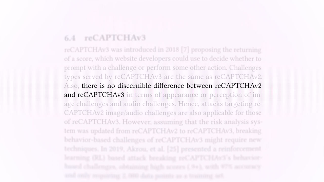
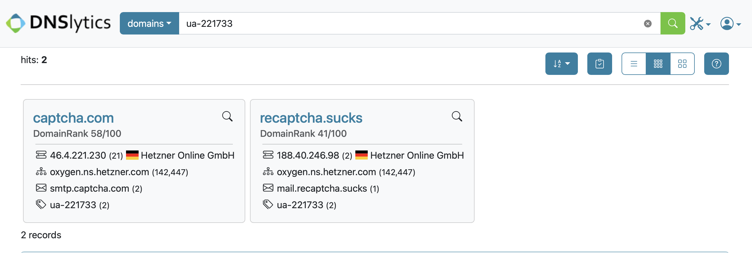