In February, I was working on a small project for a client which involved implementing some custom-designed form controls. I’m fairly competent with styling just about anything, and creating all sorts of hacky workarounds, but building custom checkboxes and select menus for this client was proving to be tedious. “Why hasn’t anyone built a simple way of doing this with, like, one CSS file?”, I wondered.
So, I made one.
In May, I previewed a work-in-progress form framework on Dribbble. If you’re not familiar with it, my goal was to build a simple stylesheet that could be attached to any HTML file. Designers could add their own resources, and it would Just Work™. I deemed the May preview release the 0.99 version, and noted that “[i]t’s nearly at a feature-complete, deployable point where you’ll be able to build on top of it.” Yeah, right.
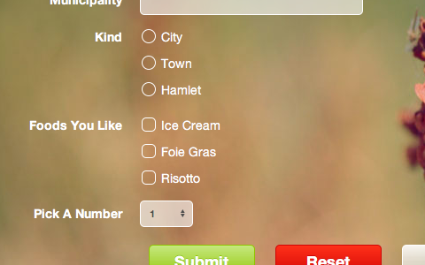
I was cross-browser testing this framework in preparation for rolling it out to the masses when I noticed a problem in Firefox. My placeholder controls are supposed to look like this:

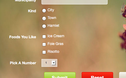
They render this way in all WebKit-based browsers, such as Safari, Chrome, and mobile browsers. The latest versions of Firefox, though, decided to render those same controls like this:

Why Firefox running on any operating system made in the past ten years renders the drop arrow in a select box like a button in Windows 95 is a mystery of the nerdiest calibre. I checked my CSS, and it looked absolutely fine. Firebug showed that it was interpreting my code correctly, so it apparently was not an issue. It should have been displaying the correct way, as in Safari and Chrome. It just wasn’t.
I started poking around online to see if anyone else had run into a similar issue with radio buttons, checkboxes, or select menus. These were the three components that were not showing the correct styling. It turns out that these are both known issues with Firefox: the year-old 649849, and the four year-old 418833.
Initially, I approached this as a fun and interesting challenge. My self-imposed limitation for this form framework was a single CSS file, and additional placeholder graphics. Is it possible to overwrite the default presentation, with a weird bug, using only a single stylesheet?
I had hoped this post would be a little bit of self-aggrandizement, showing how I worked around a couple of nasty bugs in a browser of decreasing quality. The initial premise for this was strong, after all. I worked around the inability for checkboxes to be styled by making an unordered list that looked and behaved like a checkbox, and placed it under a 0% opacity <input type="checkbox">. It worked, and it was beautiful.
But this method doesn’t work for radio buttons because it doesn’t deselect other options. Put another way, it allows for multiple radio buttons to appear to be selected. Select boxes are even more challenging to work around.
This, therefore, is an admission of defeat. The reason nobody has made a cross-browser, single CSS file solution for the tedious ways of styling form controls is because Firefox, and a couple of old bugs which are unlikely to be fixed, make it impossible.
The form framework has been officially named Tuxedo (it’s formal!). I am currently waiting for these bugs to be fixed before releasing it in both a CSS file, and a truly awesome LESS file. When those bugs are fixed, this will be the hands-down easiest way to build custom forms that work everywhere. Until then, sorry.