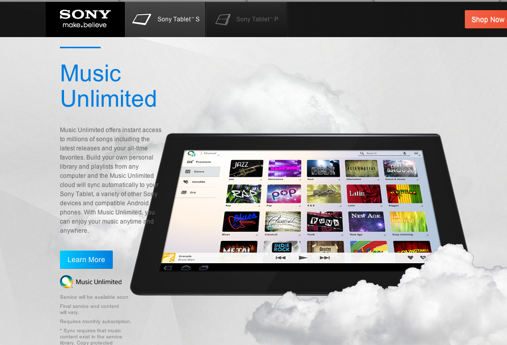
Sony launched a promotional website for their new tablet, inventively named the “Tablet S”, and I like the idea. The website is beautifully done, too, with that trendy parallax scrolling in heavy use. Something struck me upon reaching the Unlimited Music section. This is a shot of what the service looks like (click to enlarge any image in this post):
It looks an awful lot like iTunes 8’s genre view:
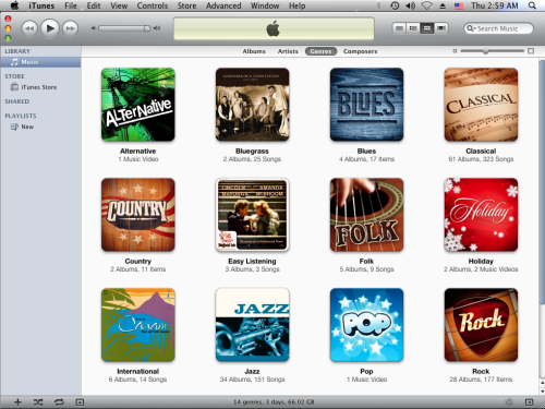
I failed to grab a screenshot of iTunes 8’s genre view when I had the chance, so all credit goes to Positive Feedback.
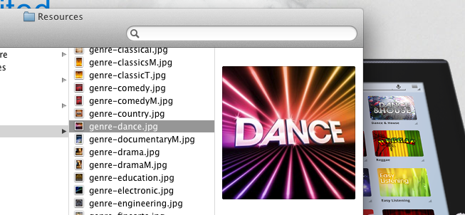
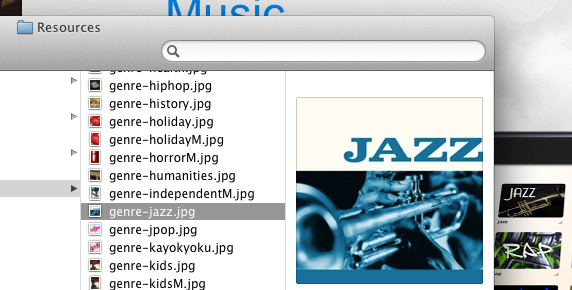
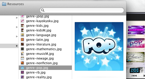
Now, of course, this is arguably nitpicking. Showing genres in an interactive, image-heavy way is not a unique concept. However, some of the genre-representative images on Sony’s device are quite close. In each, the foreground is the iTunes thumbnail; the background is the Sony version.
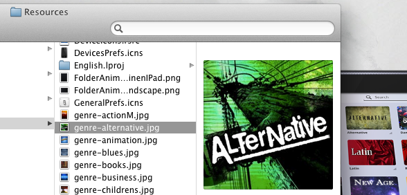
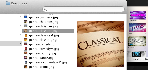
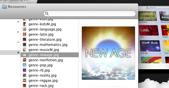

One may argue that the iTunes images are obvious representations, but that doesn’t necessarily mean the metaphors are the only ones Sony designers could have used. Why not use a saxophone for jazz, or a different font for dance? Sony has one of the better design teams in the tech world. There’s no reason they couldn’t have tried for something unique.