iTunes is a behemoth of an application. It’s a cross-platform, jukebox cum store cum multimedia library cum social network, and its interface represents a decade of this mutation. It has been roundly criticized for years for its ostensibly inefficient nature. Last month, for example, Jason Snell wrote a good piece for Macworld:
Apple has packed almost everything involving media (and app) management, purchase, and playback into this single app. It’s bursting at the seams. It’s a complete mess. And it’s time for an overhaul.
Snell, like everyone else who has levelled criticism of iTunes, has a good point here. It’s easy to point out that iTunes is broken because this is a point that everyone who uses it seems to agree upon. However, I want to take a look at why it is broken, and what needs to be fixed.
As I see it, iTunes performs three major functions, plus one additional: it organizes and plays media (including apps), it syncs media to other devices, and it allows for the purchase of media. The “+1” is iTunes Ping, which is that social network you’ve forgotten about. These aspects are viewed by many as unique and disparate, and should be treated as such. Snell, again:
It might be better off being split into separate apps, one devoted to device syncing, one devoted to media playback. (And perhaps the iTunes Store could be broken out separately too? When Apple introduced the Mac App Store, it didn’t roll it into iTunes, but gave it its own app.)
Au contriare, I contend that these functions are intertwined and necessary for each other. For now, though, I’ll critique them separately.
Media Playback
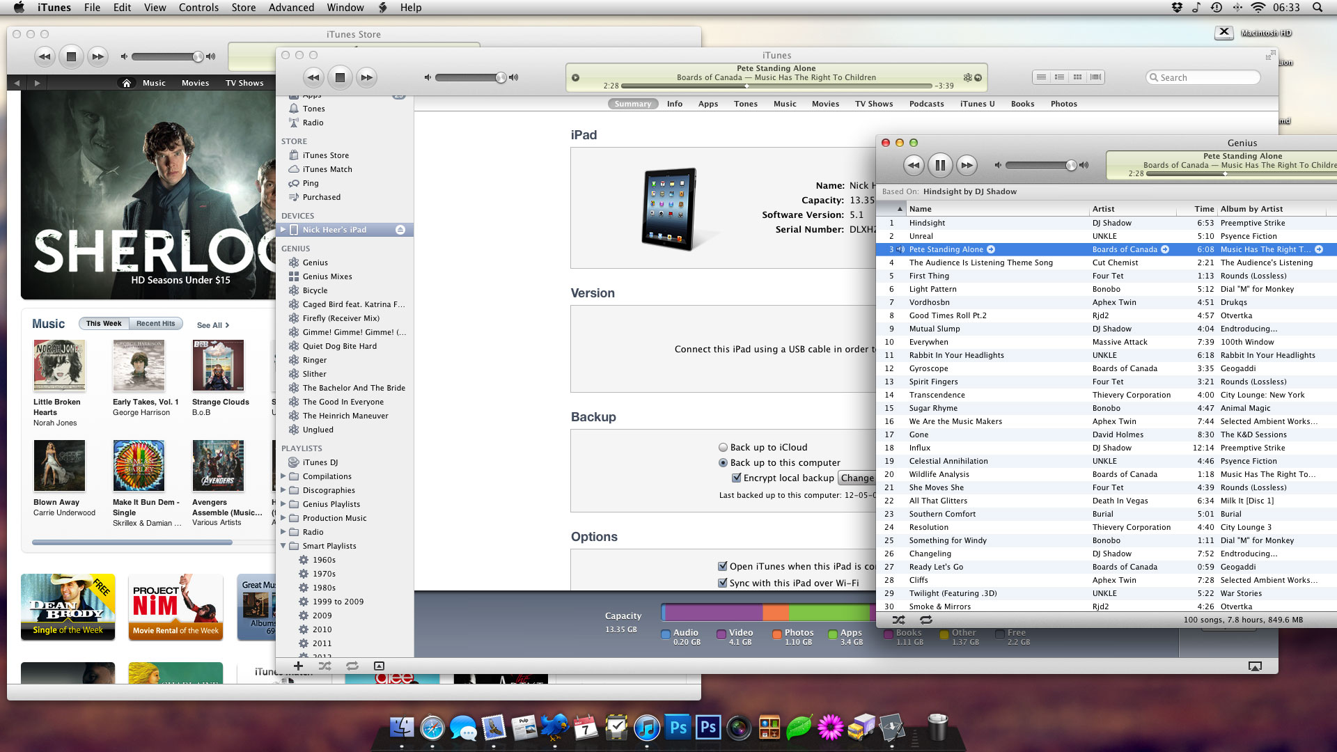
iTunes began as a simple music jukebox in January, 20011. It had a big list of every song you owned, a panel that displayed the currently-playing song, a search interface, and that was about it. When the iPod was released in October of the same year, iTunes gained some syncing features. When the iTunes Store was introduced, it was added to the desktop application. When the Store began selling music videos, movie playback made its way into iTunes. And so on, for every new feature: ringtones, audiobooks, podcasts, the iPhone, Apple TV, and Genius.
Media playback is at the core of iTunes. But it has struggled to cope in the wake of these new additions. Music organization, for example, is difficult despite numerous UI overhauls. All jukebox apps have a list view, which is information-dense, but is impenetrable with a library of more than a few hundred songs. In iTunes 8, Apple introduced a “Grid” view, which is good for moderate-sized libraries that are perfectly tagged with album artwork. Cover Flow, introduced in iTunes version who-gives-a-crap, is a fancy way of showing the list view with album artwork, but is also challenging for more than a few dozen albums.
The best view in iTunes, by far, is the hybrid view, which looks like the list view with album covers in the left-hand column. It’s quick to spot an album that you’re looking for, and works in a logical, hierarchical fashion. It still is not a great way to browse a large library, though. Combined with the browser, it is acceptable, but only just.
The problems facing the most rudimentary aspect of iTunes illustrates the complexity of the challenges Apple’s user interface designers are undertaking. There has to be a better way to catalogue a lot of media and display it in an efficient, logical way. Apple has succeeded, in my opinion, with the Music interface on the iPhone. I have around 3,500 songs on my iPhone, and it’s as easy to find a specific song as it is to shuffle the entire library. Of course, the iPhone has the unique qualities of a smaller display with a touch interface, so the UI cannot be directly ported. The inherent ideas are strong, however.
Purchasing
If it’s difficult to design an interface for organizing a library of 3,000 songs that scales well to 30,000 songs, it’s damn near impossible for a library of 17 million songs. The iTunes Store is an enormous catalogue of music, movies, TV shows, podcasts, books, and applications. Each of these are similar insomuch as they all are purchased and downloaded through iTunes, but that’s where things get complicated.
Much in the same way that music and movies have different browsing interfaces in iTunes, so must they have different purchasing interfaces. Different information is required about each, and Apple has succeeded here. Likewise for apps, podcasts, and books.
Where they have arguably failed is in the discovery of media. Ping was an attempt to create this atmosphere, but it has been largely unsuccessful. Genius recommendations are often decent, but buried in amongst a confusing interface. The Store is not an easy problem, obviously, but its entire workflow needs to be reconsidered for a better discovery path to emerge.
Syncing
Ah, the one feature everyone loves to hate.
iTunes syncing is unbelievably slow. Every time I drop my iPhone into my dock to add an album, it first has to back up its contents, figure out what needs to be changed, make the changes, and then verify it. Overall, this can take upwards of ten minutes, which is simply too long in 2012. Every step of the syncing process is important, however one gets the feeling that it should be quicker.
The verification process at the end of any sync is the part that kills me. I’ve been fairly lucky, but I know of a number of people who have high failure rates. But for it to improperly sync even once is a major issue. I have been copying files onto external hard drives on a daily basis for years and have never seen an error. I recognise that syncing and copying are two different concepts, but they use the same underlying principles. Syncing should never fail.
Finally, the syncing interface is clunky at best. App management is terrible, and the syncing interface doesn’t scale with the window 2. Syncing is, hands-down, the worst individual element of iTunes as it stands today.
Monolithic vs. Modular
Should iTunes be separated into three distinct applications, then? Perhaps one for playback, one for purchasing, and one for syncing? You can get a taste of what this might be like by double-clicking items in the sidebar to separate them into their own window. Go ahead; I’ll wait.
There are three distinct tasks here, but each are as vital to another as you’d think. Separating iTunes into different applications would be like moving the “import” function in Aperture or iMovie to another application. This is without even considering the nightmare it would be to port three applications to Windows instead of one.
People often refer to iTunes as a victim of bloat, but I disagree. I see bloat as an application gaining features far beyond its scope, such as a word processor with website creation features. If iTunes were as fast as any other application, I doubt we would hear arguments of bloat, because the features it has gained over the years make sense for its role. It’s a clunky beast, but it would suck worse if it were three mediocre ones. Think of it as Thor, instead of the Lernaean Hydra.
Maybe they’ll change the icon to a big-ass hammer to match.