Emanuel Maiberg, writing for Vice Motherboard on the new behaviour in iOS 11 of the Control Centre toggle switches for WiFi and Bluetooth.
Users can still completely turn off Bluetooth and Wi-Fi by digging into the devices menu settings, but essentially the button does not do what a user can reasonably assume Apple says it does, and that’s because Apple doesn’t trust you. This decision is the next logical step for what has always been Apple’s design ethos: It thinks it knows what you want more than you do.
[…]
But now Apple has taken this philosophy a step further. It has gone from protecting users by omitting or blocking features to outright deceiving to users about what certain features do. “It just works,” except when you actually know what you’re doing but aren’t allowed to do it. It would have been easy to make the Control Center customizable, but of course it is not.
I agree with Maiberg’s stance that the revised behaviour of the Control Centre toggles is not clear. However, I find the rest of his argument utterly ridiculous. The two paragraphs that I quoted effectively summarize his position, and they’re full of hot garbage:
I can’t speak to Apple’s intentions here, but for everyone I know, the reason they toggle WiFi in Control Centre is because a weak WiFi signal is temporarily irritating them and they want a quick way to disconnect from the network. Similarly, a user may simply opt to disconnect from a Bluetooth speaker by tapping the Control Centre toggle. I wouldn’t be surprised if Apple had information on what users’ true intent is when using these toggles and adjusted the behaviour accordingly.
Describing this behaviour change as “deceptive” gives it an unnecessarily sinister vibe. A softer version of Hanlon’s razor more correctly explains what’s going on here: poor communication, rather than duplicitous intent.
Maiberg claims in the second quoted paragraph that if “you actually know what you’re doing” you “aren’t allowed to do it”, but he opens the first quoted paragraph — just two prior, in the article itself — by noting that you can switch off WiFi and Bluetooth completely in Settings.
Maiberg’s just getting started, though. He has other complaints along the same lines:
One may reasonably argue that this is a smart design decision to prevent taking a destructive action accidentally.
Apps must be approved by Apple before entering the App Store. Increasingly, it makes it harder for you to install third-party programs on MacOS (in Sierra, this option is hidden).
It only makes it trickier to install unsigned third-party applications. Your average user probably doesn’t run into this kind of stuff very often. Those who do need to use an unsigned app can figure out how to approve it with Gatekeeper.
Some of what Maiberg argues comes down to preference. Apple’s design direction is that normal people don’t feel lost when using their products, or get confused when things don’t behave as they were expecting. Sometimes — as with the WiFi and Bluetooth controls — this can confuse more technically-minded users. But claiming that Apple doesn’t trust their users is a misinformed overreaction.
Equifax’s response to its data breach has been a total shitshow, something the company seems determined to remind us of each and every day.
For nearly two weeks, the company’s official Twitter account has been directing users to a fake lookalike website, the sole purpose of which is to expose Equifax’s reckless response to the breach.
Much as Apple’s comeback from near-bankruptcy is studied in business schools as an incredible success story, Equifax’s response to this breach will surely be used in public relations and computer science classes as an example of everything you are not supposed to do in response to a crisis.
Given the inadequacy of Equifax’s response so far, I’m not sure what justice would look like for the victims of their incompetence. Perhaps Equifax would waive the cost of locking credit scores, or maybe they would offer five or even ten years of credit report monitoring. Maybe those in charge of ensuring the security and safety of such a large repository of private data would be fired. Instead of anything like those suggestions, Equifax reported on Friday that two executives — their Chief Information Officer and Chief Security Officer — would be “retiring”. Equifax didn’t say how much their retirement packages are worth.
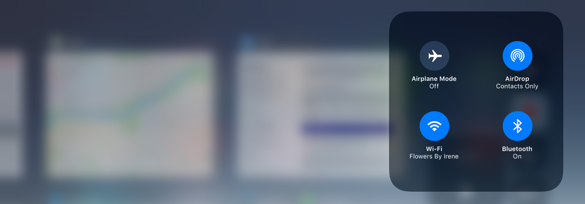
Even when toggled off in Control Center on an iPhone, iPad, or iPod touch running iOS 11 and later, a new support document says Bluetooth and Wi-Fi will continue to be available for AirDrop, AirPlay, Apple Pencil, Apple Watch, Location Services, and Continuity features like Handoff and Instant Hotspot.
Toggling off Bluetooth or Wi-Fi in Control Center only disconnects accessories now, rather than disabling connectivity entirely.
I don’t toggle either Bluetooth or WiFi so I didn’t notice this, but I also didn’t think to check whether Bluetooth was, indeed, switched off if I toggled it off in Control Centre. I kind of get why this change was made: a frequent barrier in my use of AirDrop “just working” is that a friend’s Bluetooth connection has been toggled off. I don’t think that most people would be fully aware that both networking services must be switched on for many of Apple’s “continuity” features to keep working.
Still, this does feel a bit wrong. A toggle switch that looks like it’s on or off should behave accordingly. There are some indicators of its true behaviour — when you toggle WiFi from Control Centre, a message across the top of the screen reads “Disconnected from WiFi Network Name”. This doesn’t say that WiFi will continue to be available for iOS features, though, and it seems counterintuitive.
Update: Changed “affordances” to “indicators” per a reader’s emailed suggestion.
I used the on-watch keypad to dial my on-shore boyfriend, and the dial tone came blaring through the built-in speaker, which I’m pretty sure disturbed some nearby seagulls. I’m sure the high volume was intentional to compete with loud, busy outdoor environments, and I was impressed by how much audio power was packed into the thing. His voice came in loud and clear, and we had a short conversation, before I hung up and attempted to send a text. Interacting with the screen with wet fingers is mostly miserable, but voice-to-text dictation worked supremely well.
Apple’s marketing materials for the Series 3 Watch heavily feature surfers and swimmers taking calls, so that’s what several reviewers tried, including Nguyen, Joanna Stern of the Wall Street Journal, and Lauren Goode of the Verge:
I actually went surfing, in the ocean, wearing the Apple Watch, hoping to replicate the glorious ad that Apple put out of a woman surfing and receiving a phone call on her Apple Watch. (Is this glorious? Real surfers would disagree. And I looked like a serious kook shouting “Hey Siri!” at my wrist in the ocean.) I wasn’t very far from shore, but the Watch vacillated between one bar of service and being disconnected entirely. I did manage to make one phone call from a surfboard. That was kind of wild.
Goode and Stern both found that their review units struggled to connect to LTE, leaving them with either a single bar — well, dot — or no service at all. For the defining feature of this model, that’s discouraging.
Serenity Caldwell of iMore dug into this problem and found out that an existing WatchOS 4 bug is the likely culprit:
Essentially, the Series 3 GPS + Cellular watch tries to save battery life at all times by using your iPhone’s connection, or failing that, a Wi-Fi network. What’s happening here is that the watch is attempting to jump on a so-called “captive” network — a public network with an interstitial login prompt or terms and conditions agreement. (You’ve probably seen these at a Starbucks, McDonalds, or Panera.)
Caldwell’s explanation sounds reasonable, but it’s surprising to me that Goode’s experience, out in the ocean, would be affected by a WiFi bug.
Regardless of the cause, this is a bad bug. Preordered Watches have already begun shipping, so this won’t be fixed before those are delivered. And, because the process of updating an Apple Watch is so slow and cumbersome, even for small updates, this bug’s impact will be pretty noticeable for anyone who has already ordered a Series 3 Watch.
In contrast to the Series 3 hardware, WatchOS 4 has been getting rave reviews, and I’m not surprised. Goode:
Speaking of saving a workout: when you finish a workout on the Watch now, there’s only one option, Done. The Apple Watch used to offer two options, Save and Discard. I suspect some people were accidentally discarding workouts when they were finished, instead of saving them. This is a much simpler way to do it.
I imagine the number of people who intentionally discarded a workout was vanishingly small compared to the number of people who accidentally did so. I know I have. This is one of the refinements that I love most.
Second, there’s a new feature in WatchOS called “Auto-launch Audio Apps”. It’s in the Apple Watch app on your iPhone, in the General: Wake Screen section. What happens with this is that when you initiate audio playback on your iPhone, if there’s a corresponding WatchOS app on your watch, when you raise your wrist that app is what you see, instead of your watch face.
The first time I saw this for Music, I was pleasantly surprised; the first time I saw this for Overcast, I was blown away that it worked for third-party apps without any developer intervention. Once you get used to it, it’s hard to imagine the Watch ever not showing audio controls by default.
The new Siri watch face is fantastic, by the way. I’m sure the other new faces featuring a kaleidoscope and Toy Story characters are cool, but I haven’t once switched from the Siri face since June. It is one of the best arguments for owning an Apple Watch, even — perhaps especially — if you are not a fitness buff. My only complaint is that it doesn’t work with third-party apps, so if you keep todos in Things, for example, it may not be as useful to you.
Matt Birchler wrote a much more comprehensive review, and it’s worth checking out. Of note, the Phone app now includes a keypad:
Second, this keypad is available from inside the app while you’re on a call, so you can interact with automated systems that require you to “PRESS 4 TO TALK TO A HUMAN”. This again is not required functionality, but it removes some of the limitations the watch used to have when making phone calls.
I never open the Phone app on my Apple Watch, but this might actually be useful for buzzing someone into my apartment. I’ll have to give that a try.
I’ve got my balcony door wide open this evening and the breeze it’s creating simply isn’t making a difference — I feel like I’m melting into my couch. I should be used to this after a record-shattering summer, but I am not. I live in Canada, in a city where snowfall has been recorded in every month. I am exhausted. I’m holding in one hand a glass of The Hatch’s 2016 “Rhymes with Door Hinge” and, with the other, I am balancing my iPad perhaps a little too precariously on my leg.
I’m flipping through one of the Atlantic’s excellent weekly photo galleries and I see an amazing picture that I know a friend of mine will love. I put down my glass of wine to be able to perform a somewhat tricky routine of dragging the photo with one finger, dragging the URL with another, swiping from the right-hand part of the screen to float Messages over Safari with a third finger, then navigating to that friend’s chat thread and dropping both the image and URL into a message to send it off. I’m impressed, but also not quite used to these complex interactions. I still feel clumsy sometimes when I do them — a thought that was underscored moments later when I went to pick up my glass of wine only to spill it all over my coffee table.
iOS 11, then: it gives you all kinds of fun new powers, especially on an iPad, but it won’t save you if you’re already a klutz.
I’ve been using iOS 11 daily since it was announced at WWDC and, rather than go through each feature point-by-point like an extended changelog with commentary, I thought I’d explore a bit of how this update feels different with daily use. There’s a lot to unpack and, while I think the vast majority of this upgrade is excellent and demonstrates clear progress in areas previously ignored, I feel there are some things that are really and truly confused. Let me show you what I mean.
The Weird Stuff
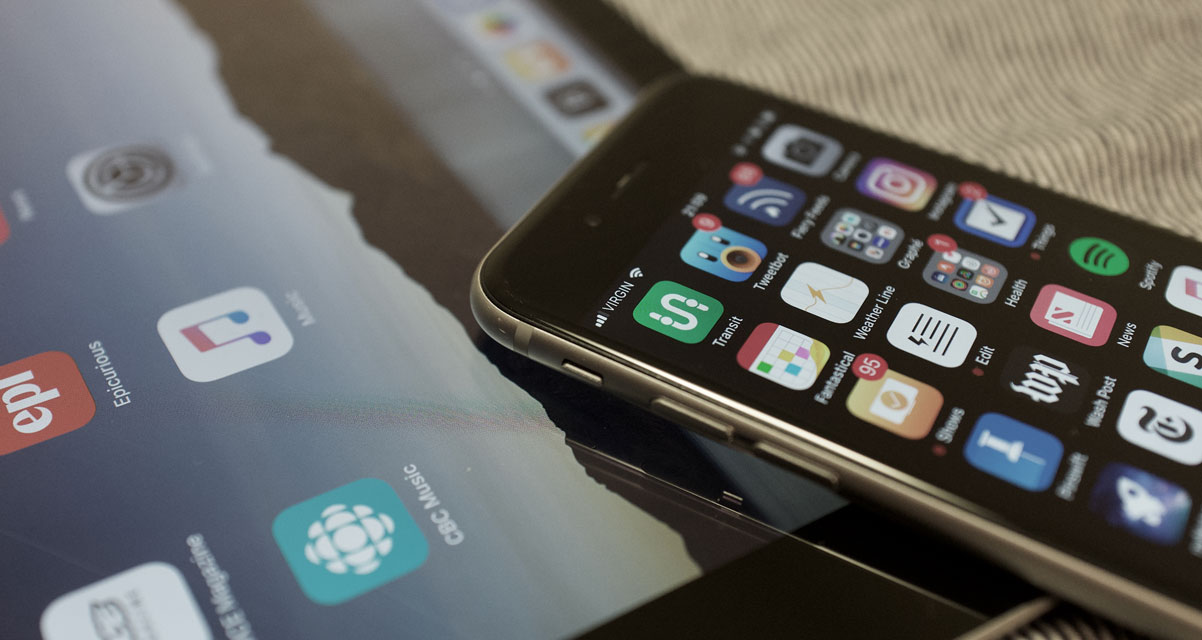
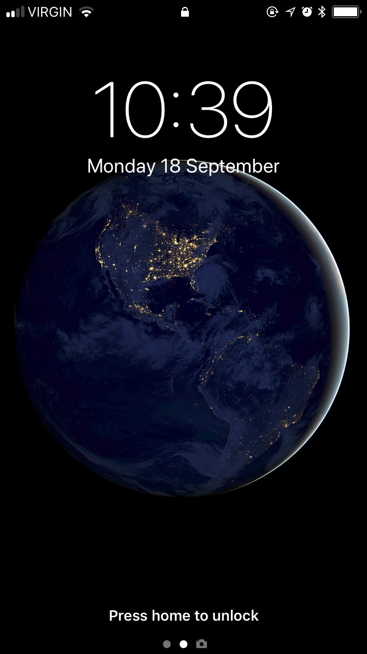
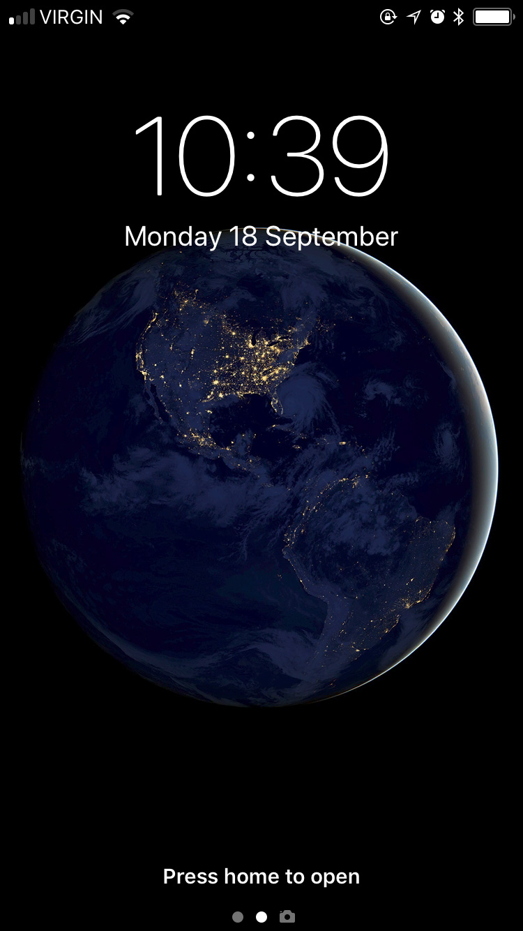
Let’s start with the lock screen, because that’s where pretty much every iOS interaction will start. When you unlock the device, the lock screen now slides up as though it’s a cover overtop the rest of the system. In some places, like notification preferences, Apple even calls it the “Cover Screen”. But, while this animation suggests that the lock screen is now sitting in an invisible place above the top of the screen, you can’t swipe upwards to unlock a non-iPhone X device — that action will scroll notifications instead — nor can you pull down from the top to lock it.
Lock Screen.Notification Centre.
Making matters even more confusing, if you do pull down from the top of an unlocked device, the screen looks like the lock screen, but doesn’t actually lock the device.
Control Centre now supports 3D Touch-like gestures on the iPad, but no iPad today has 3D Touch.
Here’s another example: the iPad and other devices that don’t have 3D Touch displays now support some 3D Touch functionality. If you touch and hold on a notification on the lock screen, for example, it looks like you’re doing the “peek” gesture. The new grid-based Control Centre requires 3D Touch interactions on the iPhone but, again, those gestures have been substituted for touch-and-hold on the iPad. I guess these are fine adaptations, but it indicates to me that aspects of the system were designed in anticipation for a mix of devices that don’t yet exist and some — but not all — of the devices that do. It is inconsistent, though: while it’s possible to use 3D Touch interactions in Control Centre and on notifications in Notification Centre, similar “Peek” interactions don’t work on home screen icons or within apps.
The differences in iOS 11, then, continue to balance new functionality with further complications. But this should be no surprise to those who have used Apple’s ecosystem of devices for several years; it is merely accelerating a trend of growing the features of iOS without forgetting its roots. iOS was, in many ways, a fresh start for the future of computing and each iteration of the OS has built upon that. Sometimes, as above, it feels as though these additions are moving a little too fast. I notice this most when additions or updates feel perhaps incomplete, or, at least, not wholly considered.
These can all be added to Control Centre, if you’d like.As an example, this iteration of Control Centre is the third major interpretation since iOS 7, released just four years ago. It no longer splits its controls across two pages which, I’m sure, ought to make some people very happy — I was never bothered by that. Its grid-like layout has been touted as being “customizable”, but that’s only true of the app launching and single-function icons across the bottom: you know, the buttons for Calculator, Camera, or the flashlight. You can now choose from over a dozen different apps and functions, including screen recording and a quick-access remote for the Apple TV, and you’re no longer limited to just four of these controls — if there are too many, Control Centre will scroll vertically.
You’d think, though, that by turning Control Centre into a grid that it would be possible to rearrange sections of it by what you use most, or hide controls you never use. That isn’t possible in this version. You might also think that adding a level of customizability would make it possible to assign third-party apps to certain Control Centre launching points — for example, launching PCalc instead of Calculator, or Manual instead of Camera. But that hasn’t happened either. It is also not possible to change which WiFi network you are connected to from Control Centre, despite the additional depth enabled by 3D Touch controls.
Here’s another example of where things feel a bit incomplete: Slide Over and Split View on the iPad. Previously, dragging an app into either multitasking mode required you to swipe from the right edge to expose a grey panel full of oddly-shaped rounded rectangles, each of which contained an app icon. Apart from looking ugly, which it was, this UI made absolutely no sense to me. What were the rounded rectangles representing? Why did they need to be so large? Why did such an obviously unscalable UI ship?
iPad multitasking on iOS 9 and 10.
Thankfully, this interface is no more for iOS. iPad multitasking is now made somewhat easier by the new systemwide floating Dock. It works and looks a little bit like the Dock on MacOS, insomuch as it contains your favourite apps and can be accessed from within any app simply by swiping upwards from the bottom of the screen. If you want to get an app into Split View or Slide Over, all you need to do is drag its icon up from the Dock and let it expand into a multitasking view on either side of the open app.
But hang on just a minute: if you’re on the home screen, dragging an app icon up from the Dock will remove that app from the Dock. So, in one context, the action is destructive; in others, it’s constructive. That inconsistency feels bizarre in practice, to say the least.
And then there’s the process of getting an app into a multitasking view when it isn’t a Dock app. You can start from the home screen or Spotlight in Notification Centre by finding your app, then touch and hold on the icon until it starts to float. Then, either launch an app with another of your fingers (if you’re starting on the home screen) or press the home button to close Spotlight. Wait until the app icon expands in place, then drop it on either side of the screen to get it into multitasking. It took me a little while to figure out this gymnastics routine and, if I’m honest with myself, it doesn’t feel fully considered. The Dock is brilliant, but the trickiness of getting non-Dock apps into a multitasking view doesn’t yet feel obvious enough.
There is, however, a minor coda of relief: the Dock has space on the righthand side, past the very Mac-like divider, for “suggested” apps. This area tends to include non-Dock apps that you’ve recently used, apps from Handoff, or apps triggered when you connect headphones. But, as this Dock area relies upon technology that is “learning” user patterns rather than being directly user-controlled, the apps you’re expecting may not always be in that area of the Dock. When it works, it’s amazing; when it doesn’t, you still have to do the somewhat-complicated dance of launching apps from the home screen.
Finally, the Dock has more of that pseudo-3D Touch functionality. You can touch and hold on a supported app’s icon to display a kind of popover menu, which looks a lot like the 3D Touch widgets that display on iPhone apps. But they’re not the same thing; apps that have a widget on the iPhone will have to add a different kind of functionality to show a very similar feature in the iPad’s Dock.
So these things — the Dock and Control Centre — feel like they are hinting at newer and more exciting things, but don’t quite conclude those thoughts. They feel, simply, rushed.
In other ways, though, it can sometimes feel like an addition to iOS has taken longer than it should.
Drag and Drop, Keyboard Flicks, and Other iPad Improvements
That statement, naturally, leads me neatly onto systemwide cross-application drag and drop, making its debut this year. There are apparently lots of reasons for why drag and drop was not in iOS previously — for example, it seems as though APFS and its cloning and snapshot features help enable a faster and more efficient drag and drop experience. The new Dock, which allows for more efficient app switching, also seems to have played a role. But regardless of why it took so many years for such a natural interaction to debut on Apple’s touch devices, we should focus on the what of it. Is it good?
Oh, yes. Very.
I love many of the iPad enhancements in this release, but none has been as strong for me as the implementation of drag and drop. Not only can you drag stuff across apps, the drag interactions are separate from the apps themselves. They kind of live in a layer overtop the rest of the system, so you can move around and find just the app you’re looking for — whether you launch it from the Dock, app switcher, home screen, or Spotlight.
You can pick up multiple items from multiple different apps and drop them into any of several different apps. This takes full advantage of the multitouch display on the iPad.
But my favourite thing about drag and drop on iOS and the reason I’ve been so impressed by it is that you can use all of your fingers to “hold” dragged items until you’re ready to drop them. You can also drag items from multiple sources and even multiple apps. It’s crazy good, to the point where dragging and dropping on a traditional computer using a mouse cursor feels like a kludge. In fact, drag and drop is one of the biggest reasons why I’ve chosen to use an iPad more in the past few months than I did for the preceding year.
Developers do have to add support for drag and drop in their apps, but some UI components — like text areas — will support drag and drop in any app without the developer needing to make adjustments.
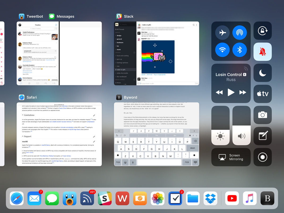
The other really big enhancement that has completely transformed my iPad experience is the new app switcher. Swiping from the bottom of the screen reveals the new floating Dock, but a continued (or second) swipe will show the new app switcher. Instead of showing a single app at a time, six thumbnails now fit onto the screen of my 9.7-inch model at once, making for a much better use of the display’s space. I’m not sure how many app thumbnails fit into a 12.9-inch model’s screen; I hope for more.
Other than being vastly more efficient, which makes the Swiss half of me extremely happy, the app switcher also preserves app “spaces”. When I’m writing, I like to have Slack and Tweetbot open in split-screen, put Safari and Notes together, and keep Byword in its own space. Now, whenever I switch between these, those pairings are retained: if I tap on Tweetbot in the Dock, I’ll see Tweetbot and Slack, exactly as I left them. This makes it really easy to construct little task-specific parts of the system.
Another great enhancement to the system is the new keyboard. Instead of having to navigate between letters, numbers, and symbols with a modal key, you can now swipe down on individual keys to insert common characters. It takes some getting used to — especially for the ways I type, I often insert a “0” where I mean to type a “p”, for instance. Unfortunately, this relatively common typing mistake isn’t caught by autocorrect. Maybe I’m just sloppy; I’m not sure. Even with my misplaced numerals, I appreciate this keyboard refinement. It makes typing so much faster, especially since I frequently have to type combinations of letters and numbers while writing Pixel Envy. I still think frequent patterns — say, postal codes, for example, which in Canada alternate between letters and numbers — should be automatically formatted as you type, but this keyboard is definitely a great step up once you get used to it.
There are some lingering problems I have with the iPad’s keyboard, in particular, however. I find that it occasionally registers keys tapped in fast succession as a two finger tap, which invokes a text selection mode. I have begun to replace entire sentences without realizing it because of this. I wish the iPad’s keyboard could do a better job of understanding the difference between fast typing and invoking selection mode. The goal should be to make the virtual keyboard as close to a physical keyboard in terms of user confidence and key registration accuracy. Also, I continue to have absolutely awful luck with autocorrect: it capitalizes words seemingly at random, changes word tense several typed words later — when I began typing the word “seemingly” just now, it changed “capitalizes” to “capitalized” — and is frequently a focus-disrupting nuisance. It can be turned off in Settings, but I find that the amount of times autocorrect is actually useful just barely outweighs the times that it is frustrating. Enhancing autocorrect is something I believe should be a focus of every iOS release, major or minor.
But, even with all the attention lavished upon the iPad this year, there are still some ultra-frustrating limitations. With the exception of Safari, you can only open one instance of an app at a time. I cannot tell you how frequently I have two different windows from the same app open at the same time on my Mac, and it’s really irritating to not be able to do that on my iPad, especially with the far better support for multiple apps in iOS 11.
There are other things that have left me wanting on the iPad, too, like the stubbornly identical home screen. I’m not entirely sure it needs a complete rethink. Perhaps, somewhere down the line, we could get a first page home screen that acts a little more like MacOS, with recent files, suggested apps, widgets, and a lot more functionality. But even in the short term, it would make sense to be able to add more icons on each page, especially on the larger-sized models.
And, strangely, in terms of space utilization, the iPad fares slightly worse on iOS 11 than it did running iOS 10 because Notification Centre has reverted to a single-column layout. There may be a reason for this — maybe even a really good one — but any attempt to rationalize it is immediately rendered invalid because the iPhone actually gains a two-column Notification Centre layout in landscape on iOS 11. I do not understand either decision.
iOS 11 replaces the two-column Notification Centre with a single column on the iPad, but adds a second column on the iPhone, even on my non-Plus model.
I also think that it’s unfortunate that Siri continues to take over the entire display whenever it is invoked. I hope a future iOS update will treat Siri on the iPad more like a floating window or perhaps something that only covers a third of the display — something closer to the MacOS implementation than a scaled-up iPhone display. I know it’s something that’s typically invoked only briefly and then disappears, but it seems enormously wasteful to use an entire display to show no greater information than what is shown on the iPhone.
Siri
Here’s a funny thing about that previous paragraph: using the word “Siri” to describe Apple’s voice-controlled virtual assistant is actually a bit antiquated. You may recall that, in iOS 10, the app suggestions widget was renamed “Siri App Suggestions”; in iOS 11, it has become clear that “Siri” is what Apple calls their layer of AI automation. That’s not necessarily super important to know in theory, but I think it’s an interesting decision; it’s one thing for a website to note that their search engine is “powered by Google”, but I’m not sure Siri has the reputation to build Apple’s AI efforts on. Then again, perhaps it’s an indication that these efforts are being taken more seriously.
In any case, the new stuff: the personal assistant front-end for Siri has a new voice. In many contexts, I’ve felt it sounds more natural, and that alone helps improve my trust in Siri. However, I’m not sure it’s truly more accurate, though I perceive a slight improvement.
This idea of Siri as a magical black box is something I’ve written about several times here. I will spare you my rehashing of it. Of course, this is the path that many new technologies are taking, from Google and Amazon’s smart speakers to the mysterious friend recommendations in Facebook and LinkedIn. It’s all unfathomable, at least to us laypeople. When it works, it’s magical; when it doesn’t, it’s frustrating, and we have no idea what to do about it, which only encourages our frustration. These technologies are like having a very drunk butler following you everywhere: kind of helpful, but completely unpredictable. You want to trust them, but you’re still wary.
Even with a new voice and perhaps slightly more attentive hearing, Siri is still oblivious to common requests. I am writing these words from a sandwich place near where I live called the Street Eatery. It was recommended to me by Siri after I asked it for lunch recommendations, which is great. However, when I followed up Siri’s recommendation by asking it to “open the Street Eatery’s website”, it opened a Trip Advisor page for a place called the Fifth Street Eatery in Colorado, instead of the restaurant located blocks away that it recommended me only moments before.
In iOS 11, Siri also powers a recommendation engine in News, and suggests search topics in Safari when you begin using the keyboard. For example, when tapped on the location bar after reading this article about Ming-Chi Kuo’s predictions for the new iPhone, it correctly predicted in the QuickType bar that I may want to search more for “OLED”, “Apple Inc.”, or “iPhone”. But sometimes, Siri is still, well, Siri: when I tapped on the location bar after reading a review of an Indian restaurant that opened relatively recently, its suggestions were for Malaysian, Thai, and Indonesian cuisine — none of which were topics on that page. The restaurant is called “Calcutta Cricket Club”, and the post is tagged in WordPress with “Indian cuisine”, so I have no idea how it fathomed those suggestions. And there’s no easy way for me to tell Apple that they’re wrong; I would have to file a radar. See the above section on magical black boxes.
To improve its accuracy over time, Siri now syncs between different devices. Exactly what is synced over iCloud is a mystery — Apple hasn’t said. My hunch is that it’s information about your accent and speech patterns, along with data about the success and failure of different results. Unfortunately, even with synced data, Siri is still a decidedly per-device assistant; you cannot initiate a chain of commands on one device, and then pick it up on another. For example, I wouldn’t be able to ask my iPad to find me recommendations for dinner, then ask my iPhone to begin driving directions to the first result without explicitly stating the restaurant’s name. And, even then, it might pick a restaurant thousands of miles away — you just never know.
User Interface and Visual Design
At the outset of this review, I wrote that I wanted primarily to relay my experiences with the iOS 11 features I use most and had the greatest impact on how I use these devices. I want to avoid the temptation of describing every change in this version, but I don’t think I can describe the ways I have used with my iPhone and iPad without also writing about the ways in which Apple has changed its visual design.
Every new major release of iOS gives Apple the chance to update and refine their design language, and iOS 11 is no exception. Last year, Apple debuted a new style of large, bold titles in News, Music, and the then-new Home app; this year, that design language has bled throughout the system. Any app defined by lists — including Mail, Phone, Contacts, Wallet, Messages, and even Settings — now has a gigantic billboard-esque title. It kind of reminds me of Windows Phone 7, only nicer. I like it a lot and, based on the screenshots I’ve seen so far, it appears to work well to define the upper area of the iPhone X.
This big title style looks nice, but I’m not sure writing “Settings” in gigantic bold letters really affects how I use this app or the system overall.In practice, though, this treatment means that the top quarter of the screen is used rather inefficiently in an app’s initial view. You launch Settings, for example, and the screen is dominated by a gigantic bold “Settings” label. You know you’re in Settings — you just launched it. A more cynical person might point to this as an indication that all post-iOS 7 apps look the same and, therefore, some gigantic text is needed to differentiate them. I do not believe that is the case — there is enough identifying information in each app, between its icon, layout, and contextually-relevant components.
And yet, despite the wastefulness of this large text, I still think it looks great. The very high resolution displays in every device compatible with iOS 11 and Apple’s now-iconic San Francisco typeface combine to give the system a feeling of precision, intention, and clarity. Of course, it’s worth asking why, if it’s so great, a similar large header is not shown as one triangles further into an app. I get the feeling that it would quickly become overbearing; that, once you’re deep within an app, it’s better to maximize efficiency — in magazine terms, the first page can be a cover, but subsequent levels down within the same app should be the body.
Fans of clarity and affordances in user interfaces will be delighted to know that buttons are back. Kind of. Back when iOS 7 debuted, I was among many who found the new text-only “buttons” strewn throughout the system and advocated for in the HIG as contentious and confusing. Though I’ve gotten more used to them over the past several years, my opinion has not changed.
iOS 11 is part of what I’m convinced is a slow march towards once again having buttons that actually look like buttons. The shuffle and looping controls in Music, for instance, are set against a soft grey background. The App Store launcher in Messages is a button-looking button. But, lest you think that some wave of realization has come across the visual designers working on iOS, you should know that the HIG remains unchanged, as does the UIButton control.
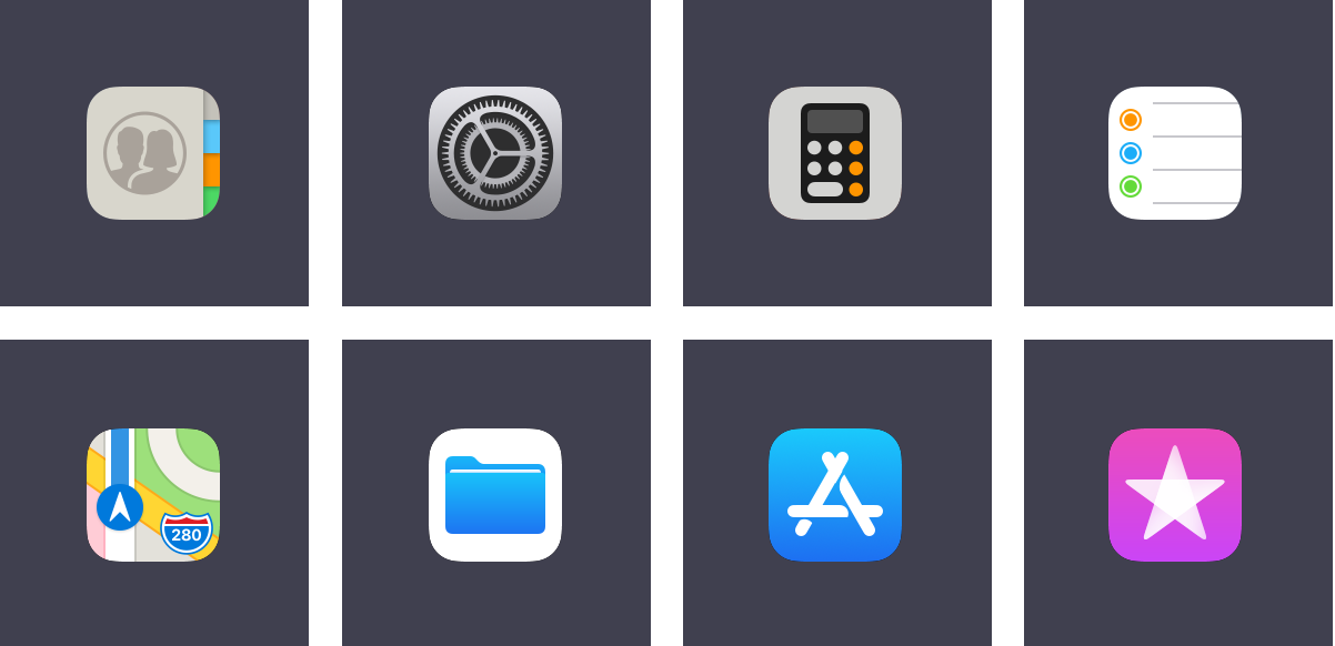
There are some noteworthy icon changes in this update as well. I quite like the new Contacts icon and the higher-contrast icon for Settings, but I have no idea what Apple’s designers were thinking with the new Calculator icon. It’s grey; it has a glyph of a calculator on it in black and orange. And I reiterate: it is grey. The Reminders icon has been tweaked, while the new Maps icon features a stylized interpretation of Apple Park which, per tradition, is cartographically dubious. I don’t like the plain-looking Files icon; I remain less-than-enthusiastic about almost any icon that features a glyph over a white background, with the exceptions of Photos and the NY Times app.
The new App Store icon proved controversial when it launched, but I actually like it. The previous glyph was a carryover from MacOS and, while I don’t think that it was confusing anyone, I do think that this simplified interpretation feels more at home on iOS. The new iTunes Store icon is the less successful of the two redesigns, I feel. As Apple Music has taken over more of the tunes part of iTunes, it appears that the icon is an attempt to associate iTunes with movies and TV shows through the blending of the purple background colour and the star glyph — both attributes, though not identical, are used for the iMovie icon as well. But this only seems to highlight the disconnect between the “iTunes Store” name and its intended function.
Icons on tab bars throughout the system have also been updated. In some places, solid fills replace outlines; in others, heavier line weights replace thin strokes. I really like this new direction. It’s more legible, it feels more consistent, and it simply looks better. These are the kinds of refinements I have expected to see as the course correction that was iOS 7 matures. While it has taken a little longer than I had hoped, it’s welcome nevertheless.
And, for what it’s worth, the signal bars have returned to the status bar, replacing the circular signal dots. This reversion seems primarily driven by the iPhone X’s notched display, but every iPhone and iPad model gets the same status bar. I cannot figure out why the brand new Series 3 Apple Watch uses dots to display LTE signal strength.
To complement the static visual design enhancements, many of the system animations have been tweaked as well. When you lift an iPhone 6S or later, the screen now fades and un-blurs simultaneously; it’s very slick. The app launching animation has been updated, too, so that it now appears as though the app is expanding from its icon. It’s a small thing; I like it.
Assorted Notes and Observations
The App Store has been radically redesigned. I’m dumping it down in this section because, while I applaud the efforts behind separating games from other kinds of apps and I think the News tab is a great way to help users find apps that might be buried by the hundreds of thousands of others, it has not changed the way I use the App Store. I’m pretty settled into a certain routine of apps, so I don’t regularly need to look for more. I didn’t ever really think, during my experience testing it, to check the App Store for what is being featured or what collections have been created lately.
ARKit and Core ML are both very promising technologies that, I think, will need several more months in developers’ hands to bear fruit. Carrot Weather has a fun AR mode today, if you want to try it out.
There aren’t any new Live or Dynamic wallpapers in iOS 11. Live wallpapers were introduced two years ago; Dynamic wallpapers were introduced four years ago.
The new still wallpapers are a clear retro play. There are familiar six-colour rainbow stripes, a Retina-quality version of the Earth photograph from the original iPhone, and — for the first time — Apple has included a plain black wallpaper.
Apple Music has gained some social networking features that, I think, might actually work well. After iTunes Ping and Connect, this is the third time Apple has really tried to push any kind of social functionality (Connect still exists in Apple Music, but I don’t know anybody who actually uses it). Apple Music’s new user profiles can automatically show your friends what you’re listening to, and you can display your playlists too. I expect the automatic sharing aspect — as opposed to requiring users manually update their profiles — to be a primary factor if it continues to be as successful in general use as it has been for me in beta.
There’s also a new take on a shared party playlist. I sincerely doubt that many people go to house parties to control the playlist in a group setting. Maybe this will change with the launch of the HomePod but, like Apple’s previous attempts — Party Shuffle and iTunes DJ — I expect this feature to be largely forgotten.
As I mentioned last year, I think the Memories feature in Photos is one of the best things Apple has built in a long time. iOS 11 promises additional event types, like weddings and anniversaries, which provides more variety in the kinds of Memories that are generated. I love this kind of stuff.
The vast majority of system photo filters have been replaced with much more sensitive and realistic filters. I’ve used them several times. While they’re no replacement for my usual iPhone editing process, they work much better in a pinch than the ones that date back to iOS 7, simply because they’re less garish.
You can now set Live Photos to loop, “bounce” back and forth, or even convert them into long exposure photos. These are fine effects, but I wish the long exposure effect would do better at detecting faces or foreground objects and creating a blur in the background. This may be more sophisticated on iPhones equipped with dual cameras; I’m not sure.
There’s a new file format for video and images — the latter of which is probably the one that will cause the most unnecessary concern. Instead of JPG, photos are saved in the relatively new High-Efficiency Image Format, or HEIF. I have not noticed any compatibility issues, and you get smaller file sizes and fewer compression artifacts in return.
The new Files app ostensibly provides access to all of your files in iCloud Drive and supporting third-party apps. However, because the most major enhancement of this is third-party app support, my time with it while testing is limited to what I have in iCloud, which makes the app function similarly to the iCloud Drive app it replaces. I look forward to using it as more third-party apps support it.
Maps now supports interior maps for an effective handful of malls and airports. If you live in a very large city in the United States or China, this will likely be useful to you; for the rest of us, I guess they have to start somewhere.
Flyover has also been enhanced in Maps, turning it into a sort of Godzilla mode where you can walk around a city overhead from your living room. It is ridiculously cool. I couldn’t confirm whether this is built with ARKit.
There are two new full-screen effects in Messages: “Echo” and “Spotlight”. The former is easily the more interesting and fun of the two. Also, the app drawer has been redesigned so it’s way easier to use.
Messages will support peer-to-peer Apple Pay in the United States later this year — my understanding is that there is a regulatory delay holding it up. As of June, the iPhone 7 was available in about ninety other countries worldwide. There are probably legal requirements that need to be satisfied for it to roll out anywhere else but, as an end user, the reasoning matters little. All that matters to me about this feature is that it will not be available where I live, and that’s a huge bummer.
The 3D Touch shortcut to get into the app switcher has been removed in this version of iOS for reasons I can’t quite figure out. It took me a while to get used to its removal; I used it a lot in iOS 9 and 10.
Safari now takes steps to restrict ad tracking and retargeting cookies to twenty-four hours of data validity. The advertising industry’s biggest trade groups are furious about this. Their creepy selves can fuck straight off.
Final Thoughts
As I’ve been writing for a few years now in occasional posts here, it feels like Apple has been going through a simultaneous series of transitions. Their services business is growing dramatically, they’ve switched over to an SSD-and-high-resolution-display product lineup — for the most part — and have been demonstrating how nontraditional devices like the iPad and Apple Watch can supplant the Mac and iPhone in some use cases.
While this story obviously isn’t going to wrap up so long as technology and Apple keep pushing things forward, iOS 11 feels like it is starting to resolve some of the questions of past releases. Despite my complaints about the rushed-feeling Control Centre and multitasking implementations, I also think that Apple is doing a lot of things very right with this update. Drag and drop is awesome, Siri is getting better, there are visual design improvements throughout, and Apple Music’s social networking features are very fun.
There is a lot that I haven’t covered in this review. That’s deliberate — some features aren’t available where I live or on the devices I use, while other changes have been small enough that you may not notice them day-to-day. However, the cumulative effect of all of these changes is a more complete, well-rounded version of iOS. I do think that the action of putting apps into Slide Over or Split View needs a more considered approach, but I can’t let that spoil how much better the Dock is than the old scrolling list overlay.
The short version of this review is very simple: if you reach for one of your iOS devices instead of running to your Mac for an increasing number of tasks, as Apple is coaxing you to do with each update, you’ll love iOS 11. Even if you don’t, and your iOS devices remain a peripheral extension to your Mac, you’ll find much to love in this version. Make no mistake: this isn’t trying to bring the Mac to your iPhone or iPad; iOS 11 is all about building upon their capabilities in a very iOS-like way. I would expect nothing less and, despite my wishes throughout this review for more, I feel like iOS 11 feels more complete than any previous update. It’s one of those ones where there’s very little you can put your finger on, but there are a lot of small things that make the system better.
iOS 11 is available as a free update for 64-bit iOS devices only: the iPhone 5S or later, iPad Mini 2/iPad Air or later, and the sixth-generation iPod Touch.
Yesterday, Juli Clover of MacRumors reported that the Apple Watch Series 3, when used on T-Mobile’s network, would be limited to 512 kbps, far below its maximum LTE speed. And there was more:
A T-Mobile representative told MacRumors reader Tony that its “High Speed Data with paired DIGITS” plan would provide 4G LTE data. DIGITS is priced at $25 per month without autopay, and $20 per month with Autopay.
For comparison, other American carriers are charging $10 per month to add an Apple Watch to a subscriber’s account. So, as a T-Mobile customer, you’d pay twice as much to get capped speeds. That’s asinine.
After an appropriate level of uproar, T-Mobile CEO John Legere said on Twitter that they would be adjusting Apple Watch plans to match the $10 per month pricing of other carriers and that speeds would no longer be capped. And, yet, it still feels like a bit of a ripoff to pay any money at all to add an Apple Watch to a cell plan.
These are outrageous prices, on a par with the ludicrous data charges that carriers used to apply before the iPhone. In those days, up to mid-2007, to want data on the move marked you out as someone with money to burn, or else a raging desire for debt.
Why outrageous? Because Watch cellular data use is not additive; it’s substitutive. If you’re pulling in data on your cellular Watch, you must have left your phone behind. Ergo, you’re doing nothing with the phone, so it’s consuming (next to) no data. The data consumption has shifted to your Watch.
I’m not sure it’s entirely correct to assume that a person is only using data on one device at a time. Later this year, Series 3 users will be able to stream Apple Music tracks; they could conceivably be listening to music and using their iPhone at the same time. But, in the vast majority of cases, data use on the Watch is likely to be limited and infrequent. $10 per month isn’t an enormous amount of money for, I would guess, most Apple Watch customers, but it’s the kind of nickel-and-dime tactic that makes cellular carriers so frustrating to be in an ongoing financial relationship with.
What does international political corruption have to do with type design? Normally, nothing — but that’s little consolation for the former prime minister of Pakistan. When Nawaz Sharif and his family came under scrutiny earlier this year thanks to revelations in the Panama Papers, the smoking gun in the case was a font. The prime minister’s daughter, Maryam Sharif, provided an exculpatory document that had been typeset in Calibri — a Microsoft font that was only released for general distribution nearly a year after the document had allegedly been signed and dated.
A “Fontgate” raged. While Sharif’s supporters waged a Wikipedia war over the Calibri entry, type designer Thomas Phinney quietly dropped some history lessons about the typeface on Quora, and found himself caught in a maelstrom of global reporting. Phinney said that because Calibri has been in use for several years, people have forgotten that it’s a relatively new font. This has made Calibri a hot topic in document forgery as fakers fail to realize that this default Microsoft Word typeface will give itself away.
This wasn’t Phinney’s first forgery rodeo. He calls himself a font detective—an expert called upon in lawsuits and criminal cases to help determine documents’ authenticity based on forensic analysis of letterforms used, and sometimes the ways in which they appear on paper. Phinney even IDs each of his cases with a Sherlock-Holmesian title: The Dastardly Divorce, The Quarterback Conundrum, and The Presidential Plot.
This is such a great piece. Given how tedious it can be for even an expert like Phinney to ascertain a document’s authenticity, try to imagine the kind of forensic work that will be needed in the near future to try to identify whether a video of someone speaking is real.
Until this week, when we asked Facebook about it, the world’s largest social network enabled advertisers to direct their pitches to the news feeds of almost 2,300 people who expressed interest in the topics of “Jew hater,” “How to burn jews,” or, “History of ‘why jews ruin the world.’”
To test if these ad categories were real, we paid $30 to target those groups with three “promoted posts” — in which a ProPublica article or post was displayed in their news feeds. Facebook approved all three ads within 15 minutes.
Contacted about the anti-Semitic ad categories by ProPublica, Facebook removed them, explaining that they had been generated algorithmically. The company added that it would explore ways to prevent similarly offensive ad targeting categories from appearing in the future.
Yet when Slate tried something similar Thursday, our ad targeting “Kill Muslimic Radicals,” “Ku-Klux-Klan,” and more than a dozen other plainly hateful groups was similarly approved. In our case, it took Facebook’s system just one minute to give the green light.
Google, the world’s biggest advertising platform, allows advertisers to specifically target ads to people typing racist and bigoted terms into its search bar, BuzzFeed News has discovered. Not only that, Google will suggest additional racist and bigoted terms once you type some into its ad-buying tool.
Type “White people ruin,” as a potential advertising keyword into Google’s ad platform, and Google will suggest you run ads next to searches including “black people ruin neighborhoods.” Type “Why do Jews ruin everything,” and Google will suggest you run ads next to searches including “the evil jew” and “jewish control of banks.”
After ProPublica’s report, Facebook announced that they would stop showing self-reported affiliations to advertisers, while Google said that they removed the terms Kantrowitz found. And, to be fair, the audience sizes reported for many of these terms are small, so Facebook and Google may prevent those ads from running.
Still, this is nowhere near good enough. Any company that sells advertising to a specific audience ought to be held accountable for it. Both Facebook and Google prohibit using their ad platforms to promote discrimination and hate, but I don’t think they can simply wash their hands of responsibility when someone uses their advertising tools for evil. I’m not necessarily arguing for regulations — though I would not necessarily object, either — but I do think both companies should be more aware of how their advertising programs are really being used, and do more to prevent misuse. Their staff wrote the algorithms that enable this, and ad revenue represents the vast majority of each company’s income. They are responsible.
Update:Brian Patrick Byrne of the Daily Beast found that Twitter’s ad suggestions also allowed advertisers to target campaigns at users who use racist and disparaging terms.
Paul Hudson covers the key changes in Apple‘s App Review guidelines, including these two standouts:
Apps that use facial recognition for account authentication “must use LocalAuthentication (and not ARKit or other facial recognition technology)”, including a requirement for providing an alternate authentication method for users under 13 years old.
[…]
In terms of privacy, Apple is making it clear that you may not attempt to identify other people or guess their user profiles based on ARKit’s facial mapping tools, explicitly banning data mining on ARKit facial data.
Apple is rarely the first to use a technology, but they’re frequently the first to do something right. Facial recognition has been around for a long time but it has a) sucked, and b) been extremely invasive. I don’t know how good Apple’s implementation is yet — though everything I’ve heard through both public and private channels indicates that it’s even better in real-world use than the onstage demos showed — but they are the first consumer technology company that seems to recognize the serious implications of facial recognition data. It isn’t fair to say that no company could be as sensitive to user privacy; it’s just that no other company is being as sensitive to user privacy.
Every year, hundreds of thousands of people hit Apple’s online store at the same time to try to be one of the first to get the newest iPhone. But this year is a little bit different because, for the first time, there are two availability dates for two very different models of iPhone. And, though there are sure to be plenty of people who are dead-set on which iPhone model they’re buying, I’m also certain that there are some who have no idea whether to preorder tonight or wait until the iPhone X is available.
Their predicament is understandable — iPhone availability is notoriously strained in the first few months of a new model’s release. If you’re unsure but think you might want to buy an iPhone 8 or 8 Plus, you’d be wise to preorder tonight or you might be standing in line next Friday.
Me, though — I’m going to wait for the iPhone X. I know it’s an obvious choice, price notwithstanding, simply because it’s the new hotness. Even more than that, though, it seems to me that it’s a completely different experience in a still-an-iPhone kind of way.
I have bought a new iPhone every two years since 2011, with the older model given or sold to a family member or friend. My reasoning is the same as why I’m waiting for the X — each new model I upgraded to brought with it a new take on how it works for me:
Going from the 4S to the 5S introduced me to the taller display and a better camera, but, more importantly, also came with Touch ID, which made unlocking my passcode-secured phone a billion times nicer.
Going from the 5S to the 6S brought with it a faster Touch ID sensor, a still-larger display, and a way nicer camera again. It also included 3D Touch, and I use that all the time.
My reasoning behind waiting is that the iPhone 8 is, more or less, a pretty similar phone to what I have. Don’t get me wrong: it’s a much faster device with a better display, nicer camera, inductive charging, and a way nicer back. But my hunch is that it would be broadly the same in day-to-day use.
The iPhone X, on the other hand, affords me the opportunity for that biennial experience shakeup. There’s the radical new design, of course, and Face ID, but I also love the sound of the stainless steel band — my 6S remains too slippery — and the stabilized “telephoto” camera. That adds up to a much more compelling opportunity for the device I’ll be using for the next two years.
But, to state the obvious, you are not me. If you are still uncertain about which model to get and want to see the iPhone X in person before committing to an order either way, you aren’t alone. Astute readers will recall that Apple stopped announcing first weekend iPhone sales figures last year. That decision makes a lot of sense this year, as I’m sure there will be many people waiting. But if you’re even slightly leaning towards the 8 or 8 Plus, it wouldn’t be a bad idea to get your order in tonight — I bet Apple will still sell as many of them as they can make.
Beta versions of macOS High Sierra made a change in the disk format of systems by converting them to use the new Apple File System. The initial release of macOS High Sierra will provide support for the new Apple File System as the default boot filesystem on Mac systems with all-Flash built-in storage. If you installed a beta version of macOS High Sierra, the Fusion Drive in your Mac may have been converted to Apple File System. Because this configuration is not supported in the initial release of macOS High Sierra, we recommend that you follow the steps below to revert back to the previous disk format.
If you’re part of the AppleSeed beta program or are an Apple Developer using a Mac with a Fusion Drive, you’ll have to back up and reformat your drive to HFS+ if you’re upgrading from a beta copy of High Sierra to the GM.
Based on the way Apple is framing this notice, it sounds like the APFS upgrade was a bug or, at least, unintentional. After all, APFS is designed to be used for a primarily solid-state storage world, not necessarily spinning hard drives.
[David Carr] had an unusual gift for recognizing young talent, and an equally unusual willingness to pull that talent up the ladder with him. He hired us for internships and jobs, edited our stories, sent out emails on our behalf, invited us to meetings we were really too junior to be a part of, and introduced us to his most successful and famous friends. But most important of all was this: He told us again and again that we had something special. We were smart, he told us. We were worthy. And we believed him, because he was the best guy we knew.
For The Atlantic’s series on mentorship, “On the Shoulders of Giants,” I spoke with over a dozen of the writers, thinkers, artists, and family members who benefited from Carr’s guidance. What follows are their stories about when Carr acted as their champion, and what he taught them about being a mentor.
Last night, I watched Vanessa Gould’s excellent film “Obit”, which features interviews with members of the New York Times’ obituary team. It’s a very funny, heartwarming, and earnest documentary, but there were times when it was pretty hard to watch — primarily, for me, when Carr’s obituary briefly appeared onscreen. Carr’s masterful command of the English language has long influenced how I write here. Lefrak’s piece shows just how amazing a human being he really was for so many.
Though not mentioned on stage at today’s event, both the iPhone X and the iPhone 8 are “fast-charge capable,” which means the two devices can be charged to 50 percent battery life in 30 minutes.
That’s great.
Unfortunately, that fast-charging feature is not available using accessories that are sold alongside the two devices. To charge at that level, the iPhone X and the iPhone 8 need to be plugged into Apple’s 29W, 61W, or 87W USB-C Power Adapters, which are sold alongside its USB-C MacBook and MacBook Pro models.
That’s not so great.
To make matters worse, the iPhone still appears to ship with a USB-A-to-Lightning cable, so you’ll need to buy a USB-C cable alongside a different power adapter to take advantage of fast-charging. With the iPhone 8, I kind of get it, though I still think Apple should swap USB cables out of the box for free at time of purchase.
With the iPhone X, though, both of the new charging features feel like a bit of a tease: neither a faster charger nor an inductive charging mat are included with the most premium, tomorrow’s-world-today iPhone model. I’m not complaining about the price of the iPhone X, for what it’s worth, nor am I necessarily making a value-for-money argument. But, given the premise of the iPhone X, I feel like bundling at least one of the two new charging features would have been welcomed.
Apple yesterday revealed the Apple TV 4K, a new set-top box that will bring all the features of the fourth-generation Apple TV, along with the ability to stream 4K HDR video content. This includes iTunes 4K movies, which the company confirmed will be sold for the same price as HD movies at $20 apiece. Users will even be able to gain access to 4K movies they’ve already purchased in HD at no extra charge.
When it made this announcement, Apple showed off a list of Hollywood studios during the keynote that will support 4K movies on iTunes at this price: 20th Century Fox, Lionsgate, Paramount, Sony, Warner Bros., and Universal Pictures. In a new report today, The Wall Street Journal noted that the major absence among this list is Disney.
Not having Disney on this list is no small thing; the company’s empire is huge. Aside from films released under the Disney brand, they also own Pixar, LucasFilm, and Marvel. Of the ten highest-grossing films in each of the past four years — including the first eight months of 2017 — Disney made fifteen out of the total forty. By my count, that’s more than any other single studio.
It’s noteworthy, too, because of Apple’s historically-positive relationship with the company. Disney was the first company to have its TV shows and movies distributed via iTunes, Steve Jobs was the company’s largest shareholder, and — even today — Disney CEO Bob Iger sits on Apple’s board.
I really respect Ron Amadeo of Ars Technica, but this article is a real stinker. The headline is “I’m worried that FaceID is going to suck — and here’s why”, but if you look at the URL slug, you’ll notice that the original title was more like “Face ID on the iPhone X is probably going to suck”. The headline may have been toned down after publishing the post, but the thrust of the article remains the same: Amadeo is very convinced that Face ID will be awful. His evidence?
This is not the first phone we’ve tried with a facial recognition feature, and they all have the same problem. It doesn’t matter how fast or accurate Face ID is, the problem is the ergonomics: you need to aim it at your face. This is slow and awkward, especially when compared to a fingerprint reader, which doesn’t have to be aimed at anything.
Similar criticisms were leveled against Touch ID when it was launched: other devices have had fingerprint readers, and they sucked. But Touch ID was different. It was faster, more accurate, and felt more natural. I’m not saying that Face ID will necessarily replicate that success story nor do I have any idea how good it will be other than what attendees have written elsewhere, but I don’t think one can necessarily make the claim that it will “probably suck” either.
Of course, I have not used Face ID, so I cannot say; I am looking forward to trying it out. I thought maybe Amadeo had gone to today’s Apple event and was writing from his experiences there. But in the third-from-final paragraph, he discloses that he hasn’t even tried Face ID yet so he has no idea whether it’s going to be good or crap. Despite this, he’s fairly certain that it won’t be good.
That is why his hot take sucks. And I can say that with confidence, because I’ve read it.
Earlier today, this author was contacted by Alex Holden, founder of Milwaukee, Wisc.-based Hold Security LLC. Holden’s team of nearly 30 employees includes two native Argentinians who spent some time examining Equifax’s South American operations online after the company disclosed the breach involving its business units in North America.
It took almost no time for them to discover that an online portal designed to let Equifax employees in Argentina manage credit report disputes from consumers in that country was wide open, protected by perhaps the most easy-to-guess password combination ever: “admin/admin.”
As reports like these keep coming in, please keep three things in mind:
The extremely private data that Equifax retains in bulk is used to permit or deny access to credit for nearly a billion people around the world.
Equifax is a for-profit corporation, not a branch or agency of any government. Its ratings have become a de facto standard based on its market share, but Equifax’s methodology is by no means a standard or transparent.
In the United States and many other countries, there are few laws governing how this private data may be stored, and fewer still providing frameworks for holding companies like Equifax and its management accountable for their mistakes.
If you still sync ringtones or do any kind of iOS app management with iTunes, you’ll want to be aware of some changes in today’s release of iTunes 12.7:
The new iTunes focuses on music, movies, TV shows, podcasts, and audiobooks. Apps for iPhone, iPad, and iPod touch are now exclusively available in the new App Store for iOS. And the new App Store makes it easy to get, update, and redownload apps — all without a Mac or PC.
The spin-free translation is that iTunes no longer supports managing or syncing locally-stored copies of apps. Most users will not notice the difference, but it does mean that the only copy of apps you download will live in iTunes or on your devices — if it has been pulled from the App Store, you will lose access to that app.
Again, virtually no users will notice this change — whether because of the death of 32-bit apps on iOS or just outdated code, many unmaintained apps won’t work with your iPhone or iPad today anyway. But the few that do continue to work yet have been pulled from the App Store are now, effectively, buried.
Incidentally, this also marks the death of exporting ringtones from GarageBand for the iPhone. And that’s a real bummer. Ten years — nearly to the day — after John Gruber lamented the “ringtone racket”, music labels still think they can get away with charging $1.30 for a thirty-second snippet of a song.
And it’s not like Apple has clean hands here either. When I searched for the song I use as my ringtone, it only found the live version of the track, one unrelated song, and four identical bullshit not-quite-copyright-infringement lame cover versions. I’m not against cover songs — I’m not an idiot — but these four versions are just lame attempts to trick people into paying $1.30 for a ringtone.
For what it’s worth, I tried dropping one of my .m4r files into iCloud Drive but it didn’t give me any option to add it as a ringtone. I wish there was a way to side-load tracks into an iOS device’s local music library and manually add ringtones to Settings.
Update:Apple says in a separate support document that you should be able to drag an .m4r file from Finder directly onto the device through iTunes; however, that’s not presently working for me. I still think this is something that should be able to be managed on-device, but it’s good to know that custom ringtones are not entirely dead after all. Sorry about that.
Update: I got it to work by not following Apple’s directions. Instead of dragging the file to the sidebar of iTunes, I opened the Tones playlist on my iPhone and dragged it directly in there. Once it’s there, by the way, there’s no way to remove it through either iTunes or on an iPhone. Also, for what it’s worth, it appears that you can use these same drag-and-drop steps with .ipa iPhone app files as well, rendering my complaints in this post unwarranted. Based on how much this feels like a hack, though, I’d be willing to bet these steps aren’t going to last much longer.
WWDC told half the story of Metal 2, ARKit, and design across Apple’s platforms; this batch of developer sessions tells the rest. Apple has just opened up the App Store to apps built for iOS 11, WatchOS 4, and tvOS 11 and, while there will be plenty of fresh, exciting bits available out of the gate, it’s clear that some developers won’t be resting quite yet.
Most of these guidelines are exactly what you’d expect, but there are a few intriguing nuggets. For example, about the notch:
Don’t mask or call special attention to key display features. Don’t attempt to hide the device’s rounded corners, sensor housing, or indicator for accessing the Home screen by placing black bars at the top and bottom of the screen.
Apple wants developers to treat the display as though it were still a perfect rectangle, but to be mindful of the notch1 and rounded corners. They do advise developers not to place controls near the edges of the display, particularly at the very top and bottom; but, the display’s extremities are treated more like padding, which ought to give the display a more immersive experience.
This is very different from the way Apple has treated the OLED display in the Apple Watch, which is “designed to blur the boundaries between device and software”. Designers and developers are advised to use the full display, edge-to-edge, because the “Apple Watch bezel provides a natural visual padding around your content that eliminates the need for additional padding”. The iPhone X has a similar edge bezel; I’m curious about the choice not to embrace similar ideas. Perhaps it’s simply because iOS primarily uses white or near-white UI components — if that’s the case, will this change, maybe in iOS 12?
Don’t duplicate system-provided keyboard features. On iPhone X, the Emoji/Globe button and Dictation button automatically appear beneath the keyboard—even when using custom keyboards. Your app can’t affect these buttons, so avoid causing confusion by repeating them in your keyboard.
You can see this in action about a third of the way down the iOS on iPhone X page in the iMessage screenshot. The area around the keyboard switcher has long been cramped; this is a terrific refinement, and I’m glad to see Apple taking over the keyboard switcher functionality in third-party keyboards.
[…] He picked up his iPhone 6 and pressed the home button. “The whole of the display comes on,” he said. “That, to me, feels very, very old.” (The iPhone 6 reached stores two weeks later.) He went on to explain that an Apple Watch uses a new display technology whose blacks are blacker than those in an iPhone’s L.E.D. display. This makes it easier to mask the point where, beneath a glass surface, a display ends and its frame begins. An Apple Watch jellyfish swims in deep space, and becomes, Ive said, as much an attribute of the watch as an image. On a current iPhone screen, a jellyfish would be pinned against dark gray, and framed in black, and, Ive said, have “much less magic.”
It’s still unclear to me whether Apple is referring to when they use the term “TrueDepth Camera System”. Is it the technology in the notch, or is it the notch itself? Phil Schiller seemed to use both meanings during today’s keynote. ↥︎
Two great pieces in the New York Times on the Equifax hack, which I will continue to post about so that none of you forget that they just lost 143 million Social Security numbers.
If a bank lost everyone’s money, regulators might try to shut down the bank. If an accounting firm kept shoddy books, its licenses to practice accounting could be revoked. (See how Texas pulled Arthur Andersen’s license after the Enron debacle.)
So if a data-storage credit agency loses pretty much everyone’s data, why should it be allowed to store anyone’s data any longer?
Here’s one troubling reason: Because even after one of the gravest breaches in history, no one is really in a position to stop Equifax from continuing to do business as usual. And the problem is bigger than Equifax: We really have no good way, in public policy, to exact some existential punishment on companies that fail to safeguard our data. There will be hacks — and afterward, there will be more.
Perhaps the most maddening part of the Equifax breach is that the credit-rating industry is itself unforgiving in its approach to even the smallest error. I’m still dealing with the damage to my credit rating that resulted when I forgot to return a library book and a collection agency was called in (for a paltry sum). The Equifax executives who let my data be stolen will probably suffer fewer consequences than I will for an overdue library book. Even if they do get fired, it is likely that they will be sent off with millions of dollars in severance, which is common practice for executives. (I would like to note that I am available for such punishment any time.)
I don’t think Equifax’s executives should be nailed to the underside of their cars by their toenails and driven through the Arizona desert landscape or anything, but there has to be some accountability here. As soon as possible, there should simply be no choice but to comply with security standards that I bet most people would assume are standard practice.