Month: February 2013

Speaking of dark patterns, Dalton Caldwell introduces some new notification preferences for App.net with a twist:

Note: Everyone is opted out of these notifications by default, so you will not receive the emails unless you turn them on. The last thing we want to do is send out a bunch of unwanted emails.

Contrast this option with Twitter’s notification settings, which are all checked by default and must be manually unchecked one at a time. It’s a veritable roach motel.

Rian van der Merwe:

This is obviously pretty dirty, and also nothing new — we’ve had black hat SEO and dark patterns since the dawn of the web. But what I can never understand about the people who use these tactics is why they don’t long for the satisfaction and personal growth that comes from doing real work and reaping the rewards of that.

On the contrary, I think many of these page admins strive for that reward, but it’s easier to reach that when there’s a certain amount of following. I’m not defending these admins — I think the people who use these tactics are cheap — but it’s satisfying to see a high level of activity on the page. It’s cheap, but it works.

In this edition of Jalopnik‘s “Sunday Matinee”, Patrick George revisits one of my favourite films:

Mind you, this was done way before the days of GoPros and YouTube, so what Lelouch did here was kind of revolutionary. He mounted a gyro-stabilized camera onto the bumper of his Mercedes-Benz 450SEL 6.9 and then recorded himself speeding off to meet a woman for an early morning rendezvous.

Once you’ve watched it, you should also check out this modern-day interpretation.

Kevin Roose (not to be confused with), for New York Magazine:

To my BlackBerry Z10 Demo Model,

Back on January 30, when you were given to me for free at the launch of BlackBerry 10 by your eager PR team, I could never have guessed that just four days later, on February 3, I’d be saying good-bye.

For a publication as distinguished as NY Mag is, the comments are cringeworthy. Via Jim Dalrymple.

Mat Honan for Wired:

[A]s the world went mobile and every pocket carried a camera loaded with apps, we turned to Facebook and Instagram to share our photos of friends and family and food. Especially food. Flickr could have been Yahoo’s Instagram, or maybe even Facebook. Instead, it became its Friendster — a reminder of a bygone era and what could have been but never was.

But something funny happened. Flickr is back.

Facebook compresses the hell out of images, and Instagram offers a specific kind of sharing. But I never gave up on Flickr. It’s always been the home of some of my favourite photographers sharing their premium wares.

Federico Viticci:

The one area that’s obviously lacking any sort of curation and increased discovery is search. Apple has been collecting hundreds of apps for common activities such as “news”, “writing”, or “doing taxes”, and yet these sections don’t show up in search at all.

Great article. The App Store still feels like a mediocre website wrapped inside a native UI, and it shows: search is broken, some things don’t load correctly, and everything feels slow.

Ed Bott, naturally:

Microsoft has been absolutely pummeled in the press and in reader comments this week by pundits and customers alike. They feel cheated by the amount of free storage space available to them on the new line of Surface Pro devices.

But is that criticism fair or even valid?

Sure, if you compare it to competing tablets which offer far greater space for user content.

If it were valid, then surely Apple would have been scrutinized carefully over its 11.6-inch MacBook Air 128, which has specs that are reasonably similar to the Surface Pro 128.

Oh, but you’re comparing it to a laptop. Okay.

Then there’s this (ugly-ass) chart:

Ed Bott's comparison chart

There are two big issues with this chart.

The first problem is that the total calculation of operating system and preinstalled applications is fuzzy. According to Microsoft, the applications included with the Surface Pro are Windows Mail and Messaging, SkyDrive, Internet Explorer 10, Bing, and the Xbox media store. By contrast, Apple bundles useful software with the MacBook Air, including iPhoto and iMovie, along with equivalents of the above.

Your counterargument might be that Bott’s chart is fair because those apps encroach upon a user’s drive space. But, while the applications Apple includes take up more space than those from Microsoft, you can always remove the ones you don’t want. The apps included with the Surface Pro take up far less space than those included with OS X, which means that Windows 8 itself takes up more drive space.

“But Nick,” you protest, “Ed Bott is comparing out of the box space, without user intervention.”

Ah, dear reader, that leads me to the second problem with the chart. Per Bott:

In both cases, you can remove installed software to further free up disk space. The MacBook Air includes iLife ‘11, while the Surface Pro has 18 included apps, some or all of which can be removed.

So removing apps is fair game. But note the final graph in the chart above — “without recovery partition”? How’s that fair?

But there’s one tweak you can make to the Surface Pro that isn’t possible for the MacBook Air.

Using the built-in Recovery Media Creator, you can copy the contents of that large Windows 8 Recovery partition to a USB flash drive.

The final step in the Recovery Drive wizard allows you to delete the recovery partition completely. You can then use the Disk Management console to extend the existing system drive to use the space that had formerly been “devoured” by the Recovery partition.

Shorter Bott: By modifying the Windows system to remove a critical recovery partition, you can have more space.

This is the dumbest comparison I’ve heard in a long time. If you want to use the logic, why not copy OS X’s recovery partition to an external drive and remove it, too? Oh, but that would be too fair.

Here’s the tl;dr version. The MacBook Air 128 gives you 77.3 percent of the advertised storage space for user data. The Surface Pro 128 gives you 75.2 percent of its advertised capacity for storing data. And with one minor tweak that doesn’t affect the system’s capabilities in any way, you can increase the amount of data storage space on the Surface Pro to 81.8% of the advertised capacity.

Liar. Emphasis mine.

I could drone on about how Bott complains that Apple measures a GB on their website as one billion bytes while omitting that Microsoft does exactly the same, or I could point out that publishing this article was so critical that he forgot to send it to his editor first, but it’s all trolling.

At the end of the day, here’s what matters: you can always upgrade the MacBook Air to a 256 GB or a 512 GB drive, but the only other available Surface Pro model is 64 GB.

Mailbox, the email app I was so excited about when I first heard about it, has been released. Kind of:

Mailbox checks email from the cloud in order to deliver it as fast as possible to the phone, support push notifications, and facilitate email snoozing. The IMAP protocol is nearly 30 years old and a part of reinventing the inbox is building a secure, modern API that’s better suited for mobile devices.

In order to provide a robust, world-class email experience, we are filling reservations on a first-come, first-served basis. We are working as hard as we can to get Mailbox into everyone’s hands quickly.

This is a smart way of scaling up the service1, but it leaves me a little worried. While Sparrow was directly connected to your email servers, Mailbox is connected to Orchestra Inc.’s servers, which read email, compress it, and send the relevant content to your phone. All of this apparently happens “securely”, but the interpretation of that is open and vague.

Ellis Hamburger of The Verge has a good profile of the development of the app.


  1. I’m currently number 258,764. ↥︎

Khoi Vinh:

None of what is on display here — the clean yet unremarkable typography, the tasteful but de rigueur color gradients, the straightforward but rudimentary iconography, the communicative but nearly featureless spinners, arrows and other visual cues — is particularly distinctive or unique to Blackberry. In fact, they demonstrate a startling lack of character, almost a willful desire to be mistaken for any other random operating system.

John Moltz reacts to Jim Dalrymple’s suggestion that there is an agenda against Apple in the press:

The more I look at the stories about Apple in mainstream media, the more I wonder about the news organization’s agenda.

I’m not sure if this is what Jim’s implying, but I don’t believe news organizations have an agenda against Apple. What they have is a bias toward conventional wisdom, narratives that are convenient and tell a “story”, even if that story isn’t exactly true.

Kontra:

There’s, of course, another way of interpreting the same list. Apple could spend a good part of the next decade bundling a handful of these Yet-To-Be-Done items annually into an exciting new iOS device/service to sell into its nearly half billion user base and beyond. Apple suffers from no saturation of market opportunities.

This is why you can safely ignore anyone who tells you that Apple’s hit its peak and has began to crumble. There’s so much that Apple could reasonably do within a consumer tech company scope.

Things that have never been said at any point in history:

  • “I’m so excited for that new Yanni album.”
  • “Where did I leave my keys to my Lada?”
  • “I love proprietary currencies.”

Terrible.

I’m not sure whether I dislike the Surface Pro or David Pierce’s review of it more. Let’s kick off with the Pro’s increased size and weight:

It’s heavy and big — more than a half-pound heavier than the Surface RT (just over two pounds to the RT’s 1.5) and almost 50 percent thicker (.53 inches vs. .37). You really notice the difference in both cases, too. Couple that with its 10.81-inch width, and calling this device a tablet borders on the ridiculous. It’s absolutely unusable in one hand, tiresome to hold while standing, and big enough that you’ll notice it in your bag.

Judging by Pierce’s comments here, that certainly sounds like a device you don’t want to use. My iPad weighs 1.4-ish pounds; it’s possible to use it with one hand, but not for extended periods of time. If this thing weighs over two pounds, then it effectively fails at being a tablet, right? Sounds like it.

Of course, that’s only when compared to a tablet — a two-pound laptop is pretty fantastic, and that may be a more fair comparison anyway.

(Cue spit take montage.)

It’s definitely not a tablet, but it’s also not a “laptop,” strictly speaking — I never figured out how to actually use the thing on my lap, with a keyboard attached and the kickstand out.

So it isn’t either? But, hey, two pounds isn’t a bad weight for a thing. Or maybe that’s too heavy. Who knows?

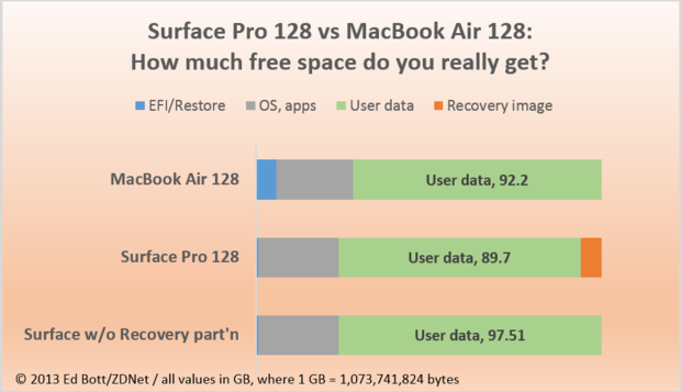
What about the internals?

The 10.6-inch, 1920 x 1080 panel on the Pro is gorgeous, maybe the best laptop screen I’ve ever seen. Blacks are deep and whites are bright (my MacBook Air’s display looks comparatively yellowish now), and colors are both accurate and vibrant. Since it’s 1080p, it also holds up to closer pixel-level scrutiny when you’re holding the device nearer to your face in tablet mode.

I love high-res displays. What geek doesn’t? Sounds great.

Having such a pixel-rich display does cause a slight problem with scaling in Windows. A lot of things are made too small by having pixels so close together, so Windows scales things up to 150 percent by default — that makes a lot of things big, and a lot of things blurry. Scaling back down to 100 percent makes everything look good again, but also makes some elements, particularly in the Desktop, too small to be really touch-friendly. I went with smaller and harder to touch, but you have to pick your poison to some extent.

This is a format you’ll notice throughout this review: a great-sounding feature, followed by a significant drawback of that very feature. Microsoft provides two ways of displaying content on the display, and they’re both sub-par.

What about software?

One thing that’s missing from the Pro is Office, which comes pre-installed on the Surface RT — you get a one-month free trial of Office 365, but that’s it.

The Surface RT is $500 and includes a copy of Office, but is generally a mediocre tablet otherwise. The Surface Pro — emphasis on the Pro — is $900 and Microsoft can’t toss in a copy of Office with the thing. No compromises, indeed.

Over the course of the review, Pierce mentions a number of significant drawbacks, whether you view this as a tablet or a laptop. It doesn’t have the battery life, weight, or — with the legacy Windows apps — an exclusively touch-based interface of a tablet, but it also lacks the lap-friendly way of using it as a notebook. Indeed, that’s how Pierce concludes his review:

Even a well-executed Surface still doesn’t work for me, and I’d bet it doesn’t work for most other people either. It’s really tough to use on anything but a desk, and the wide, 16:9 aspect ratio pretty severely limits its usefulness as a tablet anyway. It’s too big, too fat, and too reliant on its power cable to be a competitive tablet, and it’s too immutable to do everything a laptop needs to do. In its quest to be both, the Surface is really neither. It’s supposed to be freeing, but it just feels limiting.

Neither aspect of the product satisfies in each area, yet it garnered a score of 7.5 out of 10. I’m assuming The Verge‘s rating system is linear, not logarithmic, so a score of 7.5 seems like Pierce recommends the product. But the content of the review begs to differ.

I generally think David Pierce’s reviews are fair, and I bet he’s a really cool dude (no, really), but that score seems generous given the Surface Pro’s significant drawbacks.