A year ago — to the day — I closed my review of iOS 6 by noting that Apple tends to prefer subtler updates:
If you compare any two sequential major releases of iOS, you’re not going to see complete overhauls of the operating system.
You can therefore imagine how dumb I feel now, staring at a version of iOS that looks vastly different to those which preceded it. I simply didn’t think that Apple would take iOS to its bare elements, and redesign it from the ground up.
A few caveats precede this review. The first is that I am not a developer; therefore, this review is from the perspective of a user (albeit one who knows his way around Unix-like systems and can hack together some awkward PHP). The second caveat is that my experience with iOS 7 is based solely on using it with my iPhone 4S and third-generation iPad. Lastly, I am testing this in Canada as of September 18, so a couple of features (most notably iTunes Radio) are not available here, or haven’t been released yet.
With that explanation in mind, it seems about time to launch into my review of the most significant update to iOS since its debut in 2007.
Table of Contents
- Compatibility
- Under the Hood
- The UI
- A Text-Based Interface
- Animation
- Third-Party Apps
- Control Centre
- Notification Centre
- Multitasking
- Phone, Messages, and FaceTime
- Safari
- Mail, Contacts, and Calendar
- Maps
- Camera and Photos
- Music and iTunes Radio
- Siri
- Miscellanea
- Performance
- Conclusion
- Footnotes
Compatibility
In previous years, a good rule of thumb was that if your iPhone was of the previous three generations, you could upgrade to the latest version of iOS. 2012’s iOS 6 was available on the 2009 iPhone 3GS and the fourth-generation iPod Touch from 2010. The iPad 2 was the oldest iPad model supported.
iOS 7 is a little more complicated. While it also supports the iPad 2, it’s only available for the newest, fifth-generation iPod Touch models. Continuing the tradition, the iPhone 4 is the oldest iPhone that can upgrade.
But there’s more. As iOS 7 includes loads of new animations and visual effects — I’ll get to all of that in detail — it requires a lot of power in the graphics department. My third-generation iPad doesn’t have the power for blurred layers at 30 frames per second, so it simply uses a translucent background where appropriate. Oddly, while the iPad Mini and the iPad 2 share the same processor and pixel count, only the former gets blurring effects.
The iPhone 4, on the other hand, misses out not only on blurred layers, but also on parallax animations, dynamic wallpapers, animations in Weather and, weirdly, letterpressed text effects. I don’t quite understand why the last one is specifically omitted; you’d think that a 2010 processor could support a little faux-3D shadowing. Perhaps this is for the best.
Thank you to Nick Cotton and Steve Heuther for their help in confirming inconsistencies across devices.
Under the Hood
I’m not going to go over this in great detail, mostly because I don’t really know what I’m talking about. I did the required reading, but I’m no Siracusa.
The big nuts-and-bolts news this year is that iOS 7 has been rewritten and rebuilt to be a fully 64-bit operating system. This means that applications running on iOS devices can now address more than 4 GB of RAM, but it also means that there are twice the registers of a 32-bit system, along with these specifics cited by Apple:
Update: To clarify, a 64-bit architecture will not necessarily have double the registers. Nor was it necessary for Apple to go to 64-bit to double the registers. But iOS 7 can address double the registers, as seen in Apple’s first 64-bit A-series SoC.
When iOS is executing on a 64-bit device, iOS includes separate 32-bit and 64-bit versions of the system frameworks. When all apps running on the device are compiled for the 64-bit runtime, iOS never loads the 32-bit versions of those libraries, which means that the system uses less memory and launches apps more quickly. Because all of the built-in apps already support the 64-bit runtime, it is to everyone’s benefit that all apps running on 64-bit devices be compiled for the 64-bit runtime, especially apps that support background processing. Even apps that are not performance sensitive gain from this memory efficiency.
Fascinating stuff. Critically, these improvements are only available to iOS systems with a 64-bit processor which, as of writing, is precisely one: the iPhone 5S.
“But Nick,” you protest, “an iPhone doesn’t have 4 GB of RAM, so what the hell does it matter?” Well, read the above again: there are improvements beyond the 4 GB RAM limit of 32-bit applications, especially for “heavy” applications.
Apple is preparing for the future, too. While today’s iOS devices don’t have 4 GB of RAM, future ones probably will, and it’s in the best interests of developers to prepare for this scenario. And since developers need a 64-bit device to build and test on, well, you figure it out. Simply: Apple’s early to the party because that’s easier and better for developers (and, therefore, users) than if they were late.
Of course, 64-bit architecture in a phone seems like overkill now, but don’t forget that the same processors are used in the post-PC world of the iPad. And with Apple’s claims that the A7 now has a “desktop-class architecture”, that has fuelled speculation that they might be used in future Macs, too.
Much smarter people have written very thorough posts on the ARM 64-bit architecture. I encourage you to read Thomas Schilling’s article and ARM’s 2011 whitepaper (PDF), and you can always listen to Mr. Hypercritical explain 64-bit on the Accidental Tech Podcast.
I think I’ve said enough about something I don’t fully understand; it’s time I moved swiftly on to something I think I can grasp a lot better.
The UI
When rumours began to spread about the user interface refresh Apple was working on, the single most frequent word used seemed to be “flat”. Speculative mockups were effectively a variant of the iOS 6 interface without its gradients and textures. At the time, I wrote that this was setting “expectations … far too low” — Jony Ive may not be trained as a visual interface designer, but the team at Apple under his leadership is capable of far more than just making brown what was once wooden.
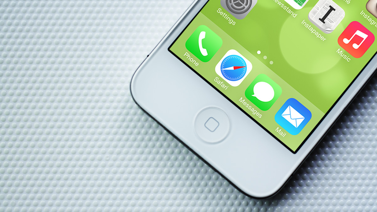
You’ll see this the first time iOS 7 boots; the screen is a wash of white and a very light blue-grey, with important labels and tappable components in something Apple calls “system blue” (R0 G122 B255, or #007aff). Shadows are minimized or removed entirely, while large colour gradients are no more. Toolbars and tab bars are rendered in a very light grey which is both translucent and which blurs the content behind it. iOS 6 didn’t necessarily feel heavy, but next to iOS 7, it looks like it’s powered by coal. As I explained earlier this year, these apparently straightforward approaches add up to an emphasis on simplifying the hierarchy of the system:
The home screen icons are now treated as their own view. Notice how the home screen is now visible within the multitasking switcher, with a blur as its background; the actual wallpaper remains focused and crisp, as if all applications and the home screen’s icons are hovering overtop.
This design philosophy is very Apple: it’s obvious, it’s clear, it’s uncluttered, and it’s elegant. If anything, the heavy textures of iOS 6 only served to accentuate the differing tastes and goals of the hardware and software design teams. Consider the amount of effort that the hardware design and engineering teams spent to simply align the front-facing camera in the dead centre of an iPhone. Take a look at almost any other smartphone, and notice how the front-facing camera has been haphazardly added wherever they could find room on the logic board.
Or think about the supply chain hurdles involved in laser-cutting microscopic holes in the aluminum body of a MacBook to ensure that the only indication of the sleep light is hidden when the computer is awake.
The hardware teams have been obsessed with reducing the computer, the phone, and the tablet to their raw essence. The iPhone has five buttons but only one on the face, because it’s the one you use most. It’s the distillation of the product.
By contrast, the software design team has delighted in adding as much detail to user interfaces as possible. Renderings of ripped pages and stitched leather could be found in the Calendar apps on both the Mac and iPad. Users of all platforms could see their friends’ leaderboards in Game Centre on a green felt and glossy wood interface. It was decadent, but it was also excessive. Most of all, it was antithetical to the deliberately neutral material choices of the hardware on which these apps were displayed. If it was inevitable for one design group to shift closer to the tastes of the other, I am quite glad that I’m not holding an iPhone made of stitched leather and cloth with a UI to match.
The interface design choices of iOS 7 play to the strengths of Apple’s hardware. Since Apple uses LCD displays, it doesn’t really matter how dark or light the onscreen content is; the constantly-on even-brightness LED backlight is the biggest power draw. If Apple used AMOLED displays in their products, you can bet the interface would be much darker, as each AMOLED pixel produces its own light (ie. darker onscreen content is more efficient than lighter content).
Apple doesn’t just use LCD displays, either: they use high-resolution LCD displays. Even though iOS 7 is available for the lower-resolution iPad Mini and iPad 2, you can tell that the system has been optimized for retina displays. There are single-pixel lines everywhere, while the system font is Helvetica Neue Light.

Every application that is shipped with iOS embraces a unified interface design philosophy. Each application has an accent colour, defined by its TintColor — in most, this is “system blue”, but Music uses a bright magenta, while Calendar uses red. You can think of this as the link colour on a web page, defining most of what you can tap on (though this isn’t always the case, as I’ll explain later). At right is the complete family of colours used by the built-in apps, as seen in Apple’s developer documentation.
While most application-specific colours are sensible, Notes chooses a bright yellow against a grey background, which is terribly difficult to read.
Notes and Reminders, by the way, stand out as the sore thumbs amongst the default apps in iOS 7. They both have retained textured backgrounds which look vaguely like paper, and they both make gratuitous use of debossed text. This, I suspect, is Apple’s way of demonstrating their new letterpressed text API; thankfully, it’s relegated to those two apps.
Despite this significant shift in the design of the system, however, it is clearly a version of iOS. At the time of the rumours earlier in the year, I also wrote that it wasn’t “going to be a complete reconsideration of what can be done on a touch screen”. This is immediately obvious: iOS 7 looks and feels like iOS, and not like another platform. The lock screen is exemplary of these ideas.
Lock Screen
The unlock screen fully embraces the minimalist, unadorned nature of iOS 7, from the very top all the way to the bottom.
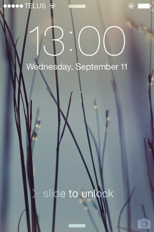
The time is displayed much larger in a custom variant of Neue Helvetica Light, which includes a rounded — not square — colon. This is your first glimpse of iOS 7’s new typography, both in visual terms and through code (more on this later). At the bottom is the familiar shimmering “slide to unlock” text, though without the familiar arrow and track for it to follow; happily, you can now indiscriminately plunk your entire thumb wherever you want on the screen to slide it (provided there are no waiting notifications). All this is pretty much what you’d expect: text-based and light.
At the top and bottom, though, there are two pill shapes. These are clues; Notification Centre can now be dragged from the top, and the new Control Centre from the bottom of the lock screen (or, indeed, anywhere in the system). Prefacing the “slide to unlock” text is a right-facing chevron to encourage you to slide in its direction.
These are solutions to a confusion which developed in the earlier betas of iOS 7: the pill shapes began as arrows facing towards the centre of the display, and there was no chevron on the “slide…” text. Some people thought that the slide direction for unlocking had become a Windows Phone-esque drag upwards. While I can see why that would make sense with an arrow-shaped Control Centre prompt at the bottom, the result feels very ham-fisted and fussy. The chevron on the “slide” text is, in particular, heavy-handed; it’s adding adornment where it shouldn’t, ideally, be necessary. However, it’s no longer confusing. I suppose that’s something.
You can always disable lock screen access to each Centre, which will hide the respective pill. That stupid chevron will still be there, though.
New in iOS 7 are the inclusion of dynamic wallpapers — seven, to be precise. All show circles of varying amounts of focus, which respond to the gyroscope so you can toss them around a bit. If you’re the kind of person who likes to stare aimlessly at your home screen, you’ll probably kill your battery life by using a dynamic wallpaper.
But if you don’t do that, you’d perhaps be interested in them. They’re very nice, and they come in all of the colours of the iPhone 5C. I’m a little surprised that Apple elected not to use these for the default matched wallpapers for that product, actually.
Sadly, there’s no way for third parties to create a dynamic wallpaper; you’re stuck with rising bubbles of several colours (though they are quite nice). However, Hamza Sood has deconstructed the format Apple is using for these and has posted a demonstration on GitHub.
(An aside: it’s going to be interesting to see if Apple implements the creation of third-party dynamic wallpapers. They aren’t images or simple movies; rather, Sood’s demo proves that they’re largely drawn with code. Perhaps it’ll be a new Xcode project type, or something with Quartz Composer. But neither of those tools are user-facing. While users can set their own photos as their wallpaper, I wonder how — if — that could be possible for dynamic wallpaper.)
There are also 33 still wallpapers, most of which are new, including the colour-coordinated ones for the iPhone 5C. They’re each 744 × 1392 pixels, with 52 extra pixels on each the left and right, and 128 extra pixels hanging off each the top and bottom of an iPhone 5’s display. This gives plenty of buffer for the parallax effects to be effective. They’re also lossless PNG images, instead of the lossy JPG images of prior iOS releases. This is a welcome improvement.
Whatever wallpaper you choose, the lock screen text is drawn directly on top with only a very slight shadow; there are no giant black glass blocks to offset the text. To compensate for the loss of any sort of base layer, the text is no longer always white. If your wallpaper is mostly light-coloured, iOS will choose black text on the lock screen (this is true, too, for the home screen).
This sounds great, but I’ve encountered a few instances where it doesn’t choose the correct colour. It’s also one colour for all text, regardless of whether some parts of the wallpaper are darker than others. This is aesthetically more acceptable, but potentially at the expense of readability. For example, if you choose a landscape photo with an overexposed sky, iOS might choose white instead of black text, and you’ll have to squint to see the clock.
This is largely hypothetical and extreme. Most of the time, the lock screen works great. It’s very clear, super clean, and oftentimes quite beautiful on both the iPhone and iPad. The starkness of it and the lack of heavy chrome create the impression that the display is larger than it actually is, compared to its cramped-feeling predecessor. It’s wonderful.
Springboard
As I’ve previously mentioned, any suggestion of a redesign of the iOS Springboard is a tall order. It’s arguably the single most defining characteristic of the platform, and hundreds of millions of people already know how to use it. The challenge, then, is to redesign and add new features to the Springboard while keeping it familiar.

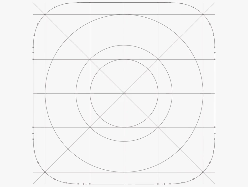
The grid of rounded square icons is still there, for one thing, but even that hasn’t escaped the Ive treatment. At a glance, the corners appear to have a slightly increased radius, but a closer (pixel-level) look reveals that the entire icon is a bit softer. The edges appear to be slightly rounded as well, which trades a small amount of definition in the shape for a more humanistic feel. Throughout the betas, a few designers, most notably Marc Edwards, worked towards isolating what this odd shape was. Early guesses pegged this as a superellipse.
It’s close, but it doesn’t quite line up. A little bit of experimentation by Mathias Madsen Stav revealed that the closest representation was essentially a rounded octagon, if it’s drawn as an SVG, but even that isn’t perfect. Unfortunately, Apple doesn’t provide an official shape or mask for designers, and nobody seems to really know what kind of pillowy, soft, rounded squircle it is. Of all the changes in iOS 7, it’s probably one of the most subtle, yet it entirely alters the rhythm of the OS.
If you’re a frequent Spotlight user, don’t panic over its missing page — iOS’ system-wide search is now made available by dragging the home screen icons downwards. It’s an extremely hidden feature; I simply assumed Apple had removed it until I read a thread in the developer forum which alluded to its new home. An advantage of this approach is that it’s now available from every page. If you know where to look, that is.
Standard Controls
Then there’s the essence of an operating system, as expressed through its controls. To make things simple, I’ve put together a table with before and after comparisons. All of these images are from Apple’s developer resources, because I don’t have an iOS 6 device handy any more. In for a dime, in for a dollar.
| Control | iOS 6 | iOS 7 |
|---|---|---|
| Button |  |
|
| Disclosure | ||
| Switch |  |
|
| Segmented |  |
 |
| Slider |  |
 |
I’ve seen Pantone swatches with more colour gradiation than these controls. But don’t mistake this for a flat UI: the iOS date picker has always had a faux-3D look, but in iOS 7, it uses actual 3D transforms.
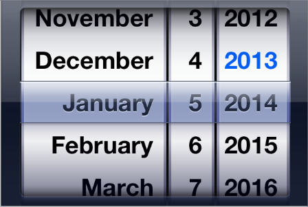
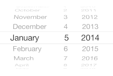
The picker has a regression, though. In previous versions, tapping on any visible text would select it, in addition to swiping through the available options. That is, if you tapped “2012” in the example above, it would jump to the middle as the current selection. In iOS 7, tapping on “2012” does nothing; you must swipe vertically to jog the “wheel” to the 2012 position.
For most other components, though, the tap targets haven’t changed much, despite the apparent control area shrinking.
Icons
I guess I can’t put it off any longer. It’s time to talk about the redesigned icons. Hold your rotten tomatoes until the end, please.
Apple says that they began the icon redesign process by establishing a common grid and colour palette. This has resulted in icons which the company, by way of Jony Ive, deems “more harmonious [in their] individual elements”. So, the obvious question, then, is “Has it worked?”.
Not entirely, no.
Let’s start with that grid. As Neven Mrgan pointed out earlier this year, while grids work for laying out content on a page, it doesn’t guarantee consistent visual weighting. Some of iOS 7’s icons appear much lighter than others, despite using similar metrics. This is due to differing amounts of content in the icons, the colour of the icons, the amount of contrast, and so forth. All of these elements — not just the positioning and size of the individual internal elements — have an effect the visual weight of each.

I’ve already covered the shape of these icons above, so let’s talk about their size. As I noted earlier, this is an OS tailored for high-resolution displays; befittingly, the required icon for iPhone apps has jumped from a 57 × 57-pixel image to 120 × 120 px. Not only is the 1x iPhone icon size simply not required any more, the icon has increased by 3 points on both sides. The 1x iPad icon is still required, as standard-resolution iPads continue to be supported, but it is now 76 × 76 pixels, instead of 72 in both dimensions.
It appears that apps must now contain all icon sizes for both iPhones and iPads. That is, developers must assume that their iPhone-only app may be used on an iPad, and it should have an icon to match.
So, Apple’s default icons, then.
I know that the designers behind these icons put their heart and soul into all of them, and I’m sure they tried a lot of different symbols and colours before settling on these. I don’t mean to be a heckler on the sideline shitting on their accomplishments. Where they are successful, they are very successful; when they falter, they fall hard.
There are some truly excellent icons in this group, it must be said. Photos, for example, uses the entire palette of colours to reference the flower icon which has been used since 2007, but in a more geometric way. The Stocks and Compass icons both use stark lines on a black background to create the impression of utility, and they do so beautifully.
The icon for Music is particularly stellar. There’s nothing about the hot pink/red/orange gradient they’ve used which should suggest music, but it somehow does connote a sense of entertainment or excitement. I also like the Maps icon, Mail, Weather, the App Store, and the suite of green communication apps. All of these are, I think, communicative and beautiful.
Where things fall down a bit for me are with the Newsstand, Calendar, Safari, and Voice Memos icons. While most other icons have a subtle gradient as their background, the stark white background of these icons make them look unfinished. Pure white is the default colour of an empty document, and it’s hard to handle carefully.
Then there’s Game Centre. While the rest of the icons have had any three-dimensional effects on them reduced to a gradient, at most, the Game Centre icon is comprised of four floating bubbles. They’re as lickable as Aqua in 2000, and completely out of place. I don’t even get the metaphor — how are four multicoloured bubbles representative of a social game leaderboard? It, too, suffers from the plain white background, which makes it even more peculiar: it’s both hyper-realistic and flat at the same time.
I like about half of these icons as-is. About half of the rest I feel should be reconsidered entirely, while the other half might need some poking and prodding to tidy them up. The icons are, really, only a small part of this comprehensive and far-reaching redesign. While they’re some of the most, uh, iconic parts of the OS, they’re not code-based, and changing them is more straightforward than many of the other parts of iOS 7’s redesign. They’re likely to be some of the first things updated in a .x release.
The most important thing Apple has done with the icons, however, is to establish a look-and-feel guideline for third-party developers. Faux 3D is out, while simple gradients are back. Were you painstakingly rendering a wooden texture before reading this review? Scrap it. Use brown, or think of something better.
Status Bar
The interface changes in iOS are so comprehensive that something as seemingly banal as the Status Bar has not been overlooked.
Previous versions of iOS included three different styles of Status Bar, not including hiding it altogether in apps like the Camera: black, semitransparent black, and a grey gradient. The latter was replaced in iOS 6 with a gradient matched to the tab bar colour, while the semitransparent black bar was reduced to only appearing on the lock screen, Springboard, and in Siri.
iOS 7 does away with these arbitrary distinctions, and simply uses a transparent background all of the time. Developers can specify to use either the default dark colour for the icons and content in the status bar, or to use a light colour. In practice, this doesn’t allow any more space for content, but it gives the impression that the content extends all the way to the edge of the display.
If an app has not been updated to take advantage of the full height of the display, iOS 7 handles this gracefully by drawing an opaque black status bar with white content.
UIStatusBarStyleDefault, and UIStatusBarStyleLightContent.
The biggest redesign of note in the status bar is the removal of bars in favour of circles. This isn’t entirely unexpected; a few of the prototypes revealed during the Apple v. Samsung trial featured this trait. But signal strength has been measured in bars since the earliest days of the cell phone. Why change now?
Quite simply, it’s clearer. Bars are small, and small things onscreen tend to blur together for people with less-than-great eyesight. These circles are much larger, and are therefore more obvious for those with poorer eyesight.
There’s another change in the pursuit of clarity: Instead of making the number of shapes visible dependent on the signal strength, weaker signals are represented with a hollowed-out circle. This makes plain how much of the actual signal strength is available, as a part of the maximum.
Finally, representing the signal as circles distances them from the WiFi indicator, especially for Windows users.
Still, I anticipate that its change will be greeted with the usual levels of dissection and overanalysis. The biggest drawback is the amount of space the indicator now consumes in the status bar. If you have a longer carrier name — Vodafone, or AT&T M-Cell, for instance — the WiFi indicator will start to push up against the time, making the status bar content feel cramped.
But for something so omnipresent, it quickly vanishes into the background; this is, of course, Apple’s intent. I don’t imagine that this change will be spared from controversy, but I quite like the circles. After you understand what they represent — and confusion should be minimal, as they’re in the same place as the bars used to be, and they are immediately adjacent to the carrier string — they’re simple, soft, and deferential. Best of all, they’re clearer than bars.
A Text-Based Interface
One of the most striking changes in iOS 7 is an increasing reliance upon text as interface elements. Instead of showing a text descriptor on top of a bevelled rounded rectangle, there is simply text directly on the toolbar. This text, in many places in iOS 7, is what constitutes “buttons”.

According to Apple’s iOS 7 transition guide for developers, this is “for clarity”. I get it — it’s 2013, and we should know that we can touch things on touch screens.
But these buttons are in direct opposition to the sound rationale established in the OS X Human Interface Guidelines for toolbar buttons:
Make toolbar icons distinct, yet harmonious. When each icon is easily distinguishable from the others, users learn to associate it with its purpose and locate it quickly. Variations in shape and image help to differentiate one toolbar icon from another. At the same time, an app’s toolbar icons should harmonize as much as possible in their perspective, size, and visual weight.
Similar guidelines don’t exist in the iOS HIG. That’s kind of fair, in the sense that iOS and OS X are not necessarily congruent platforms. But though their input mechanisms differ, their goals of clarity and simplicity are comparable. I think this guideline should be adapted for the iOS HIG.
Both platforms are also used by people all over the world, and will set their device to one of the dozens of interface languages available. To accomodate the peculiarities of each language, interface elements containing text need to be flexible, and this flexibility gets compounded with additional text-based elements.
You’d therefore imagine that distinct symbols with clear meanings would be a smart way to bridge this gap. If they’re clear shapes, their function can be made obvious, and they likely need no localization. That’s the way it’s done on OS X; on iOS, where space is even more constrained, you’d think it would be the obvious choice.
But no. This is what that same Mail toolbar looks like in Thai:

The Mark and Move buttons have been entirely replaced by horizontal ellipsises, while the Archive button is truncated in the middle. Here’s what that same set of options looks like running on iOS 6:

Look at that: the text shrinks to accomodate. It’s Thai-riffic. (Also, notice that the Archive button has switched sides in iOS 7, which is a giant headtrip for my muscle memory.)
Now, you’d think they could shrink the text in iOS 7 to accomodate the Thai language. But this issue is exacerbated due to a use of a lighter weight system font, which mandates larger text sizes for similar readability and visual weight.
Here’s where things get really crazy: iOS 7 already compensates for this. Or should do. It introduces a brand new API called Text Kit, which is kind of magical. I’d go over this, but Jürgen Siebert has already written a stellar article on Typographica which I highly recommend you read.
Built into Text Kit is something called Dynamic Type, which allows the interface to assign font attributes to semantic descriptions for the use of that font. For example, a heading could be consistently bold and a percentage larger than regular weight paragraph text. When users who require larger type select that setting, everything is scaled accordingly.
Unfortunately, these attributes are unavailable to interface elements, as Apple explains:
The fonts returned using text style constants are meant to be used for all text in an app other than text in user interface elements, such as buttons, bars, and labels.
The buttons in Mail would be an ideal use case for this technology. I’d argue that it would make complete sense for it to be usable by UI elements, as they need to be localized. The text could shrink, and use a slightly heavier weight to compensate.

But this issue simply wouldn’t exist if symbols were used instead of text. After all, the OS X Mail client uses symbols for these same functions, and it seems comprehensible to me. I may be missing something, but symbols seem like a simpler, clearer, and more universal language.
Special thanks to Jonas Wisser for grabbing the iOS 6 screenshot for me.
Animation
As with almost everything in Apple’s contemporary software portfolio, iOS 7 is animated to the gills. Most of it is pleasantly subtle and really quite nice; a bit of it is grating and slow.
With the removal of most shadows and hints of lighting, Apple turned to two methods to show depth: translucent planes, and parallax animation. These are both important to each other; neither one alone would create a convincing illusion of depth. Since I’ve already talked (at length) about why those blurry toolbars are significant, this bit’s about the parallax (and also because this is the “Animation” section, duh).
The parallax effects in iOS are both omnipresent and, thankfully, quite subtle. They are by far the most noticeable on the home screen. As you pivot the device in space, the accelerometer and gyroscope tell the OS which direction the wallpaper should fall towards and how the icons (save for those in the Dock) should respond. It’s less pronounced than the promotional video shows, and it isn’t garish at all. If, however, you dislike your icons not being quite where you left them, you can disable this animation under Settings → General → Accessibility → Reduce Motion.

Other places you’ll find parallax goodness are with notification banners, the volume overlay, and in the Weather app. The latter, in particular, is chock full of animated stuff; the simple act of scrolling through your list of cities is more like sliding them overtop their current weather. If this is distracting, tough luck: there’s no way to disable this particular animation. It’s unobtrusive enough that all but the most stubborn (read: boring) people will like it.
Even the simple act of waking your iPhone or putting it to sleep is a little more animated. Instead of immediately turning on or off, the screen quickly fades in or out, respectively, with a slight zoom of the background. It’s an elegant touch; in a sense, it’s akin to a damper on a door. It feels a little less sudden. Simply, it feels nice.
Less nice, however, is the unlock animation. The icons appear to fly in about half the speed of previous versions. The first few times you unlock your phone, it’s not bad; after about the tenth time, however, it becomes grating. It’s a similar story with the animation while opening or closing a folder: these animations simply run too slowly. If you have a good sense of aiming for moving targets, you can actually tap the icons while they’re still animating, but since I don’t drink that much coffee, I don’t have reaction times quite so instantaneous.1
There’s one final bit of animation oddity. For some reason, the universal search UI component now has a centre-aligned icon and text until you tap on it, whereupon they animate over towards the left-hand side. It’s not a poor effect, per se, but I don’t understand its purpose; why not simply always keep the text and icon left-aligned?
I’m nitpicking, really. Overall, the animation in iOS 7 is tasteful, fun, and often helpful. If you’re skeptical, go ahead and turn off all the parallax effects using the directions above. Doing so underscores that iOS 7 simply isn’t tailored to a static experience; it only feels complete when it’s given a sprinkling of motion.
Third-Party Apps
As you might expect with such a rejiggering of the user interface, most third-party apps look a bit out of place. It’s truly odd to look at iOS running an iOS app that looked fine just a few days prior and think “but this doesn’t look like iOS any more”. In some cases, it’s fucking surreal.

The depth and breadth of iOS 7’s redesign is clear when you notice that Apple hasn’t updated any of their non-bundled applications in time for launch. While Find My iPhone’s interface hasn’t been updated, it has received an updated icon. On the other hand, iBooks didn’t even get an updated icon despite OS X Mavericks, just around the corner, including a ready-for-iOS 7-style icon. iPhoto, and iMovie, and the iWorks suite are all exactly as they appeared in iOS 6, for good reason.
Unlike with the modest UI changes in iOS 6, apps do not automatically receive the new interface elements when they are run on iOS 7; apps must be recompiled with Xcode 5 to receive any of these new features. Even elements like the keyboard and text magnification loupe are exactly as they appeared in iOS 6. This small hurdle almost serves as a reminder for developers to reconsider the necessary elements in their applications’ interfaces.
In their transition guide for developers, Apple emphasizes the three themes of iOS 7 like a mantra: deference, clarity, and depth; deference, clarity, and depth. They also treat iOS 6 support as a last-case scenario:
Remember that iOS users tend to be very quick to update their devices, and they expect their favorite apps to follow suit.
If business reasons require you to support iOS 6, it’s still best to begin by updating the current app for iOS 7. Then — as much as possible — apply the design changes to the iOS 6 version of the app.
Apple is encouraging developers to consider iOS 7 not just first, but only, if possible. If Craig Hockenberry’s survey is anything to go by, an awful lot of developers will be doing just that.
As I’m not one of the cool plugged-in bloggers, I don’t have access to any betas of redesigned apps. However, I’m very excited to see the unique approaches developers and designers will be taking. Apps like those from Tapbots have such a unique aesthetic which looks right at home on iOS 6, but out of place on iOS 7; I wonder what their apps will look like after a redesign.
Control Centre
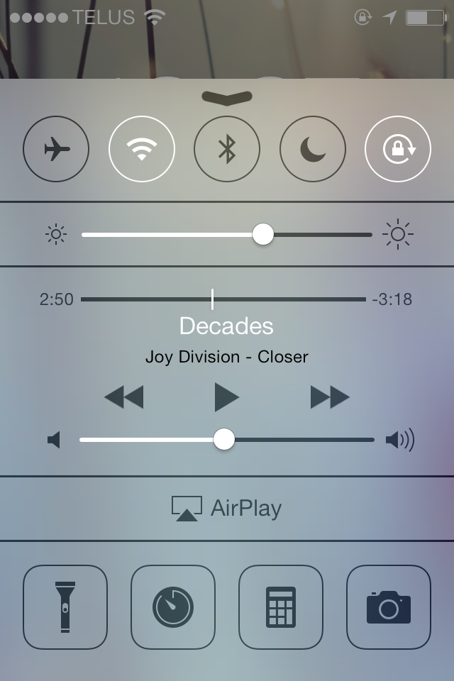
After years of triaging through several pages of app icons to find Settings simply to turn on airplane mode or to adjust display brightness, iOS users now have one place to find those things. A swipe up from the bottom of the screen will present those controls and more.
On an iPhone or iPod Touch, the Control Centre is home to toggles for airplane mode, WiFi, Bluetooth, Do Not Disturb, and rotation locking. On an iPad, the latter toggle will depend on what function you have set the sliding hardware switch to; if it is set to lock rotation, then the Control Centre will show an alert mute toggle.
Since there’s no longer a multitasking tray, many of the controls which were previously found there are now in Control Centre, including a display brightness slider, music playback, and AirPlay. On compatible hardware (which I do not own), the AirPlay item shares a row with AirDrop. I hear it works really well.
Finally, there’s a row of oddball icons for launching the Clock, Calculator, and Camera apps, as well as for using the LED flash as a flashlight. You may predict that this would finally cause the death of flashlight apps in the Store, but remember that there are still dozens of available apps for simple lap timing, a function which has been built into the Clock app since day one.
Systemwide Gestures
iOS 6 had just one systemwide gesture on an iPhone or iPod Touch: pulling down from the top of the display to reveal Notification Centre. In iOS 7, that jumps to three systemwide display-edge-based gestures.
Pulling up from the bottom reveals Control Centre, while pulling from the left edge of the display invokes a back gesture, where appropriate.
Introducing any sort of systemwide gesture to an established multitouch platform is not without its hiccups. Control Centre’s swipe-up-from-bottom apparently causes issue with a number of apps; games, in particular, seem to be affected by this. If you play a lot of Cut the Rope, there’s a toggle switch in Settings to deactivate the gesture within apps; for developers, there are some new APIs for detecting when the gesture has been triggered.
There doesn’t appear to be a setting to turn off the back gesture, though I’ve never found it to be a nuisance or problematic. In fact, its use has already been committed to muscle memory.
Notification Centre
Apple can’t seem to decide how to spell “centre”. In the US, they consistently use “center”, which is fair. In the UK, they use “centre” for everything except Game Center. In Canada, where we should get the UK spelling, we get a mash-up of both.
For consistency, I’m going to use the “-re” spelling for everything, including Game Centre.
The other system-wide Centre sees its share of updates with iOS 7. And, yes, the infamous linen texture has been removed. I could write a few hundred words describing why this is a great thing; in fact, I did. There are feature updates, too.
Notification Centre is now separated into three tabs: Today, All, and Missed. Today is a sort of daily digest with the weather, upcoming events, stocks, and a glance at the next day. I’ve found this to be both very simple and very helpful.
The Today view also includes a Google Now-esque estimation of commute times. iOS tracks frequently-visited locations to try to establish patterns, and displays a drive time estimate based on current traffic conditions. If you are at work every weekday at about 9:00, you’ll see this on weekday mornings; if you visit the supermarket every Saturday at about 13:00, it’ll let you know then. It also displays your driving time to home when you’re away.
It’s such a great idea, and I wish it were pushed even further. Why not show this view the first time you wake your iPhone in the morning? It could even include some recent notifications (“You have 13 new emails and 3 new messages.”). Apple is increasingly bringing humanity to their products, through Siri and plain-worded messages, and this could be a logical next step. Wouldn’t that be a nice way to wake up?
This Today view not as sophisticated as Google Now. It doesn’t parse your email or your calendar, so it doesn’t know if you have to drive to the airport or to an appointment at a location you’ve never visited. It also doesn’t send your frequent locations to Apple unless you explicitly say it’s okay; it doesn’t even get synced across devices. Nevertheless, the mere fact that it keeps track of your location might give you the heebie-jeebies. If you switch Location Services on at first boot, this feature is enabled as part of that package; if you’d like to disable it, you can under Settings → Privacy → Location Services → Frequent Locations. There’s also an interesting History view in that menu, where you can see exactly what iOS has tracked and wipe it entirely. It appears that you cannot remove individual history items.
Notification Centre also includes a variety of other refinements. Notifications sync across devices, which is extremely convenient if you have multiple devices set up to receive FaceTime calls.
In somewhat more frustrating news, OS X Mavericks includes quick actions directly from notifications, such as replying to an iMessage or deleting an email. Yet despite the increased collaboration between the OS X and iOS teams, this feature won’t be coming to the latter platform this year. I suspect this is a user interface design problem more than anything else; notifications are already criticized for dropping down in front of the frontmost app’s UI, and buttons would likely necessitate a larger notification still. Having used this feature extensively in Mavericks, I’d love to see it make its way to iOS very soon.
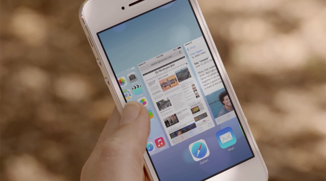
Multitasking
Multitasking on iOS has had a somewhat checkered history. In the first three major versions of the platform, any multitasking functionality whatsoever was reserved for a select crop of Apple’s own applications: Mail could download emails in the background, Phone could receive phone calls (and likewise for Messages and messages), and Music could continue to play in the background. Aside from those (and a few other minor cases), you were pretty much stuck with stopping your app mid-task whenever you clicked the Home button.
Initially, there were no third-party apps.2 Then, third party apps were allowed through the App Store, but they couldn’t join the multitasking party; Apple cited battery life concerns as a primary reason for their exclusion. The only form of background activity available to non-Apple applications were Push Notifications.
This changed in iOS 4. In hindsight, forcing developers to create apps which can be terminated at any time was a good setup for the future of multitasking on iOS (and, it turns out, on OS X as well). This has allowed iOS to provide an impression of smoothness while also being great on battery life. To ensure these attributes persisted in a multitasking-enabled iOS, third party apps were allowed access to a few purpose-built multitasking APIs:
- Background Audio: for apps like Spotify and Pandora to continue playing in the background;
- VOIP: to receive VOIP calls in the background (used by Skype and others);
- Location Services: used by navigation apps to continue to provide directions in the background;
- Newsstand: Newsstand apps received special privileges to download new content; and
- External Accessory Compatibility: there is apparently an API for integrating with third-party accessories with both Bluetooth and 30-pin capabilities, though I’ve never come across this.
These are in addition to APIs for receiving local notifications, and for completing an already-started task in the background. For many apps which needed to provide some form of background functionality, these APIs were sufficient. But these APIs couldn’t account for Twitter or RSS apps, for example, which could only download content when they were in the forefront.
Apple’s explanation for why they wanted to limit third-party multitasking is quite sound. Page-outs and memory leaks in some distant app you don’t remember launching could easily make your iOS experience real crappy. And users should never (ever) have to manually manage apps. How, then, do you build a system which automatically balances multitasking capability, battery life, and performance?
Apple thinks they’ve cracked this in iOS 7 with a few technologies, the cleverest of which is called “coalesced updates”. It’s really a very simple idea, but it has huge consequences. The theory is such that you’re giving your iOS device access to WiFi and cellular data on a regular basis through occasional use. You may simply be answering a text message while walking down the street,3 but you’re connected to LTE all the same. Or consider your phone’s persistent latent network connection while it’s in your pocket. Wouldn’t it be smart to use that network time for something useful?
Of course, there are a bunch of factors to take into account. Perhaps you’re in the middle of a field in rural Saskatchewan, and you have, like, one circle (née bar). It’s going to take a lot of power to get the cell radio up to full power. Or, maybe you’re in the middle of midtown Manhattan which, inexplicably, delivers a full connection with a ping worse than the International Space Station’s. Those are bad times to try to get a cellular data connection to download stuff in the background.
But perhaps you’re not in Saskatchewan or in Manhattan. You have four or five bars or circles or other polygons. You have a high-speed connection. That’s a really great time to refresh data in some of your apps. But which apps should be granted this power?
The day you update, iOS 7 begins to learn which applications are frequently used and assigns them priority; it then refreshes the data in those applications according to that priority. For example, if you use Facebook a lot and leave it running in the background, it will be allowed to receive new content regularly. This priority-based approach is also true for other multitasking purposes as well. Apps you use frequently and regularly are regarded with higher priority than apps which are used less frequently.
Apps don’t have to be updated or rewritten to accomplish these magical feats. I use Instagram frequently; during the betas, it was readily available with new content whenever I switched to it, as long as I didn’t use a few high-memory apps. Accordingly, the ten-minute kill timer for apps no longer exists. It may be longer, or it may be shorter — it depends on how much stuff you’re doing and how much memory your device has.
So, how does this impact battery life? In the three months I’ve been using this update, the battery life of my iPhone 4S has not been significantly impacted. It has, of course, been designed this way. This isn’t AnandTech, so I don’t have a rig to test these claims or to effectively compare new versus old. I will leave the formal tests to professionals, but I have found little to no impact with typical use.4
Phone, Messages, and FaceTime
With its myriad features, we often forget that there’s a telephone inside the iPhone. No, really, go check. I’ll wait.
This humble telephone has had a bunch of tricks added to it over its life. Apple’s introduction of FaceTime over WiFi with the iPhone 4 in 2010 was a bold foray into the world of video conferencing. For years, they had been lauding the built-in iSight cameras on their Macintoshes as offering “video conferencing right out of the box”, but it always required either an AIM or Skype connection to truly offer that. But then, with FaceTime on new iOS products and most Macs, it became a truly straight out of the box experience.
In iOS 5, Apple augmented this with iMessage. Unlike FaceTime, this was available over both WiFi and a cellular connection. Users loved it, while cell carriers hated it for being part of a breadth of other messaging apps which undermined text messaging profits.
In iOS 7, Apple continues to erode away at their dependence on others: FaceTime now has audio-only chats. You can tap the icon for either a video or audio chat, and it’ll launch just like a phone call. Unlike video calls, which is now available on a cell connection with some carriers, audio calls are WiFi-only for now. But if you’re at home, and you’re calling a friend who’s at home, and you have really bad hair, you can now do that without using a single minute of cellular call time.
Update: It turns out that FaceTime audio is indeed available over a cell connection.
Interestingly, Apple has elected to include the separate FaceTime app seen on iPads and iPods Touch in the iOS build for the iPhone. My hunch is that it wasn’t as discoverable in the Phone app, though you can still initiate FaceTime from there, too. The updated FaceTime app’s UI is pretty slick: it overlays the menus and controls on a blurred version of a live feed from the front-facing camera.
Marimba.m4r
Every couple of versions, Apple adds or tweaks the available notification sounds, and this year is no exception. There are 27 new ringtones to choose from, and twelve new alert sounds. And, true to the overall theme of “a fresh start”, the default ringtone has changed from the beloved Marimba to a new one called “Opening”.
It retains the spirit of Marimba while sounding fresher and a little more vibrant. The default text tone has been updated as well. It’s simply called “Note”.
No, really: that’s it. If you prefer the classic tri-tone sound, it’s still there, although slightly modified.
In fact, all of the original alerts and ringtones are included, but most have been crisped and brightened a bit. In practice, EQ-ing these tones with higher trebles improves their penetration. At the same volume, they’re much easier to hear than the more “rounded” sound of previous tones.
Also on the sounds front, Apple has removed the unlock sound altogether. The lock sound, however, remains. It’s a perplexing choice; I’d love to know the reasoning behind this seemingly arbitrary distinction.
Safari
Safari was, arguably, the single biggest differentiator between the very first iPhone and every other smartphone on the market in that day. But while the rest of iOS has changed over the past six years, Safari has barely been touched on a visual level, despite significant improvements to its rendering and Javascript engines. The interface of 2007 is very familiar years later. But all that changes both with the completely new UI of iOS 7, and some significant Safari-specific features.
With iOS 7, Safari joins its desktop counterpart in providing a unified address bar and search field. This field is smart: it offers a top hit, a few suggestions from your default search engine, then results from your bookmarks and history, followed by the somewhat-hidden in-page search. The top hit does not always appear; it seems to be matching to the URL, not the title (that is, typing “pi” will match a top hit of “pitchfork.com”, but not “Pixel Envy” because this site’s URL is “pxlnv.com”).
Selecting the unified address bar also shows a new look for oft-used bookmarks, which uses the apple-touch-icon of each page as a tile. If you have a lot of bookmarklets and folders in your bookmarks, as I do, this will be somewhat uninteresting.
There is a bit of a terminology confusion in the naming of this bookmark tile screen. In Mountain Lion and previous, the strip of bookmarks displayed below the toolbar was referred to as the Bookmarks Bar; in Mavericks, this has been changed to Favourites Bar. This is important to know if you sync your Safari bookmarks between a Mac and an iOS device; the default collection used for the tile view is set to a collection called “Favourites”, which is that bar. However, the collection used for the Favourites tiles can be changed to the folder of your choosing in Settings → Safari → Favourites. You might find it worth the small amount of trouble to create a new folder specifically for this purpose.
The top hit in the unibar is important, too, because it is preloaded in the background, like in Safari 7 for Mavericks. This has the effect of producing near-instantaneous load times for text-based minimalist weblogs, for instance; for more complex pages, it offers a slightly shorter load time, depending on how fast you type and press the “Go” button. If you’re on a tighter data plan, you’d be right to be concerned as to the extent this impacts your monthly allowance; in the three months I’ve been using iOS 7, I never once hit my limit or felt constrained by this behaviour. Your mileage may vary.
As for the interface, it is par for the iOS 7 course. In their promotional materials, Apple stresses the importance of interface elements which allow each application’s content to shine. In Safari, this is interpreted to its fullest extent, as almost all of the window chrome recedes upon scrolling a loaded page. The effect is a full screen of a web page, aside from a combined 40 points of status bar and current domain, even in portrait orientation. In landscape, the chrome disappears altogether.
There are a few ways to summon the window chrome after it has disappeared: you can tap the status bar area, tap the approximate area of where the lower toolbar would be, pull the content sharply downwards, or scroll all the way to the top or bottom of the page. It’s surprisingly fluid, but with one caveat: the shortcut of tapping the status bar to jump to the top now requires two taps. I wish this were not the case, but it’s not as catastrophic as a disappearing interface would lead you to assume.
Does Safari feel snappier? In a word, yes. It’s significantly better at caching multiple tabs and pages, requiring fewer reloads. On my third-generation iPad, this is especially noticeable; switching between just a few Javascript-heavy tabs used to require reloading each time, which was especially shitty if one of these tabs contained a <textarea> with unsaved content. iOS 7 is much better about preserving tabs across sessions; this is an especially good thing when you consider that you’re no longer limited to eight open tabs.
Speaking of tabs, Safari includes a new Rolodex-esque interface for navigating between them. Not only does it look better, it allows you to see more thumbnails at once. You can flick tabs off to the left to close them, too.
Is Safari really snappier in the various browser benchmark tests? Apparently it is, according to all the marketing literature (though, would they try to run Javascript slower?). My testing environment is such that I can’t do A/B tests with even a whiff of credibility, so I’ll defer any grading on this to someone who can do this reliably. I haven’t perceived much of a speed difference with real-world Javascript-heavy pages, though.
If you like your Safari features like you like your coffee — stolen — Reading List has been greatly improved with continuous scrolling, which allows you to start at the top of your list and scroll straight through to successive articles. It’s really slick. There’s also a new Social Links feature which allows you to continuously scroll through links from people you follow on Twitter or LinkedIn.
Both of these features continue to reside in the bookmarks sheet, which has always struck me as peculiar. It seems like a last-ditch place to put it, as if they couldn’t really find a better way to integrate it. At least iCloud tabs have been integrated into the tab view, which makes about a billion times more sense than shoehorning them into bookmarks.
Lastly, Safari has gained a “do not track” toggle in Settings. While it’s up to websites, analytics firms, and advertisers to obey this setting, it’s a welcome addition.
Overall, Safari hasn’t gained very many new features, but it has been carefully redesigned and is better than ever. It’s one of my favourite results of the redesign, saddled with one of the least-nice icons.
Mail, Contacts, and Calendar
Let me get the best news out of the way: search in Mail on iOS 7 is (finally) useful, powerful, and pretty much exactly what you have always expected it should be. There’s no longer a need to specify whether to search the subject line or the whole message; by default, it simply searches everything across all folders. If you wish, you can drag down from the top of the results to restrict the search to the current mailbox. For most people, however, the default “just search everything” setting will be very useful. It’s fast, too, and very reliable.
In iOS 6, Apple added pull-to-refresh for UITableViews, and it was very familiar. No surprises to find that the Loren Brichter-fication of iOS continues in this release, even though he left Apple in 2007. You can now swipe horizontally on any message in the Inbox to reveal buttons for moving and deleting (or archiving) the message “underneath” the cell. Contrary to what it may sound like, this isn’t like Mailbox; the swipe itself does not delete the message, it merely reveals a button to do so. This gesture is available anywhere a Delete button would have appeared on top of a UITableView’s cell in iOS 6.
You can now change the order of mailboxes, and there are some new automatic mailboxes for you to enable. The “Unread” box is particularly useful and, though it doesn’t appear to be enabled out of the box, I bet those who get a lot of email will quickly find and enable it.
Contacts
The biggest change to Contacts is on the iPad, where it is no longer letterboxed when the iPad is in portrait orientation. The fact that this needs to be pointed out is, frankly, ridiculous, in the truest “worthy-of-ridicule” sense. That it took until over three years after the launch of the first iPad for this to be rectified is equally ridiculous. But it’s fixed, and it no longer looks like a book. And all is good and right in the world again.
Calendar
On the other hand, the loss of the fakey pages in the iPad Calendar app has reduced some of its character. While I was never a fan of the heavy leather texture, the stacked and animated pages offered a sense of fun in a mostly staid app. With its Helvetica-and-red-on-white scheme, it now feels — for lack of a better word — Swiss: it’s very clean, but somewhat soulless. I can say that because I am Swiss, and I don’t want any email about it.
It’s a bit odd because, while the amount of subtle animations have increased throughout the system — especially with parallax effects — the Calendar app has been stripped of almost all life. I get that it’s a serious business kind of app, but that’s exactly why it needs a bit of jazzing up. Calendaring is dull and tedious and, so long as it doesn’t get in the way, a little bit of animation would go a long way here. It’s a pleasant app, but not a delightful one.
There is a convenient little trick built into the new Calendar, though, which I love. If you swipe normally across the week view, it will jump ahead a full week. But if you scrub slower, you can set an arbitrary start date: for example, Tuesday to Monday. It’s the same in the month view as well, which shows a continuously-scrolling grid of days. While these views are familiar as a calendar, they’re removed from the restrictions of one printed on paper. It’s the perfect skeuomorphic blend.
Maps
It’s only been a year since Apple launched their mapping service, yet in that time, they’ve made at least a dozen acquisitions of location, mapping, and commute planning companies. They have poured millions of dollars into the mapping service, going so far as to hire “ground truth engineers” in priority cities to ensure local data is correct.
But all of this is only minor consolation from a consumer’s perspective, as pressing and ongoing complaints remain in iOS 7’s Maps application. Most glaring is the persistent inaccuracy of significant amounts of data. Large cities remain poorly mapped, particularly those not in the United States or Canada. Local amenities are poorly plotted or non-existent, even for cities with generally good road data.

For my use, Maps is decent most of the time, and only occasionally maddening. Calgary’s data is generally accurate, but it’s on the sparse side. Some locations remain stubbornly misplaced despite myself and people I know reporting these issues. It’s particularly strange in some instances; if Apple’s engineers simply switched to the aerial imagery view for many of these issues, they’d clearly see the mistake.

For those of us who read fifteen-thousand-word operating system reviews, this is somewhat expected. Creating a worldwide mapping service is an enormous undertaking, and there’s no way it’s going to be fixed in a year. Apple could put every engineer in Cupertino on Maps duty for a year and it still wouldn’t be entirely comprehensive or accurate.
But for consumers, these continuing inaccuracies of data must be frustrating, and the excuses don’t help. Federico Viticci has made known how poor Apple’s mapping data is in Italy, while many of the iPhone users I know prefer Google Maps’ data. This is clearly a high-priority (and high-profile) project for Apple. They don’t have their head in the sand, and they aren’t taking these issues casually. But at a consumer and user level, it is difficult to reconcile the quality of Apple’s map service with the quality of the rest of their products.
I am optimistic for its improvement, however. Between talks of a data sharing agreement with Foursquare (whose local amenity plotting I’ve found to be excellent) to the acquisitions they’ve made in the past year, I think the potential for Apple Maps is superb. For some people, the present day reality isn’t quite there yet.
It’s not all doom and gloom. Some regions have beautiful new aerial5 imagery: bridges, in many large cities, have been remapped to not look like waterfalls. I’m not sure how many new cities have Flyover capability, but it seems like a lot. I maintain that it isn’t as useful as Street View, but it is a lot of fun to explore cities from a completely new perspective.
Maps also includes a rather great-looking night mode for turn-by-turn directions which won’t burn the corneas from your eyes in a darkened car. Apple’s also added turn-by-turn walking directions, and iCloud syncing of bookmarks. These are all welcome enhancements.
Camera and Photos
I begin this part of the review with a confession: I don’t hate skeuomorphism. I think there are certain places where it can be appropriate, interesting, and downright beautiful when it’s used tastefully. Case in point: the Camera app in iOS 7.
As I discussed above, this is a decidedly typographically-driven operating system. Every other application is all Neue Helvetica, all of the time, but the Camera app uses DIN 1451. This type choice — in combination with the yellow colouring for active choices — is a nod towards an old rangefinder camera. In some ways, it harkens back to the introduction of the iPhone 4, where Steve Jobs claimed that its build quality and material choices made “its closest kin … is a beautiful old Leica camera”; with iOS 7, it’s almost like using one.
In a sense, the Camera is the most deliberate redesign. It must be, for the Camera has a very specific purpose. Mail, Contacts, and Messages all display predominantly textual content, but the Camera is exactly that: a camera. Apple boasts that it’s the world’s most popular camera, and I don’t doubt that. My iPhone’s camera is my primary camera when I’m just strolling around; it’s the best way to capture ephemeral moments. For more precious memories, you should use a real camera.
In addition to video and photo, panoramic photos have joined the mode adjustment toggle, instead of being shoved into an overlay. New in iOS 7 is the addition of a square photo mode, which makes your photos Instagram-ready without having to crop anything.
In the place of the old still/video toggle lies another Instagram-esque feature: filters. These run live on A5-or-newer products, and there are eight to choose from, including the requisite vintage looks. For comparison, I shot approximately the same scene with all eight filters, plus the original photo.
 |
 |
 |
 |
 |
 |
 |
 |
 |
Much like the other editing options available from within the Photos app, these filters are applied non-destructively, which means you can change which filter you use, modify the crop, or revert the photo to its original state. It also means that applications need to be updated to be aware of these filters. Here’s what that set of filtered photos looks like in Photo Stream in Aperture:
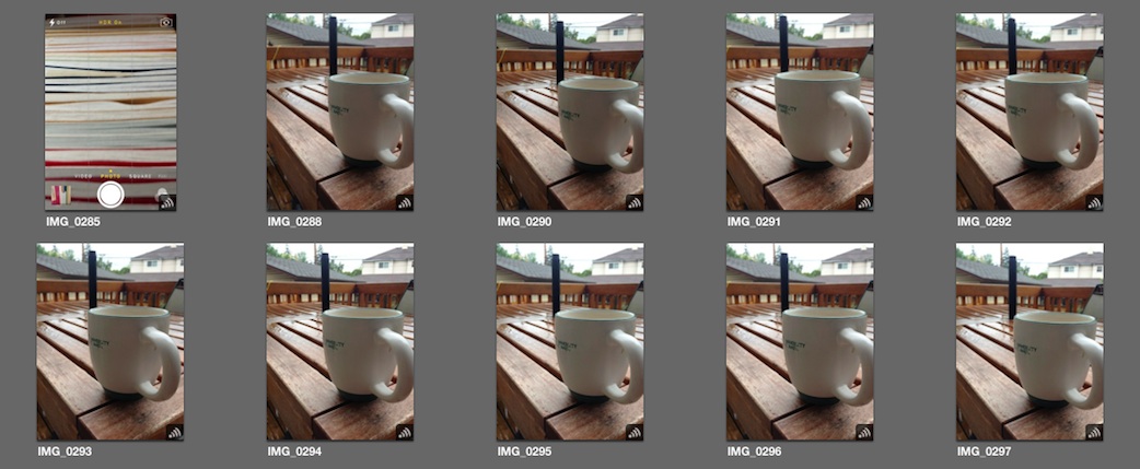
Some iOS apps will also need to be updated to “see” these filters. Afterlight appears to be aware of them, for example, but Snapseed isn’t.6
The filters themselves are not bad, per se, but I can’t see a case where I would prefer these options over many of the other (much better) apps suited to this purpose. My choice of editing app, VSCO Cam, tends to be more subtle and delicate. But, based on the number of people I see using Instagram’s Kelvin filter, I have no doubt that some of these will be extremely popular. The “fade” filter is quite nice, though.
Photo Streams
So you’ve taken a series of sweet photos of your kid (read: cat), and you’ve applied a wicked vintage filter to them. You could email them to each of your friends, but that takes a long time, and viewing photos in an email client kinda sucks. And do you want to try to remember everyone you need to email every time you take another photo and want to share it with the same group?
iOS 6 added shared photo streams, which allowed you to create an album, invite a bunch of friends, and have all updates to that album get pushed to them. This works really well, but what if those friends also wanted to contribute?
Well, in iOS 7, they can. With just one toggle control, the people who you invited to that photo stream can also contribute to it. It’s really simple, and it works very well.
You can also share photo streams publicly with an iCloud.com link with another toggle control. I’ve published a sample stream if you want to see what it looks like.
Moments
There’s one more major refinement to the Photos app: an attempt to automatically categorize your photo library based on date, time, and location. There are three levels of granularity: Years, Collections, and Moments. And, yes, they’re all proper nouns.
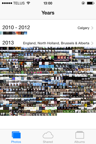


The Years view is entirely what you would expect: an overview of your photo library by annum. If you tap and hold over a general area, you can scrub along to see a series of larger thumbnails, though you need the steadiness of a monk to be at all accurate in selecting a photo. With such tiny thumbnails, it’s not the most useful view, but it presents a nice summary of your library.
The Collections view can be thought of as parts of a year. It attempts to collect related photos, largely by location. In my library, it has grouped together photos from England, and created a separate collection of photos from Belgium and the Netherlands. Many of these were taken on the same day, but it has smartly grouped them separately by location.
Finally, the Moments view is zoomed in a little bit more; several Moments exist in a Collection. Depending on how shutter-happy you are, there can be many Moments in a single day, or many days in a single Moment. Again, these are largely separated by location at a community level, which I find a memorable way to categorize photos.
If you dislike the new attempts to categorize your photos, you’ll be thrilled to know that you can still see all of your photos in the order in which they were saved to your library in the Albums tab, which now includes a separate automatic album for panorama photos. But I think most people will love the Moments-style categorization. It greatly simplifies photo library management for iOS in a way that is completely automatic, obvious, and memorable. In short, it’s very Apple.
Music and iTunes Radio
I use the Music app on my iPhone a lot — probably more than I use any other app. It’s an application that was trumpeted as “the best iPod we’ve ever made” when it was launched in the original iPhone, but has languished in recent years. This is due in part to the same reason iPods themselves (save for the iPod Touch) have felt tired over the past few generations: their purpose is clear, and new features are not regularly added.
But, then again, what could they add? Introducing new features for the sake of newness is simply bloat. One thing Apple has consistently demonstrated is a reluctance to partake in any sort of feature checklist race. That has led to a perceived slowness in adapting new features — features which, by some accounts, should be obvious. Perhaps these “obvious” features take a while because Apple tries desperately hard to get them right. Features like, for instance, some sort of streaming library.
That dream feature becomes reality in iOS 7, with the introduction of iTunes Radio. Unfortunately, this part of the review presents a significant problem for me, a Canadian. Despite my hopes that the lengthy rumours of negotiations were because Apple was hoping to roll the service out in multiple countries, it became clear at WWDC that this simply wasn’t the case. iTunes Radio is US-only for now.
Well, that is, unless you know a loophole.
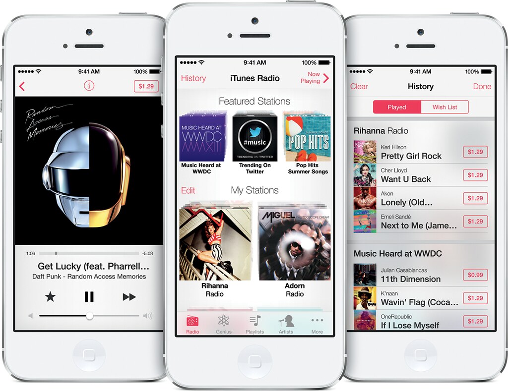
So, iTunes Radio, then. Some of the early rumours claimed that it would be similar to Spotify, except using iTunes’ significantly larger library. Other rumours thought that it would be closer to Pandora’s tailored radio stations. The reality is that it’s something like a mix of those two, with a sprinkle of iTunes Genius.
(Disclaimer: I tested iTunes Radio on my Mac, not with iOS. The technology is exactly the same, but it’s easier for me to use the loophole with iTunes than it is with iOS.)
By default, iTunes Radio assumes the first tab of the Music app. At the top are a selection of default playlists, including popular items on the iTunes Store, and what is the essence of Twitter’s “#music” app baked right in. I’ve made my disdain for the latter known before; even though it uses full iTunes tracks instead of relying on an Rdio subscription, it’s no better here in terms of new music discovery. Apple’s tried this discovery stuff with iTunes before, but where the iTunes Mini Store and Genius Sidebar have broadly failed for me in terms of discovering new music, iTunes Radio has succeeded.
The real magic happens when you treat iTunes Radio like an ultimate Genius playlist. You can start a station by searching an artist, song, or genre, or you can find one in your local library. iTunes Radio chooses songs that go well with what you’ve selected — these can be both songs from the Store that you don’t own, and ones you own already.
The suggestions iTunes Radio provides are often excellent. I never received a station which had egregiously poor results, even with trickier seeds. As an example, I selected the 1968 Nirvana album “All Of Us” as the basis for a station — that’s the progressive rock band, not the grunge one — and the station was a perfect mix. The worst suggestions I encountered were only so because they were mind-numbingly obvious (People who listen to Audioslave also like Soundgarden? No kidding). There’s an onscreen slider to adjust between more familiar songs, or “more discovery”, which tries to find more songs which are new to you. I threw a wide variety of music at iTunes Radio to see what kind of stations it spat back, and I got some delightful results. I’m excited for it to formally launch in Canada.
I did see a few bugs with iTunes Radio incorrectly reporting that a station couldn’t be created while proceeding to create the station anyway, or rapidly skipping tacks instead of playing them. I suspect these bugs are either prerelease issues, or — more likely — a byproduct of my illegitimate listening. I mention this only in the interest of completeness; I hope these bugs are not representative of the actual launch experience.
iTunes Radio shares something else in common with Pandora: limits. While iTunes Radio is available for free, songs are occasionally punctuated by ads, and there is a six-song-per-hour skip limit. Subscribers to iTunes Match don’t hear any ads; at $25 per year, it’s one of the least expensive streaming services available (Pandora One with no ads and no skip limit is $36 per year, while Spotify is a whopping $120 per year if you want mobile support).
Finally, regular readers of this site might remember my occasional bitching and moaning about streaming services. iTunes Radio gets a bunch of stuff right that Rdio and Spotify get wrong: its music library is much more complete (Led Zeppelin and The Beatles, to boot), and tracks are streamed in a very high quality 256 kbps AAC format. But, like Spotify and Pandora, it isn’t available where I live. Bummer.
There’s something else not available, he wrote in this awful segue. Cover Flow is dead.7
It’s been a long time coming, really. It was unceremoniously removed from iTunes in version 11, but it has been neglected on iOS for the past several years. It didn’t receive the matte gradients of iOS 6 and, aside from retina graphics in 2010, hasn’t seen a substantial update since the iPhone’s debut. It even retained the same sub-par rotation animation for its entire existence.
The premise of Cover Flow is somewhat retained in iOS 7, however: Music in landscape is still a graphical, not-entirely-useful way of viewing your library. If you want to find a specific artist or song, you’re best off using the portrait mode. But if you want to see a whole lot of pretty cover art, the new landscape view will be right up your alley.
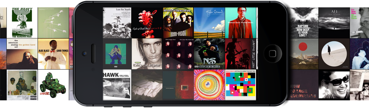
Instead of one row of album covers, you get three, and they’re not presented in a faux-3D-and-glossy environment. But if you tap on one, it will still flip over to reveal its tracklist and a minimal set of controls. It’s entirely what you would expect: a beautiful way of browsing your album covers, but not the most efficient or easy way of finding a specific song, album, or artist.
The Music app on iPads is blessedly the same in both orientations.
Siri
Everyone’s favourite robotic personal assistant has learned a few new tricks in iOS 7, putting it a little closer to passing a Turing test. By far and away the most impressive attribute is Siri’s new voices: one female, and one male. By now, you’re certainly familiar with Samantha, as OS X calls Siri’s default (American) voice:
It’s not bad at all, but it’s a bit robotic, and the pacing feels especially challenged.
The original Siri voice has nothing on the new ones, though. Remember how impressed you were when Steve Jobs demoed the new voice that would ship as part of Leopard? It’s like that, all over again.
As you can hear, it’s significantly more natural. Phrasing is particularly good, and everything just sounds a little less robotic. To assist this more natural feel, the new Siri voices include a few pre-recorded phrases, too.
New, too, is the inclusion of a male voice. Past versions of iOS had male voices for select regions, including the UK and France, but these were in place of the female voice. In iOS 7, there is a choice of either male or female for all the languages in which the new voices are available: US English, French, and German. The male voices sound great as well.
In addition to the new voices, Siri has gained some new knowledge, benefiting from enhanced Wikipedia support, and the ability to search Twitter in real time by user or hashtag. Surprisingly, there’s no way to find tweets sent from nearby, which would be useful if you’re not sure what parade you’ve stumbled into, or why traffic is the pits. Finally, Siri can now search Bing for both text and image results without throwing you into Safari.
On an iPad, Siri now runs in full screen.
Update: Thanks to “sectornation” on Reddit for reminding me that I tested this pre-release. I have replaced the Siri recordings, and have augmented my commentary below. I apologize for the error.
But all of these tricks are slightly undermined by Apple’s continuing mediocre track record of providing online services. Take a listen to those recordings of Siri again, and note that I left the end-of-speech “ding ding” in there. Notice the long pause between that sound and the results?
Siri still responds slowly on occasion. It’s better than it used to be, and Apple is clearly making progress in their online services (so much so that Apple has dropped the “beta” tag). But it’s not quite at Google levels of reliability yet, and that’s absolutely the benchmark.
Miscellanea
iOS 7 is a huge update — I feel required to emphasize the word huge. There are tons of features I didn’t get to, like SpriteKit and third-party game controllers, 60 frames-per-second video capturing, inter-app audio, and iBeacon. Here are a few which I’ve grouped together because my time with them has either been brief, or nonexistent.
AirDrop
As AirDrop is only available for iPhone 5 or later, or the most recent generation of iPads, I was unable to test it.
The premise, though, is simple: instead of using NFC to transfer data with other devices in close proximity, Apple has elected to use an ad-hoc WiFi feature they call AirDrop. You can choose whether your device is available to AirDrop from nobody, everyone, or just those people you have in your contacts. It doesn’t require any device contact, and you can AirDrop to multiple people at the same time.
In his testing, Matt Gemmell noticed that the device name is displayed, not the name of the contact when there’s more than one device with the same contact’s name assigned to it.
I’m looking forward to trying this out when I eventually upgrade from my 4S.
Find My iPhone
With Find My iPhone, Apple solved the problem of finding the location of an iPhone that has been lost or stolen. It required almost no configuration, and could be used from another device or the web. But this isn’t helpful if Find My iPhone is turned off by whomever found or stole it. Worse yet, a restored iPhone can be activated by anyone.
Enter the new Find My iPhone. Really, it should be called “Find My iOS Device”, but that’s less snappy. It’s also harder to find an iPod Touch or WiFi-only iPad because it might not necessarily be connected to a WiFi network, and neither product has a GPS chip in it. I have digressed.
The update requires the owner’s Apple ID and password to turn off Find My iPhone or to activate it. It’s persistent across restores, and can continue to display a message on the lock screen after erasing it. It’s a very clever solution.
I still don’t understand why Find My iPhone is not preinstalled on every new iOS device, though. It seems to me that it should be a core piece of the system, and I don’t see any circumstance in which it would be detrimental that it is installed out of the box.
iOS in the Car
In 2014, several vehicle manufacturers will begin offering a way to connect your iPhone 5 or newer to the centre console display, which will show an interface optimized for using it while driving. You can get directions with Maps, control various functions with Siri, and play iTunes Radio during your commute.
As this hasn’t been released yet, nobody knows how well it works. I bet Jalopnik will publish a review when they’ve had some time to test it. It’s a testament to their clout that Apple is one of very few companies which can do these kinds of deals with automakers. They did it with iPod integration, and they have the ability to do it again with iOS in the Car.
iCloud Keychain
Before there was iCloud, there was MobileMe, and its launch was a disaster. Before MobileMe, though, there was the .mac brand, which was a largely-enhanced iTools. Apple’s online services have been something of a crapshoot over the years, it must be said.
One of the (many) things that got lost in the transition from iTools/.mac/MobileMe to iCloud was keychain syncing. Because these tools were designed in the pre-iPhone world, keychains could only sync between computers, which sucked for most people who owned a computer, but also an iPad and an iPhone — the latter two of course equipped with more finicky touch screen keyboards. So users had a choice:
- use several very secure passwords with a combination of lowercase letters, uppercase letters, and numbers, all of which they’d have to memorize, and then try to type on a smooth glass surface;
- use a couple of shorter, more memorable passwords, which would certainly be easier to type but would be less secure;
- use a third-party password syncing app like 1Password.
The latter is a good option, but why should we have to buy another service to be able to sync a keychain? Shouldn’t my desktop Apple product be able to sync that over using an Apple syncing service to my portable Apple product?
Well, that’s finally happened. Apple is rolling out iCloud keychain syncing to Mavericks and iOS 7. It doesn’t appear that it’s going to be available until Mavericks is released, but it was live during the developer previews of both, so I had a little bit of time to test it.

In practice, there are two parts to this feature: automatic password suggestions, and syncing itself. First, when signing up for an online account, Safari will often suggest a password for you, unless the website has specifically disallowed it. It will remember this password in the keychain, which will be synced across all devices that have iCloud Keychain enabled. iCloud can also sync credit card data, if you choose; the CVV number must be entered each time, though, for security reasons.
The second part — the syncing feature itself — requires a little more setup. Apple has wisely opted to use a secure two-step authentication process. On the first device you set up, you’ll be asked to create a four-digit PIN. You can instead opt to use a “complex” security code (similar to the “complex” full keyboard device passcode setting), or a random security code. If you choose the final option, “don’t create security code”, it will revert to a two-step process which requires confirmation on another device. The second step of the process is to add a phone number, for secondary confirmation.
It’s a painless setup process, and it seems very secure: keychains are encrypted, and the amount of information needed to log in follows the best two-step practices. This, combined with Touch ID in the iPhone 5S, should make users more willing to employ the better security practices that we all know we should be using already.
Automatic App Updates
I have written a little over 14,000 words without mentioning perhaps the most-requested iOS feature since the App Store was launched. I think that’s because it’s so simple, clean, and invisible that it’s pretty much perfect. Which is to say that it works exactly as you’d expect.
It works in combination with the cool networking tasks coalescing I described in the “Multitasking” section a very long time ago. Apps automatically update in the background. It’s as simple as that.
Now a cautionary note: I’ve seen reports of this being enabled over a cell connection by default when updating. If you’ve got a really limited data plan cap, you may want to ensure it’s disabled in Settings → iTunes & App Store; the “Use Mobile Data” switch should be off. If you want to disable automatic updates entirely, there’s a switch for that in the same location.
Recent updates can be seen in the “All” tab of Notification Centre, but there’s no accompanying push notification banner when one is updated. Tapping on one will take you to the App Store where you can see the change log.
Simple, right? That’s exactly how it should be.
Performance
You’d imagine that the substantial code-based visual effects — all that translucent blurring and the parallax effects — combined with the extended multitasking capabilities would slow iOS 7 to a crawl, especially on the older hardware that I own. And yet.
Put simply, I haven’t noticed any lag or stutter. Nearly every animation is, to my eyes, a full 30 frames per second; the only exception being rotating a hybrid-view Maps from one orientation to another on my third-generation iPad. Every other animation that you can think of runs as smooth as the proverbial hot knife through butter, even for the craziest kinds of animations you can think of.
At right is a short clip of multitasking from the Camera app. As you can see, not only does it smoothly complete the zooming animation to reveal my open apps, it keeps running the live view from the camera in the multitasking switcher. And it’s doing all of this while mirroring it via AirPlay for me to record it. That’s extremely impressive.
One little niggle continues with regard to performance, though. The Camera understandably consumes a lot of memory: it’s running live eight-megapixel video at about 15 frames per second while getting live GPS coordinates. It’s such a big app, though, that almost every other app running in the background will be killed. I bet this isn’t as big an issue on newer hardware, if there’s at all an issue on something like an iPhone 5.
The other major performance issue I’ve found is with Siri. When it’s (she’s?) first run after a few hours of not using it, the interface will respond slowly and the query will likely be unanswered (“I didn’t quite get that”). After that, queries will be returned with the usual 1–10 second wait time.
As I noted above, I’m not set up to run battery life tests with any sort of reliability. I’ve found battery life to be comparable with iOS 7; some days have perhaps been a little better than on iOS 6. Your mileage, as it were, may vary.
Conclusion
If you notice any typos, broken links, or something factually incorrect, I’d really appreciate an email or a tweet. Thanks for reading.
In the three months in which I’ve been using iOS 7, I’ve continuously been impressed by the polish, focus, and depth of the interface’s redesign. Yes, some of the icons look rushed and unfinished. But that’s such a small part of the overall interface that I’ve become used to them. And, if you’re anything like me, you have a mix of apps from third-parties on your home screen; the Calendar app is bothersome, but I use Fantastical anyway.
But if you don’t settle on the icons and keep exploring through the entire operating system, I think you’ll be pleasantly surprised with just how comprehensive the changes are, and how they make the system feel. They make it feel alive.
This reminds me of the transition from Platinum to Aqua. Remember how prominent the pinstripes were in the early days? Remember how gratuitous the transparency was? Some long-time Macintosh users were uncomfortable with the new direction, while others love it.
iOS 7 is Aqua. It’s a fresh start, using new technologies which weren’t available nor practical in 2007. It’s going to change over the course of the next several years. But its foundations have been laid, and they are very strong.
The difference between iOS 7 and Aqua, though, is the sheer scale of the update: according to Apple, they’re going to ship their 700 millionth iOS device next month. Apple hasn’t sold anywhere near that number of Macs. If you have Facebook, you’ll know how much your timeline lights up every time there’s a minor design change. Now imagine a few hundred million people updating to the radically different iOS 7 in one day. I hope it goes well, but I predict a lot of people are going to be surprised, and not necessarily in the best way.
Should you upgrade? In a word, yes, but not without reservations. Even though it’s iOS 7.0, you can almost think of it as a 1.0 release — it’s that big of a rewrite. As such, it comes with the familiar caveats of a 1.0 release. According to several reports, it’s quite buggy on non-retina devices. From my experience, I’ve seen no major bugs or issues on my iPhone 4S, and only a few scattered problems on my third-generation iPad (but none of the hard resets or critical errors that others are describing). If you own an iPhone 5 or 4S, or an iPod Touch, it’s a stellar update. If you have a third- or fourth-generation iPad, or an iPhone 4, you should upgrade, but be prepared for an occasional hiccup. If you own an iPad 2 or Mini, I’d hold off for a while, perhaps until the first bug-fix releases.
It’s a truly sublime experience which manages to preserve the familiar aspects of iOS while providing a brand new look and feel. The redesign makes the entire user experience feel brighter and more alive. It’s not just a bit of trite marketing: updating to iOS 7 really does feel like getting a brand new phone. I have thoroughly enjoyed the time I’ve spent with it so far, and I’m excited to see where it goes in the future.
Right now, though? It’s spectacular.
-
When I worked at a coffee shop, there was a seventy-something guy who came in daily and had a quadruple-shot latte. You’d think he’d be visible buzzing by the time he left, but that didn’t seem to be the case. ↥︎
-
In a somewhat bizarre statement, Steve Jobs claimed that Apple didn’t want a third-party app to bring down AT&T’s (née Cingular’s) network. This is ridiculous; AT&T could barely cope even without third-party apps. ↥︎
-
On a semi-related note, I’m writing these words from a train as I travel from London to Brussels. While in London, I frequently noticed a probably lethal combination of vehicles with the right-of-way, and pedestrians texting while jaywalking. And, yet, nobody was killed. Amazing. ↥︎
-
My guess is that people who whinge about reduced battery life with each update in the first week of its availability are experimenting with every new feature. That’s not to say that there are never legitimate battery life issues with updates, but they are usually found over a longer time span. ↥︎
-
I don’t understand the impetus to call it “satellite” imagery when it has been photographed from planes and helicopters. ↥︎
-
If you really, really like Gotham, you can apply the Noir filter in Photos, then import the picture into Afterlight and select the Olive filter at about 70%. It’s damn close. ↥︎
-
Aside from in OS X’s Finder. I don’t think it’s going to last many versions more there, either. ↥︎