But on Friday morning, a random productivity app called Cириус broke into the top three.
[…]
The reality seems to be that the app is a Russian banking app disguised as a Pomodoro timer. Activity on Telegram this week points to the app actually being a client for Russian financial institution VTB Bank.
The link on “VTB Bank” goes to Wikipedia instead of VTB’s website, where the first tab on the home page slider is currently advertising this app. (Update: It has since been removed.) It is barely disguised. In Russian media, the developer says there are other apps lined up to take the place of this one after it is inevitably removed. Apple and Google have repeatedly failed to catch apps violating U.S. sanctions.
Hall:
The app will almost certainly be pulled soon, but it’s always surprising that existing systems in place sometimes miss detecting apps disguised like this.
Again and again, the world’s leading social media companies have targeted students, even as complaints have mounted that they are hurting teenagers’ mental health and academic performance, according to a New York Times review of internal documents that lay bare for the first time these tactics to hook young users.
[…]
The companies’ push to keep children glued to their screens has overshadowed concerns from parents, teachers and even their own trust and safety teams about interfering with school, according to the documents and interviews with dozens of parents, teachers and former tech company employees.
I do not think it will be surprising to many readers that these companies had strategies to increase usage by children, even during school hours, but I do think it is notable to see it spelled out in these documents. The popularity of these apps is not organic or foretold; it is, at least to some extent, created. There is no reason why Meta would need Instagram “ambassadors” at schools (PDF) to “drive product adoption” if it were not trying to increase Instagram use among teenagers.
Valentino-DeVries:
Members of the company’s [Google’s] education department were often excited about products they thought could improve learning, such as affordable laptops and educational YouTube videos, according to court documents and interviews. They worked alongside product managers, however, who were focused on a different upside: increasing YouTube’s viewership.
YouTube is maybe the trickiest of all these platforms to govern within schools because it has no alternative. There is a vast library of genuinely educational and informative video on the site, and then there is the rest of YouTube. It therefore makes sense to allow its use among students and within schools. However, YouTube has also been honed for boosting engagement, something which affects all users. That is not to say we should have exactly the same standards for children and adults, but it highlights the difficulty of using a singular platform with general-market financial incentives in an educational setting.
Meta has quietly embedded face-recognition technology for its smart glasses into an app downloaded to millions of phones, according to a WIRED analysis of the company’s software.
[…]
Three AI models powering NameTag have already been deployed from Meta’s servers and now reside on its customers’ phones, according to WIRED’s analysis, which was independently reproduced by outside experts. One model detects faces, one crops them, and a third encodes them into biometric data.
Facial recognition, as Mehrotra and Cameron repeatedly note, is not yet enabled. But according to an Electronic Frontier Foundation researcher who tried the existing code, it appears to be partly functional.
Meta communications troll Andy Stone is really mad about this story and, on X, even claimed the “feature doesn’t exist” (Xcancel). Last time I spilled water across my keyboard, I was just happy my laptop still worked properly, but it seems that in Meta’s case, it resulted in writing an entire facial recognition feature and pushed it to production. Incredible stuff.
The New York Times reported on Meta’s rollout strategy for the feature earlier this year (previously linked), while Ryan Mac, then at Buzzfeed News, wrote in 2021 that Andrew Bosworth said facial recognition in smart glasses was something the company was exploring. On X, Bosworth built upon Stone’s reply (Xcancel) to this article claiming it is “incredibly misleading” and “dishonest”, for no particular reason.
Some companies are irredeemably bad and rotten to the core. The sooner Meta runs out of money and closes up shop, the better the world will be.
If you are still using Microsoft Office 2019 for Mac, it will stop working fully on 13 July 2026. Word, Excel, PowerPoint, and Outlook will enter “reduced functionality mode” — a euphemism meaning you can view and print documents but cannot edit, save, or create new ones. Microsoft’s documentation doesn’t clarify what this means for Outlook users.
Why is this happening? A certificate expiration is forcing Office 2019 into read-only mode, though Microsoft acknowledges this only obliquely in the FAQ. Without a current certificate, the apps can’t confirm you have a legitimate license.
Engst compares Microsoft’s approach to Apple’s when it issued an update earlier this year for decade-old iPhones, with a new certificate that allows iMessage and FaceTime to keep functioning. While Apple’s approach is welcome, it is also a good reminder why this proprietary service should always be paired with support for open standards like SMS and RCS.
[…] The customer did their part by paying; it was the company that chose to impose the activation model in order to weed out cheaters; shouldn’t it then own any problems that creates?
But it’s actually worse than that because even subscribing to Office 365 doesn’t fix the problem. You need a newer version of Office, which necessitates a newer version of macOS, which may necessitate getting a new Mac — all to fix what seems like an artificial problem.
My workday began with a notification from Teams that the desktop app will stop working on 20 July, as Microsoft says it is only compatible with the three most recent versions of MacOS. The oldest supported version, therefore, is MacOS Sonoma and, given Apple’s own support policy, that means only Macs released in the past eight years or so are supported. Even though many Macs from that era remain capable and fast, eight years is a long time, and Teams remains available through a web browser.
Also today, OneDrive automatically updated to a newer version, which is incompatible with the version of MacOS I am running. I received no warning until I tried launching it. Microsoft provides no support for this kind of problem for end users but, luckily, I had a Time Machine backup I could use. However, I realized OneDrive would probably automatically update and I would have to do all this all over again, and it contains no relevant preferences. So I needed to delete the related files in /Library/LaunchAgents and /Library/LaunchDaemons and then, thanks to a tip from Sébastien Marchal, block the updater domain in my /etc/hosts file.
The software Microsoft makes is often the kind of thing people are required to use for their job. We do not have a choice of whether to have it installed. It would be nice if Microsoft cared just a little bit more about the durability of what it ships.
The bad blood between the super PACs comes as powerful Silicon Valley companies race to shape the future of A.I. regulation. The groups are two of the biggest spenders in this year’s midterm elections, laying out nearly $24 million and promising that over $100 million more is on the way.
Their financial duel is effectively a proxy war between two of the biggest A.I. companies, Anthropic and OpenAI. One super PAC, Public First, is allied with Anthropic, while the other, Leading the Future, is aligned with OpenAI.
If those names sound familiar to you, it could be because I covered this topic last month. Schleifer’s story is, of course, far more in-depth and better-sourced — and, as an outsider, it is a story that does not leave me feeling particularly confident in the A.I. policy prospects in the world’s most powerful country.
The amount of money A.I. companies have on hand is truly staggering. Of course all of them are spending tens of millions of dollars to influence the results of a midterm election, just like how Formula 1 teams, which used to be plastered in cryptocurrency ads, are now covered in logos for A.I. companies. It is only going to get worse.
OpenAI posted a response to its website claiming it has “not made donations to any super PACs”. This appears to be technically true, though not meaningfully so, as Leading the Future is funded by OpenAI co-founder Greg Brockman and its founding was encouraged by OpenAI’s chief global affairs officer. OpenAI says “any engagement with that organization has been in a personal capacity, not on behalf of the company”, but the distinction between personal and business involvement seems wafer-thin when it comes to executives and super PACs reflecting the interests of the company they run.
The widespread hacking campaign that relied on simply asking Meta AI’s chatbot to take over a victim’s Instagram account appears to have continued even after the company said the issue had been resolved. Meanwhile, the company has been scrambling to secure the targeted accounts and alert victims.
It is not very often for there to be an update on a security incident where it is less severe than originally reported, and I cannot remember a time when Meta has ever been able to provide such welcome news. And it is not as though this is some obscure or difficult-to-use way to hijack an account. If Meta has communicated to users any steps they can take to reduce the likelihood of becoming a victim, I have not received it.
His [Bill Gates’] carefully crafted image has been shattered as more details of Gates’s association with the late Jeffrey Epstein have spilled into public view, challenging prior efforts by the 70-year-old to downplay his relationship with the sex offender. In a February town hall with foundation employees, Gates owned up to two affairs with Russian women referenced in Epstein’s emails.
[…]
Two different polling teams — at the Gates Foundation, and his private office, Gates Ventures — for years have closely tracked opinions about Gates, including on favorability, trustworthiness and inspiration. A media analysis prepared for the Gates Foundation found that there had been a more than 40% increase in “critical news narratives” about Gates and the foundation since the Epstein files were released through February, according to internal documents reviewed by The Wall Street Journal.
There are so many little details in this story that are worth your time, but my big takeaway — aside from the Epstein stuff — is the neurotic obsession with building image that, I imagine, is fairly common among public figures. I know this, of course; you probably do, too. But to see it spelled out in the way Glazer does is quite something.
Gates pays people to obsess over his public perception for him — to choose his clothes, to work with Netflix on documentary-style vehicles for him, and to massage his blog and social media accounts. There is something truly bizarre about having a team edit together a video of a rich businessman going for pizza in an attempt to make him relatable and likeable, and then — presumably — tracking the performance of that Instagram post.
Gates and his foundation have done undeniable good in the world, while also being a figurehead of the mixed results of billionaire philanthropy. Also, he spent a lot of time around Epstein. It remains a mystery to me why billionaires like him also want to become beloved celebrity intellectual figures.
A video released on Telegram by pro-Iran hackers claimed to document a remarkably simple exploit that appears to have involved using a VPN connection with an IP address that is in or near the target’s usual hometown, requesting a password reset for the account, and then choosing to chat with Meta’s AI support assistant. From there, the video shows the attacker told the bot to link the account in question to a new email address, after which the bot dutifully sent that address a one-time code that allowed a password reset.
Meta, a trillion-dollar corporation, should probably hire a few more people who have read the SMBC comic.
[Sarah] Wynn-Williams, whose bestselling memoir, Careless People, details her years working at Facebook, was due to appear in conversation with the investigative journalist Carole Cadwalladr and academic Tim Wu.
Instead, Wynn-Williams sat on stage for the duration of the hour-long discussion between Cadwalladr and Wu, without speaking or responding. She was unable even to nod or shake her head.
To be sure, Wynn-Williams’ silent appearance onstage is the kind of thing that would encourage press coverage and, presumably, this publicity could encourage book sales. Yet Meta has, for a full year now, insisted that “Careless People” is just a bunch of old anecdotes; pay no mind, there is nothing to see here. But its lawyers are vigorously enforcing the arbitration order (PDF) preventing her from making public remarks about Meta that could be construed as critical or negative.
I am no media relations expert, but I bet “Careless People” would feel much less potent if Meta realized it is a trillion-dollar corporation with a crappy reputation regardless of one ex-employee’s book, and with shareholders who do not care about what she wrote so long as the ads keep selling.
Here are some updated numbers. Just like last time, these numbers only include App Store Search impressions from iOS devices. As you’ll see, these numbers get harder and harder to compare over time.
Chris Lindsay, developer of Nihongo, a Japanese dictionary app:
Before the rollout, my organic and paid downloads had remained pretty steady for most of the last year. After the rollout, my my organic installs dropped, and my paid installs rose. My overall downloads actually stayed roughly flat, but a large chunk of what used to be organic downloads appears to have shifted into paid downloads instead:
The ads themselves still work well. The problem is that many of these paid downloads seem to be users I previously would have acquired organically.
These ads are effectively another surcharge Apple has foisted upon developers for the privilege of distributing software to my iPhone and yours. Far from being premium “curated” experience, the App Store is this way because Apple has every incentive to steadily make it a little bit worse for users and developers — because where else are you going to go for your iPhone apps?
Remember, the plan was $26.4 billion [in Twitter/X revenue] by 2028. We’re more than halfway there. How’s it going? Well… when he combines xAI (grok) revenue with X revenue (so not even just breaking out X’s ad revenue)… we get… a total of $3.201 billion in 2025. So, just to put this in perspective… when he took over in 2022 he laid out a five year plan to take the company that had $4.5 billion in ad revenue the year before he bought it up to $12 billion in five years. Three years in and… it’s now somewhere pretty far below $3 billion. […]
Earlier this year, a judge found against Elon Musk in a lawsuit filed by X against advertisers claiming they staged an illegal boycott.
The SpaceX prospectus, by the way, is one of the funniest documents to ever live on the sec.gov domain. It is lucky the business it is known for is so damn photogenic because it is, at present, a profitable satellite internet provider with side businesses of space exploration and artificial intelligence that each lose money. (How it internally accounts for the cost of sending Starlink satellites into orbit is a fantastic question.) And the present business model of the latter is something Patrick Boyle described as “renting GPUs to a competitor on terms that can vanish in a fiscal quarter”. Yet the company still claims the size of its total addressable market is over $28 trillion, or over one-fifth of the entire world’s GDP.
Even so, a $1.75–2 trillion valuation is plausible simply because of Musk. Similarly, and back to that AFP article:
According to its filing, TMTG generated US$900,000 in revenue during the first quarter, a paltry amount for a company valued at US$2.47 billion on the stock market.
That valuation is not much; at time of writing, it is worth about as much as Central Garden & Pet, owners of Nylabone and McKenzie plant seeds. That company last quarter posted revenues one thousand times greater than TMTG, with profit margins of over 12%. Nevertheless, TMTG has a connection to the U.S. president, so it is similarly valued. Lots of good, normal stuff happening in the world’s largest and most powerful economy.
And somewhere along the way the whole emotional center of the thing shifted. I set out to build an anti-Photos utility — a search engine for a hard drive. What I actually ended up with is a memory keeper. Open a photo today and Iris tells you the date, surfaces “16 items on this day,” drops a pin on the map, and lists the people in the frame with their ages quietly calculated from their birthdays. That is not a utility. That is the opposite of anti-anything.
I have been testing Iris for a couple of months and I think it is delightful. It reads all the photo libraries you point it at — your system library, whether that is in iCloud or local, and any folders you want like the one that contains your Lightroom edits, for example — and makes them accessible in a single, giant view.
But that is not the coolest part. No, that is that it lets you explore your tens- or hundreds-of-thousands of photos in a way that treats each of them as little memory boxes. So often, it is not just a picture of your kid, or your dog, or your dinner; it is a time you would like to remember. There are a bunch of things in each file that can bring you back to that moment. Photos does a poor job of that; Iris, on the other hand, is made for exactly that, something Hall takes seriously. How many apps are there with a manifesto?
Your account, your listening history, and your data remain exactly where they are. The team building Last.fm is the same. The service continues as normal.
It is difficult to know whether it is riskier for Last.fm to be independent or under the banner of the hilariously corrupt Paramount Skydance conglomerate, but I imagine it would not — uh — last long if the leadership of the latter continues making cuts. I am happy to be a paying subscriber to a service I care about, and am excited to learn what comes next.
I’d like to make an analogy between software development and Apple App Store review. A common, cursory reaction to the obvious failures of app review, the continual appearance of countless scams in the App Store, is to suggest that Apple hire more reviewers. My contention is that adding reviewers is not a solution to the problem of App Store curation, and the belief in such a solution is a myth. I don’t claim that hiring more reviewers would make app review slower. Rather, I think that meaningful, effective curation can’t be measured simply by the amount of available labor, much like [Fred] Brooks argues that the possibility of measuring useful work in units of time, man-months, is a myth.
Apple markets the App Store as a “curated storefront”, but that is not meaningfully true if it is serving up, as Apple says, about two million apps. Meanwhile, as Johnson writes, “nobody worries about scams in Apple Arcade […] a truly curated service”.
The thing is that Apple’s App Store should have a carefully selected inventory of apps. That is Apple’s whole brand: premium, highly-desirable products, and people are willing to pay a little more. The App Store does not match that promise. I think the direction of regulatory and court decisions on the governance of iOS app distribution could be a gift for more selective curation, the kind of thing for which some third-party developers would want to pay extra compared to the competing third-party app marketplaces that would also be available.
Alas, we are on the cusp of another WWDC during which Apple seems unlikely to make major changes to software distribution across its many “post-P.C.” platforms.
The Federal Trade Commission will require Cox Media Group (CMG) and two smaller marketing firms to pay a total of $930,000 to settle allegations they deceived customers by falsely claiming to offer an AI-powered service that could target localized ads based on conversations captured from consumers’ smart devices and that consumers had opted into such targeting.
Congratulations to Joseph Cox of 404 Media who broke this story in December 2023 and a related story about MindSift and 1010 Digital, the “smaller marketing firms” who settled with the FTC. According to the FTC’s complaint (PDF), Cox Media Group continued its fraudulent marketing through mid-2024, around the time the pitch deck was leaked to Cox. All three of these companies helped to feed the conspiracy theory that apps use device microphones to collect data for ad targeting.
For what it is worth, Cox Media Group told Reuters it “relied on marketing materials provided by a third-party vendor about the vendor’s product”.
Like many conspiracy theories, elements of this story were covered without skepticism by websites like the Daily Mail and Zero Hedge. These are crank websites that hinge on unreliable narration driven by confirmation bias; yet, both happen to be extremely popular, particularly among those who immerse themselves in conspiracy thinking. Because companies like Cox Media Group misrepresented how they collect information and took advantage of the relatively widespread suspicion that devices are listening to everything we say for ad targeting purposes, it undermines our ability to have a reasonable discussion about the actual ways in which they are ruining our privacy. From the FTC’s press release:
According to the complaints, this service did not, in fact, listen in on consumers’ conversations or use voice data at all — nor did the service accurately place ads in customers’ desired locations. Instead, the service the companies provided consisted of reselling — at a significant markup — email lists obtained from other data brokers.
Of course that is what Cox Media Group was doing. Not only does this settlement clarify this whole audio-based-ad-targeting narrative is nonsense, it also shows the power of the normalized yet still invasive practices of data brokers and ad tech. The damage done by Cox Media Group is that it is harder to have this conversation because they have poisoned the well. Meanwhile, anyone who is clinging to the conspiracy theory might point to this settlement as evidence of a cover-up — if crank websites cover this settlement at all. As of writing, I could not find it on either the Daily Mail or Zero Hedge.
Attorney General Ken Paxton filed suit against Meta Platforms Inc. and WhatsApp LLC (collectively “WhatsApp”) after the company misled consumers regarding the strength and scope of its privacy protections for its messaging app, WhatsApp.
Paxton is alleging (PDF) Meta is fully lying about the end-to-end encryption promise of WhatsApp in this wild lawsuit.
The sole factual evidence cited for the claims is an article published last month by Bloomberg. It reported that the US Commerce Department’s Bureau of Industry and Security [BIS] had abruptly closed an investigation into allegations that Meta could access encrypted WhatsApp messages shortly after one of the department’s agents sent an email outlining the probe’s preliminary findings.
[…]
Thursday’s lawsuit doesn’t indicate that the AG’s office has obtained the email itself or gathered any information from the investigators involved. Instead, it cites only the Bloomberg report for support. The complaint also noted that Meta employees receive plaintext WhatsApp messages that are reported to the company by fellow WhatsApp users. Those messages, however, are taken from the reporting party’s device only after they have been decrypted using the decryption keys available only to the reporting party.
More backdoor allegations were made in another lawsuit (PDF), this one filed in March, citing a January Bloomberg article that, in turn, says this was being investigated by the U.S. Department of Commerce and noting a 2024 SEC whistleblower report. There is no explanation in the lawsuit of how such a vulnerability could exist.
Earlier this year, before either Bloomberg article was published, a group of plaintiffs hired one of the most prestigious law firms in the United States to sue Meta with similar allegations, though they provided no technical evidence either. In later filings, the plaintiffs eventually cited the same April Bloomberg piece as Paxton. In response, Meta’s attorney submitted a forceful declaration (PDF) explaining that “the [Bloomberg] article itself included a statement from a BIS spokesperson explaining that the claims against WhatsApp were ‘unsubstantiated’ and BIS was not investigating WhatsApp or Meta”, and cited a number of external public articles questioning the technical merits of the case. The plaintiffs lawyer wrote in response (PDF) that “saying an investigation was not complete is very different than saying the facts are wrong” and, in turn, points to an article on Medium by Adrian Găitan. Găitan writes:
By the end of this article, you’ll understand not just that WhatsApp’s privacy model is broken — but exactly how it’s broken, layer by layer, from the cryptographic primitives all the way up to the FBI agent pulling your metadata every 15 minutes in near-real time.
This article feels compelling in its length, technical detail, and citation of declassified documents, but I found a closer reading conspicuously differs from what its introduction — and, indeed, these lawsuits — allege. Găitan points to eight distinct vulnerabilities. Two of them are extraction methods when data is at rest, like when it is stored in an iCloud or Google Drive backup, or bugs in the app that are exploited by a spyware vendor. This is not nothing, but it is also not a problem with end-to-end encryption; it is, in fact, a reminder of its limitations. Two others are irrelevant: Meta does not claim either A.I. prompts nor business chats are end-to-end encrypted.
That leaves four possible vulnerabilities Găitan alleges in WhatsApp’s specific security. One is the company’s willingness to install a “pen register” which provides to law enforcement a near-real-time record of user chat metadata, but not the contents of chats themselves. The second is the metadata WhatsApp stores and how it can be used to triangulate connections. Another complaint Găitan has is that WhatsApp is not open source, so it is not possible to fully verify Meta’s claims of secure end-to-end encryption. Lastly, Găitan points to research claiming it is possible for WhatsApp to surreptitiously modify the participants in a group chat.
For those keeping track, that leaves basically one vulnerability — the latter group chat problem — that would satisfy the kinds of claims being made in these lawsuits: that Meta has “unrestricted access to users’ communications”; that Meta and WhatsApp “have access to all WhatsApp users’ encrypted communications in their entirety”. One could make the case — and I certainly have — that backups of supposedly secure and private messaging platforms should be similarly inaccessible for meaningful “end-to-end encryption”. One could even make a reasonable argument that all of the issues raised in Găitan’s piece as all of them degrade WhatsApp’s privacy promise.
But these lawsuits are not making those claims. They are citing a single email from a government investigator as passed through a media report, and claims from whistleblowers and others that have not been validated. I am not stumping for WhatsApp here. If Meta has been lying about its privacy to the extent these lawsuits allege, it should face serious punishment. I suppose we will learn as they play out whether these claims have merit. It is, however, shocking to me how many lawsuits have been filed in such a short time period making essentially the same allegations yet without any actual proof.
On the morning of December 4, five ninth grade girls, all 14 or 15 years old, showed up for class at Radnor High School. By 8 a.m. — the sun had been up for less than an hour — it felt like the entire school already heard what happened the night before. A fellow freshman boy allegedly created AI-generated sexually explicit videos of the girls using an app, and sent them to his friends. From there, word of the videos and gossip spread from teenager to teenager, school to school, until they made their way back to the girls whose faces were in the deepfakes.
[…]
The images originated from one boy, who used an app called Movely, the girls and their parents believe. The app is similar to dozens hosted in the Apple and Google app stores and advertised on Instagram and TikTok that promise to create AI images and videos of users as superheroes, animals, or influencers; behind a paywall, however, users could edit photos and videos with text prompts.
It almost goes without saying, but the “paywall” is — or was; the app has been removed — an in-app payment from which Apple takes a 15–30% cut.
Apple released its annual justification for running software distribution through the App Store — it told European regulators it actually has five, so maybe this press release only concerns the one accessible from an iPhone — and there are some big numbers in it, as usual. Apple says it “took a number of actions to block bad actors from distributing malicious software, rejecting over 2 million problematic app submissions last year alone”. This Movely app was not one of them. It was only removed after the Tech Transparency Project reported in April that App Store search terms like “nudify” and “undress” displayed results for apps that do exactly that. In its press release, Apple says it has many features for directing kids to age-appropriate apps and restricting them from downloading those which are not but, of the software found by TTP in the App Store and Google Play Store, “31 of the apps were rated suitable for minors”.
Of Movely, the TTP said in its report:
Likewise, an App Store search for “adult AI” returned an ad for Movely – AI Photo to Video. The app offers a suite of AI photo and video editing tools including a try-on feature that will replace a woman’s clothes with outfits including bikinis and lingerie. One tool allows users to select part of any photo and edit it with a text prompt. To test this feature, TTP uploaded an image of a woman in a white T-shirt standing next to a river. After using the selection tool to highlight the woman’s shirt, we entered the prompt “topless.” The app immediately generated four versions of the woman nude from the waist up. It required a paid subscription to download the AI images.
TTP could not reach Movely’s developer, FES2 Inc., for comment. Emails sent to the developer bounced back as undeliverable.
(For clarity, the TTP says it used A.I.-generated images of women to test these apps.)
The search query used to find this app, “adult A.I.”, feels like something Apple should be testing against. If it does not want porn or porn-adjacent apps in its store, it should obviously block these kinds of keywords and flag the apps which are in the results. Moreover, Apple says:
As powerful AI development tools drive a surge in app submissions, Apple’s App Review process has seamlessly scaled to handle the volume and to help ensure every new app and app update meets the App Store’s high standards for privacy, security, and quality.
These red flags are not obvious in hindsight; they should have been obvious from the time this app was submitted. Meanwhile, apps from longtime and trustworthy developers like Manton Reece and Radu Dutzan are stuck in App Review for dumb and basically invalid reasons.
Essentially spyware, an ODIT [on‑device investigative tool] can grant almost unlimited access. Investigators can capture screenshots, monitor keypresses, access emails and text messages — including those that are encrypted — and even remotely activate microphones and cameras. All without the owner knowing.
By August, police announced 23 arrests, 279 charges, and more than $9 million in recovered vehicles.
But the case has also done something else: It has pulled back the curtain on how police forces in Ontario — not just in Windsor, but in Toronto and Peel Region — are now using these powerful technologies to reach deep inside suspects’ devices. And despite ODITs growing use in major prosecutions in the province, government lawyers and police are fighting tooth and nail to keep almost everything about them secret: how they work; what safeguards, if any, govern their use; even the names of the companies that sell them.
The details of this report align with research published last year by Citizen Lab about Paragon’s Graphite spyware, including a likely link to the Ontario Provincial Police. It is not the only police force in Canada using ODITs, either. In 2022, the RCMP acknowledged its own use; Christopher Parsons, a civil rights advocate and director at the Information and Privacy Commissioner of Ontario, keeps a small library of related policies.
You probably know the gist. Predictions and dire warnings of a future lived in an immersive virtual world had been around for decades before Neal Stephenson solidified the concept in his 1992 novel “Snow Crash”, but Stephenson called it the “metaverse”, and that was important. It was a cautionary tale. Not everyone understood that. The video game Second Life, launched in 2003, provided an early glimpse of the concept in a P.C. environment. Another piece of the puzzle, consumer-grade virtual reality, began to take shape when Oculus was founded in 2012, and shipped a developer-centric version of its virtual reality headset in 2013. The company was acquired by Facebook a year later. Oculus released a few more headsets while Facebook figured out what to do to “truly transform the way we live, work and connect with each other”.
Despite this goal, “metaverse” was not yet part of Facebook’s lingo, though it was in Oculus’vocabulary. A 2015 internal memo from Mark Zuckerberg does not once contain the word despite describing the strategy it was developing. Even “Oculus” was barely mentioned in the company’s quarterly earnings calls around this time. But in the Q1 2018 call (PDF), Zuckerberg laid out a “10-year journey” for why Facebook bought Oculus, saying “every 10 to 15 years or so, there’s a major new computing paradigm”, and it is “very likely that the next one is going to be around virtual and augmented reality”. “One of my great regrets in how we’ve run the company so far is I feel like we didn’t get to shape the way that mobile platforms developed,” Zuckerberg said, explaining that it was important to spend vast sums of money now “in order to build some of the muscles to be competitive” later. Facebook was training for a major battle that would never materialize.
In the weeks after Meta announced it was retreating from its metaverse efforts earlier this year, I revisited this and other earnings calls, plus presentations and other documentation, as I tried to better understand what the metaverse was pitched as compared to what it ultimately became. I wanted to know how something so silly was treated by executive and media figures alike as a sincere directional shift for one of the world’s biggest companies in particular. In hindsight, it feels like a particularly narrow period of hype coinciding with — and, I think, benefitting from — the most urgent years of the COVID-19 pandemic. As enthusiasm deflated, it was almost unnoticeable despite forecasters labelling it an essential next step of the internet — a necessary next frontier.
The obsession with the metaverse seems to have solidified in Silicon Valley after Matthew Ball published an essay in January 2020 in which he forecasted that, at the very least…
…it is likely to produce trillions in value as a new computing platform or content medium. But in its full vision, the Metaverse becomes the gateway to most digital experiences, a key component of all physical ones, and the next great labor platform.
Ball admits “we don’t really know how to describe the Metaverse”, but sets seven criteria that, in general, portray it as an expansion and continuation of our blended physical and digital worlds, without the constraints of a physical space and with its own economy. Most notably, he says it will offer “unprecedented interoperability” between platforms and providers. He also lists eight things it is not, among them: it is not just a virtual world, or virtual reality, or a digital economy, or a new app store, or a new platform. It is more about a set of protocols and ideas that, yes, incorporate all these elements, but the metaverse is not itself these qualities.
Ball published this essay with darkly fortuitous timing. A week earlier, Chinese health authorities had isolated a new strain of coronavirus aggressively spreading in Wuhan; a day before, they published its genetic sequence. Within a couple of months, the world had turned upside down and many of us were suddenly spending our days in a space that felt more virtual than physical. We may have only been working from home — or, at least, those of us who had the option and were not laid off — and socializing over Zoom, all while remembering the last concert we went to or the last time we ate a meal in a restaurant.
In July 2020, Forbes contributor and futurist Cathy Hackl imagined a world — one that was “for certain, it’s coming and it’s a big deal” — that connects augmented reality, neural interfaces, and a whole bunch of assumptions. In this environment, you could merely remember that you need to buy something, and then a virtual vending machine would materialize so you could order that thing. Hackl defines the metaverse as “a future iteration of the internet, made up of persistent, shared, 3D virtual spaces linked into a perceived virtual universe”.
In “The Future is a Dead Mall”, a video essay using Decentraland as a jumping-off point for a discussion of the metaverse, Dan Olson navigates several writers’ conflicting definitions before making the reasonable conclusion it is basically irrelevant:
If you comb through dozens and dozens of definitions of the metaverse you can assemble a web of broad attributes where some are generally agreed upon, while others border on being mutually exclusive. It’s a vague, largely incoherent cloud of ideas that’s malleable enough that basically anything can be called part of the metaverse, a proto-metaverse, or a semi-metaverse.
[…]
When you understand that the metaverse isn’t a distinct invention or construct, but merely a rhetorical proxy for The Future of Technology, then all of this becomes a lot easier to deal with.
I think Olson is largely correct; this is how the term is actually used. But, though not his intent, I think defining “metaverse” in vague terms is favourable to its boosters because it does not hold them to something specific. I think the explanation offered by Mark Zuckerberg in Facebook’s Q2 2021 earnings call (PDF) is actually pretty fair. This was two quarters before the company changed its name, and between prepared remarks and the question period, there were twenty total mentions of “metaverse” on this call.
So what is the metaverse? It’s a virtual environment where you can be present with people in digital spaces. You can kind of think about this as an embodied internet that you’re inside of rather than just looking at. We believe that this is going to be the successor to the mobile internet.
You’re going to be able to access the metaverse from all different devices in different levels of fidelity — from apps on phones and PCs to immersive virtual and augmented reality devices. Within the metaverse, you’re going to be able to hang out, play games with friends, work, create, and more. You’re basically going to be able to do everything that you can on the internet today as well as some things that don’t make sense on the internet today, like dancing.
So, in some ways, exactly like Olson’s definition: “different devices in different levels of fidelity” that let you socialize and do work, just like everything you currently do on the internet — plus dancing. It seems almost halfway toward being normalized in his head, though it feels as alien to read this today as it surely did then. Yet Zuckerberg is getting at something here. Virtual and augmented reality are ways of immersing us in unique environments that radically change how we interact with technology. And on the next quarter’s earnings call (PDF), Zuckerberg expanded:
[…] If you’re in the metaverse every day, then you’ll need digital clothes, digital tools, and different experiences. Our goal is to help the metaverse reach a billion people and hundreds of billions of dollars of digital commerce this decade. Strategically, helping to shape the next platform should also reduce our dependence on delivering our services through
competitors.
Your avatar cannot simply be a picture of you. You will “need digital clothes” for this space. Need.
In addition to building hype among investors during these earnings calls, Facebook was pumping up its metaverse efforts in more general audience settings. In May 2021, CNetpublished a transcript of a thirty-minute Zoom call between Zuckerberg and Scott Stein where the former could wax lyrical about the bonafides of where Meta was at the time — “with the fidelity of experiences that are possible today, to me that just says, wow, in five years this is going to be clearly better on almost all of these fronts for a lot of the things that we do”. Casey Newton, of the Verge, was given by Facebook a copy of an internal meeting in which Zuckerberg told employees the company’s “overarching goal across all of these initiatives is to help bring the metaverse to life”. The two then recorded a soft and cuddly episode of the Vergecast that allows Zuckerberg to play visionary and rattle off the company’s metaverse talking points. “I think over the next five years or so, in this next chapter of our company,” Zuckerberg told Newton, “I think we will effectively transition from people seeing us as primarily being a social media company to being a metaverse company.” By October, Sarah E. Needleman was relaying to readers of the Wall Street Journal the words of Unity Software’s Marc Whitten the imperative for businesses to develop a “metaverse strategy”. “The metaverse is going to be the biggest revolution in computing platforms the world has seen,” said Whitten, “bigger than the mobile revolution, bigger than the web revolution”.
It is not difficult to see the deliberate strategy here. In 2019 and 2020, Facebook was not talking about the metaverse and, though a few commentators connected the just-announced Horizon social world to the concept, it was not treated yet as the inevitable future. As 2021 rolled on, Facebook’s promotional drumbeat grew stronger. Suddenly people were talking about the metaverse, and connecting it all back to Facebook. There was, it would appear, real buzz — enough, at least, for the Journal to find corroborating voices and take it seriously.
Three days after its Q3 2021 earnings call, Facebook held its Connect conference, which is centred around its augmented and virtual reality efforts. This was a big moment. This would be the keynote where the company laid out its metaverse-centric vision, and changed its name to Meta to reflect this new focus, and because it had to. “From now on,” Zuckerberg said, “we’re going to be metaverse-first, not Facebook-first”.
Rewatching this presentation in 2026 is a bizarre experience, not least of which because of how it is shot. Most scenes appear to be green screened with composited animations. Demos are virtually nonexistent, with most representations of the metaverse carrying a disclaimer that they are “not actual product images” and they are “strictly for illustrative purposes only”. Even so, Zuckerberg and other executives at Meta are all-in on hyping up an experience that, at best, only barely resembles what it ended up shipping. In many cases, it is not even close.
There is a Jon Batiste concert visualized as something that could be attended in-person by someone in Los Angeles and in the metaverse by someone in Kyoto, presumably through the glasses each person is wearing. We do not see the performance from their perspective, but the implication is that the virtual viewer would see it from the same or similar perspective to the in-person attendee. Both get invited to a virtual after-party where they can buy NFT-based digital merch and meet Batiste or, at the very least, his avatar. The reality of metaverse concerts is quite different than this concept. In 2024, Meta showed a Sabrina Carpenter performance in Horizon Worlds. The seats were great, but even in this immersive environment, it appears more like a concert film than a unbroken show viewed from a single perspective. Also, I cannot find any record of an after-party or virtual merch.
Zuckerberg touts Horizon Worlds as the place users will go to socialize, and Horizon Workrooms as the virtual environment for their job. The latter has since been completely shut down, while the former was put on ice. In gaming, Zuckerberg was particularly excited about Rockstar’s port of “Grand Theft Auto: San Andreas” which, three years later, Rockstar cancelled before it had been released. He said “remote work is here to stay for a lot of people” in this keynote, less than two years before ordering in-office work three days per week; two years after that, Instagram demanded five days per week in-office. I guess “a lot of people” does not include the people who are building the products that let a lot of other people work remotely. That is a little weird.
The wishcast-a-thon of Connect 2021 was treated by some with an entirely unearned gravitas. Dean Takahashi, of VentureBeat, called it a “historic moment” and compared it to the Manhattan Project. He thought Meta could bring about universal basic income, with Zuckerberg “paying us to use his devices so that we can make a living in his ecosystem”. In a mostly skeptical article in the New York Times, Kevin Roose raised the possibility that Meta’s focus change “could help with the company’s demographic crisis”, and advocated taking it seriously because the company “has found what may be an escape hatch” from “Facebook’s messy, troubled present”.
To mark the occasion, Zuckerberg granted interviews to four publications, all embargoed until after the Connect 2021 video was published. Dylan Byers, for Puck, was left with the understanding that Zuckerberg “doesn’t really care” about press coverage or questions about the legitimacy of this pivot — in a good way. “[I]t’s just that he’s not so bothered by the unrelenting criticism, and near-term and collateral damage,” wrote Byers, “that he’s going to check his ambitions or think twice about whether or not he’s the right person to help usher in the next phase of the internet”. Alex Heath, of the Verge, implicitly acknowledges the role Facebook’s public relations team played in creating the impression of interest in the metaverse, writing “it wasn’t thrust into the mainstream conversation until Zuckerberg started talking about it publicly earlier this year”. Heath did not break any news of note; neither did Matthew Olson, of the Information. The latter did at least contradict Zuckerberg’s protest of the “relatively high fees”, “a nod to the 30% commission” of Apple’s App Store and Google’s Play Store, by stating that while “Zuckerberg didn’t indicate what commission Facebook would charge”, “Oculus’ Quest
Store currently takes 30%”.
The following day, Matthew Ball spoke with Zuckerberg in a live audio session that has since been pulled from Zuckerberg’s Facebook page, though clips remain available on YouTube. A transcript of the conversation reads like a context-free time capsule of that era, with praise for meme stocks, NFTs, and Web3 in concept more than in practice — and, of course, Ball’s writing on the metaverse. (Six months after this interview, the NFT market would well and truly collapse, with peak transactions occurring the month before Ball and Zuckerberg spoke.) Ball raises the subject of the company’s $10 billion annual spending on Reality Labs. Zuckerberg believes “the metaverse can reach a billion people, say, in the next decade, and that there can be supported hundreds of billions of dollars of commerce. And that if that’s the case, then even with relatively modest fees on the transactions that happen in our services, we think that could be a big business”. But Zuckerberg says he does not want to lose too much money, which is being treated as a “somewhat moderating force over the next period that will keep us from being able to make all of the fees maybe as low as we would want to”. The strategy is, to be clear, entirely dependent on a massive groundswell of public interest in a fundamentally new understanding of computing.
(Zuckerberg also takes time in this conversation to note his respect for intellectual property, at least for luxury brands: if “someone can just make a knock-off Gucci sweater, then I don’t think Gucci’s going to feel that good about being in that space, right, or participating in that system”. Just a few years later, Zuckerberg would allegedly approve the use of pirated ebooks for training the company’s artificial intelligence systems. The work of authors, it would seem, is not as concerning as the reaction of luxury brands.)
A few days later, Zuckerberg again eschewed traditional media outlets and sat down for an interview with Sara Dietschy; then, he chose a softer approach in spirit, if not in volume or cadence with professional talking guy Gary Vaynerchuk. Earlier that year, Vaynerchuk had launched his own NFT collection and, not long before speaking with Zuckerberg, had sold five of his paper doodles for $1.2 million at a completely real Christie’s auction, so you could say they are both on the same wavelength:
Vaynerchuk: The extremity of the NFT space is going to be even greater for what that means. It’s almost like our
world is all about to become the fashion industry because we communicate so much through what we wear. The digital version of that is going to have an incredible impact on society.
Zuckerberg: Oh, totally.
Totally. Just like the fashion industry.
In 2022, Meta added support for NFTs in Facebook and Instagram, a project which it discontinued less than a year later. Digital collectibles got a shoutout in the Connect 2021 presentation, had a brief moment in the sun, and were quickly forgotten about. These things are supposed to be building blocks of the metaverse and Meta barely tried.
Meta’s annual commitment that Ball referenced, of $10 billion, represents all Reality Labs spending, including game development, some A.I. investments, and its EssilorLuxottica collaboration. Even so, despite a complete change in corporate priorities explicitly in the direction of the metaverse, Meta’s long-term interest did not match its investment. Here is a chart I made of mentions of “metaverse” in the transcripts of quarterly earnings calls from Q1 2021 — the quarter before its public relations push — through Q1 2026:
Mentions of “metaverse” in Facebook/Meta quarterly earnings calls. Source: company transcripts.
The highest point on that chart is the Q2 2021 earnings call I used earlier for the definition of “metaverse”; the second-highest is Q4 2021, the first earnings call after Connect 2021. The total count includes mentions in Meta’s prepared remarks, plus the question-and-answer period that follows. Investor conference calls are not a perfect proxy for a company’s priorities, but they are indicative. At the very least, for a company that entirely changed course with a new goal — “from now on, we’re going to be metaverse-first” — and a directly relevant name, one might imagine the company and analysts will be similarly eager to discuss how that is going. But no. In Q4 2022, mentions are half that of the year prior. By Q1 2024, neither Meta nor the analysts on the call seem to care all that much — while there were just four mentions of “metaverse”, there were ninety of “A.I.”.
This speaks volumes. It is the kind of thing that makes you wonder if this company was ever serious about this metaverse pivot at all. It seems like it had every intention, sure, but could it ever have executed on its vision? Of the four interviewers chosen for pieces related to Connect 2021, only Ben Thompson even thought to question its feasibility. (Thompson was also the only one to say he was permitted to view a copy of the presentation in advance. I do not know if this means the other three interviewers did not see it and, therefore, could not interrogate it more thoroughly, or if they did see it and simply did not bother to ask.) At the time, Facebook had no track record in building an operating system, barely had any credibility in hardware, and it only kind of created a platform on its “blue site”. (It arguably avoided creating platforms for developers with Instagram and WhatsApp.) This same company was claiming it was launching the successor to the smartphone and the next iteration of the internet. Every one of these chosen interviewers should have been all over this, but they were too distracted by the rebrand and Facebook’s sordid history to notice it was only a concept video more than it was any kind of real concept.
2. The Others
While Meta made itself the face and name of the metaverse, it was far from alone in promising the immersive computing platform of the near-future. Time basically acknowledged this by declaring one of the best inventions of 2021 was the Qualcomm Snapdragon XR2 — a foundational headset chip, rather than Meta’s attempt to build the platform.
In April 2020, Washington Post reporter Gene Park proclaimed the “next version of the Internet is often described as the Metaverse”, going on to confidently explain how it would be built. Of all the companies involved, Park wrote, “it’s Epic Games, with Fortnite, that has the most viable path forward in terms of creating the metaverse”, citing Ball’s seminal metaverse essay.
In April 2021, months before Facebook began asserting its commitment, Epic Games announced it had raised a billion dollars to “support [its] long-term vision for the metaverse” with $200 million of that coming from Sony. A year later, Epic raised another $2 billion, a billion of which again came from Sony, and the other billion from Lego. In 2023, a Lego game was added to Fortnite, which is not really the metaverse as much as it is a nifty Minecraft-like game-within-a-game.
Yet in Epic Games’ telling, it is basically delivering the metaverse already. CEO Tim Sweeney spoke at the 2023 Game Developers Conference about the company’s vision. Since there are around 600 million monthly active users of games, like Fortnite and Minecraft, set in virtual worlds, Sweeney reckoned “we can set aside the crazy hype cycle around NFTs and VR goggles. Yes, these technologies may play a role in the future, but they are not required. This revolution is happening right now.” Sweeney spoke of interconnectedness and open standards that would allow users to move between different spaces in a unified way. “What a user would really like is to be able to buy a cool-looking outfit in one place and take it everywhere they go” Sweeney claimed. (Why do they always mention digital clothes? My theory is because they do not view fashion as having much value beyond a basic assessment that how someone dresses is an expression of identity.) Sweeney describes Fortnite, Unreal Engine, and the Epic Games Store as “on-ramps to the metaverse”, and that the users of which already understand their in-game socialization can be extended to “going to a concert and dancing” in a virtual environment. Leaving aside the contradiction with definitions of the metaverse that mandate a more immersive environment, it is a big leap to think a brief animation of Eminem scratches the same itch as an actual performance.
Microsoft, as ever ahead of a trend without fully conceptualizing it, said it was doing metaverse stuff before Facebook started referencing it in public. Satya Nadella, defining the metaverse as “made up of digital twins, simulated environments, and mixed reality”, claimed a mix of Azure features, HoloLens, and Mesh would allow enterprises to get aboard. Last year, Microsoft said it was getting out of V.R. hardware and turning its mixed reality collaboration product into a glorified Snapchat filter in Teams.
Then there is Roblox. When Andreessen Horowitz announced its investment in the company, Marc Andreessen and David George wrote that “[w]hile pundits have been distracted by the readiness debates and questions over V.R. vs. A.R., the foundations of a global metaverse have been quietly built in the background… in Roblox”. This was in February 2020 — before Epic Games, before Microsoft, and well before Meta said anything in public about the metaverse. In January 2021, as part of Wired’s predictions for the coming year, Roblox CEO David Baszucki confidently predicted “the metaverse will experience widespread use, and start to become a human co-experience utility”. In March, the company went public at a $30 billion valuation. After Facebook changed its name to Meta, Baszucki saw that as validation of its strategy. That November, he made the rounds on business television networks like Bloomberg and CNBC to advocate for the company as a trailblazer.
In January 2022, Bernhard Warner of Fortune was getting excited about the possibilities of the metaverse, writing it “might be the most important trend in tech since the iPhone”, perhaps “a tectonic shift in tech that they [big tech and big investors] can’t afford to miss”. The way Roblox was “monetizing the metaverse” was a key piece of evidence, with virtual concerts and — most importantly — brands. “A parade of consumer brands […] have set up a presence on Roblox in the past year”, wrote Warner, citing Nike’s approach as being particularly exciting. A month earlier, it had acquired a company called RTFKT, which its press release extolled was a “leading brand that leverages cutting edge innovation to deliver next generation collectibles”. Guggenheim Securities, a subsidiary of Guggenheim Partners which has over $350 billion in assets under management, said it was the “‘best idea’ of 2022”, according to Warner. People are going to need virtual outfits, right? Yet, just three years later, Nike shut down RTFKT.
Gucci, another of the brands with a virtual presence in Roblox, sold virtual handbags for in-game currency for a limited time in 2021 and 2022; users realized they could effectively counterfeit and resell them. At least one of Zuckerberg’s predictions kind of came true. And, while Warner highlighted Disney as another company with in-game presence, it has not maintained a meaningful investment because, according to Variety, it feels Roblox is unsafe for children, a sentiment that was not helped when Baszucki appeared on the “Hard Fork” podcast. Roblox has settled lawsuits with the attorneys general of Nevada, Alabama, and West Virginia over accusations its platform features enabled child exploitation by other users. Roblox has denied any wrongdoing though it says it is enabling better parental controls and tighter restrictions on children’s accounts.
Through 2021 and 2022, the metaverse hype cycle was apparent across the tech industry. Max A. Cheney, reporting for Barron’s in August 2021, noted “[m]entions of the metaverse in earnings transcripts and other corporate documents are up five times this year compared with 2020, according to data from Sentieo”. This relative figure must have a hilariously low baseline, sure, but it is an indicator of how many businesses became briefly enchanted by this concept. There were serious financial analyses of real estate in the metaverse. Keep in mind that what is meant by “real estate” is much, much, much closer to domain names than it is land and deed. In July 2022, Technavio, a market research company, forecasted this market would be worth $5.37 billion by 2026. This report was picked up by Debra Kamin, of the New York Times, who published an article in the paper’s real estate section in February 2023 explaining this “new frontier for real estate builders and investors”. The primary anecdote in Kamin’s story is a just-completed mansion in Florida with a “twin” in a metaverse platform called the Sandbox. “As these technologies get more immersive”, the homebuilder said, “it’s going to make a lot more sense” to have a 3D virtual model of a house. Kamin was not breaking news on this specific story, as it was first reported by Emma Reynolds, of Forbes, over a year earlier. One would think that Kamin could therefore have asked some more probing questions or surveyed the actual market for NFTs which, by 2023, had fallen off a cliff. But no. Instead, the builder got the imprimatur of the Times describing the combined physical and digital sale in flattering terms. Ultimately, neither the listing nor many of the sale notices mentioned the sole marketing quirk of this house, suggesting that by 2023 the novelty of a digital model of a mansion was kind of over. I was curious if the NFT was a factor in the buyer’s decision, but did not receive a response to requests for comment I sent to a phone number associated with the current owner of the property.
Both the Times and Forbes articles are individual disasters in their own right. Sure, we might not expect a pinacle of journalistic integrity from Forbes and, to a lesser extent, the unabridged property ads that form the real estate section in prestigious newspapers including the Times. But to communicate this nonsense with the framing of “real estate” is treating wild speculation with unearned seriousness. This project was also co-signed by Sotheby’s. The whole thing is an embarrassing validation of a market that, predictably, would prove to have no substance. This was obvious by the time the metaverse mansion was being peddled. Eric Ravenscraft, in Wired in December 2021, reported that the attempts at artificial scarcity “more closely resembles early-access video games and common pump-and-dump schemes” than a real estate market. Indeed, a Coingecko analysis found metaverse “land” was worth 34% less in 2024 compared to the year prior, and 72% less than at its peak in 2022. This was an average across several platforms, and the biggest decline was in the Sandbox, the digital home of that mansion’s 3D model twin. According to a CoinDesk report published last year, the Sandbox laid off half its employees and its token has dropped in value from its peak by 90%. As of March 2026, user rights to space in Sandbox and Decentraland — another metaverse platform — that had originally sold for hundreds-of-thousands to millions of dollars were not a market totalling $5.37 billion as forecasted by Technavio. They had become basically worthless.
3. Fever Dream
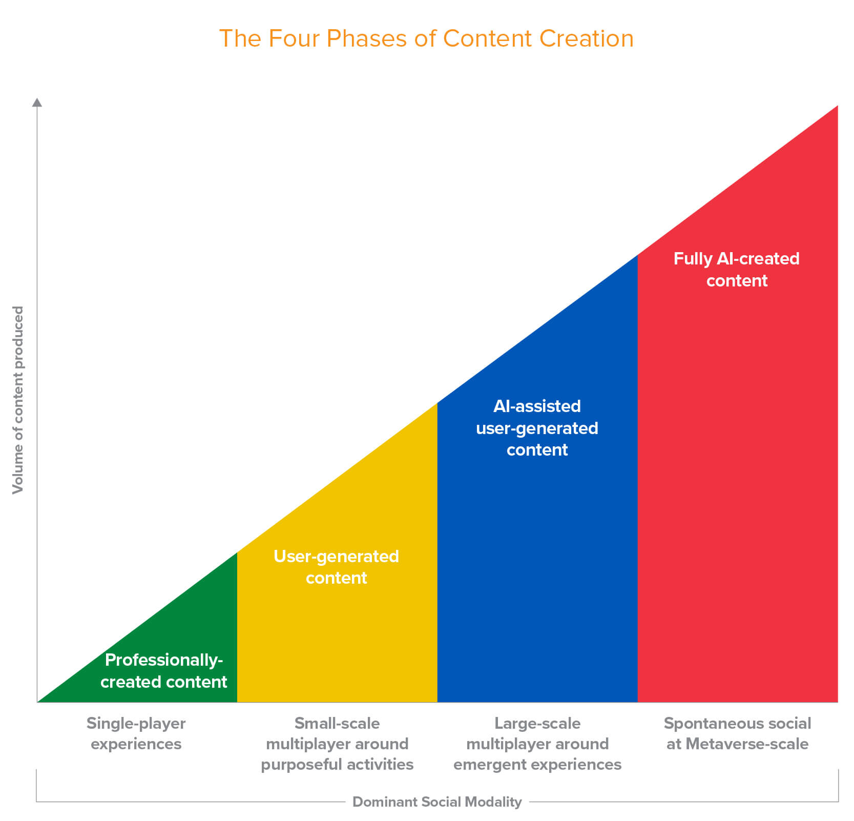
Officially, Meta is still all-in on the concept around which it pivoted the entire company in 2021. It still has a whole marketing page proclaiming its belief “in the future of connection in the metaverse”. You can go shop its lineup of Quest headsets which Meta says represent the best and most immersive metaverse experience, though its flagship model is now two-and-a-half years old. It has awkwardly promoted its Ray-Bans as “A.I. glasses” despite them becoming the company’s most successful line of mixed reality products, and it is desperately trying to connect its newest muse of A.I. with its last one. The single mention of “metaverse” on its Q1 2026 earnings call (PDF) is when Zuckerberg claimed to be “excited for more of our metaverse efforts to be powered by the A.I. models we’re training as well”. If you want to be unfairly generous in your interpretation of Zuckerberg’s brief remark, you could point to a December 2020 Andreessen Horowitz piece, in which general partner Jonathan Lai refers to this shape as a “pyramid”, and says that “fully A.I.-created content” is directly correlated with “spontaneous social at metaverse scale”. Obviously. I am not feeling generous.
Others in the space have not fared much better. Roblox has not mentioned the word “metaverse” in its quarterly or annual reports since Q1 2022 (PDF). Epic Games scarcely mentions it in recent news releases, either: since January last year, just one announcement contains the word “metaverse”, while seven are dedicated to the lawsuits Epic has been fighting against Apple and Google. Far from the inevitable next chapter of the internet, the metaverse, supposedly the future of how we live, work, and play online, is a non-event.
Near the end of the Connect 2021 presentation, Nick Clegg, then Meta’s global affairs chief, said “the metaverse isn’t something we’re building, so much as it’s something we’re building for”. Olson, in his video, wryly notes that, in the eyes of its promoters, “the metaverse cannot fail; you can only fail to make the metaverse”. The metaverse is so inevitable that “you might even already be in it”, according to Barron’s. But the metaverse is not predestined; it never has been. It is a construction of tech companies that saw in the pandemic their future — not ours.
A slightly charitable interpretation of what I think the pandemic demonstrated to Facebook executives, for example, was how invaluable technology companies were in maintaining connections even when most people could not do so in-person. They recognized how much time people were spending in front of screens already, even in years prior, and assumed that could be a more social experience.
But a more cynical view is no less fair. With the pandemic undoubtably came a realization of how much money Facebook stood to make, if only it had a platform. In 2019, there were two publicly traded companies worth over a trillion U.S. dollars; by the end of 2021, there were five, with Apple and Microsoft now worth over two trillion dollars each. This pandemic was not going to last forever — but it did not need to. Our world was permanently changed, or so it would have seemed, and we would surely want to virtually attend concerts and buy PNG files of band t-shirts with real money. And these companies would take their cut.
One thing I have mentioned but did not emphasize is just how often Zuckerberg and Sweeney mention Apple and Google platform fees as a primary justification for building the metaverse. Sweeney spent several years fighting lawsuits against both companies, mostly winning the one against Google and mostly losing the one against Apple. His efforts have, nevertheless, shined a spotlight on these grotesque practices. But it would be a mistake to assume this is an objection on ideological grounds. These guys just want to take those commissions for themselves. Sweeney spent his GDC 2023 presentation comparing the need for open standards in the metaverse to the openness of the web, but unlike the web, the Epic Games store takes a 12% commission. Meta beat that, though; it even beat Apple and Google. By the time the individual fees are added together, transactions made through Horizon Worlds could be levied a commission of up to 47.5%. The money thing is not even a secret; it was often the very first thing people like Zuckerberg and Sweeney discussed in interviews about their metaverse plans. This was a financial decision before it was a product or service people might actually want to use.
It would not be fair to characterize Meta’s endeavour as an impulsive flash in the pan. Zuckerberg laid out his vision in a 2015 internal memo in which he explained how the company “would like a stronger strategic position in the next
wave of computing”. Then, in January 2017, the Chan Zuckerberg Initiative acquired a company called Meta, I think mostly for the name; a year later, Zuckerberg floated the idea of a rebrand. The 2015 memo that effectively set this whole thing into motion gives the impression of a surprisingly cogent document if you set aside the wildly optimistic timelines — “VR/AR will be the next major computing platform after mobile in about 10 years” — and the idea that virtual and augmented reality are so compelling it will supersede the desire for phones and televisions. If anything, the unearned confidence in this memo should have been alarming at the time. As Zuckerberg himself writes, the “core social networking work is no longer new, Internet.org is extending something rather than inventing it, and A.I. is not yet tangible”. This is not a company known for doing new, and it is now stuck with a name reflecting a bungled attempt to change that. Staff are not happy after years of mass layoffs, court losses, role reassignments, and internal surveillance to feed the company’s A.I. projects. Do not get me wrong — Meta’s business of collecting vast amounts of information about its users and selling relevant ad slots is as strong as it has ever been. But Meta the ad company is not Meta the platform innovator.
And this feels like the why of it all. If tech companies can channel a meaningful sliver of our entire lived experience into a world of their creation, one where they collect a portion of revenue, it would make them inescapable. Ball, Sweeney, and Zuckerberg may have all written or spoken about the importance of interoperability and open standards, but these platforms want to exercise a degree of control more similar to native software than to the open web. The steps for migrating from Horizon Workrooms to a competitor’s product, for instance, are not what one would expect if openness were a priority.
For a brief couple of years, it seemed like there could be enough enthusiasm from reporters in the space, venture capitalists, and executives to make the metaverse happen. Then ChatGPT launched in November 2022, and the pandemic ended in the U.S. in May 2023, and any interest anyone may have had for spending more time with people in a virtual setting largely evaporated. It turns out we are okay with having meetings and playing games online, but we actually like seeing live music in-person and travelling to real places. The problems each of these things may have — high costs, environmental impact, and so on — are notable and real, but are not ones with metaverse-based solutions.
The pandemic did not make the metaverse. There was sufficient interest in developing it well before then, and it is possible all of these companies would have announced all these products and services on the same timeline. But in a world without a pandemic, I cannot imagine anyone would have treated these metaverse announcements with anything like the seriousness they did. The pandemic officially ended in the U.S. just six months after the first release of ChatGPT, so it is impossible to disentangle the influence of either. But it is notable to me that the nosedive in mentions of “metaverse” on Meta’s investor calls occurred in Q3 2023 — the quarter immediately following the declared end of the pandemic.
As for the futurists like Hackl, who confidently proclaimed the metaverse was “for certain”, they have found an out thanks to its flexible definition. Jeff Barrett, of the Shorty Awards’ “It’s No Fluke” podcast, published a glowing profile of “the Godmother of the Metaverse” earlier this year under the headline “Why Cathy Hackl Keeps Getting the Future Right”. “When enthusiasm cooled and narratives collapsed, many distanced themselves from the space”, writes Barrett, noting with seeming approval that “Hackl did the opposite. She reframed it”. Many people — perhaps everyone, come to think of it — could predict the future if they got to retcon their predictions to fit reality.
There are many open questions about the metaverse; most glaringly among them, whether it could actually become a thing for normal people. That depends a little bit on what definition we use. If it simply means the slow erosion of the boundary between our physical and digital environments, that is probably something that will continue to happen. For most people, though, that does not look like Meta’s Connect 2021 concept animations. Whatever that ends up being will probably be the result of people finding something useful and intriguing about doing something different. It will not be the product of big companies redirecting the money hose of platform fees onto themselves.
With thanks to Marquette University for granting me access to the Zuckerberg Files. A frustrating number of Zuckerberg’s post-Meta interviews are video-based, so the transcripts produced by this effort were invaluable. Where possible, I have checked these copies against the originals.
A Sherwood News analysis shows that the breaks afforded to Meta on just the sales tax of GPUs would come out to more than $3.3 billion — enough to build 33 new high schools, pay the salaries of all the state’s public school teachers for more than a year, or pay for more than seven years of the Louisiana State Police budget. (The secretary from the Parish committee that approved the financing plans declined to comment, and the chair of the committee didn’t respond to requests for comment.)
This is the very same project where Jonathan Weil, of the Wall Street Journal, found “aggressive accounting” that “strains credibility”. Neither of these advantages would be possible for a less-resourced competitor. Meta is a company so rich it benefits immensely without carrying nearly as much risk as the scale of this project would imply.
