More on Liquid Glass ⇥ tidbits.com
Adam Engst, TidBits:
So, no, I don’t want tools that “give way to content” or “shrink to bring focus to the content.” When I’m cooking, I want my knives, spatulas, measuring spoons, and the like exactly where they belong, so they’re instantly at hand. My Mac is set up in much the same way, with every app appearing exactly where I expect and, for the most part, providing an interface that looks and works as I want.
Engst pointedly differentiates “productivity apps — real tools” from apps permitting a more passive consumption of media. It may make more sense for controls to fade away in something like a media player. In most of the apps I use every day, however, I want to have obvious and immediate access to the tools I need.
Here is another cooking analogy: a minimum requirement, for me, for a stove is for it to be equipped with physical knobs. I do not want to be hunting for the magic capacitive spot or pressing a +/– toggle to change a burner’s setting. The latter options seem more elegant; they give the impression of refinement. But they are less effective for the same job because they do not allow for real-world practicality.
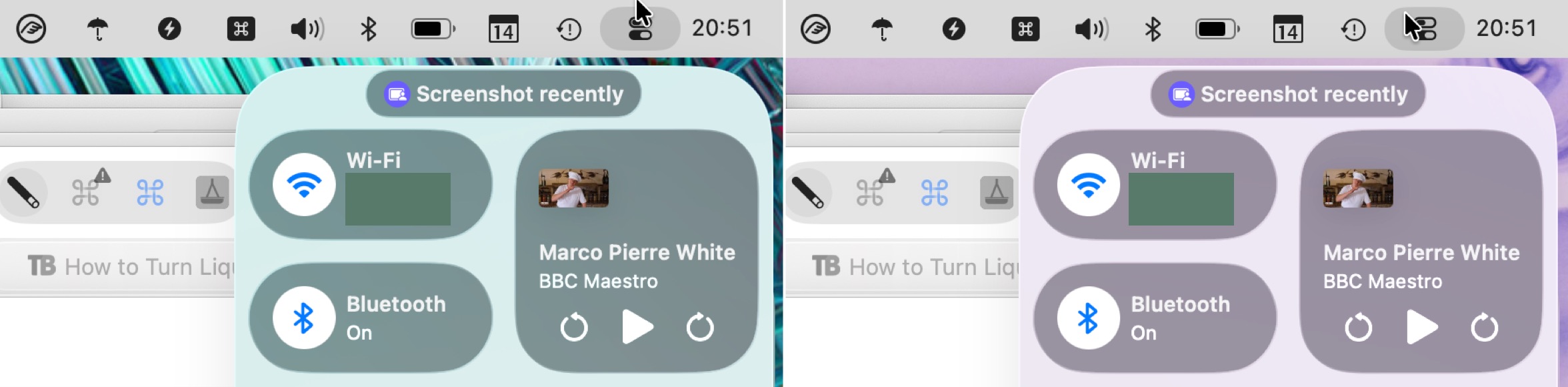
Engst also wrote a well-illustrated guide to the many accessibility settings and hidden preferences to configure Apple’s operating systems for different contrast and usability preferences. A notable issue with these settings is that some properties of Liquid Glass are not truly the fault of transparency. Instead, a Liquid Glass element — like Control Centre — might be reflecting the colours around it, giving the impression of translucency without actually being translucent. This effect does not appear in window-specific screenshots when you have “Reduce Transparency” turned on so, as Engst writes, it makes it better for creating screenshots for documentation. But it does mean that, while the “Reduce Transparency” setting is literally true, it feels dishonest.
Raluca Budiu, of Nielsen Norman Group, published a critical assessment of Liquid Glass with a number of agreeable points. The customized iMessage conversation is appropriately hideous. However, I found the argument against the more prominent Search button in many apps unconvincing:
Search in earlier versions of iOS lived at the top of the page. In Mail or Messages, users had to scroll down to reveal the bar. It wasn’t the most discoverable pattern, but years of repetition made it second nature.
Now, in iOS 26, search has migrated to the bottom of the screen and is always visible. For newcomers this might feel easier to find, but for long‑time users it’s a jarring break from habit that slows them down until the new pattern becomes ingrained. (Even if the new pattern might prove beneficial over time, existing users must relearn it, which in the short run means lost productivity and added frustration.)
It is not often I see NNG criticizing an improvement in making a control more obvious. While I suppose it is true that users will need to understand they can simply tap the search button instead of remembering to scroll for the hidden field, I cannot imagine this relearning is as arduous as the long-term impact of hiding the search function.
What is disappointing is that the hidden search field still exists in a handful of places. Most notably, Music on iOS 26 still has two different kinds of Search: the one you can get to by tapping on the button in the bottom-right, and the locally-scoped one you will find at the top of views like Playlists.