With this week’s public release of Apple’s operating system updates comes Apple Intelligence now on by default. More users will be discovering its “beta” features and Apple will, in theory, be collecting even more feedback about their quality. There are certainly issues with the output of Notification Summaries, Siri, and more.1 The flaws in results from Apple Intelligence’s many features are correctly scrutinized. Because of that, I think some people have overlooked the questionable user interface choices.
Not one of the features so far available through Apple Intelligence is particularly newsworthy from a user’s perspective. There are plenty of image generators, automatic summaries, and contextual response suggestions in other software. Apple is not breaking new ground in features, nor is it strategically. It is rarely first to do anything. What it excels at is implementation. Apple often makes some feature or product, however time-worn by others, feel so well-considered it has reached its inevitable form. That is why it is so baffling to me to use features in the Apple Intelligence suite and feel like they are half-baked.
Consider, for example, Writing Tools. This is a set of features available on text in almost any application to proofread it, summarize it, and rewrite it in different styles. You may have seen it advertised. While its name implies the source text is editable, these tools will work on pretty much any non-U.I. text — it works on webpages and in PDF files, but I was not able to make it work with text detected in PNG screenshots.
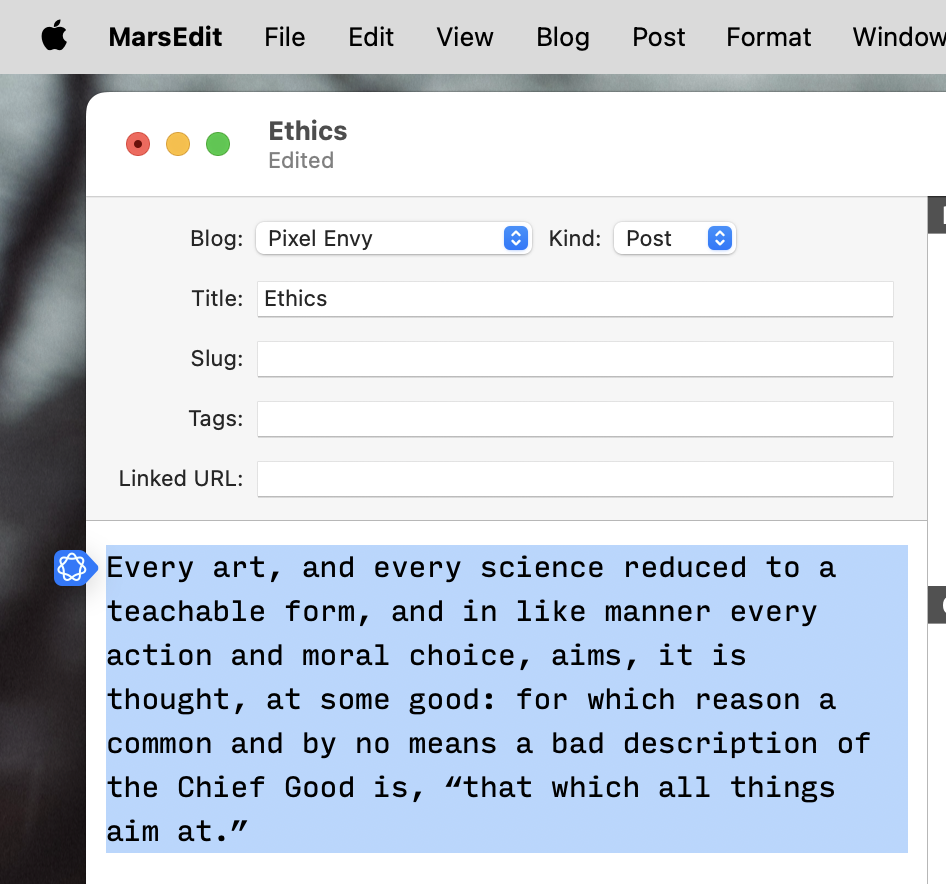
What this looks like on my Mac, sometimes, is as a blue button beside text I have highlighted. This is not consistent — this button appears in MarsEdit but not Pages; TextEdit but not BBEdit. These tools are also available from a contextual menu, which is the correct place in MacOS for taking actions upon a selection.
In any case, Writing Tools materializes in a popover. Despite my enabling of Reduce Transparency across the system, it launches with a subtle Apple Intelligence gradient background that makes it look translucent before it fades out. This popover works a little bit like a contextual menu and a little like a panel while doing the job of neither very successfully. Any action taken from this popover will spawn another popover. For example, selecting “Proofread” will close the Writing Tools popover and open a new, slightly wider one. After some calculation, the proofread selection will appear alongside buttons for “Replace”, “Copy”, and providing feedback. (I anticipate the latter is a function of the “beta” caveat and will eventually be removed.)
There are several problems with this, beginning with the choice to present this as a series of popovers. It is not entirely inappropriate; Apple says “[i]f you need content only temporarily, displaying it in a popover can help streamline your interface”. However, because popovers are intended for only brief interactions, they are designed to be easily dismissed, something Apple also acknowledges in its documentation. Popovers disappear if you click outside their bounds, if you switch to another window, or if you try to take an action after scrolling the highlighted text out of view. Apple has also made the choice to not cache the results of one of these tools on a passage of selected text. What can easily happen, therefore, is a user will select some text, run Proofread on it, and then — quite understandably — try to make edits to the text or perhaps switch to a different application, only to find that the writing tool has disappeared, and that opening it again will necessitate processing the text again. A user must select the resulting text in the popover or use the “Replace” or “Copy” buttons.
Unlike some other popovers in MacOS — like when you edit an event in Calendar — Writing Tools cannot exist as a floating, disconnected panel. It remains stubbornly attached to the selected text.
As noted, the Writing Tools popover is not the same width as the other popovers it will spawn. By sheer luck, I had one of my test windows positioned in such a way that the Writing Tools popover had enough space to display on the lefthand side of the window, but the popovers it launched appeared on the right because they are a bit wider. This made for a confusing and discordant experience.
Choice of component aside, the way the results of Writing Tools are displayed is so obviously lacklustre I am surprised it shipped in its current state. Two of the features I assumed I would find useful — as I am one person shy of an editor — are “Proofread” and “Rewrite”. But they both have a critical flaw: neither shows the differences between the original text and the changed version. For very short passages, this is not much of a problem, but a tool like “Proofread” implies use on more substantial chunks, or even a whole document. A user must carefully review the rewritten text to discover what changes were made, or place their faith in Apple and click the “Replace” button hoping all is well.
Apple could correct for all of these issues. It could display Writing Tools in a panel instead of a popover or, at least, make it possible to disconnect the popover from the selected and transform it into a panel. It should also make every popover the same width or require enough clearance for the widest popover spawned by Writing Tools so that they always open on the same side. It could bring to MacOS the same way of displaying differences in rewritten text as already exists on iOS but, for some reason, is not part of the Mac version. It could cache results so, if the text is unchanged, invoking the same tool again does not need to redo a successful action.
Writing Tools on MacOS is the most obviously flawed of the Apple Intelligence features suffering from weak implementation or questionable U.I. choices, but there are other examples, too. Some quick hits:
I could not figure out how to get Image Playground to generate an illustration of my dog, something I know is possible. On my iPhone, the toolbar in Image Playground shows a box to “describe an image”, a “People” button, and a plus button. The “People” button is limited to human beings detected in your photo library, even though Photos groups “People & Pets” together. Describing an image using my dog’s name also does not work. The way to do it is to tap the plus button — which contains a “Style” selector and buttons to choose or take a photo — then select “Choose Photo” to pick something from your library as a reference.
This is somewhat more obvious in the Mac version because the toolbar is wide enough to fit the “Style” selector and, therefore, the plus button is labelled with a photo icon.
Also in Image Playground, I find the try-and-see approach as much fun as it is with Siri. I typed my dog’s breed into the image prompt, and it said it does not support the language. I then picked one photo of my dog from my photo library and it said it was “unable to use that description”. I wish the photo picker would not have shown me an option it was unable to use.
Automatic replies in Messages are unhelpful and, on MacOS, cannot be turned off without turning off Apple Intelligence altogether.
The settings for Apple Intelligence features are, by and large, not shown in the Apple Intelligence panel in Settings. That panel only contains a toggle for Apple Intelligence as a whole, a section for managing extensions — like ChatGPT — and Siri controls. Settings for individual features are instead placed in different parts of Settings or in individual apps.
I think this is the correct choice overall, but it is peculiar to have everything Apple Intelligence branded across the system with its logo and gradient — and to advertise Apple Intelligence as its own software — only to have to find the menu in Notification settings for toggling summarization in different apps.
You will note that not a single one of these criticisms is related to the output of Apple Intelligence or a complaint about its limitations. These are all user interaction problems I have experienced. Perhaps this is the best Apple is able to do right now; perhaps it considered and rejected putting Writing Tools in a panel on MacOS for a good reason.
It is unfortunate these features feel almost undesigned — like engineers were responsible for building them, and then someone with human interface knowledge was brought in to add some design. There are plenty of things that are more visually appealing and consistent with platform expectations, like Priority Inbox in Mail. Many of the features seem more polished for iOS compared to MacOS.
Writing Tools, in particular, can and should be better. I write a little on my iPhone, but I write a lot on my Mac — not just posts here, but also emails, messages, and social media posts. A more advanced spelling and grammar checker that has at least some contextual awareness sounds very appealing to me. This is a letdown, and because of so many basic reasons. I do not need Apple Intelligence to be the apex of current technology. What I do expect, at the very least, is that it is user-friendly and feels at home on Apple’s own platforms. It needs work.
-
In the public version of iOS 18.3, summaries are unavailable for apps from the News and Entertainment categories. ↥︎