I do not know that I have made it clear how much I appreciate many aspects of MacOS Big Sur’s visual design update, which is something even I did not fully understand until I was compelled to use Catalina full-time for a week.
Last year, my iMac developed some shadowing in the corner of its display, and it bugged me. Over the holiday break, I took it in for a new display which required leaving it at the Apple Store for about a week.1 I needed a workaround for my day job — my old MacBook Air running Catalina hooked up to my Thunderbolt Display did just fine. But, screen fidelity aside, it was clear after a day that using Catalina felt cramped and messy. Icons and text in the menu bar were not as well-aligned. Rows in the Finder were squished together like every pixel on the display remained precious real estate.
Big Sur changed all of that for the better. There is subtly more space around many interface elements, and there is a clearer sense of structure. But it also introduced problems for readability, many of which are the result of an obsession with translucency and brightness.
Translucent effects have been a part of modern MacOS since it debuted as Mac OS X in 2001 with the then-fresh “Aqua” visual interface language. But it was only with Yosemite in 2014 that Apple began using translucency more liberally throughout the system. No longer was its use confined to the Dock and menu bar. The linen texture in the login window and Notification Centre became a sheet of frosted glass. Application toolbars, once metallic, changed to a sheer grey gradient, and sidebars went from a solid light blue fill to yet another light grey glassy texture.
There seem to be some rules for translucency in the post-Yosemite MacOS environment that should, in theory, give it a sense of structure:
Translucent elements are only visible in foreground windows.
Elements in background windows are always opaque.
The Dock and Menu Bar — including the elements they spawn, like Notification Centre, pull down menus, and Dock menus — are always translucent.
However, in practice, these rules introduce all sorts of problems for legibility, logic, and clarity.
Let’s start with the first rule and foreground windows. I usually keep my Mac in light mode, so the translucent elements in MacOS appear similar to their non-translucent predecessors. But adding translucency to those elements, a la rule one, negatively impacts contrast. A sidebar that shows through some of the colour of a very dark background element, for example, will necessarily reduce the contrast between the dark sidebar text and the now mid-grey sidebar fill.
MacOS attempts to mitigate contrast problems through more blending effects. The translucent textures in MacOS are called “Vibrancy”, since it is not a simple matter of dropping the opacity of the foreground elements. Elements with Vibrancy also blur what is in the background, and blend it with the foreground texture in ways that are intended to improve legibility no matter what the background layers contain. There are different levels of transparency and blur — what Apple calls “materials” — available to developers, and stacking them tends to produce bizarre effects. For example, take a look at the sidebar buttons in Reminders:
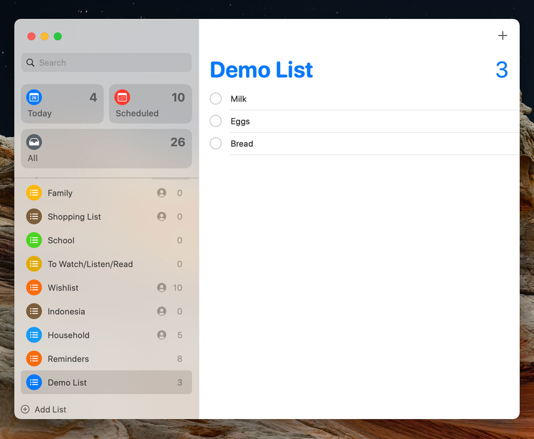
That is dark grey text atop a mid-grey button texture in a light grey sidebar. Subjectively, I find it unpleasant to look at; more objectively, it has insufficient contrast. It is the same with the Search field located in an application’s Help menu:
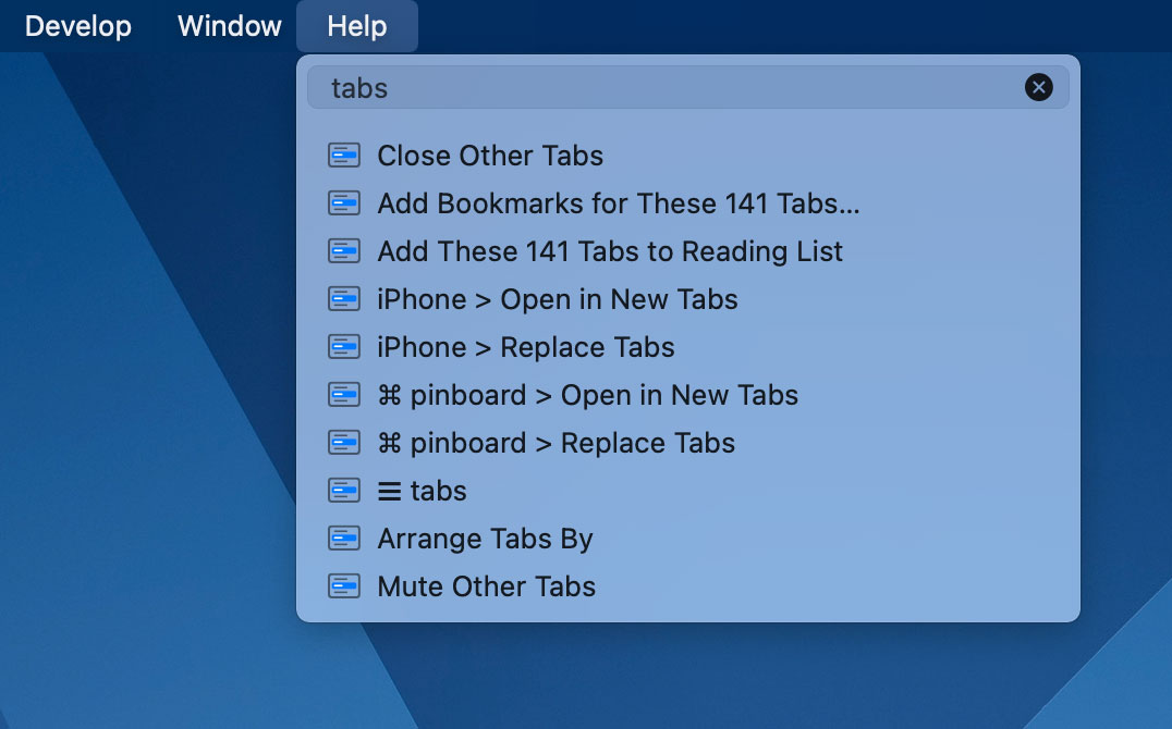
The menu material is a brighter translucent layer. The Search field is scarcely differentiated by a slightly different material containing dark grey text. On a dark background, it is difficult to read.
One more example of stacked layers of translucency, as seen in Big Sur’s new alert style:

Here, the Cancel button is a different material compared to that used for the alert window — though still translucent — and its text colour is a shade of the background. This combines in a smeared, hard-to-read mess.
The second rule of vibrancy in MacOS is that background windows are entirely opaque for what I assume are performance reasons.2 This excludes system features that are created from the menubar or Dock, which are always translucent, and these choices sometimes create illogical situations. In Notification Centre, this manifests as stacks of notifications where all of them appear to be translucent to background windows but the foreground notification is not translucent to the notifications apparently stacked behind it:
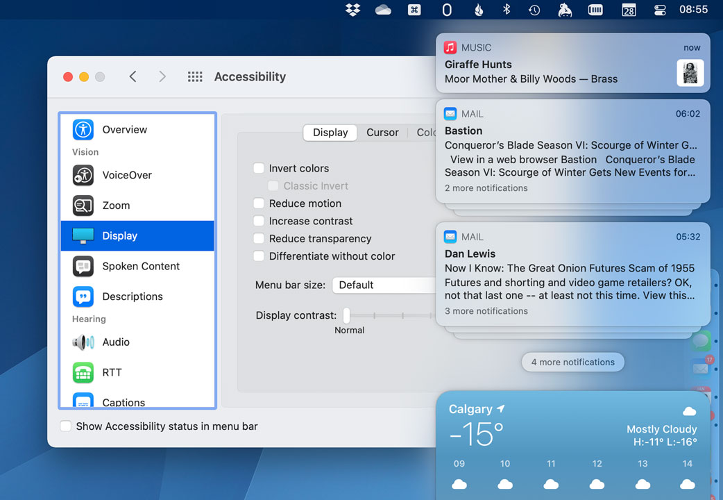
It would surely be a terrible idea to treat each notification as a translucent sheet; I can imagine how much that would compromise their already-shaky legibility. But if translucency is supposed to help differentiate the frontmost layers of system components, surely the notifications behind it should be opaque.3
Nevertheless, the rest of the system behaves as though the foreground window is comprised of panes of glass, and the background windows are made of solid plastic. Often, this means background windows actually have better contrast than windows in the foreground. Here’s Reminders again:
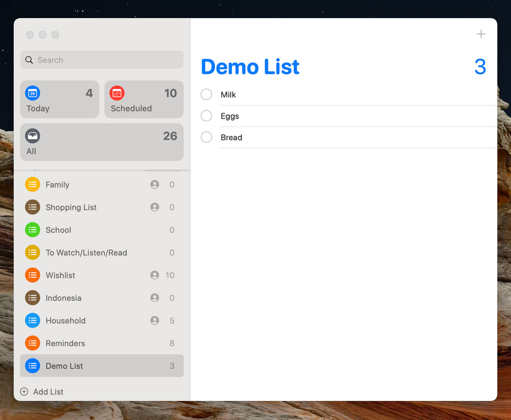
If the window control widgets were in full colour instead of grey, you would be forgiven for assuming this is just what the app looks like all the time. Several MacOS apps are similarly more legible when they are in the background: Music, Contacts, Calendar’s single day view, Dictionary, and Voice Memos — to name a handful.
Some other apps exhibit reduced contrast when they are in the background. But because the sidebar is often a critical interface element, compromising its legibility in foreground windows means going to more extreme lengths of illegibility for background windows. When Mail is in the background, the text labels and icons in the toolbar and sidebar become a mid-grey that, on the light grey background, is difficult to read. This makes it more obviously an inactive window, but it is so bright that it clashes with the active window and makes it hard to quickly see what is in the foreground:
Translucency in these areas has been part of MacOS for years, but Big Sur’s redesign introduces brighter windows that look nearly the same in the foreground and background. This is not directly because there are translucent elements in foreground windows, but the wildly insufficient contrast in background windows is necessary because foreground windows in Big Sur are already lower-contrast — because of their translucent elements. To borrow from a Lewis Black sketch on the “Daily Show”, it’s like Six Degrees of Kevin Bacon, except it’s just two degrees and Kevin Bacon is translucency.
There is a way to switch all of this off: in System Preferences, under Accessibility and then Display, you can tick the Reduce Transparency box. This makes everything opaque — though, unfortunately, it is indiscriminate, and I think the Dock works just fine as a translucent smear — but foreground and background windows in Big Sur are still similarly bright. You can also select Increase Contrast if you want a black border around interactive elements. But no matter how much I appreciate Apple’s accessibility efforts, I can’t help but think it is strange that there are two systemwide preferences for different degrees of making interface elements readable.
One of the critiques I often see of Apple’s recent visual interface direction is that it looks better in screenshots than in actual use. I disagree; I think translucency only makes sense when using MacOS or iOS. The smeared background of a toolbar looks worse in screenshots than it does in use. But I think this effect works far better in iOS than on the Mac.
The translucent glass effect was adapted from iOS 7, introduced the year prior to Yosemite. Compared to the Mac, iOS devices have strict rules about where application windows will be. On an iPhone, an app is always running full-screen; on an iPad, there are more options, including apps that float over others. But only a handful of system-level processes — Notification Centre, Control Centre, Spotlight, and, until recently, Siri — blur the contents of windows behind. Translucency in apps only affects the contents of that app: toolbars give an impression of what lays beyond the current scroll view; contextual menus sit in a layer overtop the app area. Translucency here adds depth to an interface with a singular context.
MacOS is messier than this. It encourages the use of multiple windows stacked haphazardly. Making elements of the foreground window translucent provides no new information. On the contrary, it creates confusion within itself and for background windows that are necessarily opaque. Everything has become lower-contrast necessitating the use of preferences to make the system readable.
That doesn’t mean translucency should go away entirely. But if I were in charge of these things, here’s what I would change:
Sidebar translucency has got to go.
Stacked translucent elements — like the Search field in the Help menu, and buttons in dialog boxes — have also got to go. Translucency is fine as a background for some windows, but every item on top of it should be opaque.
Translucency in toolbars can remain, as its effects are limited by the window’s boundaries. Perhaps this would have good enough performance that it could affect all visible window areas, not just the window in the foreground.
The texture of foreground and background windows should be more obviously different.
The background of a pull down menu should be nearly opaque.
I am not asking for much here, and I know design decisions like these are contentious. There are some people who think Apple should return to previous eras of visual interface design. I disagree; I think Big Sur is generally a positive iteration, particularly for its clearer structure. But Apple could learn a thing or two from its previous operating system design patterns. Most obviously: contrast is good.
-
Thankfully, covered by one of the few times I have actually purchased AppleCare. ↥︎
-
This is true for every app except Calculator, but it is true enough that I can call it a rule and treat Calculator as a special case. Why is Calculator so special? Great question. ↥︎
-
There is a similar story in that Reminders screenshot. Notice the sidebar is scrolled slightly but, aside from the shadow, the sidebar’s texture is seamless and there is no sign of the scrolled items in the background of the glass layer on top. ↥︎

