A brief, throat-clearing caveat: while I had written most of this pre-launch, I was unable to complete it by the time Apple shipped its annual round of operating system updates. Real life, and all that. I have avoided reading reviews; aside from the excerpt I quoted from Dan Moren’s, I have seen almost nothing. Even so, I am sure something I have written below will overlap with something written by somebody else. Instead of trying to weed out any similarities, I have written this note. Some people hire editors.
The Name
Here is a question: does anybody know what we were supposed to call the visual interface design direction Apple has pursued since 2013? For a company that likes to assign distinct branding to everything it makes, it is conspicuous this distinct visual language never had a name.
To be fair, iOS’s system theme was not branded from when it was first shown in 2007. It inherited some of the Aqua qualities of Mac OS X, but with a twist: the backgrounds of toolbars were a muted blue instead of the saturated “Aqua” blue or any of Mac OS X’s window themes. The system font was Helvetica, not Lucida Grande. It was Aqua, but not exactly. Even after 2013’s iOS 7, a massive redesign intended, in part, to signal higher level changes, no name was granted. The redesign was the rebrand. The system spoke for itself.
In MacOS, meanwhile, the “Aqua” branding felt increasingly tenuous to me following the system-wide redesigns of Yosemite — which Craig Federighi said “continue[d] this evolution” — and Big Sur.
Now, then: Liquid Glass.
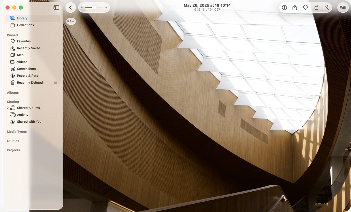
The name is remarkably apt — definitely Apple-y, and perfectly descriptive of how the material looks and feels. In most contexts, it looks like slightly deep and modestly bevelled glass in either clear or slightly frosted finishes. Unlike familiar translucent materials that basically just blur whatever is behind them, Liquid Glass distorts as though it is a lens. It even, in some cases, displays chromatic aberration around the edges.
And then you start to move it around, and things get kind of strange. It can morph and flex when tapped, almost like pushing a drop of mineral oil, and it glows and enlarges, too. When a button is near enough to another, the edges of the tapped button may melt into those of the proximate one. When you switch between views, buttons might re-form into different buttons in the same area.
That alone fulfills the “liquid” descriptor, but it is not the first time Apple has used the term. Since 2018, it has described high-resolution LCD displays with small bezels and non-zero corner radii — like the one on my MacBook Pro — as “Liquid Retina displays”. One might reasonably wonder if there is a connection. I consulted my finest Apple-to-English decoder ring and it appears Apple is emphasizing another defining characteristic of the Liquid Glass design language, which is that each part of the visual interface is, nominally, concentric with the bezel and corner radius of a device’s display. Am I reaching too hard? Is Apple? Who can say?
Apple’s operating systems have shared a familial look-and-feel, but Liquid Glass is the first time they also share a distinct name and specific form. That seems to me like a significant development.
My experiences with Liquid Glass have been informed by using iOS 26 since June on my iPhone 15 Pro, and MacOS 26 Tahoe since July on my 14-inch MacBook Pro. For a redesign justified on its apparent uniformity across Apple’s product lineup, this is an admittedly narrow slice of use cases, and I am sure there will be dozens of other reviews from people more immersed in Apple’s ecosystem than I presently am. However, I also think they are the two platforms telling the most substantial parts of the Liquid Glass story. The Mac is Apple’s longest-running platform and users have certain specific expectations; the iPhone is by far Apple’s most popular product. I do not think my experience is as comprehensive as those with access to more of Apple’s hardware, but I do think these are the two platforms where Apple needs to get things right.
I also used both systems almost exclusively in light mode. I briefly tested them in dark mode, but I can only describe how the visual design has changed in my day-to-day use, and that is light mode all the time.
The Material
The first thing you should know about the Liquid Glass material is that it is not exactly VisionOS for the Apple products you actually own. Sure, Apple may say it was “[i]nspired by the depth and dimensionality of VisionOS”, but it is evolved from that system’s frosted glassy slabs with slightly recessed text entry fields. This is something else entirely, and careful observers will note it is a visual language coming to all of Apple’s platforms this year except VisionOS. (Well, and the HomePod, if you want to be pedantic.)
The second thing you need to know is that it is visually newsworthy, but this material barely alters the fundamentals of using any of Apple’s devices, which makes sense. If you were creating a software update for billions of devices you, too, would probably think twice about radically changing all those environments. Things looking different will assuredly be a big enough change for some people.
The Liquid Glass material is most often used in container components — toolbars, buttons, menus, the MacOS Dock — but it is used for its own sake for the clock numerals on the Lock Screen. I think this will be its least controversial application. The Lock Screen clock is kind of useful, but also kind of decorative. (Also, and this is unrelated to Liquid Glass, but I cannot find another place to put this: the default typeface for the clock on the Lock Screen now stretches vertically. I like the very tall numerals and the very cool thing is that it vertically compresses as notifications and Live Activities are added to your Lock Screen.) If you do not like the glassy texture on the clock, you can select a solid colour. Everyone can be happy.
That is not the case elsewhere or for other components.
Translucency has been a standard component in a visual interface designer’s toolbox for as long as alpha channels have been supported. It was already a defining characteristic of Apple’s operating systems and has been since the introduction of Aqua. Translucency helps reduce the weightiness of onscreen elements, and can be used to imply layering and a sense of transience. But there is a key problem: when something in a user interface is not entirely opaque, it is not possible to predict what will be behind it.
Obviously.
Less obvious is how a designer should solve for the legibility of things a translucent element may contain, particularly text. While those elements may have specific backgrounds of their own, like text used in a button, there is often also plain text, as in window titles and copy. Icons, too, may not have backgrounds, or may be quite small or thin. The integrity of these elements may not be maintained if they are not displayed with sufficient contrast.
However, the impression of translucency is usually at odds with legibility. Say you have a panel-type area containing some dark text. The highest contrast can be achieved by making the panel’s background white. There is no way to make this panel entirely white and have it be interpreted as translucent. As the opacity of the panel’s background drops, so does the contrast whenever it appears over anything else that is not itself entirely white.
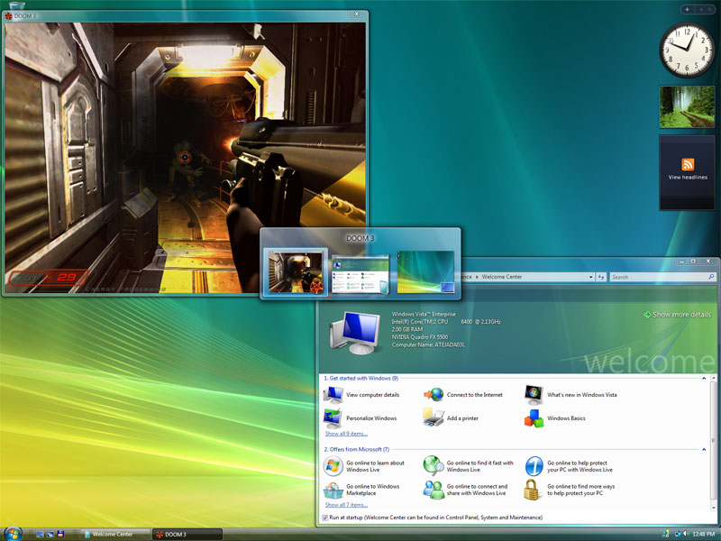
So designers have lots of little tricks they can play. They can decorate the text with outlines, shadows, and glows, as Microsoft did for various elements in Windows Vista. This works but is not particularly elegant, especially for text longer than a few words. Designers also blur the background, a common trick used in every major operating system today, and they adjust the way the foreground inherits the tones and shades of the background.
The Liquid Glass texture is more complex than Apple’s background materials or Microsoft’s Acrylic. It warps and distorts at the edges, and the way it blurs background layers is less diffuse. There are inset highlights and shadows, too, and all of these effects sell the illusion of depth better. It is as much a reflection of the intent of Apple’s human interface designers as it is a contemporary engineering project, far more so than an interface today based on raster graphics. That it is able to achieve such complex material properties in real-time without noticeably impacting performance or, in my extremely passive observations, battery life, is striking.
I do not think all these effects necessarily help legibility, which is as poor as it has ever been in translucent areas. The degree to which this is noticeable is dependent on the platform. In iOS 26, I find it less distracting, I think largely because it exists in the context of a single window at a time (picture-in-picture video being the sole exception). That means there is no expectation of overlapping active and inactive windows and, so, no chance that something overlapping within a window’s area could be confused with a different window overlapping.
Legibility problems are also reduced by how much is moving around on a display at any time. Yes, there are times when I cannot clearly read a text label in an iOS tab bar or a menu item in MacOS, but as soon as I scroll, legibility is not nearly as much of an issue. I do not wish to minimize this; I think text labels should be legible in every situation. But it is better in use than the sense you might get from the still screenshots you have seen in this article and elsewhere.
Apple also tries to solve legibility by automatically flipping the colour of the glass depending on the material behind it. When the glass is overtop a lighter-coloured area, the glass is light with dark text and icons; when it is on top of a darker area, the glass is dark with light-coloured text and icons. If Apple really wanted to improve the contrast of the toolbar, it would have done the opposite. These compensations do not trigger immediately so, when scrolling through a document containing a mix of lighter and darker areas, there is not as much flashing between the two states as you might expect. It is Apple’s clever solution to a problem Apple created.
With all the places the Liquid Glass texture has been applied in MacOS, you might believe it would make an appearance in the Menu Bar, too, since that has sported a translucent background since Leopard. But you would be wrong. In fact, in MacOS 26, the Menu Bar often has no background at all. The system decides whether the menu titles and icons should be shown in white or black based on the desktop picture, and then drops them right on top of it. Occasionally, it will show a gradient or shadow, sometimes localized to either side of the menu bar. Often, as with the other uses of translucency, legibility has been considered and I have not had difficulty reading menu items — but, also like the other translucent elements, this would never be a problem if the menu bar had a solid background.


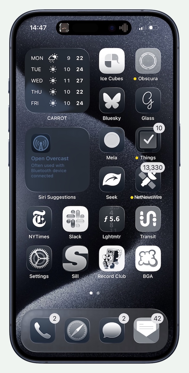
Here is the thing, though: Liquid Glass mostly — mostly — feels at home on the iPhone. Yes, Apple could have avoided legibility problems entirely by not being so enamoured of translucency, but it does have alluring characteristics. It is a very cool feeling of true dimensionality. It is also a more direct interpretation of the hardware on which these systems run, the vast majority of which have gloss-finish glassy screens. Glass onscreen feels like a natural extension of this. I get it. I do not love it, but I feel like I understand it on the iPhone far more than I do on my Mac.
The animations — the truly liquid-feeling part of this whole thing — are something better seen as they are quite difficult to explain. I will try but do not worry: there are visual aids coming. The buttons for tools float in glassy bubble containers in a layer overtop the application. Now imagine those buttons morphing into new bubbly buttons and toolbar areas as you move from one screen to another. When there are two buttons, they may become a unified blob on a different screen. For example, in the top-right of the Library section of the Music app, there is an account button, and a button labelled “⋯” which shows a menu containing only a single “Edit Sections” item. Tapping on “Playlists” transforms the two button shapes into a single elongated capsule enclosing three buttons. Tapping “Artists” condenses the two into a single sorting button. Tapping “Genres” simply makes the two buttons fade away as there are no buttons in the top-right of this section.
Though these animations are not nearly as fluid as they were first shown, they seem like they help justify the “liquid” part of the name, and are something Apple has enough pride in to be called out in the press release. Their almost complete absence on MacOS is therefore notable. There are a handful of places they appear, like in Spotlight, but MacOS feels less committed to Liquid Glass as a result. When menus are summoned, they simply appear without any dramatic animation. Buttons and menus do not have the stretchy behaviour of their iOS counterparts. To be sure, I am confident those animations in MacOS would become tiresome in a matter of minutes. But, so, if MacOS is better for being less consistent with iOS in this regard, that seems to me like a good argument against forcing cross-platform user interface unification.
The System
Strictly speaking, Liquid Glass describes only this material, but the redesign does not begin and end there. Apple has refreshed core elements across the entire system, from toolbars and buttons to toggle controls and the Dock. And, yes, application icons.
I have already written about the increasing conformity of app icons within MacOS which has brought them into complete alignment with their iOS counterparts, down to the number of dots across the top of the Notes icon. If there are any differences in icons on MacOS and iOS for the same system app, they are insignificant. Regardless of how one may feel about this change — personally, aghast — they are changes made in concert with the Liquid Glass personality. Icons are now more than bitmap images at set sizes. They are now multilayer documents, and each layer can have distinct effects applied. The whole icon also appears to have a polished edge which, by default, falls on the upper-left and bottom-right, as though it is being lit at a 45° angle.
If these icons have an advantage, it is that Apple is now allowing more user customization than ever. In addition to light and dark modes, application icons can now be displayed in clear and tinted states. Designers can specify new icons, and iOS will automatically convert icons without an update with mixed results. And, as with the other icon display modes, this also affects widgets on the Home Screen and icons across the system. Clear and tinted both look like frosted glass and have similar dimensional effects as other Liquid Glass elements, though one is — obviously — tinted. I can see this being a boon to people who use a photo as their wallpaper, though it comes at the expense of icon clarity and designer intention.
The party trick on the iPhone’s Home Screen is that each of these layers and the glassy edge respond to the physical orientation and movement of your device. Widgets and folders on the Home Screen also get that shine and they, too, respond to device movement. Sometimes. The shine on the App Library overview page does not respond to motion, but the app icons within a category do. App icons in Spotlight are not responsive to motion, either, and nor are the buttons in the bottom corners of the Lock Screen. The clock on the Lock Screen responds, but the notifications just below it on the very same screen do not. This inconsistency feels like a bug, but I do not think it is. I do not love this effect; I simply think similar things should look and behave similarly.
One of the things Apple is particularly proud of is how the shapes of the visual interface now reflect the shapes in its hardware, particularly in how they neatly nest inside each other. Concentricity is nothing new to its industrial design language. The company has, for decades, designed devices with shapes that nestle comfortably within each other. Witness, for example, the different display materials on the iMac G4 and the position of the camera on the back of the original iPhone. It is not even new in Apple’s software: the rounded corners of application icons mimic the original iPhone’s round corners; the accessory pairing sheet is another example. But accentuating the roundedness of the display corners is now a systemwide mandate. Application windows, toolbars, sidebars, and other elements have been redrawn as concentric roundrects, perfectly seated inside each other and within the rounded rectangle of a modern Apple device’s display. Or, at least, that is the theory.
In reality, only some of Apple’s devices have displays with four rounded corners: Apple Watches, iPhones, and iPads. The displays of recent MacBook Airs and MacBook Pros have rounded corners at the top, but are squared-off at the bottom. Neither the iMac nor either of Apple’s external displays have rounded corners at all. Yet all of these devices have inherited the same bubbly design language with dramatically rounded application windows.
Perhaps I am taking this too literally. Then again, Apple is the one saying application windows are no longer “configured for rectangular displays”, and that they now fit the “rounded corners of modern hardware”. Regardless of the justification, I quite like the roundness of these windows. Perhaps it is simply the newness, but they make applications seem friendlier and softer. I understand why they are controversial; the large radius severely restricts what can be present in the corners, thus lowering the information density of an application window. It seems Apple agrees it is more appropriate in some apps than in others — app windows in System Information and Terminal have a much smaller corner radius.
Still, the application windows which do gain the more generously rounded corners are appreciably concentric to my MacBook Pro’s display corners at default scaling (1512 × 982) and at one tick scaled down (1800 × 1169). But at one tick scaled up (1352 × 878) the corners are no longer concentric to the display corners, and now feel overlarge and intrusive in the application area.
Even on a device with four rounded display corners, this dedication to concentricity is not always executed correctly. My iPhone 15 Pro, for example, has corners with a slightly smaller radius than an iPhone 16 Pro. The bottom corners of the share sheet on my device are cramped, nearly touching the edge of the display at their apex.
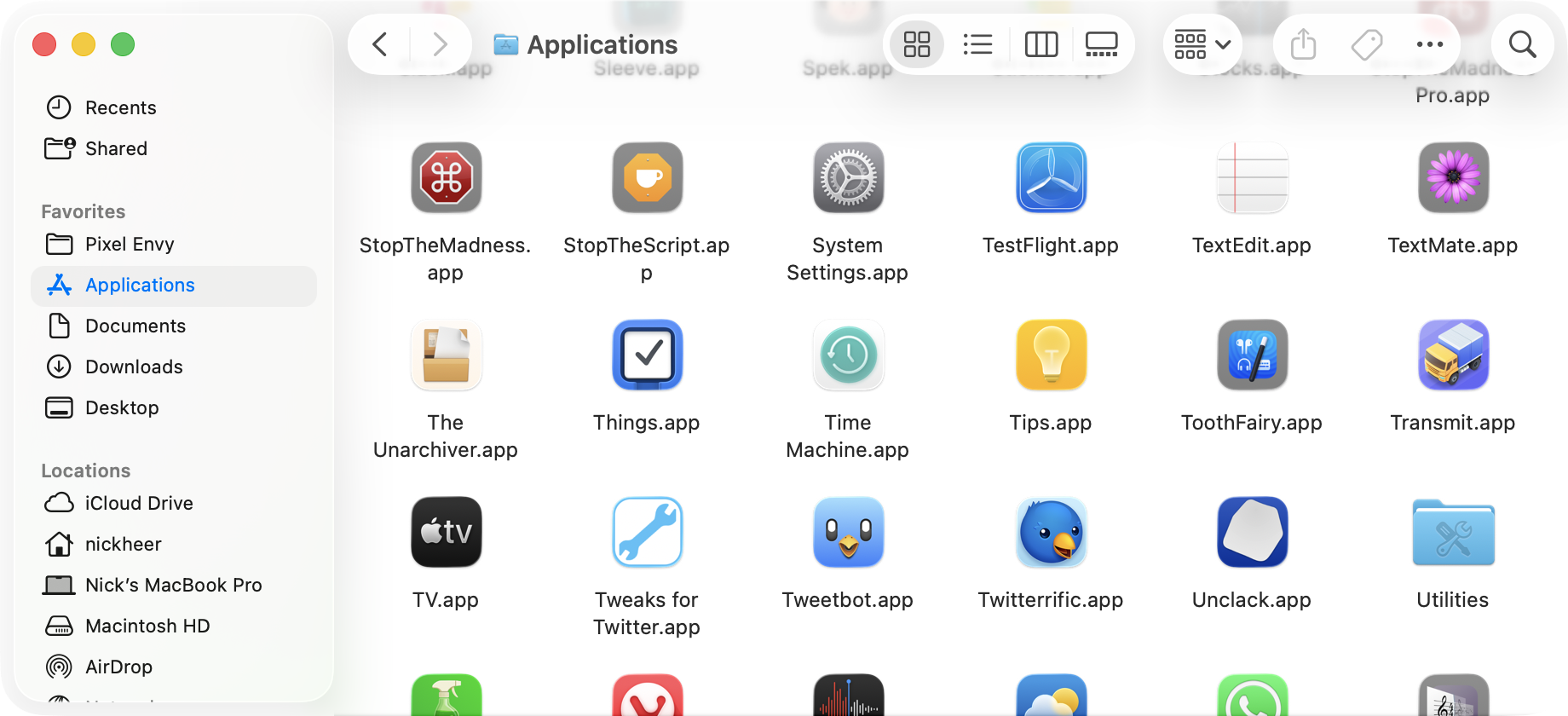
Then there are the issues caused by this dedication to concentricity. Look again at that Finder window screenshot above and pay attention to the buttons in the toolbar. In particular, notice how the icon in the item grouping button — the solitary one between the view switcher, and the group that includes the sharing button — looks like it is touching the rounded edge.
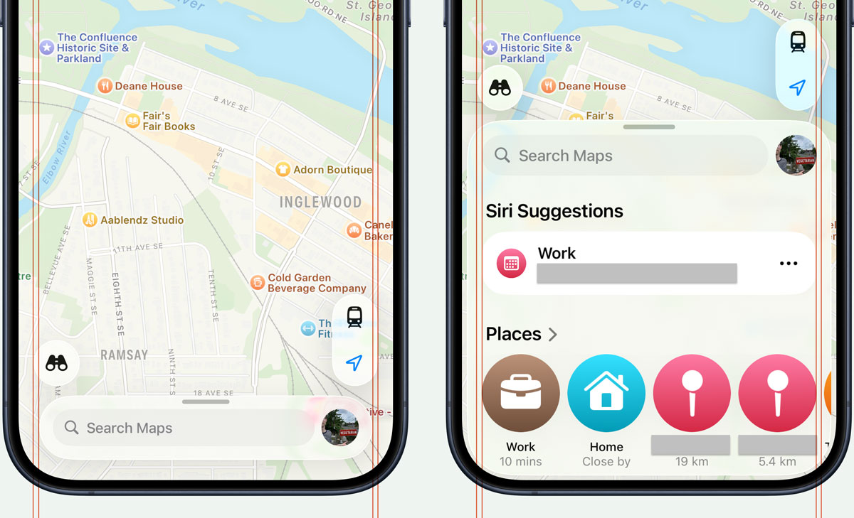
Maps on iOS has a different kind of concentricity issue. When the search area is in a retracted state, the container around the search bar does not align with the left and right edges of the buttons above it, in a way that does not feel deliberate. I assume this is because it follows the curves of the display corners with an equal distance on all sides. When it is in an expanded state, it becomes wider than the buttons above it. At least — unlike the Share sheet — its bottom corners are rounded correctly on my iPhone.
I could keep going with my nitpicks, so I shall. The way toolbars and their buttons are displayed on MacOS is, at best, something to get used to, though I have tried and failed. Where there was once a solid area for tools has, in many apps, become a gradient with floating buttons. The gradient is both a fill and a progressive blur, which I think is unattractive.
This area is not very tall, which means a significant amount of the document encroaches into its lower half. In light mode, the background of a toolbar is white. The backgrounds of toolbar buttons are also white. Buttons are differentiated by nothing more than a diffuse shadow. The sidebar is now a floating roundrect. The glyphs in sidebar items and toolbar buttons are near-black. The shapeless action buttons in Finder are grey. Some of these things were present in previous versions of MacOS, but the sum of this design language is the continued reduction of contrast in user interface elements to, I think, its detriment.
Apple justifies these decisions by saying its redesigned interfaces are “bringing greater focus to content”. I do not accept that explanation. Instead of placing tools in a distinct and separated area, they bleed into your document, thus gaining a similar level of importance as the document itself. I have nothing beyond my own experience to back this up. Perhaps Apple has user studies suggesting something different; if it does, I think it should publicly document its research. But, in my experience, the more the interface blends with what I am looking at, the less capable I am of ignoring it. Clarity and structure are sacrificed for the illusion of simplicity offered by a monochromatic haze of an interface.
Even if I bought that argument, I do not understand why it makes sense to make an application’s tools visually recede. While I am sometimes merely viewing a document, I am very often trying to do something to it. I want the most common actions I can take to be immediately obvious. For longtime Mac users, the structure of most apps has not changed and one can rely on muscle memory in familiar apps. But that is more like an excuse for why this redesign is not as bad as it could be, not justification for why it is an improvement.
Then there are the window controls. The sidebar in an application is now depicted in a floating state which, Apple says, is “informed by the ambient environment within the app”, which means it reflects the colours of elements around it. This includes colours from outside the app which, a lot of the time, means the sidebar looks translucent to windows underneath it, which defies all logic. The sidebar reflects nearby colours even if you enable the “Reduce Transparency” setting in Accessibility settings, even though it makes the sidebar look translucent. But then the window controls are set inside this sidebar which, because it is floating, makes it look like these controls do something to the sidebar, not the application window.
Since the sidebar is now apparently overtop a window, stuff can be displayed underneath it. If you have seen any screenshots of this in action, it has probably been of the Music app, because few other applications do this, because why would you want stuff under the sidebar?
In the Photos app, it reminds me of a floating palette like Apple used to ship in iPhoto and Aperture. Those palettes allowed you to edit a photo in full-screen on a large display, and you could hide and show the tools with a keystroke. A floating sidebar and a hard gradient of a toolbar is a distracting combination. Whatever benefit it is supposed to impart is lost on me.
I expected Apple to justify this on the basis that it maintains context or something, but it does not. Its Human Interface Guidelines only say this is done to “reinforce the separation and floating appearance of the sidebar”, though this is not applied consistently. In a column view in Finder, for example, there is a hard vertical edge below the rounded corner of the ostensibly floating sidebar. I am sure there are legibility reasons to do this but, again, it is a solution to a problem Apple created. It reimagined sidebars as a floating thing because it looks cool, then realized it does not work so well with the best Finder layout and built a fairly unrefined workaround.
I am spending an awful lot of words on the MacOS version because I think it is the least successful of the two Liquid Glass implementations I have used. MacOS still works a lot like MacOS. But it looks and feels like someone dictated, context-free, that it needed to reflect the redesign of iOS.
The iOS implementation is more successful since Liquid Glass feels — and I mean feels — like something designed first for touch-based systems. There is an increasingly tight relationship between the device and its physical environment. Longstanding features like True Tone meet new (well, new-ish) shifting highlights that respond to physical device orientation, situating the iPhone within its real-world context. Yet, even in its best implementation on iOS, Liquid Glass looks out of place when it is used in apps that rely on layouts driven by simple shapes and clean lines.
The Clock app is a great example of this clashing visual language. Each of its function is comprised mostly of a black screen, with white numerals and lines, and maybe a pop of colour — the second hand in the stopwatch or the green start button for timers. And then you tap or slide on the toolbar at the bottom to move through the app and, suddenly, a hyper-realistic glassy lens appears.
The Calculator app is another place where the limited application of Liquid Glass feels wrong. The buttons are drawn in some kind of glass texture — they are translucent and stretch in the same way as menus do — but the ring of shimmering highlight is so thin it may as well not exist. Apple does say in its Human Interface Guidelines that Liquid Glass should be used “sparingly”, but it uses the texture everywhere. There are far more generous buttons in Control Centre and on the passcode entry screen that feel more satisfying to press. Also, even though the buttons in Calculator are nominally translucent, the orange ones remain vibrant despite being presented against a solid black background.
This confused approach to visual design is present throughout the system. It has been there for years to some extent — Books has a realistic page flip animation, and Notes retained a paper texture for years after the iOS 7 redesign. But Liquid Glass is such a vastly different presentation compared to the rest of iOS that it stands out. When some elements have such a dynamic and visually rich presentation while others are plain, the combination does not feel harmonious. It feels unfinished.
This MacOS update is not all bad on a design front, to be fair. Sidebar icons now have a near-black fill instead of an application-specific colour; they gain the highlight colour when a particular sidebar item is active. This has the downside of making each application less distinct from each other, but it is a contrast improvement in a user interface that is mostly full of regressions. Also, inactive application windows are more obvious, with mid-grey toolbar items, window widgets, document icons, and window titles. On an iPhone, the biggest user interface good news is a sharp reduction in the number of modal dialogs. They are not entirely banished — not even close — but fewer whole-screen takeovers is good news on today’s larger-screened devices. The second piece of good news is the new design of edit menus that are no longer restricted to horizontal scrolling, and can expand into vertical-scrolling context menus. Also, on the Lock Screen, you can now move the widgets row to the bottom of the screen, and I quite like that.
There are enhancements downstream from the floating controls paradigm reinforced in this Liquid Glass update. In many iOS applications with a large list view — Messages and Mail, for example — the search field is now positioned at the bottom within easier reach. Floating controls do not require the Liquid Glass material; the Safari redesign in iOS 15 now seems like a preview of where Apple has now headed, and it obviously does not use these glassy controls. But I think the reconsidered approach in iOS 26 is more successful in part because the controls have this glassy quality.
There is, in fact, quite a lot to like in Apple’s operating system updates this year that have nothing to do with user interface changes. This is not a full review, so I will give you some quick hits, starting with the new call screening feature. I have had this switched on since I upgraded in June and it is a sincere life improvement. I still get three to six scam calls daily, but now my phone hardly ever notifies me, and I can still receive legitimate calls from numbers not in my contacts. Bringing Preview to iOS is an upgrade for anyone who spends huge chunks of time marking up PDF documents.
Spotlight on MacOS is both way more powerful and way easier to use — if you want to just search for files and not applications, or vice-versa, you can filter it. Oh, and there is now a clipboard history feature which, smartly, is turned off by default.
Oh, and you need to try “Spatial Scene” photos. If you have not tried this feature already, go and do it, especially on your Lock Screen. I have tried it with photos taken on iPhones, pictures shot with my digital camera, and even film scans, and I have been astonished at how it looks and, especially, feels. I have had the best results when I start with portraits from my digital camera; perhaps unsurprisingly, the spatial conversion is only as good as the quality of the source photo. For a good Lock Screen image, especially if you want to overlap the clock, you will want a picture with reasonably clear background separation and with a generous amount of space around the subject. There is a new filter in the Lock Screen image picker with good suggestions for Spatial Scene conversions. Again, you will want to try this.
And there are downsides to the two operating system updates I have used. Both are among the buggiest releases I can remember, likely in part because of the visual refresh. There are functional bugs, there are performance problems, and there are plenty of janky animations. There are so many little things that make the system feel fragile — the Wallpaper section of Settings, for example, has no idea widgets can now be aligned to the bottom of the Lock Screen, so they overlap with the clock. I hope this stuff gets fixed. Unfortunately, even though these operating systems are named for the coming calendar year, Apple will be shifting engineering efforts to the OS 27 releases in a matter of months.
The ‘Why’ Of It All
I kept asking myself “why?” as I used iOS 26 and MacOS 26 this summer. I wanted to understand the rationale for a complete makeover across Apple’s entire line of products. What was the imperative for unifying the systems’ visual interface design language? Why this, specifically?
Come to think of it, why is this the first time all of the operating systems are marketed with the same version number? And why did Apple decide this was the right time to make a dedicated “operating system” section on its website to show how it delivers a “more consistent experience” between devices? I have no evidence Apple would want to unify under some kind of “Apple OS” branding, but if Apple did want to make such a change, this feels like a very Apple-y way to soft-launch it. After all, your devices already run specific versions of Safari and Siri without them needing to be called “Mac Safari” and “Watch Siri”. Just throwing that thought into the wind.
If anything like that pans out, it could explain why Apple sees its products as needing a unified identity. In the present, however, it gives the impression of a changing relationship between Apple’s presentation of how it approaches the design of its products. Public statements for the past twenty-plus years have communicated the importance of letting each product be true to itself. It would be easy to dismiss this as marketing pablum if not for how reliably it has been backed by actual evidence. Yes, lines have become blurrier on the developer side with technologies like Catalyst, and on the user side by allowing iPhone and iPad apps to be run within MacOS. But a nominally unified look and feel makes the erosion of these boundaries even more obvious.
Perhaps I am overthinking this. It could simply be an exercise in branding. Apple’s operating systems have shared a proprietary system typeface for a decade without it meaning anything much more than a unified brand. And it is Apple’s brand that supersedes when applications look the same as each other no matter where they are used. In my experience so far, developers that strictly adhere to Apple’s recommendations and fully embrace Liquid Glass end up with applications having little individual character. This can sometimes work to a developer’s benefit, if their intention is for their apps to blend into the native experience, but some developers have such specific visual styles that an Apple-like use of Liquid Glass would actually be to their detriment. The updates to Cultured Code’s Things are extremely subtle which is, I think, the right call: I want Things to look like Things, not a generic to-do app.
A uniform look-and-feel across not just Apple’s apps and systems, but also third-party apps, is a most cynical answer to the question of why? and, while I do not wish to entirely dismiss it, it would disappoint me if this was Apple’s goal. What I think is true about this explanation is how Liquid Glass across most operating systems makes it possible for any app to instantly feel like it is platform-native, even when it is not.
Or maybe the why? of it all is for some future products, like a long-rumoured touch-screen laptop. This rationale drove speculation last time Apple updated the design of MacOS, and we still do not have touch screen Macs, so I am skeptical.
The frustrating thing about the answers I have given above to the question of why? is that I am only speculating. So far, Apple justifies this redesign, basically, by saying it is self-evidently good for all of its platforms to look the same. This is an inadequate explanation, and it is not borne out in my actual day-to-day use. I think iOS is mostly fine; Liquid Glass feels suited to a whole-screen-app touch-based context. In MacOS, it feels alien, unsuited to a multi-window keyboard-and-pointer system.
I am sure this visual language will be refined. I hope it has good bones since Apple is very obviously committed to Liquid Glass and its sea of floating buttons. But so far, it does not feel ready. I spent the summer using MacOS in its default configuration, aching to turn on “Reduce Transparency” in Accessibility settings. It is not pretty, especially in application toolbars, but it is less distracting because different parts of an application have their own distinct space.
I have tried, in this overview and critique, to be cautious about how much I allow the newness of it to colour my perception. Aqua was a polarizing look when it was introduced in Mac OS X. Leander Kahney, in a December 2000 article for Wired, wrote about longtime users who were downright offended by its appearance in the then-current Public Beta, relying on utilities to “Macify” the Mac. Again, this is from 2000, sixteen years after the Mac was introduced. As of today, Aqua has been around in some form for over nine years longer. But it at least felt like a complete idea; in his review of Mac OS X Leopard, John Siracusa wrote of how it was “a single, internally consistent design from top to bottom”.
These new operating systems do not feel like they are achieving that level of consistency despite being nominally more consistent across a half-dozen platforms. MacOS has received perhaps the most substantial visual changes, yet it is full of workarounds and exceptions. The changes made to iOS feel surface-level and clash with the visual language established since iOS 7. I am hopeful for the evolution of these ideas into something more cohesive. Most software is a work-in-progress, and the user interface is no exception. But all I can reflect upon is what is before me today. Quite simply, not only is it not ready, I am concerned about what it implies about Apple’s standards. Best case scenario is that it is setting up something really great and it all makes sense in hindsight. But I still have to live with it, in this condition, on today’s hardware that is, to me, less of a showcase for Apple’s visual design cleverness and more of a means to get things done. It is not a tragedy, but I would like to fast-forward through two or three years’ worth of updates to get to a point where, I hope, it is much better than it is today.