On May 25, Microsoft announced that they would no longer be making smartphones.
On the very same day, I purchased a brand new Microsoft Lumia 650 smartphone. I have often said on this website that I would choose a Windows Phone were iOS to one day cease to exist; I figured it was time to put my money where my mouth has long been. So, I used one nearly exclusively for a week.1
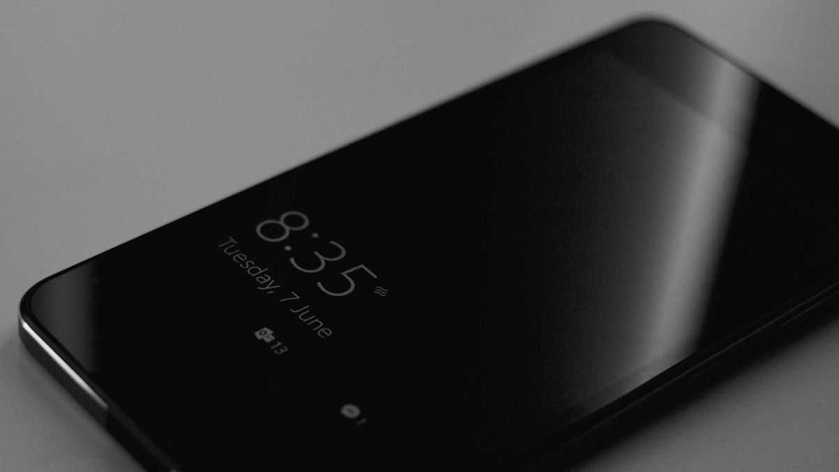
The Lumia 650
There are two things to consider here: the Lumia 650, and the Windows 10 Mobile operating system that powers it. And I’ll keep the phone review short: it’s not awful, but it is boring.
The Lumia 650 is handsome, but almost cartoonishly generic. It feels like a prop phone, of the kind you’d see in a stock photo or an IKEA display. The hardware is a slab of glass wrapped in plastic and plasticky-feeling aluminum, adorned with a Windows logo on the back and a Microsoft wordmark on the face. It’s not pretty, but if it weren’t there, you’d forget what kind of phone you were using.
Microsoft has elected to use Qualcomm’s Snapdragon 212 processor. It’s a quad-core processor clocked at 1.3 GHz. With the 1 GB of onboard RAM, you might reasonably expect it to be fast. Or, least, fast enough.
It isn’t.

Despite the smooth animations and capable SoC, the Lumia 650 is slow. Apps take a long time to launch and are purged from memory far too quickly. Even relatively basic tasks — such as opening an email or loading a webpage — are apparently laborious affairs for this phone.
There are a total of two noteworthy things about the Lumia 650. The first is that it’s cheap — really cheap. I bought mine unlocked at the Microsoft Store for $200 Canadian, and it’s the model featuring two SIM card slots and a 30-day return policy. In a world of $600 Samsungs and $800 iPhones, the Lumia 650 is an absolute bargain.
The second interesting thing about this phone is that it is, as far as Microsoft’s plans are concerned, the final Lumia. It was introduced on February 15 and went on sale on April 1. Less than two months later, Microsoft canned the whole operation.
But, while the Lumia brand is dead, Windows 10 Mobile lives on.
Windows 10 Mobile
As with many of Microsoft’s products, I think Windows Mobile is chock full of really great ideas. I noticed this the first time I put my Lumia to sleep, then pulled it out of my pocket. The time, date, and an indicator of an awaiting email were all displayed in white on the jet-black background — a feature called the “Glance screen” that Nokia first introduced on their Symbian devices, and brought to Windows with the Lumia 925 in 2013. Because of the AMOLED displays in virtually all Windows Mobile devices, only the handful of pixels that make up the time and other information need to be turned on. It’s genius.
Then there are the famous Live Tiles on the home — excuse me — Start screen of all Windows Phone-cum-Mobile releases. Instead of being a static icon, the tiles are large enough that they can flip and scroll to show more information.
The weather icon, for instance, alternates between showing current conditions and a forecast for the next few hours. Twitter’s tile shows the most recent notification, and Outlook shows the subject lines and senders of new messages.
Again, I think Live Tiles are an extremely intelligent innovation. They have the at-a-glance information capacity of a widget married to the uniformity and predictability of icons. They’re not interactive, and they don’t need to be. They’re just a glimpse into what the app is doing in the background.
Microsoft’s virtual assistant, Cortana, also brings some new ideas to the table. Instead of being a black box of unknown capability like Siri, or a presence of unknown reach like Google Now, Cortana includes what Microsoft calls a Notebook. It’s a preferences-like menu of things that Cortana knows about you, including connected accounts, frequent locations, and more. These are all editable, so if Cortana starts thinking that your morning coffee pit-stop is where you work, you can correct it.
Yet, for every innovation in Windows Mobile, I encountered a stumbling block of some kind. Some things aren’t fully developed, while other features are marred by poor execution.
For example, you know how I mentioned you could connect accounts to Cortana? The only account types that can be connected, so far as I can tell, are Microsoft Dynamics CRM, LinkedIn, and Office 365.
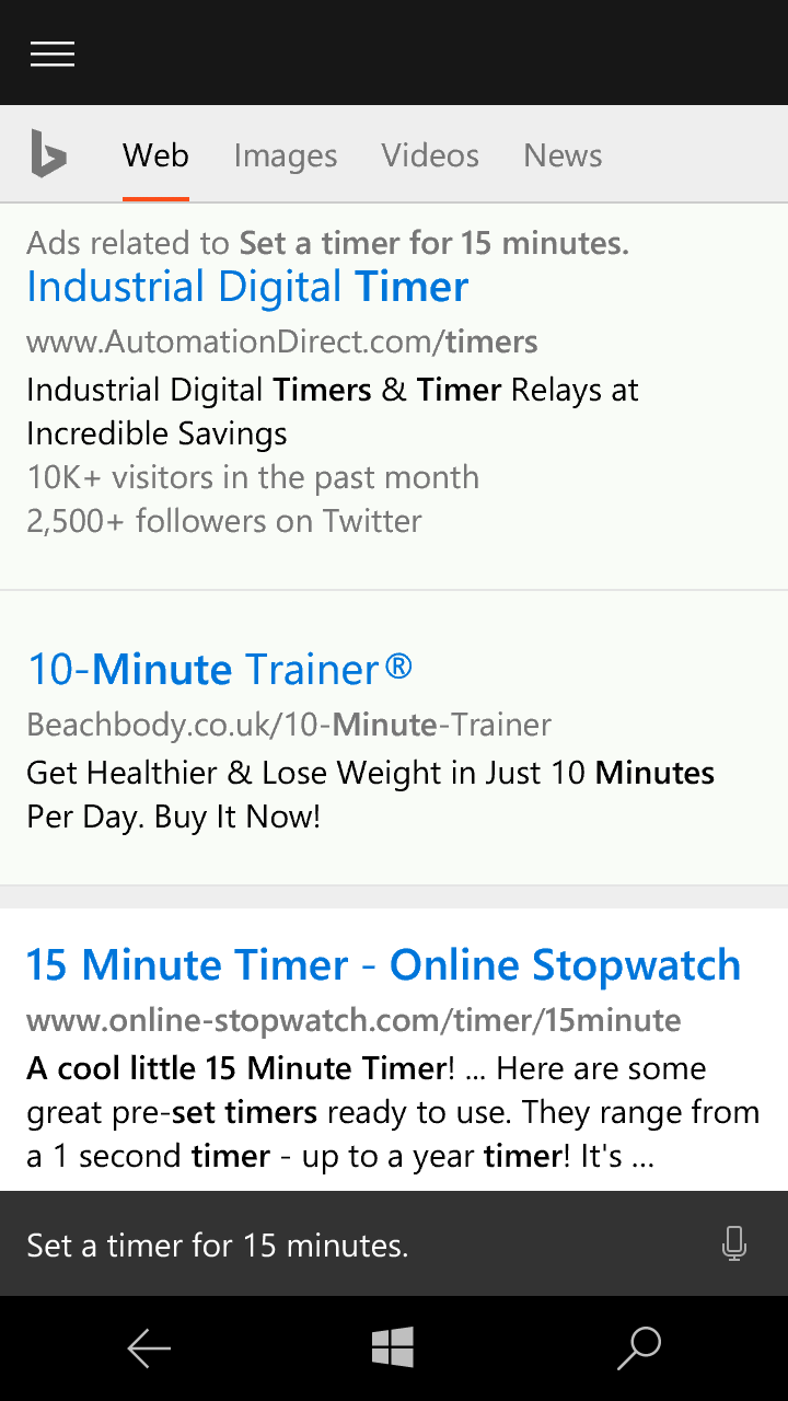
Cortana itself is deeply flawed. I regularly use Siri for creating reminders and setting timers, especially while cooking. Sometimes, but not always, invoking Cortana and saying “remind me to pick up my parcel tomorrow at 8:30 AM” would present a results page that looked like a reminder was created, but wouldn’t actually follow through. (I unfortunately neglected to get a screenshot of this.) A request to set a timer for fifteen minutes simply shows a search results page:
Photos are a real mixed bag for Windows Mobile. The Lumia 650 has an acceptable camera, though its processing is aggressive with its sharpening. It even has a Live Photos-esque feature where it will record the first few seconds before the photo was taken. Nice.
The front-facing camera isn’t bad, but it has a special viewfinder that makes you look sick:

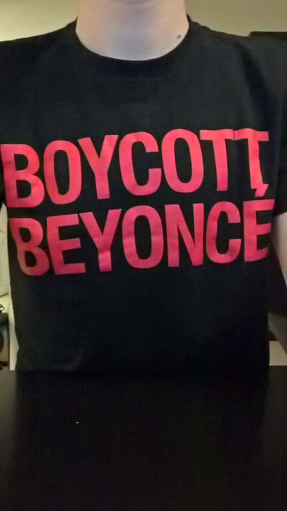
After you take a frankly brilliant photo like that, it will automatically back itself up to the mysterious cloud. A Microsoft account includes access to OneDrive and 15 GB of free storage. By default, all of your photos will be uploaded there automatically, and sorted into separate folders for photos, screenshots, and saved images.
OneDrive even attempts to automatically tag objects and scenery in the shot. From the library of about 100 photos I shot on the Lumia, around 60 have accurate — if general — tags, while a handful have inaccurate tags (for instance, identifying an indoor scene as outdoor). The remainder have no tags at all.
Sounds great, right?
Only after taking a bunch of photos in a row did I find out that Windows Mobile will upload those photos to OneDrive over a cellular connection. I have a metered plan, so this is not ideal.
Luckily, Windows includes a really nice dashboard where you can view your mobile data usage. You can even set your monthly cap and your monthly turnover date, so it’s not dumbly accumulating data usage for the entire phone’s life, like iOS does. There’s also a setting in Photos to prevent automatic uploads on a metered mobile connection.
To the best of my knowledge, however, this setting simply doesn’t work. I have my data limit set, yet any photo I take on the Lumia will automatically upload regardless of what connection I’m on. This resulted in a bill from my provider approximately 50% higher than usual, and I used the Lumia for just one week.
And then there are the little things.
One of the hardest habits to kick while writing this is my tendency to write “Windows Phone”. It turns out that Windows Phone, as a brand, doesn’t exist any more. Due to Microsoft’s platform unification, everything they do is now considered “Windows 10”, and that’s it. My Lumia runs Windows 10, a Surface runs Windows 10, and your friend’s computer begrudgingly runs Windows 10.
Luckily, in lots of their documentation and other literature, Microsoft muddies the water by referring to the phone version of the operating system as “Windows 10 Mobile”, so I’ve been calling it “Windows Mobile” throughout this review.
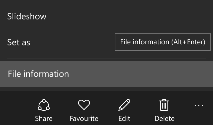
I mention this because Windows 10 Mobile is surprisingly similar to Windows 10. I don’t mean that in the same sense as Steve Jobs stating that “iPhone runs OS X”. There’s nothing technically wrong about what he said, as anyone who has mucked around in the iOS system folders knows, but the intent of that statement largely served to acknowledge a shared core.
Windows 10 Mobile, on the other hand, is a clear descendent of its desktop predecessors:
In a similar vein, Windows — the desktop kind — is the only supported operating system for syncing software. I tried plugging my Lumia into my Thunderbolt Display via USB to manually drop some songs onto the built-in storage, and it ended up drawing too much power, which shut off all my other connected USB devices.
Even semi-basic stuff like the clipboard doesn’t work as expected. There are two different copy widgets and two different paste widgets, and there’s no consistency between their availability or use.
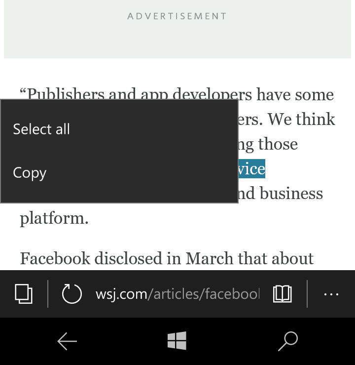
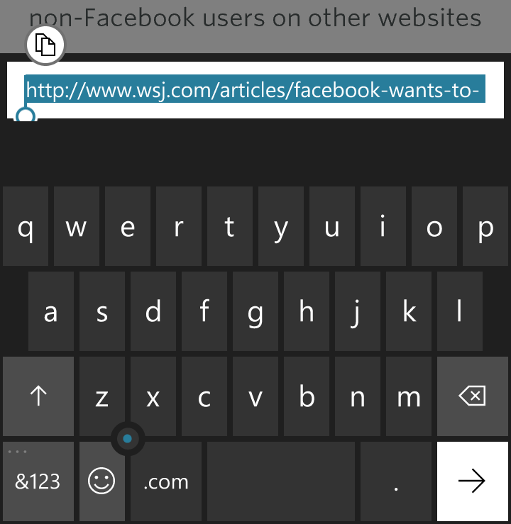
These two controls look completely different, but behave identically. Contrast that with this composite screenshot of the two paste controls available in Windows Mobile:
textarea.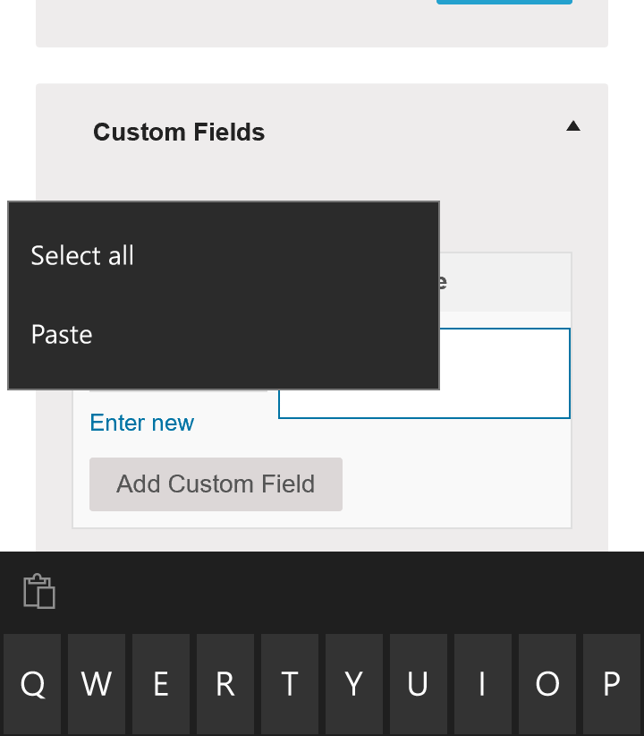
You’ll note that the paste control on the keyboard is greyed out and deactivated, but the menu shows a paste option. I have no idea why this could possibly be.
And that’s all in the first-party apps. What about apps from others?
Third-Party Apps
You knew this was coming, didn’t you?
One of the things I was worried about going into the week with Windows was that I’d find it difficult to use it normally as it might lack the apps I use every day.
One of the nice surprises of the week was just how easy it was. It turns out that I already do a lot of stuff using the default set of apps: email, messaging, web browsing — the usual suspects. But I use a lot of third-party stuff too: Twitter, Slack, Snapchat, the New York Times app, Instagram, a Pinboard client, and an RSS reader, to name a handful.
And you know what? Nearly all of those apps are available for Windows Mobile — Snapchat is the sole exception on that list.
The problem with a lot of these apps is that they’re just not very good. Because Windows Mobile has an insignificant market share, developers are — understandably — hesitant to sink more time into building apps for it than they absolutely must, so there’s a lot of shared interface ideas and assets.
The Twitter app is very similar to its Android cousin, except with a dark background instead of white. Slack, well, looks like Slack. And then there’s Instagram:
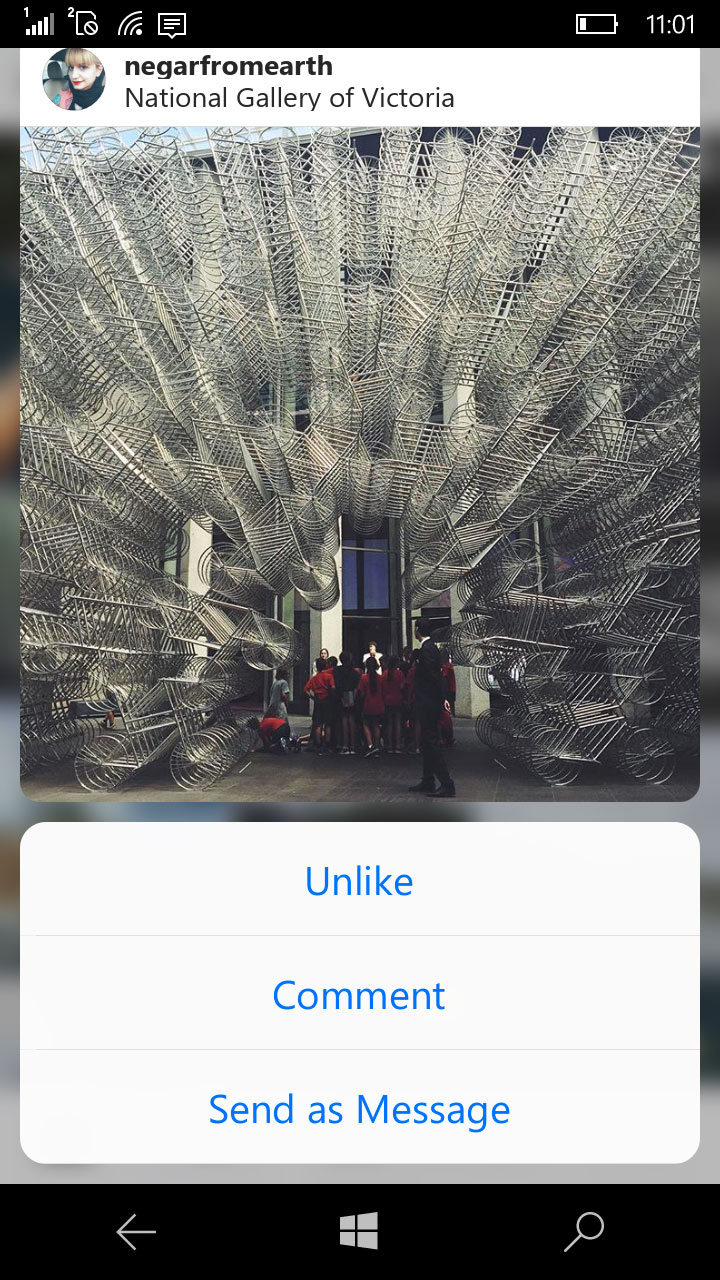
Now that’s funny.
Windows Mobile has been the distant third choice for native app development for a very long time. Though Microsoft boasts nearly 670,000 apps in the Windows Store, very few of them are actually good. Aside from cross-platform pollination issues, many of the apps I tried throughout the week felt really bottom-shelf. I’d rather not pick on specific apps, as many are from smaller developers, but there’s a sort of third-rate knockoff quality to most that I tried. They feel rushed, incomplete, and generally of a sub-par quality.
That could be because I bought a Windows device at a particularly rough time for their app store. Due to its dwindling market share, lots of big-name developers and companies have discontinued support for Windows Mobile; what’s left in their wake are lower-rung apps.
The lack of developer support is, of course, not new information. What is news is that Microsoft isn’t making phones any more and is concentrating solely on the operating system. If developers weren’t committed to the platform before, what are the chances of that changing with Microsoft’s reduced investment in it? And how can hardware companies be confident in the phones they’re making when even Microsoft isn’t?
Microsoft may think they’re pushing forward with Windows 10 Mobile development, but it feels more like a slow crawl towards an inevitable sunset.
Buyer’s Advice
For a long time, I’ve said that I’d choose Windows Mobile if iOS didn’t exist. And, to a certain extent, I stand by my reasons why: the operating system feels fluid, it has a lot of uniquely brilliant innovations, and it’s fairly user-friendly.
But after spending a full week with it, I see cracks where I wouldn’t have before. I’ve previously tinkered with a friend’s Windows 8.1 smartphone, and I don’t remember it being as unpolished as Windows 10. There are huge executional flaws that mar the day-to-day experience, in ways that are baffling and obvious. And, of course, the dearth of decent third-party apps is a death knell for the platform.
They say “never meet your heroes”. I think that holds true in a lot of cases; it certainly did here. Despite its deep flaws, I like Windows Mobile. I want to root for it, not because it’s the underdog, but because there’s genuinely good stuff here. But, midway through the week, I started itching to get back onto my iPhone. I missed Fantastical, Pinner, and Tweetbot. I really missed iMessage, and the deep integrations with my Mac. Despite the myriad frustrations I have with iOS, it’s still the one I’d choose every single time.
And if iOS didn’t exist? Well, I can’t see Windows Mobile lasting much longer. I guess I’d have to use an Android phone. I wonder what that’s like.
Thanks to G. Keenan Schneider for reading an early draft of this.
-
I wanted to keep using my Apple Watch for fitness tracking, so I had my iPhone in my other pocket. I also listened to music on it, for reasons noted in the review. Excluding that, I was all Windows, all the time. ↥︎