“There’s this thing that’s happening right now in user interface design that I find kind of shackling. The faux wood paneling trend, […]
— Matias Duarte
At that big Android event yesterday, Matias Duarte and Company made great pains to show the world how their new release – dubbed Ice Cream Sandwich – is different from the worlds of Windows Phone and iOS. What the team at Google built is not entirely unique, as it reads as a blend of Apple’s attempt at an idealised photorealism with Microsoft’s purely digital environment. Duarte emphasised what he sees wrong with iOS in an interview with Josh Topolsky, noting that Apple’s user interface is “not photorealistic, [but] illustrations”. Apple has fully embraced real-world materials, right down to a bullet-point in their Human Interface Guidelines (HIG):
When appropriate, add a realistic, physical dimension to your application. Often, the more true to life your application looks and behaves, the easier it is for people to understand how it works and the more they enjoy using it.
Apple’s emphasis on idealised realism is not a recent trend. This is the same section from the Mac OS X HIG:
When appropriate, consider adding the appearance of real-world materials. In some cases, real-world textures, such as wood, leather, metal, or paper, can enhance the experience of an app and convey meaning to users.
This approach is known as skeuomorphism. The term describes the imitation in newer products of historical or traditional materials, in a non-functional, decorative manner. It’s often used to add familiarity to a newer product. It’s the reason why there’s often grain added to digitally-shot movies, and why there’s faux cork printed onto the filter end of some brands of cigarettes.
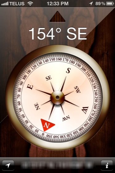
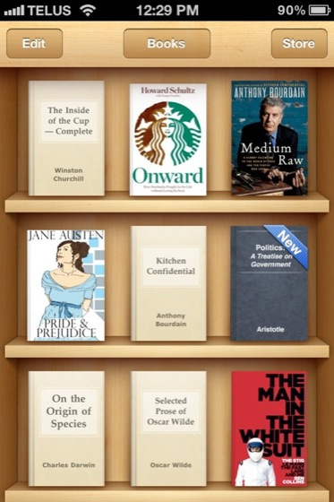
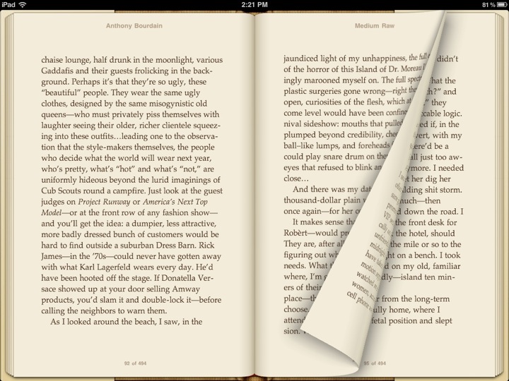
In many cases, skeuomorphic user interfaces imitate reality to increase the ability for new users to know immediately what they’re using. The Compass application that began shipping with the iPhone 3GS is a perfect example. There is no doubt as to what that application represents, and what it does. This is also true of Calculator, Notes and iBooks. The latter would be difficult to interpret as an ebook application without the use of shelves, and the shelves themselves would be unclear without the wood texture.
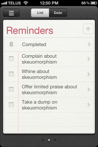
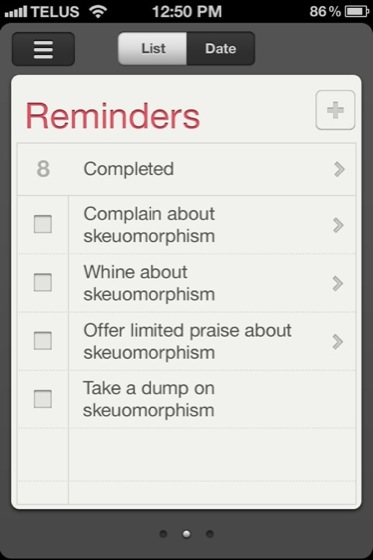
Sometimes a skeuomorphic user interface doesn’t enhance usability, but adds a sense of depth to an otherwise dull UI. Consider Reminders, an application that began shipping with iOS 5. I created a version without texture and where many of the real-world paradigms are removed. It isn’t necessarily less-readable as a to-do list, but it’s less engaging. It looks like it lacks detail; it looks unfinished.
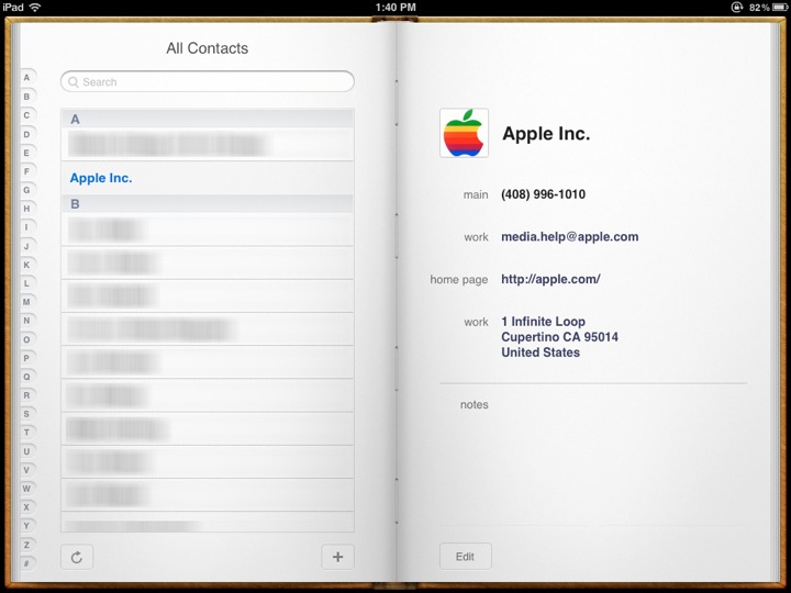
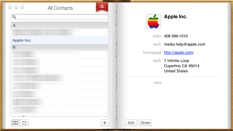
There is one application, however, that throws a big-ass wrench into Apple’s traditionally focused sense of interaction, and it’s appalling: Contacts, otherwise known as Address Book. The current incarnation began on the iPad and it spread like a gangrenous wound to the Mac. The metaphor of a book is, in theory, a sound one. Contact information has traditionally been stored within a little book. But this paradigm breaks in the digital realm, and especially in Apple’s implementation, because any book-like interaction is missing. It’s not that book-like interaction can’t, or doesn’t, work (look at iBooks on the iPad for instance), but that this cannot exist when there is no reason to flip pages. As a result, the stylised book fails to behave like the object it represents, creating a disconnect.
Realism in user interfaces can be a way to add familiarity and ease-of use to an application. There are times, though, when something of an invisible line is crossed, making the application harder to understand. Isn’t it ironic?
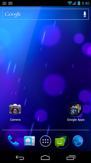
I think that’s what Matias Duarte feels, but I don’t think the Ice Cream Sandwich approach works. It doesn’t scrap enough of the nearly-photorealistic elements. Note, for instance, the icons on the home screen. The camera, phone and browser icons sit in an awkward spot between skeuomorphism and digital non-representation. It strikes me as half-assed, especially since the solution is sharing the same real estate. Why not use glyph-based icons, as with that used for the application drawer and the navigation buttons? It seems like it would solidify their commitment to their refreshed user interface. The lock screen in Ice Cream Sandwich fully embraces this to great effect. You can either commit to an interface, or look foolish.
Commit.