
I am, of course, a massive fan of Twelve South (12S). The small company is responsible for several of the most innovative, most well-designed and best-fitting accessories for the Mac, iPad and (now) iPhone. As a diehard, I own a Compass and a BookArc, both of which keep my desk clean and amp up its style. And so Andrew Green — founder of 12S — announced the BookBook for iPhone last month on Twitter and I fell in love.
It’s odd, though, that I was considering purchasing one. This is the third variation of 12S’ BookBook line of cases, of which the previous two I did not enjoy. The BookBook for the MacBook (Pro) was the first to launch, and it’s a rather bulky product. It’s stylish, sure, and clever, but it lacks a certain amount of elegance. It’s overdone. It’s a similar story for the iPad version. There are several book-style cases for the iPad on the market, and Twelve South’s isn’t as well executed as Nedrelow’s or the rightly eminent DODOCase.
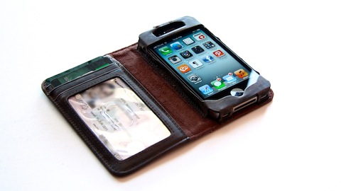
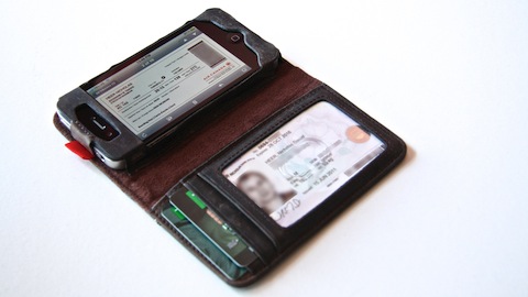
The iPhone version is a different story. Unlike the MacBook and iPad versions, it isn’t bulky for style concessions, but because it adds functionality. The inside flap hides slots for cards, a clear pocket for identification, and a pocket for cash. As the promo video demonstrates, one simply grabs their keys and their BookBook, and is set for the day. It’s simply marvellous.
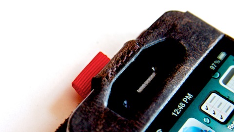
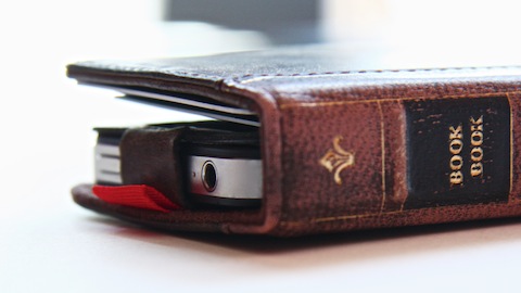
The iPhone is held on the right-hand side of the case, with cutouts for the earpiece, ring/silent switch and home button. Notably absent is a cutout for the camera and flash. This is by design. To compensate, Twelve South has added a small red pull-tab to allow the phone to be slid up with your thumb. It’s a smart way to overcome a design obstacle. The alternative would be to have a cutout in the rear and, while more convenient, would destroy the suspension of disbelief. The illusion of it being a book is more powerful without the hole.
By now, a typical review would descend into complaints, and I’m afraid there’s no exception this time (though my complaints are minor). With three cards in the wallet portion, with another card and a folded up bill in the pocket, the case does bulge quite noticeably. I suspect this is partially due to the leather not being “worn in”, but it’s slightly disconcerting. When folded shut, the leather tends to leave a significant smudge across the left-hand side of the screen. Again, this is probably due to it being new, but as someone who attempts to keep their screen polished, this is unwelcome.
The big worry, though, is the idea of keeping your credit card(s), identification and expensive smartphone in the same place. It certainly makes it easier for a thief to procure your valuables (and identity, potentially). If you don’t feel comfortable taking that risk, the BookBook is definitively not for you.
An aside: I purchased my BookBook at Toronto’s Eaton Centre, while on vacation. It was while waiting for my delayed flight that I realised Twelve South created the perfect product for the domestic traveller. One can display their boarding pass on the iPhone while presenting their ID. It’s a genius product.
To sum up, the BookBook for iPhone is a magnificent achievement. The concept of combining a wallet and phone case isn’t a new one, but Twelve South’s execution of that idea is nearly perfect.
Update
Before rushing out to buy one of these, please see my followup review:
I remain sold on the concept. The idea of a phone case with a wallet is a smart one, and Twelve South has executed theirs the best out of the ones I’ve tried or seen. However, I can’t use the BookBook every day. It’s not a finished product yet.
Or, skip to the final verdict:
This is a great wallet-type case, and probably the best of that type. I don’t think I can recommend it in good conscience, however, due to the issues I’ve mentioned. They’re not big issues, but when combined, they make for a worse user experience than a separate phone and wallet. That’s the clincher.