It’s been less than two months since the Apple Watch was announced, and it won’t ship for several more months, but Apple is getting developers on the fast track by launching the Watch’s SDK, WatchKit, now. And it’s a real treat because it’s the first extended glimpse into the interface and what it means to develop for the Watch. After reading the documentation, what appears clear is that the Apple Watch will be like no other iOS device and no other smartwatch on the market.
Pixels and Performance
Without releasing any hardware, Apple has revealed the answer to a big mystery on that front: the display resolutions of both models of Watch. The 38mm one has a screen that’s 272 × 340 pixels, while the 42mm one measures 312 × 390 pixels. Based on the 1:1 graphic on the Layout page of the Human Interface Guidelines and my rough calculations, that works out to about 312 and 326 pixels per inch, respectively.
If I were a betting man, I’d have bet on a shared resolution, with the smaller one utilizing a trimmed version of the iPhone 6 Plus’ panel, and the bigger one getting the 326 pixel-per-inch panel used in iPhones since the fourth generation. Clearly — and surprisingly, to me at least — that’s not exactly the case.
But what’s not known is just what kind of panel the Watch will have; I’m interested to see whether it’s an LED or some kind of (AM)OLED, which would be Apple’s first.
Along with display pixels, the Human Interface Guidelines also reveal the different sizes of icons required by the system. As you might expect, with two different — and somewhat finicky — display resolutions, there are two sets of icon sizes required. The small Watch has 29-pixel Notification Centre icons, 80-pixel “long look” icons, and 172-pixel home screen icons; the big one has 36-pixel, 88-pixel, and 196-pixel versions of the same. Apple also provides a set of recommended stroke weights for the contextual Force Touch menu icons, with a single pixel of weight difference between the little Watch and the big one.
From the outside looking in, this seems needlessly resource-intensive and complex; two different resolutions with two different sets of icon sizes means a lot of work for designers and developers alike. But it also comes across as a certain level of care and dilligence. Apple didn’t simply trim down an iPhone; this is someting entirely new for them. It’s a complete reconceptualization of personal technology, and it’s going to take some effort for it to work well. 1
Indeed, the HIG is notable for where it differs from the recommendations in, say, the iOS HIG. From the Color and Typography page:
Avoid using color to show interactivity. Apply color as appropriate for your branding but do not use color solely to indicate interactivity for buttons and other controls.
In the equivalent iOS page:
Consider choosing a key color to indicate interactivity and state. Key colors in the built-in apps include yellow in Notes and red in Calendar. If you define a key color to indicate interactivity and state, make sure that the other colors in your app don’t compete with it.
Avoid using the same color in both interactive and noninteractive elements. Color is one of the ways that a UI element indicates its interactivity. If interactive and noninteractive elements have the same color, it’s harder for users to know where to tap.
There are other, more subtle, differences between the way different UI components are treated on each platform. The message here is clear: don’t just try to scale down your iPhone app.
Speaking of hard work for designers and developers, have you seen the Watch’s approach to animation? I’ll simply quote the HIG:
Create prerendered animations using a sequence of static images. Store canned animations in your Watch app bundle so that they can be presented quickly to the user. Canned animations also let you deliver high frame rates and smoother animations.
Let’s see that again in an instant replay:
Create prerendered animations using a sequence of static images.
I didn’t believe that this meant what I knew it meant, so I downloaded the “Lister” demo app to take a look at its assets. And I found a progress bar rendered as a circle, with each of the 360 frames of the animation in its own PNG image. It means exactly what you think it means: each frame is its own image.
There’s more curiousity at play, too: Maps embedded in apps are non-interactive, and app caches are limited to just 20 MB, or approximately 14 floppy disks.
All this adds up to a distinct impression that the Apple Watch is little more than a dumb notifications screen, which is what I — and so many others — have repeatedly stressed that we don’t want. Indeed, that’s basically what the Watch App Architecture document conveys:
When the user interacts with your Watch app, Apple Watch looks for an appropriate storyboard scene to display. It selects the scene based on whether the user is viewing your app’s glance, is viewing a notification, or is interacting with your app’s main interface. After choosing a scene, Watch OS tells the paired iPhone to launch your WatchKit extension and load the appropriate objects for running that interface.
As of right now, it’s write-only.
So why am I not worried? WatchKit is kind of like the “sweet solution” of the Apple Watch, only way better than that ever was. For now, Watch apps are limited to interactive notifications and Glances, Apple’s name for quick, focused information from a parent app. Watch apps require an iPhone to be present, paired, and nearby for them to run, because they’re basically just showing an extended UI projected from the iPhone.
Apple is promising “native” Watch apps later in the year, though it remains to be seen the extent of the processing that can be done on an Apple Watch itself. The limitations currently imposed on Watch apps are likely limited by the speed at which UI components and code can be transmitted from an iPhone to a Watch, not the processor inside the Watch itself. But I’m not sure it’ll be possible to leave the house with only the Watch, and not your iPhone, too. You may not need to take your iPhone out of your pocket, but it appears that you’ll be relying upon it for most connectivity and app data.
For now, though, WatchKit is limited to treating the Apple Watch as a way to show immediately-relevant information, and little more. So why would I be more optimistic about its chances? Or, at least, more optimistic compared to, say, the way I viewed the Pebble Steel or the Samsung Galaxy Gear — or, indeed, smartwatches as a category. I’m more optimistic because it feels like the iPhone all over again: Apple wasn’t the first to market, but they’re seeking to be the best. And everyone else will likely follow in their footsteps.
There’s a lot to pick through in this new territory, but Apple seems dedicated to making it as straightforward as possible for both designers and developers. Developers have extraordinary limitations — barely any options for sizing and placement of UI objects, and no subclassing of interface controllers, both which developers have previously relied upon to create customized interfaces. Designers have the luxury of a care package of PSD templates of icons, interfaces, and UI components.2 Oh, and the new system fonts.
San Francisco
I remember reading all kinds of reactions to the Apple Watch, but the commentary from designers about the new typeface is what I remember clearest of all. In September, it didn’t even have a name. Plenty of people called it “DINvetica”, while others speculated that this was, indeed, Apple Sans. While it may be the final form of “Apple Sans”, its public name is San Francisco, harking back to the old Macintosh days of typefaces with names like Chicago and Geneva. Indeed, it now occupies the namespace of Susan Kare’s original.
This is clearly something Apple has been working on for a very long time. Initial — and, dare I say, lazy — comments immediately rushed to compare it to Roboto. A closer look reveals more differences than similarities.
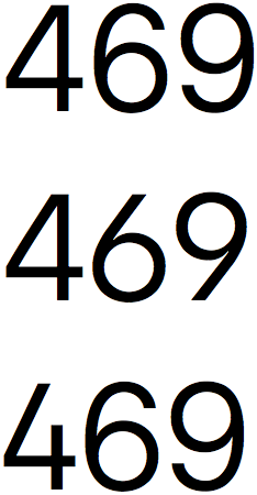
The San Francisco family comes in three styles, each in myriad weights. Display is to be used when text is 20 points or greater, while Text is to be used at smaller sizes. There’s also a Rounded style hiding in the SDK, but don’t tell anyone.3 There are also a few alternate numbers, shown at right, proper small caps, and a plethora of international and special characters. It’s a very comprehensive typeface family.
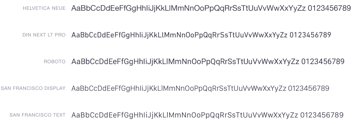
I compared it against two similar faces: DIN Next is a 2009 update of the venerable DIN 1451, and Roboto is Google’s house face. I threw Helvetica Neue into this comparison because it’s Apple’s current system face. All of these are the regular weights, and all are set at the exact same size, utilizing the fonts’ built-in kerning metrics. A few things are immediately apparent in this comparison:
- San Francsico Display is noticeably optimized for larger sizes. Strokes are thinner, and it’s a little tighter.
- The “DINvetica” reference couldn’t be more appropriate: the numbers look very similar to Helvetica’s, while the characters take inspiration from DIN.
- If Roboto looked a little gross before, it looks really gross in comparison to these. This is the newly-updated version of Roboto, not the old one with the Helvetica-knockoff uppercase-R. It looks way better than the old version, but it’s nowhere near as precise-looking nor as balanced as the others here.
- San Francisco Text — that’s the one for smaller text sizes — has similar metrics to Helvetica Neue. Not the same, but if you squint a little, kind of close enough, and closer still to the metrics of Lucida Grande. Perhaps this is eventually the new UI font for all Apple interfaces. It certainly would be more of a distinct signature face than Helvetica, and it would be more legible, too.
San Francisco is extremely exciting. Apple has released a number of in-house typefaces, even very recently — Menlo was released in 2009, and Chalkboard in 2003 — but this is the first comprehensive family to be released since 1984. It’s apparently still being worked on, but it’s in very good shape.4
-
Just how long have we been asking for a PSD of the iPhone UI? ↥︎
-
San Francisco Rounded isn’t shown here because it silently fails to install. ↥︎
-
When you try to print a document with San Francisco, the tracking is absolutely enormous. This might be due to Dynamic Text features, or it might be related to a Yosemite bug for fonts with UPMs greater than 1000. San Francisco has a UPM of 2048. ↥︎