Imagine being in charge of an algorithm that hundreds of millions of users depend on every day and saying, “Hey, let’s take any word that’s capitalized in your contacts and just always capitalize it in text messages!”
It’s not just contact names that inform the autocorrect dictionary: any capitalized word in a contact record will be fed into the dictionary, as will installed apps. So, if you know someone who works at, say, Apple, or you have the Transit app installed, you will find yourself regularly undoing the automatic capitalization of those words when talking about fruit or the very concept of public transit. Sometimes, autocorrect will fix its aggressive capitalization after it is given more context by typing several more words; but, frequently, it does not.
Apple has long been a company of measured progress, but for two years in a row, they’ve delivered a substantial leap in the abilities and extensibility of iOS. iOS 7 brought a complete top-to-bottom redesign, while iOS 8 allowed developers to interact with the OS and other apps more than they ever could previously.
But leaps and bounds of supersized progress don’t come for free; indeed, both releases felt like they lacked the kind of software quality we’ve come to expect from Apple. While I can’t think of a single product they’ve made that didn’t have any bugs, the severity and regularity of quality-assurance gaps made the past two years of iOS feel rushed and a little incomplete.
Apple has faced this before; Mac OS X Leopard, released in 2007, was riddled with far more bugs and quality issues than its predecessor. Its 2008 successor, dubbed Snow Leopard, was famously billed as having “no new features” — that wasn’t entirely accurate, but it was the thrust of the release: bug fixes, bug fixes, and bug fixes (and Exchange support).
iOS 9 is an attempt to strike the balance between these extremes. There are two sets of promises: it’s supposed to fix a lot of bugs and improve overall performance and stability, but it’s also supposed to be a fully-featured release. So, is it?
I’ve been using iOS 9 since early June on my iPhone 5S and iPad Mini 2. This is what I’ve learned.
Impressively, iOS 9 runs on all the same devices as iOS 8 did. If you have an iPhone 4S or iPad 2 or newer, or an iPod Touch with a 4-inch display, you can update to the latest and greatest operating system. Four years is a long time in the smartphone world, but Apple remains just as committed as ever to older hardware.
But, though no devices have been dropped from the compatibility list with this release, there’s also an array of caveats and limitations, as usual. A5 hardware does not support Proactive features, for example. Similarly, only A7-and-newer iPads support picture-in-picture or Slide Over, while only the iPad Air 2 currently supports split-screen multitasking.
But, though the newest features are limited to the most recent hardware, older models should perform far better under iOS 9 than under 8. The iPad 2 is four and a half years old, yet Apple is still dedicating engineering resources to making sure it continues to feel like new hardware. That’s pretty impressive, and it seems to acknowledge a longer upgrade cycle more typical of a computer than, say, a phone.
Installation
Installing iOS 9 is as simple as you’d like and are used to: it’s available both over-the-air, and as a full standalone download. Depending on what device you’ve got, the complete package size will vary from about 1.4 GB for an iPad 2 to over 2.1 GB for an iPhone 6 Plus.
Over-the-air is another story. While there is no single reason why iOS 8’s upgrade rate was noticeably slower than iOS 7’s, the large amount of required disk space — four or five gigabytes — is likely a significant contributing factor, especially considering the amount of 16 GB devices still in use (and, inexplicably, being sold). Apple promises that devices only require about a gigabyte of free space to upgrade to iOS 9.
Updates get even better after you’re running iOS 9 in terms of both timing and available space requirements. Let’s start with the first one by taking a peek at the over-the-air update feed (large file warning). When you run an OTA update, it checks what version of iOS you’re currently on, which version is the latest available, and downloads just the required files for your device. Here’s what that looks like, in part, for a version of iOS 8:
Did you catch that? The SUInstallTonightEnabled key is a clue that iOS will now allow you to run system updates overnight or during periods of lower usage. In an increasingly rare moment, the post-PC iOS is learning from the Mac.
If you don’t have enough space on your device for that update, iOS will now offer to delete apps to run the update, then automatically restore them after the update has been completed. It’s a nice touch, but it also seems to acknowledge that 16 GB iPhones are both tiny, yet, here to stay, at least for a while.
Under the Hood
Bitcode, Slicing, and On-Demand Resources, Oh My
Since the release of the iPod Touch in 2007, there have been several distinct versions of iOS created with assets designed or created for specific hardware configurations. An iPhone doesn’t need an iPad’s graphical assets, and the WiFi-only iPod Touch doesn’t need a bunch of cellular-specific code or apps. This is evidenced by the vast chasm between the smallest and largest sizes of iOS 9.
Unfortunately, third-party developers haven’t had a similar ability. After the introduction of the iPad — and, with it, the creation of the universal iOS app format — app sizes grew significantly; this occurred over and over with each introduction of higher-resolution and larger-screened iPhones and iPads. So far, the only solution developers had for this is to create separate iPad and iPhone versions of their app which, due to pressure from both Apple and consumers, is suicidal.
But now there’s a way. Not for supporting developers’ livelihood, sadly, but for them to be able to provide just what’s needed to different devices, at just the right time. Apple calls it “App Thinning”, and it’s comprised of three complementary aspects: bitcode, slicing, and on-demand resources.
Bitcode is kind of cool. Instead of uploading a fully-compiled app, developers can now upload partially-compiled code. Apple can then optimize the app build based on their latest — and, presumably, most efficient — compiler, and the app gets built on the fly.
App slicing requires a little to a lot more work from developers, but probably creates the best balance between space savings and effort required. Developers can now “tag” resources within their app — images, sounds, graphics code, and other data — based on the kind of device they target. For example, neither my iPhone 5S nor my iPad Mini require “@3x” images, which are only used on the iPhone 6(S) Plus, but apps that I download these days often include them and they can take up a lot of space. After a developer correctly tags these files, they will no longer be included in apps that I download to my devices. The same goes for OpenGL vs. Metal, different qualities of audio or video, and different device architectures.
What wasn’t made entirely clear is how sliced apps behave when downloaded from iTunes. It’s easy to figure out how the slicing and building decisions are made when downloading over-the-air from the device, and Apple has built support for slicing into enterprise tools. But the only reference to iTunes comes in the overview document, and there are no specifics:
For iOS apps, sliced apps are supported on the latest iTunes and on devices running iOS 9.0 and later; otherwise, the App Store delivers universal apps to customers.
I haven’t found another reference to how iTunes handles app slicing; for example, when there’s one or multiple devices on a user’s account. Apple PR doesn’t talk to me. (But do they talk to anyone?) I simply don’t know.
Finally, there are on-demand resources. Depending on the app, this might require substantially more work from developers, but it could also provide some of the most significant space savings for users. By storing on the device only the assets that the app needs at the moment and for the foreseeable future, developers can potentially create vastly more depth in their apps without worrying quite as much about a significantly ballooning file size. Furthermore, developers who have already added more depth and size to their apps can strategically make reductions dynamically.
For instance, consider the apps that you’ve downloaded that provide some kind of tour or walkthrough at first launch. As a user, you probably won’t need that again, so the developer can allocate those assets as deletable after use. But the app itself won’t delete them — on-demand assets are entirely managed by the system. That means that one app from one developer could request space currently occupied by another app from a completely different developer. The system is supposed to do the right thing. If there’s an app that you haven’t opened in a long time, it can clear out unneeded assets from that app first, because — let’s face it — you probably won’t notice.
These three things — bitcode, slicing, and on-demand resources — comprise app thinning. Apple’s goals for developers have so far been working in opposite directions: they want developers to build universal apps with Retina-ready graphics and the latest architectures, but they also want to keep the starting capacity of their devices at 16 GB and the free iCloud storage at just 5 GB. Thinned apps work to try to address all of these goals.
I won’t dive into whether this comes close to justify the continued low-capacity devices and services Apple sells by default (it doesn’t) but it certainly reduces the pain of having such a device. If the space savings are as pronounced as Apple says they are — mileage may vary — it will mean a much better user experience for everyone, and less squeeze for those at the base level of device offerings.
Performance
Most years, the newer your iOS device, the less interesting this section will be to you. That perennial rule also usually comes with the unfortunate implication that users with older devices have to deal with increasing obsolescence.
But that’s not the case this year — iOS 9 comes with performance improvements for both new and old devices. Devices that support Metal — Apple’s near-hardware graphics layer — can take advantage of its significantly improved performance in most of the default apps.
For older devices — particularly those of the A5 generation — Apple promises significantly better performance. I don’t have one of those devices any more so I wasn’t able to test this.
Battery Life
Another major focus of the under-hood improvements in iOS 9 is battery life. Apple says that an extra hour of typical battery life can be expected in daily use.
So how did the marketing fare in the real world? I don’t have an adequate rig set up to test battery life in some kind of semi-scientific fashion, but in day-to-day use, it has fluctuated greatly from beta to beta, as can be expected. But that made me a little worried when faced with the promise of significant battery life gains. The third and fourth betas exhibited almost impossibly good battery life; if anything, I would have guessed that the promised additional hour was an understatement. The fifth beta, on the other hand, appeared to completely ruin my iPhone’s battery life. It went from reliably lasting all day long to being nearly completely depleted by lunchtime. Around this time, though, I began noticing some other strange battery-related behaviour: accelerated depletion between the 20% and 10% warnings, for instance, only to plug it in and find that it was at 19%. I suspect one of the cells in my phone’s battery has died.
Therefore, it would be imprudent for me to judge the battery life of the gold master I’ve been using for the past week. Some days, it’s phenomenal; others, it’s poor, and — given the far better battery life of a few of the earlier betas — I think my phone is partly to blame.
One significant factor appears to be music playback, which I’m consistently seeing at the top of the list of power-hungry apps in Settings. Even after switching off Apple Music and choosing only local items for playback, I noticed occasional network activity from within the app. But Apple Music was included with the third beta, and its battery life was just fine. I have no logical explanation for this.
If you can’t get to an outlet, you’ll be delighted to hear that the low-power mode from the Apple Watch has made its way onto the iPhone. This mode disables all kinds of background processes, places the battery percentage in the status bar, and apparently disables some visual effects. After enabling low-power mode, though, I didn’t notice the omission of blurring, translucency, or any of the usual suspects on my iPhone – the only things disabled, as far as I can figure out, are Dynamic wallpapers and parallax effects. Apple says that an additional three hours of battery life can be expected after enabling low power mode, in addition to the extra promised hour. That’s not as significant of a gain as low-power mode on the Apple Watch, but you’ll still have network connectivity and all your apps on your iPhone. It’s a tradeoff.
In my testing, the low-power mode delivered, though not as I expected. The description is a little misleading: if you turn on low-power mode when you’re first prompted — at the 20% warning — you won’t eke out three additional hours; you’ll probably add an extra hour of life, at best. But if you go all day long in low-power mode, you’ll probably get the full three hours.
The battery life on my iPad has been exceptional, but isn’t it always? I’ve been using it regularly for the past few months, especially, and I haven’t noticed a decrease in battery life (but nor have I noticed any improvement, either). In case you were wondering, low-battery mode isn’t available on the iPad.
UI
After a major interface design overhaul that practically rewrote the HIG just two versions ago, it comes as no surprise that the UI of iOS 9 has, well, very few surprises. The corners of some things are a little more rounded and there’s a lot more space within action sheet items. But there are changes, indeed, and they’re systemwide.
San Francisco
Helvetica has been the signature typeface of iOS since its launch, which, for myriad reasons, makes for no small feat to consider replacing it. From a developer perspective, apps have only ever tested against it as a system font, so every label and every text cell fits just right. From a user perspective, it’s one of the things that makes iOS look and feel the way iOS does. For all it has been criticised for being generic, there’s an intricacy and geometric precision to its forms.
While I personally enjoy Helvetica, its shortcomings in user interfaces are obvious, even to me. Because its letter forms are similar, they tend to blur together and become ambiguous at the smaller sizes of most UI labels, buttons, and controls.
In my eyes, the days of Helvetica on iOS and OS X were quickly coming to a close with the introduction of the Apple Watch, bringing with it the typeface family known as San Francisco (or, for the retro users among you, San Francisco Neue).
Unlike OS X’s switch from Lucida Grande to Helvetica Neue last year though, the switch to San Francisco has gone largely unpublicized by Apple. They didn’t mention it during the WWDC keynote, and neither of their OS X or iOS promotional pages make note of it. For comparison, here’s what Apple wrote on the page devoted to Yosemite’s design:
For some, the choice of a font may not be a big deal. But to us, it’s an integral part of the interface. In OS X Yosemite, fonts have been refined systemwide to be more legible and consistent across the Mac experience. You’ll notice a fresh, new typeface in app windows, menu bars, and throughout the system. The type looks great on any Mac, and even more stunning on a Mac with a Retina display.
There isn’t an equivalent section for either iOS 9 or El Capitan’s use of San Francisco. I kind of understand this; the change to Helvetica in OS X had an outsized amount of attention placed to the change of system font, given that most users might not notice it. But San Francisco is an in-house typeface that’s completely unique to Apple’s operating systems, and it plays to the “only Apple devices work together so seamlessly” trope in their marketing, in a very distinctive way. Like Segoe — Microsoft’s in-house UI font — but unlike Roboto — Google’s — San Francisco is only available on its proprietors’ platforms. That is, while it was once possible to make a website look iOS-ey on other platforms by embedding Helvetica (Neue) as a web font — and while it is possible to make a website that looks like it comes from Google by doing the same with Roboto — it is not legally possible to make your website or app look like iOS 9 or OS X 10.11 on any platform other than Apple’s. San Francisco is not available as a web font, and it’s also not available in in-app font pickers. It is only to be used as a UI font, or where Apple deems appropriate. They control its use.
Each of the San Francisco fonts includes a sample of the Display variant on top, and the Text variant below.
So what about the typeface family itself? San Francisco has been written about and dissected since its launch by myself, among many others, so I’ll try not to rehash too much. In a nut: I think San Francisco is extremely well-proportioned, looks fantastic, and performs very well as a UI font.
That’s a good thing, because it is now the one, true UI typeface across all of Apple’s operating systems, which means that the designers at the company thinks it works well and is legible on displays ranging from the poky-ass Apple Watch to a gigantic iMac, and everything in between. To make this more manageable, Apple has created two major versions of San Francisco: SF UI and SF Compact — née San Francisco, as shipped with WatchKit — that each contain Display and Text families, for a total of 42 font files. The Compact version is used exclusively on the Apple Watch, while the UI version is used on iOS and OS X.
But that’s not the whole story, because there are individual versions of the UI version specifically hinted and tuned for various purposes in both operating systems in which it is used. There are four different grades of the “regular” weight, presumably for better Dynamic Type support. These grades are not exposed to the end user and they’re not available to designers.
It all adds up to a fabulous family of typefaces that works well at pretty much all of the sizes at which it’s used. The lighter weight looks gorgeous displaying the date at the top of Notification Centre, while the regular weight is crisp and clear below the icons on the home screen. San Francisco shares the precise, metallic feeling of the DIN family — it replaces DIN in the Camera app — but is a little rounder, which makes it feel friendlier.
One of the main complaints I noticed about prior attempts to port San Francisco to iOS or OS X was that it too narrow, making it difficult to read. We now know this was the Compact version, with a much more appropriate UI version waiting in the wings. By opening up the characters compared to what we’re used to with the Compact set used in watchOS, it’s more legible at the sizes and with the amount of information it’s expected to display in iOS. Plain text emails, for example, are displayed in San Francisco; using the Compact version is noticeably less readable when it’s used in paragraphical text:
SF Compact on the left; SF UI on the right.
This build of Deliveries mixes Helvetica and San Francisco.As you might expect, a systemwide typographic update does throw off the occasional third-party app. Most apps specify either the system font or a custom font, and these apps will look just fine. Apps that specify both the system font and Helvetica (Neue), on the other hand, look a little janky, largely because the two typefaces are close enough that they clash, like really poor denim-on-denim. These issues are minor and will, of course, be resolved in due time. Most importantly, I have found precious few instances of text strings that overrun their intended area or are truncated significantly differently than they would be in iOS 8.
As transitions go, it’s subtler on the surface than, say, the one from Lucida Grande to Helvetica on OS X, but it’s extremely effective. It’s a much better UI font than Helvetica, and — dare I say — simply nicer in every application. Helvetica is a classic; San Francisco is clearer and more delightful. It’s possibly my favourite change in iOS 9, largely because it’s one that’s carried through the entire system with ease. It adds an additional layer of sophistication that Helvetica just can’t muster; it doesn’t have that quality.
Back Button
Somewhat more noticeable is the introduction of a back button in iOS. This has been part-and-parcel of every other mobile OS for a long time, so what’s different about Apple’s implementation?
In almost all situations, the system maintains a back stack of activities while the user navigates your application. This allows the system to properly navigate backward when the user presses the Back button. However, there are a few cases in which your app should manually specify the Back behavior in order to provide the best user experience.
Most of the time, the system controls back button behaviour on Android, but developers can intervene:
For example, when a notification takes the user to an activity deep in your app hierarchy, you should add activities into your task’s back stack so that pressing Back navigates up the app hierarchy instead of exiting the app.
For example, tapping on a new text message notification and then tapping the back button will — by design — not return you to the last thing you were doing, but send you to the message list.
The first thing the Back button button does, as you might expect, is take you back one screen from where you are. Your phone remembers all the apps and websites you’ve visited since the last time your screen was locked, and will take you back one page each time you press Back, until you get to the Start screen.
[…]
There’s one exception to the rule: if you’re in Internet Explorer and press Back, you’ll return to the previous webpage you visited, rather than to the previous app. But once you’re out of it, Back goes back to taking you, well, back again.
Not exactly consistent in either case. Tapping the back button in an app might take you to the previous screen within the same app, might take you to a different app, or it might take you “back” in a way you may not expect. There are some who get used to this; there are others who want them to die.
And now, nine major releases in, iOS has one.
Happily, it’s implemented in a much more consistent way than any other major platform (and, I admit, it’s a stretch to call Windows Phone a “major platform”). It’s really very simple: if an app sends you into another app, you’ll see a back button on the lefthand side of the status bar. It replaces the assorted networking indicators, happens automatically, and requires no intervention from developers.
In the first month using iOS 9, I rarely used the back button simply because the multitasking shortcut is so engrained into my muscle memory. But, since I began to remind myself that it existed and is much more convenient than the app switcher, I’ve increasingly become reliant upon it.
However, its placement in the upper-left corner seems to fly in the face of Apple’s newer giant and gianter phones, relatively speaking. When Phil Schiller introduced the iPhones 6 last year, he addressed concerns that the much larger phones would be harder to use and hold (lightly edited for clarity — Schiller wasn’t exactly on-point during this presentation):
One of the things the team has worked on is to not only help [these phones] feel great in your hands […] but to make [them] easier to use one-handed. With iOS 7 last year, we introduced a new gesture: a side swipe gesture, thinking ahead to these phones and knowing that you’d want to use [that gesture] here.
The back button in most iPhone apps — or, at least, the good ones — is in the top-left of the navigation bar, but the inter-app back button in iOS 9 is in the status bar above it. It’s true that this will likely be used less frequently than the back button within an app. It’s also true that the app switcher can always be accessed with the home button, and with a 3D Touch from the edge on a 6S. But most devices running iOS 9 — at least, for a while – won’t have 3D Touch, but many of them will be larger. That makes the back button a little less than accessible, especially one-handed.
On my 5S, though, I think it would feel strange without it now.
Hierarchy and Order
With hundreds of millions of active users, any change Apple makes to the user interface components of iOS is necessarily going to cause a big ripple. Obviously, the biggest so far was the rollout of iOS 7, bringing with it equal amounts of praise and condemnation. Though I was generally positive towards it, there’s one thing iOS 7 did, design-wise, better than almost anything else.
Sheets Stacked on Light
Jog your memory with a look at the mess that was the hierarchy of iOS 6. If you think of different components that make up the iOS user interface — the wallpaper, icons, toolbars, and so forth — the Springboard lay somewhere in the middle of the UI stack. Dark linen — Apple’s background texture du jour — was probably the worst offender, appearing in elements that logically resided underneath the wallpaper — like folders and the multitasking tray — and in Notification Centre, which appeared overtop everything else.
In the video that accompanied the introduction of iOS 7, Jony Ive explained very clearly how the individual components of the operating system became organized:
Distinct, functional layers help establish hierarchy and order, and the use of translucency gives you a sense of your context. These planes — combined with new approaches to animation and motion — create a sense of depth and vitality.
The wallpaper became the base; nothing could be underneath it. Everything — icons, apps, folders, and the multitasking switch — would now be placed overtop the wallpaper. Finally, auxiliary, temporary “sheets” — Control Centre and Notification Centre — would appear over everything else. iOS 7 brought a clear order to the stacking of user interface components.
Multitasking
In that vein, the multitasking UI was revamped to shrink applications to tiles, floating overtop the background image, while the home screen icons appeared to float in their own tile, complete with a frosted background. This brought a sense of physicality to the OS, reinforcing the layering of the interface components.
But one thing has remained consistent since the introduction of multitasking in iOS 4: the most recent applications have always appeared on the lefthand side, while older apps are stacked to the right. It has been this way for five years: left to right, new to old.
In iOS 9, multitasking gets a visual makeover, causing a distinct functional change. When you double-press the home button, the current app shrinks and flies nearly offscreen to the right. Apps are now stacked in a kind of vertical Rolodex, right to left, with the second most-recent app taking the centre position, and all others receding into the distance on the left. It takes some getting used to, especially if your muscle memory, like mine, is predisposed to scrolling towards the right to find the app you’re looking for, but it’s not bad.
The impetus for this change remained unclear to me, however. I wracked my brain for the past few months trying to understand why this is a better multitasking UI than the one it replaces, and I could only think of a single reason: its implementation of apps suggested by Proactive and Handoff. Previously, this feature felt like it was shoehorned in by placing the suggested app to the left of the home screen. This doesn’t make sense contextually, insomuch as that app is from a completely different device. Now, the suggestion is visible as a banner at the bottom of the screen, similar to the mini-player introduced in the Music app in iOS 8.4. It’s a more conceptually robust approach, as if the app resides outside of the boundaries of the device and can be pulled into view.
Now that I see 3D Touch working on the iPhones 6S, though, it’s clear why Apple chose to change the multitasking UI: it is now consistent with the back-paging swipe gesture. It hid under my nose this entire time.
A Metaphysical Interface
Apple’s choice to render many of the user interface layers with a background of blurred smears of translucent white. I think there was a significant conceptual rationale behind this decision — much greater than the aesthetics.
Your device’s display is a small-ish, very bright light with translucent colours suspended in differing amounts on top. User interface elements are literally blocking part of this light on their way to your eye. You can approximate the real-life effect iOS 7 is simulating by holding two sheets of paper in front of a lamp at varying distances from each other. In a sense, iOS went from being skeuomorphic — in the sense of attempting to replicate real-world analog materials — to skeuomorphic in the sense that it’s an almost literal interpretation of how an LCD works.
When placed in that context, the lack of shadows makes sense. Why would something entirely backlit draw shadows in any direction other than forward, straight into your face? Sure, there are exceptions: iOS 7 also, somewhat hypocritically, introduced the NSTextEffectLetterpressStyle attribute to Text Kit, which no developer I can think of has actually used because nobody is doing letterpress-style text on otherwise “flat” user interfaces. By and large, though, iOS 7 eschews typical shadowing because there are no shadows in this environment.
Except when the system is viewed in ambient lighting, that is. And that’s pretty much all the time, indoors or out. While the backlight remains the primary source of light, the foreground lighting with cast shadows onscreen. And if an element were to be overtop another in the virtual space, it should cast a shadow, right? Insist otherwise as hard as you want, but skeuomorphism isn’t dead on iOS; it has evolved and become more sophisticated.
A very, very diffuse drop shadow on popovers.
In iOS 9, popovers, action sheets, and multitasked apps now draw a drop shadow behind them. It’s large and diffuse, and the kind of thing you only really notice in terms of shading rather than shadowing. The impression is that these popovers are significantly — nearly impossibly — closer to the user’s eye than anything behind them, kind of like the exaggerated virtual depth of folders and animations. It’s nice to have some sense of depth-by-lighting back.
Springboard
Another year begets another shuffle of applications installed by default. This year, Find My Friends and Find My iPhone receive the privilege of being preinstalled with iOS 9 and cannot be removed. I question the decision for the former to be built in, as much of its functionality is built into the Messages “detail” view anyway. I don’t know a lot of people who use Find My Friends; I suspect that many people will toss it into the same folder where Stocks, Tips, and Game Centre presently collect dust.
Happily, these are the sole additions to the preinstalled apps. While there is a new app by way of News, it basically replaces Newsstand, which is converted into a basic folder in iOS 9. Any apps or publications that resided within it are freed and displayed as regular apps. Passbook has also been renamed Wallet to more accurately reflect what it’s supposed to be, and Apple Watch is now, simply, Watch.1
News and Wallet icons. I’ll get to the specifics of Wallet and News later, but I wanted to comment briefly on their icons. Both represent something of an evolution of the Apple’s established iOS icon aesthetic, and they look so similar that I wouldn’t be surprised if they were created by the same designer. The Wallet icon is more muted than the icon it replaces, while the News icon is simply nicer than the outgoing Newsstand icon. Rather than being a series of differently-coloured rectangles all crammed onto a white background, it’s a greatly-simplified newspaper on a pink background. There’s even some shadowing in both of these icons. I think they look great.
And the Kitchen Sink
As of iOS 9, there are at least 33 applications installed by default, plus News if you live in a supported region and Activity if you have a paired Apple Watch. And, if you switch it on in Settings, there’s also an iCloud Drive app, but it’s hidden by default.
This certainly isn’t the first complaint you’ve read of this nature — and I’m sure it won’t be the last — but that’s a lot of default applications. It makes sense for Apple to try to cater to as much of the vast and heterogeneous iOS user base, but there is a necessary tradeoff. There’s more clutter and, therefore, less disk space afforded to a user’s own data. The latter is particularly noticeable when the company continues to insist that 16 GB is a reasonable entry-level capacity. Most baffling of all, however, is that the way Apple has configured default apps means that their updates are tied to system updates. The delta updates Apple introduced in iOS 5 and their much faster-paced update schedule lately have made this less of a burden, but it’s silly that a security flaw in, say, Find My Friends will necessitate a system update.
There are plenty of apps that we regularly ignore on our iPhones, and they seem pretty constant for most people. Who, for example, uses Compass regularly enough to keep it on their first home screen? It’s hard to make the argument that these apps represent the core functionality of iOS devices. Yet, Apple has already created a solution to this. With the introduction of the iPhones 6 last year, Apple began bundling the iWork suite of apps on the higher capacity models, but you could remove them. And, if it tickled your fancy, you could download them again later. There are probably ten apps that come preinstalled with iOS 9 that could easily fit into the category of nonessential apps that should be deletable. Fine, prevent me from deleting Messages or Safari, but why do I need to keep Stocks on here?
Wallpaper
iOS 9 shuffles the wallpaper selection, losing many of the legacy wallpapers that have shipped since iOS 7. Most of the gradients, coloured patterns, and so forth have been removed, along with many of the photos. Even the blue/green wave photo that was used in the earlier iOS 9 betas doesn’t ship with the release version.
Instead, we’re treated to some gorgeous macro photos of bird feathers that really highlight the precision of the Retina display. Only two non-Retina products run iOS 9, and Apple currently does not sell a single new non-Retina iOS device, so it makes sense to take advantage of the quality of these displays.
There are also some gorgeous new photos shot on a black background, which look especially nice on devices that have a black bezel around the display. It gives them the same kind of edge-less look as the Apple Watch display.
Unfortunately, there are no new Dynamic wallpapers included with the OS, only those that shipped with iOS 7, and there’s still no developer API for creating them. There are some motion wallpapers that will ship with the iPhones 6S, but those are more like videos as opposed to the existing programmatic Dynamic wallpapers, and require interaction before they will come alive. The seven colours of bokeh have, as far as I’m concerned, become stale. I’d love to see some new Dynamic wallpapers in both design and colour, but it doesn’t feel like it’s a priority.
iPad
If iOS 7 was the “look and feel” release and iOS 8 the “Christmas for developers” edition, iOS 9 is the iPad update. See, for all of the big changes in iOS 7 and 8, the iPad seemed like an afterthought; or, at the very least, the enhancements to the iPad during this era felt like they were only developed in parallel to any iPhone improvements. If you’re wont to radically oversimplifying the iPad’s software and UI, this isn’t much of a surprise. Since its introduction, the most frequent criticism of the iPad has been that it’s “just a big iPhone”. This is, in some ways, good — its software is recognizable, approachable, and easy-to-use. Apple played this criticism as a strength in early ads, promoting that “you already know how to use it”.
But it does have its drawbacks when it comes time to multitask, for instance: with only one app capable of being onscreen at a time, it makes researching and writing at the same time more cumbersome than it is on a computer running a desktop operating system. From the iPad’s perspective, this represents multiple tasks; from the human perspective, these two aspects define a single task. There are a enough little instances of issues like this that make the iPad feel less capable than it ought to be. Even if you’re like Federico Viticci and have managed to work within these limits — even making the most of the situation and treating them as an advantage — any improvement to the iPad’s multitasking capabilities certainly bolsters its post-PC credentials.
And bolster its credentials Apple has. It’s now possible to have two apps onscreen simultaneously, more easily toggle between two or more apps, and watch videos at the same time as other apps are open. Of course, having multiple apps visible at the same time isn’t necessarily the tricky bit; the hard part is making all of this additional capability feel easy to use when all there is to work with is a flat sheet of glass.
Slide Over and Split View
Since iOS 5, swiping from the top of the screen has brought down Notification Centre; since iOS 7, swiping from the left has gone back, and pulling up from the bottom has revealed Control Centre. Now, with iOS 9, Apple has completed their monopolization of edge-of-display gestures. Swiping from the right side of an A7-generation-or-later iPad will slide a different app overtop the currently-active one. It’s like proper multitasking; or, at the very least, bi-tasking.
Out of the box, most of Apple’s apps work in Slide Over, and most apps are expected to adapt Slide Over. The only exceptions that they envision are apps that require the entire screen, like a game, or a dedicated camera app. Everything else should adapt or die — my words, not theirs.
To switch between apps, there’s a “handle” at the top of the Slide Over area, similar to the one at the bottom of the lock screen that invokes Control Centre, or the control within a notification that expands it. Dragging down on this handle reduces the current app to a thumbnail and displays icons for available apps in a vertical strip of tiles.
Even with just the default apps, this feels like it will not scale well. Only four app icons are visible at a time in portrait orientation, and just three are shown in landscape. When most of the 60 third-party apps I have installed on my iPad support Slide Over, I imagine it will be unfeasible and inefficient. This is almost entirely due to each app icon being wrapped in a large tile-like shape that is slightly less opaque than its surroundings. I’ve been attempting to understand the justification for this since the WWDC keynote, and I still don’t get it. Perhaps it’s intended as a subtle indication that the app will not open full-screen or its intent will become more clear with the iPad Pro in hand, but it comes across to me as unnecessary chrome that significantly increases the amount of scanning and searching one needs to do to find a specific app.
Both this gesture and the gesture used to invoke Slide Over feel somewhat non-obvious to me, much in the same way that Control Centre and Notification Centre felt hidden when they were first introduced. As Slide Over uses the same symbolism as both Centres, it doesn’t take too long to figure it out, provided you know about it in some way prior to using it. The monopolizing of the righthand edge of the display also means that the forward-paging gesture in Safari no longer works, but perhaps that’s one way to figure out that this new multitasking option exists. Unlike either Centre, pressing the home button while the Slide Over view is active will not close the view; it will return the user to the home screen.
I wouldn’t dedicate this much discussion to the UI if I didn’t consider it one of the most important qualities of multitasking on the iPad. I wouldn’t be surprised if one of the biggest reasons the iPad didn’t have this feature until now is because of the challenge of trying to fit everything expected or required for a multitasking environment into the existing iOS UI language. Notably, there are things missing: there’s no close button or a way to “quit” the secondary app, for example, and it doesn’t appear in the app switcher. You just have to trust that the OS will do the right thing; no manual app management is required.
An app in Slide Over is the same 320-point width of iPhones 4 and 5, and they look the same as their iPhone counterparts. But even if an app is universal, it won’t appear in the Slide Over tray unless it meets the Apple-stipulated requirements:
The app needs to have a Storyboard-based launch screen, not an image.
The app must support all four device orientations.
Most importantly, it needs to be linked to the iOS 9 SDK.
I’m not a developer, but I wanted to find out how easy this was. I downloaded a couple of older sample projects from Apple’s developer centre and followed the steps above and, within a few minutes, had them running in the Slide Over view. It seems fairly easy to implement, but I’m sure it will vary from app-to-app. The advantage will go to developers who have followed Apple’s suggestions and hints over the past few years, and who already have universal apps.
So how is it in use? Quite simply, the addition of Slide Over to the iPad has significantly changed the ways in which — and how often — I use my iPad Mini. While doing research for this review, I was able to have developer documentation open in Safari and pull in Notes any time I wanted to jot something down. Similarly, many nights this summer have been spent on my balcony reading articles with Instapaper or Safari, and pulling in Messages to chat with friends. These are simple things that have always been possible before, but its the increase in elegance and intuitiveness that really sets Slide Over apart.
Unfortunately, neither Slide Over nor Split View support simultaneously displaying two instances of the same app. A typical multitasking case for me is to have two documents open in Byword, or two webpages visible side-by-side. This is a surprising shortcoming for an otherwise-fantastic improvement.
One complaint I’ve long had with the iPad, ever since I bought my first — the iPad 2 — is that it does not ship with enough RAM. I’m not some kind of spec fiend, but when a web browser struggles to keep two tabs in memory at once, there’s a problem, both with the average size of web pages today and with the amount of memory available to handle them. My experience with Slide Over tells me that this remains the case, though significantly less so than ever before. It’s clear that Apple’s engineers have done a lot to improve the performance and memory consumption of iOS — tabs remain in memory longer with more open, and backgrounded apps seem to be dumped from memory less frequently. But it’s not quite as smooth as it could be.
Put it this way: the original iPhone, the 3G, and the first generation iPod Touch used effectively the same processor and memory combination. Do you remember how switching apps felt on those devices? Every time you pressed the home button, it felt like you were quitting the foreground app, and every time you tapped on an icon, it felt like the app was launching. It wasn’t painfully slow by any stretch of the imagination — certainly not for its time — but there was a perceptible amount of hesitance. Now recall how doing the same on a recent iPhone, like a 5S or newer, feels like you’re merely hopping between two apps (if those apps are built well).
Using the multitasking features on my iPad Mini in combination with often-heavy webpages open in Safari doesn’t feel like it lies at either end of these extremes. That’s good, in the sense that it doesn’t feel like I’m toggling in a kind of modal way, but it’s not as great when it doesn’t entirely feel like popping another app in for a peek, and then getting back to what I was doing. It’s a slightly hesitant, nervous feeling that I get from the OS, as though it wants to tell me just how much work it’s doing. Obviously, my iPad Mini is not of the most recent generation, but its hardware does represent over 50% of the iPads that are currently running iOS 9’s multitasking features.
Split View
Split View is the next level of multitasking on the iPad, allowing you to run two apps side-by-side. Unfortunately, it requires kind of a lot of power (and RAM) to do this, so its availability is limited to only the newest iPads: Air 2, Mini 4, or Pro, naturally. I do not have an iPad Air 2, so I was unable to test Split View; Federico Viticci does, though, and did test it, so you should go check out his review for that and many, many other things.
I have played around with it in the iPad Simulator, though, so I feel somewhat qualified to chat a little about its UI and a few other related things.
The good news here is that if you’ve figured out the UI for Slide Over, you’re 95% of the way towards activating Split View. After pulling in a Slide Over view, you’ll see a small drag indicator on its lefthand side. Tap on this, the active app will shrink horizontally, and you’re now running two apps side by side.
In the simulated ways in which I’ve been able to test this — and what has been corroborated with others who have had hands-on experience — the two apps behave as if they didn’t know the other exists. You cannot, for instance, drag a link from Safari on the left into Messages on the right. The lack of drag-and-drop support — or any significant interaction, really — between the left and right apps is a surprising omission, especially since it’s an Apple product, and they’re kind of known for drag-and-drop. Though it’s not a standard interaction method in iOS, it would make a lot of sense in Split View.
Even without that, I can see this being a huge productivity boon. It’s only supported in the iPad Mini 4, iPad Air 2, and iPad Pro at the moment — of which only the first two are currently shipping — but it’s the kind of enhancement that defines the iPad as, in Tim Cook’s words, the “clearest expression of [Apple’s] vision of the future of personal computing”.
Picture-in-Picture
There’s another layer of multitasking available on top of the Slide Over and Split Views. iOS 9 allows you to pop video out of its app and float it overtop everything else on the screen. Also, when you press the home button while a fullscreen video is playing, the video will continue to play in an overlay. The video can be resized by pinching, and can be moved to any corner or even offscreen temporarily.
The video overlay will avoid covering important UI elements, like the keyboard.
The video overlay is pretty clever too. If it’s positioned in the lower corners and you return to the home screen, the video will bump up to be just above the dock. The video will also typically avoid navigation bars.
Picture-in-picture functionality doesn’t work by default in all media views within apps; developers will need to make changes to allow users to take advantage of this. By default, videos played in Apple’s built-in apps — including Safari — will work with picture-in-picture. That means that any video you can stream on the web can be made to float above everything else, in any other app. That’s a lot more powerful than it sounds like — there are lots of universities that make recordings of lectures available for students, for example. Floating the lecture above Pages or OneNote is golden for students.
This is not a feature I have used extensively, and I don’t think it’s the kind of feature most people will use extensively. But the times that I have used it I’ve been thankful for its inclusion. I never observed it lagging or dropping frames, even when scrolling through complex web pages or my gigantic photo library behind it.
Command-Tab
There’s one more really cool multitasking feature that will be familiar to anyone who uses OS X: a task switcher. It looks pretty much the same as OS X’s, and it’s invoked with Command-Tab, just like OS X’s. It’s the kind of thing that’s optimized for the Smart Keyboard that will be available for the iPad Pro.
The iPad Release
All-told, the additional iPad-centric features in iOS 9 give a vital and impressive lift to a platform that has felt a little under-served for a while. The multitasking capabilities are impressive and genuinely useful — as I wrote earlier, it has increased the amount of time that I spend with my iPad, and the features that are coming to newer iPads make it much more likely that I upgrade sooner rather than later.
Keyboard
Precisely five hundred, fifty-five days ago, Apple decided to impart confusion on iOS users everywhere by redesigning the shift key on the keyboard. As I said last year, changes to the keyboard must be approached carefully — it is, of course, one of the most-used interface elements, and any change will be noticed. The decision to change the shift key in the way they did was not a good one.
In iOS 9, Apple is not taking chances. Not only has the design of the shift key been refreshed to make the active and inactive states much more distinct, the keycaps now change from uppercase to lowercase when the shift key is not engaged. As this has always been something that’s possible in theory, it’s reasonable to question why it took eight years for it to make the cut. And it only takes a screenshot to figure it out.
From a typographic and layout perspective, uppercase letters are super nice to deal with. In most typefaces, they’re all the same height which means it’s fairly simple to vertically align them in a way that looks consistent and balanced. Lowercase letters, on the other hand, have proper ascenders — like the vertical beam in a d — and descenders — as with the letter j. That makes the letters difficult to align vertically, which you can see in the screenshot above. They’re all aligned to a baseline — that is, the bottoms of the letterforms all touch the same line — and the x-height — literally the height of the letter x — is vertically centred within the keycaps. But because ascenders and descenders go beyond the x-height and baseline, as they do, half of the letters of the alphabet look misaligned within their keycaps.
No matter how wonky this looks, I’ll bet this is huge for users with less-than-perfect eyesight, and others in the accessibility community. If you find it typographically disturbing, it can be disabled in Settings under Accessibility → Keyboard.
The keyboard has more tricks up its proverbial sleeve. On iPads, tapping on the keyboard with two fingers allows it to enter a sort of pseudo-trackpad state, where you can move the text insertion cursor around. It’s pretty great, especially in long documents.
Apple has also added formatting shortcuts to the top of the iPad and iPhone 6(S) Plus keyboards. I type pretty much everything in plain text, but for someone who uses productivity apps regularly, I’m sure it’s great. There’s no way Apple would ship it, but I’d love a Markdown version.
Searching Harder
Proactive
The machines are rising. We have told them so much about ourselves and, as we are creatures of habit, they have learned so much about us. And now they want to help us; that is, with a little bit of help from some Californian software engineers, too. Google has Now, which attempts to predict what you want to look at based on the time, your location, and what’s on your device. Apple would like to do something similar with an addition to Siri that they call Proactive.
Proactive can be accessed with both Spotlight — which Apple now bills simply as “Search” in most places, but not in Settings — and Siri. In iOS 9, Spotlight can be accessed by swiping down on any home screen, or — making its jubilant comeback — swiping to the left of the first home screen. These modes are similar, but not identical: swiping downwards only shows Proactive app suggestions, while swiping to the left displays suggestions for contacts, apps, nearby businesses, and news.
Proactive in the morning. All of my friends are dead.When Proactive learns about you and works for you, it is clever and often helpful. Take my routine, for instance. My day typically begins at around 6:30 AM. I wake up and, over the next hour or so, check my Instagram and catch up on the news. At about 8:15, I plug in my headphones and walk to the train station for my commute. Day after day, this pattern doesn’t really waver.
All through this, Proactive is learning certain cues. When I wake up in the morning, it suggests Music, Instagram, and NYT Now. If there’s an event invitation in one of my emails, it suggests that I add it to my calendar at the top of the message. When I plug in my headphones, I see the last song or podcast I listened to on the lock screen. In fact, as I’ve been writing this review every evening over the past few weeks, I’ve seen Notes — where I’ve been keeping a bunch of my observations and ideas for this review — suggested by Proactive at around 9:00 or 10:00 each night. It’s a really nice touch.
Proactive in the evening. All of my friends are still dead.Unlike Google Now, all of this predictive work is done on the device. Instead of a remote server analyzing the goings-on of your device, the OS itself figures it out.
The exception to this are the recommendations for nearby businesses which, naturally, requires pinging a server with your location. These are grouped into categories like Fast Food, Cinema, Nightlife, and gas stations, based on the current time of day. (I’m writing this review at night — can you tell?) Tapping on one of these circular icons launches a Maps search for that category. Unfortunately, it doesn’t automatically filter these results by those which are currently open, but it does sort by distance. This feature is only available in China and the US at launch, unfortunately; during the betas, it was functional in Canada and I really liked using it. I hope it comes back soon.
But, ever since the WWDC keynote, I’ve been perplexed as to why so much of this tentpole feature has been tucked away in Spotlight, given how much it can change the way customers use their phones. When I unlock my phone, I see my first home screen. On there are the apps I use most frequently; I would suspect most others’ phones are set up in a similar way. It’s unlikely that I’m going to make the effort to swipe one screen away, as I’ll find four or eight apps that are typically on my home screen already. Occasionally, as with the Notes suggestion above, I will see apps that are buried deep inside a folder, and that’s genuinely useful. I get the feeling that this is the first step in preparation for a more major push to modify the way we think of the home screen, but right now, it’s not radically changing the way I use my iPhone or my iPad.
I also don’t understand the logic by which apps and contacts are suggested. This is, of course, by design — it’s more magical when you don’t know what’s inside the hat, so to speak. Of the eight contacts suggested on my phone right now, seven are people I’ve recently texted, emailed, or called, which makes sense. Six of those people are on my favourites list in the phone app. The last of the eight suggested contacts is someone who is also on my favourites list, but who I have not called nor messaged in the past several months. Maybe that’s Proactive reminding me to get back in touch; I’m not sure. I’ve also seen a couple of instances of suggestions for contacts whose birthdays are coming up, but not always, and not with any particular rhyme or reason.
But often not suggested are non-favourite contacts who I am in regular contact with recently. Lately, there are a couple of people I’ve been speaking with by phone, text, and email, and not one of them has appeared in this suggested contacts area. I’ve since removed all but two of my favourite contacts in the hopes that I’ll receive a more relevant mix. Perhaps this works better for people in corporate settings, or others may potentially talk to a few dozen people every day.
Even if these suggestions become really great, I’m back to my lack of understanding of why this functionality isn’t front and centre, or part of the typical iOS workflow. When I want to message a friend, I open Messages, regardless of how much or how little I contact them; when I want to email someone, I fire up Mail. Providing suggestions is genuinely helpful, but when they’re presented in a way that doesn’t fit my learned usage patterns, I’m unlikely to use them regularly. The surprising exception to this, for me, was last year’s introduction of favourite and recent contacts to the app switcher. Apple has removed it this year, but I regularly used that feature. Perhaps I will learn to integrate Spotlight into my typical usage pattern after all, but it hasn’t come naturally yet.
There are instances where Proactive goodness could conceivably appear in the places you would expect. For example, when you tap the search box in Maps, you’ll see the same higher-level versions of the business categories that Proactive suggests — instead of Fast Food or Nightlife, you’ll see Food or Fun. Tap on one of these broader categories and you’ll see all of the sub-categories: for Food, that would include Restaurants, Supermarkets (which displays as “Supermark…” on my phone, but never mind that), and, yes, Fast Food. Though these are not in any way predictive – it doesn’t use the current time to suggest nearby businesses — I find this integration far more natural, and it’s something I’ve regularly used over the past several months.
And then there are Proactive’s app suggestions. For a period of a few weeks, I had several parcels arriving, so I was regularly opening and checking Deliveries. But now, all of my parcels have arrived – less one; long story — and I don’t have much of a need for Deliveries at the moment. Though I haven’t opened the app for a while, Proactive continues to suggest it. It doesn’t seem to take much for Proactive to learn something, but it does seem to take a long time for it to forget stuff.
An event and a new contact were detected in this email, but it’s not always consistent.Event invitations represent what is probably the cleverest Proactive functionality. It is, as far as I can tell, the only instance of one app being aware of the contents of another app without user intervention. Calendar will detect events included in received emails and schedule it as a placeholder. This doesn’t confirm the event with the inviting party, but it does allow you to schedule your time, especially if you’re far more popular than I am and go to a lot of cool parties.
In practice, I’ve found it difficult to replicate this functionality with any reliability. A confirmation email from Hotels.com, for example, was detected perfectly, with the exception of detecting what time zone I booked the hotel in. But a plain text email like this produced unexpected results:
Hi Nick,

We’re having a party!

When: Friday, September 11 at 8:00 PM until midnight
Where: Jarvis Hall Fine Art

Hope to see you there.
(I should note that this email is fake, but Jarvis Hall really does run a great gallery in Calgary.)
In this case, Mail will detect the event in the email and display a banner across the top similar to that in iOS 8 for adding a new contact. However, it will not detect the location of the event, nor use anything in the email — not even the subject line — as an event title. Calendar also won’t create a placeholder event, and minor differences to the formatting of that message can fail to make the banner appear in Mail as well.
Perhaps most surprising is that receiving an ICS event file, the standard file format for event files in all calendaring applications, doesn’t display the banner in Mail nor does it create a placeholder event in Calendar. Colour me perplexed.
As far as I can tell, Proactive-enhanced calendaring is a temperamental animal. It does not behave consistently, which is frustrating, but when it does work, it’s magic. Like most seemingly-magical things — Siri, natural language search engines, automatic whatever — its limitations feel undefined and murky, and they’ll only be found by experimentation.
There’s one final touch bit of Proactive goodness, and that’s related to audio. When you plug in your headphones or connect to a Bluetooth system, the last-playing song will appear. This I like very, very much.
Spotlight
So what about enhancements to Spotlight that aren’t predictive? Well, iOS 9 has those, too, in a big way.
Remember the halcyon days of rumours that Apple would compete with Google by introducing a web search engine? Well, they’ve kind of done that, only it’s a much more comprehensive interpretation that searches content on both the web and on your phone, even within apps. And the only way you can access it is if you have one of Apple’s devices; there’s no webpage with a search box.
To make this functionality possible, Apple has been not-so-secretly crawling the web for the past several months. I first started noticing references to an Apple web crawler in January or February in my server logs, and references to AppleBot — as it came to be known — showed up at the end of March.
17.142.152.145 - - [31/Mar/2015:21:28:41 -0400] "GET /?p=15974 HTTP/1.0" 301 20 "-" "Mozilla/5.0 (Macintosh; Intel Mac OS X 10_10_1) AppleWebKit/600.2.5 (KHTML, like Gecko) Version/8.0.2 Safari/600.2.5 (Applebot/0.1; +http://www.apple.com/go/applebot)"
The AppleBot uses a familiar array of signals to index pages, including Schema, Facebook’s OpenGraph, and HTML structure, and has so far indexed a bizarre assortment of sites. I’ve spot-checked many of the sites that I typically visit, and I haven’t really noticed a pattern. Very high-traffic sites are in there, as you might expect, but sites with even moderate traffic seem to be chosen based on criteria I haven’t figured out. Pixel Envy is in there as a suggested website, but Stephen Hackett’s excellent 512 Pixels is not, and he’s way more popular than I am.
Perplexing indexing anomalies aside, the fact of the matter is that this represents a radical shift in Apple’s approach to search. Previous versions of iOS have been entirely dependent upon Microsoft’s Bing search for their web results. Now, Bing results are demoted, but still visible, in both Spotlight and Safari.
Also in Spotlight in iOS 9 are results from Twitter, web videos (like Vevo and YouTube), and pretty much all of Apple’s built in apps (including their content). And you can do conversions and other basic kinds of math, or check the weather.
Starting in iOS 9, developers can set up the content of their apps for indexing. For example, Television Time uses this API so that you can search for a show from Spotlight, and each result is linked to that specific part of the app (in this case, a television show). Spark continues its quest to be a total replacement email app by indexing all your mail, and Pinner indexes your Pinboard bookmarks. I’m glad to see Apple opening up this kind of extensibility in their OS; it’s so much better for it.
Siri
There are some enhancements and changes to Siri in this release, too. As one may reasonably have guessed, Siri in iOS 9 looks a lot like Siri on the Apple Watch, complete with an RGB histogram that represents audio waveforms. I’m not entirely sold on this logic, or lack thereof, but I quite like it — I think it’s the best Siri has ever looked.
Also inherited from the Apple Watch is a lack of the familiar “ding ding” chime when activating Siri. If you’re on an iPhone, you’ll only feel a couple of quick pulses of haptic feedback. It’s subtle, but it feels like a much richer, more personal experience. It’s hard to explain, but it’s the difference between a version of Siri that feels like cold software, and a version that’s more immersive and connected.
The rest of Siri’s audio feedback, like reading answers aloud, can now be set to be dependent on the position of the ring/silent switch. This combination of things can render Siri mostly silent, most of the time, which has given Apple the confidence to reduce the amount of time the home button must be held before Siri is activated. It feels more fluid and somehow closer, though I have noticed an increase in the amount of accidental activations I make. It’s genuinely not a big deal, though: Siri is faster than it has ever been, and there’s no chime to embarrass you in a meeting or class.
If you’re outputting sound from your iPhone via Bluetooth or the headphone jack, or you’re using an iPad or, presumably, an iPod Touch — both of which lack a vibrating motor — you’ll hear the activation chime, but no de-activation sound.
Changes to sound effects aside, one thing I’ve noticed in iOS 9 is a marked increase in Siri’s accuracy. I’m never sure whether this stuff is my imagination or not, but the reliability of Siri has gone up seemingly significantly over the past few months I’ve been using this new incarnation. I’m guessing that the Watch and the forthcoming Apple TV helped fine tune this, and the result is that I’m far more confident using Siri than I ever have been. Yes, it still — inexplicably — can’t edit reminders, but it’s better at understanding you when you do utter a command that it can obey. It’s a relatively small amount of progress, but the payoff is worth it.
Something new and Proactive-related is that you can now ask Siri to remind you about “this”. What’s “this”? Well, it’s whatever’s on the screen at the moment. Got a Mail message that’s open in the foreground but you don’t want to deal with it right away? Tell Siri to remind you about it, and you’ll get a reminder with a deep link to the message itself in Mail. This works in a lot of apps — Messages, Phone, News, Maps, and others. It works with third-party apps that have adopted that search indexing functionality we talked about earlier. You could even try it now, if you’ve already upgraded to iOS 9: just activate Siri, and ask her to remind you to about this in an hour. There: I just created an intermission for you. You’re welcome.
But, like much of Siri’s functionality, it’s buried under a layer of guesswork and unexpected failures. You can’t, for example, ask Siri to remind you about anything in Photos or Music — say, if you found a playlist in For You that you wanted to listen to later. It also doesn’t work with some of the cues you might expect. For example, invoking Siri on a Safari page on your iPhone and asking it to remind you to check the page out on your iPad will create the reminder, but it won’t be triggered when you next switch devices.
More Intelligent, but Not Brilliant
Apple has clearly put a lot of work into all aspects of search. Proactive is one of their most ambitious efforts yet in the space, and it’s clear that Siri works better than ever, and can be tuned to your voice. The addition of third-party indexing to Spotlight is totally killer. All of these things come together to make iOS more personal and more user-friendly.
But no matter how much work has gone into all of these features, there remains the nagging feeling that Apple could have done more if they didn’t have such a hardline stance on user privacy. The flip side of the coin is, as Jack Wellborn quipped, “The reverse statement sounds even worse: ‘Google Now takes functionality seriously, but privacy is sacrificed.’”
I can’t be alone in wanting the best of both worlds: the privacy of Siri with the features of Google Now. But I’m not desperate, and it’s far easier for me to be patient with what iOS has now than to try to make Google Now as privacy-conscious as possible. It’s far from perfect, but at least I don’t feel like I’m turning tricks.
Safari
Safari View Controller
So far, iOS has come with two major APIs available to developers for including web content in their apps: UIWebView and — new in iOS 8 — WKWebView. The latter performs better, but they’re basically the same sandboxed, dumb web browser in an app, completely distinct from Safari.
iOS 9 includes an incredible new API for developers called Safari View Controller. Federico Viticci has a great explanation of this new API but, in a nut, it’s almost like running Safari directly within an app. There are shared cookies, which means your logins from Safari will transfer over, autofill is available, and it’s much safer for users as all browsing activity is isolated to the view controller.
I’ve been testing a few apps that have implemented SVC, and I can’t tell you how nice it feels. In most cases, it’s a subtle change, but the ways in which it improves over its predecessors improves the consistency of web browsing in different apps.
Content Blockers
“A widescreen iPod with touch controls” got big applause, while “a revolutionary mobile phone” got a massive reception. But “a breakthrough internet communications device” was merely greeted with tepid and polite clapping. With hindsight, we recognize the raucous applause opportunity we missed at Macworld 2007; the iPhone truly revolutionized the way we communicate on the web.
Before the iPhone, the mobile web was considered an anomaly. Very few sites considered how they would be rendered on the crappy WAP browsers included with most phones, from cheap flip phones to what was then considered a “smartphone”. Very few advertisers wasted their time or money trying to cater to these users.
But, as the mobile web grew after the introduction of the iPhone, everyone began to take notice. Companies large and small wanted their web properties to work well on phones, so developers began to create techniques to support them. Responsive web design was born of the desire to have identical content available for every visitor, no matter their screen size; after all, the mobile web is just the web. Browsers on both desktop and mobile adapted to these increasing demands. But as soon as performance improved, some developers would take advantage of it.
Also taking advantage of the increased JavaScript performance in web browsers were ad exchanges, analytics scripts, and other bullshit. Developers could use far more advanced techniques to try to measure everything from time spent on page to tracking every move of the user’s mouse throughout the page, to tracking a user within a site and around the web. Not only is this performance-intensive, it’s also invasive.
Because many websites converted to a responsive website and implemented a bunch of ad and tracking scripts, mobile users have been receiving the same bloated webpages as desktop users for years. A 10 MB text-only article — more common than you’d think — is inexcusable on the desktop, but at least it barely makes a dent in most broadband data caps. On mobile, though, the data caps are far more restrictive and the price per megabyte is way, way more.
Here’s the sticky problem: these crappy scripts and performance-intensive ads are how many websites make money these days. In order to pay for the — pardon me — content that readers consume, they have to put up with a bunch of stuff around it that readers don’t want. That much is understandable. But when a page’s weight is 10% content (and supporting code) and 90% advertising, that’s irresponsible and wrong. Something’s gotta give.
With iOS 9, Apple is bringing content blockers to Safari and Safari View Controllers. They’re only available on 64-bit devices for performance reasons, and they’re more complex than they seem on the surface. Yet, as far as users will be concerned, they provide for a far better browsing experience in a painless and unobtrusive way. Perhaps you’ve heard about this news.
So why are these extensions receiving significant media coverage? Well, let’s begin with the technical stuff. Most browser extension formats that you’re used to simply inject code upon loading a page, and they do so recursively — that is, the code also gets injected into each framed page within the parent page. This code may hide content on the page based on a stylesheet, or do something based on an additional script.
Content blockers are different. Instead of running during page load, the browser pre-compiles the JSON-formatted list of rules. This makes it way more efficient because the extension doesn’t have to load for each frame within a page, nor does it have to reload each time a new page is visited.
What kind of content can you block? Well, that really depends on what kind of blockers third-party developers create — unlike the misconception in plenty of media reports, Apple is not preloading an ad-blocker, nor are they implying that this is the intended use of content blockers. Indeed, plenty of third-party developers are utilizing this extension in different ways, from blocking adult content to silencing the internet peanut gallery.
But plenty of the content blockers available from third-party developers will be ad and tracker blockers. Unfortunately, like most iOS extensions, activating a content blocker is a bit buried. After downloading one or more of your choice from the App Store, open Settings, tap Safari, then tap Content Blockers and switch your newly-acquired blocker on.
I’ve been using Crystal for the past month or so and the difference it makes to loading times is, ahem, crystal clear. Page loads are reduced, often significantly, and I can have more pages open at the same time without triggering a refresh when switching tabs. It’s night and day.
Unfortunately, as has been pointed out, there are some ethical dilemmas that are inescapable. Blocking ads makes it harder for a website to earn money. But, while we’re not entitled to a website’s content, we are typically there for anything but the ads. If this were like television — where the balance between advertising and substance is typically tilted towards substance — the ethical argument would hold more weight. But it isn’t; the scales are tilted too far in the direction of stuff that isn’t substantial. Furthermore, there are plenty of very heavy scripts that load in the background that track you within a site, or even across the web. I didn’t ask for an omnipresent Facebook “like” button that tracks me everywhere, but it’s out there. Everywhere.
There’s one more issue I have with content blockers: the name. Ads are not content; comments are not content. It’s a bit of a misnomer, but I suppose “crap blocker” didn’t fly in Apple’s marketing department. Oh well.
If content blockers take off on iOS — and I think they will — there’s going to be a big shakeup. Things will necessarily change, and that’s why there’s been so much media coverage. But we will hopefully be left with a better web that’s less scummy, more respective of privacy, and nicer to mobile data caps.
Other Enhancements
There are a couple of other changes to Safari this year that, while not as headlining as content blockers, are important in their own right.
File uploading is no longer limited to images. Now, when using a standard HTML file uploader, you can select from iCloud Drive, OS X Server, and third-party apps — like Dropbox or Transmit — in addition to the photo library. That’s impressive, especially for iPad users who would like to use it as their only computer.
It’s also now possible to select from all available username and password combinations stored in iCloud Keychain when autofilling a form. There are lots of sites on which I have multiple username and password combinations, and the crapshoot autofill of iOS 7 and 8 bothered me on these sites. Sadly, it still isn’t possible to generate a password when registering for an account, like you can on OS X.
Safari now supports Touch ID and access to multiple saved passwords.And, naturally, these enhancements are available in Safari View Controllers, too.
Finally, the Find In Page and Request Desktop Site options have been moved from the address bar to the sharing sheet. The latter is also available by holding the reload button, as is an option to reload the page without content blockers. This makes a lot more sense than burying any of these things at the bottom of the address suggestions.
News
With iOS 5, Apple added a new icon to the home screen: Newsstand, and it was a curious beast. It had the container-like behaviour of a folder blended with the dedicated multitasking icon of an app. But the intent was pretty clear: instead of having a bunch of news apps all cluttering up your home screen, why not have one place for publications of all sorts, indie and professional? These apps would look like the news, too, with icons that were masked and skewed to look like physical magazines and newspapers laying in wooden shelves.
While they were at it, Apple gave these apps some special permissions. Unlike any other app, Newsstand apps could change their icon with each issue, because magazines and newspapers change their front page with every issue. These apps could also change the app description at will, without having to submit a new app build to the review team. Perhaps the most significant difference between a Newsstand app and a generic app is that they were allowed to refresh in the background, something otherwise unallowed with the APIs available at the time.
Even with all of these additional capabilities and hundreds — perhaps thousands — of mainstream publications supporting it, Newsstand never really took off. Perhaps users didn’t like the idea of opening multiple apps — sorry, publications — every day to read what’s new in each, or maybe they didn’t want to pay for several individual subscriptions. The redesigned Newsstand icon in iOS 7 certainly didn’t help, as it no longer indicated to the user whether the publications inside had been updated. Meanwhile, the background refresh capabilities previously exclusive to Newsstand apps were opened up to every app.
News is a different animal altogether. Instead of being a folder of separate apps, it’s just one app with all publications within it. Publishers also don’t have to create custom apps because News relies on RSS, which means all publications — large and small — can be included.
For publishers, there are two ways of getting your app included in News. The first way is to head to iCloud.com and sign in with your account. Then, launch the News Publisher app. You can fill in your details, submit your RSS feed, and upload a logo. You can even submit multiple RSS feeds for different categories or sections. For example, if I were so inclined, I could create separate feeds for linked items and full-length articles, and they would appear as different sections within News. Apple recommends using only full-content RSS feeds, as opposed to truncated summary-style feeds.
The obvious advantage of submitting your feed through News Publisher is that it will be included in the searchable News directory. Feeds are automatically crawled for keywords and topics; publishers do not have to fill in a lengthy metadata or description form which, let’s face it, would likely be abused anyway. Being in Apple’s directory, though, requires a review from Apple, and I know of perfectly legitimate publications that have been rejected with the same kind of vague rationale as some App Store rejections.
Fortunately, if a website has an RSS feed, there’s another way to add it to News. In Safari, just tap the Share icon and scroll across the bottom row of actions until you find Add To News. Tap this icon and the sharing sheet will disappear. There will be no visual confirmation of any kind, but the site will be added to News.
When you launch News for the first time, you’ll be asked to subscribe to several publications and topics that you’re interested in. Apple refers to both publications and topics as “channels”, and they have quite the variety of both. You can also subscribe to topics, for when there’s something in the news you’d like to keep an eye on from any publication. As this is Apple, you won’t find Playboy or Penthouse in News — not even just the articles. But it has built-in topic detection for all items, and it does not censor topics that Apple might otherwise consider “mature”.
Apple News Format looks like it’s partially Markdown-powered.By my guess, there are thousands of publications in News available at launch — including, I feel compelled to point out, the one you’re reading right now — but you might notice that some of these publications look a little more polished than others. Some mainstream publishers — such as the New York Times, Vanity Fair, and Cosmopolitan — appear to have been given early access to the Apple News Format (ANF). This format promises to offer far more control over article appearance, like custom typography, custom layouts, and the option of a parallax effect on the top “cover” photo. It will also offer readership statistics to publishers. Apple hasn’t released the specifications for their format yet and my attempts to reverse engineer it were not fruitful. In part, though, it looks like it’s formatted with Markdown.
The biggest difference between RSS and ANF is that the latter supports in-story ads and monetization, while the former does not. Publishers using ANF can opt to use their own advertising network and keep all of their revenue, or they can use iAd from which Apple receives a 30% cut of revenues. RSS feeds do not support this kind of advertising, but News will not block or otherwise undermine sponsorship posts.
Additionally, there’s no way for publishers to set up a paywall or require authentication to read their articles. This seems like a logical next step for the platform, perhaps even repurposing the name Newsstand to allow publishers to offer paid subscriptions.
News, then, starts to feel kind of like a glorified RSS reader with a custom format soon to be available, and a monetization layer on top. But News comes with the same kind of personalization features as Apple Music. Tapping the heart icon in the bottom toolbar while reading a story tells News that you’d like to read more articles like it in the For You tab.
As with Music, this works better in theory than in practice. Because it isn’t an automated process, generating a profile of your particular interests and things you enjoy requires you to manually intervene regularly, and I’m not sure a tiny heart icon in the lower toolbar is a convincing way of doing that.
Apple says that News also uses the stories you read to help establish trends for the For You section. my expectation would be that reading and liking stories within News would surface other articles related to those, but from publications I do not typically follow. However, I haven’t really noticed this in practice — every story in my For You stream right now is either from a publication that I already follow, or is from a publication writing about a topic I already follow.
News articles can be shared with other apps or saved for later. When sharing a link to a story, it points to an apple.news URL which redirects to the original source on non-iOS 9 platforms. Saved articles are perplexingly not synced with Safari’s Reading List, but they are saved offline.
Having written all of this, you may be expecting my feelings towards News to be rather muted; yet, I’ve opened the app nearly every day since it became available. As a basic RSS reader, it’s actually pretty good, with offline article support, a clean layout, and a nice gestural way to flick between stories – just swipe left and right. Additionally, scrolling “past” the bottom of an RSS article — but not an ANF article — will pull up a web view of the RSS link. This is typically the original post, but for feeds that use a Daring Fireball—style link post feature, it will be the linked article.
News is only being made available in three places at launch: the United States, the United Kingdom, and Australia. Apple is also only accepting English-language feeds at launch. This seems particularly restrictive for an app based on displaying content from the web using an open standard, but what do I know?
Notes
On pretty much any platform since the dawn of time, the built-in note-taking app has largely seemed like an afterthought. It’s almost always just a text box that allows for user input, with few options or features. That’s not necessarily a bad thing; there are plenty of people who love a no-frills spot to dump their thoughts, ideas, notes, lists, or whatever.
But there is a case to be made for a text editor that offers some additional options while keeping them out of the way for those that want the minimalist experience. Evernote, Vesper, Yojimbo, Byword, and plenty of others have all offered variations on this theme. While all allow you to keep things simple with text in a box, they all allow some level of formatting flexibility, whether it’s adding images, dividing by section headers, or creating lists.
The Notes app on iOS has received the same treatment. No longer just a text box with bold/italic/underline options and a syncing backend, Notes now allows for a plethora of formatting options. There are the usual suspects — different kinds of lists, headers, and titles — and you can insert photos.
But there are some other, much more clever options available. You can now create todo lists within a note, which I’ve found extremely useful. When I write a lengthy review like this, I typically keep some notes of my findings in a paper notebook; sometimes, I’ll write some notes in Vesper, too. I prefer paper because I can also make a list of things that I need to look into further.
For my review this year, I made a commitment: all my notes for the review would be taken in the new Notes app. No exceptions. While that meant entrusting my precious notes to iCloud, I felt it was my duty to take the plunge.
I also made another decision. I write almost all of the articles on Pixel Envy in Byword, because it means I can write in Markdown, keep everything synced with my different devices so I can write wherever, and know that everything is backed up. But this year, I have opted to write this section of this review in Notes. (And, I should point out, I’ve switched to MarsEdit on the desktop because it’s just nicer.)
I could almost have written the entire initial draft of this review in Notes, if I were so inclined. It’s really nice to be able to keep everything together, and simply back out of this note and open up my list of iOS 9 observations for consultation. That list is critical to this review: everything I’ve noticed that I find interesting is in that note. I’ve also created a list of items that require further inquiry in my iOS 9 observations note, made possible by the new checklist feature.
It’s also possible to add a drawing to a note, and there’s even a ruler so your lines don’t get all wonky. I’m not much for drawing on my phone, but I’ve played around with it and it’s quite nice, albeit limited: there’s no way to choose a custom colour, for example, so you’re limited to the 24 presets. There are also just three drawing instruments available — pen, pencil, and felt tip — but each can have a unique colour, and they do look distinct (unlike in some other drawing apps).
For some reason, Notes remains saddled with a fake-looking paper texture and debossed text. Why this is the case I’ve no idea; it is completely incongruous with the rest of iOS, and yellow on grey is not a particularly flattering colour combination.
On the backend, Apple has changed the syncing technology from WebDAV to iCloud Drive. There were once days when I wasn’t sure whether this was an upgrade; now, I’m much more convinced it is. The fact that Apple is making Notes a headlining feature and they’re eating their own dogfood on it displays much more confidence in iCloud’s abilities.
So: is Notes my new go-to note-taking app? I’m not really sure. I rely upon Vesper’s tagging abilities and I vastly prefer its design, but Notes is a much more viable candidate. It no longer feels like the notation app that its developer is obliged to include, and that’s a big step up.
Maps
The big news in Maps this year is the introduction of transit directions in a small selection of cities. If you live in a reasonably big city in China (ostensibly — more on that soon), or you’re a resident of the metro areas of Baltimore, Berlin, Chicago, London, Mexico City, New York City, Philadelphia, San Francisco, Toronto, or Washington DC, this will be incredibly relevant to you. I do not; therefore, it is not. But I went and checked out transit directions anyway in some places that I know pretty well.
The Bank and Monument Underground interchange. Apple Maps on the left; Google Maps on the right.
The thing Apple seems most proud of is that they’ve mapped the physical station structure, whether under- or over-ground, and that makes a difference on some of the giant underground stations you will find in London or New York. For example, the Bank station that one arrives at on the DLR line in London is midway between the Bank station for the other lines and Monument station. They are all connected via a massive network of pedestrian tunnels and it’s notoriously easy to get lost in this interchange, especially if you’re a tourist. I’m not entirely certain if you’ll get a cell signal in the main tunnel that connects Bank and Monument, though.
The vegetarian Indian restaurant that you can see in the Google Maps screenshot is pretty good.
Even for smaller stations, it’s nice to know exactly how the station is laid out, especially if you’re a tourist. Hounslow West is not a big station — there’s just one line that goes through it — but it would have been nice to know its layout in advance of visiting a couple of years ago.
As I don’t live in any of these cities, I’m in no place to judge the accuracy of these listings in a real-time kind of way. I compared a selection of listings to a couple of other transit apps and the local transit authority’s official listings, and they seem fine. There’s nothing here that stands out to me UI-wise, either, which is a really good thing: this looks like a very competent transit integration, and I suspect a lot of people living in the cities covered will use it.
Craig Federighi said Shenzhen was among the covered cities, but not in my testing.While Apple says that over three hundred cities in China can take advantage of transit directions, I tried a few that were listed on the WWDC keynote slide and was notified in all cases that no transit options were available. The transit icon didn’t appear on any cities in China, either, and no Chinese cities are listed in the Maps data providers document. I’m not sure if the deals didn’t get finalized in time, or perhaps it’s something that only appears if you’re in China, but if it was, indeed, omitted, that’s pretty significant, even if only in purely numerical terms.
Update: It appears that transit data in China is only available if you’re browsing from within China. Thanks to Wil Turner for his help in confirming this.
Data Quality
It has now been three full years since Apple launched their mapping product. That’s a long time for most things to get perfect, but nowhere near enough time for a cartography product to get great all around the world. Apple has been steadily making improvements, but for each enhancement they make, there are others that still feel lacking.
The other day, I came across Calgary’s 10th street LRT station on Apple Maps, which was KO’ed shortly after Apple Maps’ launch. I reported it as closed at the time, but it required a second report a couple of weeks ago for it to be resolved.
Search is still messed up, too. My annual search for “wine market” — Kensington Wine Market is near my apartment — continues to return a list headed by a place in Baltimore, and a series of others that are located nowhere near where I live.
I’m sure that Apple continues to make improvements in mapping data, and I’m sure that it’s going to keep getting better in more and more places. But for some people in some places, it can be a long wait. In the same way that users with content blockers probably aren’t going to disable them to see if ad exchanges have gotten any better, most users probably don’t check in from time-to-time with Apple Maps if they’ve switched to Google or another provider. And that’s a little sad because, as you can see in the London Underground screenshots above, Apple’s data is sometimes better than Google’s.
Grab Bag
Bugs and Stability
It’s kind of funny that I’m burying one of the stated goals of this release all the way down here, in the knick-knacks section. In my experience with it, iOS 9 puts Apple back on the road of higher-quality software releases. I encountered far fewer serious bugs, and I can’t think of any significant frustrations in the release version. That’s not to say that there aren’t any, only that I haven’t seen anything wildly broken on either of my devices. It’s good news; you should smile.
Health
One of the more glaring indications that Apple’s corporate staff is overwhelmingly male is that Health in iOS 8 omitted female and reproductive health factors from tracking. In iOS 9, Apple has added a reproductive health category to Health and HealthKit, including spotting, basal body temperature, and menstruation. As HealthKit is just a secure data store and junction point for third-party apps, it probably won’t replace your standard period tracker. But, it’s now possible for different apps to securely share reproductive health data; for example, if you’re trying to conceive, you may want to use a couple of apps to keep track of all of the relevant data.
Photos
After years of cries from developers and users alike, iOS now includes a dedicated automatic album for screenshots. Unfortunately, screenshots still litter the All Photos view, and there remains no way to view just photos.
There’s also a new “Selfies” album for photos taken with the front-facing camera. It doesn’t perform any face recognition or anything, so if you’ve taken any photos with the front-facing camera, they’re going to be in here.
Notification Centre
I never really understood why notifications were sorted by app in previous versions of iOS. When you miss a notification, you probably don’t want to go hunting through a list of apps to figure out which one it came from. In iOS 9, missed notifications are now — correctly, in my opinion — sorted by time, newer to older.
Developers are now able to add a text entry field to notifications, like that for Messages.
Widgets
There are a couple of new Notification Centre widgets in iOS 9 provided by the system: one for Find My Friends, and another for battery status.
The Find My Friends widget is perplexing to me. If you’ve used the app, you know that it takes a little while for it to refresh your friends’ locations. Placing this necessarily slow response in the context of a Notification Centre widget is a recipe for something that probably won’t be used; why not just open the app instead?
The Battery widget in Notification Centre.The Battery widget is a little more useful. It allows you to keep tabs on the battery status of your iOS device and any paired Bluetooth gadgets. My Jambox Mini, for example, doesn’t have a visual battery indicator; displaying it on my phone makes a lot of sense.
Settings
Our prayers have been answered: it’s now possible to search Settings. Unfortunately, it’s not particularly smart: while it handles all the basics you’d expect, slightly fuzzier searches don’t match. For example, say you wanted to change the wallpaper but didn’t know that it was called that; searching for “background” will not find the Wallpaper settings panel. This, unfortunately, also applies to the more esoteric settings nestled deep. It’s not the best search engine in the world, but it gets the job done most of the time, provided you know what to look for and simply don’t know where to find it.
Security has also been improved. Saved passwords and credit cards in Safari now lay behind Touch ID prompts, which should provide at least a little more security than a passcode, and it’s possible to search within the saved password list. iOS will also default to a six-digit simple passcode for the system, up from four digits. The math says that this provides a million possible combinations, so your jackass roommate or the NSA — depending on who you annoyed most — will have a more difficult time trying to guess it.
Recommendations and Conclusions
If there’s anything I learned while using it, it’s that iOS 9 is a big release, far more than just a patch-and-refine deal. It’s clear that Apple learned a lot from building iOS 7 and 8, and the results are solid. It’s not perfect, but it remains the best mobile operating system for me. I wouldn’t have any reservations about recommending that you upgrade as soon as you can.
Thank you for devoting so much time to reading my thoughts on iOS 9. If you’ve spotted anything that you feel is unclear or incorrect, please get in touch. If you liked what you read, please let others know. I really appreciate your time.
Presumably to reflect how much Apple wishes for the Apple Watch to be to watches what the iPad is to tablets. ↥︎
Excusing my mild obsession with this app — hey, I take public transit a lot — this is one of those cases where the Apple Watch makes sense. It takes the thing you use for checking the time and repurposes it to show you something immediately related to the current situation. Apple isn’t articulating this well, possibly for a good reason, so it’s up to us seeing it live, in person, to make the connection.
Apple’s sole attempt at personalized recommendations—the painfully inadequate “Genius,” which recommended clones of apps you already installed—was phased out last year for the even-worse “Near Me,” showing the same location-centric apps to everyone in your city.
This one-size-fits-all model may have worked in the first year, but as the App Store has grown, it’s created an environment where discovering under-the-radar gems is impossible.
Of the two recommendation engines Apple has created, Genius was the one that worked best for me, in the same way that contracting a whopping head cold for a couple of days is preferable to having the flu for a week.
I never use Nearby. It acts as a divider in the App Store between the four tabs I actually care about. Maybe it’s moderately more relevant if you live in a really dense city like Hong Kong or New York, or if you’re somewhere really specific, like an art gallery or a zoo. But where I live, the Nearby tab has displayed pretty much the same apps since iOS 7 launched: a couple of transit apps, the Calgary Herald’s app, an internet radio station, and a taxicab app. Snore.
Between this and Apple’s acquisition of Hopstop, I’m probably wrong with regards to their prospects of adding transit directions to Maps. I didn’t think it was probable before, as Google spent years trying to get data deals with major cities; now, I think it’s extremely likely that public transit directions are coming to Maps.
With any luck, bicycle directions are next on the list, too.
If you’ve read this blog for a while, you’ll know that I’m enamoured with an app called Transit, even though it hasn’t been available in Calgary. I even mentioned it in my iOS 6 review.
Well, I can finally use it in my city, and I already love it. It’s also available in San Francisco, for you Bay Area folks. It’s beautiful, it’s $5 for a year’s subscription, and it apparently will work with iOS 6 Maps. Easiest purchase I’ve ever made, apart from the coffee I had this morning. Man, that was necessary. You have no idea.
I told myself I wasn’t going to do this. There are bound to be hundreds of reviews of iOS 6, so why should I contribute to that mess? What could I bring to the table that’s new, that’s different, and which places my own spin on the average new operating system review?
To simplify things, and to ultimately allow for a story arc of sorts, this review is split into three separate parts, each of which is almost its own article but are better presented as a combined piece.
Quick warning: this is kind of long. It’s, according to Byword, nearly 5400 words. If I were you, I’d add it to Instapaper or Pocket if you don’t have time right now.
A Contrast of Approaches
Less than a month after Apple unveiled the features of iOS 6, Google announced Android 4.1 “Jelly Bean”. By and large (and befitting its x.1 version number), it’s a bug fix and tweaking release. But even a major release, like Android 4.0(.1) “Ice Cream Sandwich”, focused more on fixing long-standing issues. Compare, for instance, the feature lists for iOS 6 and Android 4.0, the two most recent version number increases of each platform. The length of both is misleading, but reading through one after the other shows completely different approaches to development by Google and Apple.
Apple chooses to work on a bunch of highly polished, super smooth features at one time. Google releases an initial feature list a mile long and tweaks it over time with trickle releases, while simultaneously implementing more new features. It’s not that Google’s is bad, per se, or that Apple’s is inherently better. It’s just a different approach. Google aims for many incremental updates, whereas Apple targets annual x.0 releases.
Google is very comfortable with releasing products before the paint has dried, using early adopters as beta testers. This strategy has worked very well for a number of their products, such as Gmail and Google Docs. And, judging by the posters around their office, Facebook has adopted a similar strategy.
By contrast, Apple is very particular about only showing, let alone shipping, nearly-completed products. Yes, there are exceptions—the “iTV” at the 2006 “It’s Showtime” event, and Siri. But these are exceptions, not the rule1.
It’s interesting to note that Microsoft has adopted a similar strategy to Apple’s with respect to Windows Phone 7 and 8. The former launched in 2010 (!) without multitasking or copy and paste. They are slowly adding features in (and, in some cases, back in) as they get each upgrade to a point where they feel it’s finished.
I’m not sure which strategy is proving to be more effective, or quote-unquote better for the average user. Sometimes, I don’t mind using incomplete products, but I have been burned by a Google beta before. I used to take notes collaboratively in art history with Google Wave, and it worked beautifully, until it was turned off. To be fair, I used the product knowing full-well that Google could pull the plug on it at any time. Likewise, Facebook.com consistently fails to load various components because of constant changes being commited to the code base.
The difference in strategy is, I think, notable for the differences it produces in products. Android 4.1 ostensibly fixes the pervasive lag that has existed since the beginning of the OS. That’s great, and I’m glad it’s fixed. But it’s another in a long list of longstanding issues. One of the release notes from the Android 4.0 changelog concerns an improvement to copy and paste functionality. But one will note that Apple’s clipboard hasn’t changed since it was released three years ago.
Once again, there are exceptions, as with any generalization. But as I said above, the strategy that Apple aims for is the x.0 release, whereas Google chooses to focus on the .x update. While I think the latter has its benefits, I prefer the former. Moreover, even though I see the benefits of Google’s approach, I wouldn’t recommend it, much in the same way that I wouldn’t recommend an old Alfa Romeo to a friend for obvious reasons. Apple’s strategy means I have to wait longer for features, but it also means that they’re typically better-considered and better-designed when they finally arrive. It’s a better overall package.
The Pixel Envy iOS 6 Review
When I was reading the live blogs of the 2012 WWDC keynote, it became very clear that Apple doesn’t have much low-hanging fruit to conquer any more with iOS, at least not in the way that they did previously. iPhone OS 2 brought third-party apps, version 3 gained cut, copy, and paste, iOS 4 brought multitasking, and iOS 5 dealt with modal notification hell. All of these features filled in obvious weak spots in the operating system.
iOS 6 is subtler than any of these, and improves upon each in almost every way. The first thing I noticed after booting was that most of the user interface is smoother, with matte toolbars and buttons replacing the previous gloss. And, as first things to notice go, these are subtle details. It’s akin to the transition that has occurred for Aqua on the Mac side for the past few years, with ever-decreasing amounts of glossy elements. Icons still gain a glassy overlay by default, though, and some popups are still shiny.
In many places on the iPhone, the grey status bar no longer appears. In fact, as far as I can tell, the grey status bar no longer exists, having been replaced with one which uses the average colour of the bottom row of pixels of the app’s navigation bar. App developers can set a status bar colour if they wish.
In many default applications, such as in Maps or Safari, the old grey status bar has been replaced with a white-on-black variant which slightly rounds the application’s top corners. This is borrowed from the iPad’s UI, creating a less-distracting environment, even on my white iPhone. On my black iPad, this status bar effectively melts into the bezel. It looks very, very cool.
Aside from the smoother default interface components, two default apps have acquired interesting, non-standard UIs. Maps gains a distinctly iPad-like grey metal interface. It’s the only application with this look, and it’s a curious choice. It isn’t bad, just out of place, and I don’t understand why it was ported to the iPhone instead of using one of that device’s native application appearances.
If you open the Music app, you’ll notice that it’s gained a weird white-and-grey UI for its menus, and a matte black interface for the Now Playing screen. It’s similar to its iPad cousin, but it looks much brighter here. And, like the Maps UI, I don’t understand the context of this particular app appearance. Apple has also clearly forgotten about the Cover Flow view when the Music app is turned into landscape (don’t laugh—I bet you did, too) because it retains the old glossy blue look on the album reverse track list.
Leaving aside the Cover Flow oversight, Apple seems to have focused on the default Music app a fair bit in the details. As was reported after the first beta shipped, the reflections on the metallic slider controls in the Music app now respond to the gyro. These are the stupid tweaks that put a smile on my face. Additionally, the “Store” button on the left-hand side of the toolbar has a slight delay to prevent accidentally triggering it after traversing back from a deep level of the app (say, from the Now Playing screen). I whined about this when iOS 5 was released, and filed a radar. They fixed it in iOS 6.
Maps
Maps is clearly the biggest story concerning iOS 6. Much will be said about how this is Apple’s way of sticking it to Google where it hurts, but it’s less dramatic than that, yet so much more interesting.
As you are well aware, Apple wants to control as much of the software-and-hardware stack as is possible. It’s as much for reasons of pride as reasons of practicality. When they want to add new features to their products, it’s straightforward, but only if they control the stack. When Apple wanted to add turn-by-turn navigation to the iPhone’s Maps app, they hit a wall. Their contract with Google didn’t cover the feature, and with Android as their bargaining chip, Google wanted to gain more leverage over the presentation of maps. These discussions were quiet, but the word I’ve heard is that they wanted more money, and better brand placement. My guess is that they wanted to rename the app “Google Maps”. You can imagine how Apple’s executives reacted to that, because a non-Google Maps was born.
Amonst the usual suspects—Digital Globe, Canada Post, the US Postal Service—the Acknowledgements page notes that Apple partnered with navigation company TomTom to acquire much of the mapping and GPS direction skills that the latter is known for. The map tiles are apparently Apple-designed, though with base data from OpenStreetMap, and overlayed with typographic features set in the gorgeous Avenir (or is it Avenir Next?).
The results of this are a mixed bag. As you’d expect, this transition isn’t going to occur perfectly. Google launched their maps service in 2005, and they’re the best in the business. There are some immediately-noticeable improvements, like turn-by-turn directions, Yelp and OpenTable integration, and rendering quality. Due to the new vector-based map tiles, inertial scrolling now works in Maps, as well as all UIMapViews, and the map can be rotated any way the user wishes. Also, there are no more sponsored results from Google’s service injecting themselves into my non-ad-supported device. Fantastic.
Contrary to some reports, the new Maps app does include walking directions. It does not, however, show transit directions; instead, it displays a list of available local transit apps (almost all of which will, ironically, be using Google’s public transit feeds). This is perhaps the biggest drawback for many users after upgrading. Even though there are transit apps available for most big cities worldwide, the previous implementation in Maps was killer.
There’s a special URL scheme available to developers for handing off the directions from Maps to their transit app, and these developers can register with Apple to get their apps listed. It should work very well as more developers get on board, but for the next month or so, it’s going to be rough.
The biggest issue I’ve seen with the new Maps is search. Arbitrary location searches from Maps are startlingly inaccurate. A search for “market” will choose a place in Canmore, Alberta—around a hundred kilometres away—as its best guess. Kensington Wine Market, just down the street, is displayed as a pin, but is not the first choice. Addresses sometimes need to be entered in their entirety, including city and province or state. In general, its search abilities are (surprise) nowhere near as reliable as the Google-powered Maps.
3D Maps
The big, demo-friendly feature of Maps (and, indeed, iOS 6 as a whole) is the 3D flyover view. It only works for a few cities right now, and some of these render better than others. I was delighted to find that London, New York2, and downtown Calgary are now present. Spinning around the Bow is a lot of fun. Unfortunately, some major cities are not present, like Paris, Hong Kong, or Shanghai.
It’s technologically fascinating and very engaging, but critically, it isn’t as useful as Google’s Street View. If you don’t know what Chicago’s Willis Tower looks like, Apple’s 3D maps will provide a better view of it. But if you want to know what your friend’s new neighbourhood looks like before you drive to their housewarming party, Google has flyover beat, hands-down.
Apple’s servers also can’t seem to cope with the amount of traffic that 3D maps require. The rendering and download speed were fairly quick during the early days of the beta, but as more people download the gold master build, it’s taken a noticeable hit. This is going to be an issue for at the next week when everyone is trying out all of this stuff. It remains to be seen how Apple will handle all the additional traffic.
Speaking of the new Maps app, there was a fair amount of speculation and concern as to how linking to an Apple map would work. A new Maps link is a standard HTTP link—http://maps.apple.com/maps?daddr=San+Francisco,+CA&saddr=cupertino—which will open in the native Maps app on iOS 6 by default, or redirect to Google Maps if the system is not running iOS 6, such as a desktop or another phone. Older iOS devices will redirect to the native Google Maps app. As of right now, there isn’t a way to embed Apple-created maps in a website.
Aside: The simple act of reading a word many times begins to make that word sound like gibberish. “Maps” isn’t as succeptable to this as, say, “spoon”, or “painting”. Happily, there are other features of iOS 6 to talk about.
Safari & Reminders
Apple seems to have improved just about every default application in some way or another. For a start, Safari has fixed so many of my longstanding complaints that I uttered an audible “yes, finally!” upon using it for just five minutes.
It’s the simple tweaks, such as opening a new blank page in Safari for iPhone. It will now open after the current tab, not at the end of the stack. That is, if you are using tab two of five, the new page will open in tab three of six, not six of six. This doesn’t apply to the iPad, however.
Happily, opening a new tab in Safari on iPad no longer selects the damn search field by default, and therefore doesn’t display a list of arguably irrelevant previous searches which I must dismiss before I am able to select a bookmark from the bookmarks bar, or manually type a URL. Can you tell how much this irritated me in previous versions of iOS?
Reminders gains two big improvements. In iOS 5, location-based reminders were limited to addresses in your contacts, or your current location. In iOS 6, reminders can now be triggered at an arbitrary location. I’ve noticed that the arbitrary location doesn’t always make the best guess if you try a non-address query. For example, I live near Kensington, in Calgary. Setting a reminder to trigger at “Kensington Starbucks” will drop the pin anywhere between that Starbucks location, and one in North Carolina (see complaints about Maps’ search above). Also, reminders are now able to repeat, like any calendar event.
Passbook
Speaking of default apps, Apple has added another one, just to spite the people who bury Newsstand, Compass, and Voice Memos on the very last page of their home screen. Passbook is an app “for the stuff in your pocket”, as the original marketing material read. It’s one app for gift cards, coupons, tickets, and passes, and it’s pretty rad. Passes get added to a stack, and can be scanned with any optical barcode reader. These scanners are at least as commonplace as near field communication transcievers, but they have a marked improvement over NFC: they rely on common barcode standards. By contrast, there are several competing standards for NFC, and it’s therefore an unfinished piece of hardware right now.
Passes are incredibly simple to create, requiring only an icon, a logo, and a pass.json file. There are also a few things that a developer needs to install on a server, but the process is very easy, and very inexpensive. As a result, mom-and-pop stores are able to hire a developer and designer and get a pass set up quickly, all for a significantly lower budget than a complete app.
Apple presents Passbook by noting that there are a bunch of store-specific apps, and it would be helpful to place them in the same app, since they all perform similar functions. They also offer a few advanced features to developers willing to explore beyond the necessities described above. If you enable location services on a pass, it can push a notification to your lock screen when you are in one of the store’s locations, which makes finding the pass much easier than fumbling through several home screens of apps.
Also, since the pass is powered by a simple json file, pushing updates to a pass is extremely simple, for changes in flight times, or updates to a gift card’s balance.
Adding passes is as easy as opening a link in Safari and tapping button in a confirmation dialog. But if you download and install the OS X 10.8.2 update, it’s even better. You can open the same link, launch the pass on your computer, and sync it over iCloud to your phone with one button. Clever. And, while I haven’t tested this, it seems that iCloud syncing would enable multiple users on the same Apple ID to share a pass.
You’ll note that the bulk of this section is speculative. That’s because, apart from the sample passes given to developers, there are no apps enabled for Passbook yet. This is something that may change come release day but, as a Canadian, these things usually take much longer. I’d therefore like to review Passbook on its own when I’ve had the opportunity to use it for a month or more, to see what the retailer rollout will be like.
Siri
Siri gains a bunch of very nice improvements in iOS 6. First up is full support in Canada, and a bunch of other countries, including location-specific information. Apple has integrated Yelp and OpenTable into Siri, so you can make dinner reservations while driving home after forgetting (shit, shit, shit) that it’s your anniversary. You’re welcome.
If you want, you can check out what movies are playing, too. Probably. Siri stumbles hard on the biggest local theatre, Chinook Centre, and all sample queries I make as I write this are met with the response “I didn’t quite find what you were looking for, but here’s ‘The Inbetweeners’.”
There’s some basic sports integration for football, football (get it?), the NBA, MLB, and the NHL. It looks pretty good for fans of those sports, with player cards, team rosters, and the latest scores. But, as neither billiards nor Formula 1 are enabled yet, it’s not a feature I’ll use often.
On the plus side, you can now update your Twitter and Facebook as you’re walking along the street. Twitter integration is particularly smart: if you have Twitter handles linked to your contacts, it will automatically convert full spoken names into mentions.
Siri is also now on the iPad (third-generation only) and iPod touch (yet-to-ship fifth generation only). See above for what it includes. Any questions?
Redesigned Stores
iOS 6 includes redesigned iTunes, App, and iBooks Stores. These stores look a hell of a lot better than their iOS 5 cousins, with slick, matte black interfaces, and bright, horizontally scrolling selections of content. The iTunes Store is especailly nice, since previews can now play in the background while browsing the rest of the store. It also keeps a history of songs previewed.
Unfortunately, the revised interface for search results in the iPhone App Store is a large step back. While the large previews are nice, the swipable “card” UI makes for a lot of horizontal scrolling to find the app you’re looking for, especially if your search terms are vague (“Twitter client”, or similar). As David Barnard demonstrates, the entire search UI is buggy and convoluted.
The redesigned stores also feel slower, though I’m not sure they actually are. Loading the home page of a given store takes takes nearly 30 seconds over WiFi on my iPad, but I didn’t time it pre-upgrade, so I’m not sure if that’s actually slower. Some of the transforms, like the album flips, are noticeably jittery, momentarily betraying its humble UIWebView foundation.
On the plus side, the redesigned stores are much (much) easier to browse, preview music, and make purchases. The App Store no longer prompts for a password when downloading updates, which is nice (though it would be extra awesome if there were a way to allow apps to automatically update).
Et Cetera
Other subtle tweaks round out iOS 6 nicely. Phone calls can now be responded to by text message while on the lock screen without answering the call, and a reminder can be added to return the call later.
There’s a slightly-refreshed interface in Camera, with a black toolbar and metallic controls. Also, for iPhone 4S users, the panorama camera is enabled, and it’s totally awesome. I’ve only used a few panorama apps, but this seems more elegant and more reliable than any of them. Panoramas can only be shot when the iPhone is held in portrait, but that gives you a much higher quality photo. There’s a helpful level on screen, and a bubble will appear to remind you to slow down when you spin a little too quickly. It’s very, very fun.
I shot a few sample panoramas to see how good the stitching is, and it’s very impressive. You can see them in my iOS 6 set on Flickr.
As mentioned above, Facebook is integrated in a similar manner to Twitter was in iOS 5, except tagging is not supported. If you choose to share a photo to Facebook, you can select the album in which to place the photo, right on the sharing sheet (the default album is one called “iOS Photos”).
Apple has decided to allow the merging of your Apple ID, your iPhone number, and any other email addresses you’ve set up with FaceTime or iMessage. That means that you can now receive iMessages sent to your phone within Messages on Mountain Lion. This is very handy. Apparently, the protocol for accessing text messages over Bluetooth is also supported in iOS 6, but I haven’t discovered a way of activating this.
FaceTime is now supported over 3G (unless you’re on AT&T). I ran a short test, and worked out that FaceTime over 3G uses roughly 3.2 MB/minute, about the same as the Skype app. By contrast, a one-minute film made using the front-facing camera is about 26 MB. Your mileage may vary.
The Sharing menu has been redesigned. Not only does it use tiles of the same size as app icons, the menu paginates. Speculate at your leisure.
Spotlight now shows which folder apps are in, in an identical manner to that proposed by Neven Mrgan. He should have patented that3.
Lastly, the shutdown spinner is optimized for Retina displays. Finally.
There’s probably a lot that I’m forgetting here, as it truly is a subtle update. iOS 6 further reinforces Apple’s steady momentum—per Gruber, their roll. If you compare any two sequential major releases of iOS, you’re not going to see complete overhauls of the operating system. Implementing multitasking in the way that Apple chose to was no doubt an engineering achievement, but it’s virtually invisible to the user by design.
But compare versions two or three years apart and it’s obvious that there is dramatic improvement, driven by a laser focus on the same strategy. iOS 6 isn’t noticeably different than iOS 5, but it includes a few very polished new features, along with the requisite bug fixes, tweaks, and improvements. It’s part of the steady drumbeat of Apple’s progress.
The Future of iOS
Regardless of your personal preference, Apple has carved a comfortable slice of the market share for people attracted to a predictable, largely-consistent, and polished mobile operating system. It’s a great OS, and it became better in a lot of little ways with iOS 6. Where can Apple go from here?
Features
As I mentioned, there aren’t many obvious shortcomings left with the OS, especially not in ways consistent with Apple’s goals for it. The availability of third-party apps outside of the App Store is perhaps the biggest complaint amongst the power user crowd. I think an iOS implementation of Gatekeeper would allow for this, but I don’t think that it fits with what iOS means to Apple. OS X only gained an App Store after it was released for iOS (then iPhone OS), and it’s a computer with a true file system. iOS is more abstract, losing (more or less) the legacy of a PC operating system. It’s simpler.
One of the most common comparisons I hear between iOS and Android is that the latter has a plethora of widgets to add to the home screen—everything from email inboxes to small games, and, yes, the venerable weather widget. Esteemed designer Max Rudberg produced a short concept video illustrating a Dashboard-esque overlay of widgets. I think this is a better concept for widgets on iOS than on the home screen, but I don’t think it hits the mark quite right.
Both of the above examples are things which exist on other platforms (read: Android) and are often cited as reasons to recommend that platform over iOS. But Apple doesn’t do things just because others are doing the same. Indeed, both of these examples smell of “me too” pleading.
Something that is straight up Apple’s street, however, is Craig Hockenberry’s “HomeBase” concept. In a nut, it’s a simple way to assign a certain geographic area as your home, and change the phone’s behaviour at that location (turn off passcode, turn off Bluetooth, and similar). Motorola has already added Smart Actions to some of their phones, with a similar concept. It makes sense for Apple, too. They’re the company that brought you Automator.
One of the other ideas I’ve seen floating around is a way to set third-party app alternatives as defaults. Some people want Google Chrome and Sparrow instead of Safari and Mail, and I think that’s a fair idea. I don’t see why Apple wouldn’t do this—they don’t strike me as quite that protective of iOS.
Another common request is for Apple to open Siri up to third-party developers. As I noted in my iOS 6 review above, the new Maps app has created a gap in the market for even more public transit applications. One that struck my eye is the simply-named Transit, which uses your location to find your nearest bus stop or train station, and lists the next arrivals for that stop. It’s a genius concept, though as of the time of writing, it isn’t yet available in Calgary, so I haven’t tested it. An extension I can imagine is that a user will be able to ask Siri “When does my next bus arrive?”, and it will query Transit for the answer. This would, of course, require the ability to set defaults (as above), but it would be incredibly useful for a wide variety of apps.
The Ecosystem
One of the areas Apple has invested heavily in over the past decade is in building their ecosystem. What began with an online music store now offers access to all forms of entertainment, books, newspapers, magazines, video chat, text messages, and a way to keep all of this in sync.
The advantages of this universal support are obvious. With one login controlling the whole bucket, it’s ridiculously easy to buy content. For some people, iMessage has completely replaced text messaging. A friend of mine bought an iPod touch instead of an iPhone, using iMessage, FaceTime, and Skype as replacements for their respective phone functionalities. It makes a lot of sense, and it saves him at least $60 per month.
Since the 10.8.2 and iOS 6 updates also allow a user to tie their phone number to their Apple ID, it’s now possible to answer FaceTime calls, and send and receive iMessages from a Mac, or an iPad. It’s a very impressive, elegant feature.
But this approach relies entirely on Apple’s ability to maintain or increase their market share. In the United States today, chances are pretty good that a text message sent to a random phone number will not be received on an iPhone. This is obviously dependent on who you send text messages to—I sent more text messages than iMessages, for example, because most of my friends do not use an iOS device. Similarly, I tend to have more Skype video calls than FaceTime ones.
You will recall that Apple promised at the iPhone 4 keynote to make FaceTime an open standard. Over two years later, no apparent progress has been made on this promise. Trevor Gilbert at PandoDailyargued for a similar promise for iMessages, though, ideally, one which Apple would keep. I would agree.
I must make pains to note that I am not suggesting that there’s some form of “lock-in”. Take RIM’s BlackBerry Messaging service as another example of a proprietary communication system, which didn’t present itself as a barrier to users wishing to jump ship after RIM let their phones stagnate. Nor is Apple doomed to fail if they don’t make these protocols open.
However, I do belive that it would be in the best interests of their users if they did create a more open standard. RIM isn’t—and wasn’t—in a position to provide a free messaging service to non-BlackBerry users, but Apple is. I think it would offer an enormous advantage on Android, oddly enough, in the same way that iTunes offers Apple a foot in the door on Windows.
Whatever Apple chooses to do in terms of their ecosystem, their mobile future is extremely bright. They might not have the majority market share, but they do make the most money in the mobile space by far. They have the best-designed hardware, the most extensive ecosystem (available in far more countries than Google’s or Amazon’s), and the smoothest OS. It may not tick all the boxes in a specification chart, but it is the most refined and polished without having to fall back on “palm touch mute pause“.
Here’s to the future.
iOS 6 will be released this Wednesday, September 19. OS X 10.8.2 will likely be released the same day, as it includes several related compatibility updates.
I don’t count the operating system previews shown at WWDC because these are released to developers to prepare them for the upcoming OS. Very rarely will an OS demo at WWDC be shown with features that do not make the final shipping version. ↥︎
By the way, there’s this totally rad and somewhat ironic 3D version of the Fifth Avenue Apple Store, the one of the crown jewels of their retail operation. ↥︎
“Method of Displaying Specific Directory Within a Non-User-Facing Operating System Heirarchy”. ↥︎
Google still leads in mapping, and public transit is one area where Apple almost certainly cannot catch up. Google has spent a long time negotiating to make this data public. Ironically, you can bet that almost every transit app for iOS 6 is going to be using this data.
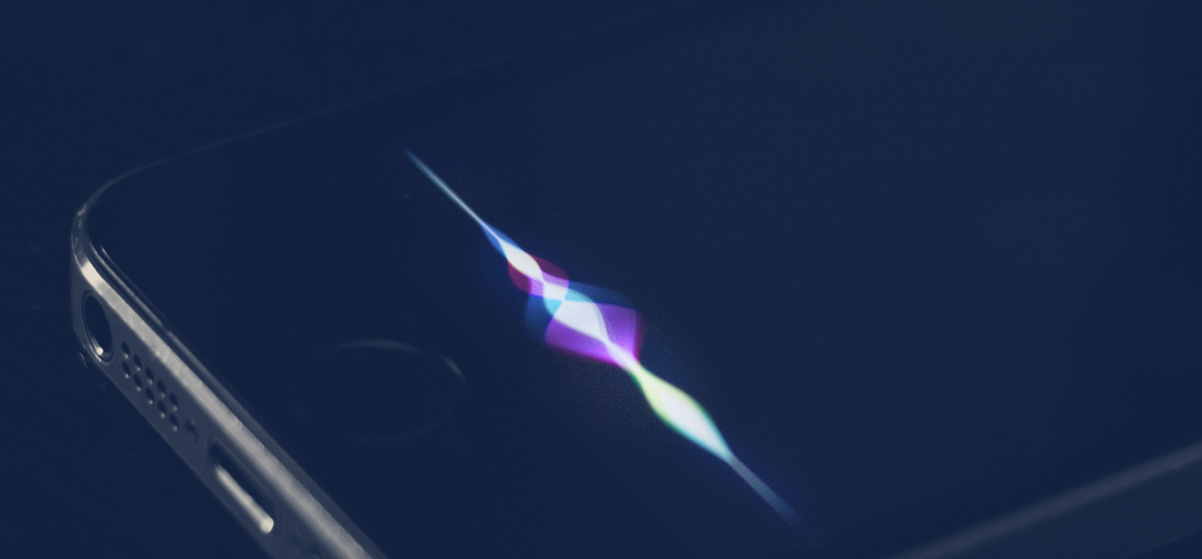
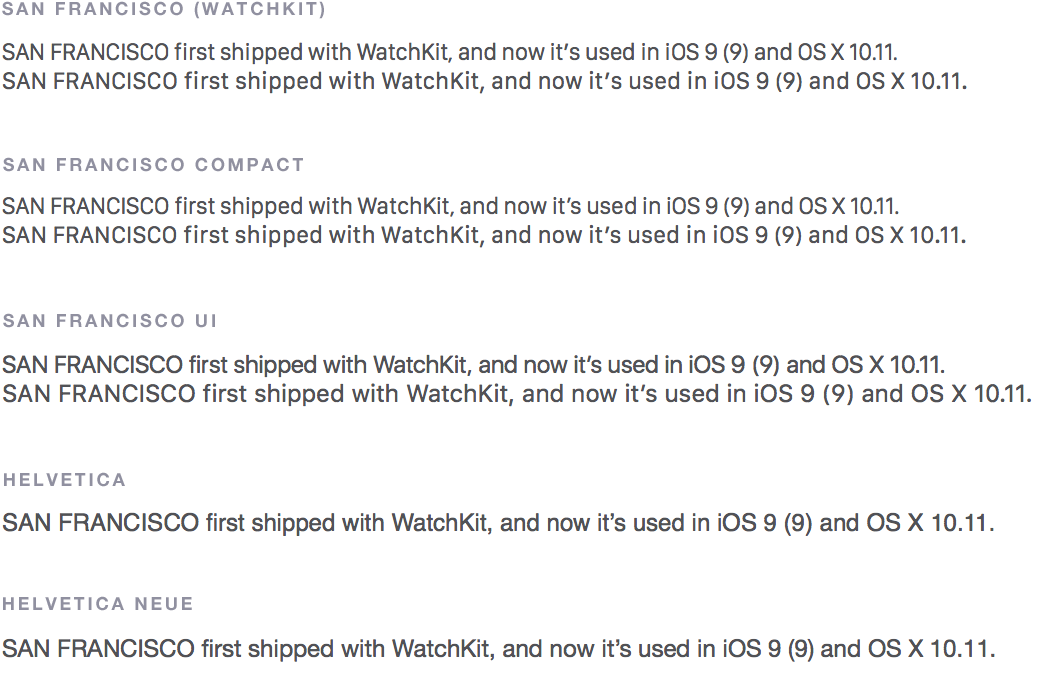
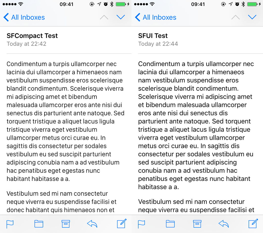


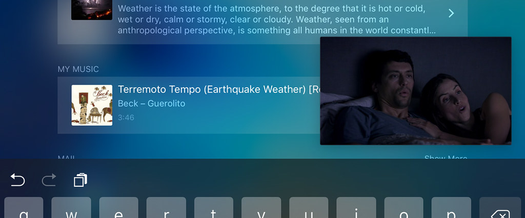
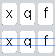
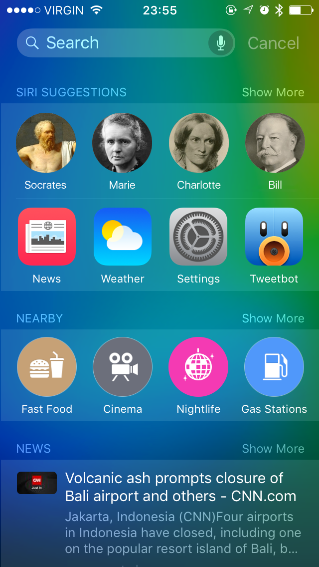

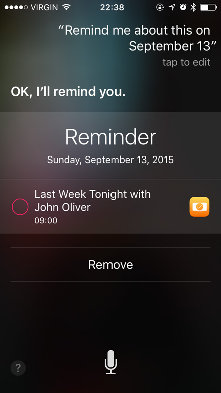
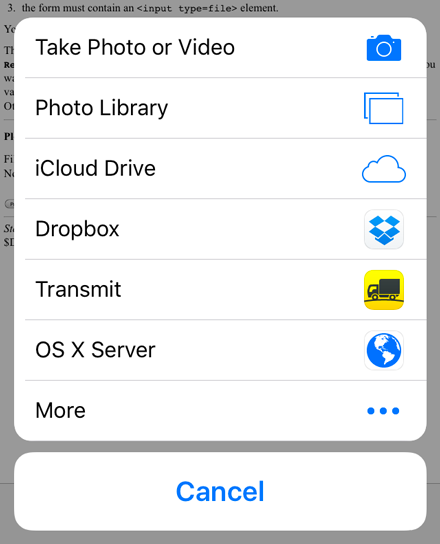
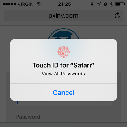


