Ever since Amy Wang published these two paragraphs in the Washington Post, my Twitter timeline has been lit up with UI designers wanting to know how what is described here is possible:
Shortly after 8 a.m. local time Saturday, an employee at the Hawaii Emergency Management Agency settled in at the start of his shift. Among his duties that day was to initiate an internal test of the emergency missile warning system: essentially, to practice sending an emergency alert to the public without actually sending it to the public.
[…]
Around 8:05 a.m., the Hawaii emergency employee initiated the internal test, according to a timeline released by the state. From a drop-down menu on a computer program, he saw two options: “Test missile alert” and “Missile alert.” He was supposed to choose the former; as much of the world now knows, he chose the latter, an initiation of a real-life missile alert.
Today, the Honolulu Civil Beat published a photo of this menu. I’ve reproduced it here for ease of discussion:
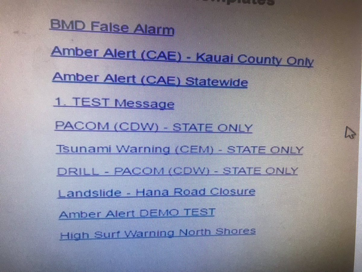
Look at this list. I mean really look at it. The link that the operator clicked is marked “PACOM (CDW) – STATE ONLY”; the one that they should have clicked is marked “DRILL – PACOM (CDW) – STATE ONLY”.
This list appears to be in no particular order. The link to initiate an internal test is not beside the one for a live, public alert, nor is grouped with other internal tests.
The use of uppercase text is inconsistent. In some instances — “PACOM” and “CAE” — it is used for initialisms, but in others — “DRILL” and “TEST” — it is used for emphasis. In the case of the two links here, uppercase is used for both emphasis and an initialism.
On a related note, uppercase text is harder to read than mixed-case text.
Aside from the text itself, here are no visual clues in this list to differentiate a test alert from a live alert.
Without knowing how this system is built, it would be ridiculous to suggest they modernize it or create separate menus for test and live alerts. In fact, I think the simplicity of this menu is a strength, not a weakness. But there are some steps that I think the Emergency Management Agency could take to reduce the likelihood of this happening again:
Reorder the list so that test alerts are grouped together, and clearly separated from live alerts.
Clarify the use of uppercase words. Because government agencies love to use initialisms, that is, by default, the only instance in which uppercase words should be used. All other words should be in sentence or title case.
Differentiate test and live alerts further. If it is not possible to change their colour, perhaps it is possible to add a symbol in front, even something as simple as three exclamation marks to indicate that the alert will be sent to the public. Test alerts should also be more clear; perhaps prefacing each one with something as simple as “Internal Only:” would make it easier to understand that those alerts won’t be public.
I know I’m making it sound trivial to differentiate each kind of alert, but it isn’t — it needs to be something that’s clear in both a calm test-only environment and in an emergency.
More clearly indicate the false alarm option, as it is neither a test nor an emergency live alert. It undoes a previous live alert, and should more clearly indicate that.
As I wrote above, I don’t know what is possible within the existing emergency system; even something as apparently simple as reordering the list may require many hours of work. But I don’t think the options above are entirely unreasonable and, in conjunction with requiring that more than one person sign off on issuing an alert, would add an extra layer of safety by reducing complexity in this UI.
Update: Marcel Honore of the Honolulu Civil Beat reports that the UI shown above is not, in fact, identical to the UI that an operator would see:
However, state officials now say that image was merely an example that showed more options than the employee had on the actual screen.
“We asked (Hawaii Emergency Management Agency) for a screenshot and that’s what they gave us,” Ige spokeswoman Jodi Leong told Civil Beat on Tuesday. “At no time did anybody tell me it wasn’t a screenshot.”
Honore obtained a different screenshot which, while prettier, still has the same problems as the example screenshot above.
Thanks to Kyle Dreger for pointing me to this update.