
Here we go again.
iOS turned seven years old this year. For the vast majority of its life, it was an operating system that followed the philosophy of its parent company: slow progress; a steady roll. Last year, Apple used a major systemwide redesign to simultaneously contemporize the operating system and create a kind of conceptual reset. It was version 7.0, but it felt a little like a 1.0, and carried with it the best and not-so-best elements of that connotation. But while much of the coverage centred around the way iOS 7 looked, I don’t think it was a mere aesthetic change. By asking developers to consider carefully the most important elements of their apps, Apple initiated a spark of reinvention.
The opportunities created by iOS 7 were largely conceptual in nature, however. For a more comprehensive difference in the way developers are able to approach the OS, there need to be a number of core changes. That’s exactly what iOS 8 delivers. In addition to a bevy of enhancements to existing capabilities, there are substantial platform-overhauling improvements under the hood.
It is for this reason that I will be writing a review of iOS 8 in two parts. The first part, which is what you’re reading now, is a review of the first-party aspects of iOS. It is truly a review of iOS 8, not apps built for iOS 8. The second part, which will be released in weeks-to-months, is a review of what is possible when third-party developers get ahold of the thousands of new APIs available to them.
This is what I have gleaned from using iOS 8 every day since June 2 on my primary (and only) iPhone 5S and my Retina iPad Mini.
Contents
- Compatibility
- User Interface
- Notifications
- Spotlight
- Safari
- Messages
- Maps
- Camera
- Photos
- Continuity
- iCloud Drive
- Keyboard
- App Extensions
- App Store
- Health
- Miscellanea
- Conclusions
Compatibility
iOS 8 is one of the most compatible releases of the operating system, dropping support only for one device: the iPhone 4. I, unfortunately, don’t have my iPhone 4S to test on, but I hear that nearly all of the big features of iOS 8 are on all supported devices, including the iPhone 4S and newer, the iPad 2 and newer, and the current-generation iPod Touch.
Update: Ars Technica’s Andrew Cunningham points out that iOS 8 is particularly poor on the iPhone 4S because many of the new features require a screen of greater height.
In fact, the biggest compatibility issues with iOS 8 are likely to be based on which Mac you own. The Continuity features require Bluetooth 4.0 and Yosemite, which means you need to own a relatively recent Macintosh.
As I said above, I’m testing this with an iPhone 5S and a Retina iPad Mini, plus a mid-2012 MacBook Air running Yosemite on the public beta stream.
Performance
My hardware is admittedly very recent; until a week ago, I was on the very latest and greatest iOS devices. So it comes as no surprise that iOS 8 has been buttery smooth on both of my devices, with only the faintest whiff of lag in some animations on my iPad.
Unfortunately, on older hardware like the iPhone 4S and the iPad 2, iOS 8 is really slow. Based on what Ars Technica is reporting, I imagine that those devices barely qualified for an update on Apple’s terms. One hopes that performance may improve in a future update.
Battery life seems to be equal to that of iOS 7. I haven’t noticed a significant improvement nor worsening. Your mileage may vary.
User Interface
With last year’s major overhaul of the entire OS, it’s completely unsurprising that the UI changes in iOS 8 are generally very minor. The rows in the Favourites tab of the Phone app have less padding, Playlist titles in Music now use smaller bold text, and the Bookmarks icon in Safari is now a more literal than abstract interpretation of what a book looks like.
Home Screen
There are, as anticipated, virtually no changes to the home screen of iOS 8 as compared to iOS 7. It’s still the same grid of icons, and nearly all of the icons are, to my eyes, exactly the same. Passbook has, of course, gained a red stripe at the top for the credit cards it will now hold, if you have an iPhone 6 (Plus) or an Apple Watch. The Music icon has also changed its gradient — it’s basically a flipped version of the previous version. Other than that, virtually identical.
While I didn’t expect any changes to the home screen in iOS 8, I was surprised at the fairly large selection of new wallpapers. In addition to the “underwater rays” image that was set as the default for the betas and the new default space-themed photo in the release version, there are fifteen brand new wallpapers available. Most are of flowers isolated on either plain black or white backgrounds; a couple are space themed, while the rest are nature themed. There’s a lot of snow going on in these new wallpapers, which is both pretty and quite chilling.
But there are no new dynamic wallpapers at all, which is peculiar. It’s not that anything was promised, but it feels almost forgotten with all of the new static images. All of the available dynamic wallpapers are the same animation in seven different colour schemes. A couple of the new still wallpapers — the “underwater rays” one, for example, or the bouquet — could easily be non-distracting dynamic wallpapers. It’s a small thing, but it’s a feature that feels neglected.
Notably, the Podcasts and iBooks apps, formerly requiring separate App Store downloads, now come pre-installed.
Recent Contacts
When you double-click the home button to enter the multitasking view, you’ll now see your friends’ faces across the top of the screen; or, if you’re understandably a bit lazy with your contact management, you’ll see their initials. At first, you’ll see your recent contacts, in order of last contact left-to-right. If you scroll to the left, you’ll see your favourite contacts, right to left. Tap on a dot and you’ll be able to contact them by phone, FaceTime, or send them a message.
It’s an implementation that I find a bit odd, but also a feature that I’ve unexpectedly used a lot. I’m not sure why it feels odd — it’s a screen where you can see your most recent apps, so why not see your most recent contacts, too? It makes sense academically, and I use it a lot, but it feels confused.
Control Centre
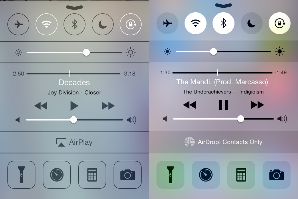
Control Centre was a great addition to iOS 7; in iOS 8, it receives almost no new features, but it does get a makeover. It’s now a dark-on-light sheet, with clearer icons and more apparent on/off states. The content “underneath” the sheet still dims when Control Centre is active but, happily, it now un-dims when you change the brightness so you get a much better idea of what you’re setting it to.
The very few new features afforded to Control Centre are related to iTunes Radio: you can now see the number of skips remaining, and there’s a new “Buy” button if you’d like to keep the song currently playing. Other than those additions, Control Centre remains great at doing what it does: making it quick and easy to toggle frequent settings, open frequent apps, and control your tunes.
Notifications
As of iOS 5, notifications no longer interrupted every damn thing on your phone with gross modal popups, and it was glorious. But, for many, simply being notified about stuff on their phone in a less intrusive manner was not enough. “Why wasn’t it possible to interact with these notifications, too?”, they wondered. Say you receive an email that you know you’re going to delete anyway. Why was it necessary to tap on it, switch to Mail, tap the trash icon, double-click the home button, and return to what you were doing?

It gets more tricky when replying to text messages. While it would be antithetical and, therefore, somewhat silly to compose a lengthy text from a quick reply box, it is maddening that an understandable stray tap can erase an entire message. Here’s the play-by-play:
- See notification of new message appear at the top of the screen while using the phone.
- Swipe downward on it to reveal the quick reply box with a send button.
- Tap out a full reply on the keyboard at the bottom of the screen.
- Move thumb up and across half the display to the send button in the upper-right like trying to span a river of lava, because tapping in the empty space between the keyboard and the send button will dismiss the notification and erase all traces of the message.
I have mistakenly lost more than a handful of messages in this way. The problem is created through a combination of a considerable physical distance between interactions, and a small tap target. And this was on my 5S; I imagine this would be quite challenging on the iPhones 6 unless you invoke Reachability.
Despite its occasional frustrations, it’s a very useful piece of functionality that I’ve wanted for a long time. My nitpicking is just that: nitpicking. I love what is possible already with interactive notifications, and I’m very excited to see what developers do with them.
Notification Centre itself receives some great improvements in iOS 8. The Today view’s weather widget now has an icon to represent current conditions, and it appears to more reliably display the current temperature rather than the forecast. The curious and often confusing “Missed” tab has also been removed, leaving just “Today” and “Notifications”. Finally, third parties can now build widgets for use in Notification Centre — more on this later.
One final observation. With Control Centre now using an icy white background instead of the mid-grey it used before — neither light nor dark — Notification Centre remains the sole use of an overlay sheet with a dark background. The very dark background isn’t bad so much as inconsistent. I’m sure there’s a really great reason why Notification Centre doesn’t adopt the same icy white background as Control Centre, but I’m struggling to think of what that reason could be. Perhaps I’m arguing out of pure principle, but I can’t see why Notification Centre is so special and unique that it requires an inverted colour scheme.
Spotlight
The most notable change to the home screen comes by way of Spotlight. Formerly relegated to searching through your phone, Spotlight is now also a powerful search engine. You can almost think of it as the return of Watson or, if you prefer, Sherlock.
Depending on where you live, Spotlight will now display top hits or good guesses for websites, apps, items in the iTunes Store and iBookstore, locations nearby, news, and movie times. I’ve found everything but the latter two items to be functional where I live.
Spotlight is still accessed by the same gesture of swiping downward on the home screen, though it now blurs the icons behind it. This animation is perfectly smooth every time on my iPhone, but occasionally sluggish on my iPad. Start typing, and results from both your device and the web will rapidly appear. It’s extremely convenient to be able to search for, say, “coffee” and have a list of local coffee shops pop up without having to open Maps or Yelp.
It’s important to be extremely precise with your typing. Spotlight appears to perform no spell check, autocorrect, or even search approximation. Typing “beas” will suggest the Beastie Boys, but if you keep typing and make a mistake — “beass”, for instance — it will have no clue what you’re trying to type. And, like I said, there’s no autocorrect. Bizarre.
I’ve noticed that it will sometimes only search your local device on the first try — trying the query again will reset Spotlight and it will make the proper web-wide search. It’s also not always the smartest search engine, either. Typing, say, “Indian food” will, indeed, find Indian restaurants near me, but typing “Egyptian food” will only suggest the Wikipedia article for Egyptian cuisine, despite there being an Egyptian restaurant a block away. Typing “coffee” will find nearby coffee shops, but typing “cafe” will suggest CafePress. When it works, it’s extremely nice; when it doesn’t, it’s opaque and baffling.
It’s also a sensitive and delicate flower. Searching nearly any band will show suggestions on iTunes, but try typing a band with profanity in its name (Fuck Buttons, Fucked Up, Holy Fuck) and it’ll pretend it can’t hear you. Oh, it knows perfectly well what you want because it’ll find local results for that, but it absolutely will not search the web, iTunes Store, or Wikipedia for those phrases. I understand that Apple wants to be friendly to parents and kids, but my iPhone is registered to my Apple ID, so they also know my age. Can’t they just assume that I did not accidentally type “Fuck Buttons” into Spotlight and that I would actually like to read their Wikipedia article and buy some music?
Safari
To think that Safari started life in 2003 as a simple frame around the web is to consider just how far our expectations have come for what a frame around the web should do. It now runs on our iPhones and iPads, not just our Macs; it’s vastly more powerful underneath while retaining an interface of simplicity. In iOS 8, it gets far more powerful while retaining a virtually identical user interface.
For a start, the Spotlight functionality above is available within Safari’s address bar. That means you can bypass your search engine of choice — be it Google, Bing, Yahoo, or, now, DuckDuckGo — and go straight to Wikipedia, or Maps, or a high-ranking website. While that’s very handy, there are also iTunes Store and iBookstore suggestions that appear whenever you type the name of media available on either store — this feels a bit more like a sales push rather than a helpful suggestion.
The iPad version of Safari has been significantly upgraded to be nearly on par with its Mac counterpart. Instead of relegating bookmarks, shared links, and the Reading List to a popover, there’s now a sidebar on the lefthand side which is far more intuitive for triaging all those links. There’s also the great new interface when you tap the button to see all of your open tabs on your iPad, and all that are open on your other devices. It’s the same UI as is used in Yosemite, and it makes the browsing experience feel much more powerful while also making it easier.
The iPad version of Safari has also gained a feature from the iPhone version: when scrolling, the address bar now retracts. You’d think that it wouldn’t make much of a difference on such a large screen, but it makes web browsing that much more immersive. With just the tiniest bit of window chrome at the top of the display, the feeling that you’re holding the web in your hand is made more prominent.
There are also a couple of slightly hidden functional improvements. Safari now includes the ability to request the desktop version of a site if you’ve been redirected to a stupid mobile- or tablet-“friendly” version — OnSwipe, I’m looking at you. Tap on the address bar and scroll up to see the “Request Desktop Version” button. Tap it and it will change this user agent string…
Mozilla/5.0 (iPad; CPU OS 8_0 like Mac OS X) AppleWebKit/600.1.4 (KHTML, like Gecko) Version/8.0 Mobile/12A365 Safari/600.1.4
…into this:
Mozilla/5.0 (Macintosh; Intel Mac OS X 10_10) AppleWebKit/538.44 (KHTML, like Gecko) Version/8.0 Safari/538.44
Magical.
Since it’s just a user agent switcher, this trick doesn’t work for responsive sites which are dependent on viewport or device width. However, it works well on the more pesky kinds of “mobile optimizing” plugins.
Finally, if you’ve been mourning the death of RSS, you’ve been mourning too soon. It’s back, baby; once again, there’s an RSS reader built into Safari. On any site with an RSS feed, tap the sharing icon and you’ll see a new option: “Add to Shared Links”. Tap that, confirm it, and you’ll get the latest updates to your favourite websites alongside links shared by friends on Twitter. I feel obligated to point out that this poky little site has an RSS feed, so you could try this feature out right away. I’m just saying.
Messages
iOS’ messaging client has seen very few changes since iOS 5, when iMessage was introduced. The mobile messaging landscape, however, has evolved dramatically in that time. On the surface, iOS 8’s myriad new features in this app sound fantastic, but it’s a bit of a mixed bag.
iPhemeral (Groan)
One of the most significant developments of the past several years has been the introduction of ephemeral messaging services like Snapchat. Instead of assuming users want to keep their messaging history forever, there’s now a setting to delete messages after either thirty days or one year (or you can keep all messages forever, like some kind of hoarder).
There’s also a Snapchat-esque way to send expiring photos, and audio, and video clips. If you thought Snapchat’s implementation of photos was bare-bones, you’ll be surprised to know that iMessage is even more stripped-down. You can’t even choose whether or not for the flash to come on, let alone select a filter.
The obvious comparison is, of course, to Snapchat. For reference, Snapchat photos are typically about 50–100 KB, while a ten-second video clip is about 1 MB. I couldn’t get pixel dimensions or codec details, but “Jonicraw” on the XDA Developers forum has successfully used video of 240 × 352 pixels, with a tiny 192 kbps bitrate (I doubt that figure, by the way). Whatever the case, it’s tiny and the quality is pretty crappy, but it’s fast.
Unlike Snapchat, iMessage doesn’t compress images and videos like crazy. Photos are 1,080 × 1,920 pixels, resulting in files of about 250–350 KB, depending on the photo. Videos are, naturally, much larger: I filmed a ten second clip and it weighed a full 19.4 MB. And this, I think, is where this feature falls hard on its face. Snapchat video looks like shit, but it’s fast to send and uses very little data. It’s an ephemeral message, after all, not a work of cinematic art. Apple’s implementation of ephemeral messaging, on the other hand, is a full HD video, uses twenty times as much data, and takes a comparatively long-ass time to send even on LTE.
The ephemeral audio feature is pretty intriguing. Snapchat is great for disappearing text, photos, and videos, and it has seen plenty of competitors try to jump in that space. But I could only find a single Snapchat-for-audio app: Wickr. Unlike the App Store, Google Play makes its install base figures public, and Wickr has 50,000–100,000 downloads. By comparison, Snapchat has 50,000,000–100,000,000 downloads. Wickr simply isn’t that popular.
I don’t understand why not, though. Leaving a brief audio message is a great way of sending a message that’s more personal than a text message, and less interruptive than a phone call. Apple has executed many aspects of this feature remarkably well, too. The resulting audio files are tiny and heavily-compressed — typically less than 1 KB per second — making them perfect for a simple voice message that sends and receives quickly. When the other end receives the message, they don’t have to interact with the notification at all. They can simply raise their phone to their ear and the audio message will play. They can respond in a similar manner, like they’re just taking a phone call. Or, as mentioned above, you can press and hold on the button in Messages to record audio, then flick upwards to send it.
This gesture-based interaction sounds really great on paper, but in practice, I’ve found it more of a mixed bag. It’s a difference of how the iPhone is ideally used versus how I actually use it. Both of these gestures are easily triggered unintentionally. If you give your screen a wipe with your sleeve while Messages is open, for instance, it can trigger the mic-flick gesture. Similarly, I occasionally triggered the raise-to-speak gesture while simultaneously lifting my phone from my pocket while unlocking it. I’m sure that, with practice, the way I use my iPhone will change to accomodate these gestures — I already remember to avoid wiping my display while Messages is open. But it’s something to get used to, and made it feel less like these particular gestures were doing work for me than I work was doing for my iPhone.
Media
Details
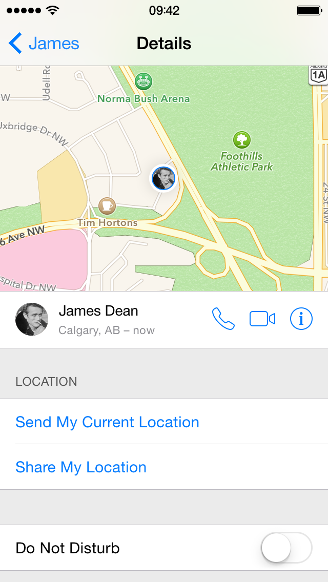
One of the nicest new features is the killer Details view. If you’ve already set up location sharing with Find My Friends, you’ll see where a contact is. You can also send your current location to any contact, regardless of whether they have iMessage. I’ve found this feature extremely useful in the past couple of months of testing, letting my friends know where I am in a crowd, or showing them how far away I am from where we’re meeting up. You can now enable Do Not Disturb on a conversation-based level, so if one of your contacts is being a little noisy but you need to keep notifications on for everyone else, you can. Finally, there’s an infinitely-scrolling grid of all the media you’ve ever sent or received with that contact.
Group Chat
Group messaging in Messages has always had so much promise, yet failed spectacularly on extremely basic things — things like, say, leaving a group thread. It’s an incomprehensible omission that has been remedied in iOS 8, along with the ability to kick others out of a chat.
The killer Details view above is really great for group chat, too. Because it integrates basic location information for people within a thread, you could set up specific group threads for your family, or your drinking buddies, or whatever your friend groups are. You might even already have these group chats set up. Then, you could easily see where those friends are, or where your family members are.
These group chat enhancements are a long time coming, but they’re totally worth the wait.
As far as the rest of Messages goes, it is like I said: a mixed-bag of changes. Details view is great, while video messaging completely misses the mark. Quick photo and audio messaging are nice to have in a first-party app, but don’t feel nearly as essential as the new photo picker sheet.
Maps
Apple made just one big announcement regarding Maps in iOS 8, which is that it has vastly improved support and cartography in China. That’s really great to hear, but I don’t live in China. “What’s in it for me?” he asked, selfishly ignoring the world’s biggest population.
Well, it turns out that there have been a slow series of improvements over the past year to Maps. Belgrade, my example city from last year, has finally gained the river Apple denied the existence of. But, while Apple has been busy adding nature back where it belongs, Google has improved their already-better data. Even at a high zoom level, it’s apparent that Google clearly has better mapping data in Belgrade (and, it must be said, much of the world).


Here in Calgary, I’ve found significantly fewer data problems. Many of my longest-standing reports have been resolved in the past year, and it’s clear that Apple has invested a lot of time and effort into bringing the service up to the expected standard.
There are also kinda-sweet Flyover “tours” of select major cities around the world. Wherever you see a “3D” icon beside a city, you can tap to start a Flyover tour of notable landmarks in that city. Because it uses Flyover’s automatically-generated 3D mapping, it’s not actually like flying over a city in a helicopter, unless that city was recently inhabited by giant lizard monsters. It’s kind of cool, but also a bit corny. It’s the kind of feature that will be fun on a snowy Sunday afternoon, but it’s probably not something you’re going to play with on a regular basis.
I am becoming more and more impressed with the quality of Apple Maps. They didn’t add transit directions, nor have they introduced indoor maps (though those are coming soon) — for where I live, there are no new headlining features this year. It’s clearly not as good as Google Maps is in much of the world, but the data quality has been substantially improved to the point where I think people in many parts of the world can start to trust it. That’s a really big deal.
Camera
Apple’s approach to photography has always followed a script of trying to get the best results with the absolute least effort on the part of the person pressing the shutter. Of course, they’d love to add some features for more advanced users, but in a way that doesn’t add complexity to the UI for regular users who just want to take a picture. So, while Camera looks exactly the same in iOS 8, it’s learned some great new tricks.
Tapping to focus looks the same, but if you scrub upwards or downwards, you can now change the exposure of the image. You can even press and hold to lock focus, then scrub to change and lock the exposure. While the image processor in the A7 generally does a good job at finding the correct exposure for an image, sometimes you just want it to be a little more or less than its assumption. Apple’s implemented a very simple interface for that, and I’ve used it tonnes.
There’s also a great timer mode for perfect group shots. You can set the timer to either three or ten seconds; when the timer hits zero, it will take a burst of ten photos on devices that support burst mode. That way, you should ideally end up with a photo where nobody’s blinking.
Finally, if you have slow motion video, it’s natural to have the complementary time lapse video mode. In my testing, it appears to run at about 15× real time speed, and it looks really good. As with any time lapse, you will have to keep this approximate-fifteen-times figure in mind, though: as video recording uses a lot of power, remember a minute of time lapse video will require fifteen minutes of heavy CPU use. But the results speak for themselves — it’s a full HD video, and the fact that it’s possible to shoot, edit, and upload this all from your phone never ceases to amaze me.
Of critical importance, though, is that all of this functionality was added and the Camera’s UI is virtually unchanged. It’s more powerful, yet instantly familiar to anyone who will be upgrading from iOS 7.
Oh yeah, and you can take panorama photos with an iPad now. People now take pictures with their iPad all the time, but it still looks ridiculous. I reserve the right to cringe a little whenever I see someone taking a panorama photo with their iPad.
Photos
iCloud Photo Library
It’s so easy to take loads of photos on any digital camera; it’s equally easy to take so many that you quickly lose track, forget to look at them, or forget to back them up. We’re now using our phones as our digital cameras, and they have far more powerful software and way better connectivity than any basic digital camera. So, naturally, they should be way better at editing and backup. There are loads of iPhone apps that take care of the editing part; backing up, though, is a bit stuck.
If you rely on the built-in Photo Stream, you only have access to your 1,000 most recent photos — nowhere near enough for the serious photo nerd. You can turn to a third-party solution, like Dropbox, but this requires an entirely separate app and service, and its photos are not available in the built-in Photos app. And then you switch to your iPad and you need to manually download those photos to show them to your friends. What you want is a way to effortlessly back up every photo you take, and have it available on every device.
iCloud Photo Library is, ostensibly, the mend for your woes. It’s as simple as it sounds: every photo you take, stored in iCloud. Unlike Photo Stream, iCloud Photo Library occupies your iCloud storage space, though Apple is blessedly less stingy with their new pricing tiers. While you still only get 5 GB of free storage, upgrading to 200 GB is just $4 a month, while 500 GB is just $10, and 1 TB is $20. The only stinginess I feel is with the 20 GB plan, which is $1 a month. While I understand that Apple is a business and shouldn’t leave oto much money on the table, it feels like nickel-and-diming to charge $12 per year for a relatively modest storage bump.
Minor gripes with iCloud pricing aside, iCloud Photo Library looks like it will be a very slick feature, and one that I — like so many others — have wanted for a very long time. Unlike Photo Stream, iCloud Photo Library stores all of the photos you shoot in the mysterious “cloud”, otherwise known as an enormous data centre somewhere in North Carolina. “Server Farm Photo Library” doesn’t quite have the same ring to it, though. It’s designed to be virtually seamless, require zero input on the part of users, and allow them to feel like their memories are safe and protected.
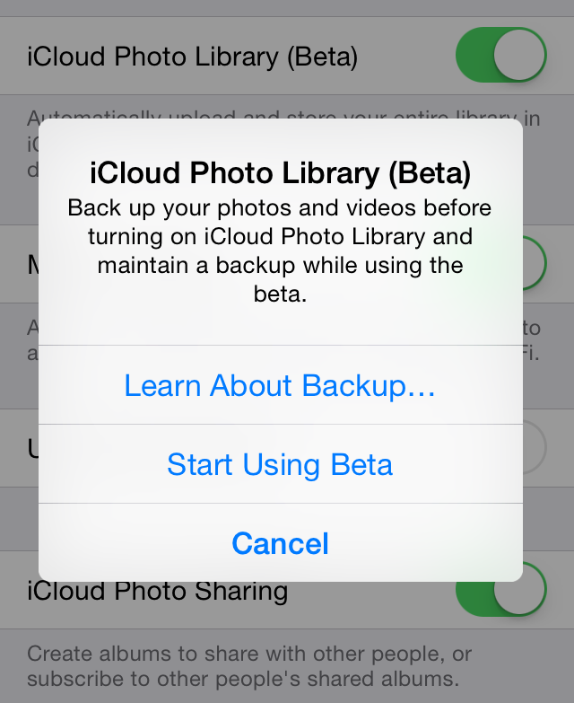
If Apple really doesn’t consider the service ready for prime time, it’s a noticeable change of tone from earlier this year. It’s a cautious approach to such a critical online service, complete with a reminder to back up your photos before you flip the switch to turn it on. Apple hasn’t had the best success with online services; I hope they can get this one right, because I will use the hell out of it.
Photo Management and Editing
Formerly just an envelope around basic photo organization, Photos in iOS 8 has been upgraded to be a powerful and extensible photo management and editing app. It’s like iPhoto without so much cruft. In fact, Apple is so confident in the abilities of Photos that iPhoto won’t even launch on iOS 8.
To start with, there are some very capable automatic controls for improving a photo’s light and colour, and for converting it to black and white. The “light” control, for example, is actually a mix of exposure, highlight, shadow, brightness. contrast, and black point levels, algorithmically mixed to change the scene’s overall light. It’s kind of a magic trick to be able to so quickly and easily be able to improve a photo’s light and colour so much without the photo looking artificially enhanced. Of course, if you’d like, you can always fine-tune each of the individual controls, but most people are going to be really happy with the largely-automatic settings.
The cropping tool has also been significantly enhanced. It now does automatic horizon detection to straighten your photo. Surprisingly, it doesn’t use any sort of gyroscopic data, but rather tries to find the horizon through an algorithmic and visual process.
Continuity
At WWDC in 2011, Steve Jobs introduced the concept of iCloud by explaining that all devices now operate on an equal plane. No longer is the Mac the hub of your digital life; this role has now been occupied by the cloud. So, he explained, it made sense to “demote” the Mac to the same level as the iPhone and iPad. And it kind of worked — the last thousand photos you took with your iPhone or iPad would be available on all your devices; you could redownload iTunes content on any device without penalty; your iTunes library could live in the proverbial cloud. All good things.
But this approach has always felt a little half-assed. Take iCloud Tabs, for example, introduced with Mountain Lion and iOS 6. You could, theoretically, start browsing for something on your Mac, then hop onto the couch with your iPad and pick up where you left off. This required you to tap the little iCloud icon in Safari on your iPad, find the tab that you want (assuming it has synced, which has traditionally been something of a crapshoot), tap on it, and pick up there. Wouldn’t it be great if you could seamlessly jump from Safari on your Mac to Safari on your iPad without those extra manual steps? Hell, wouldn’t it be great to do this in every app that has iOS and OS X counterparts?
Or perhaps you have friends who still call you using the telephone, or text using SMS. You’ve been able to pick up FaceTime calls and iMessages on your Mac, but you’ve had to switch to your iPhone to take standard cell calls and text messages. Isn’t that such a hardship?
Well, alleviating these and other weird inconsistencies are part of Continuity, a set of technologies that allow your Mac and iOS devices to talk to each other in a much more comprehensive way. Best of all, if you have the requisite hardware, software, and typical configuration, it’s virtually invisible to set up. Your iOS devices need iOS 8, and your Macs need Yosemite; everything needs Bluetooth 4.0, and everything needs to be signed into the same Apple ID. Got all that? Great — Continuity technologies should, as the saying goes, just work.
There is one caveat with this section in particular: this is going to feel like a bit of a dual review of iOS 8 and Yosemite, the latter of which is currently in public beta and won’t be out until sometime this fall, probably in October. This is a “tentpole” set of features, so I’m sure they’ll make the cut, but just keep that in mind.
Handoff
Apple calls the ability to seamlessly move between your different Apple devices — including your Macs, your iPhone, and your iPad — “Handoff”. When it works — and it does regularly and almost flawlessly with my iPhone 5S, iPad Mini, and MacBook Air — it’s a beautiful thing. I can walk into my apartment while drafting an email on my iPhone and pick it up on my Mac. I can start messaging a friend on my iPad, then grab my phone and head out the door while continuing the conversation.
You invoke Handoff when you notice a small icon in the lower-left of the lock screen. Slide it upwards — of course, enter your passcode or scan your finger — and you’ll be directed straight into the app. It works similarly in the other direction, too: an icon will pop up to the left of the Mac’s Dock. Click on it, and you’ll open the app from the iOS device.
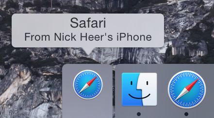
It will be interesting to see how third party apps integrate Handoff, too. I’ve been testing the new version of Pinner, my favourite Pinboard client, and its Handoff integration is especially interesting because it doesn’t have an equivalent Mac app. So, if you’re reading one of your bookmarks in the app, you’ll be able to continue reading on your Mac in Safari — it just passes the URL along. Clever.
Phone Features on Your Not-iPhone
So some of your friends don’t have an iPhone? Or you actually make real phone calls? With Yosemite and iOS 8, you can now make and receive calls and text messages anywhere, though the latter feature won’t be here until October. It’s as simple and seamless as you’d like. Text messages behave exactly like iMessages, and phone calls behave like FaceTime Audio calls.
The mic and speaker used for a phone call automatically switches to the device you’re using. You can start the call on your Mac, then touch the green bar on your iPhone to switch to it. As best as I can figure out, though, you can’t go the other way.
There is one major limitation to making or taking phone calls using your Mac: there’s no way to show a keypad on OS X. This means I can’t buzz people into my apartment from my Mac, and you can’t phone anything with a phone menu without touching your iPhone. Once you use the keypad, the audio will, of course, switch to your phone. For typical calls, though, it’s very convenient.
The audio quality is hit-or-miss, however. I’ve taken a number of calls through my Mac using the mic on top of my Thunderbolt Display and most times, the other party has asked whether I’m in a tunnel or being held captive in a cell in a former Soviet Bloc country.
SMS messaging from your Mac or iPad is just like using iMessage. It’s almost completely seamless — the only indication that you’re sending text messages is the presence of green chat bubbles instead of blue ones. Unfortunately, during my testing, it was also about as reliable as iMessage: that is, not always good enough. Keep in mind that I’m describing a feature that has yet to be enabled on either platform, and I anticipate that its reliability will be improved by launch.
Mobile Hotspot
What a pain in the ass.
AirDrop
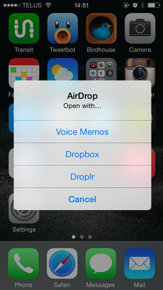
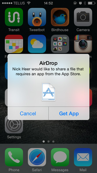
Introduced in OS X Lion, AirDrop was a technology that allowed users to “drop” files onto another Mac on the same network. In iOS 7, Apple added AirDrop to the iPhone and iPad, allowing you to send photos, locations, and other stuff to another iPhone or iPad. But, despite the two technologies sharing a name and a concept, they weren’t interoperable. Want to send a photo to a friend’s nearby Mac from your iPhone? Email it to them. Lame.
In iOS 8 and Yosemite, the two things named AirDrop are now one thing named AirDrop, and it works simply and invisibly. You can send files between any combination of iPhones, iPads, and Macs. What kinds of files? I’ve found that this is largley dependent on whether your sending from iOS device or from a Mac. A Mac can receive anything and, in theory, send anything, while an iOS device is much more limited. When you send a file from a Mac to an iOS device, one of three things will likely happen:
- If you send a photo, a video, a website, a Maps location, or a contact card, the iOS device will automatically open the file in its respective default app. Note that this list does not include audio files. This is the same behaviour as in the previous iOS AirDrop implementation.
- If you send any other kind of file and the iOS device has any apps that supports the file’s MIME type, it will suggest apps with which to open the file.
- If you send a file that the iOS device cannot open, it will tell you that it requires an app from the App Store, and try to provide you a list of apps that support that MIME type. It will also send a “declined” notice to the Mac. I tried sending all kinds of stuff to my iPhone — Quartz Composer plugins, Xcode workspaces, Macintosh services, system preference panes, and so forth. As you’d expect, almost no apps are available that support those MIME types, with the surprising exception of Quartz Composer plugins, which are apparently “supported” by various messaging applications and PDF editors.

Hitting the Bluetooth Limit
So what’s the catch? Well, Continuity is reliant upon Bluetooth, specifically the 4.0 “low energy” standard. Unfortunately, if you have a fairly tech-heavy setup — you’re reading my silly blog, so you probably do — you’re likely going to run into the practical limits of Bluetooth. While the standard officially supports seven connected devices, Apple’s own support document says that the practical limit is “three to four devices”. The peripherals Apple ships with their Macs are typically wireless, so your keyboard and mouse or trackpad are two devices. Add your iPhone and iPad to that and you’ve hit the practical limit, and it sometimes shows. I’ve very occasionally seen spotty and unreliable Bluetooth connections on one or more of my connected devices, including my wireless keyboard and trackpad.
What this means is that I have needed to restart some or all these devices or reset their Bluetooth connections every so often in order to get Continuity features to function correctly. It’s rare, but it sometimes happens. If you run into this issue, my troubleshooting recommendation is to reboot everything, turn on Bluetooth one device at a time, and hope for the best.
iCloud Drive
iCloud was a bold vision for the future of cloud storage. While Dropbox, SkyDrive, Google Drive, and other providers were essentially building a remote version of a (My) Documents folder, Apple thought that they could do better. What people wanted, they thought, was seamless syncing between devices on a per-app level. Start a project in Pages on your iPad, pick it up later in Pages on your Mac, and make last-minute edits in Pages on your iPhone. That was the dream.
But the reality is that not everyone uses the same app on every device. The app you use to edit Markdown documents on your iPhone might be different to the one you use on your Mac. The app you use on your Mac might not even have an iOS counterpart. Therefore, a siloed solution is simply not sufficient for the way people actually use apps.
Apple has eased up on its grand vision with the introduction of iCloud Drive. Now it’s possible for any app to access any other app’s documents on any device. Oh, sure, Apple suggests an app-based folder structure, but you don’t really have to use it — you can make your own folders and store stuff at the root level without issue, though I’m not 100% certain if it’s a good idea to delete the individual app folders.
At launch, though, iCloud Drive has a big problem: its document syncing model is entirely incompatible with the “old” iCloud storage used in Mavericks, and Yosemite isn’t launching until next month. And iOS 8 prompts you to use iCloud Drive during the setup process. And there’s no way of reverting this choice. It almost certainly won’t delete your data, but you will not be able to sync documents between an app updated for iCloud Drive and an app not yet updated. For example, if you use Byword on your Mac and iPhone and Metaclassy updates the iPhone app before Yosemite’s release, and you move your documents to iCloud Drive, you won’t be able to get at them on your Mac. Oh yeah: you also probably have automatic app updates enabled.
I think this is a short-sighted way to launch such an important feature. Apple already doesn’t have the greatest reputation for cloud services; if they break users’ expectations on document syncing, shit will absolutely hit the fan. This seems like something that should only be rolled out when its Mac counterpart is good and ready.
Keyboard
First things first: the emoji keyboard is now enabled by default. You’ll see a little smiley face to the right of the punctuation switcher key instead of a globe icon if it’s the only secondary keyboard enabled. 👍.
The keyboard is one of the features of any smartphone that users will interact with most, so any change made to it is going to have a significant effect across the system. Therefore, it’s imperative that these changes must have their effects considered. The fiasco over iOS 7.1’s confusing shift button — stubbornly and unfortunately retained in iOS 8, by the way — demonstrates just how carefully updates to the keyboard must be approached.
It is this level of care that one would hope Apple has utilized when adding predictive typing to the stock keyboard in iOS 8. In essence, predictive typing, um, predicts what words you’re most likely currently typing or about to type and suggests them, so you can simply tap on one instead of writing it out in full.
Apple calls their predictive keyboard QuickType. To facilitate it in iOS 8, Apple has added a row above the standard keyboard with three boxes in it. Each box contains a word or, occasionally, a phrase that the keyboard thinks you’re likely to be currently typing or will want to type next; tapping on one will insert that word or phrase, followed by a space. Simple, right?
Things get a little more complicated when you’re midway through typing a word. The middle cell displays the best guess as to what you intend to type, while the righthand cell is a second option. The box on the left sometimes displays the current progress on the word between quotation marks, signifying that it will insert this text verbatim. At other times, though, it’s another full word or phrase option.
It’s pretty smart in unexpected ways, too: even though tapping a word inserts the word followed by a space, adding punctuation after the word doesn’t require you to remove the space first. Even the double-tap-spacebar-to-add-a-period shortcut works with a double-tap of the spacebar; that is, the addition by QuickType of a space after the word doesn’t make this shortcut a single tap. It tries to fit into your learned touchscreen typing habits.
So, how does this work in practice? Well, that really depends on your typing style. If you’re a slow touchscreen typer but a fairly fast reader, you’re probably going to like the predictive keyboard. It’s also pretty handy if you’re trying to one-hand type while carrying a bag or something. It’s much less nice if you’re someone who’s used to typing on an iPhone and seeing the little autocorrect balloons appear to let you know what word is going to be swapped out. See, when predictive typing is enabled, the middle cell with the word highlighted blue becomes the indicator of what the replacement word will be. The leftmost cell, with the word between quotation marks, is your way of cancelling the insertion of the word in the middle cell. I found it to be far too subtle, and a frustrating experience as a result.
I also didn’t find it made my typing any faster: I’ve used Apple’s touchscreen keyboards since I bought an iPod Touch soon after they launched in 2007, and I’ve become fairly adept at using them. The predictive stuff was a real curveball for me. I really tried using predictive suggestions regulalry and frequently. But, in practice, the unreliable nature of the suggestions oftentimes meant that I would keep using the keyboard normally and hope that I could catch the weirder suggestions before they were inserted, something that’s more challenging without the much more obvious autocorrect balloon. But there were a few times I was thankful to see it, like when I was carrying groceries with one hand and trying to add a reminder before I forgot.
It’s supposed to be quite a clever keyboard, too. Apple claims that this keyboard learns about the way you write to different people and within different apps. In reality, either I write pretty much the same everywhere, or any differences produced by this feature simply aren’t that noticeable. In fact, I’ve found it noticeable that it doesn’t learn what I type to different people — if I start a sentence to pretty much anyone with “I”, it predicts that I want to tell them that I love them. Damn you, autocorrect.1 I also found that it wasn’t very good at siloing the language that I use in Messages from the language I use in Mail. I occasionally write in CHOCKLOCK in Messages, and I’ve found that this has leaked into Mail and other apps, though I’m not sure why I’m complaining.
One of the smart things the keyboard does is present options: if someone texts you asking whether you’d like to order pizza, pasta, or salad, it will put “Pizza” in the first cell, “Pasta” in the second, and “Salad” in the third. The upper limit to these suggestions is obviously three — if there are more, it will display the first three detected items; with just two options, the third cell will suggest “I’m not sure”.
It’s also impossible to get it to suggest profanity. I tried using the above trick, but I replaced “pizza” and “pasta” with “fuck” and “shit”. Even then, I couldn’t get it to suggest either expletive. This is obviously an extreme (and stupid) case. But even milder expletives — damn, dammit, and crap — will not be suggested, even in appropriate contexts on a device where the owner has dutifully and painstakingly trained autocorrect to retain profanity. I’m not arguing that these should be the most prominent suggestions at every opportunity, but if I type “I feel like shi”, the correct suggestions are likely not “she” and “ship”, especially when QuickType is supposed to be contextaully-aware.
If you want, there are a couple of ways to turn off the predictive keyboard. You can temporarily disable it by swiping downward on the predictive bar itself, which will shink and leave behind a small “handle” that you can drag to show the predictive options again. I found myself triggering this hiding accidentally more frequently than intentionally. For a more permanent solution, pressing and holding on the keyboard switcher icon will show a small menu with a toggle switch. Or, of course, it can be turned off from the Settings app.
Of course, this would be a bigger problem if you were absolutely restricted to Apple’s system keyboard. In iOS 8, you are not. In fact, there are a whole bunch of ways that third-party developers can insert themselves into various parts of your system. Finally.
App Extensions
I’m struggling to think of a single feature requested as much in recent years by developers and users alike as the ability for different apps to share common data, and to access the data of other apps. Due to its tightly locked-down security model, there has been little support for this in iOS; the solutions for doing this have so far been kludgy. Some apps have used custom URL schemes and base 64-encoded files to enable this on some level, while others have agreed to use third-party frameworks. These workarounds are obviously just that: workarounds. They have significant drawbacks — low file size limitations, requirement of common support, and so forth — that should not be present in software developed in 2014.
Frankly, these workarounds shouldn’t even need to exist; an operating system based on OS X should be able to handle inter-app data sharing in a secure, manageable, and non-scary way. Yes, there are obvious security benefits to using an operating system that’s totally locked down, but there are obvious convenience benefits to using a more app-friendly OS. But perhaps this is a false dichotomy. Perhaps it is possible to have an OS that allows inter-app sharing of all kinds of data while retaining robust security. At least, that’s what Apple wants to demonstrate with iOS 8 and App Extensions.
There are six flavours of extensions afforded to developers:
- Sharing
- Actions
- Third-party storage providers
- Photo editing in Photos
- Notification Centre widgets
- Keyboards
That’s a big list of six, with a lot of possibilities. I’ve had first-hand experience with a few of these categories, and have seen the others in action. But this review’s conceptual heart is about iOS 8 itself, not third-party apps, so this part will be relatively brief and not a review of third-party apps using these APIs — that comes in part two of this review. For now, let’s break them down one-by-one, starting with basic sharing.
Sharing
Say you, like I, use Instapaper, and you read the New York Times. You’re browsing through the NYT Now app on the train and you come across a really fascinating article about a linguist critiquing restaurant menu descriptions. Just then, the train pulls into your station, so you need to quickly save the article for later reading. You could try to remember to do that, but you’ll probably forget, so you tap the Sharing button and you’re presented with two options: save it to your Reading List, or save it within the NYT Now app. Neither of these are preferable, because you use Instapaper as a place to dump articles you want to read later.
So what do you do? Well, if you’re like me, you first fill out the NYT Now’s feedback form requesting support for Instapaper for the nth time, which is the smartphone equivalent of writing a nasty letter. While you wait for them to manually add it, you copy the URL, open the Instapaper app, and save it manually. Meanwhile, you glance over at the passenger next to you who’s using a Nexus 5 and see her save stuff to Pocket from a bunch of different apps. Jealous?
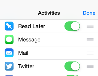
In iOS 8, the developers of Instapaper, Pocket, Pinboard apps, and so on can now add their own sharing button to the share sheets of any app, both first- and third-party. It’s installed systemwide by tapping on the “More…” button of the share sheet from any app that would support the extension and simply flipping the switch. There is no indication, however, that a new extension has been installed and can be enabled.
You can place the button in whatever position you’d like, and even turn off system sharing options other than Messages and Mail, for some reason. Unfortunately, as of the golden master, the button likely won’t stay where you put it because there’s a longstanding bug that drops third-party sharing buttons to the end of the row.
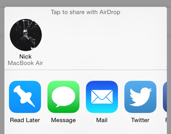
That aside, the button will now be available in first- and third-party apps that provides data the extension supports. It’s a feature that I, among many, have long wanted, and it’s very pleasing to finally have this capability.
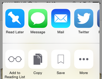
Actions
There’s a second row of icons on a share sheet, too: Action buttons. These are differentiated from Sharing buttons by the way in which they use data. While Sharing buttons copy data from the host app into a receiving app or service, Action buttons enable another app to manipulate data in a host app. For example, you may use a Sharing extension to add something to a third-party to-do app, but you might use an Action to look up some highlighted text in a dictionary Apple doesn’t officially support. The former is copying content elsewhere; the latter is manipulating content in-place.
Actions and Sharing extensions do have a lot in common, though. They’re installed in a similar way and are invoked by similar means. But both Actions and Sharing extensions have a common drawback: they are only accessible via the Share sheet, which means that they’re not supported in apps that don’t have a Share sheet.
Third-Party Storage
Apple “generously” provides 5 GB of free iCloud storage, but what if you prefer another service like Dropbox or SkyDrive? Sure, Dropbox has a great API for third-party developers, but what if you’d like to use its files in one of Apple’s apps, or another app that doesn’t have Dropbox integration?
Well, the third-party storage extension in iOS 8 is about to be your new best friend. Any app that supports iCloud Drive will also support third-party storage services with this system extension — requisite support for iCloud Drive is, indeed, the catch here. But near systemwide support for third-party storage options means that you can store your stuff with the provider of your choice and still use many of the apps you love. Put another way, the selection of apps you can use is now largely independent of the storage services it supports. That’s an all-around great thing.
Photo Editing
Fellow photo nerds: this is a big one. The App Store has some of the best photo editing apps available on any platform, mobile or otherwise. Each of these apps typically import a photo from your Camera Roll — perhaps even copy the photo into the app’s own library — and create a copy of the file after you save it. If the app doesn’t have its own library, it’s going to be a lossy copy of the file, locking all of your edits down.
In iOS 8, app developers can now add their own editing tools to the first-party Photos app. In addition to Apple’s own filters, for example, VSCOCam could potentially offer their far nicer ones for quick photo enhancement without having to open another app. I’ve only seen the developer demos of this, so I’m not sure what the limitations of the extension are. Presumably, it would be very difficult or nearly impossible to build all of the capabilities of VSCOCam, say, into a mere extension.
Happily, this isn’t necessary. In iOS 8, apps that edit photos can now edit the same file in place, nondestructively. That should mean no more lossy copies of the same file just to adjust the perspective in SKRWT before applying filters in VSCOCam.
Notification Centre Widgets

These widgets all live in the Today tab in Notification Centre. They can be placed in any order between the Today Summary/Traffic Conditions, and the Tomorrow Summary, all of which are locked to specific positions when enabled. Unlike a hypothetical widget on the home screen, the visibility of Notification Centre can be toggled easily, and they’re accessible from within any app, and also from the lock screen.
When you install an app with a Notification Centre widget available, you’ll see a small badge below the “Edit” button at the bottom of the Today view. Tap it, and you’ll be able to activate and place the widget. While I prefer this approach to, say, a modal dialog that tells you every time an app update includes a widget, I think that this subtle indication will be missed by some users. Be prepared for developers including “What’s New” screens in their apps with steps to install their widgets.
Keyboards
I expected most of these extension types eventually in iOS, but I really, honestly, never expected this one: iOS users can now install third-party keyboards systemwide, and even run them exclusively, in place of any first-party keyboard.
Once you’ve downloaded an app from the App Store that contains a keyboard, you can add it through the familiar keyboard Settings screen, where there’s a new section titled “Third-Party Keyboards”. You can drag your new keyboard to the order you’d like, and use it from any app.
You’ll also see a warning that third-party keyboards can see everything you type. This sounds dumb and obvious, but it’s something I hadn’t fully considered before. Sure, you type “lol” on your keyboard, but you also type your credit card data, username and password combinations, and so forth. Surely any third-party keyboard that has extended network access would be a goldmine for hackers. Fortunately, this isn’t the case — selecting password fields and similar input areas will automatically bring up the system keyboard instead.
There are other limitations to third-party keyboards that you might not expect. For example, because they can’t draw outside of the keyboard area, they can’t offer inline ways to manipulate text. Third-party keyboards also cannot offer dictation because App Extensions can’t use the microphone.
What they can offer, though, ranges from the obvious to the wildly creative. There are, of course, gesture-based keyboards like Swype coming to iOS, and keyboards that promise to offer better autocorrect or smarter prediction capabilities. But there are more creative uses for third-party keyboard support, too. PopKey, for example, is a “keyboard” of animated GIFs. Then there’s TextExpander, which has used crazy hacks to try to enable systemwide support; TextExpander snippets can now, erm, expand in every app by way of a TextExpander keyboard.
And I don’t know about you, but I’m pretty excited by what I’ve seen so far in terms of shift key readability.
Extensions, Overall
You’ve probably noticed some common threads between the six kinds of App Extensions. They require a containing app, for a start — there’s no way to install just an extension — and, according to the rules of the App Store, the containing app must have some functionality itself beyond simply being a container for an extension. All extensions are also disabled by default, and require a user to manually enable them, often with subtle or even no indication that a new extension is available.
There’s one more aspect of App Extensions that I find fascinating for its possibilities, but also its potential for confusion. If you use third-party apps as system app replacements — Mailbox instead of Mail; Fantastical instead of Calendar; Chrome instead of Safari; Weather Line instead of Weather — it’s now plausible to make these apps feel more like defaults without official support from iOS to change default apps. You can send stuff to Pinboard or Instapaper instead of Reading List; you can use third-party apps to manage and edit your photos without cluttering up your photo library with duplicates.
Unfortunately, in most instances that I can think of, it’s still going to be clunky. For instance, Mailbox could offer a Sharing extension; unfortunately, there’s no way to hide the default Mail app on a share sheet. Google could add an “Open in Chrome” systemwide extension, but links will still open in Safari by default. Alternative weather apps could include their own Notification Centre widget, too, but users will have to turn off the entire Today Summary widget, which also includes calendar information.
All told, App Extensions are huge. Obviously. They’re arguably the single most important enhancement for developers since the introduction of the SDK in 2008. I could not be more excited to see what will be done with these APIs.
App Store
The App Store has been in rough shape for a while. Really rough shape. Sure, it has a whole lot of apps, and they’re downloaded a lot, and some developers around the world are reaping the rewards. But with 1.2 million apps in the store, it’s a gigantic pain in the ass to find anything, especially with the slow side-scrolling search introduced in iOS 6. Apple has tried to mitigate this by building collections of apps around certain themes, but it only goes so far. It, too, doesn’t hide the lack of obvious and significant features for developers and users alike. Apple is committed to proving that they’re not ignoring the feature requests. The App Store in iOS 8 is a big update — one of the biggest since its launch.
For a start, vertical scrolling is back, and I couldn’t be happier. Not a lot needs to be said about how clunky and slow the side-scrolling search UI was, and I’m glad this has been fixed. Trending searches are also displayed, so you don’t even have to type the names of some of the hotter new apps. It’s really sweet.
There are some great new user-facing features in the Store. Developers can now define app bundles, so users can purchase a whole set of apps. For example, an entire productivity suite makes sense being sold both as individual apps and as a bundle. If a user has purchased apps in the bundle, they can buy the bundle at an appropriately discounted rate.
There’s also a new middle tab. Apple seems to use the middle button in the App Store’s tab bar as a sort of playground; you’ll remember that last year, it was the fantastically useless “Apps Near Me”; the year before, it displayed Genius recommendations.
This year, a whole bunch of stuff all comes together in a very convenient way in the Explore tab. Here, you’ll find apps popular near you, in case you actually used that feature, as well as a directory of popular and featured apps, and Apple’s themed collections of apps.
Unlike previous “middle tabs”, I’ve actually found myself using the Explore feature, though I’m not entirely sure why. It offers almost nothing on top of the standard Categories browser that you can get to from the top-left of the Featured tab — in fact, it seems to offer less. But perhaps that’s the point: it’s a more focused and less overwhelming way to browse the App Store.
There are some great new developer-friendly tools, too. In addition to standard image screenshots, developers can now add video previews to their apps’ listings. Apple’s even built a really slick way to record these — just connect your iPhone or iPad to a Mac running Yosemite, start a new QuickTime video recording (confusingly, not a new screen recording), and select your iOS device from the camera selection dropdown. Once you do, the device will get a clean status bar with no carrier, a full signal, a full battery, and the famous “9:41” time. This isn’t added as an overlay — it’s actually changing it on the device, meaning you can take still screenshots using the same trick so you don’t have to muck about in Photoshop to get a really nice status bar.
Finally, Apple is at last offering an official and clean way of allowing much broader beta testing. You may recall that they acquired Burstly, makers of TestFlight, in February. TestFlight has retained both its name and a similar icon and is now the official way for Apple developers to distribute betas. Previously, anyone you’ve wanted to beta test your app would have to have their devices’ UDIDs added to the developer portal, to a limit of 100 individual devices per year. This has been a nightmare for developers, especially those in a large organization who will have a significant number of internal testers.
Now, up to 25 people, each with up to 10 devices, can be added as internal beta testers. They will receive any build of any app, regardless of how buggy it is. Apps for internal testing won’t have to go through the app review process. In addition, up to 1,000 external users can now receive beta copies of an app. These copies must comply with App Store rules and regulations, and developers can attach notes to the update to let testers know where they should focus their attention.
If you were reading carefully, you probably noticed that I switched from explaining about how developers had to add test devices to test users. It’s true: Apple now allows developers to add users by Apple ID or email address, not by device. This makes so much more sense. It’s more likely that you’ll want to distribute beta copies of an app to a person, not just a device, and they should be able to run the app on all of their devices.
The new App Store features are huge for both developers and users, but I anticipate it’s not enough. There’s still no opportunity for developers to do basic things like set an upgrade price, for example. It’s a big overhaul, but I anticipate that it’s not going to be quite enough for everyone. What is there, however, is really very good. I think it’s going to make a lot of developers happier, and make the browsing experience way better for users.
Health
Health is an interesting sort of app from Apple. Out of the box, it does pretty much nothing at all. There’s a lot of data the app can glean — calorie intake, body fat, cycling distance, number of times fallen, manganese intake, and so forth — but it all requires additional hardware.
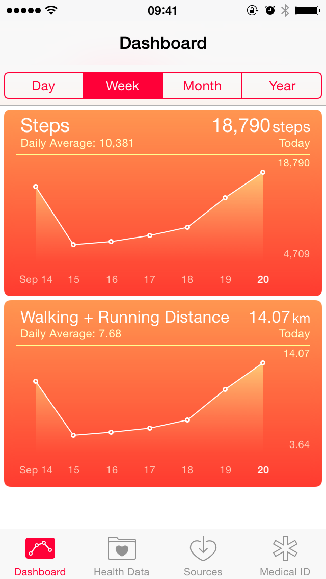
Happily, there’s a little bit of functionality that does work right away: there’s a step counter, a card that shows your walking and running distance, and a Medical ID card. If you have an iPhone 6 or 6 Plus, you’ll also be able to use the cards for flights of stairs climbed, and cycling distance.
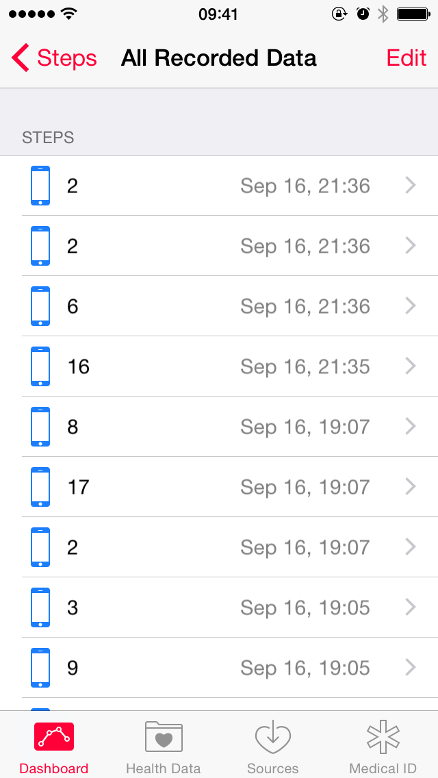
I’ve found the step counter to be moderately accurate. It’s nothing like one of those pedometers you’d get in a box of Special K, but you can still sometimes fool it by shaking your phone as you sit on your ass. Because you presumably carry your iPhone nearly everywhere with you, though, it’s a much better approximation of the number of steps you take in a day, and how far you walk.
The Medical ID is a very smart feature. You can fill in pertinent information like an emergency contact, blood type, height, weight, birthday, and whether you’re an organ donor. If you get knocked unconscious, a first responder can access the Medical ID from the “emergency” button on the passcode pad. In addition to allowing you to call 911, 999, and other emergency numbers, iOS 8 will also allow you to call your Medical ID emergency contact without unlocking the phone. I think this is a very smart, very conscious feature. It’s not something you’re going to use all the time (I hope), but it’s something you’ll be able to set up and forget about, and it might have your back one day.
But that’s all Health really does when you launch it: count your steps, measure how far you cycled, and allow you to make an emergency Medical ID. The other functionality is unlocked by way of third-party hardware — and, soon, the Apple Watch — and HealthKit, Apple’s framework for developers. Unfortunately, as of writing, there’s no hardware that yet supports this functionality, so I have had nothing to test here. I’m looking forward to revisiting this in several months.
In the interim, if you’d like, you can always manually enter the amount of riboflavin you consume.
Apple also stresses that the app is very protective of your privacy, keeping everything very locked-down. They’ve set rules in the App Store to prevent developers from selling data gleaned through HealthKit. I think I experienced just how protective Health is while beta testing iOS 8, in fact: when I restored my iPhone from my beta backup to upgrade to the GM, all of my Health data was not restored. My Touch ID setup was also not restored; Apple has previously clarified that Touch ID data never leaves the device. These were the only two things that had no restored data after the backup finished syncing. Curious.
I’m not a big fitness buff, but I’m very excited by the prospects of Health and HealthKit. It’s another piece of iOS 8 that will reveal itself as more developers build stuff for it, so it’s a bit of a waiting game. For now, though, it’s kind of cool to know that I took nearly 16,000 steps on Sunday just from running some regular errands.
Miscellanea
The workhorse productivity app that is Mail receives some modest but worthy enhancements to inbox management and composing.
In iOS 7, Apple added some Mailbox-ish swiping gestures to reveal buttons “below” table cells. In iOS 8, you can now swipe all the way right-to-left to immediately delete or archive a message. If you’re a Mailbox user, you might find the friction coefficient of this gesture a bit tricky to get used to. Occasionally, I found myself unintentionally deleting messages when I meant to flag them. Once you get used to the friction of the gesture, though, it’s as nice of a way to manage your inbox as it is in Mailbox.
(Seriously, Apple totally cribbed the gesture from Mailbox.)

Accounts that include Archive as a default action for swiping left will offer Trash for swiping right.

Finally, when you’re composing a message, you can now drag the top of the message down to temporarily place the message in draft mode to get at your inbox. Then, tap or drag the bar with the message subject at the bottom to return to your draft. This is super handy for being able to copy/paste another message’s content into an email.
Touch ID
Formerly limited to being able to unlock your iPhone and make purchases from the built-in stores, Touch ID authentication is now open to third-party developers. It works pretty much as you’d expect as a user: if you want access to something, you plunk your finger on the home button. Easy magic.
In addition, Touch ID now works in more places. You know how you could use Touch ID to unlock your iPhone, but if you had waiting notifications, you had to type in your passcode? That always felt like a cop-out to me — a wasted opportunity. In iOS 8, that’s fixed. Swipe on a notification, put your thumb on the home button, and let Touch ID do its thing. It is a little more awkward than unlocking your iPhone with your fingerprint normally because your thumb has to go from swiping on a notification to the home button, but it’s a minor issue.
Update: Apparently, this was always possible in iOS 7, but I never figured that out. No joke. Because the screen always prompted for a passcode, I always typed my passcode in; I never tried my thumb. I wish I was joking about this. I’m supposed to be good at this stuff. Thanks to Benjamin Esham and Ben Sargent for pointing this out.
Weather

Still can’t? Take a guess as to how you view that information.
The correct answer? Scroll the app vertically. There is absolutely no indication that this is possible. Even when you are scrolling, no scrollbars appear. It’s a totally opaque interface that I didn’t realize was there until I discovered it by accident. The crazy part is that Apple already solved this problem with horizontal scrolling in the same app: the grid is such that it’s impossible to make it appear as if you cannot scroll the day’s forecast horizontally. If only the vertical grid offered smoething similar.
I’ve found the Weather Channel’s data to be fairly accurate, certainly moreso than Yahoo’s. It’s still not as great as Forecast.io, for example, but it’s really very good. I did notice that a few of the cities I have in the app — London, Paris, Tangier — were not fully recognized when I upgraded from iOS 7. Current weather conditions and the associated animation for those cities was not displayed. I resolved the issue by removing and adding back those cities.
There’s one more awesome little thing: now that there are Notification Centre widgets on OS X Yosemite, too, Weather syncs your cities between the two platforms. Nice.
Siri
I have amended this section to reflect live dictation, which I entirely forgot about. That’s how well it works.
It is perhaps a little bit odd that I’m placing the flagship feature of a three-generations-ago iPhone into the “Miscellanea” section, but Siri clearly wasn’t a major focus of this release wasn’t as much of a focus for this release as were other parts of the system. There are a couple of extremely nice additions, though.
First up is Shazam integration. If you invoke Siri in a room when there’s music playing but you don’t say anything, Shazam will kick in and try to identify the song. It works as well as Shazam does, which is to say about 80% of the time.
I’m a little bit surprised that Apple is using Shazam when they must have a decent internal song matching program — it’s how iTunes Match works, after all. There must be a good reason for choosing a third-party app; I just can’t think of it.
Also, when you connect your iPhone to a power source, Siri will enter a passive mode where you can say “Hey Siri” without touching the home button. I’ve tried using this while cooking to read me my text messages and set timers, and I’ve had only moderate luck with it. Sometimes I feel like a complete idiot while standing there shouting “Hey Siri” at a small lump of unresponsive metal and glass. It’s typical Siri: when it works, it’s magic; when it doesn’t, it’s deeply frustrating.
Update: The most significant improvement to Siri is that it now displays its interpretation of your dictation in real time. It works so well that I completely forgot about it when I initially published this review, but it’s there, and it’s really great. To turn on live dictation shows that Apple is clearly far more confident in the speech recognition abilities of Siri this year. It’s really, really nice.
Tips
There’s a host of new functionality in iOS 8, and some of it is a little tricky to find — consider the additional gestures in Mail, or the swipe-to-send-audio gesture in Messages. Apple has therefore provided a built-in app to provide you tips on how to use iOS 8 better. It’s a really simple app, with little video hints, sort of like those that play on the screens behind the Genius Bar at an Apple Store.
Apple promises that they’ll push out new tips regularly, and they offer push notifications if you’d like to be alerted to new tips.
For those keeping count, by the way, Apple has added four new default apps — Podcasts, iBooks, Health, and Tips — that cannot be removed from the home screen, except to be nestled into the folder where you already keep Newsstand and Game Centre.
Settings
There are two great new features in the Settings app. First, every app on your phone now gets a menu in Settings, regardless of whether the developer puts the app’s settings in the Settings app. This makes it way easier to get at an app’s settings for typical app functions, like notifications, cellular data usage, privacy, and so forth. This can be a little confusing if an app also has options within the app for changing its settings. Perhaps this is some sort of giant nudge from Apple.
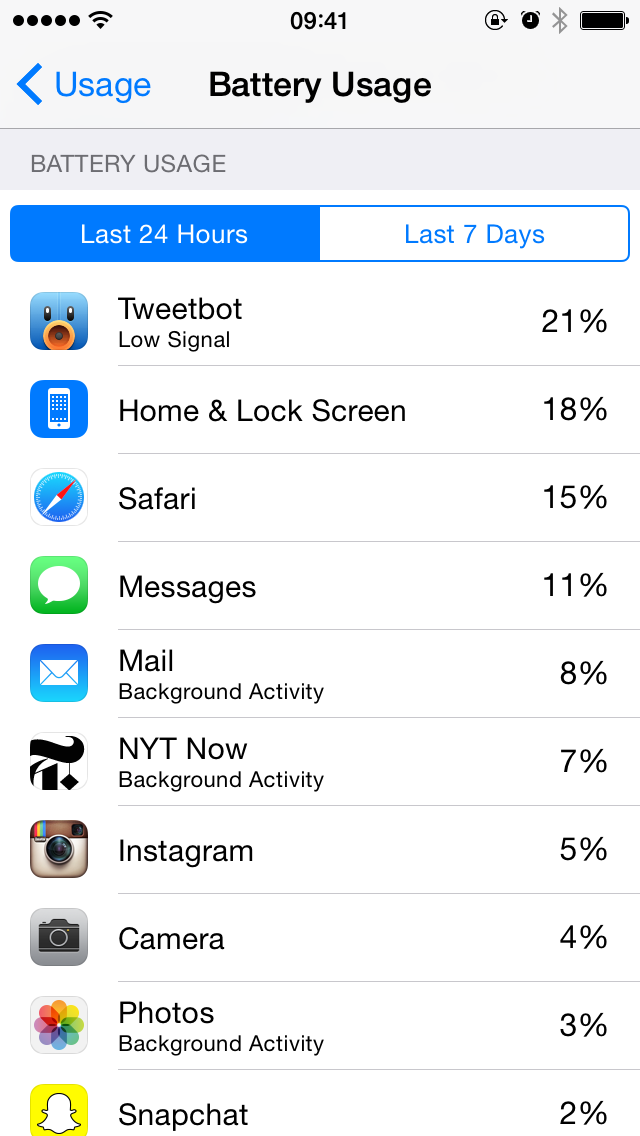
This isn’t necessarily as definitively shaming as you might think, though. Apps that you use most will, obviously, consume more battery power than apps you use less frequently. In the past seven days, my home and lock screen usage is at 18%, but that’s because I kept getting notifications and replying to them from the lock screen. Par for the course.
But if you notice an app near the top that you use infrequently, that’s a good indication that it’s inefficient. It would probably be more useful to have a weighted list that takes into consideration the amount of time the app is being actively used versus the amount of energy it consumes.
Conclusions
This is a huge review of an operating system update that has yet to fully materialize. The amount of extensibility offered to third-party developers is unprecedented on iOS, and I am looking forward to seeing what they do with it.
Despite it being a huge review, there’s a lot I didn’t have time to discuss. There’s now support for travel time in Calendar appointments, and huge accessbility improvements that deserve their own article. Voice Memos has an entirely new UI that’s really quite nice. There’s a huge new iCloud feature targeted towards families, allowing parents to authorize their kids’ purchases.
But I’ve covered all I wanted to talk about in this review, and I think you’ll agree that this is an enormous iOS update. Over the past few years, we’ve seen Apple slowly lay the groundwork for a big leap forward in software and services. We — users and developers alike — are now reaping the rewards.2 Even if you’re not buying a new iPhone this year, you, iOS 8 is a big enough leap forward that you won’t feel like you’re missing anything.
That’s not to say that there aren’t problems with it. I’ve pointed out a number already, and I’m sure we’ll hear more reports as users update. It’s not without its flaws and its bugs. But I think iOS 8 is the biggest iOS release for users and the most exciting opportunity for developers since iOS 2.0. It’s really that big of a deal.
The second part of this review will be a lengthy consideration of what the new APIs in iOS 8 have enabled. I anticipate I’ll publish it in a few months’ time, but it may be sooner or later depending on the software landscape.
-
On the plus side, there’s an interesting almost-poetry to the phrases and sentences predictive typing will construct if you just keep tapping the middle cell. ↥︎
-
Yes, developers, I am keenly aware of how buggy and broken Xcode is this year and how painful it is to develop for many of iOS 8’s new APIs. ↥︎