In March, the New York Times unveiled a major redesign of individual article pages. The company billed it as an interpretation of the newspaper for the online experience of 2013, replete with a requisite responsive design, web fonts, and bigger photography. In addition, the newspaper eschewed pagination in favour of a single-page format.
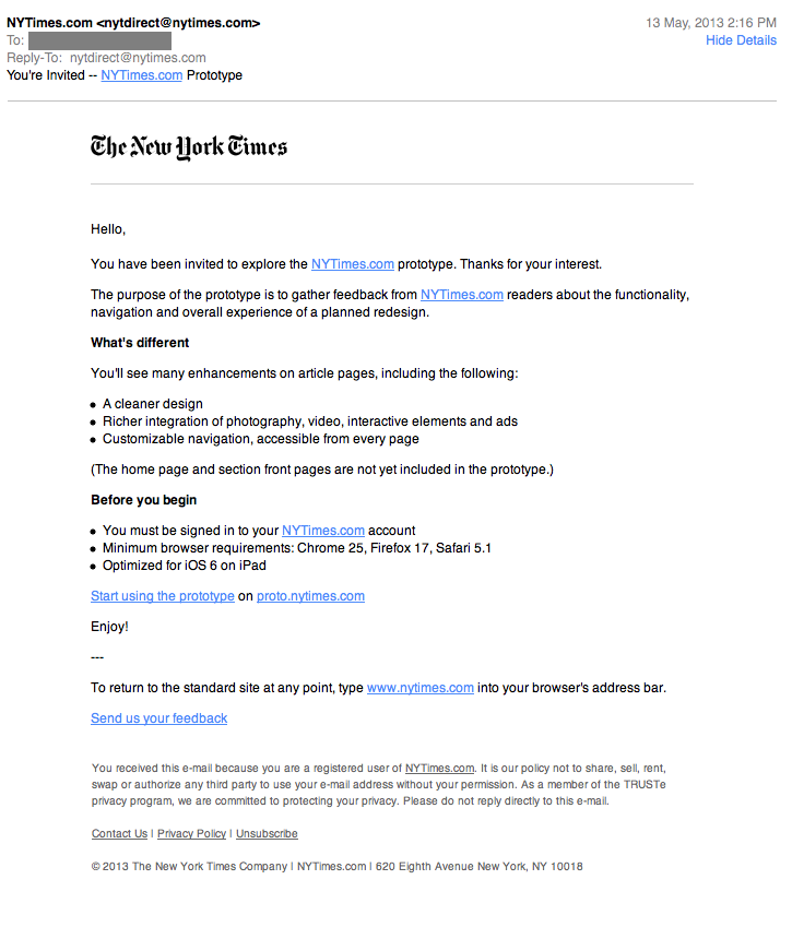
I received my invitation to test the prototype earlier today. In the email, the Times promised that this redesign was “optimized for iOS 6 on iPad”, which is an oddly-specific targeting. However, it speaks volumes about the shifting device demographics. The website for one of the most widely-circulated newspapers in the world is primarily targeting iPads — not desktops, not laptops, and not “tablets”. That’s huge.
But a focus on a contemporaneous website doesn’t necessarily translate into a successful web experience. It’s important to keep in mind that this is just a prototype, and is very much a work in progress. But, as of right now, it requires a lot of work in order to progress:
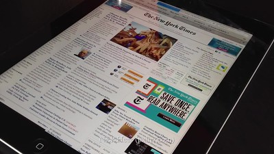
As you can see from the video, the article page uses its own crappy scrolling coefficient. It feels too fast and inconsistent. A visit to the WebKit Inspector reveals that the article resides within its own hidden overflow div which has some scrolling Javascript applied to it. This decision allows the Times to provide navigation between articles by scrolling to the left or right. One side effect of this implementation is that it breaks the native gesture to jump to the top by tapping the status bar. For an experience ostensibly optimized for iOS 6 on an iPad, this is shockingly poor.
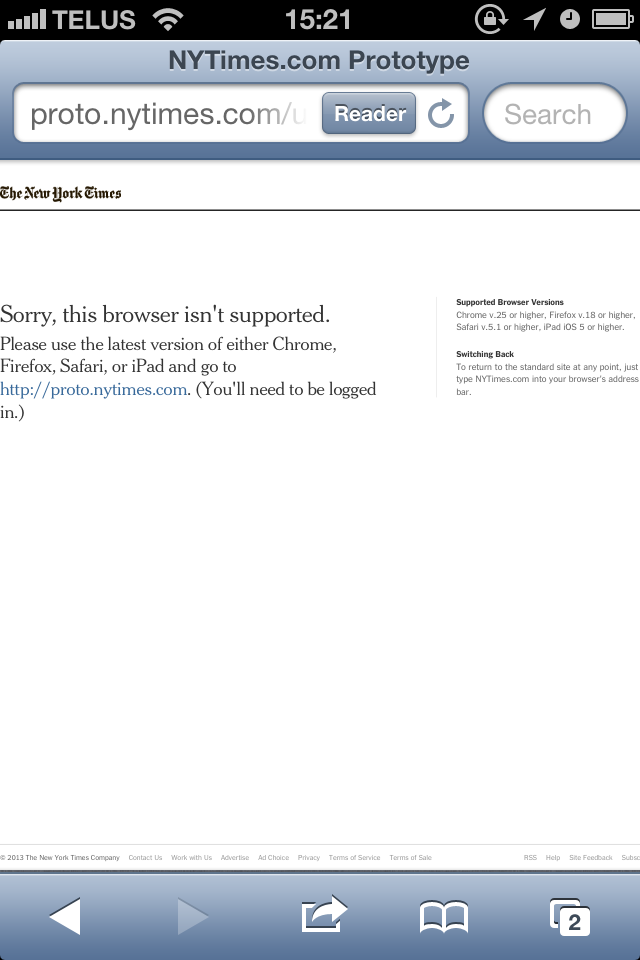
A couple of other issues were immediately noticeable: the lack of scrollbars is presumably another byproduct of the odd scrolling implementation, and graphics throughout the prototype are not optimized for a retina display. Finally, the prototype doesn’t work at all on my iPhone.
I must stress that this is obviously a prototype, and doesn’t (yet) represent the shipping product. However, the Times is releasing these early previews in an attempt to solicit feedback and issues. I’m only too happy to oblige.